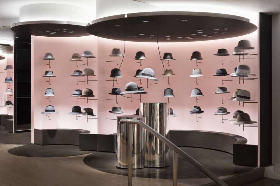
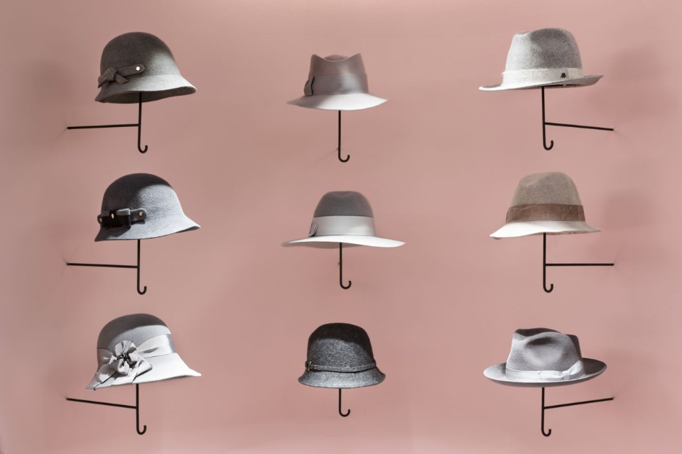
It's one thing to know which are the main ones this year.colors according to the Pantone version, and it is quite another matter to put these colors into practice. Yes, and together. Today we show you real examples of interiors in which the shades of the year - "rose quartz" and "serene blue" - play the main role , and at once the two main colors of the year are the shades of Rose Quartz and Serenity. Despite the fact that at first glance these colors resemble a typical pair "for a boy" (blue) and "for a girl" (), experts explain their choice by a gradual gender blur in the fashion industry, and these shades are perfectly combined with each other. To figure out how to use them in the interior, we suggest looking at our selection of private and public projects in which these colors are used in one variation or another. Seibu Shibuya Shopping Center, Japan Shibuya is one of the most striking, distinctive and generally unusual areas of the Japanese capital. The facades and interiors of local buildings correspond to this status: what is only the two-storey Seibu shopping center, designed this year by the Nendo studio. The main concept is a wandering circus: the compartments with collections of clothes and accessories resemble mobile carriages, and the color scheme is very juicy, festive and contrasting. The designers called the department with hats “Cloud of hats”. The straight lines and zigzags inherent in the compartment with women's clothing give way to rounded and cylindrical shapes, and the hats are placed vertically, resembling tiny umbrellas floating in the sky. All walls are painted in the trendy shade "rose quartz", and it is combined with a neutral light ceiling, dark and chrome details. 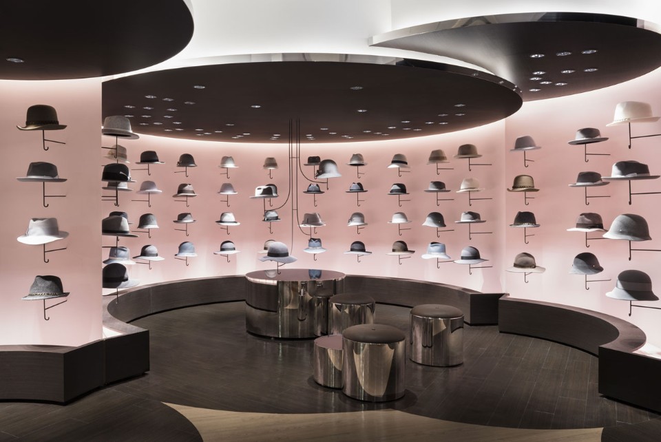
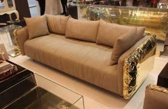
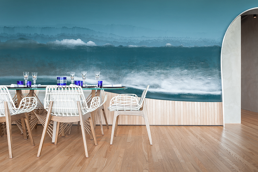
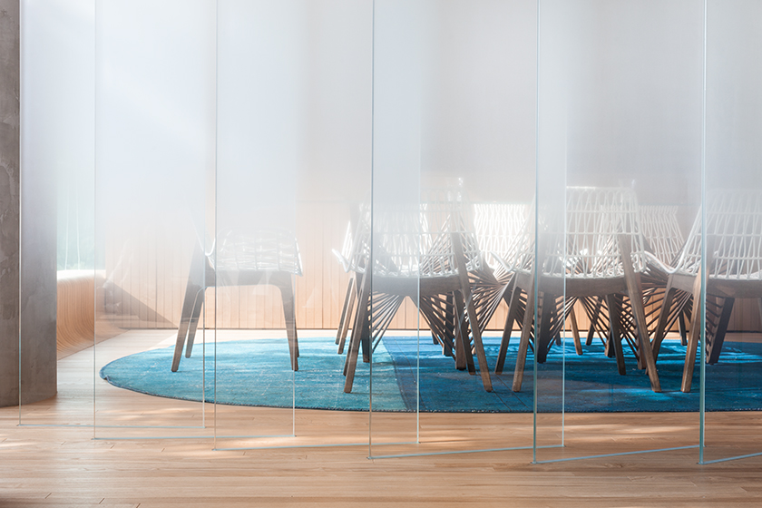
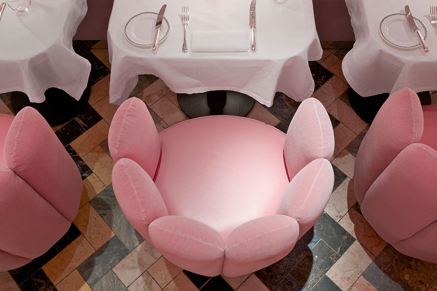
 The Ocean Restaurant, Hong Kong Shades of Blueare inevitably associated with the sea - that is why there are so many of them in the interior of The Ocean fish restaurant, which was designed in 2015 by the Substance studio. The long narrow hall resembles either a coast or an aquarium: on the one hand, panoramic windows open a view of the ocean, on the other, it “covers” visitors with a huge wave. Despite the detailed association with the depths of the sea (aquariums in the walls, glass beads that look like fancy algae and openwork white chairs that resemble corals), the interior of the restaurant looks very warm thanks to the abundance of natural light, transparent details and light wood. Another nautical element is the shell-shaped semicircular sofas in this year's second main shade, Serenity.
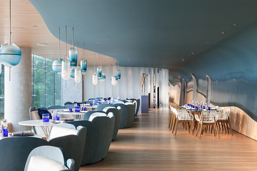
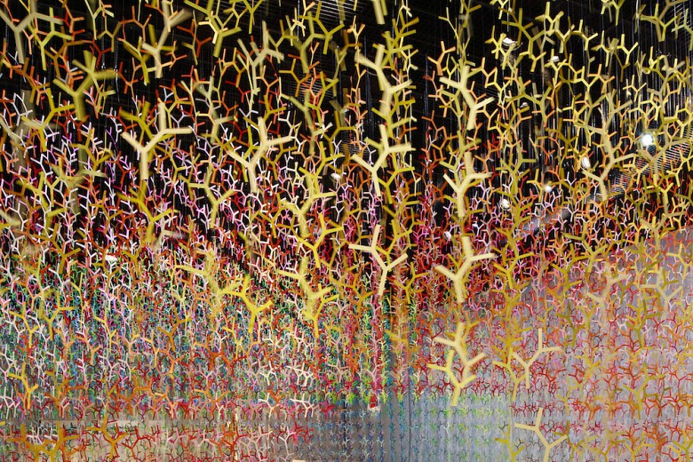
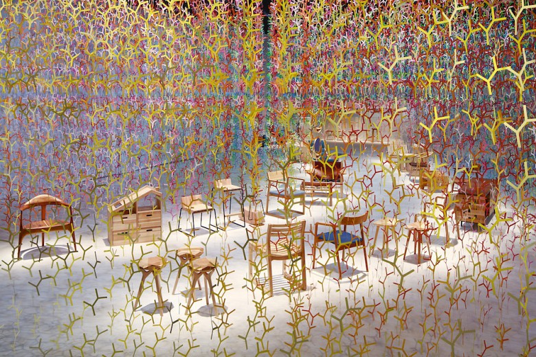
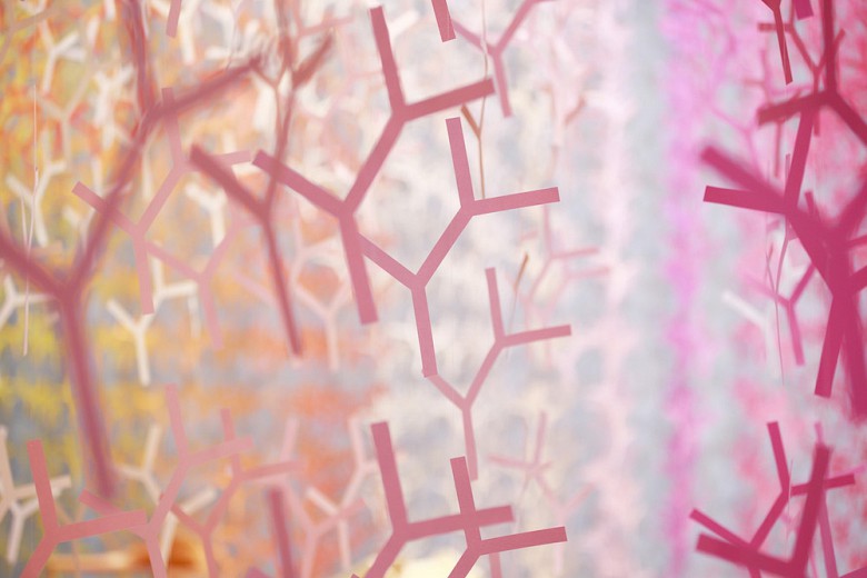
 Installation Bunshi, Japan Installation withThe symbolic name Bunshi (the term refers to the Japanese concept of branching) was born as part of the Wood Furniture Japan Award 2016. The author of the project, French architect Emmanuel Morro, surrounded the Japanese wooden furniture located in the center of the room with a real fairy forest, consisting of 20,000 elements. The installation is designed to express the meditative nature of nature and is filled with colors: in the work, the architect used more than 100 colors that intertwine and resemble a three-dimensional rainbow. In this variety of palette, you can also find the presence of the main colors of this year: rose quartz and pale blue.
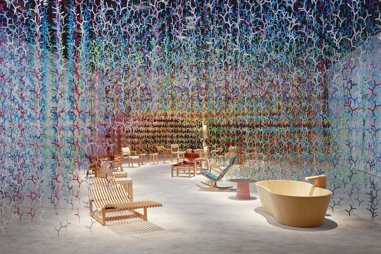
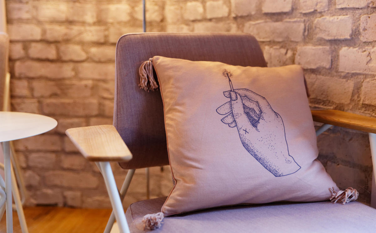
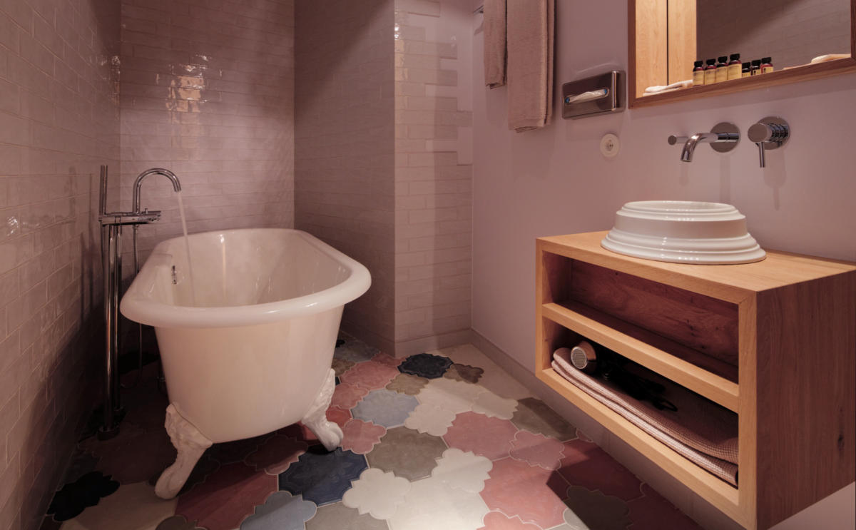
 Libertine Lindenberg Hotel, Germany LibertineLindenberg can be safely called one of the most unusual hotels in Frankfurt. Moreover, it is not even a hotel, but a kind of guest community, where, according to the owners, everyone feels at home. The interior was designed by Franken Architekten and designer Kathi Kæppel. The hotel surprises at the entrance: the lobby is a mixture of a bright, cheerful tavern and a dark bar. The rest of the interior turned out to match him: in each room you can find the contrast of a delicate pastel shade of pink and deep dark colors, metallic elements and memorable details like tarot cards. All rooms are decorated in the same style: mysterious, slightly sentimental and partly fantasy.
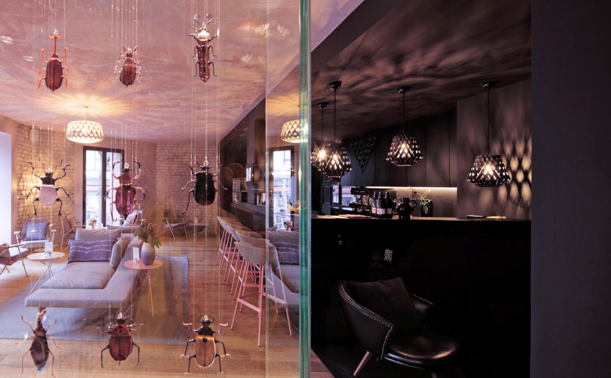

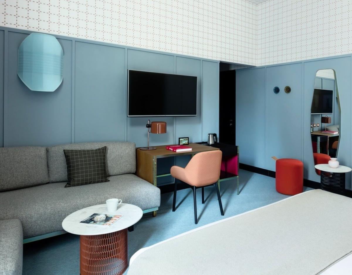
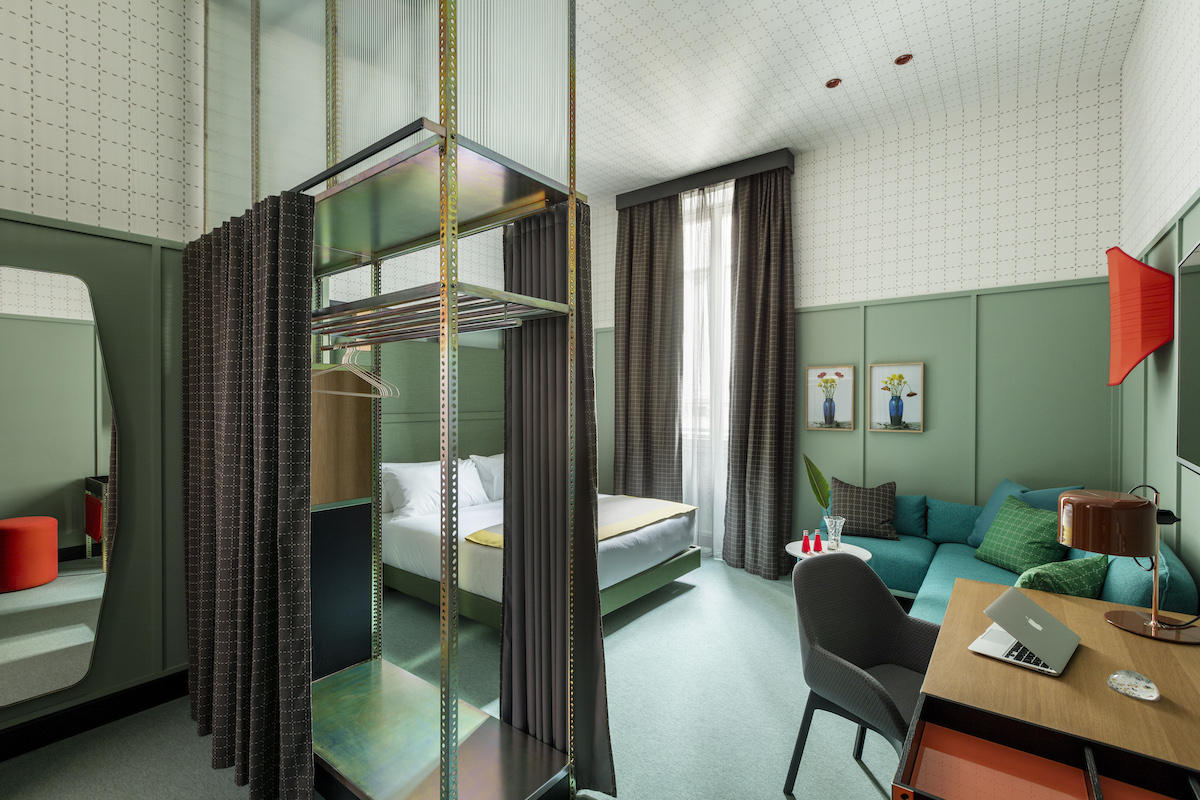
 Room Mate Giulia Hotel, Italy Room Mate Giulia -this is Milan, Milan is Room Mate Giulia. Why? It's simple: the interior of the hotel in your favorite city was designed by the designer and art director of the famous Cassina factory - Patricia Urquiola. A wealth of colors, a bold mix of materials and the work of local contemporary artists: the hotel reflects 100% the spirit of the city. The interior of the rooms is thought out to the smallest detail: each of them, regardless of the degree of luxury, looks homely and cozy and does not lose its design chic. The furniture is either real vintage or Cassina products created especially for this hotel. The designer did not skimp on colors: in the interiors of the rooms and the lobby, you can find almost the entire palette, among which you can find both serene blue (walls in one of the rooms) and quartz pink (marble floor in the recreation area).
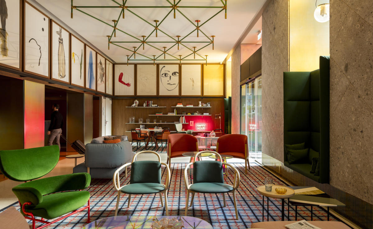
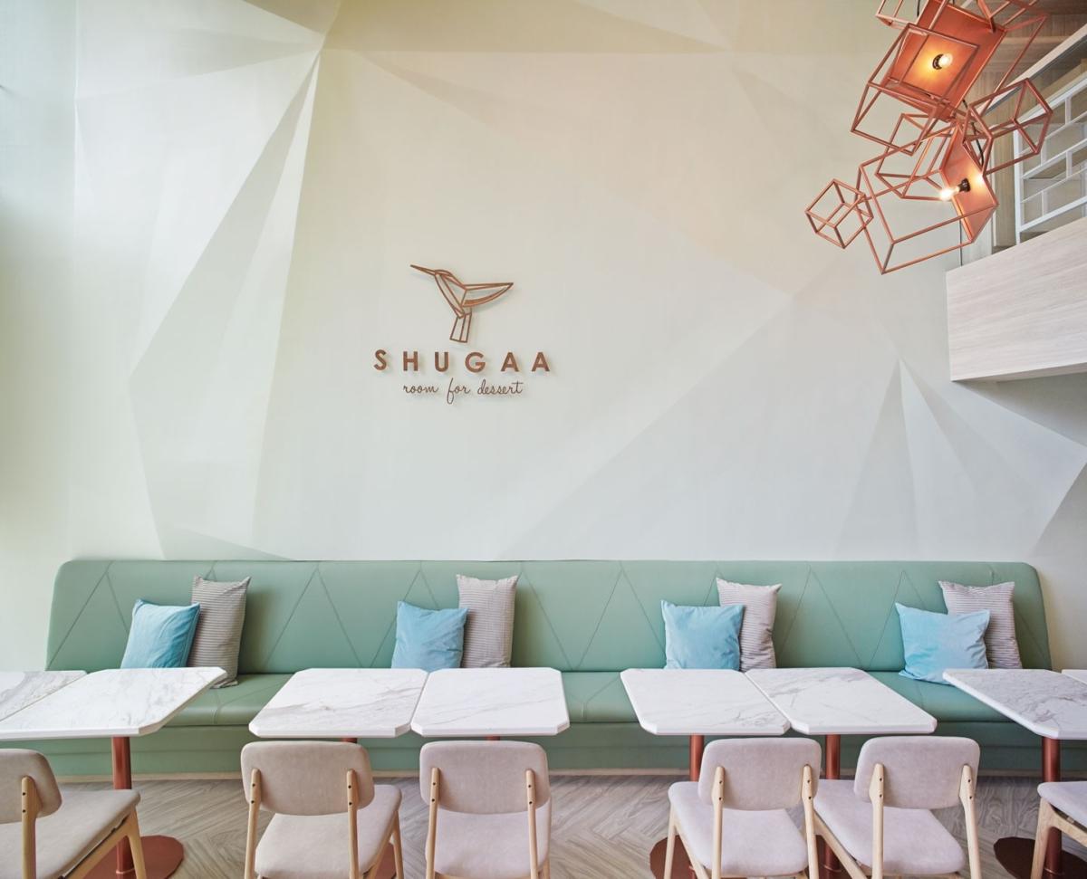
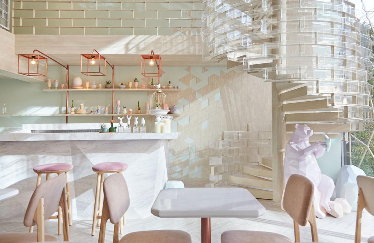
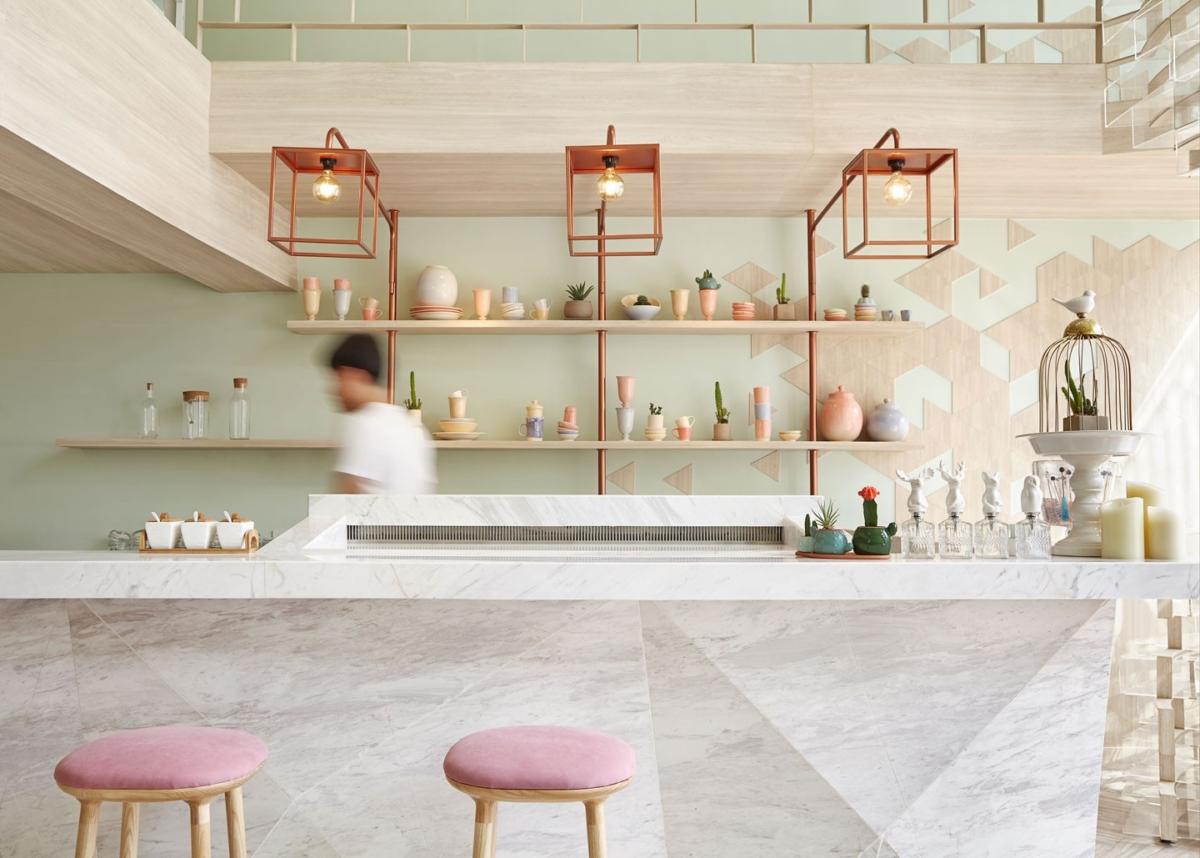
 Shugaa Patisserie, Thailand This year inA dessert bar with an unusual design concept has opened in Bangkok: the interior and exterior design is based on the structure of a sugar crystal. The designers of the party / space / design studio did not depict sweets too literally: instead, a spiral staircase appeared in the pastry shop, as if folded from refined sugar cubes, cubic copper lamps and triangles on the walls resembling the facets of a crystal lattice of sugar. The color scheme deserves special attention: delicate pastel shades are perfectly combined with each other and convey exactly that atmosphere of lightness, sweetness and airiness, which should be in a confectionery specializing in exquisite European desserts.
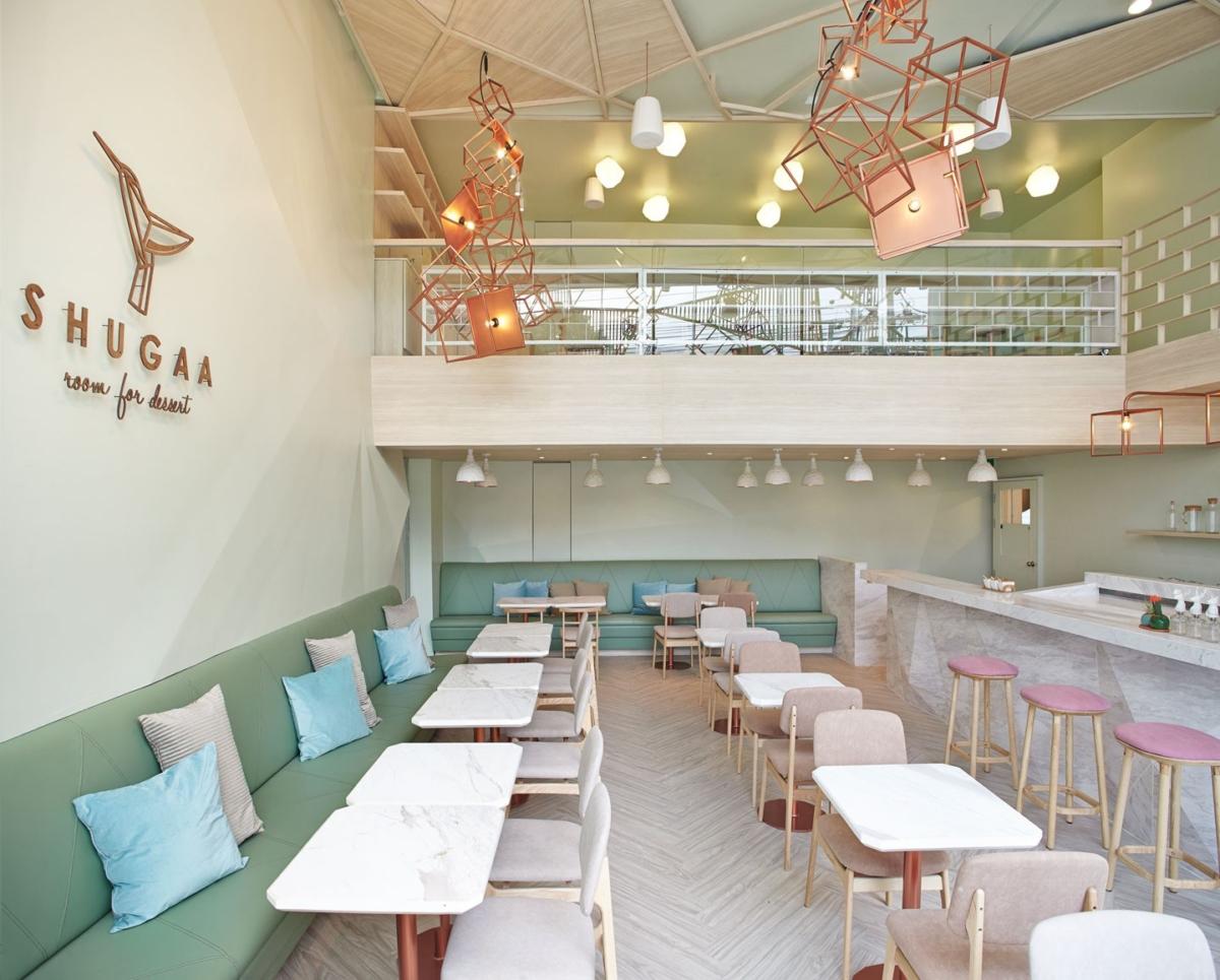
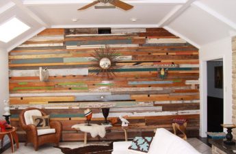
 Loft Casa Ljungdahl, Sweden In 2015 studioNOTE Design has carried out a large-scale reconstruction of attic apartments in a house built in the 30s: an old apartment that has not been renovated for a long time has been turned into a bright and spacious one. The transformation began with a simplification and transformation of the layout: first of all, the designers got rid of all unnecessary walls, partitions and unnecessary finishing elements. Color plays a very important role in this interior, since the furnishings were made quite minimalistic, with a predominance of simple shapes and free space. In the color palette, the designers have moved away from the combinations typical for a loft (dark shades of gray, brick red, metallic, etc.) and opted for three primary colors: light gray-blue, pastel pink and sand.
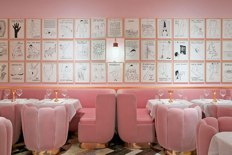
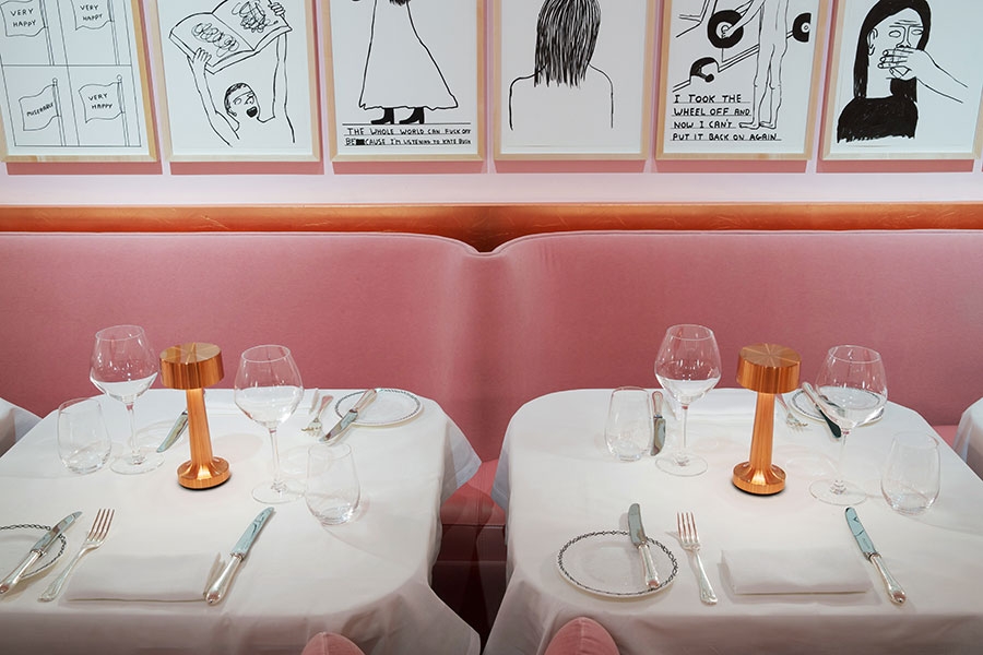
 The Gallery Restaurant, UK The RestaurantGallery is part of Sketch, a large cultural and entertainment complex that opened in central London in 2002. It is unusual in that once every two years, the owners transfer it into the hands of contemporary artists and decorators in order for them to make a new design of the complex. So, in 2014, the work on the interior of the restaurant was entrusted to Indian decorator Madavi and artist David Shrigley. For The Gallery, India chose a classic style with Art Deco elements, pink color and David Shrigley caricatures as the main accent. At the request of the owners, marble floors were left in the renovated interior, the mosaics for which were created by the artist Martin Creed two years ago.
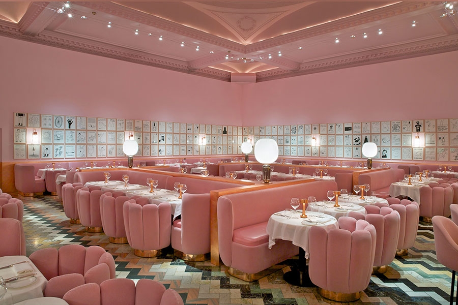
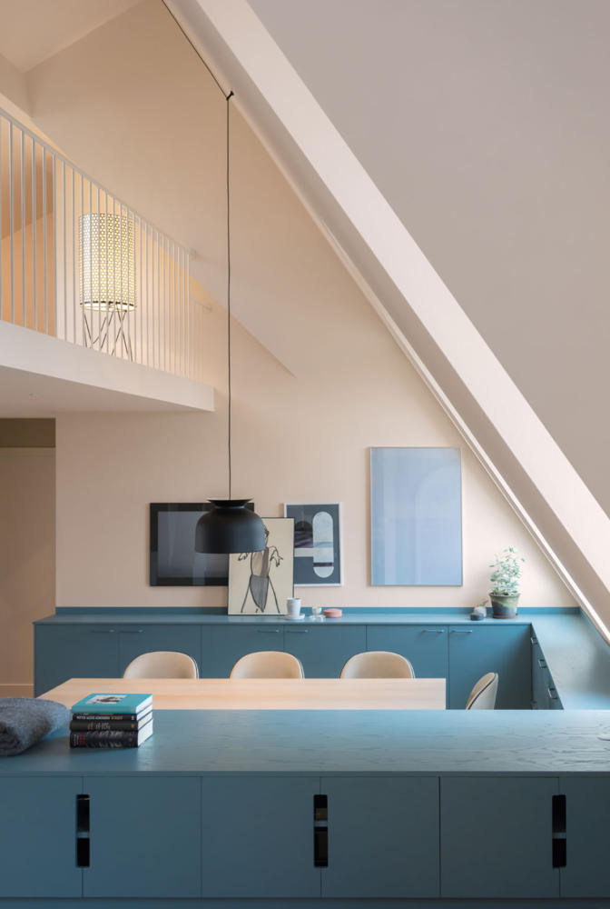
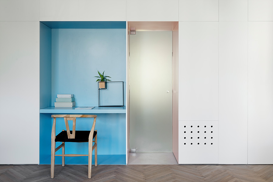
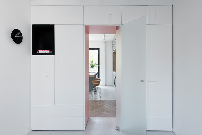
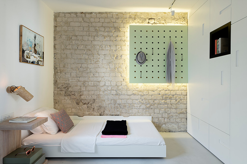
 Apartment When Color Meets Calm, Israel Anothera private interior in our selection, convincingly proving that the main colors of 2016 perfectly take root in living spaces. An inconvenient one-room apartment in Tel Aviv with an area of 55 sq. m. designers Maayan Zusman and Amir Navon turned it into a bright, cozy and functional apartment with two bedrooms and a spacious public area. The main part of the work was related to redevelopment and space optimization. With the help of the construction of new walls and getting rid of all unnecessary elements, it was possible to almost completely redraw the "insides" of the apartment, and then little was left to do - to make the interior not only comfortable, but also aesthetically pleasing. For this, the designers used modern furniture and light colors with accents in the form of blue, turquoise and light pink shades.
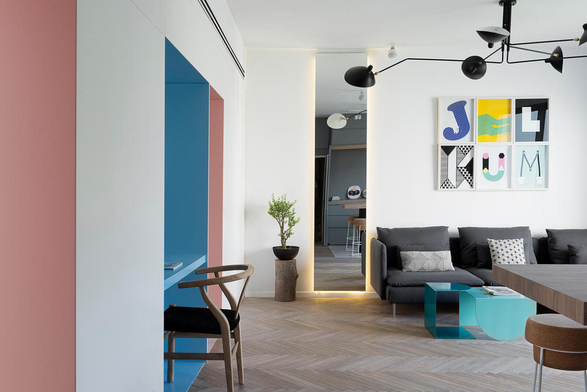
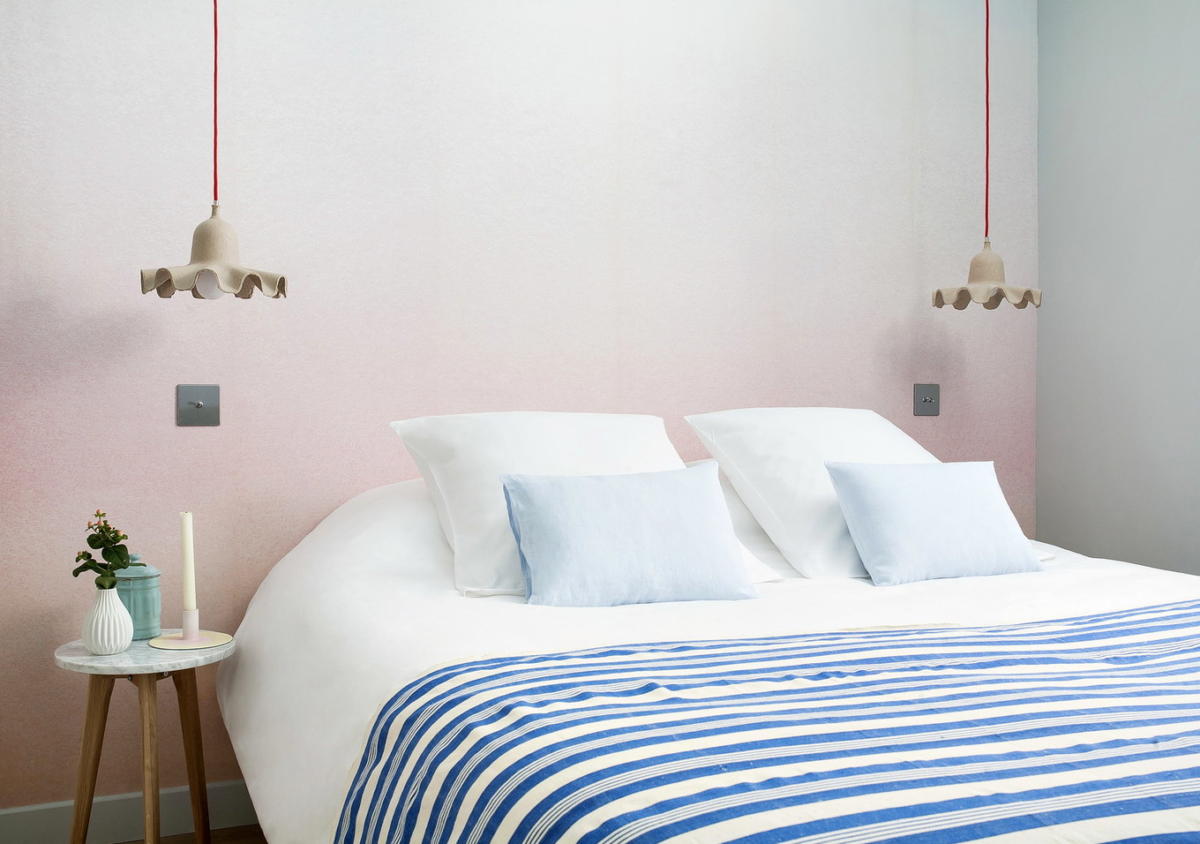
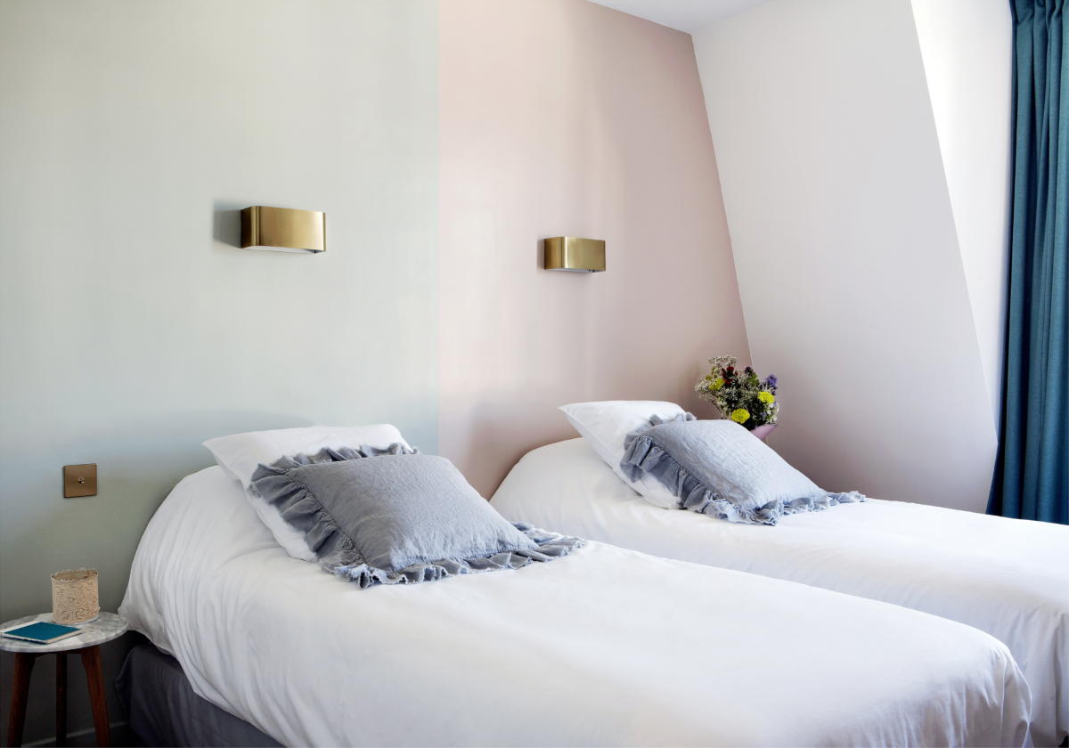
 Henriette Rive Gauche Hotel, France To Thisa unique Parisian boutique hotel we are already: each of the 32 rooms has its own unique design, created by Vanessa Scoffier. In the hotel's interiors, retro motives are intertwined with furniture in the style of the 50s, and bohemian decorations coexist with antique details. Even the exterior with a real garden and vintage wrought-iron furniture is surprisingly harmonious with the interior. Since an individual design has been developed for each bedroom, within the walls of the hotel you can easily choose a room for every taste. Some of them are dominated by dark colors and strict lines, in some - neutral stylistics, and some are made in delicate gray-white-pink tones.
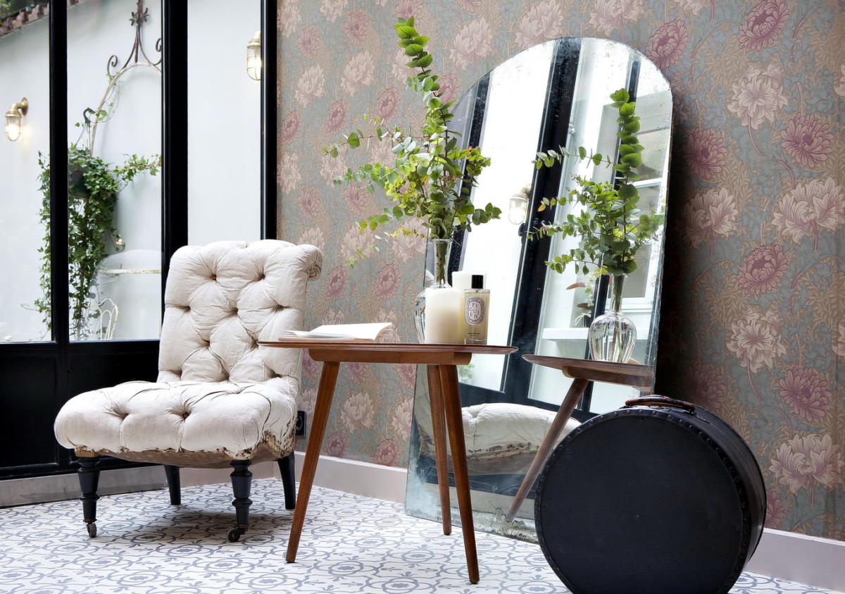

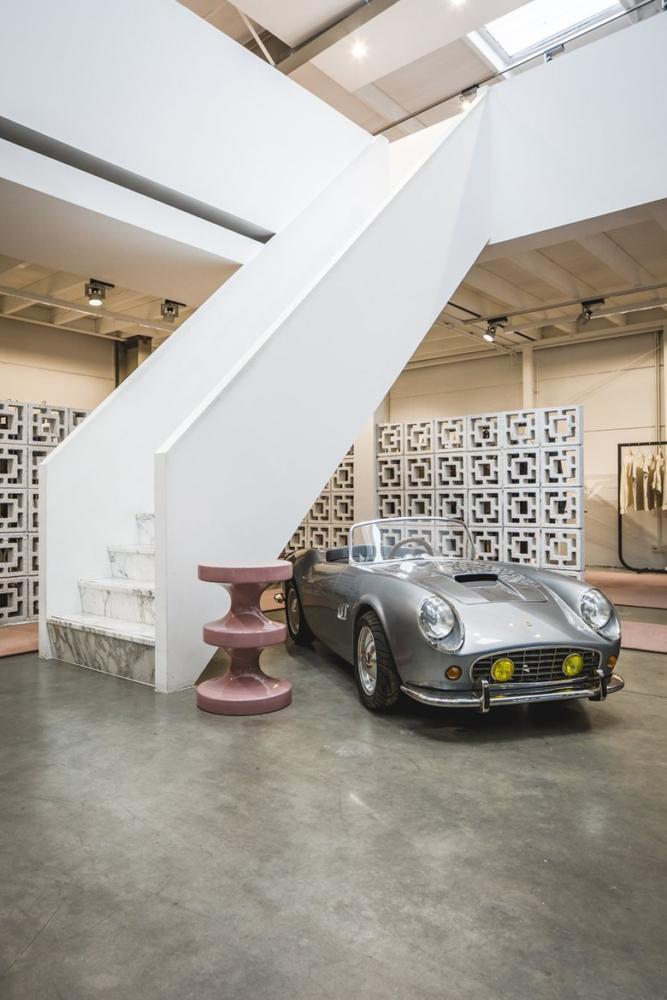
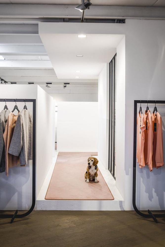
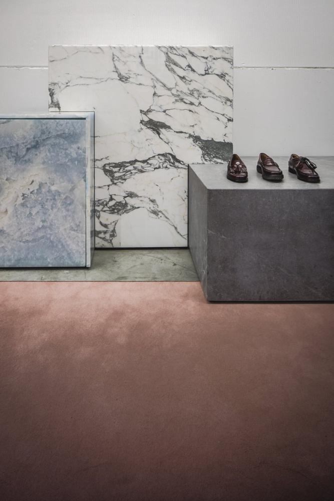
 Showroom New Market, Netherlands New Market - onefrom the leading Dutch modeling agencies. Cooperation with the Framework studio is not the first: before that, the designers designed one stand for the agency at the Modelfabriek exhibition in 2013 and another to demonstrate the new collection in 2014. In the same year, the fashion agency invited the studio to design its own showroom in Amsterdam ... The studio's designers have filled the former warehouse building with luxurious natural materials and used a simple yet very stylish color scheme: white, shades of gray and dusty pink. The atmosphere of noble minimalism is complemented by the almost complete absence of decor.
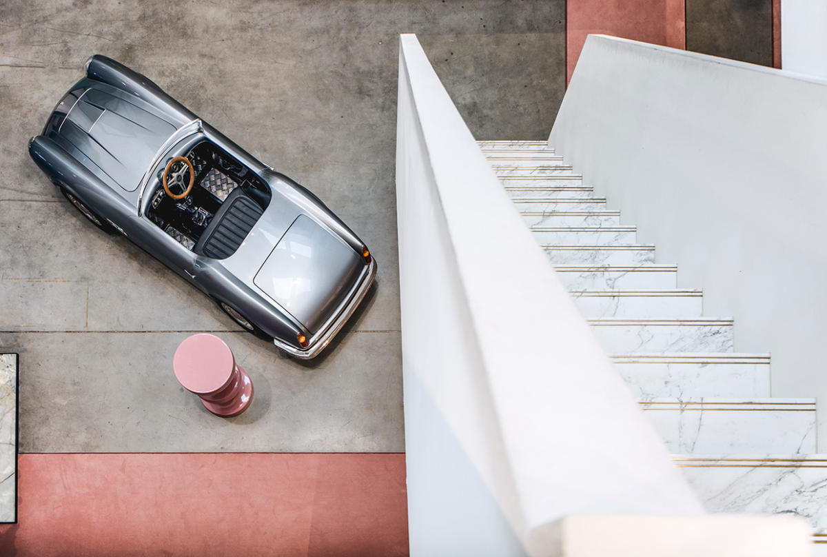
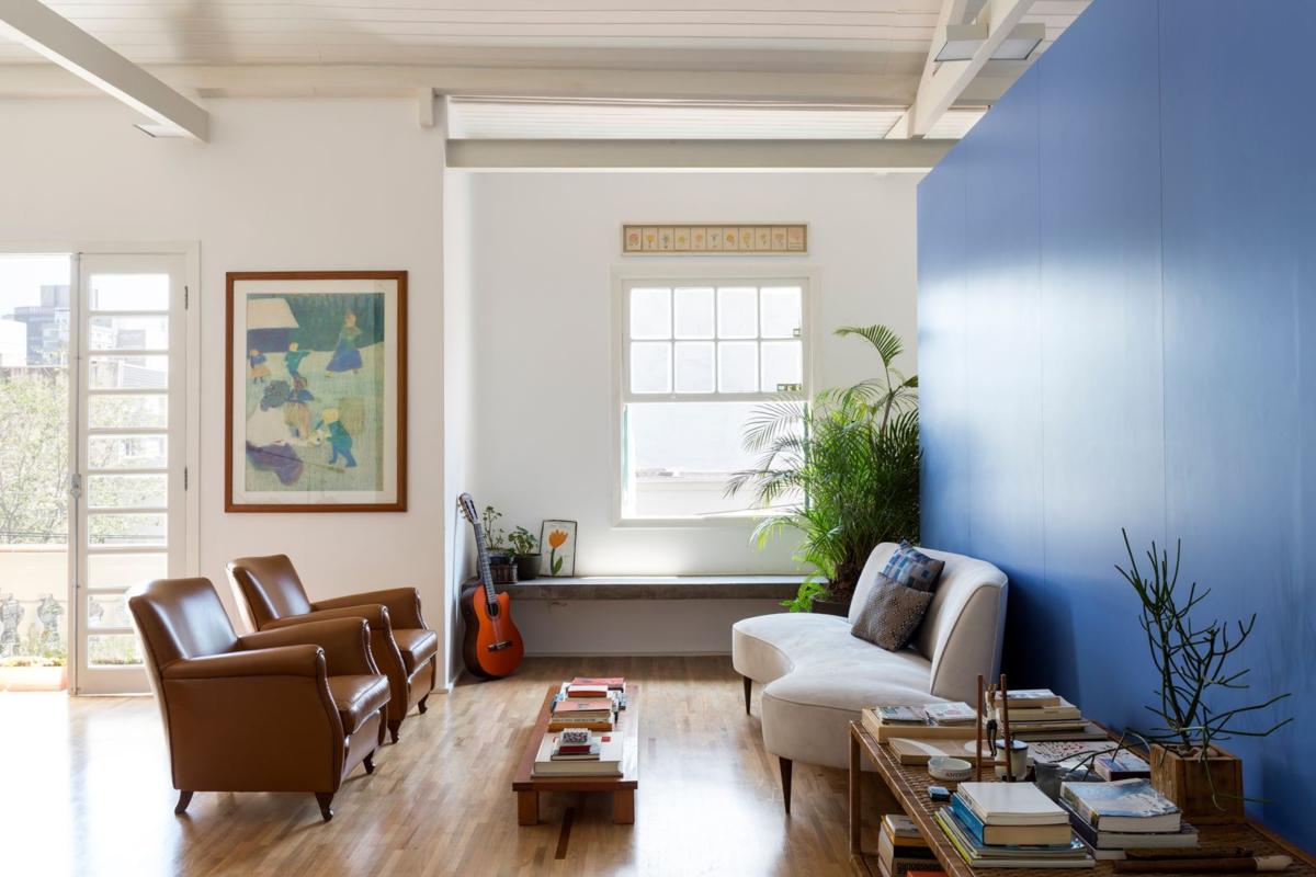
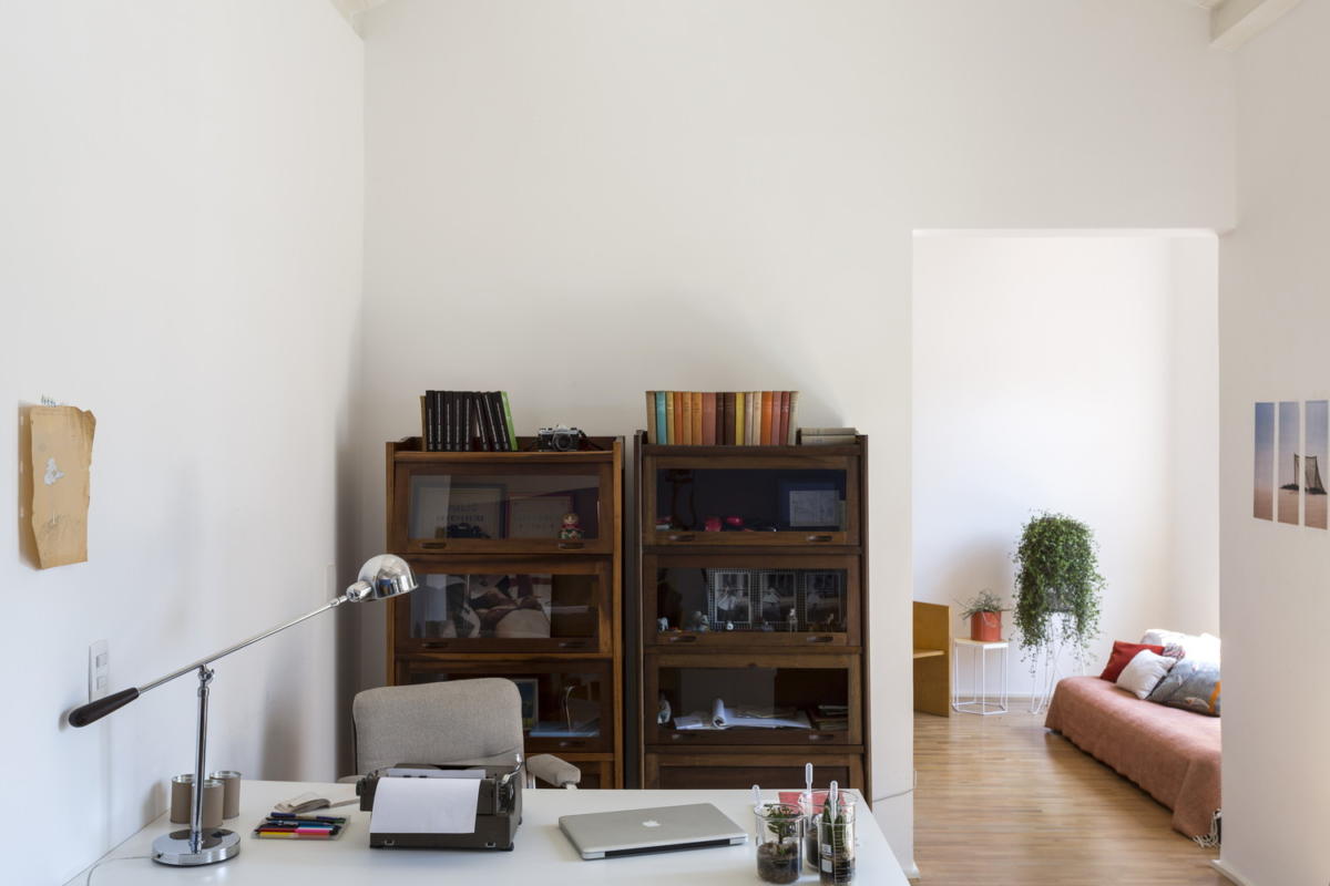
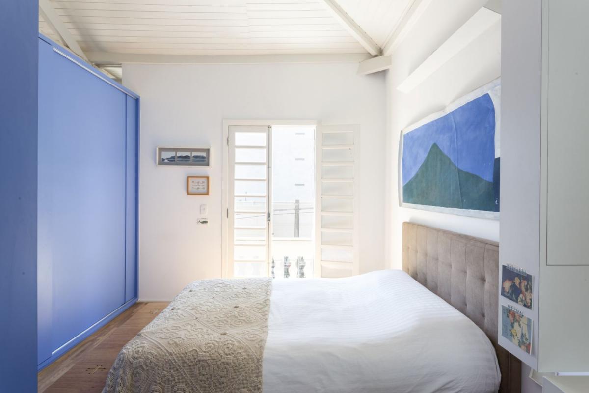
 Joaquim Apartments, Brazil In 2014architectural bureau RSRG Arquitetos has presented a project of a renovated apartment in São Paulo: housing with an area of 79 sq. m required competent redevelopment and rational use of space. The designers paid special attention to working with natural light to enable it to freely penetrate into every corner of the apartment. White and shades of blue were chosen as the main colors, and yellow and orange details acted as accents. Remarkably, the blue color is not scattered throughout the apartment: the so-called "blue box" is painted in it - an architectural element that separates the bedroom from the public area. It is repeated only in some decorative elements.
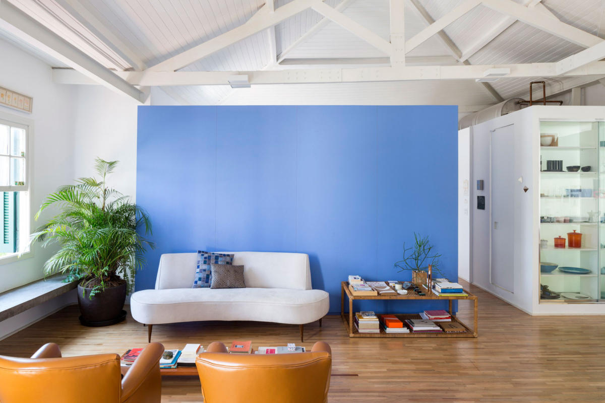
 Materials are taken from the site archilovers.com.
12 interiors in the most fashionable colors of the year - etk-fashion.com