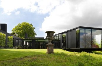
The main color of the coming year is Pantonenamed the color of kale - Kale. But everything new is well forgotten old. Designer and architect Maria Romanova tells what role the Kale color played before and what interior future awaits it. Top 10 colors from Pantone for 2017 are bright and active shades of the nature around us. It is both the active life force of the elements and relaxation - the whole spectrum of emotions and feelings. And among them it symbolizes a healthy lifestyle,. Maria Romanova was interested in how to use Kale and how it works with her nine companions, and she shared the result of her research with us. Maria Romanova, designer and architect. She has two higher educations - an architect and a translator. He believes that it is difficult to talk about the real work of a designer without constant contact with culture, history and architecture. Therefore, since his internship at Cambridge, he continues to travel a lot. Owns the studio "Anfilada MARO", teaches, writes a book about design. - The colors of the coming season, from light and light to explosive and bright, are combined into unique combinations that tell about the diversity of nature and its origins. Therefore, next season will give us many opportunities to unleash creativity and daring experiments. And the main color in the palette, Kale, a natural shade of green, will be the perfect complementary color or even the main background for brighter tones in the palette. What Kale will become for interiors Perhaps, Kale will appear as the main color on the walls, but on the other hand - it can also be used as an accent, for example, in textile design. Accessories in the form of glass and ceramics are also good for decorating in general, and in particular for table decor. This is velvet, and silk, and satin. This is glass in stained-glass windows. These are crystals, majolica and smalt.  photo from the working archive of the studio "Anfilada MARO"
  photo from the working archive of the studio "Anfilada MARO"
  photo from the working archive of the studio "Anfilada MARO"
  photo from the working archive of the studio "Anfilada MARO"
  photo from the working archive of the studio "Anfilada MARO"
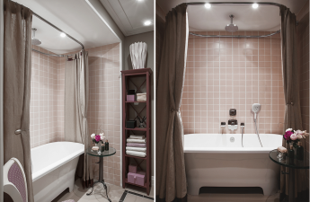
  photo from the working archive of studio "Anfilada MARO" Сhow to combine color Kale Kale is the perfect complementary color in the 2017 palette for the rest of the tones. If it is only a background, then light shades will come to the fore and open up, and vice versa, as an accent one, it can act solo, and then light shades of the palette will give it way. And other colors of 2017 were:
- Pantone 17-4123 - "Niagara". This is a classic blue denim, which speaks of our desire for ease, convenience and relaxation of the day off.
- Pantone 13-0755 - "Primrose yellow". This joyful yellow tinge immediately takes us to where warmth, where the vitality rises, where the mood is good and sunny days.
- Pantone 19-4045 - "Lapis blue". Strong and confident, this intense blue hue is filled with inner radiance and depth.
- Pantone 17-1462 - "The Flame". This magnificent theatrical shade adds a fiery heat to the palette-2017.
- Pantone 14-4620 - "Paradise Islands". A cool blue-green tint hints that our dreams of escaping to the island can become a reality.
- Pantone 13-1404 - "Pale Dogwood". A quiet and calm pink shade generates an aura of innocence and purity.
- Pantone 15-0343 - "The Greens". This piquant yellow-green color speaks of the need to explore, experiment and reinvent.
- Pantone 17-2034 - "Pink Yarrow". Bold and stormy, pink yarrow is a fascinating and stimulating color that lifts the mood and adrenaline.
- Pantone 14-1315 - "Hazelnut". This shade is reminiscent of the natural colors of nature. It is down to earth, simple and with its inherent warmth will be a transitional color that will unite the entire palette.
 Related Articles What Designers Can Be Inspired byin search of color combinations Kale and contrasting colors such as Yarrow Pink can be found in historic interiors. There is Flame, Pale Dogwood and Niagara with Greenery. Yes, perhaps all the colors of 2017.
  photo from the working archive of the studio "Anfilada MARO"
 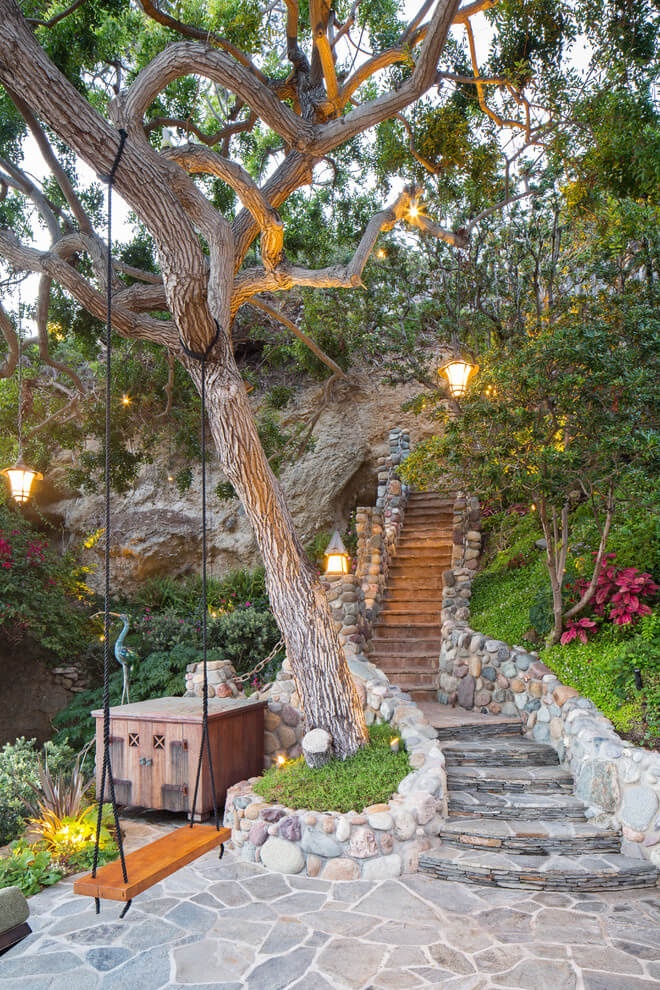 photo from the working archive of the studio "Anfilada MARO"
  photo from the working archive of the studio "Anfilada MARO"
  photo from the working archive of the studio "Anfilada MARO" ButNot only in classical interiors, these colors and shades can be harmonious. Introducing the palette of 2017, Pantone demonstrates on its website the entire fan of these combinations. The awakening of nature - from semi-shades of freshness to turbulent activity.