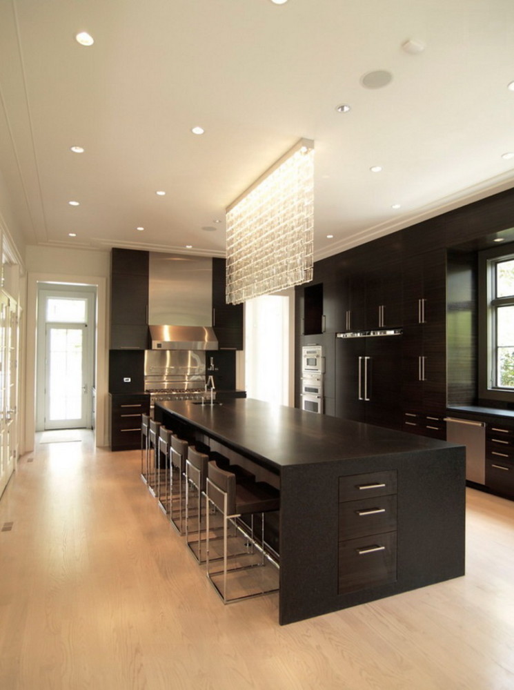
If you have no appetite at all, or vice versa, you are readythere is everything, without feeling the taste, perhaps it is the color of the room where you are. Shades of walls, furniture, even dishes affect the feeling of hunger and satiety, so it is worth considering scientific information about this when planning the interior of the kitchen - read in our article all about how to control the amount of food with the help of color Even if you eat in front of a computer, the true the center of food at home is the kitchen. If only because it stands there, near which we often have a snack. Here we drink tea and taste what we cook. And if the kitchen is combined with the dining room and living room, then we can say with complete confidence - the prevailing color here will affect the appetite and mood of the whole family and even guests. 1. Black color Black appetite not only does not excite, it reduces it. So why is it often used in luxury restaurants? Quite simply: the classic elegance of color evokes a sense of high quality. People come to prohibitively expensive restaurants not to eat their fill, but to get the experience of participating in a beautiful life. So a black kitchen is a good option if the impression you make is important to you, and you are ready to eat in a more cheerful dining room. 
![]()
 2.White It seems that this is the ideal color for the kitchen - it literally exudes cleanliness and freshness. And it's not for nothing that traditional refrigerators and dishes are made exactly white. That's right, but this color has a dangerous property - to provoke overeating. White food (or food eaten in a white interior) looks light and harmless, and our body is ready to absorb it without stopping. No wonder you can endlessly eat, for example, popcorn, rolls or ice cream. So be careful and when dining in a white kitchen, try to think about whether you are really hungry.
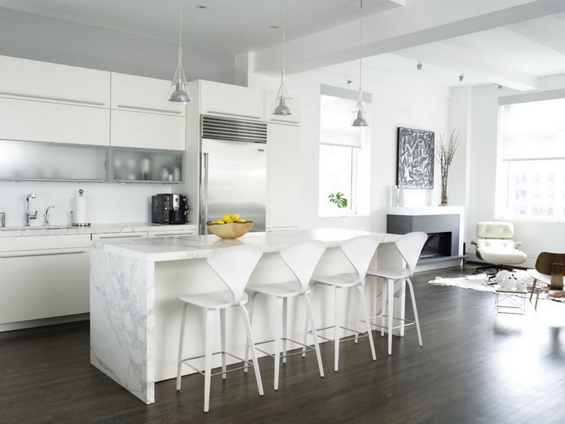
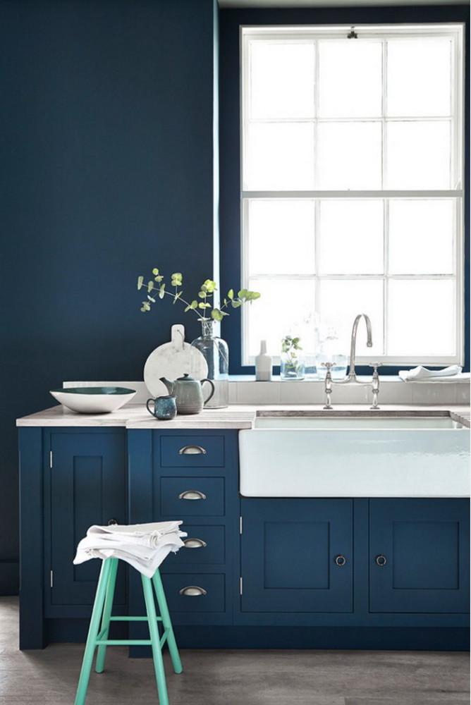
 3.Blue color There are almost no blue and blue food in nature (the exception is blueberries), therefore, in the presence of its shades, everything seems to us not very appetizing. Use this property of color if you are struggling with overeating and looking to lose weight. Even a blue light bulb in your refrigerator can help you cope with uncontrolled binge eating. But if the ideal weight is reached, dilute the blue with bright details or sometimes eat outside the kitchen. Mito Melitonyan, architect: - I am not very interested in fashion in design and I do not think that it has any significance for an architect at all. However, a certain trend in customer preferences can still be traced. Recently, cold shades of gray and blue have become especially popular, chocolate has become unexpectedly popular. The standard black-white pair does not slow down. Someone may find such rich shades too heavy for the kitchen, but do not forget that this space is one of the few places where you can realize quite bold ideas. Usually the kitchen is a separate room where people, without a free room, spend a lot of time: they work, receive guests, and the whole family gathers. If in the bedroom and living room most often you need to please everyone and therefore the design is chosen more calm, then the kitchen is, one might say, the center of the apartment, and it may well differ from the rest of the interior, which means that you can afford the most daring experiments here. melitonyan.com
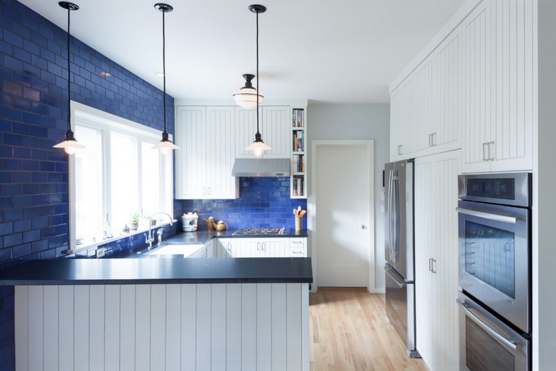

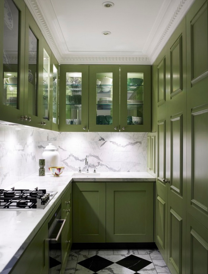
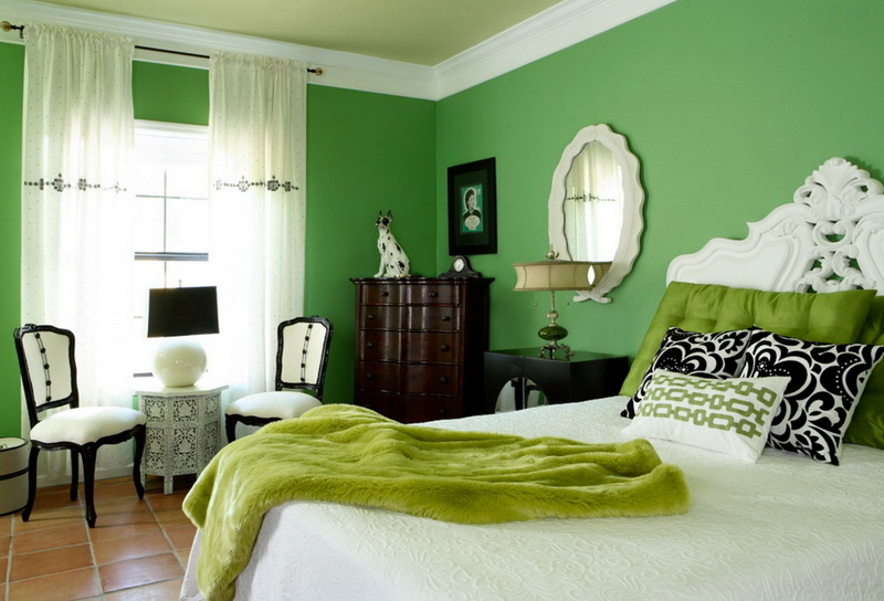
 4.Green color Good color for a healthy appetite. Greens, herbs, fruits and vegetables of all its shades are nutritious and full of vitamins, so in a kitchen with a similar color scheme, you want to drink healthy smoothies and make salads. But do not miss the tone - nutritionists recommend pistachio even as a dish color for picky children, but the swamp background will make even the most delicious dish unattractive.
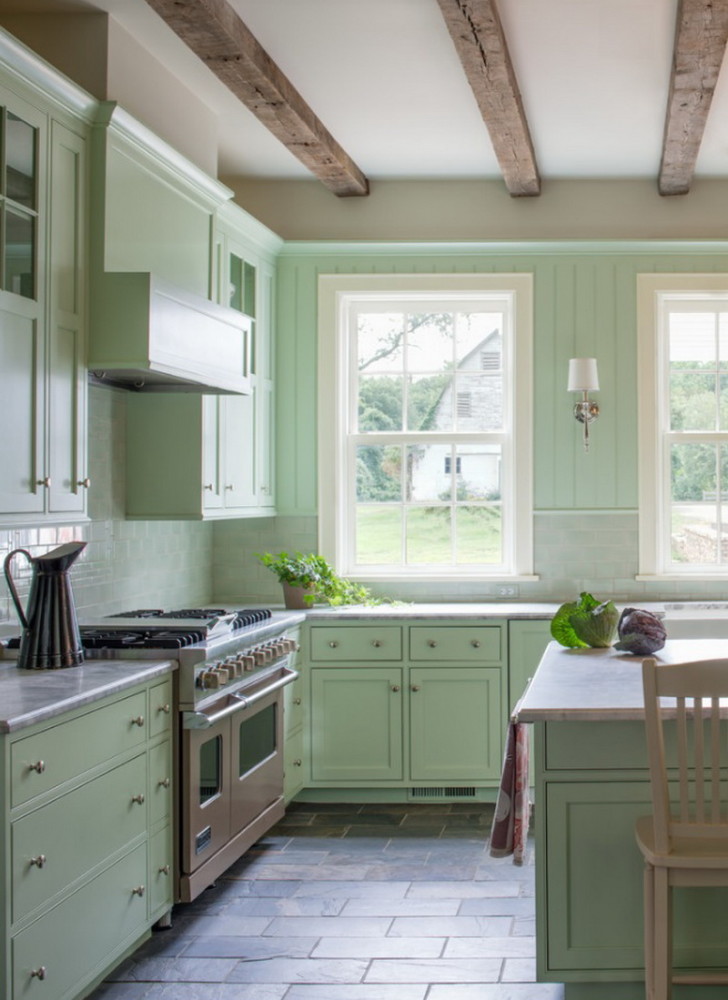
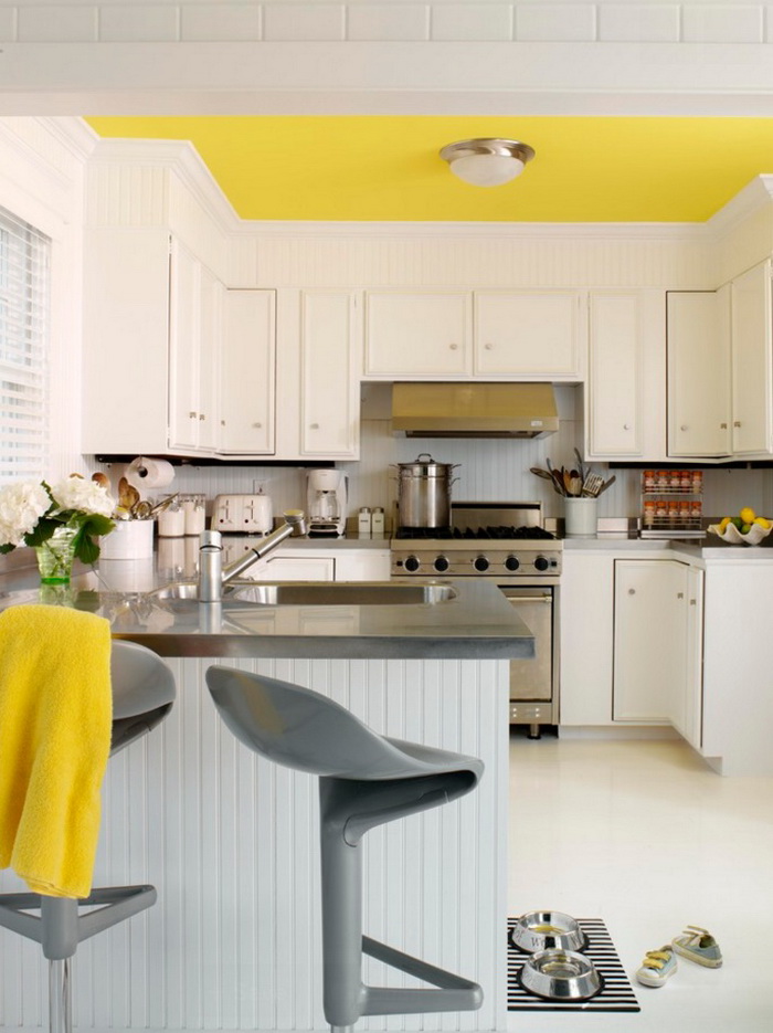
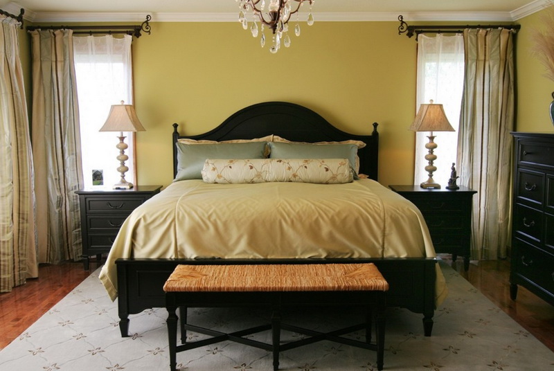
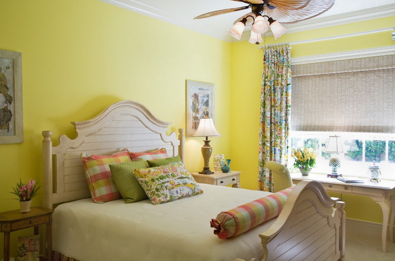
 5. Yellow color Yellow is the color of joy.He not only provokes a surge of positive emotions, but also encourages communication. But there is a detail: young people find it more attractive than adults, and is primarily associated with low prices - remember the "yellow price tags", meaning discounts. Therefore, its properties are used by fast food restaurants - pay attention to the signs of McDonalds or chairs in Subway. In any case, the yellow kitchen will make you feel good and have a good appetite.
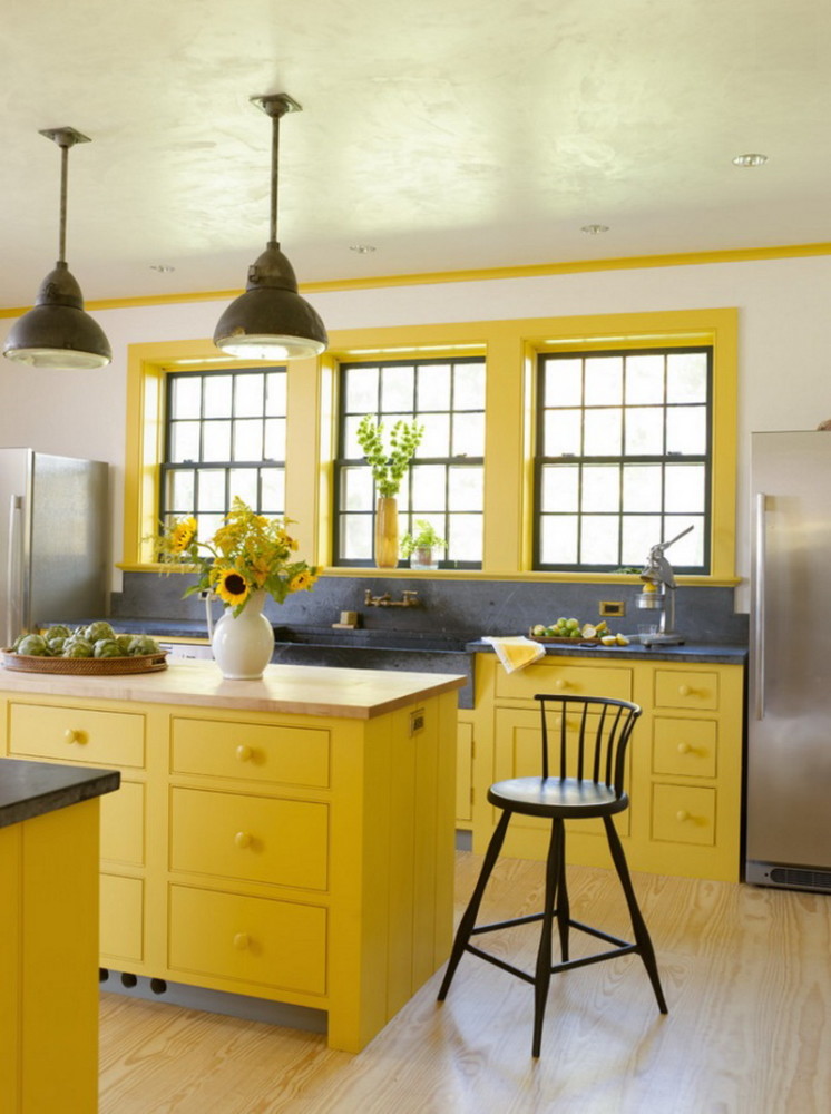
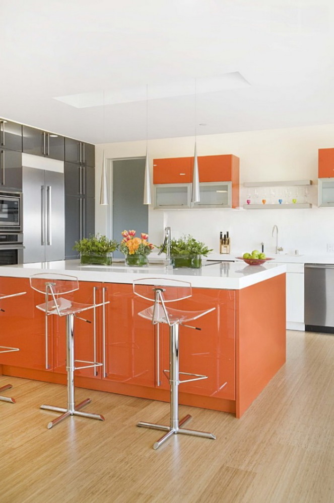
 6.Orange color Orange is similar in effect to yellow in many ways. It not only increases appetite, but causes real hunger - which is actively used by fast foods, where you can quickly and inexpensively have a snack. But this does not mean that a kitchen designed this way will look cheap - just combine a bright color with metal and wood details. By the way, orange also relaxes and even increases the flow of oxygen to the brain, forcing us to make decisions faster - cooking will be more efficient.
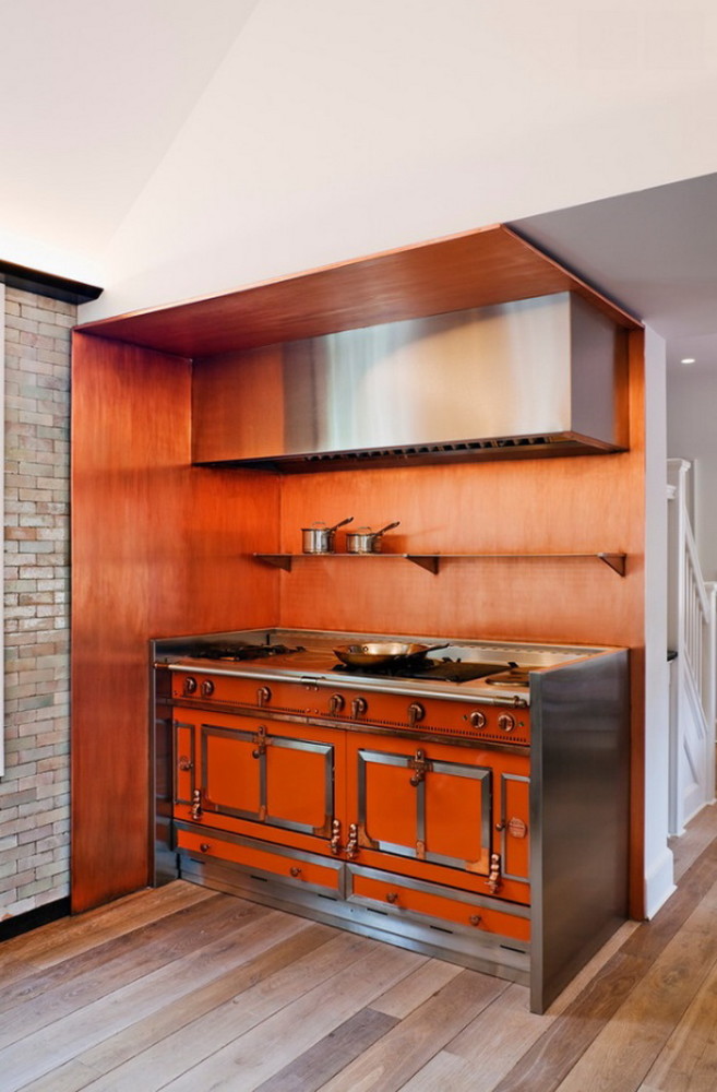
 7.Red This is the most energetic color, it literally increases blood pressure, and with it appetite. There are many delicious red things in nature - tomatoes, strawberries, apples, so the subconscious immediately begins to send us obsessive thoughts about food in the interior of this color. Dark burgundy is an excellent choice for both the kitchen and the restaurant. One side effect: people won't stay here for long, the impact is too strong. So use it in proportion - on accent walls, décor and detailing for a strong yet balanced impression.
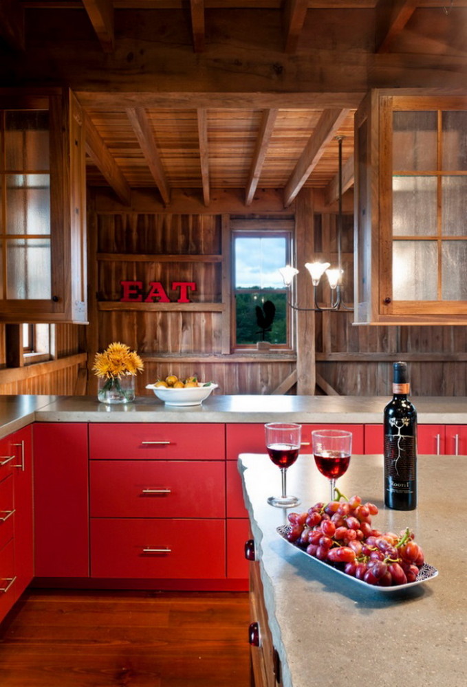

 - a powerful tool for managing appetite andMood, so use it carefully and wisely. There is no clear rating of the best and worst colors, but depending on your goals, features and lifestyle, these or other shades can help or hinder. Take on their properties: screw a blue light bulb into the refrigerator during a diet, a child who is difficult to feed, buy orange dishes, and decorate the kitchen so that you were pleased to be there, eat and cook.
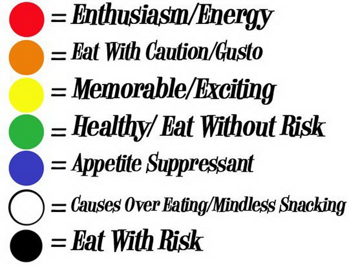
Kitchen design: the effect of color on appetite control


