We will show you a small apartment in Poland,Which looks much larger than its area. About how the designers managed to achieve this, you will learn from our article. And, of course, you can repeat these tricks in your apartment, they are simple. To dive into the atmosphere of the morning breeze, to enjoy the gentle haze of a sunset evening and to meet the mint freshness of the sea - three pleasures in one interior. And we could not refrain from his poetic chanting, using eloquent epithets, considering the photo of this apartment. Perhaps you will agree with us.
In the resort
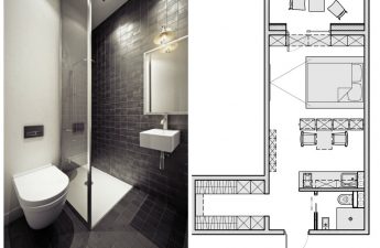
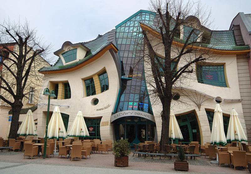
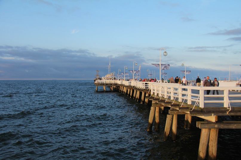
Sopot is a city where people come for the sake of the sea, goodair and unusual attractions. First of all, many architects, and just lovers of the unusual, it is known for the building "Crooked House" (Krzywy Domek). Another striking attraction of this resort town is the sea pier, which is considered the longest in Europe. Its length reaches 515.5 meters. It was he who served as the starting point in the creation of the interior, which has come into our field of vision today. The apartment in question is located just two hundred meters from this amazing place. Its area is only 42 square meters, and it is hard to believe it when you first look at the photo. It seems to have at least 80 square meters of floor space. What is her secret? How, who and by what means managed to create such an incredible visual effect? 
The atmosphere of a historical city in a modern interior
Once upon a time to the designer Lucyna Kolodziejska (LucynaKołodziejska), an elderly woman, endowed with charm and charisma, turned. She is very passionate about the history of her hometown, she likes its old streets and architecture of the 19th century, when Sopot acquired the image of a resort town. But the customer did not manage to buy an apartment in a historically significant building. Having bought housing in a modern building, she realized that the desire to create the atmosphere of the old city in it did not leave her. That is why she came to Lucina. The interior was intended to be rented out to tourists coming to Sopot, so one of the main wishes of the customer was to create a relaxed atmosphere that would always be conducive to relaxation, but would not be too dull. 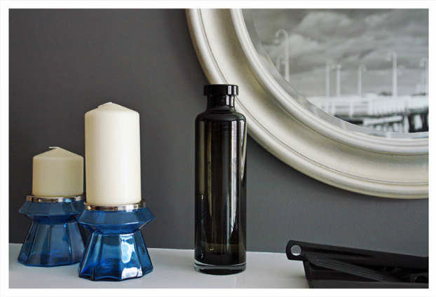

More than there really is
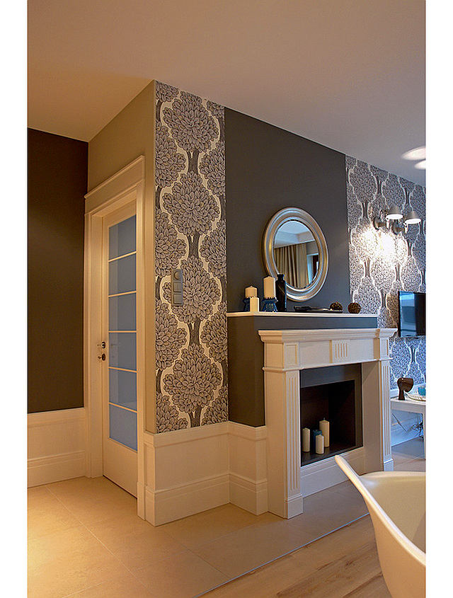
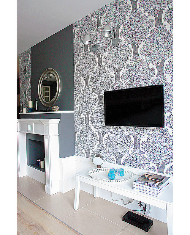
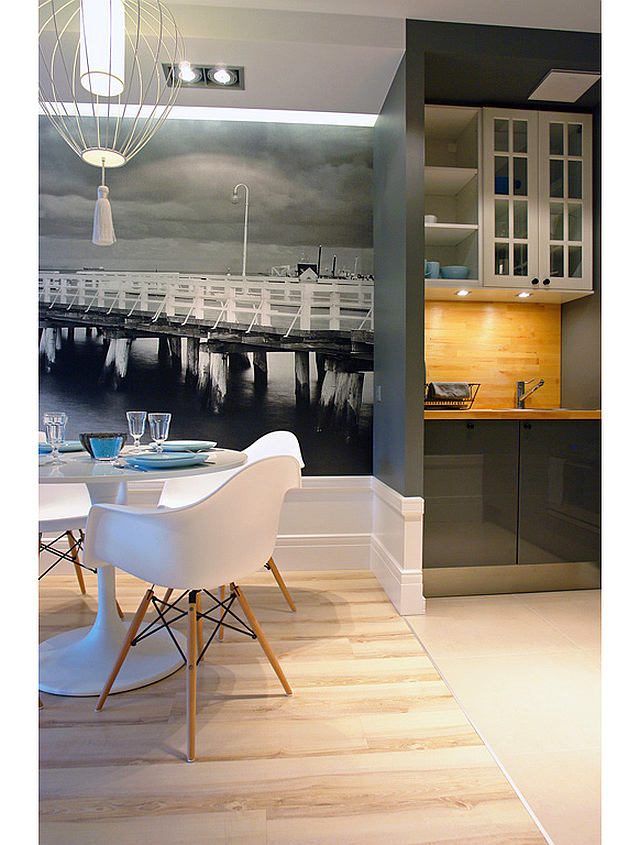
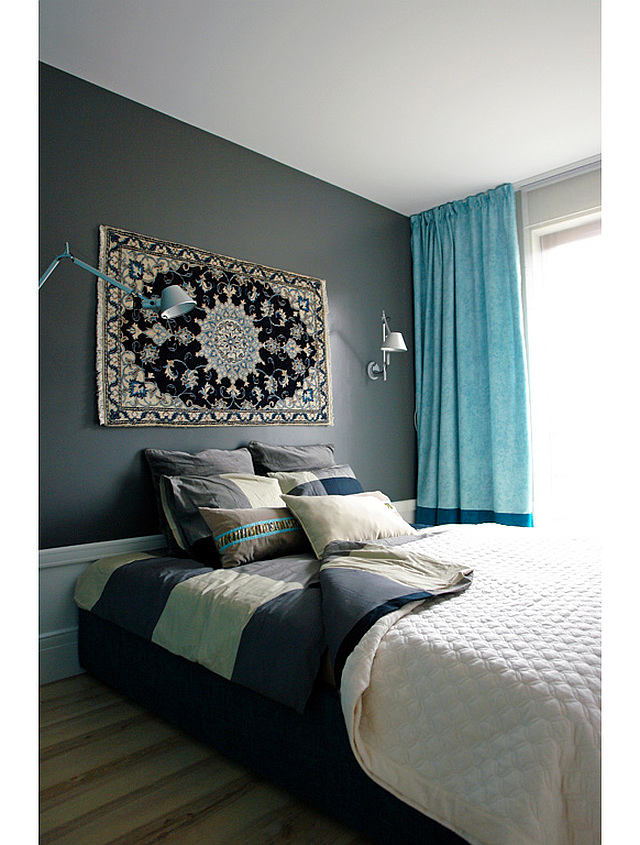
Lucina immediately got an idea - why not domore space with a photopanel? The technique is simple, but for some reason it is rarely used by designers in practice. It was based on a photo of that famous pier, taken by a Portuguese photographer. So the perspective of the photo becomes an extension of a small living room. Monochrome here works to create a historical atmosphere, and bright splashes of a refreshing turquoise hue, like sea spray, refresh the interior. Our opinion: - This interior is dominated by gray, and it is presented here in several variations. This allows you to clearly distribute all areas and identify accents. Gray is by far the most popular color among architects and designers. Why? Perhaps because it is pleasant to work with it not only in large spaces. He is able to save even the most doomed interior, especially if it is skillfully played with light, as they did in this apartment. See how skilful use of suspended ceiling lighting can transform an interior. Even increase it visually. The photopanel, illuminated in the evening with the same illumination, looks airy and realistic. This gives the interior even more of the desired atmosphere than during daytime. 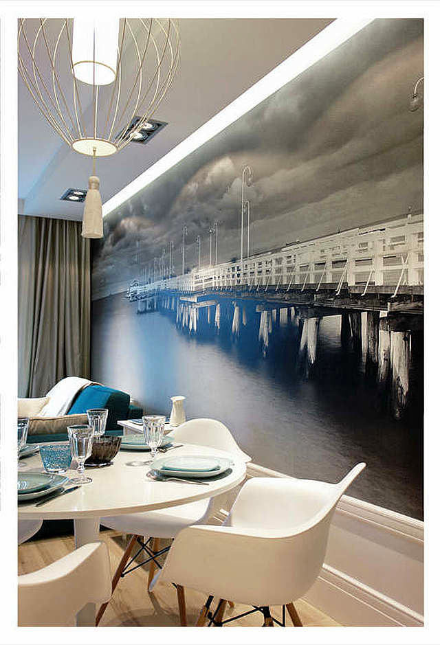


Invisible Kitchen
When you first look around this interior,it is difficult to notice the kitchen, since it is very harmoniously embedded in it. The facades of the lockers resemble the windows of old Polish houses and echo the geometry of the photo panel. The lower cabinets have lacquered dark gray facades that reflect light from the window, thereby visually stretching the room. Where is the sink? Approaching, we find it in a small niche, there are also upper and lower cabinets. Interestingly, this kitchenette was able to accommodate a hob, microwave, dishwasher, coffee maker and all the necessary cutlery. 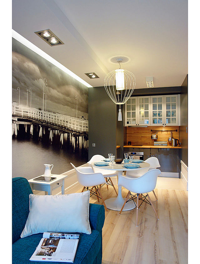
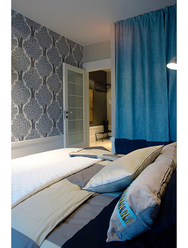
Bedroom: separately or together
From a completely studio space in thisThey decided to leave the interior, leaving the intimate area of the bedroom, isolated from the living room-kitchen-dining room. Since the apartment is designed for vacationers, there are two single beds, which, when combined, form a completely comfortable double bed. Our opinion: - Another secret of this room is that it has a spacious built-in closet for storing things, but it is not even visible. It turns out that it is behind the curtain, which is made of the same material as the curtain on the window. This creates a mirror effect, which looks pretty interesting. 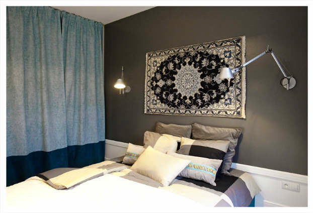
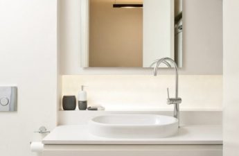
On the seacoast
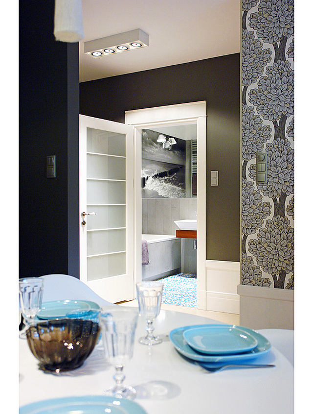
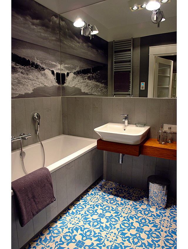
The bathroom cannot boast of a largearea, but thanks to the same gray color and a successful play of light, it, like the living room, began to seem larger. A photo panel depicting the sea coast was also used here. The photo was taken already specifically for this interior by Lucina herself. To enhance the effect and add light, the designer decorated one wall with a mirror, attaching two lamps to it, the position of which can be adjusted as desired. They decided to put vintage Moroccan tiles on the floor, as they are very much loved by the landlady and, moreover, perfectly continues the marine theme. Another nice bonus of this bathroom is the built-in radio, so you will never get bored here. You can even sing along! 
 nocujemywsopocie.pl