How many people, so many opinions. Some like quiet colors in the interior design, others prefer bright colors. Designers say that a beautiful environment is possible in any color. Tastes of all people are different, no doubt. Someone likes a quiet color scheme in the interior, someone prefers brighter, popier. But any situation can be beautiful, if it is well thought out and correctly embodied.
Orange will warm, white cool
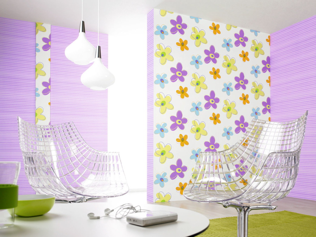
If you like funky interiors, you betterchoose a contrasting finish - in colors that are at diametrically opposite ends of the color spectrum. For example, yellow and purple, red and blue. Warm colors are most often chosen by optimists and choleric people. The warmest of all is orange. It is never cold (this applies to all, all of its shades) and goes well with a warm shade of blue, as well as with white, which even makes it even more juicy and saturated. Meeting with terracotta, brown and burgundy, orange becomes a little muted, calm, pastel, giving rise to a composition in the style of Italian interiors. Black can be combined with it only in "small doses" - to make the interior graphic. Orange is good for the kitchen, as well as for the nursery and dining room. 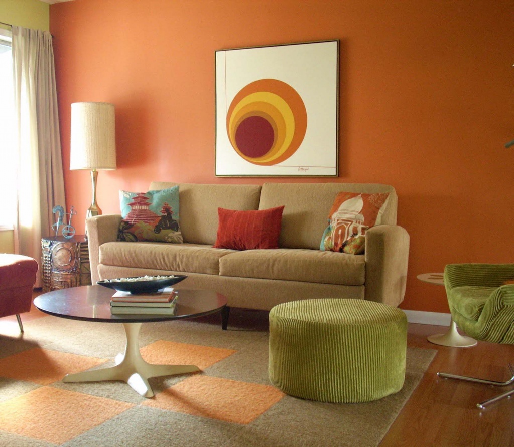
How the background and furniture interact
The choice of furniture must be treated verycarefully. The walls can be repainted, but changing furniture that is unsuccessful from the point of view of the designer or the owners will be much more difficult, especially if an expensive set is chosen. First of all, decide what will be brighter in tone - background or furniture. Designers give advice that bright walls and light furniture are more practical. But keep in mind: light colored furniture tends to take on a background shade. For example, if the room is decorated in yellow or red colors, the furniture will take on a warm hue. And interior items located against the background of cold tones visually become colder.  Very good in the interior is green,It resembles vegetation and succulent grass: it soothes, relaxes, and at the same time is perfectly combined with many shades of yellow, white, gray, blue, purple and brown. But do not overdo it with intensity shades! Know: the darker the green, the lighter and more contrast the object with it should be. And white plus green is a classic of the genre.
  Dark green and marsh are suitable for the cabinet,hallway and dressing room. Bright shades of green are good for decorating a kitchen or nursery. For the bedroom, light green, pistachio shades or green tea are preferable, and for the living room, muted shades of green. Depending on which color pair you choose, the atmosphere can be very different - from the hot tropics (combined with terracotta, sand and orange) to the classic interior. White and blue interiors evoke thoughts of summer, seaside vacations and relaxation. Purple, which is close to blue in color, is liked by romantics and philosophers.