How to choose the right color palette forinterior? What colors look especially good together? Today we decided to figure it out and even turned to a specialist for help. Making out your interior, not everyone thinks about how to properly use color. Some people think that by painting the walls in a favorite shade, they will make their home more comfortable, but this is not always the case. Today we will tell you how to make your apartment interesting, attractive and comfortable with the right color combinations.
Cozy colors
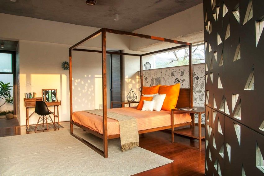
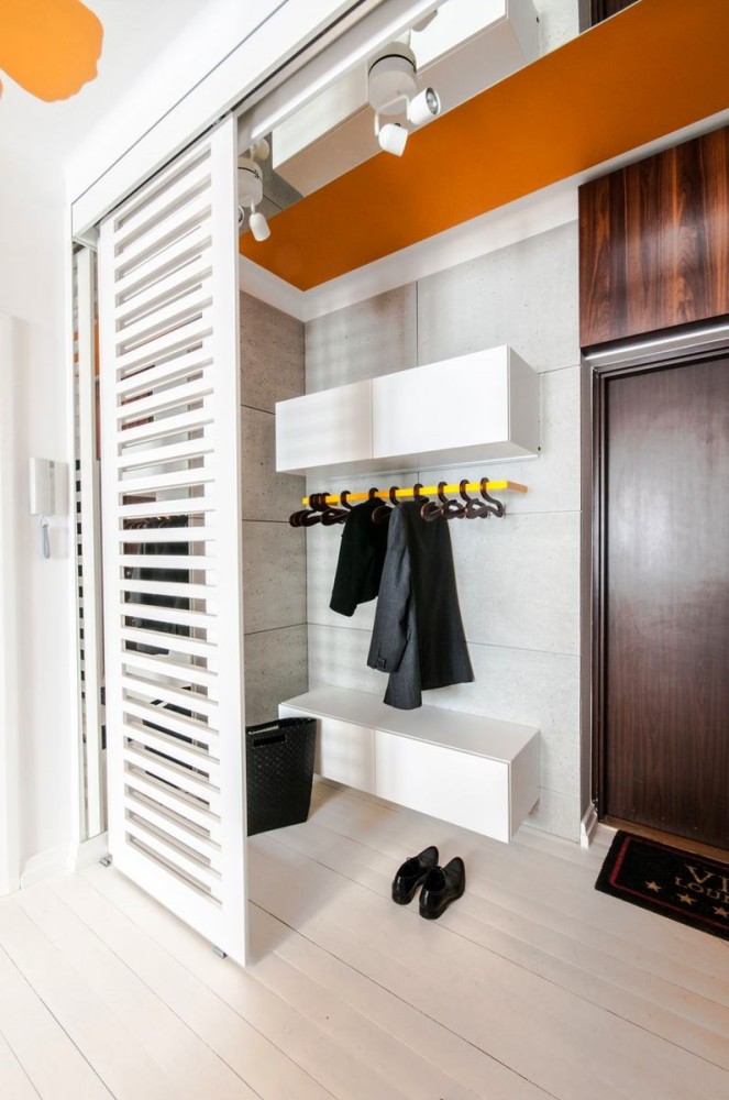
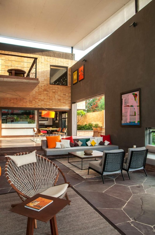
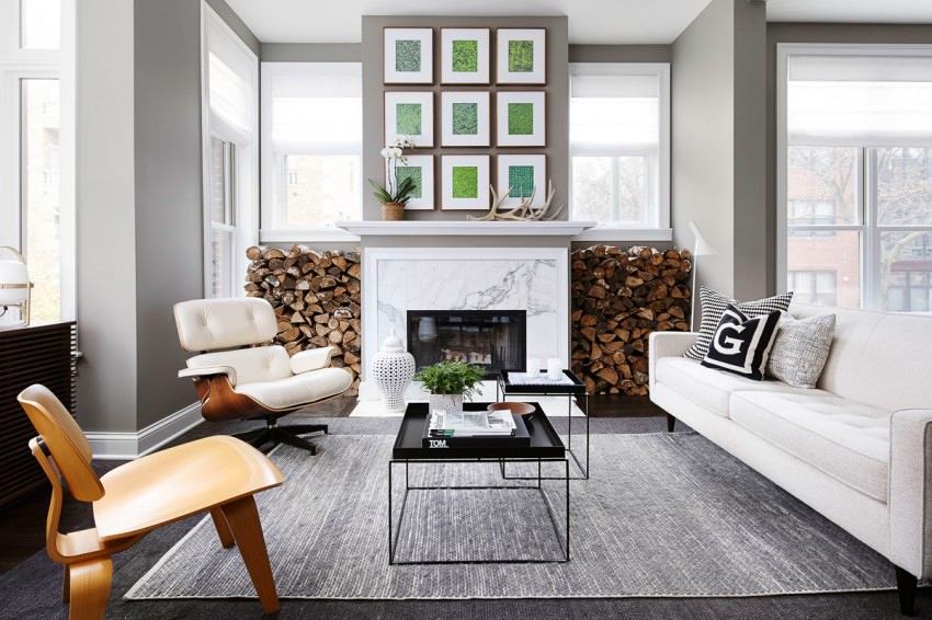
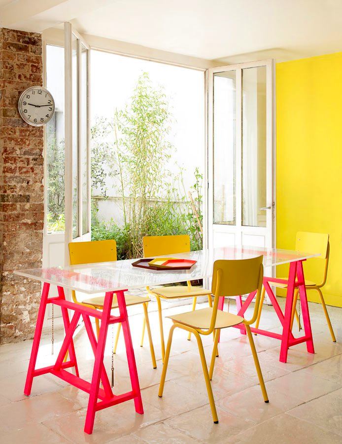
The most comfortable for a person are warmearthy and sunny shades. These include: orange, brown, beige, yellow. But if light brown and beige can be used as the main shades, then orange and yellow are good as accents. Orange is best chosen for the kitchen or dining area, for example, in furniture or accessories, or to highlight a part of the wall with it. It is perfect for these premises, as it can stimulate appetite on a psychological level. Yellow can improve mood and create a sunny atmosphere in the interior, but it is suitable for rooms where an active part of life takes place, that is, for a living room, hallway, kitchen. Ideal for the office, as it sets you up for productive work. 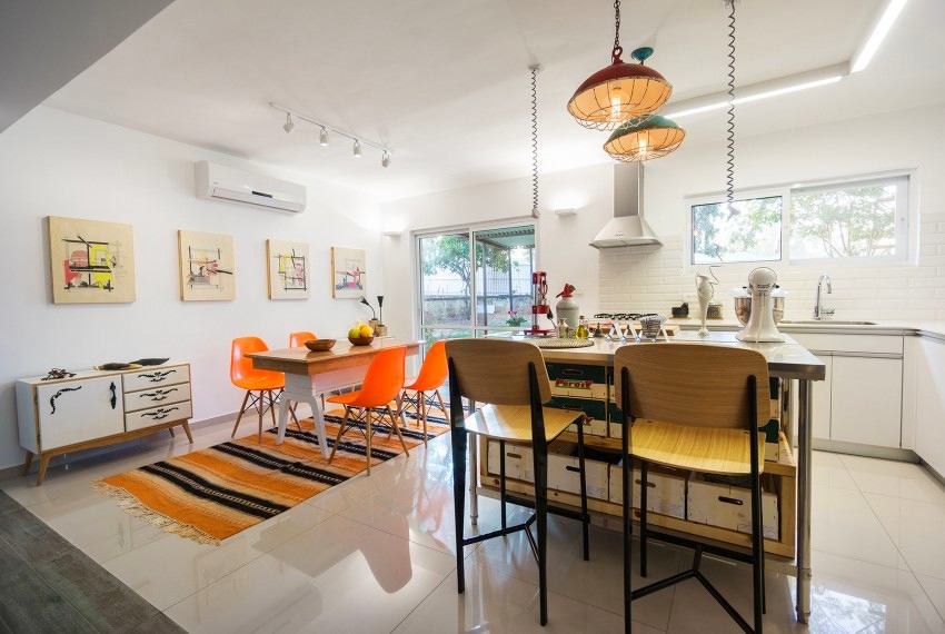

The colors of relaxation and cheerfulness
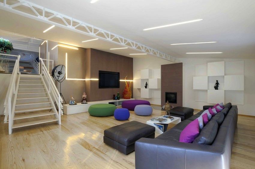
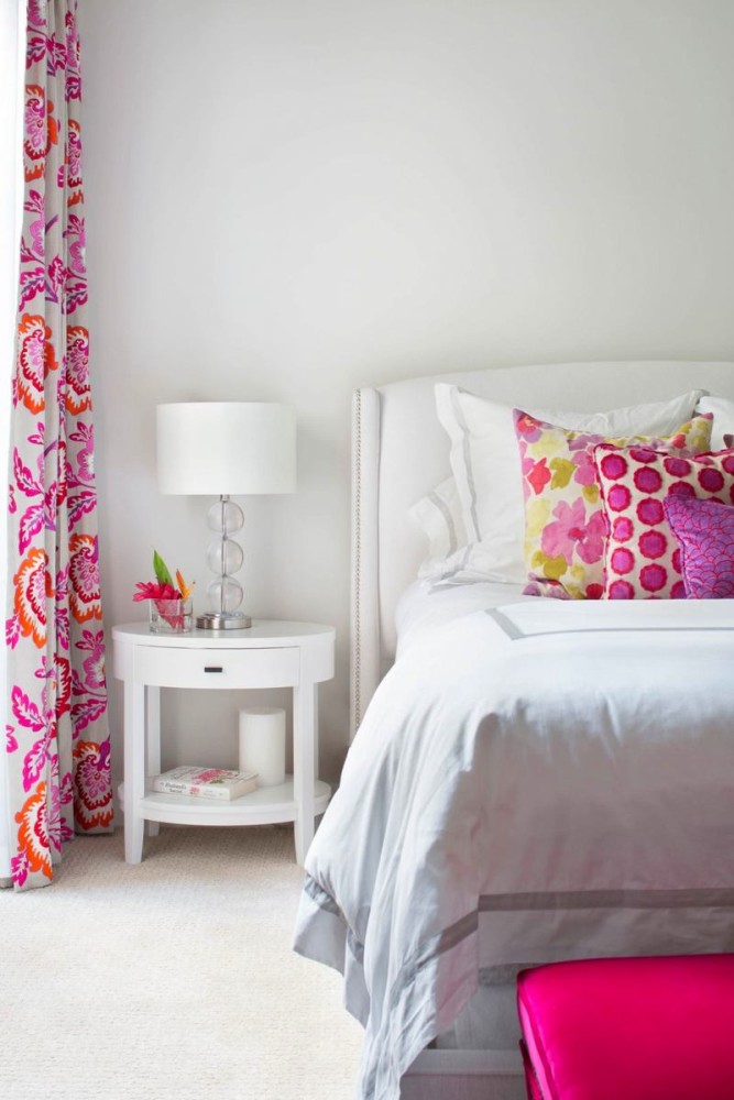
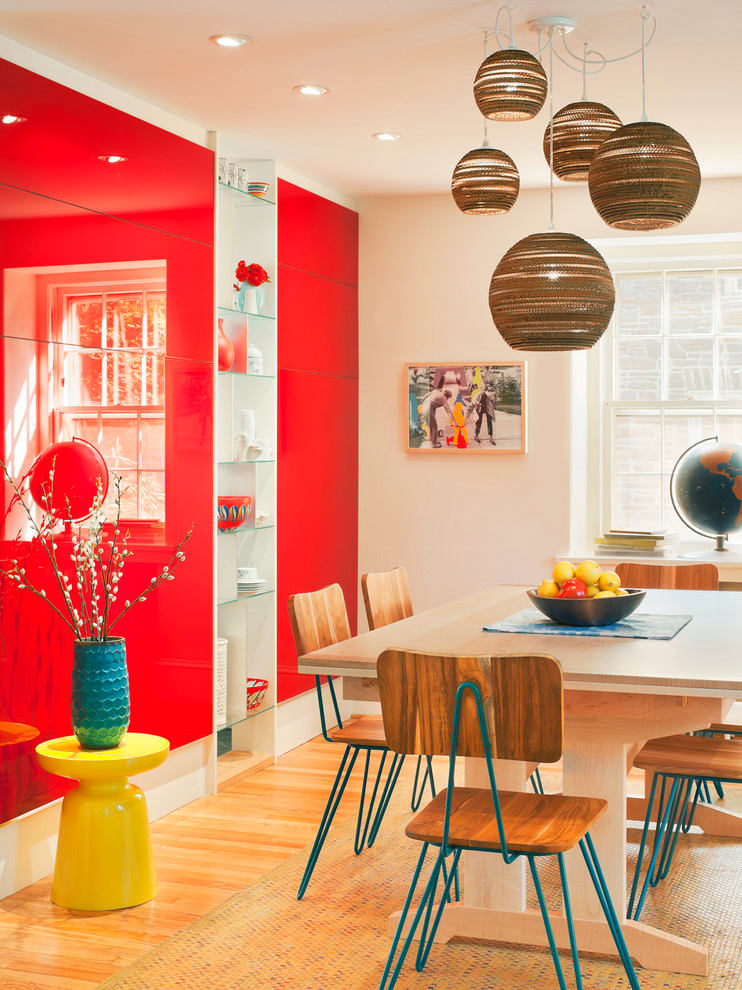
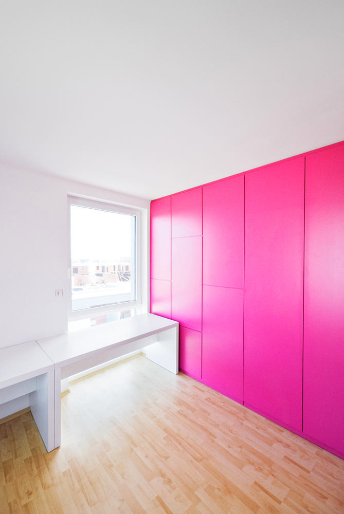
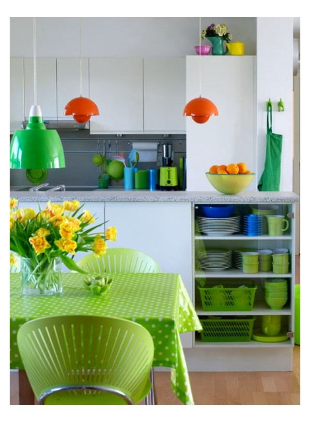
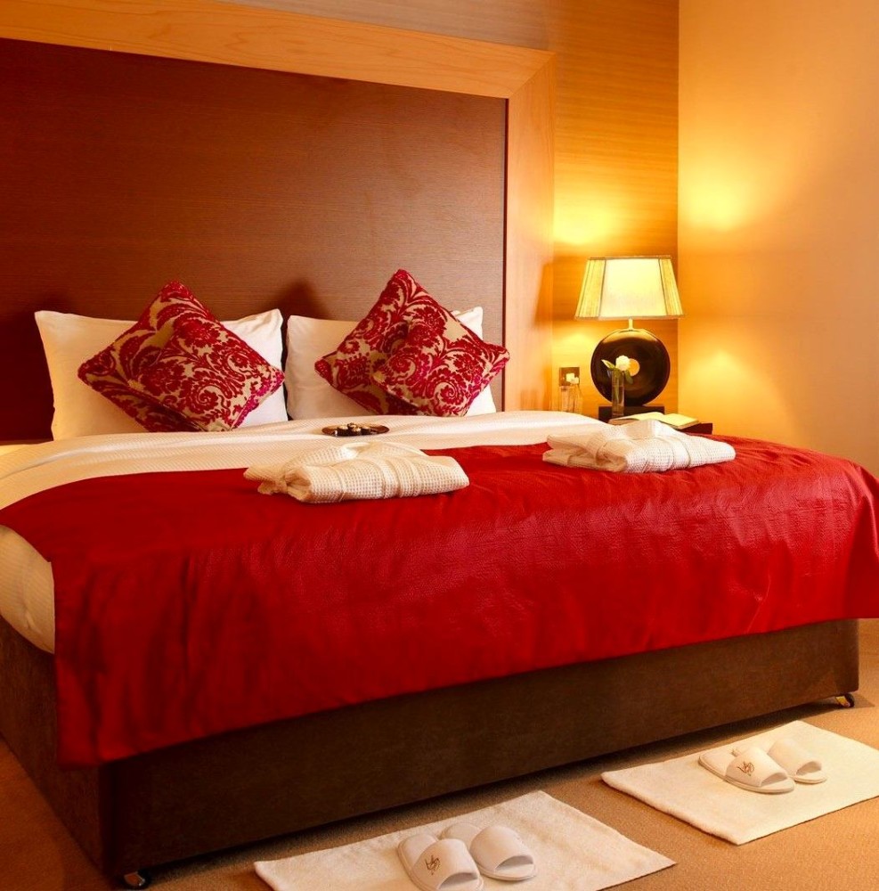
Deep tunes to a calm wave, and hisdelicate shades can refresh the interior and invigorate their owner. In addition, they reduce the feeling of hunger, so they are rarely used in the design of the dining room or kitchen. the color of harmony, which reminds a person of nature, grass and meadows. It brings spring notes to the interior, refreshing it and contributing to the creation of a calm and good atmosphere. Purple shades look cozy in completely different rooms. They are often supplemented with pink, which, according to psychologists, is not recommended for very withdrawn individuals. The color red is contradictory. In China, it is considered traditional and is used quite often; in Europe, it is treated with caution. It is not recommended to use pure red, it is best to dilute it with white or use it as small blotches. 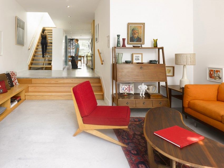


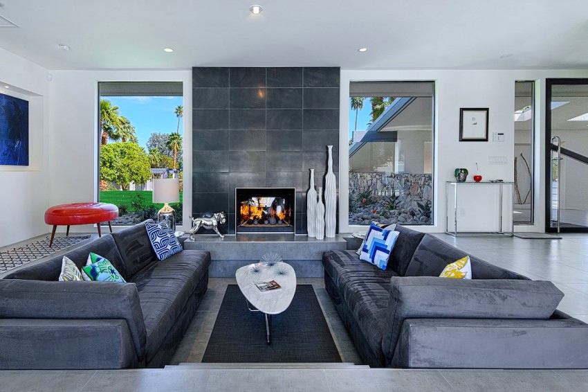
Universal palette
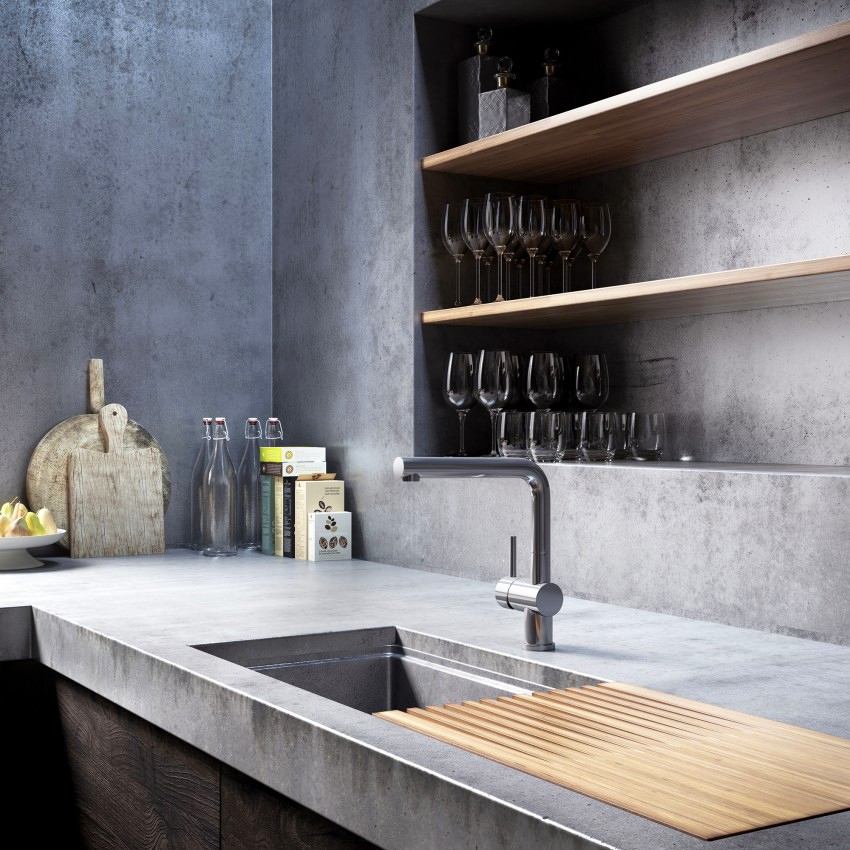
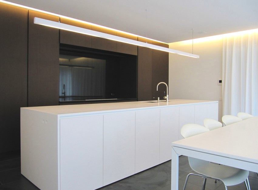
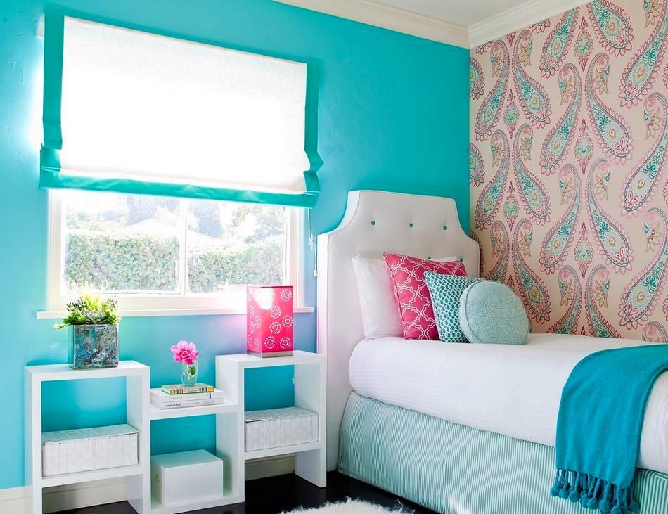
Gray color deserves special attention.It is loved by many designers, architects and decorators for being versatile. Sometimes the entire interior can be built in shades of gray and it will look very interesting. If you decide to use a different palette with it, then you must remember that gray is able to adjust to the dominant colors and shade them. Most often, gray is used in minimalist, Scandinavian interiors and high-tech style. A natural wooden board used in the decoration of the floor, walls or ceiling looks fantastic against a gray background. Gray is also able to emphasize the varied texture of brick or natural stone. It goes well with natural materials and pastel shades, for example, with beige, caramel, muted delicate turquoise or raspberry. 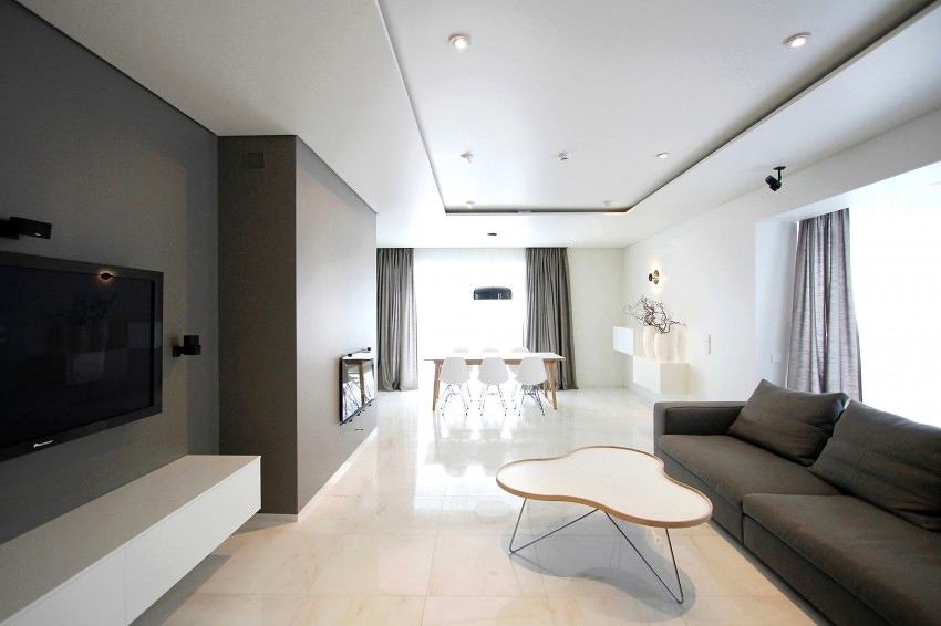
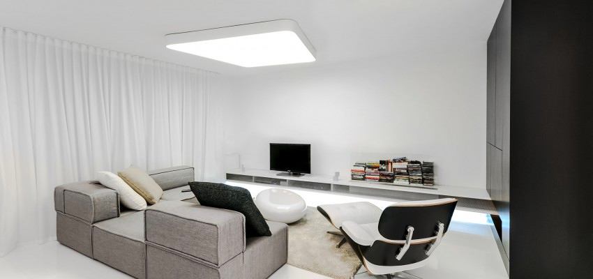
Playing chess: black and white
Often in the interior they use a contrastingcombination of white and colors. By the way, in 2015 this is one of the fashion trends. If you want to make the atmosphere more mysterious, then choose black as the dominant color, and use more white for a lighter atmosphere, but stick to a balance so as not to lose the graphicness of the interior and make it too gloomy. Try to keep it no more than 50 percent black. This does not mean that black and white should be equally divided. Use gray, silver, blue, green, beige or red as diluting or complementary shades. Add just a few colored elements, and your interior will become more cheerful, and its severity will soften a little. 
Expert Advice
Color in the interior is a question that raises a lotdisputes and contradictions. Some experts believe that some colors reduce the space, while others say the opposite. We decided to turn to an expert who gave us some tips to answer many of your questions. Alexey Eliseev, head and co-owner of the Manders chain of English paint stores Alexey is constantly involved as an expert in the preparation of materials for our website. You can read his comments


 pinterest.com


