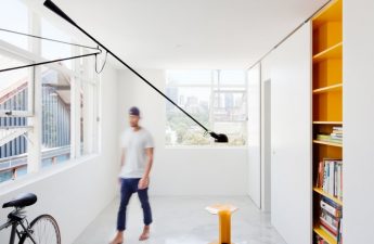
 For visitors to our portal we have preparedan incredibly fascinating story about an ultra-modern apartment with retro elements from the 50s of the last century. Its interior was designed by local master Kira Chuvaleva for a young, enterprising and pretentious young man. The studio space is only 36 square meters. The building in which it is located was built more than 100 years ago. The talented designer told us about how this idea was brought to life.
 An architect originally from Moscow, with a passion for decor andeverything beautiful was inherited from her father and grandmother, but she did not understand it right away. The road to professional self-realization was long and painstaking, but relevant. She received experience and knowledge in the field of design at the educational institution "Details", where she completed the main and additional programs. Kira works mainly in the field of individual housing - apartment decoration, she also has skills in decorating offices and large companies. In addition, she was engaged in the development of design for events, worked part-time as a stylist for the glossy magazine Seasons, and participated in the creation of productions with friends. Her artistic and design creations are presented in several magazines, including "Architectural Digest", "Leading Trends" and "Andrew Martin's Design Review". A regular participant in the television show "Apartment Question", she was also invited as an expert for several stories on the Russia channel.
About inspiration
Surprisingly, it was original and extremely significantThe designer's clients become sources of creative enthusiasm. When the person is interesting and pays attention to the end result, the project is completed successfully. Kira is very lucky, as she has excellent mutual understanding and creative union with all her clients. Like many creators, the designer needs a trusting relationship and freedom of creativity. She is not a specialist who works under tight deadlines, as each of her design ideas requires an individual approach and careful development, as it includes a large number of the latest ideas and concepts, designed to meet the needs of the client. And this process requires sufficient time and seriousness to thoroughly understand his temperament and history.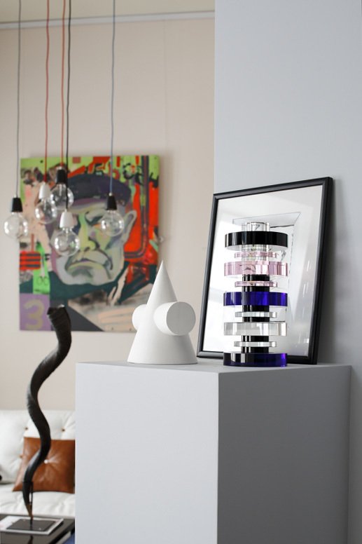
Layout
The project version was declared as a studiolifestyle of a young man, as he is modern, hospitable and loves spatial volume. In addition, the author found such an interior more rational, as it allows leaving the room multifunctional and changing the small area of the dwelling, giving it a unique and unrecognizable appearance. It ended up being filled with light and very spacious.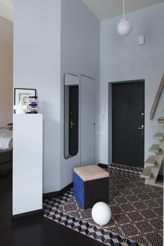


Customer
A modern young man who leadsenergetic lifestyle, with an intensive schedule, holds a high position as a manager in a major company. He simply needed an adviser to develop and implement the apartment's decoration, because he can appreciate beauty and easily understand what the master wants to achieve. For this reason, Kira bought a couple of creative works of art for the project, which effectively blended into the design. The author of these masterpieces is Davina Garrido, she also lives in the capital.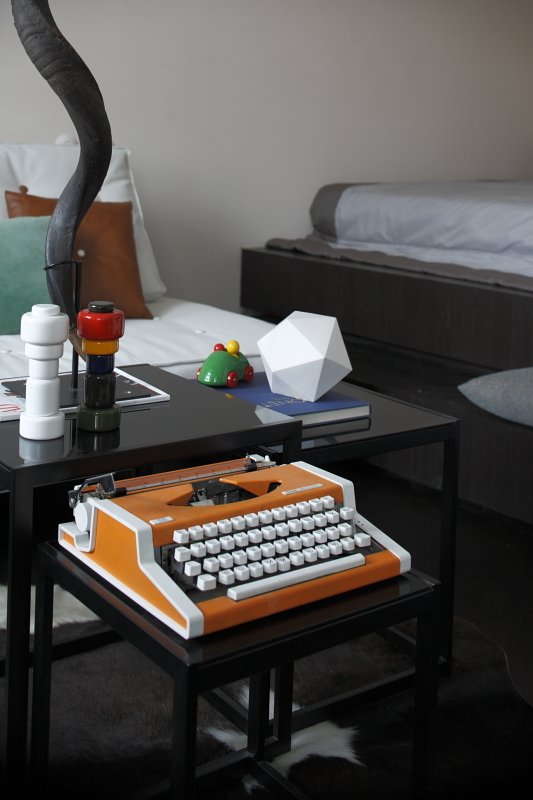

Style
The architect is not a fan of obvious and frankstylistic directions. It was important for her to understand the customer's requirements and wishes, and at the same time to adjust them, effectively combining them with the historical essence of the building, which was erected more than 100 years ago.
Coloring and illumination system
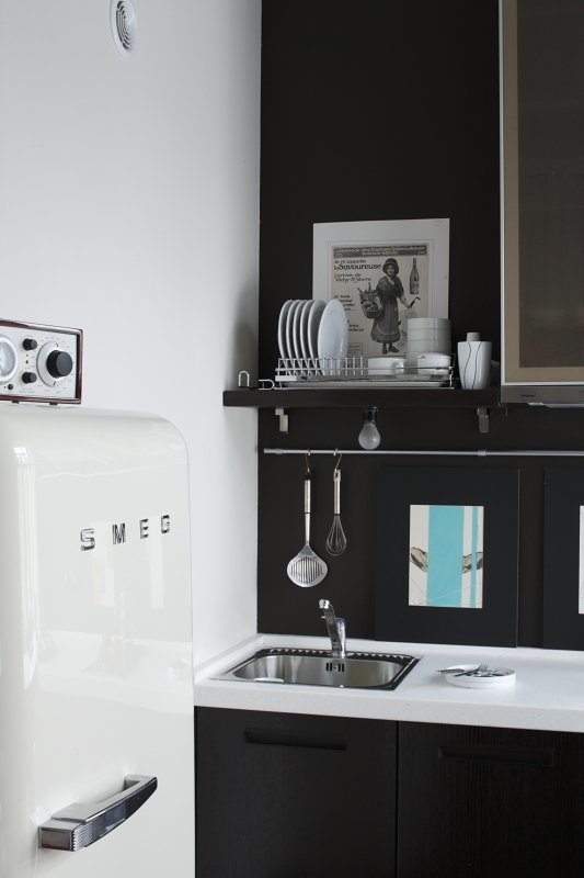
Since the studio is located in an oldThe author was very lucky in the construction, as there were three window openings for a small area of the room. The goal of the project was to enhance the natural sunlight, as a result, a calm and peaceful snow-white shade of the walls was chosen. In addition, it creates a huge reflective surface. Independent multifunctional areas are accentuated with other tones, but it can be noted that the color palette of the space refers to cold gray-blue. In the kitchen area, the walls are painted in the colors of the floor surface and furniture set, so that the room filled with equipment and household appliances does not catch the eye. The colors of grayish and azure were borrowed from the old Metlakh ceramics in the front and facade side of the house. As a result, the exterior began to surprisingly harmonize with the interior design of the home.
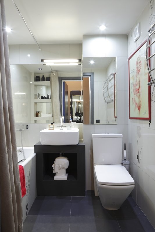
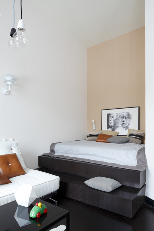 Concealed lamps, a product of innovativetechnologies, are used only in the bathroom, where rich lighting and even radiance are important. Throughout the studio, the illumination system is classically located depending on the functionality. Where necessary - local lamps above the countertop or sconces for reading books in bed. In the kitchen area, simple bulbs were installed, imitating the style of the delightful lamp near the sofa. This reduces the ardor and brings the decor closer to the time of the construction. One modern source of illumination is the lamp in the guest room from the Philips brand. It changes its color, creating an original atmosphere in the evening and is comfortable to use with an abundance of light colors.
Furnishings
The furniture set is based on a certainin accordance with the times, it takes us to the modernist style, when the classics have gone, leaving room for progressive technologies and innovative trends. The designer deliberately installed rotary switches that are similar to vintage models. The client is a supporter of the style of the 50-70s of the last century, so they entered the interior of the room very effectively. In addition, such furniture rationally complements the interior - it mostly all has long supports, the floor surface is clearly visible, and the gaze, sliding over the furniture, does not run into the fence, which creates an optical effect of spaciousness. Only the dining table, made of solid walnut wood, has a classic design under the table.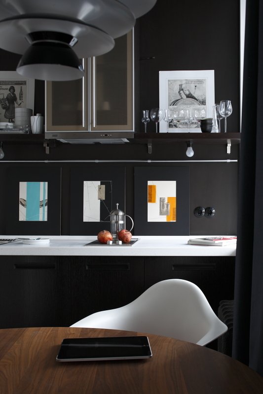

Design and textile matters
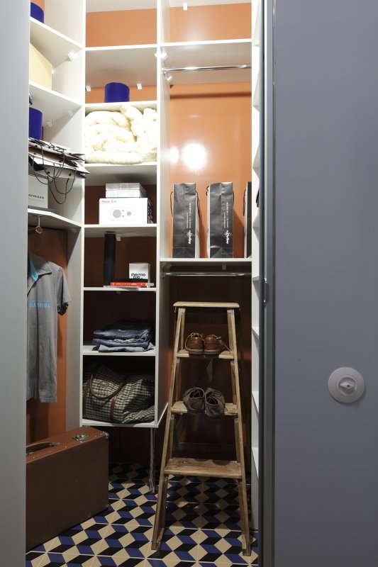
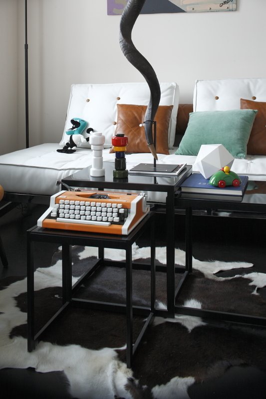
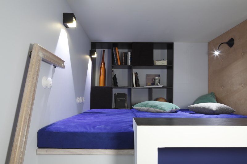
Since the design is ultra-modern andmasculine, and the decor and textiles are minimalist, weightless Roman blinds support the main color palette, and do not create an obstacle to the penetration of sunlight, while providing a sense of privacy from prying eyes. A voluminous flowing curtain made of fabric that looks like a suit hides communications. In the chill-out area above the bathroom, the cushions are covered with automotive synthetic textiles. The main decor was creative works and graphic ceramics in the hallway, imitating Mettlach.
Implementation difficulty
The hardest part of every conceptual designthis is a search for professional specialists. The process of reconstruction from the idea to execution takes a long time, since there are few qualified workers and companies on the market that can perform small orders well (for example, make a staircase in the corridor) or produce everything at a high level, pay close attention to the smallest elements and, approving all actions with the architect and the client. In addition, in small projects in most cases they try to save money, which can also create some problems during implementation.
Tips for project readers
We want to wish you to learn to seebeauty in ordinary objects and follow three rules when decorating a room: a sober mind, a holistic concept, and agreement with the apartment in which this decor will be located. As Ludwig Mies van der Roh said: "Less is more."
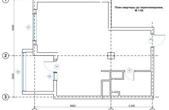
Apartment plan
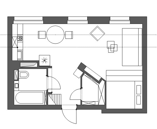 Photo material: Sergey Ananyev Author of painting: Davina Garrido
