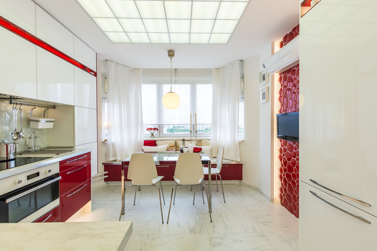
 The owners of this apartment have set adesigners not quite a trivial task. In a small kitchen area, only 13 "squares", they wanted to see three zones at once: not only the kitchen, but also the living room and dining room. Minimalistic style came to the rescue. Within its framework, you can create a very non-standard interior, while functional and comfortable, although there is very little furniture and decorative elements in it. The kitchen is decorated in white and red colors, and here you can not only cook, but also eat, gathered together at the table, discuss something, sitting on a comfortable sofa, and even watch TV.
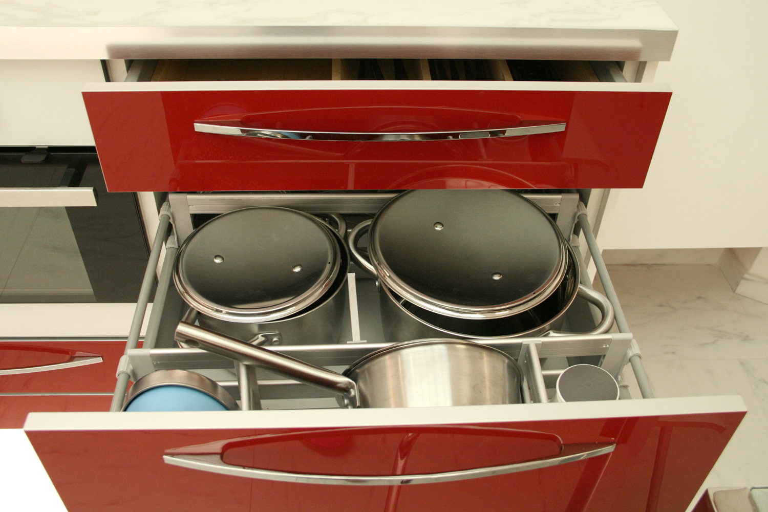
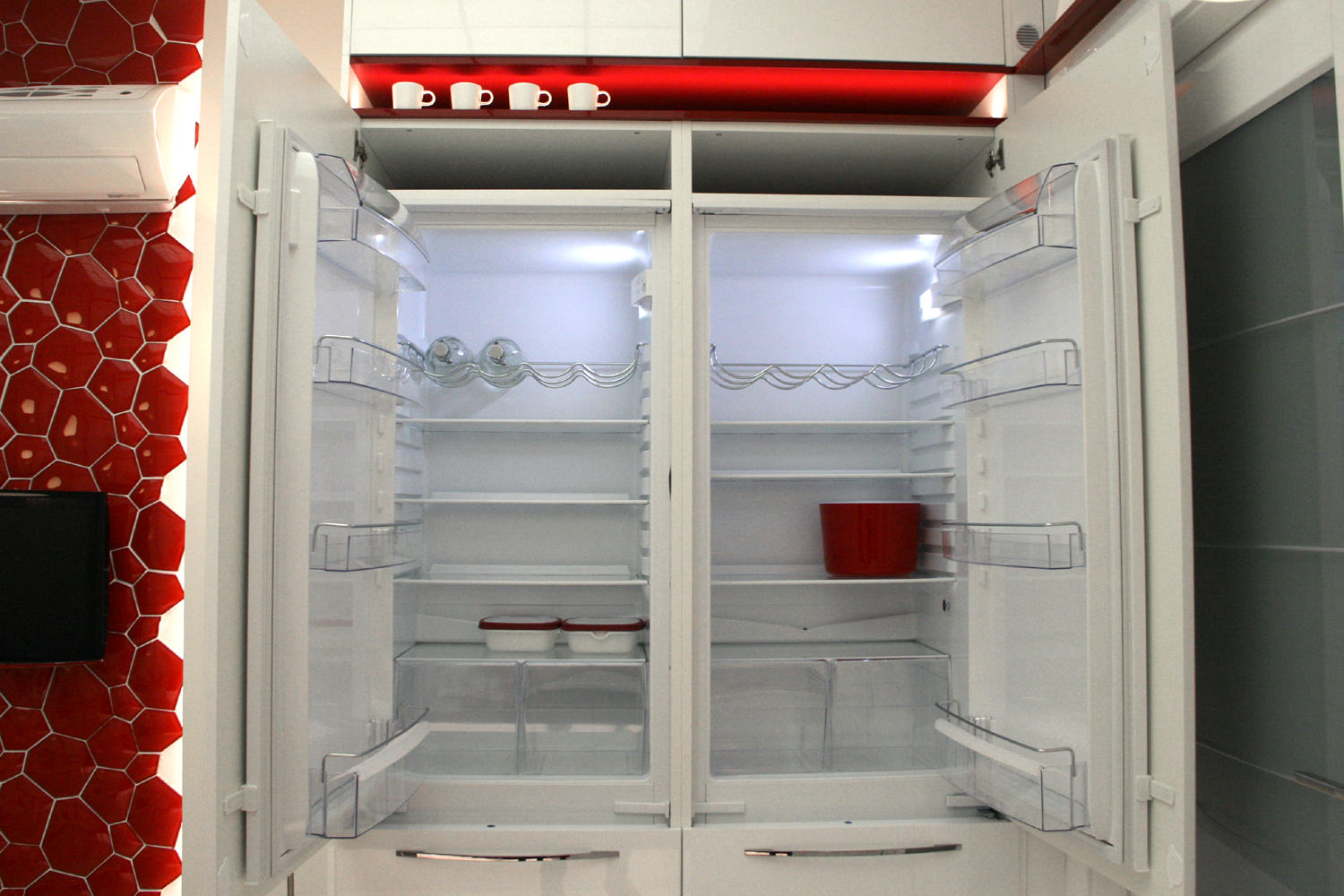
 The special feature of the kitchen is the abundance of places whereyou can store all sorts of gadgets and food supplies. This is due to the lifestyle of the owners: the hostess prefers to stock up on food rather than go shopping often. That's why two refrigerators "settled" in the kitchen.
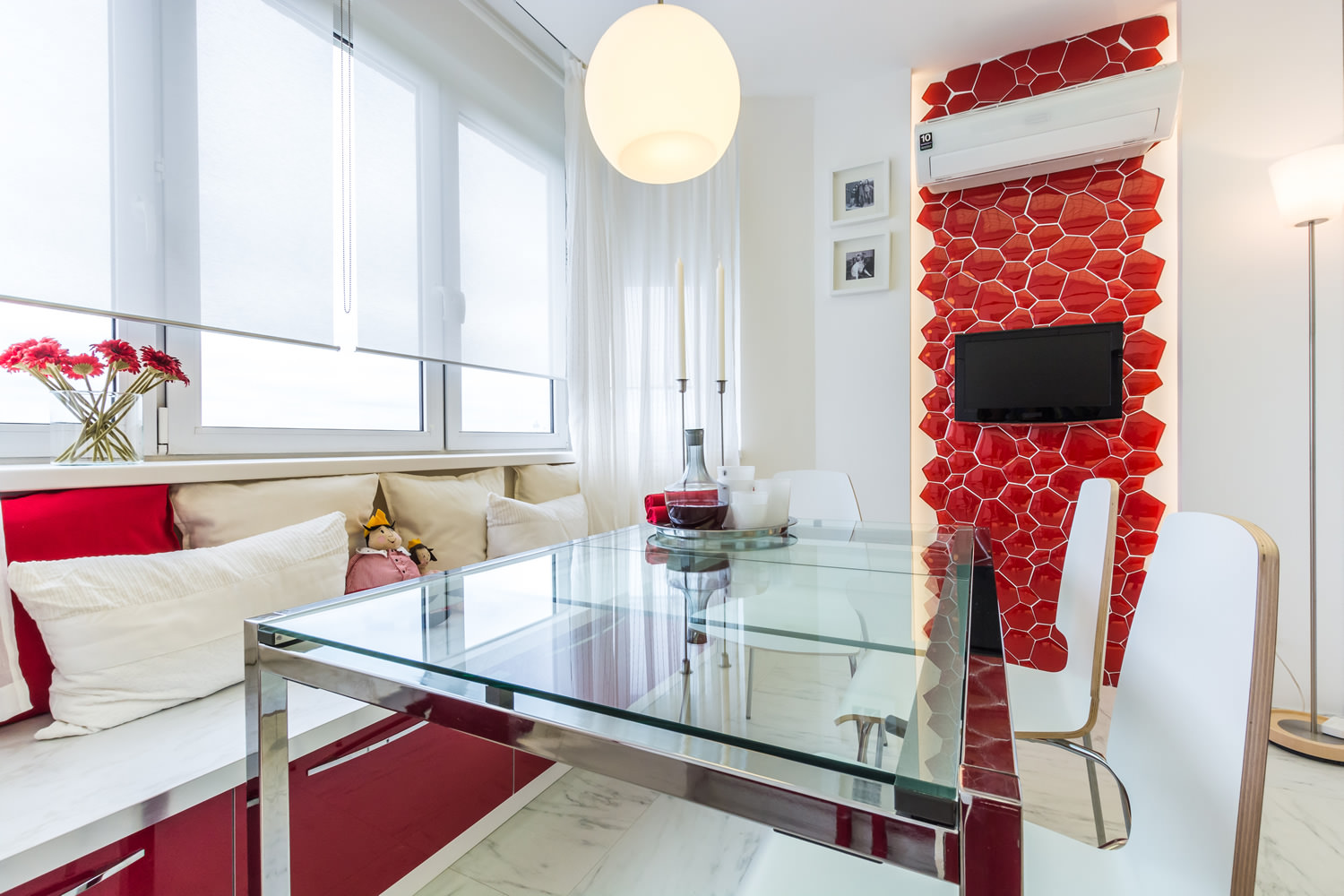
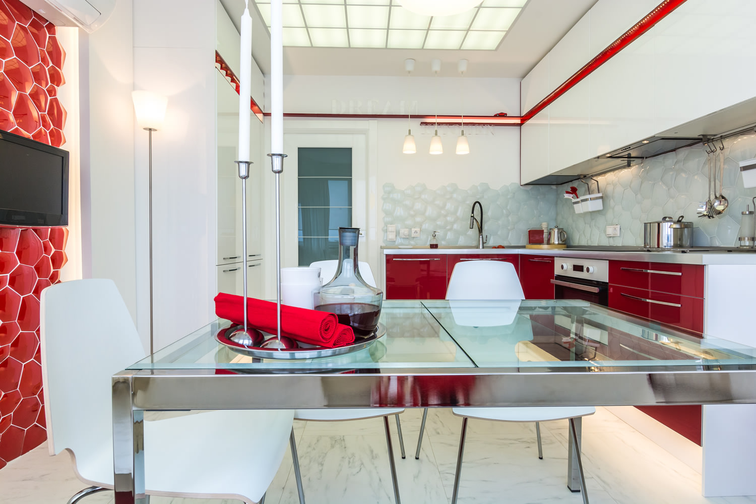
 The basis for the stylistic solution was whitecolor. Juicy red was chosen by the designer as an accent, additional. As a result, we got an impressive, elegant, but at the same time quite restrained kitchen. Red was used for the lower facades, they are white on top, but the accent tone is also present in the niche. This decorative element turns into a kind of ribbon and runs through the entire room like a “red thread”, giving it integrity.
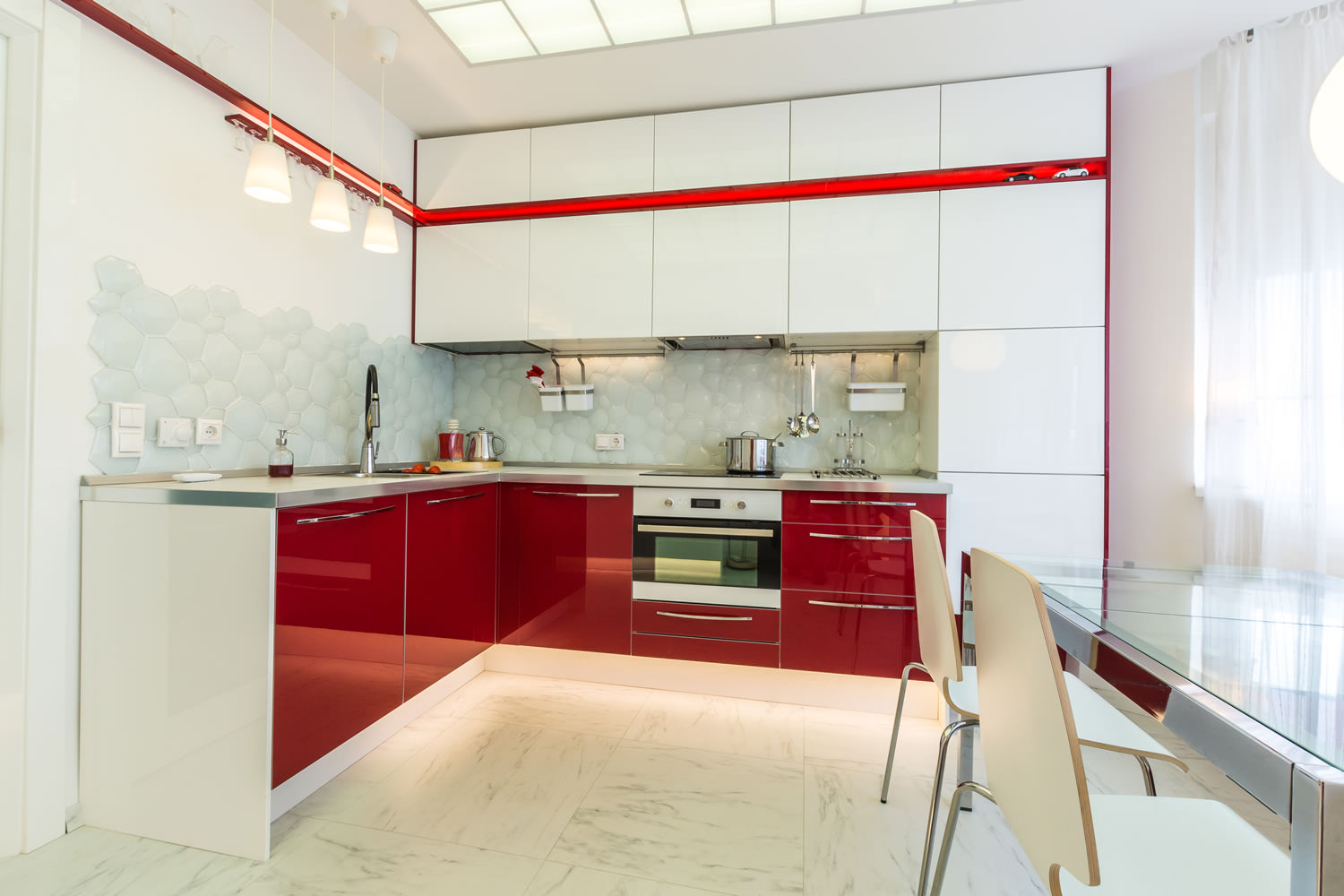 Light sources protected by inserts made offrosted glass, are located on the ceiling. This is the main, working light, providing comfortable work. But not the only one. There is lighting around the perimeter of the room, there is a floor lamp that repeats the shape of the pendants installed above the work area, as well as a spherical chandelier. All these lighting fixtures allow you to vary the level of illumination and use some of them as needed or desired.
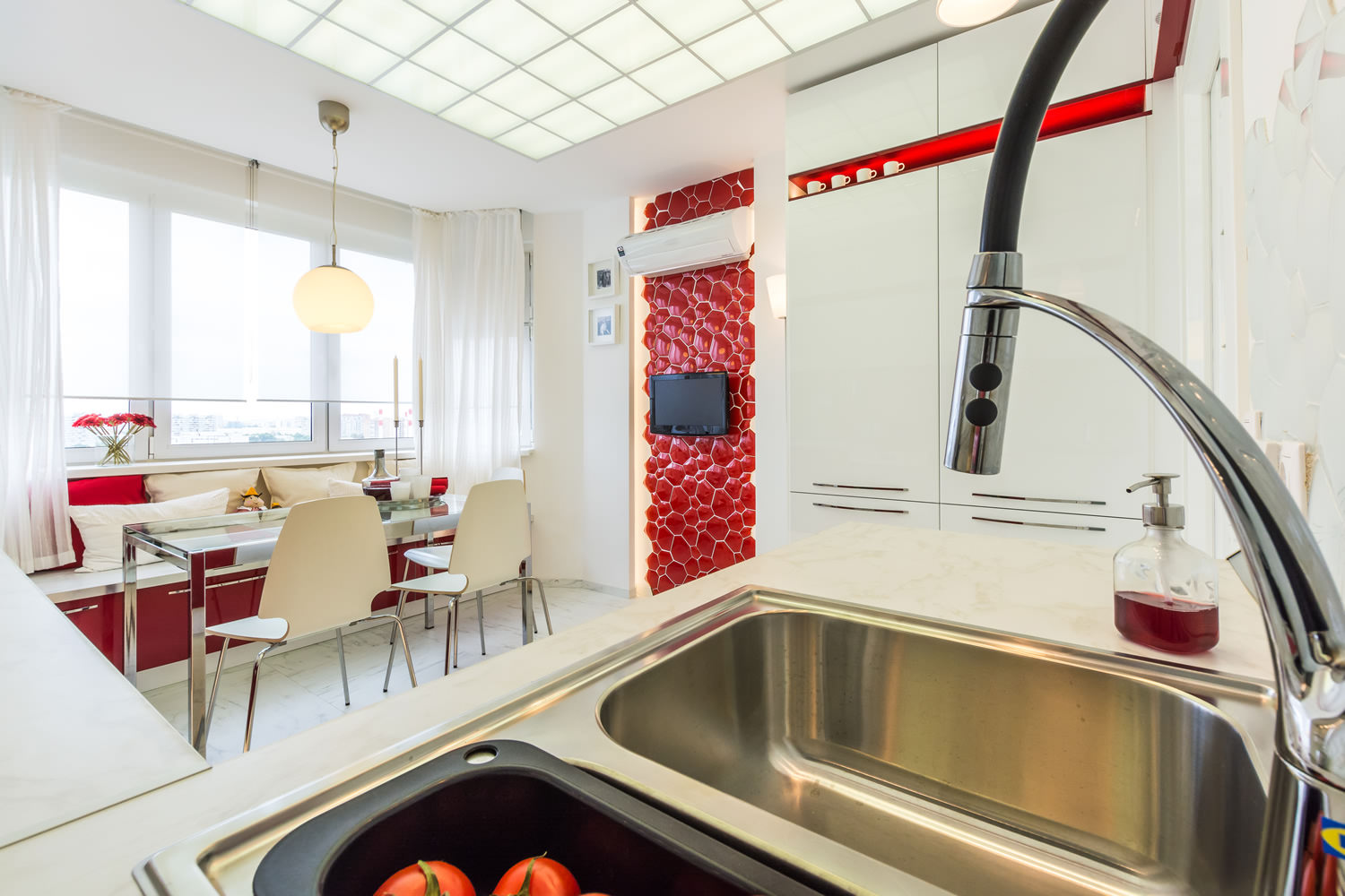 This kitchen makes extensive use ofgeometric elements. Squares can be seen on the door (here they are made of glass), and marble figures are present on the flooring. They are echoed by light squares on the ceiling.
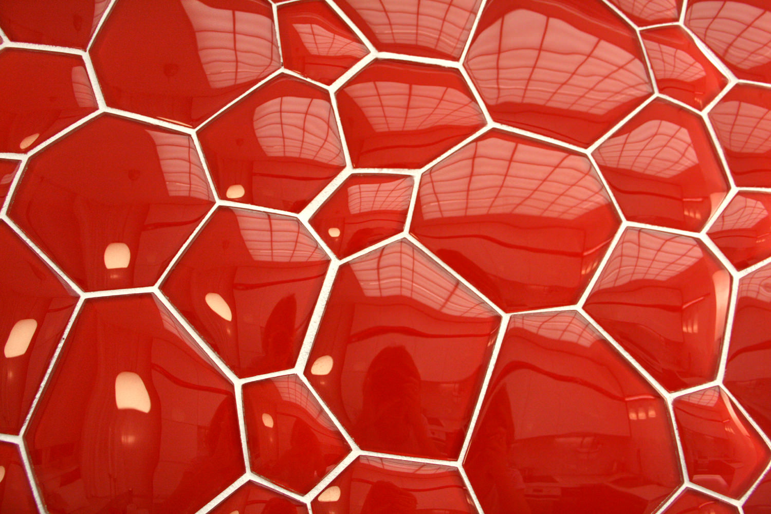
 The kitchen design has its own unique feature.The role of such is played by three-dimensional mosaic panels, reminiscent of foam bubbles. Above the work area, they are painted white and act as an apron. The same bubbles, only red, can be seen on the kitchen wall.
 There was also room for a sofa, which the bay window was transformed into. The pillows thrown on it made the room more "homey", cozy and comfortable. There are storage spaces above the furniture.
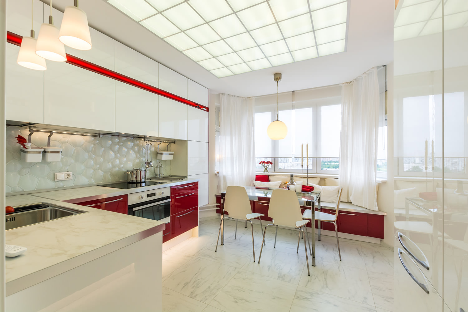 There is a dining area next to the sofa.The glass table can be extended and increased in size if necessary. It is accompanied by chairs with white plastic seats. The roller blinds are the same color: they have become an alternative to the usual curtains above the sofa, so that they do not disturb the rest of the hosts and guests.
Expressive red and white interior of a small kitchen
