 Small spaces are not only domesticrealities, leading world experts also regularly face difficult tasks of decorating limited space. Today we will consider their original solutions.
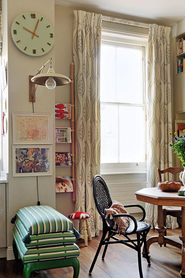 "In small quantities everything matters" So saysdesigner Beata Heuman, commenting on her London apartment. She knocked down the partition between the kitchen and bedroom, leaving only a load-bearing column, and placed a thin cabinet there. A stylish stool serves as additional storage.
 Jane Churchill kept only 2 of the 4 small bedrooms, using the freed space as a terrace. She designed interesting chairs near the fireplace, in harmony with the proportions of the sofa.
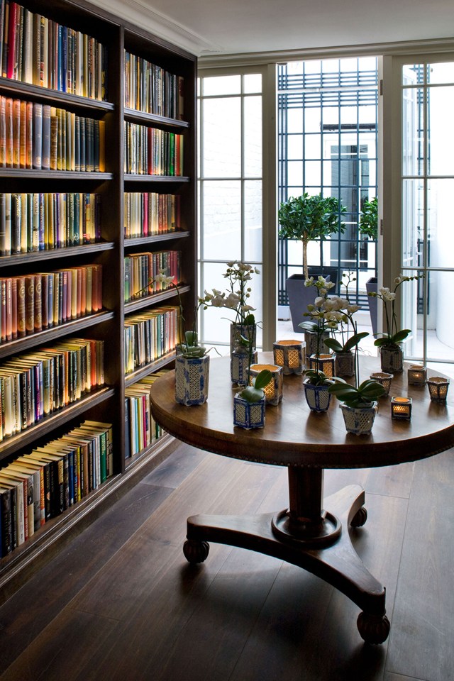 "Mirrors are an effective way to combat"Crowded space," says Gabby Deeming. By directing light into dark corners, you can create the illusion of a doorway - a brilliantly simple solution in a 17-square-metre room.
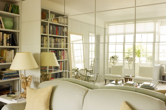
 By mounting mirrors opposite the windows, Ann Boyd achieved lightness and elegance; the paneling completely copies the pattern of the frames.
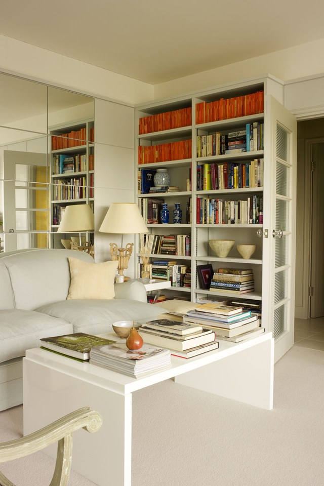
 Light can do wonders. Following this simple principle, Eve Mercier took a risk and made a glass roof. The result is obvious.
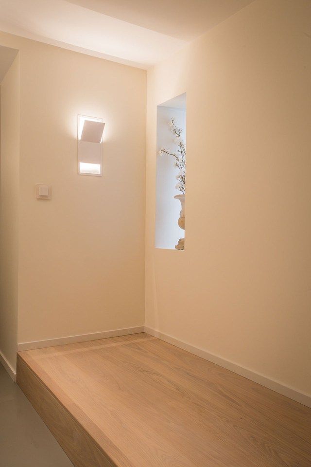
 Architectural firm Studio 29 took a slightly different approach – hidden lighting uses the ceiling as a reflector.
 “When a client wants to open up a space, we"We recommend breaking it up with open bookcases or mirrored partitions, they work like theater curtains," designer Andrew Winch shares with us. The structure behind his bed imitates a passage into a non-existent room.
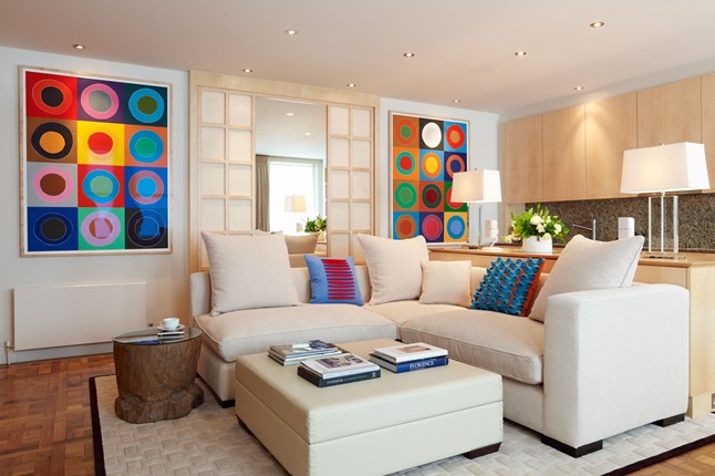 The kitchen is nothing more than a bar in the living room –Emily Todhunter claims. The double-sided bookcase with a serving window is a vivid example of this. The vanity unit is a simple and roomy chest of drawers.
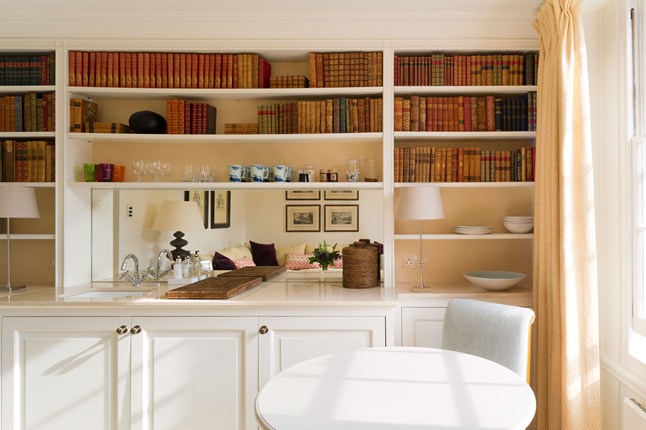
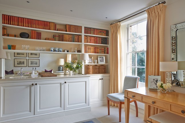
 The children's bedroom in the Louise Glyn house is a worthy example of meticulous space saving.
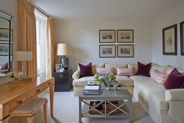
 The L-shaped sofa in Emily Todhunter's studio folds out when her twin children come to stay. And the duvets are stored in a large black box.
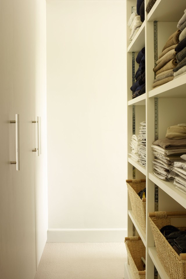
 The stumbling block is the storage of things. Open shelves are visually hidden behind the headboard.
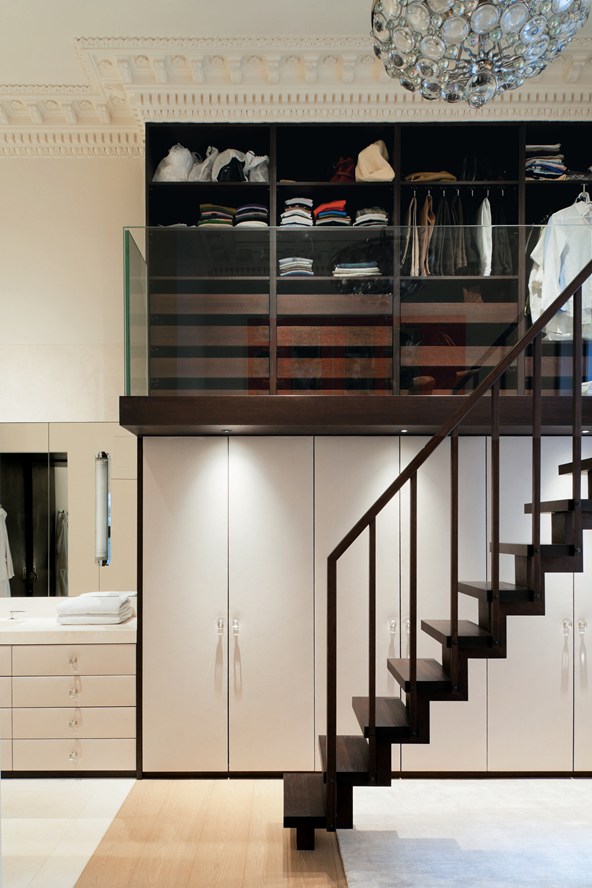
 The glass balcony in front of the closet is awesome!
 There is always wasted space under the stairs – the perfect place for a washing machine.
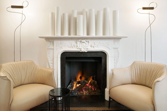
 Venetian plaster creates the illusion of open space – the subdued light from the floor lamps is softly diffused across the wall.
 The active terracotta color is in amazing harmony with the faded blue – the dark parquet completes the color composition.
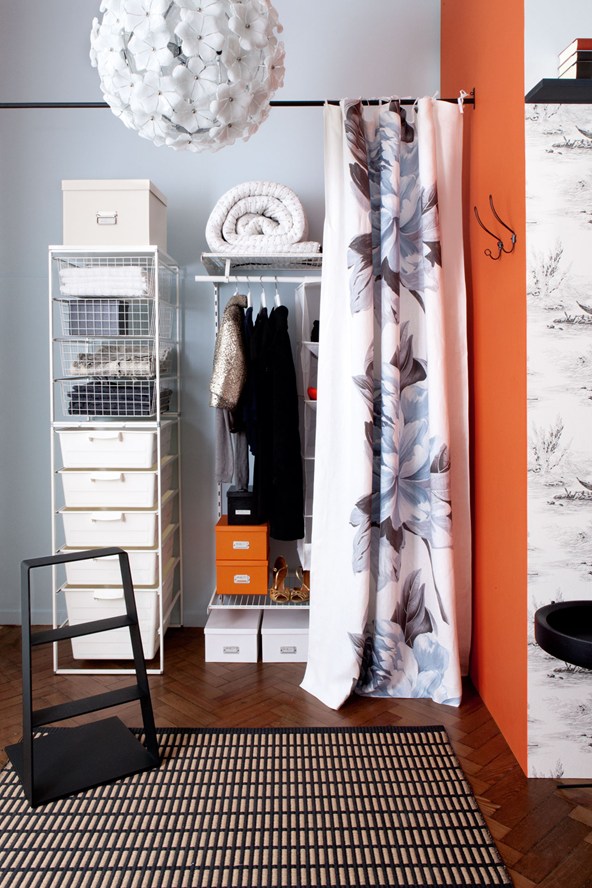 A collage of ceramic tiles will add dynamics to a cramped space.
 The cheerful paneling and end mirror create a nice optical illusion.
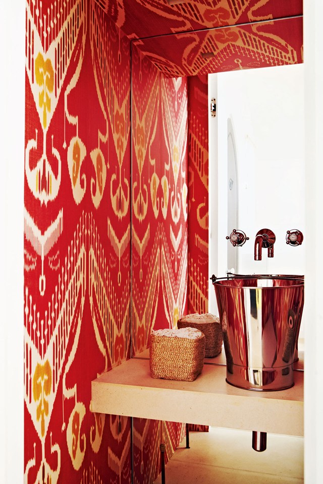 Heal's new Ambrose collection is a blank for your ideas.
The interior of a small room: photo 8 ideas from famous designers
