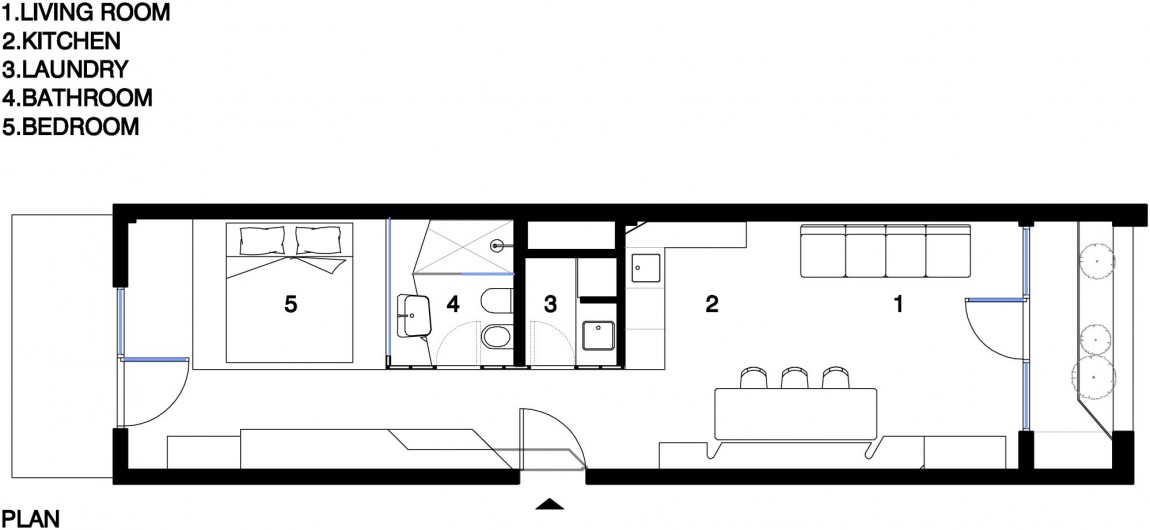
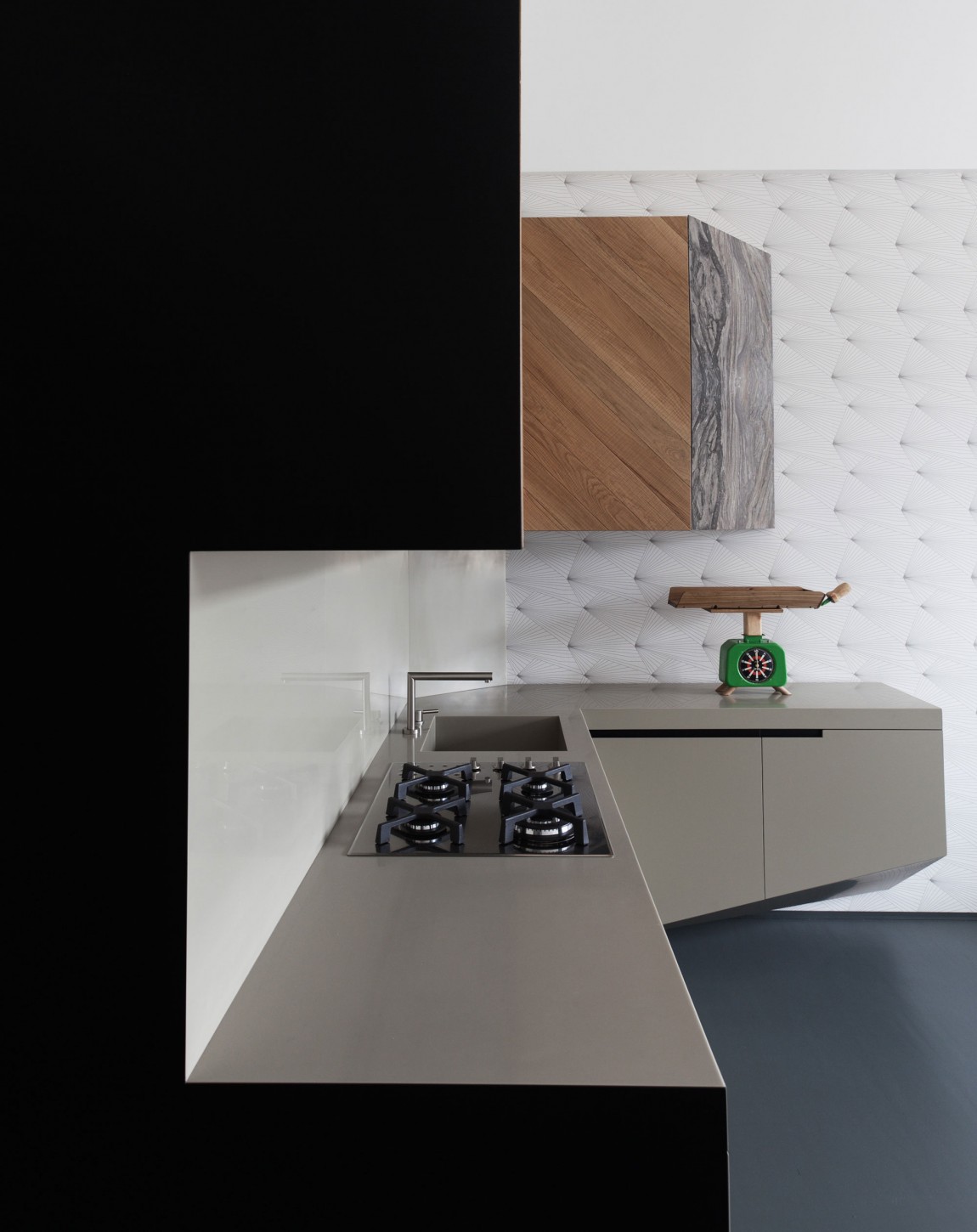
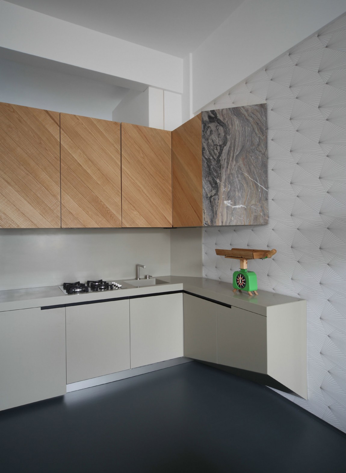
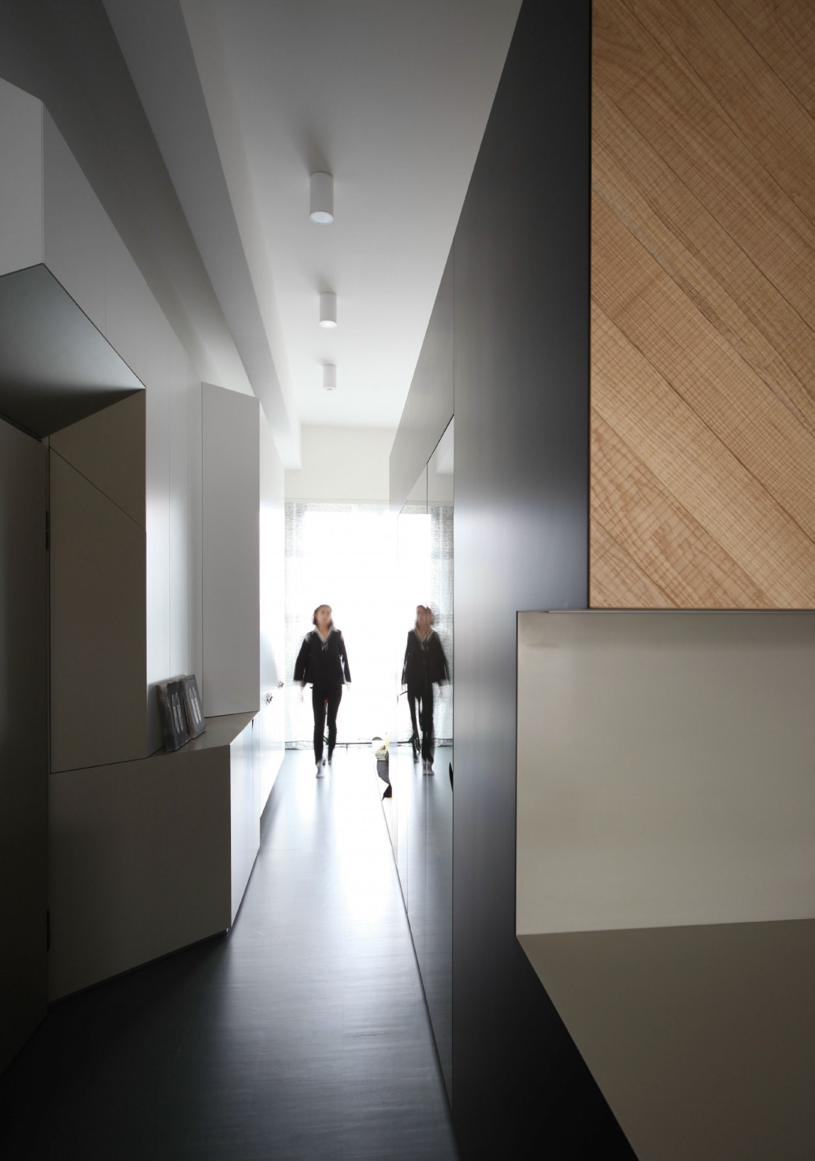
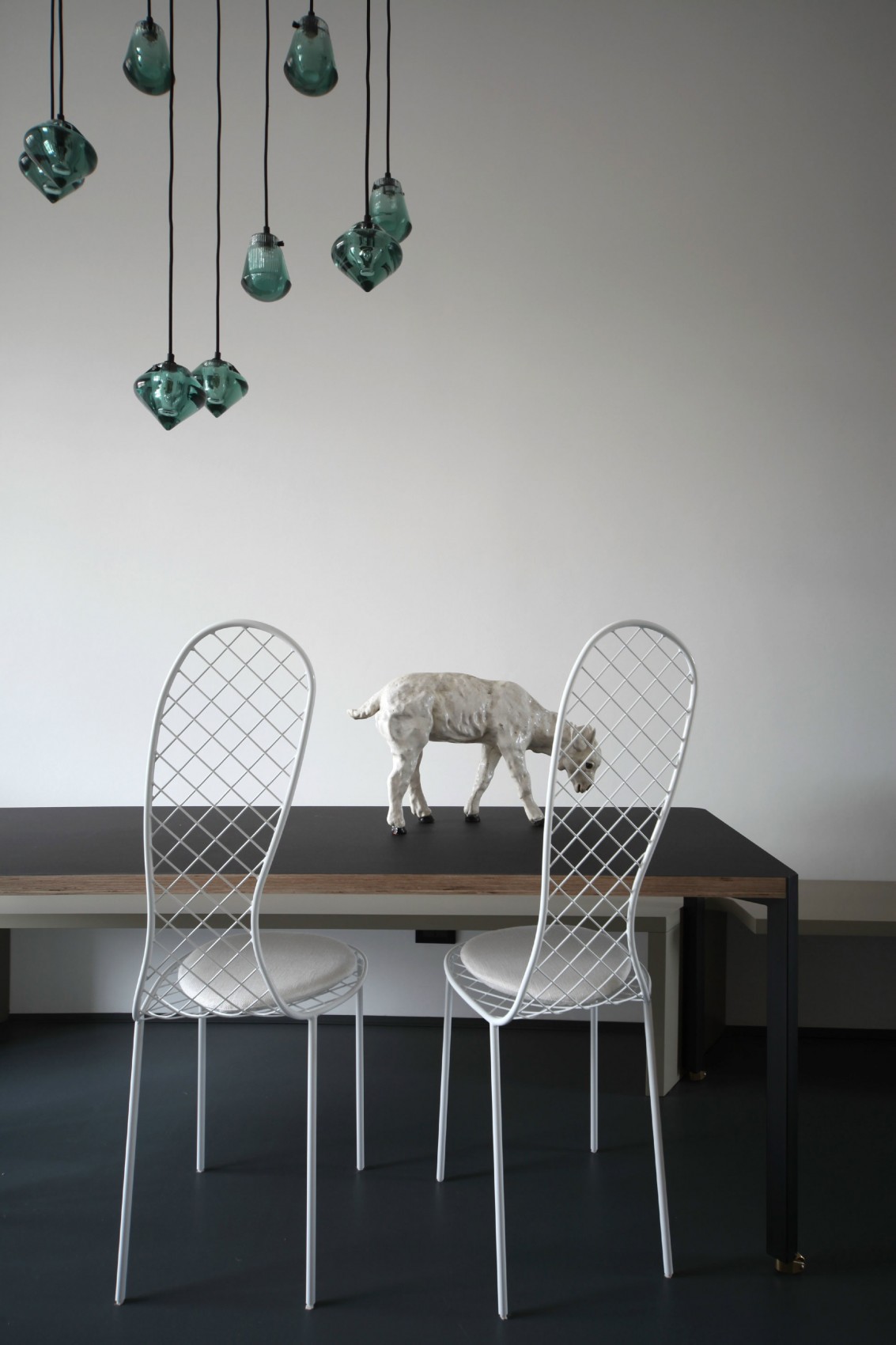
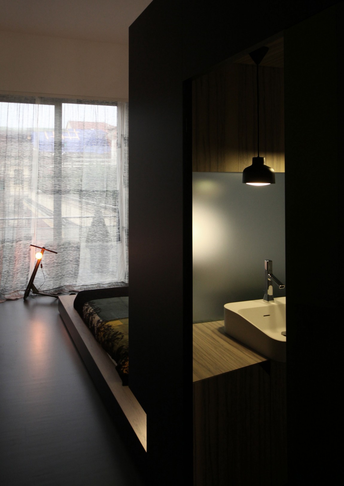
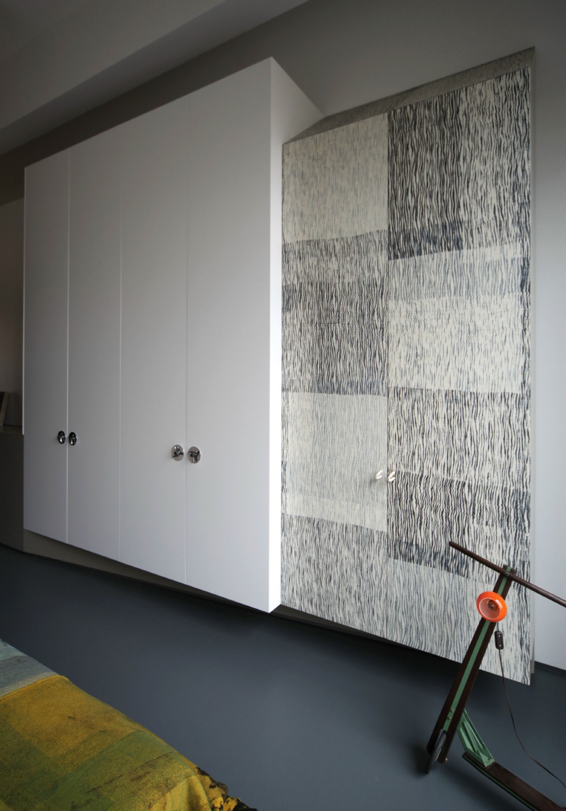
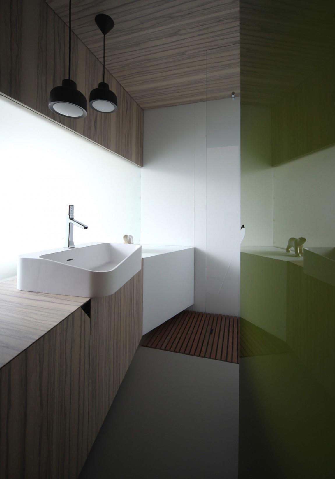
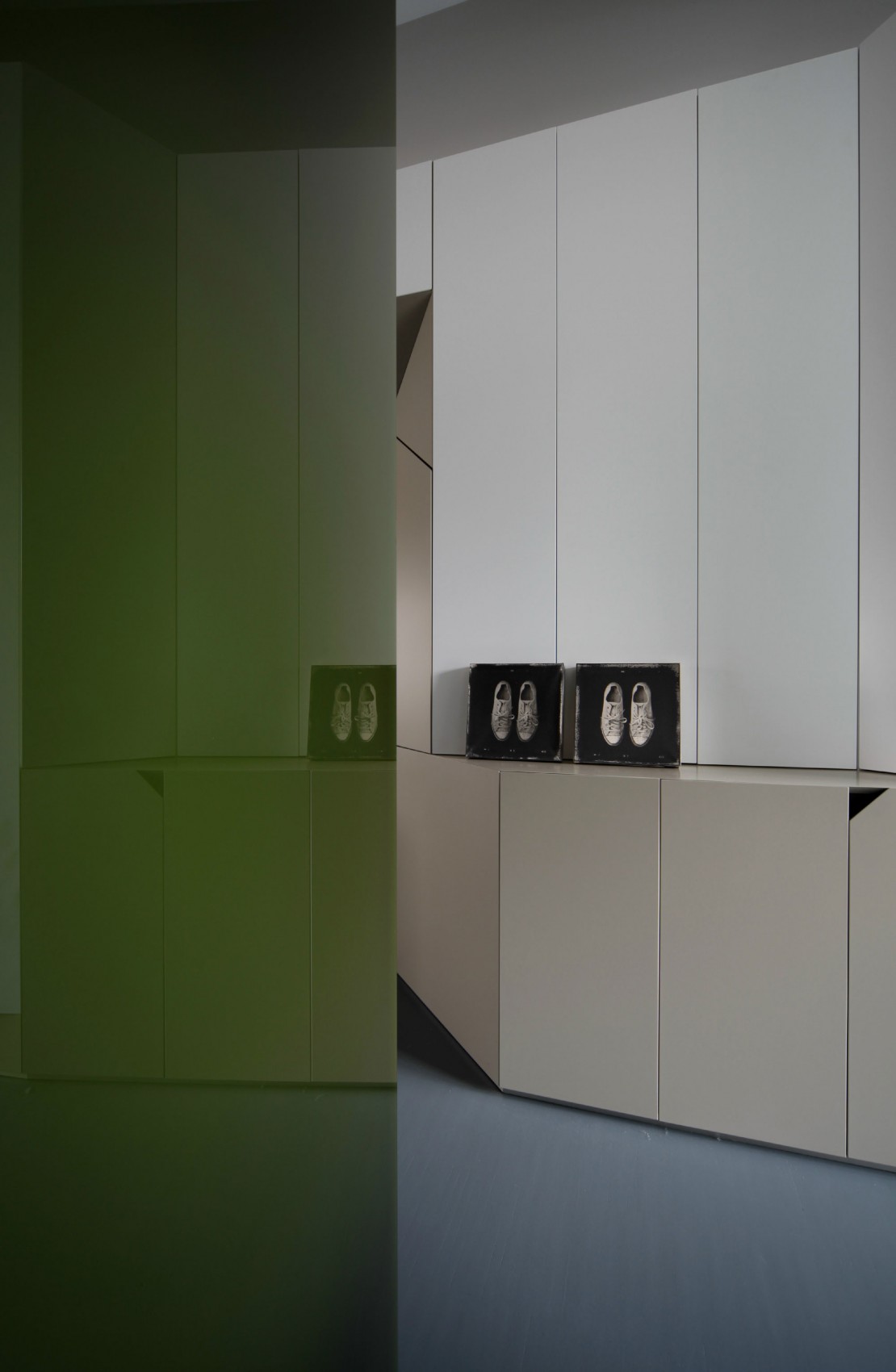
 How effective and at the same time maximalhow to conveniently organize the space of a small living space? This is the question that apartment owners all over the world ask themselves. And today we invite you to virtually visit the city of Turin in Italy to get acquainted with another solution to the problem. This residential project has become another achievement of the well-known design company UdA. The apartment has a simple layout, reminiscent of a container, and a small area of 40 m2. Andrea Marcante and Adelaide Testa, leading employees of UdA, had another opportunity to fight with the peculiar features of post-industrial architectural space. The designers fully coped with the task and developed the theme of the arrangement of several structures inside each other. Thus, the interior decoration is arranged as a continuous single whole, which on its way encounters scenarios familiar to everyday life. The long and narrow space is organized as a sequence of "modules" deployed towards the neighboring area and inward, where the resident cooks, eats, sleeps, works and has fun. This leads to a minimization of living space, in which materials and furniture constructed from them flow smoothly from one functional form to another. The wooden finish changes on its way from the bedroom, through the bathroom to the kitchen. The marble slabs look modest, unobtrusive, and in places even hidden with caution and prudence, as if they were abstract symbols in a human comedy. And the black lacquered surfaces, resembling a play of shadows, act as elements that connect the entire plot, while the rigid geometric forms send graphic hints and begin a dialogue with the wallpaper motifs of the surrounding walls.



 Material courtesy of UdA. Photos by Carola Ripamonti.
"Multi-layered" interior of a small apartment in Turin
