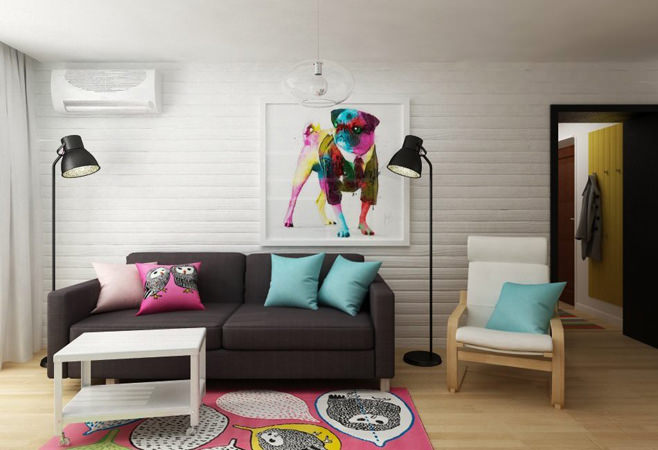
 Young designers from the Gradiz studio managed tocreate a high-quality and fairly budget interior in a two-room apartment of only 40 square meters. Our favorite site about small interiors will talk about this unique spectacular design today. The owner of the apartment is a positive, cheerful woman, and these qualities of hers are reflected in a bright picture with an ironic print on the wall in the living room. Such an original work of art gave a small two-room apartment a unique childish mood. And the colorful images of owls on the carpet and pillows in combination with cheerful aquamarine were real highlights of the interior. A huge mirror standing on the floor visually expanded the space of the room. In it you can see yourself in full height, which is extremely important for every woman.
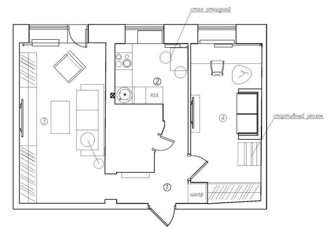
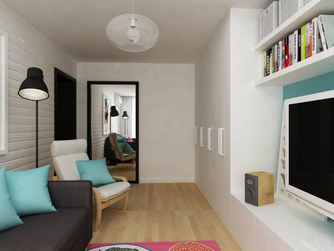 A young woman lives in this tiny apartmentmother with her five-year-old son. The client did not want to radically change the original design of the apartment, so the designers supplemented the existing layout with spectacular finishing and new furniture arrangement. The designers opted for budget materials and modules, which allowed them to save a lot of money. Almost all the furniture items, as well as accessories, were purchased in IKEA stores.
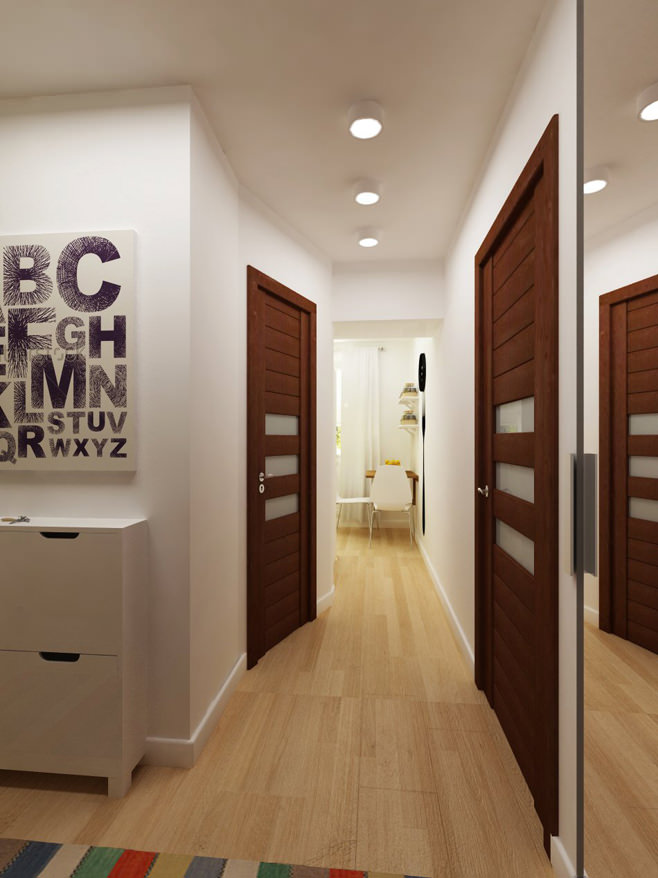 For finishing a small two-room dwellingThe predominantly white color was chosen. In the hallway, kitchen, corridor, and also in part of the children's room, the walls have a smooth light surface, and in the living area one of them is favorably distinguished by the relief appearance of painted wood.
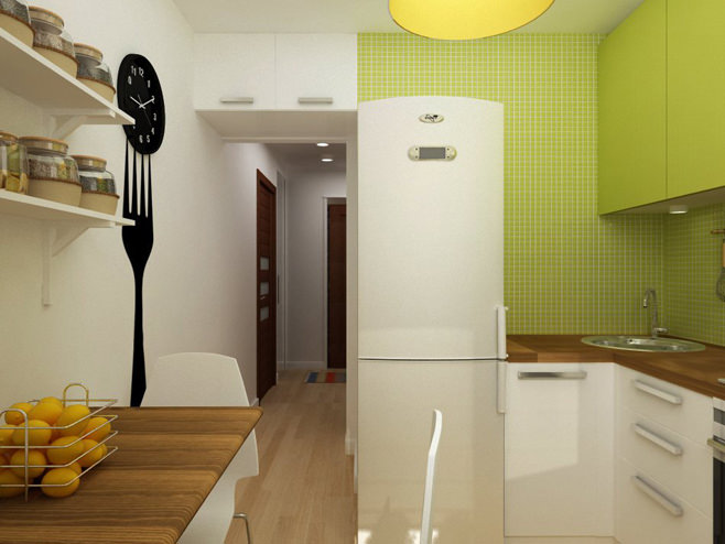
 To combine the functional zones of the apartmentone common space, it was decided to lay the same flooring in all the rooms with a noble shade of light wood. Such a skillful design technique helped to effectively highlight the elegant dark sofa against the general background, as well as achieve harmony in the interior. Thus, the neutral color of the floor goes well with the pistachio-colored kitchen, white cabinet and wooden chair in the living room. To visually increase the space and give it volume, the specialists dismantled the door to the kitchen. To hide the work area and visually separate the cooking and eating room, the designers installed a large, roomy refrigerator at the entrance. The original clock on the fork is an excellent thematic accent and perfectly lifts the mood.
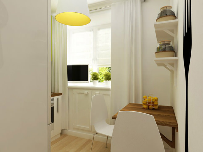
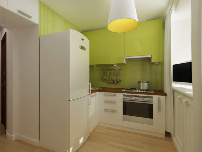
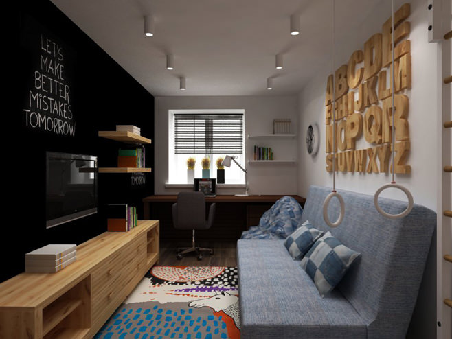
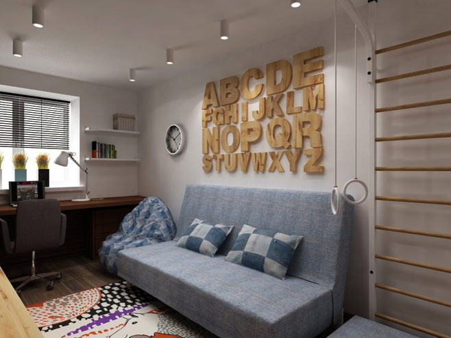
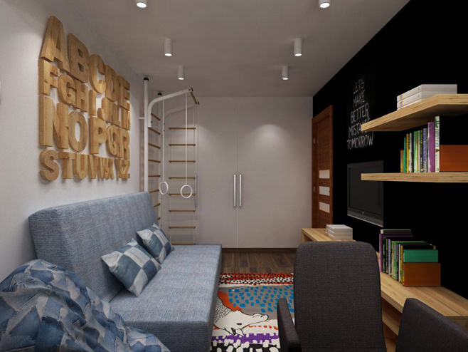
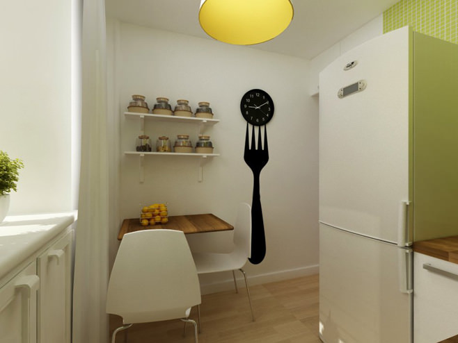 The children's area is the complete opposite of brightcolorful mom's room, as it has . One of the walls is painted black and is a functional surface on which, like on a blackboard, you can draw and erase inscriptions. Near the window there is a large desk where the boy will do his homework, and the horizontal bar will help him maintain his physical fitness. This is the interior that the owner of this room ordered, despite the fact that he is only 5 years old.

 Apartment layout
Stylish interior of a two-room apartment
