Have no idea how beautiful and functionalredesign your studio apartment? Especially for you, designer Alina Chernyshova will tell you about all the intricacies of redevelopment of a small-sized apartment and even demonstrate a good example. Today, small-sized apartments with great difficulty fit into the modern concept of comfort. But striving to place all the components of a comfortable and beautiful life in a small area, one should not forget about the safety of both the owner of the apartment and all the inhabitants of the house. Often, the desire at all costs to make a kopeck piece out of a one-room apartment leads to gross violations: demolition of load-bearing walls, dismantling of window-sill blocks, transfer of kitchen equipment to living quarters, and the like. Today designer Alina Chernyshova will tell you how to do it right. Alina Chernyshova Alina Chernyshova has been working in the field of interior decoration for more than eight years: as an editor of leading mass media about architecture and design, she shares theoretical knowledge gained in the practice of running her own projects. Alina studied art history at Moscow State University. Lomonosov, and interior design - at the school-studio "Details". She founded an accessible art workshop and her own design bureau. modbum.ru Using the example of a typical layout of a one-room apartment in a house of the P-43 series, we will consider zoning options that expand the functionality of the living space without violating the rules, building codes and legislation.  A one-room apartment in a house of the P-43 series hasone important planning feature: a storage room adjacent to the corridor. It would seem that this is a huge plus for the old housing stock. However, in the depths of the dark room there is a house duct, which takes up half of an already miniature room. It is impossible to demolish, dismantle, reduce the air duct under any circumstances! The second air duct is located quite traditionally for panel houses - in the kitchen. This "column" is also untouchable! By changing the dimensions and configuration of the air duct, homeowners harm themselves first of all, disrupting ventilation throughout the house. The third type of untouchable parts in any apartment is a sewer riser equipped inside a shaft that looks like an air duct. In the apartment of the P-43 series, it is located in a combined bathroom. The wall, conditionally dividing a one-room apartment in a house of the P-43 series into two parts, is load-bearing (marked in red on the plan), which means that it is absolutely impossible to demolish it. The only removable partition in this apartment is between the kitchen and the corridor (marked in blue on the plan above). The location of the "wet" zones is the second important point that requires special attention. On the plan (below) a living area is marked in red, a room - a kitchen and even more so bathrooms cannot be placed on this area. Blue marks the areas where kitchen equipment can be located - the kitchen itself (in terms of the developer) and the corridor. But this circumstance will not help to radically change the zoning of the apartment - such a configuration of the corridor does not allow moving the kitchen here.
 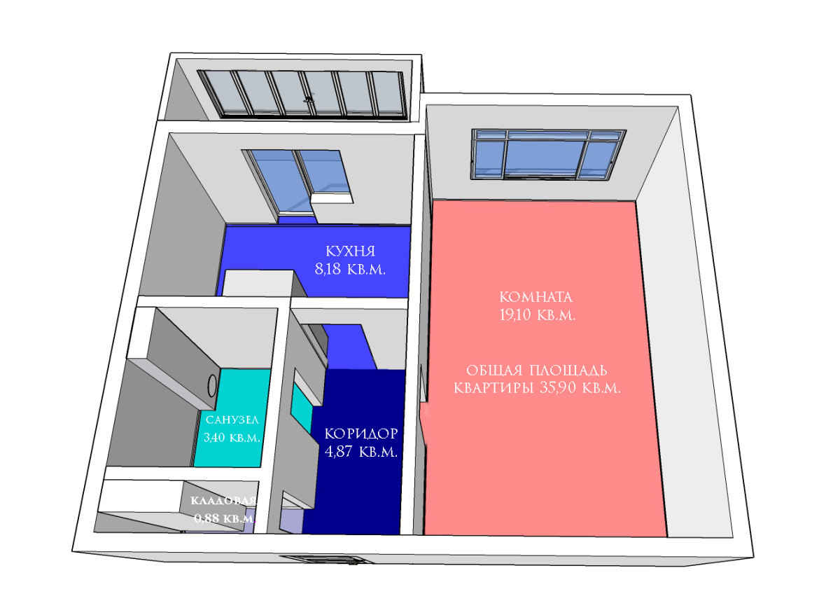 Style and color preferences - lastpoint of the design project that forms the future appearance of the apartment. Classic or hi-tech, white Scandinavian or bright modern - in this matter, everyone makes their choice. In the dispute "who is better: Mozart or Vysotsky" there is no right. Of course, apartment owners who create an interior together with a designer must, as they say, be "on the same wavelength" with the author of their future interior. The task of the designer is not to guess what exactly you love, but to listen carefully, asking the right questions in advance, and reflect your lifestyle within the framework of a separate layout. Alina Chernyshova, designer Option 1. Neoclassicism for a lark This zoning option was created for a young married couple who are planning to have children in the next five years. The prospect of becoming parents coincides with the dream of buying (by that time) housing of a larger area, so it's too early to do a full-fledged children's territory, but now parents come to the newlyweds, guests often stay until the morning, which means that the only room should also have a full-fledged double bed (for the hosts) and a fold-out sofa (for guests).
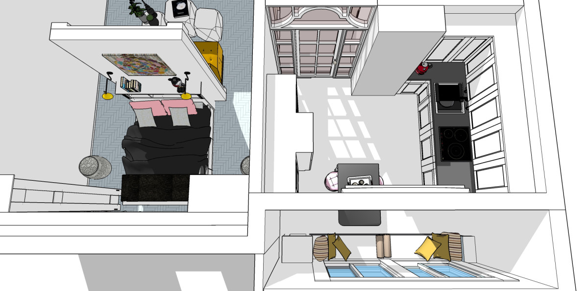
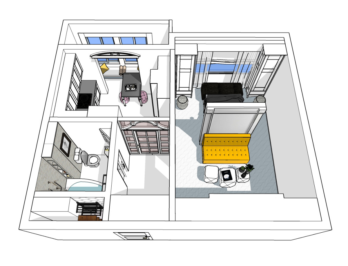
 The bed is turned to the window: waking up with the first rays of the sun - a great joy for the "lark". "Back" to the bed (through the newly erected partition) is the living room area. Separation of a single and not too large room into two parts increases its functionality, but "eats" space. Visually correct the situation will help several tricks: three mobile coffee tables can be made of a transparent material, a sofa is better to choose without armrests and bright contrasting upholstery. So we fill the room with air and light.
 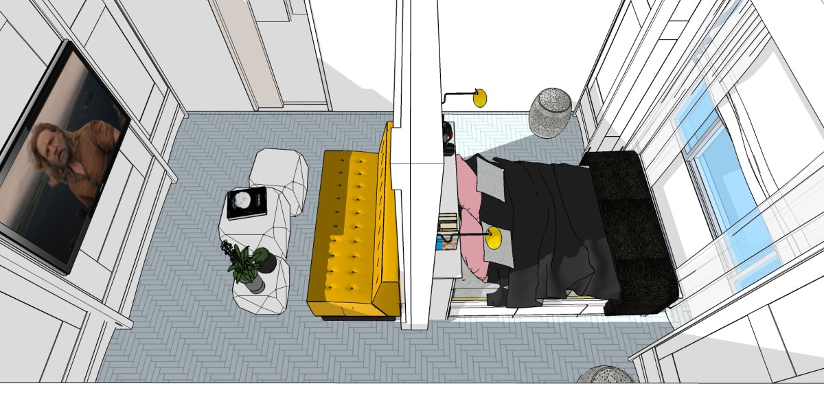 The play of light and shadow is supported by a glass dooropening in an openwork crate. It solves several problems at once: it functionally separates the kitchen from the corridor, while not clamping the room into frames, allowing sunlight to freely enter the room. The area of the kitchen has been increased due to the addition of a loggia. The dining table is located right on the window sill. The entire space of the loggia is like a garden gazebo, where you can sit comfortably on the pillows and have breakfast even while lying down. The refrigerator is built into the central part of the T-shaped furniture group at the wall opposite to the slab. An L-shaped mirror cabinet is mounted in the corridor near the front door - it is deliberately made in a minimalist style so as not to visually argue with such a spectacular glass doorway, but only to reflect the light.
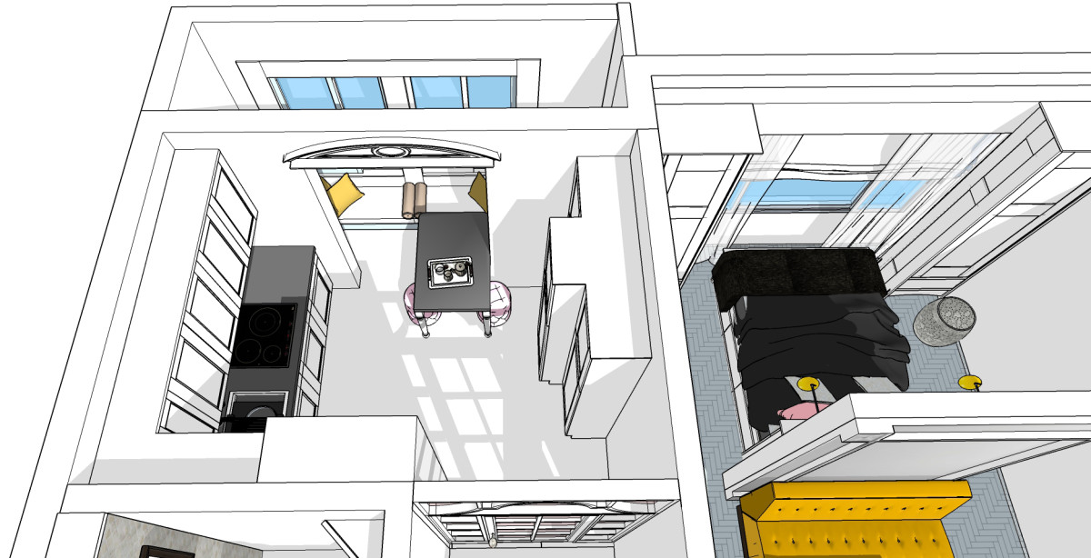
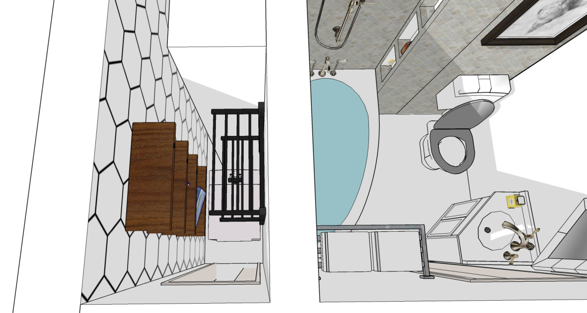
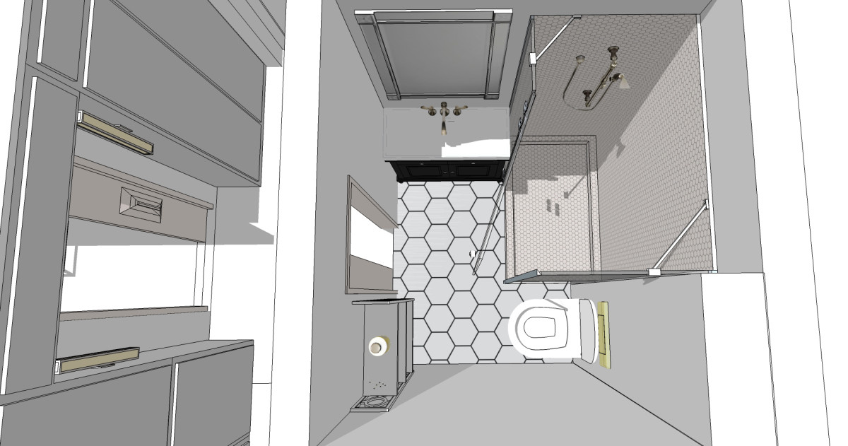
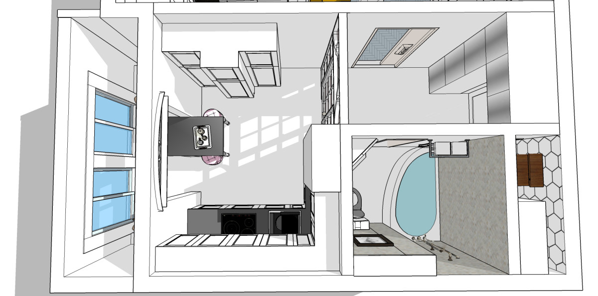 The bathroom is designed in a classic style.The originally combined bathroom in the new layout includes a bathtub - the "drop" model, the shape of which saves space, without depriving the pleasure of pleasant procedures. A corner cabinet with a sink and a corner mirror are also designed to use space efficiently and ergonomically. Such a utilitarian object as a toilet is placed in the same way as it was originally intended by the developer. It is impossible to change its position in the existing conditions: the sewer drain is located above the floor in the riser shaft, too thin walls and a low ceiling do not allow pulling communications anywhere. The "column" of the riser is increased along the wall towards the "drop" bath. A line is intentionally left in the sketch, from which the hidden side shelves begin. In real performance, of course, the structure merges together without any seams. At the same time, bottle jars, shampoos are hidden from prying eyes, and the bathroom is always clean and tidy. The pantry room, which we mentioned at the very beginning, talking about the atypical location of the common house duct, is now equipped with a laundry. A washing machine is installed here: the top-loading model fits perfectly into the dimensions of the room. Electric heated towel rails are installed above the machine: two models with a shelf - for quick drying of a large number of things.
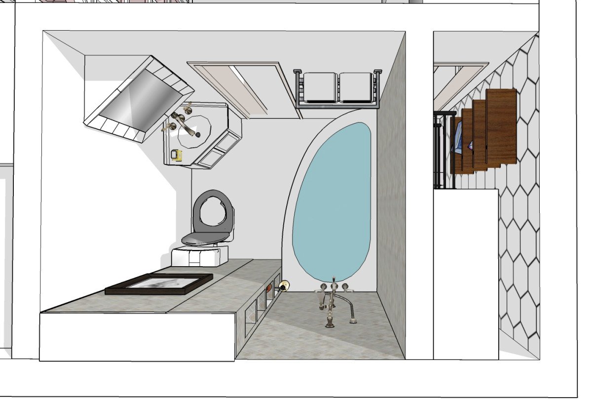
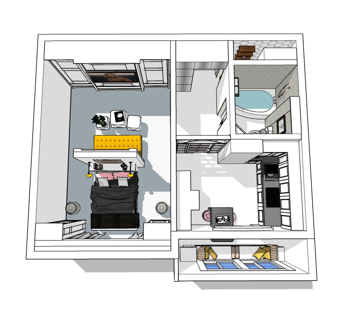
 Option 2.Vertical and geometry Panoramic glazing of the balcony was the starting point for this layout option. Vertical floor-to-ceiling windows open up an almost limitless view of the stunning view from the window, which is a pleasant bonus for the owners of the apartment. The window sill in the kitchen is equipped with a seating area at the table, the height of which allows you to install two bar stools facing the window.
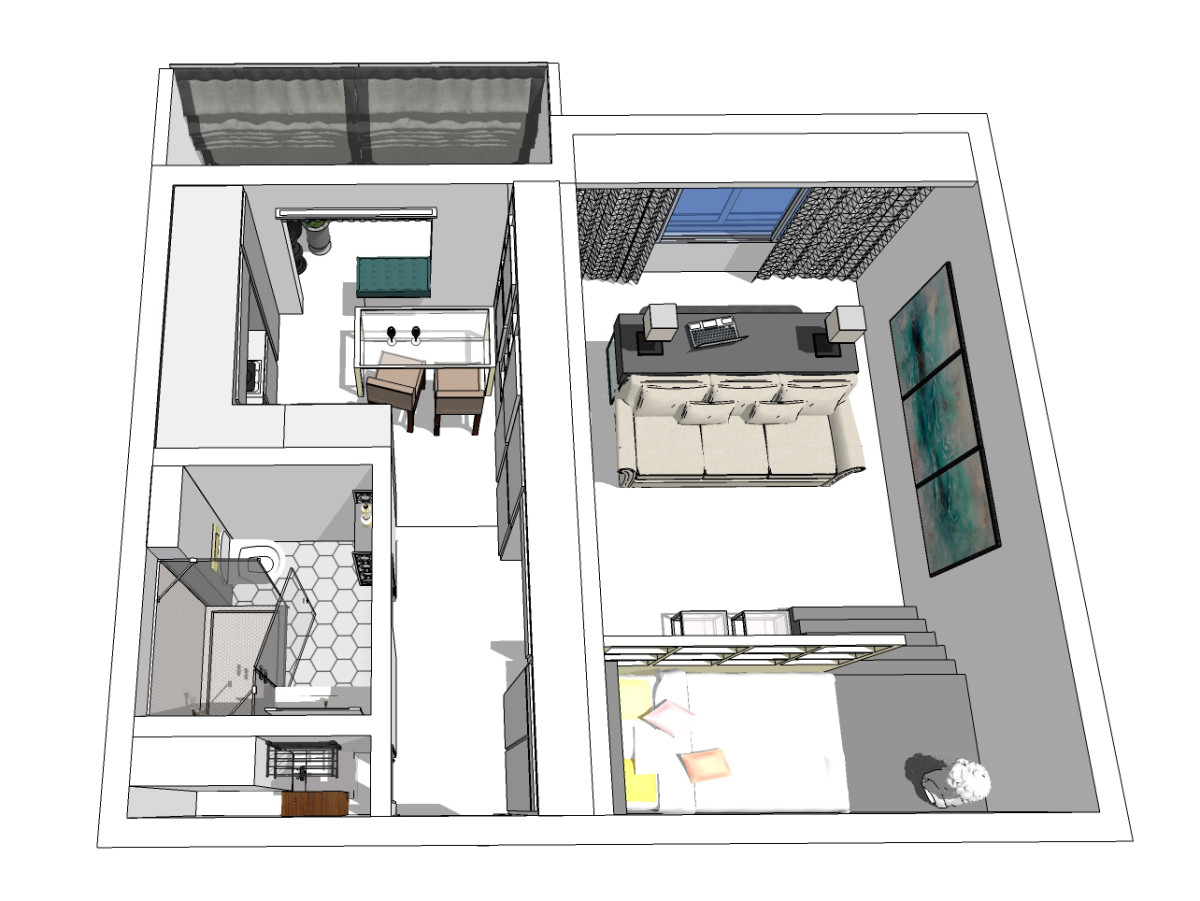
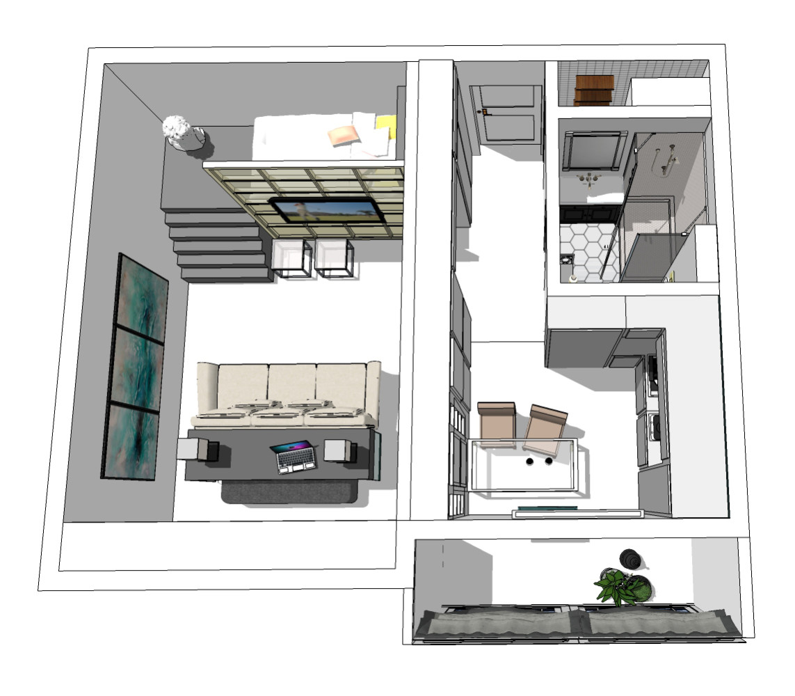 Between the kitchen and the corridor there are nopartition, and door. Initially, the theme of geometry is read in a long, enfilade-like passage that pierces the apartment. Along the whole wall, from the front door to the kitchen window, a cupboard is built, its facades also specify a straight-line dynamics. The door with the door to the room is organically inscribed between the blocks of the cabinet.
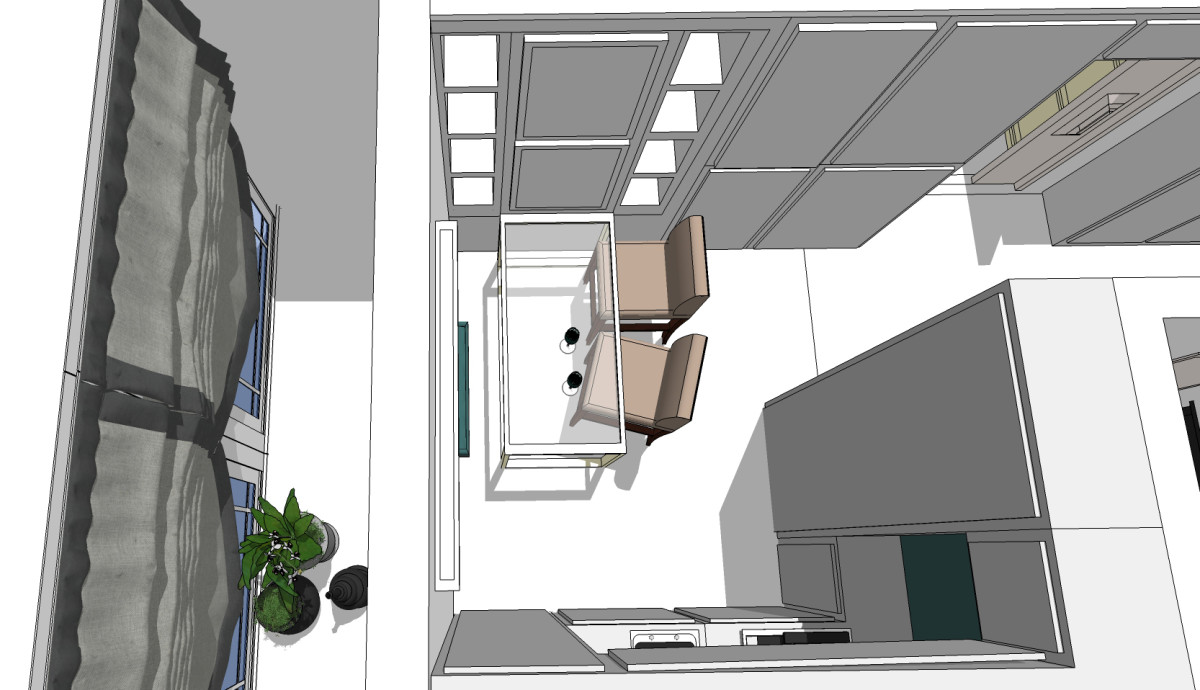

 The air duct in the kitchen is painted in the color of the headset anddecorated with a rectangular panel - in order to integrate it into a large-scale furniture group in this part of the apartment. All cabinets are mounted from floor to ceiling - this technique will visually increase the height of the room. The layout of the only room has been decided on "two levels". The sleeping place is raised to a very high podium. With a total height of the walls of 2.7 meters, this structure, of course, cannot be called a full-fledged attic, and even more so "the second floor". But such a technique will allow not only to zone the space, but also to become an adornment of the entire interior. In addition, storage boxes are planned in this podium, under the bed. The steps are also equipped with pull-out compartments. In the center of the newly erected "wall" facing away from the bedroom, a TV is fixed. There are two transparent coffee tables on the floor that slide easily into the sofa. And behind the sofa there is a console table with a pull-out long pouf. This furniture group creates the effect of a home office. On both sides, along the walls, there is a free passage through the entire room to the window.
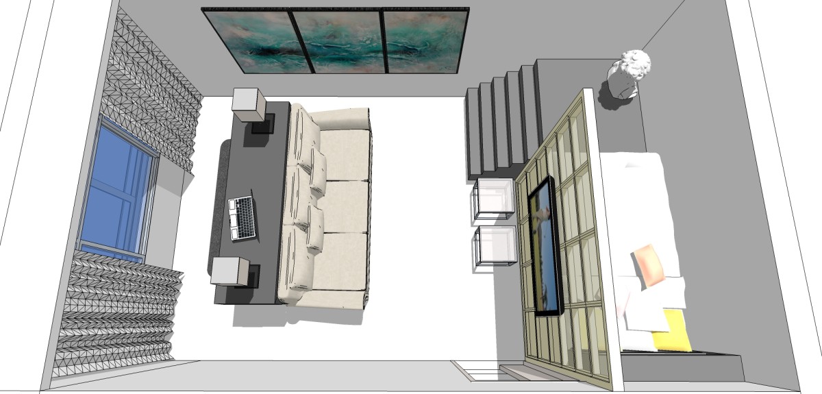
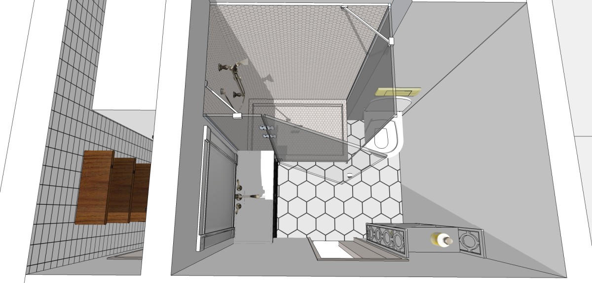
 Combined (initially according to the developer's project)the bathroom is equipped with a transparent glass shower. This technique fits very well into the vertical geometric theme of apartment decoration. A suspended toilet bowl is mounted on a sewer shaft box, the dimensions of which have been increased inside the room for concealed installation of the installation system. The layout of the storage room, which has been converted into a laundry, completely repeats the solution given in the first version.
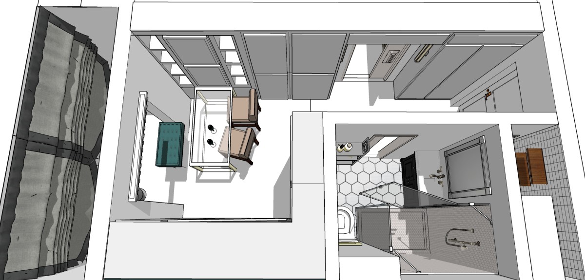
 We thank the talented designer Alina Chernyshovafor the provided sketches (I must say that she performed them herself) and a detailed story about how to properly reschedule a one-room apartment. We hope that you will find the advice of a specialist useful. Live comfortably! And be together with etk-fashion.com.
Two options for replanning a typical odnushki: ready-made solutions from the designer - etk-fashion.com