 Work as an architect and interior designerIn the city of St. Petersburg, this is a noble occupation, but quite difficult. It is necessary to take into account the historical value of the buildings, which often contain apartments that were formerly communal apartments. The layout of these residential premises is non-standard, and the climate of this area does not have the best effect on the preservation of the objects. But designer Ekaterina Chernova managed to create a project that is perfect for a young married couple. Look how she was able to advantageously emphasize some details: windows and amazingly beautiful brickwork, which the owners inherited. Katya Chernova graduated with honors from the Department of Architecture and Urban Development of the State University. She did not stop there and entered the St. Petersburg Institute of Painting named after I. E. Repin.
 And for about 6 years now she has been specializing indesign of country houses, remodeling of apartments, offices and beauty salons. Katerina set about fulfilling the new task set before her. It was an apartment located in an old house with a unique history. It was built by the famous architect Karl Brant in the middle of the 18th century for personal use. After that, the house was given over to Maria Petipa's dance school, and only then the utility workers divided the premises into many small separate living rooms. After the distribution, a one-room apartment of 50 square meters with ceilings about 3 meters high went to a young couple, but the condition was simply terrible, and it was impossible to live in it without major repairs. The apartment is on the first floor, and even despite 4 windows, it has too little natural light.
Assigned tasks
At first it seemed that the demands put forward toproject for this space, it is impossible to implement. The clients wanted to have a separate bedroom, a comfortable dressing room, an office, a living room for hosting noisy events, a cozy corner for overnight guests, a laundry room and an entrance hall.
Remodeling
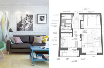
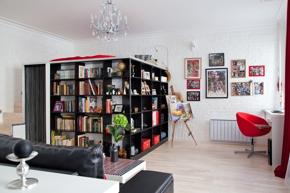
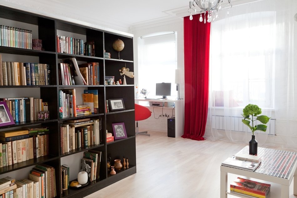
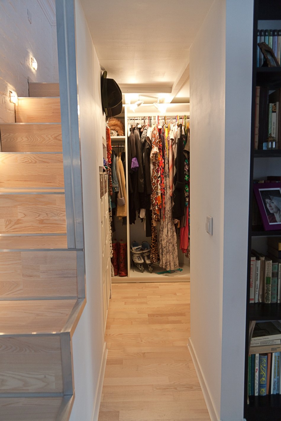
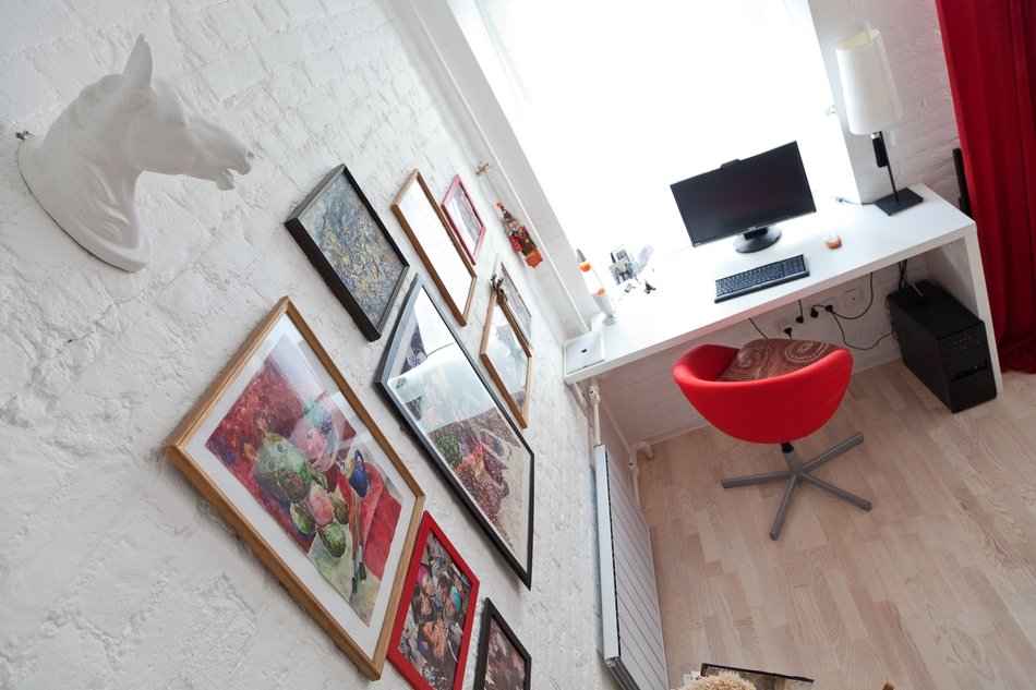
It's very good that there are no load-bearing walls in the apartment,Therefore, all the partitions were demolished. It was possible to revise the entire room to make it the way the customers wanted to see it. After much deliberation, it was decided to create a second level, you can’t call it a floor, since the height is only about a meter, but it is quite enough for a sleeping place. A dressing room was located under it. Thanks to the most rational use of this space, it was possible to create spacious wardrobes and drawers. But on the outside, the dressing room was equipped with bookcases, which accommodated a significant size library of the clients. A work table was placed instead of a window sill. As for the kitchen, it is small, but, nevertheless, it was possible to fit everything necessary in it. The dining table was perfectly replaced by a bar counter. With the help of a false column, it was possible to separate the space at the entrance from the main room, behind it they put a coat rack. The bathroom was made joint in order to allocate a little space for a pantry. It accommodated things that look unpresentable, but are needed in everyday life.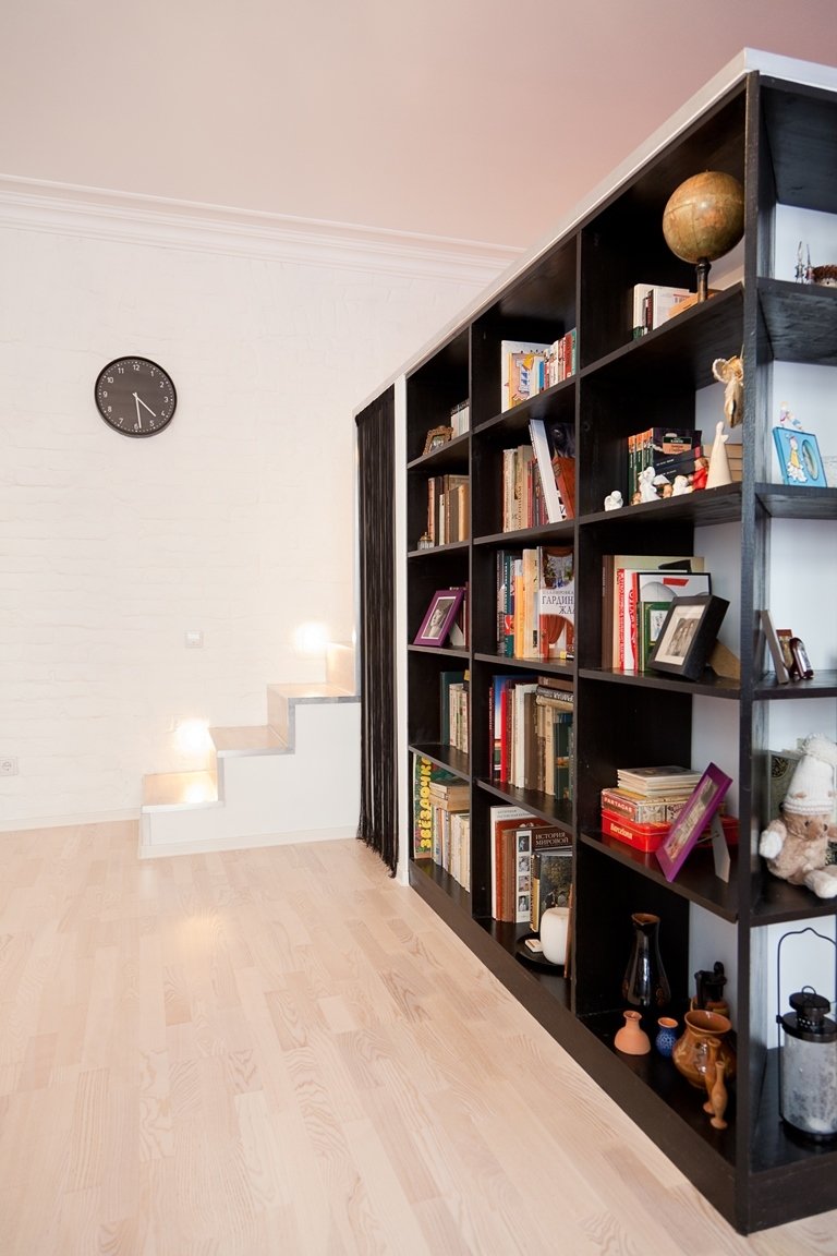
Style Selection
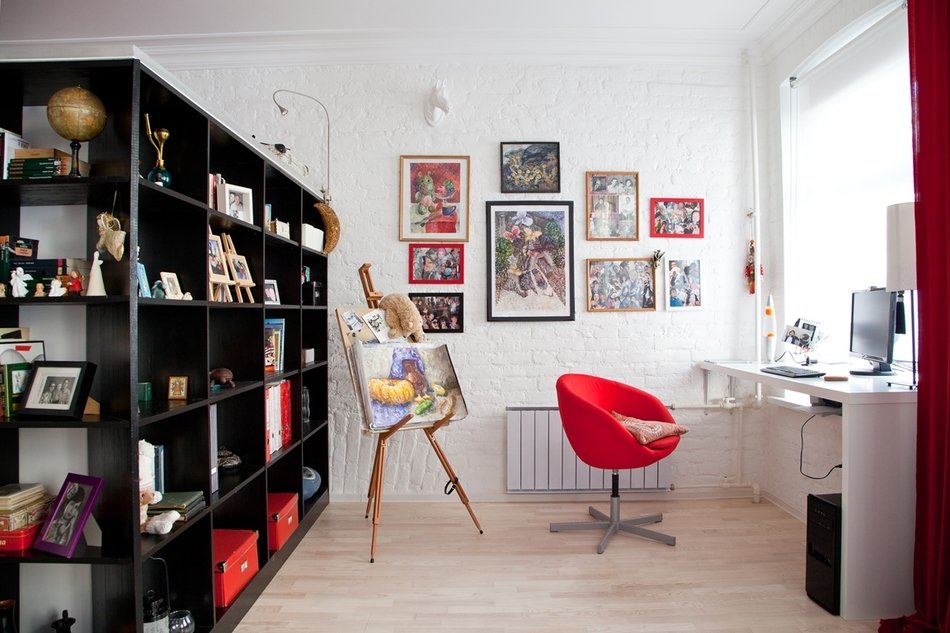
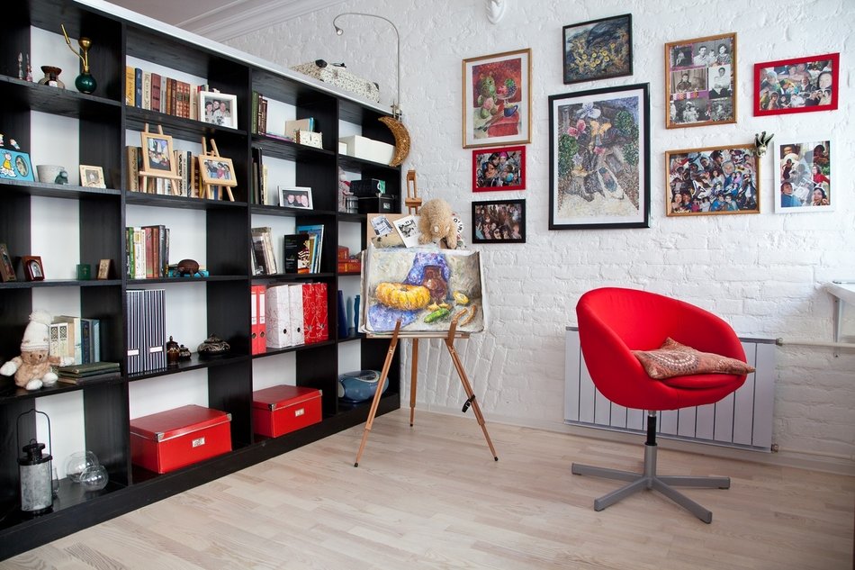
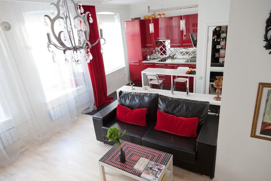
As Katerina admitted, she became very close toI liked the idea of a loft after watching the movie "Interview", where the main character's apartment was in this style. The designer believes that the entire space should be as open as possible and is perfect for a young family without children. The author loves to combine seemingly incompatible details in one room. Thus, this design features not quite even brickwork, which was painted in a delicate light tone, heavy curtains made of rich red velvet and a large number of glossy surfaces that create many broken reflections. The dark-toned shabby ceramic tiles are in amazing harmony with the natural-colored wooden parquet board, but the bathroom is lined with tiles that imitate the rough surface of metal, with a slight hint of a golden-hued mosaic.
Choosing furniture
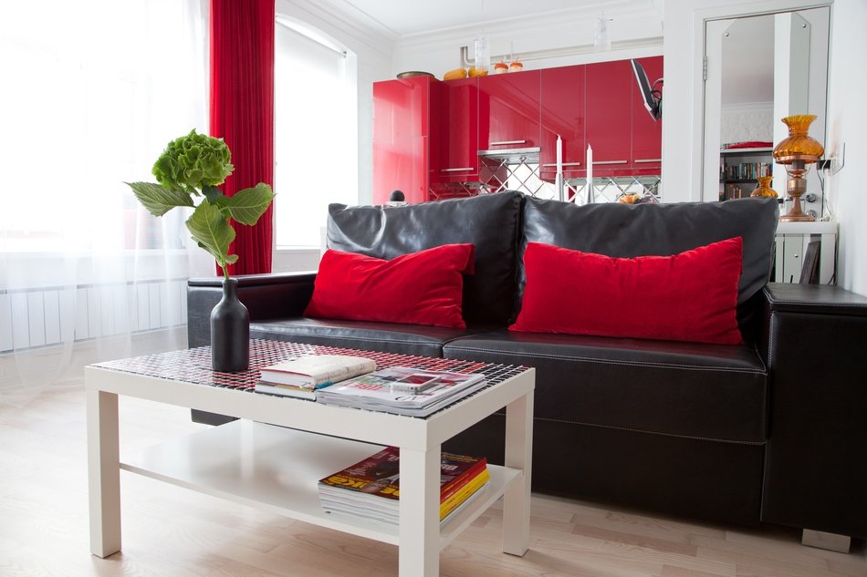
Due to the fact that the deadlines were quite tight,Most of the kitchen furniture was bought at IKEA. All the other furniture was made to a special design by good manufacturers in St. Petersburg. Some details had to be finished ourselves, for example, the tabletop of the coffee table. Now it is laid out with mosaic, the color of which matches perfectly with the other elements of the interior.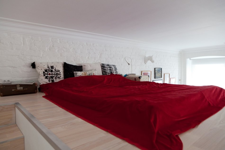
Shades
To make the room appear overloaded, the wallsdecided to paint it snow-white, which went well with the light floor. The dark color of the bookshelves draws the eye to them, but due to the fact that most of the shelves in the room are open, they do not seem heavy. A few juicy accents were also added. The harmony of white and black, and a few bright shades is a feature of the loft.
Lighting
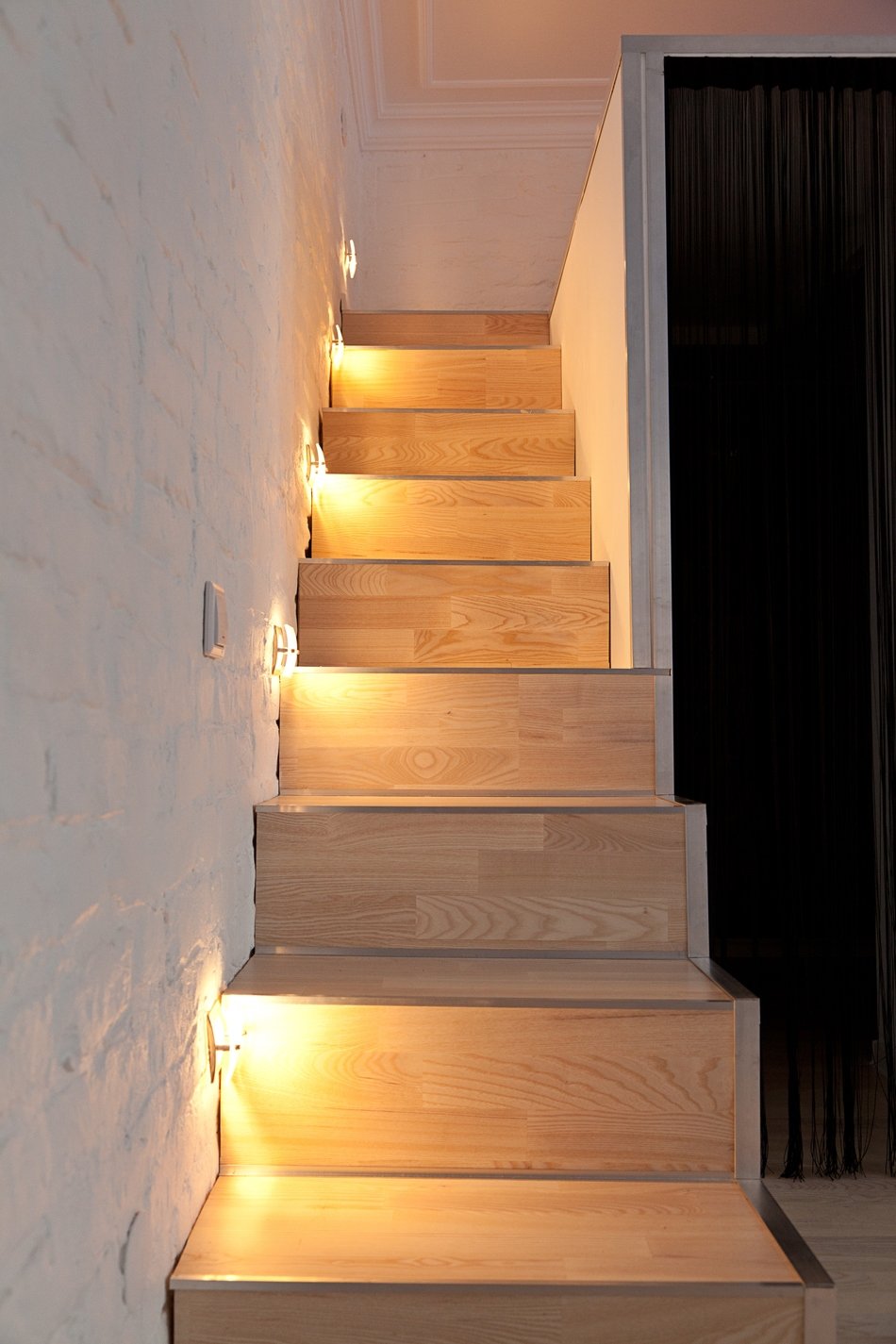
As for lighting, there is some in the apartment.saturated. In addition to its main purpose, it was also supposed to emphasize the zoning. In the kitchen, additional lamps were hung above the bar counter, in the living room - a chandelier of amazing beauty. The staircase was equipped with its own lighting, many spotlights were installed.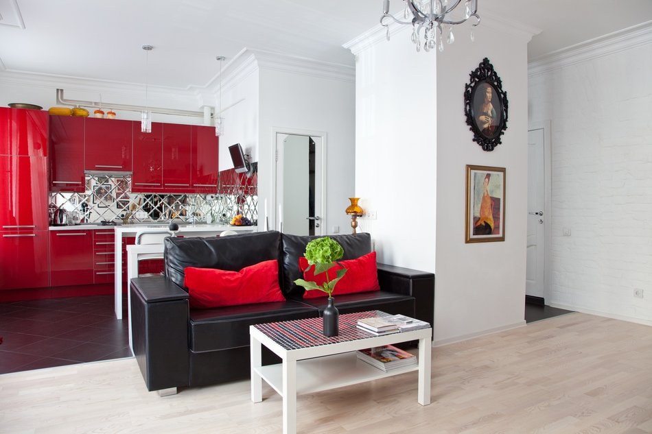
The main techniques to help increase the space
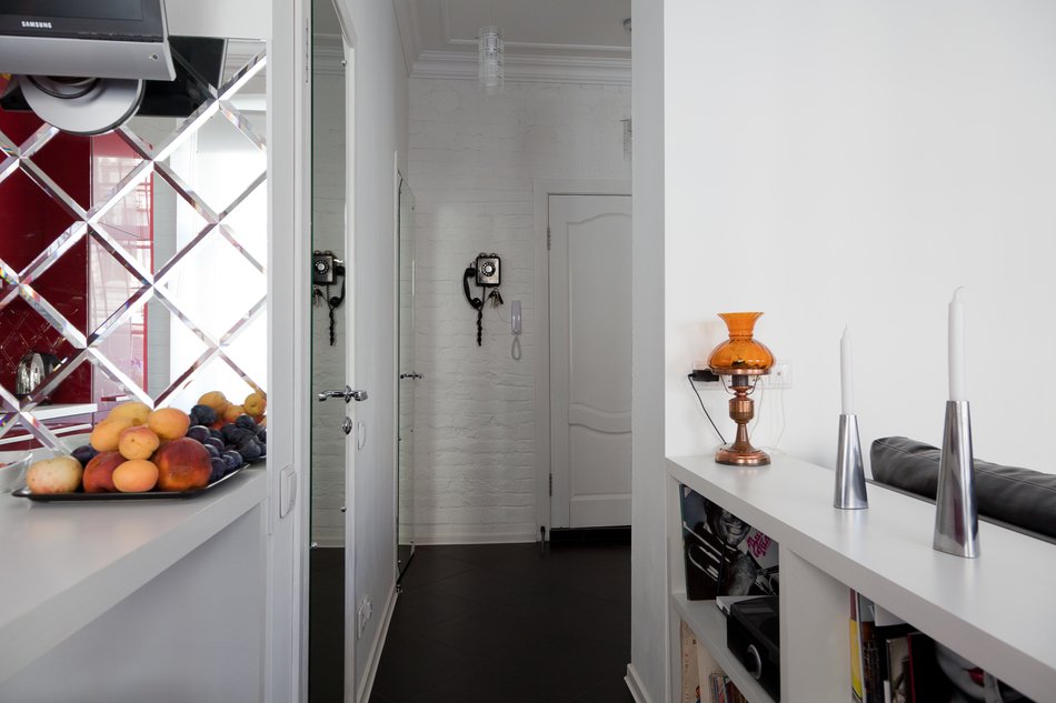
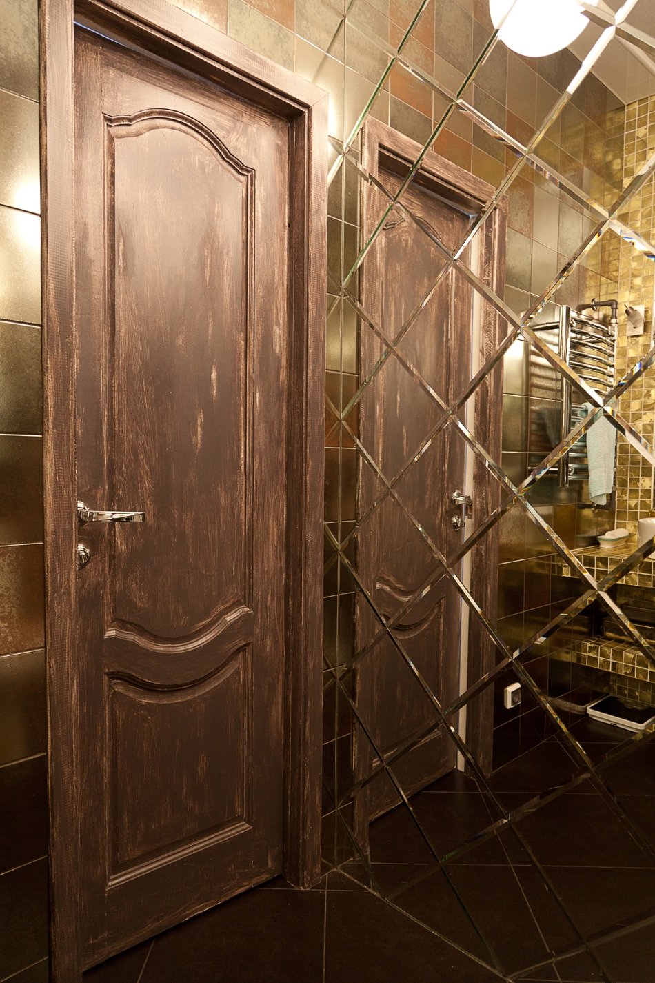
Despite the fact that the apartment was overcrowdedfunctional areas, it had to be light and spacious. The best way to solve this problem was to use mirrors, which help add volume and lightness. Thus, mirror tiles, door panel overlays and many glossy surfaces appeared in the house. Also, many mirrors of different shapes and sizes were hung throughout the apartment: an apron in the kitchen, a wall in the bathroom, decorative elements on a false column.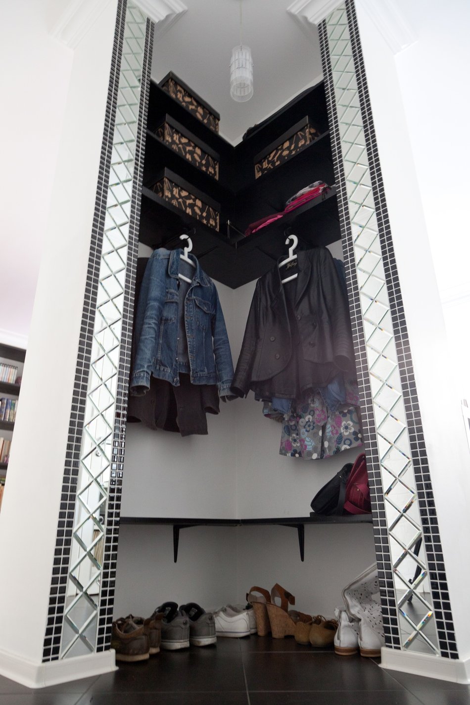

Complex moments
From the artist Brant, clients inheritedamazingly beautiful ceiling moldings that no one wanted to touch. But because all the partitions had to be demolished, it was not possible to save them, so the designers used moldings.
My pride
The most important thing in the work of any designer islisten to the client, try to learn about his priorities and life features. You need to know what comfort and convenience mean to him. Only by taking into account all his wishes, you can create a surprisingly pleasant and cozy design. At the same time, you should not be afraid to offer your new unusual ideas. If they are interesting, clients often accept them.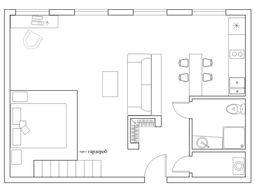
Advice from an architect
- Never be afraid of experiments, especially with colors and textures. The most incredible combinations in the end can give an incredible effect.
- If you want to create a second tier in your apartment, first make sure that you have enough space for it and it is completely safe.
- Equip, as in this project, the steps of the stairs with an illumination that can work all night.
