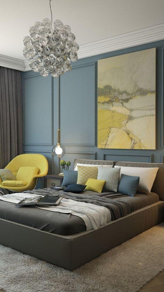
We have already studied five of the ten most fashionableshades of 2017 according to Pantone. There are blues, greens, reds and pastels in this palette, but there is only one yellow. And exactly how to use it in the interior, we will talk today Primrose Yellow, or "Yellow Primrose" - this is a shade of soft sunlight, spring, freshness and joyful mood. Primrose Yellow is warm, not too bright, looks quite neutral and goes well with both warm and cold shades. Such an optimistic color can transform and refresh any interior. But how exactly to do this, interior designer Natalya Chernichkova will tell us. Related articles Natalya Chernichkova, BerryConceptDesign In 2011, she graduated from the Faculty of Psychology, Moscow State University. MV Lomonosov with a degree in ergonomics. In 2013, she graduated from the International School of Design, and also completed refresher courses in interior design at the British School of Design. In 2015, she opened her interior design studio BerryConceptDesign, which offers a full range of services for the creation and implementation of interior design for residential and public premises. - In my opinion, Primrose Yellow combines perfectly with all shades of blue and gray palette, for example, with the sky blue color from the Pantone Island Paradise palette. In this combination, one of the colors can be dominant, the second accent. Do not forget to introduce a third neutral shade into such a color scheme (all shades of gray, white, beige) so that the interior does not cause feelings of satiety. Of course, the color "Yellow Primrose" attracts attention, so it makes sense to use it in those areas that should be looked at, for example, in textiles, niches with art objects, doors. 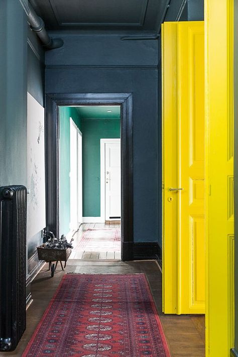

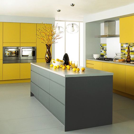
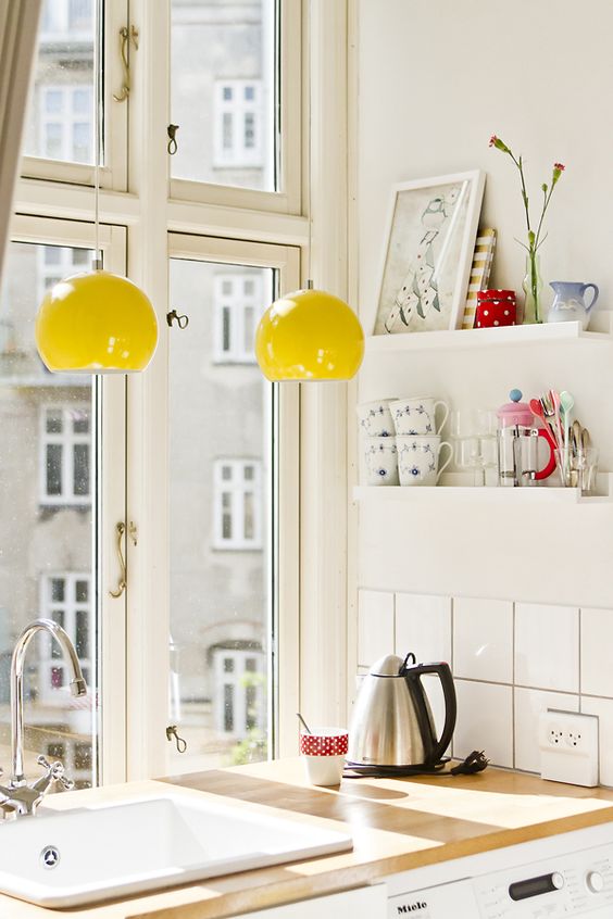
 Until recently, Primrose Yellow was loveduse in kitchens: all shades of yellow are believed to increase appetite. It seems to me that if you want yellow in the kitchen, then it is better to adhere to the rule of the classic triad, that is, to build the color scheme of the interior from 2-3 shades. For example, if you completely make your kitchen furniture in the color Primrose Yellow, then the walls and other furniture should be fairly neutral shades. Textured wooden surfaces or monochromatic natural stone will perfectly complement such an interior. Another option is to use Primrose Yellow locally, for example on a backsplash, in lamps, or to contrast one of the walls.
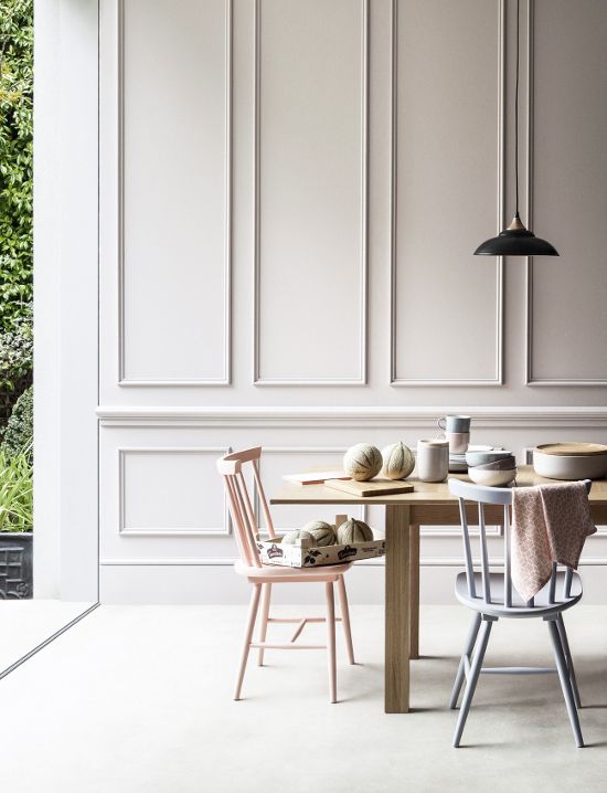
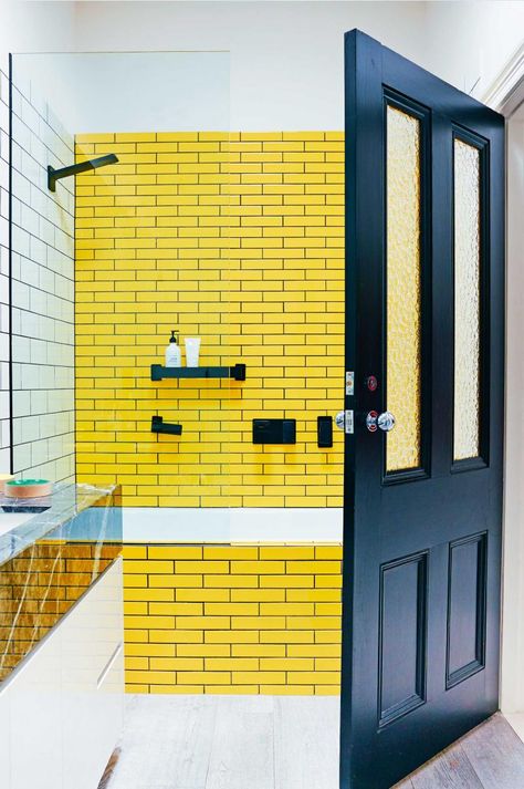
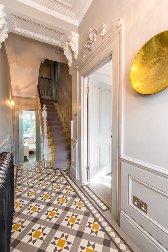
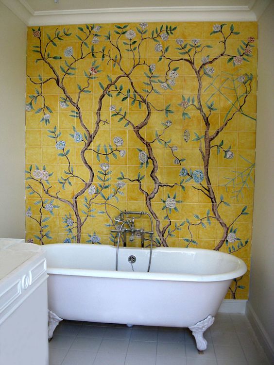
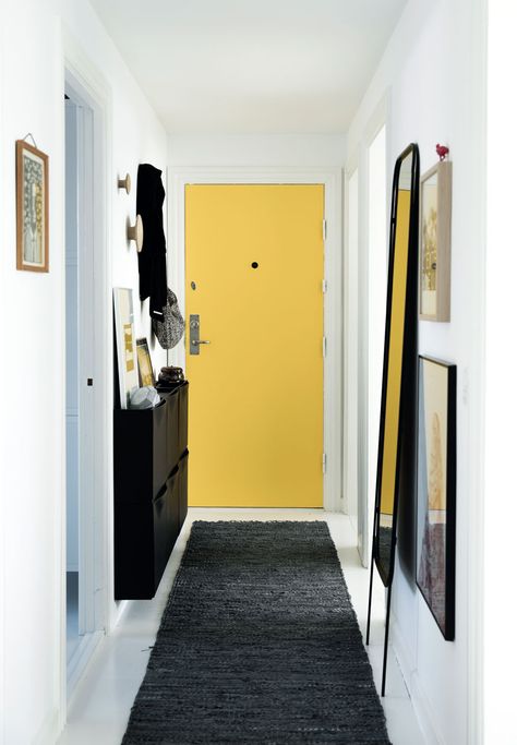
 The shade "Primrose Yellow" is ideal forhallways, bathrooms and small rooms without windows. Such a radiant shade will make up for the lack of sunlight. Here you should not limit your imagination, you can safely experiment with pieces of furniture, decor and walls. In the bathroom, a bold solution would be a combination of yellow and contrasting dark gray or black colors. The combination of yellow primrose tiles and white tiles, simple and geometric, will be more versatile and calm.
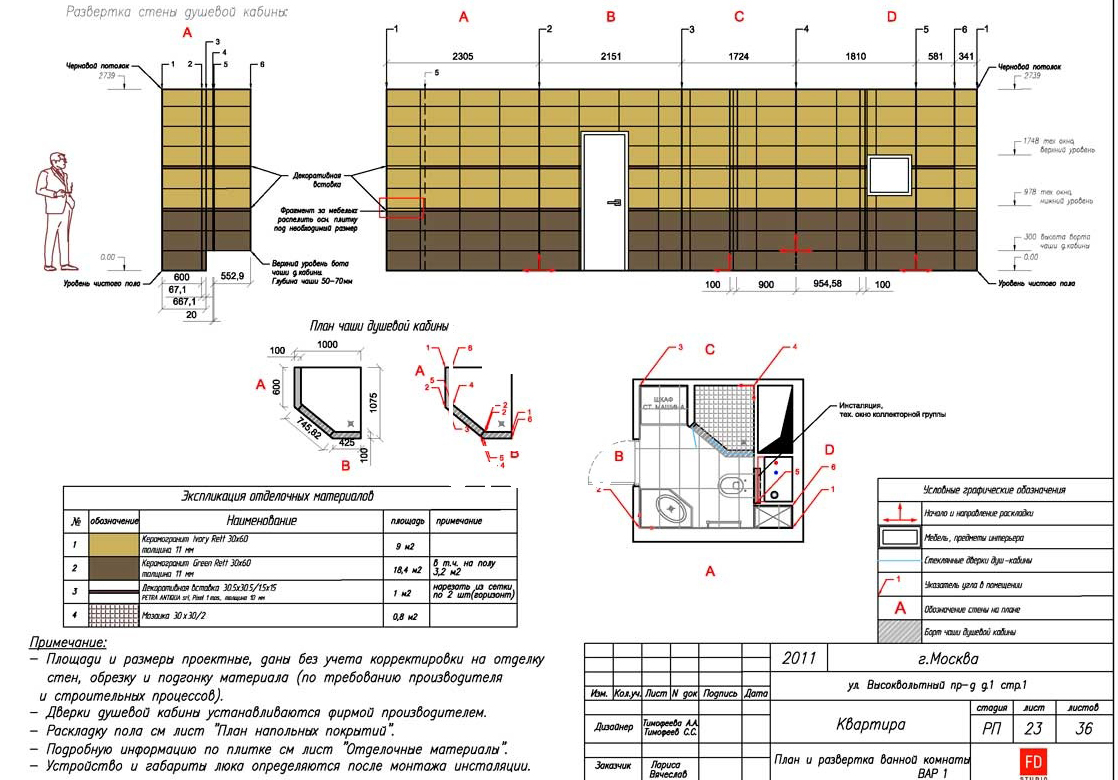
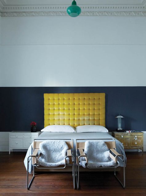
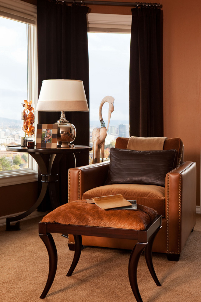
 But in the living areas, the bedroom and the living room, I wouldadvised to use the shade "Yellow Primrose" in moderation. Too much of this color can be tiring and interfere with proper rest. In residential premises, Primrose Yellow will look perfect in textiles, decor items and small interior items, such as poufs, armchairs, vases of flowers, lamps. The monochromaticity of any interior can be diluted with this warm, fresh shade. In any calm interior, pillows or a blanket in Yellow Primula will attract attention. Indeed, one bright element is sometimes enough to completely change the perception of a room. Related Articles
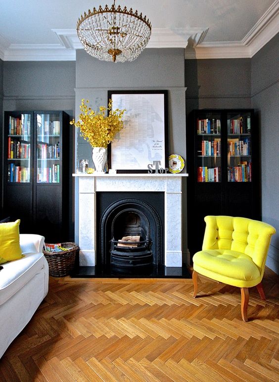
Color in the interior: trendy Primrose Yellow, or "Yellow Primrose"


