 Today we will introduce readers toa stunning project that transforms a nondescript kitchen into a stylish peninsula. When architect Stephanie Horowitz and her husband moved into a new home in Boston, they were expecting their first child. The couple were eager to make some changes to create a safe and functional home for their growing family. They replaced flooring throughout the home and renovated the small kitchen using VOC-free paints. Stephanie Horowitz, who moved from a cramped city apartment, had a clear vision of how to make the small space practical and efficient. The kitchen also had to blend in with the surrounding living space. And she certainly succeeded: now a large peninsula creates a seamless transition between the rooms.
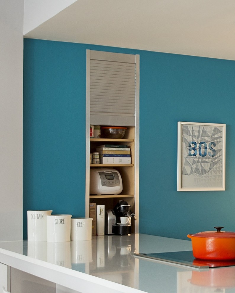
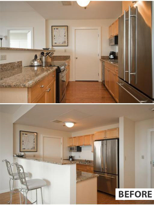 Before renovation it was used as a tablepartition with a countertop. However, it was too small and inconvenient. The central wall of the kitchen was occupied by a door leading to the laundry room-pantry. The first change that Horowitz, a designer at ZeroEnergy Design, made was a redesign of the room: the door to the laundry room was moved, since it disrupted the flow of the room. After the renovation, the entrance to it became accessible through the bathroom. More functional kitchen cabinetry was installed, including deep lower cabinets and upper drawers almost to the ceiling. Thanks to this approach, the usable area doubled. Rational storage systems were organized. The new built-in cabinet-garage holds a large number of dishes, as well as small household appliances, kitchen utensils and cookbooks. Note that the appliances are built flush with the kitchen front. This is an important subtlety that makes the look of the set streamlined.
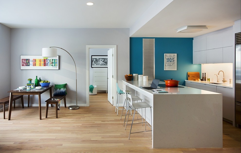
 In addition to its functional qualities, kitchenThe area harmonizes perfectly with the open dining room. The unified style solution creates the image of a single space. To avoid the kitchen furniture from being conspicuous, it was visually relegated to the background by creating clean lines of cabinets and countertops. The previous half-wall was replaced by a wider peninsula. It delimits the space and creates a smooth transition between the kitchen and dining room. The popular bright blue color on one wall sets the color scheme of the interior. Along the peninsula, on its outer side, there is enough space to put three chairs. On the left, there is a wine cabinet with shelves for dishes. The wide peninsula also features a large work surface. Here you can have a snack or work on a laptop.
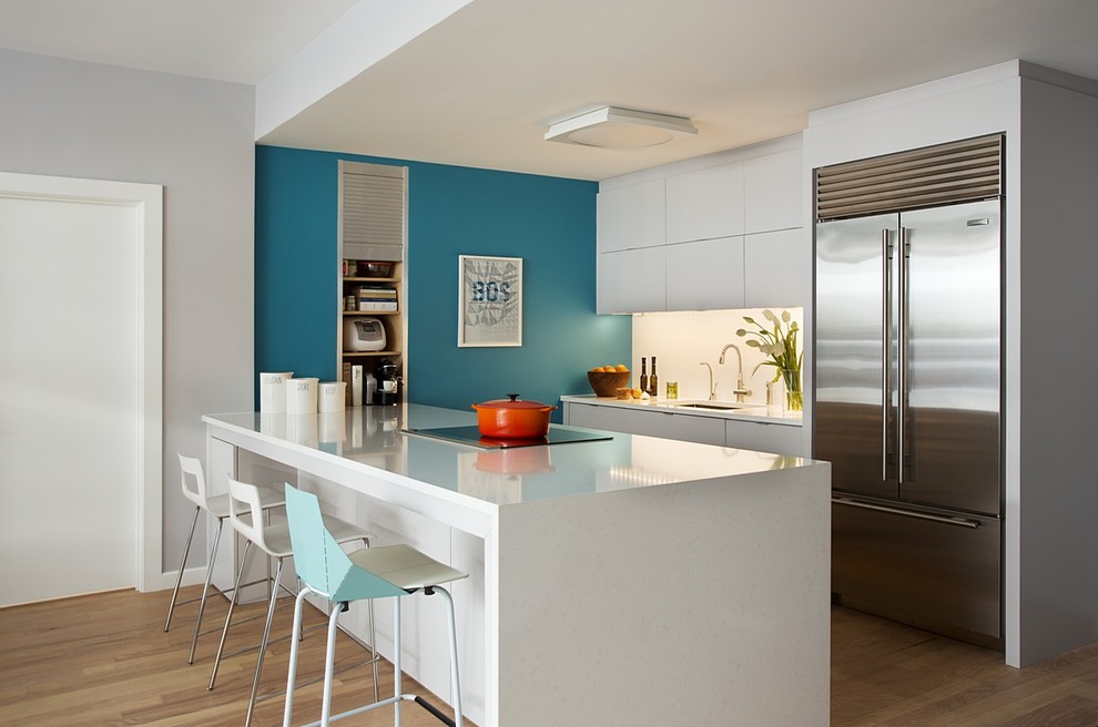 As an architect, the owner of the house was not afraiduse elements of the laboratory style, although it was the first time I used them. The countertop and kitchen island are made of quartz stone (Organic White Caesarstone). This surface is easy to clean and simple to use. The plugs for electrical outlets are hidden under the upper drawers. LED lighting makes the room brighter and more airy. In the design of this kitchen, everything is taken into account and provided for the comfort of the owners. For example, the blender, which they use daily, stands on the countertop and is always at hand. In the former apartment of the couple, this was impossible to do, since the upper cabinets hung too low.
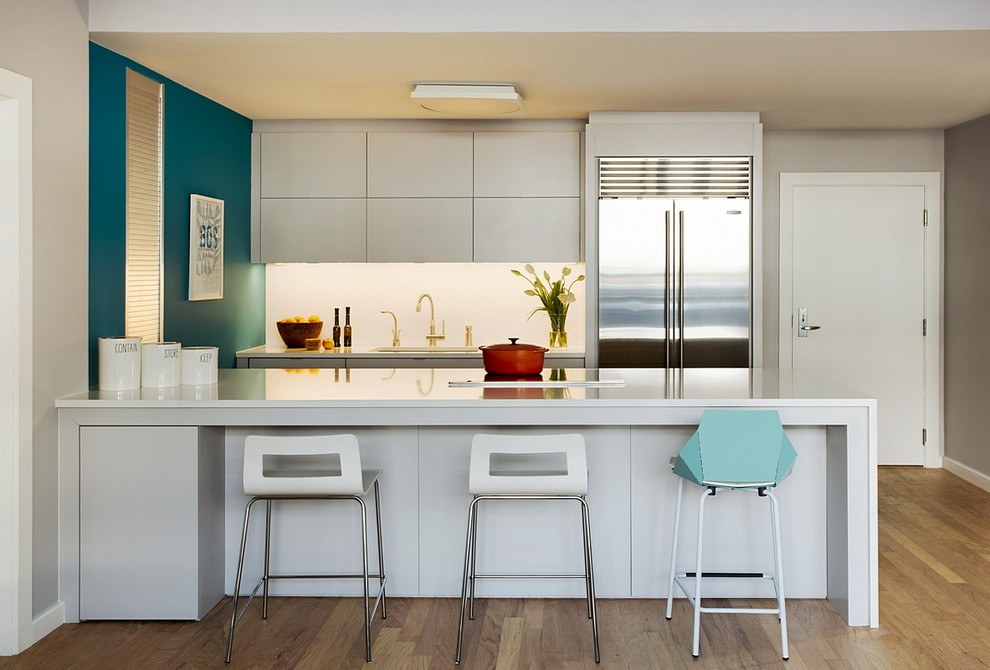 Stylish kitchen furniture, apron, countertops andPart of the walls are kept in a single white color, which visually increases the space. Instead of an exhaust pipe, an umbrella with a lower draft is used. When there is no need for it, the umbrella is hidden under the tabletop.
 The microwave oven is built in such a way thatit is hidden from view. Above it is a deep cabinet-garage, in which small household appliances and cookbooks are stored. This allowed to free up the countertop and maintain a neat view from the dining-living room. The accent on the blue wall is created by a niche with a drop-down door located in it.
Competent reconstruction of a small kitchen - photos and comments
