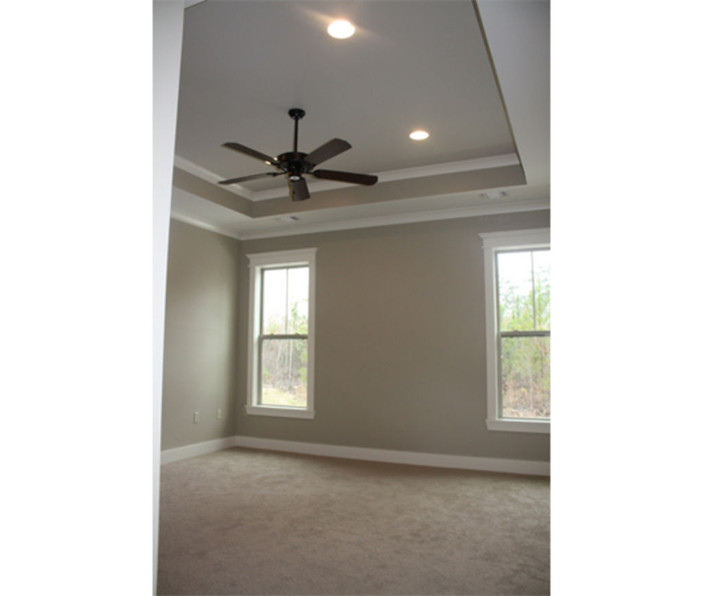
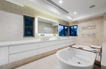
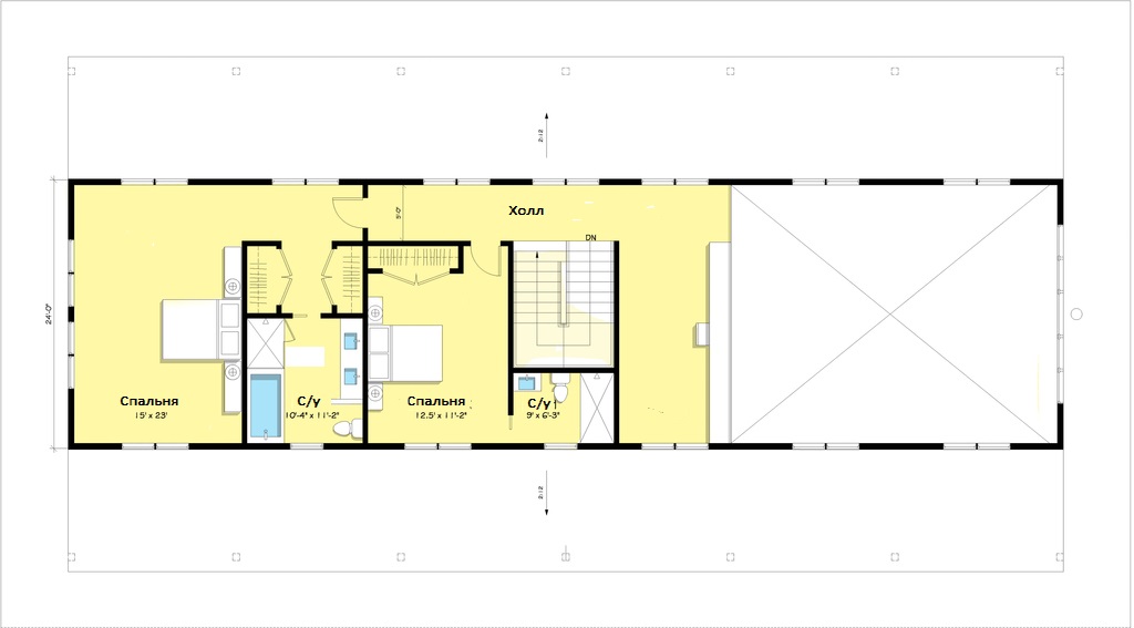
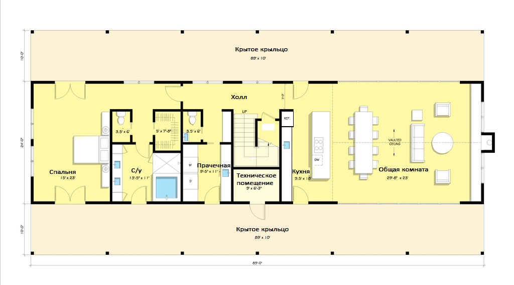
You don't always come across houses that are the samecharming from the outside and inside. Designer Alexey Shesterikov and I tried to figure out what’s wrong with this seemingly nice house. The house’s exterior is beautiful — a typical village building with a certain amount of charm and coziness. One floor, a charming porch, and siding on the facade — everything is very simple and practical at the same time. The use of siding has a lot of advantages, from aesthetic appeal to characteristics such as increased strength, fire safety, frost resistance, and resistance to ultraviolet radiation and adverse climatic influences. Alexey Shesterikov, designer: — In our climate, it’s better not to use siding for the facade. We have the richest timber in the country. So let’s use this wealth. Inside, on 176 square meters, there are3 bedrooms, 3 bathrooms, an office, a kitchen and a living room. The layout involves several entrances to the house, almost identical bedroom sizes and an unusual arrangement of some rooms. For example, the island not only visually separates the kitchen from the dining room, but also borders on a passage through which you can get to the rest of the house and the garage. Situated in the very center of the building, the kitchen only gets the light that reaches it from the living room, the windows of which are also hidden under the roof of the porch, and from the dining room. Alexey Shesterikov, designer: - I really like the house for its exterior and the fact that it is one level. The same cannot be said about the layout: the rooms are square, there is no air in them. I don’t like to limit myself to straight ceilings and prefer to have the ability to transform into such areas as a bathroom from a bedroom. And a bedroom next to a living room - this is not quite right. A walk-through kitchen is a minus. And the lack of space also suggests that the house can only be used for temporary residence.
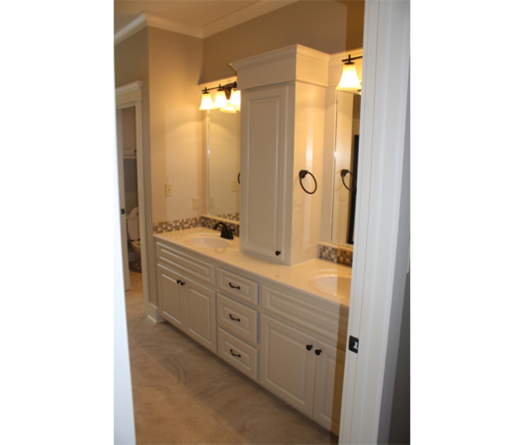
 And if you can still get used to the layout, theninteriors here clearly need the help of a professional designer. Faceless rooms that are not attractive in any way can become much more interesting if they are properly furnished and decorated with soul. You can read about how to breathe life into a completely banal and boring interior, using a real example of a designer's work.
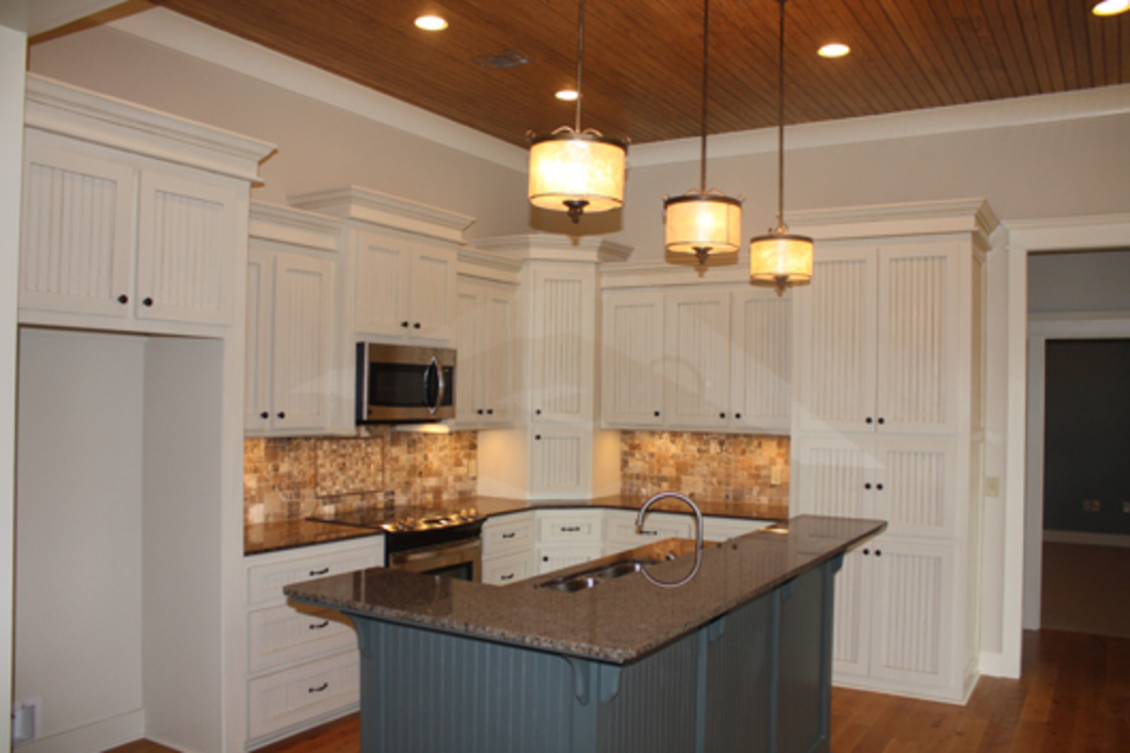
 The plan and photos of the house are taken from the websitehouseplans.com. Alexey Shesterikov, designer: - Houses made of sandwich panels are a really convenient and fast construction. I am a supporter of using materials with minimal finishing and as little labor as possible. A large number of wet processes are excluded, which entail time and financial costs. When using only MDF panels in finishing, you can achieve different original results, which minimizes problems in operation. Read also: .

We criticize the house of 176 meters – etk-fashion.com
