 How great it is when you don’t have to spend money on the services of specialists, because you can come up with and implement the reorganization of your apartment yourself.
 This is exactly what the fashionable and ratherfamous designer Maria Dadiani, when the question of renovation arose. She managed to perfectly arrange three different zones in a virtually tiny space, equipping them with only the most necessary interior items purchased in regular furniture stores.
A little about the owners
This living space is intended fortwo spouses and their cat. Moreover, its main advantage can be considered the location of the house - not everyone is lucky enough to live in the historical center of Moscow next to Patriarch's Ponds. By the way, it was the exterior that had the greatest influence on the formation of the idea of the transformation, because such beauty could not fail to inspire.

Remodeling
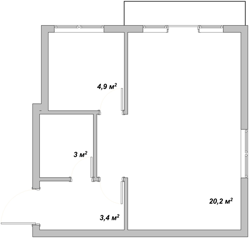
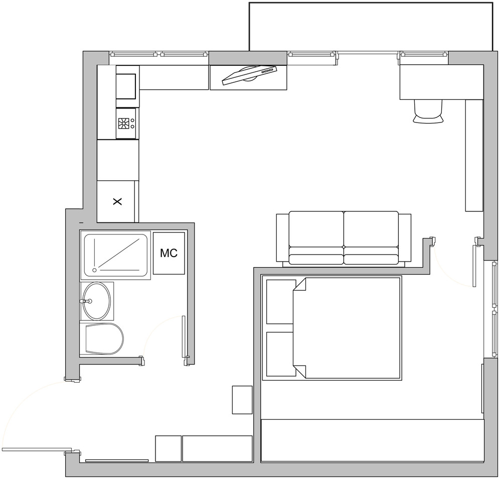
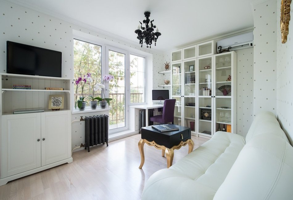
When starting a renovation, the first thing to consider is familyThe couple thought about how to change the layout of the house so that it would seem taller and more spacious, and at the same time furnish it with all the necessary furniture. As a result, they wanted to get two full-fledged, comfortable rooms, not devoid of some chic. First of all, light finishing materials were chosen, which are traditionally used to visually increase the area. The next step was to get rid of the internal wall dividing the small kitchen and the room to create a kitchen-living room, which is popular these days. Its dimensions turned out to be quite decent - about 16 sq. m. The initially inconvenient corner location unexpectedly became an advantage, since Maria guessed to fence off the second window to organize a small but full-fledged bedroom. True, this meant that she had to thoroughly work on high-quality insulation of the outer corner wall.

Storage systems
The couple loves to travel and from eachcountries bring various souvenirs that remind them of their trips. Naturally, they had to place them in such a way as to show them off to their guests. To do this, a tall white shelving unit occupied an entire wall of the living room, the coloring of which allows for the focus to be on the items and books on the shelves.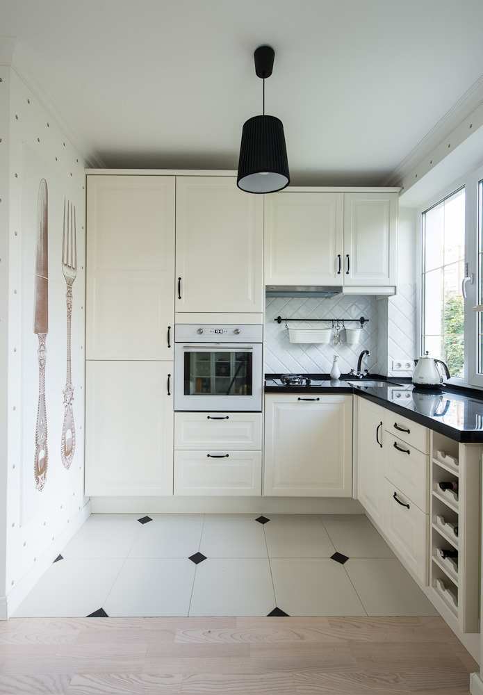
Lighting
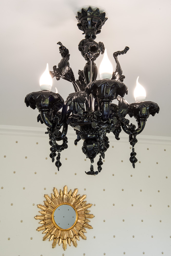
For maximum penetration of naturalTo avoid street light, the window and the door that opens onto the balcony were made completely transparent, which allowed for several artificial lamps and a chandelier made of black Murano glass, which serves more as an interior decoration than as a functional element. The chandelier was brought from Venice and has a complex structure, including many small hand-made parts. The bathroom is equipped with exclusive Arabic lamps that the owner found at the Grand Bazaar in Istanbul during her next trip. They cannot fail to amaze with their beauty and exclusivity, when the light rays are reflected in hundreds of glass plates and cast glare on the hand-forged fittings.
Palette
Light cream collectible wallpaper,produced with the participation of a famous Dutch company, decorated with a barely noticeable ornament with elements of heraldic symbols, give the whole atmosphere sophistication and chic. Their textured similarity with finely tanned soft natural leather cannot fail to make the proper impression.
Headsets
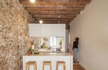
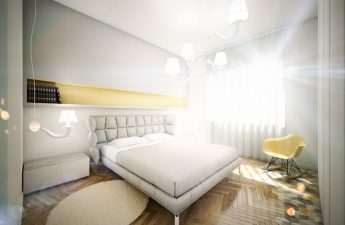
In the bedroom, oddly enough, it was possibleinstall a spacious tall wardrobe for storing clothes and other personal items, stylistically matched to the overall color scheme with light paneled facades. It should be noted that Maria abandoned the idea of making custom-made furniture, thereby proving that even a luxurious renovation can be economical. The main feature of the project was the author's refusal to use a regular dining table and even a bar counter, which is often used today. The fact is that in this case, a window sill was used, which was combined with the countertop of the kitchen set to get a cooking area. The cabinets were decorated with the same facades as in the bedroom, adding black handles to match the charcoal artificial stone of the countertop for contrast. By the way, all modern appliances fit here, including a dishwasher. Since the owners prefer to have lunch and dinner outside the home, the created corner and a glass table near the sofa are quite enough for them to organize a light breakfast. As mentioned, they did not buy a dining table and chairs, thus saving a decent amount of living space. As a result, the rooms please the eye with maximum openness, plenty of light and air.
Textile decoration
We can see a heavy silk curtainonly in the bedroom, where there is a need for darkening. The remaining windows are deliberately left without even thin tulle, so as not to stand out from the general environment, but to merge with it. The only decoration for them is a thin gold layout, as if framing the stunning landscape outside the window.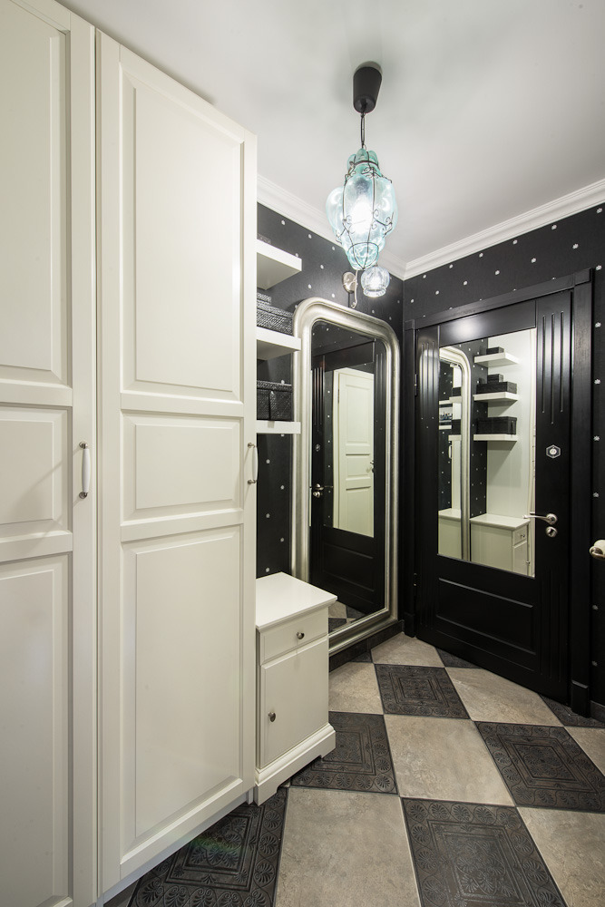
Advice from a specialist
- Do not make rash purchases of bulky furniture that may take up too much space.
- Try to make sure that the rooms get as much natural light from the street as possible.
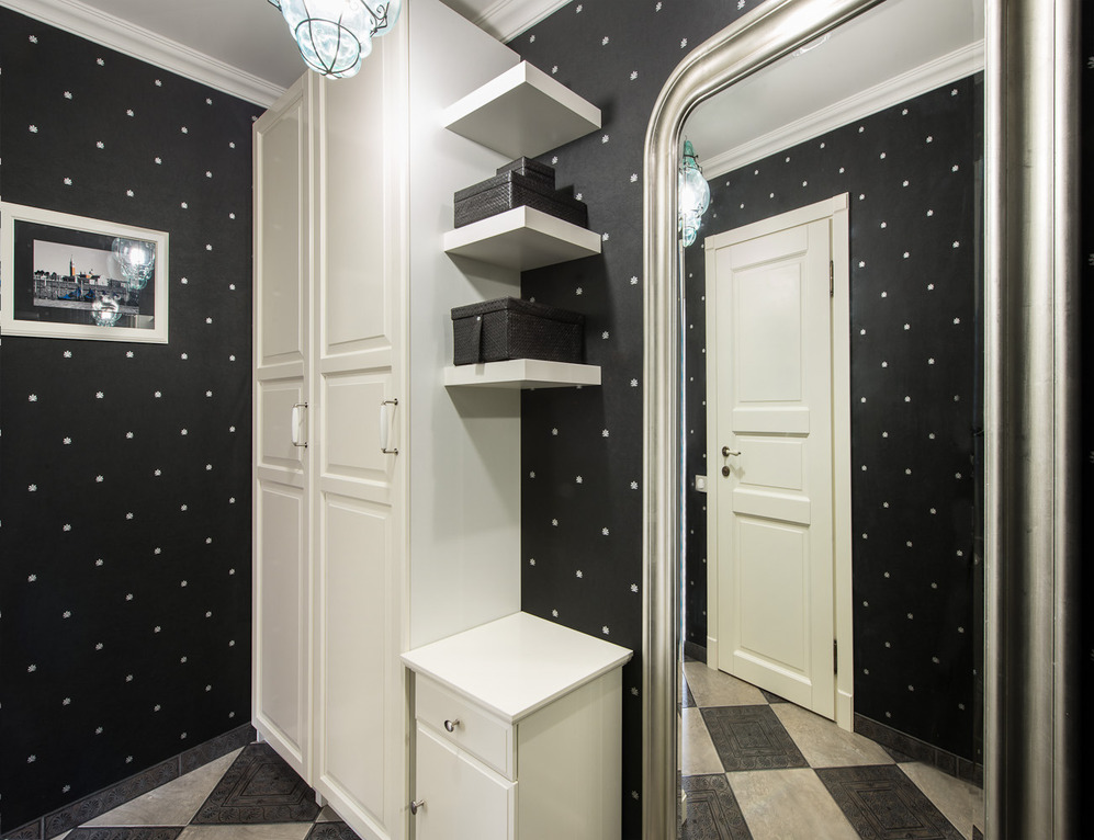
- For a visual increase in space, use a bright palette and mirror surfaces.
- Find a functional application for every centimeter of your home.
- Feel free to fantasize and apply these fantasies in transforming your home.
