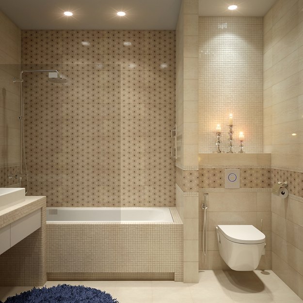
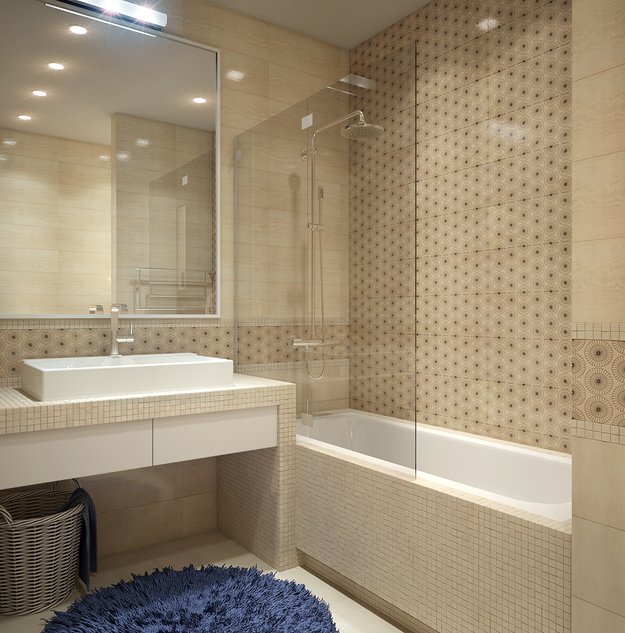
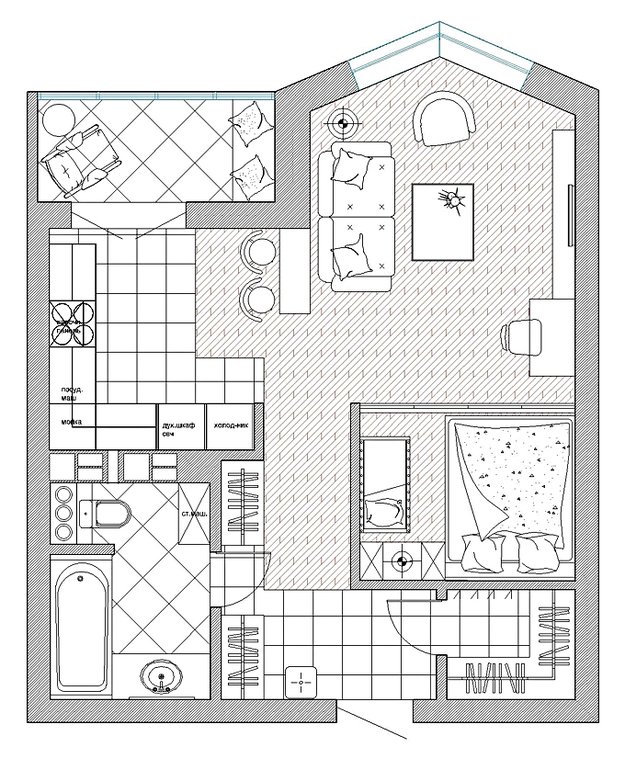
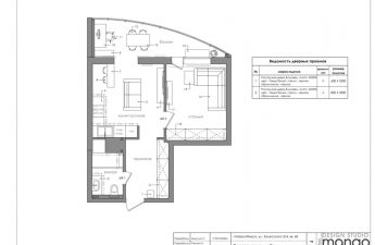
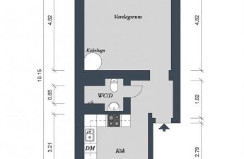
 The project conditions presented a serious challenge.for designers: a large wish list with a small available area. And they successfully answered it. allowed to create an isolated bedroom, a work area, a kitchen and living area in the apartment. Plus, it was possible to provide a corner for a child's bed.
 Sergey and Oksana Balamatyuk, owners anddesigners Nest Creative The development was undertaken by the design studio Nest Creative, which specializes, as the name suggests, in creating "creative nests" with original interiors created according to individual projects. The bureau's specialists undertake the remodeling of both apartments and premises for a store or office. At the same time, they assure: the result will perfectly meet your needs.
Desire of the client - the law for the designer
The family for whom the apartment was being remodeledis still small. But the young spouses Natalia and Alexey are planning to increase it soon by having a child. An interesting color scheme was important for the head of the family, and his "other half" would like to avoid pretentious shapes and complex lines in the interior. The result of the wishes voiced by the customers was to be a harmonious and integral space, where spacious areas for cooking, rest and receiving guests are provided, as well as a comfortable workplace and a separate bedroom. It was also important to combine the vision of Alexey and Natalya regarding the color scheme of their apartment, so that it would not cause disagreements and would please both spouses.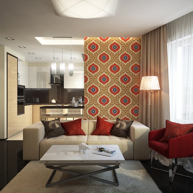
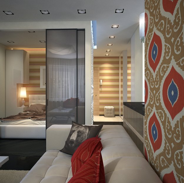
Dismantling the walls to build new ones
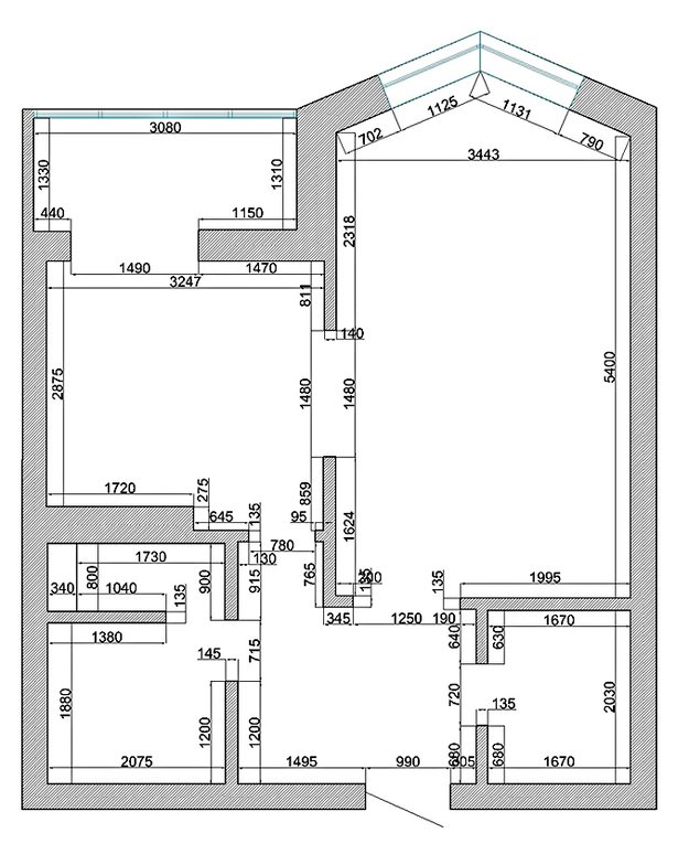
In the original room, planned at one timeDuring construction, it was impossible to implement all the design tasks. Zoning the space taking into account the desired functions required a global redevelopment. The old walls were demolished, and the new ones created a separate room for the bedroom in the apartment, including space for a crib, as well as a kitchen area combined with the living room.
Light and color solution
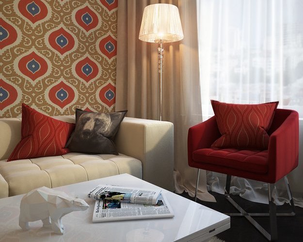
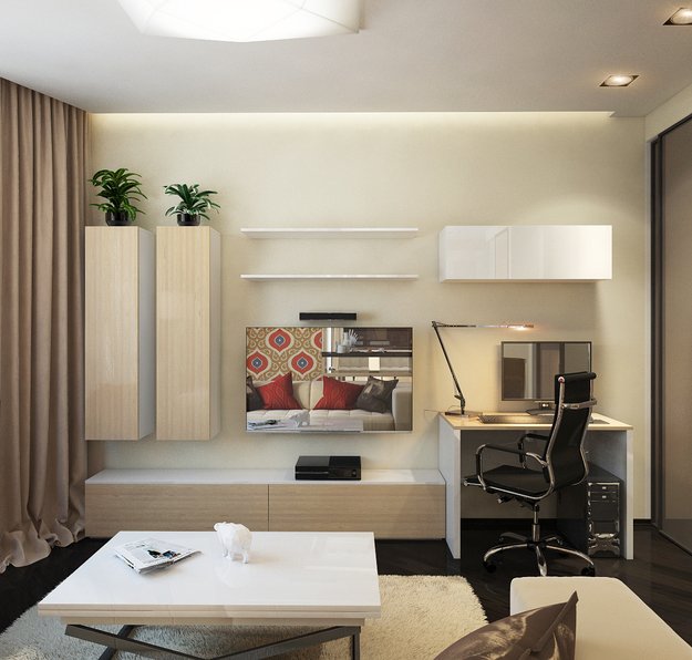
The designers designed the lighting in such a wayin such a way that it would help support the functional purpose of each zone. To do this, it was necessary to provide several light sources of different levels: general illumination of the space, implemented with the help of chandeliers on the ceiling and walls; "atmospheric" glow due to a special ceiling lamp, supporting the mood of the room; spotlight - narrowly functional sources, allowing, for example, to equip a computer table, a work area in the kitchen or an armchair in the living room. As for the color, the designers settled on several shades of brown, diluting it with eye-catching wallpaper with a geometric pattern and bright sofa cushions.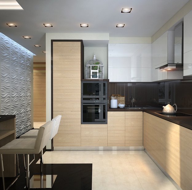
Interior items
Furniture was specially ordered for the projectkitchen and hallway, as well as unusual wardrobes for the bedroom. They are cabinets of a peculiar shape, in which there are cutouts for decorative items and a table lamp. These cabinet transformers can be placed differently if free space is needed for a child's bed. Then the cabinets-cabinets stand next to each other, forming an interesting ensemble. Also, upholstered furniture from Belarusian manufacturers was purchased for the bedroom and living room.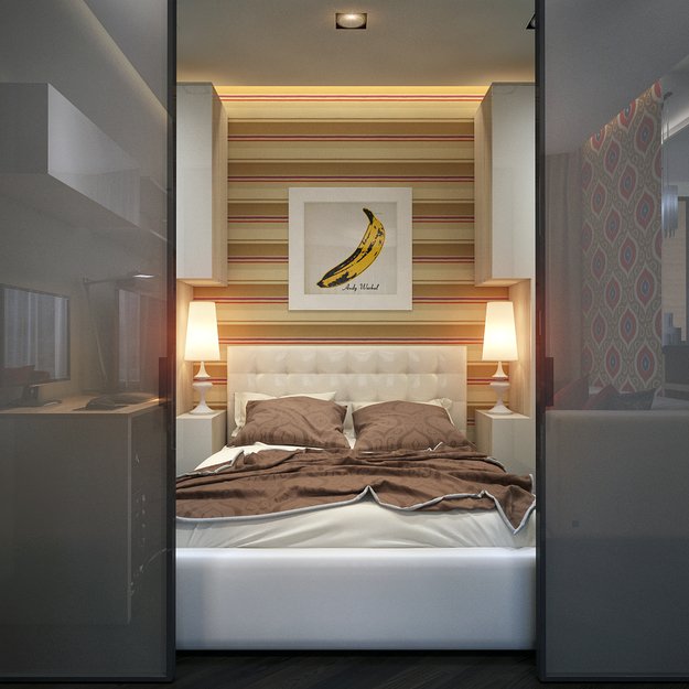
Problems encountered
Before making the best decision,The designers worked out 5 versions of the future interior. And when the option was chosen, increased accuracy of calculations was required, especially in the bedroom. Carelessness in calculations would have led to a number of errors. For example, there would not have been enough space for the future baby's crib, furniture could have prevented the sliding doors from opening, or it would have been difficult to move the cabinets.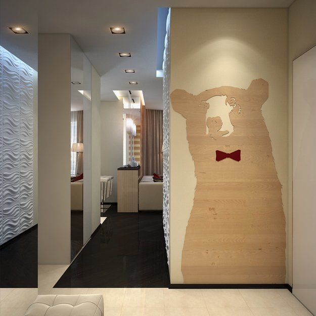

If you decide to reschedule a small apartment
Be especially careful duringpreliminary measurements. It is clear that in a limited footage you want to zone the space so as to fit more functions into it. It is better to entrust such complex calculations to a professional designer. If you want to visually expand the space, use horizontal lines. It is in this way that the stripes will “deceive” the eye, giving the room more volume than it actually is.
