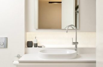
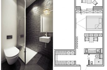
How to create an interior that will becomfortable for everyone — both the owner and the tenants? Today's studio is a striking example of a rented apartment where you'll want to stay longer The customer wanted to make a small studio in the center of sunny Sochi as quickly as possible. At the same time, the space had to retain its volume, and the interior had to be dominated by light shades and natural materials with natural textures. Designer Yulia Telnova took on the development of the apartment project in a modern style. Yulia Telnova, interior designer Received a higher education at the B & D Institute (Institute of Business and Design) in the faculty of practical design. For over 7 years, she has been designing interiors of varying complexity, mainly apartments and country houses. telnova.ru Related articles The customer purchased several apartments in a new residential complex in the center of Sochi. One of them was a small studio with an area of 37 square meters. The apartment was not intended for permanent residence of the owners, so the approach to the development of the project was different. Yulia Telnova: — The customer wanted to renovate this apartment for rent, and he turned to me to develop a design project. I helped to determine the category of potential tenants and analyze their needs, desires, and taste preferences. First of all, it was necessary to pay great attention to the functionality of the space and use the small area to the maximum.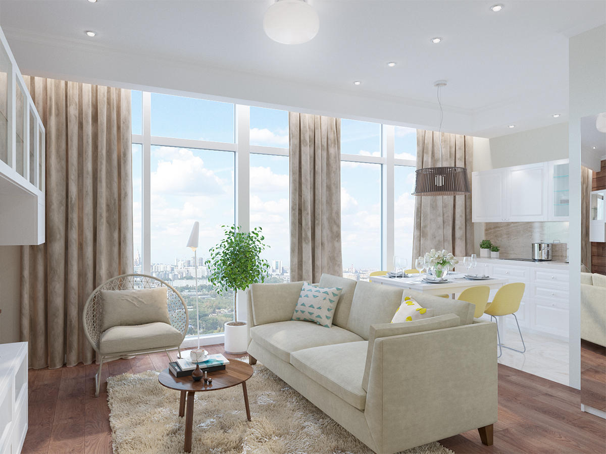 The peculiarity of this apartment is its correct layoutsquare shape and large panoramic windows overlooking the city. The layout was free: partitions were only near the bathroom, a place was determined for the kitchen area. The designer proposed several options for the layout of the space, and the customer settled on the one with a full-fledged sleeping area, separated from the common space by a partition. The entrance area was visually separated by another partition and a different floor covering. Porcelain stoneware with a stone texture was chosen for the hallway and kitchen area, and in the bathroom its effect was enhanced by tiles imitating a wood surface. The kitchen apron is finished with porcelain stoneware with a similar texture, but a more saturated color.
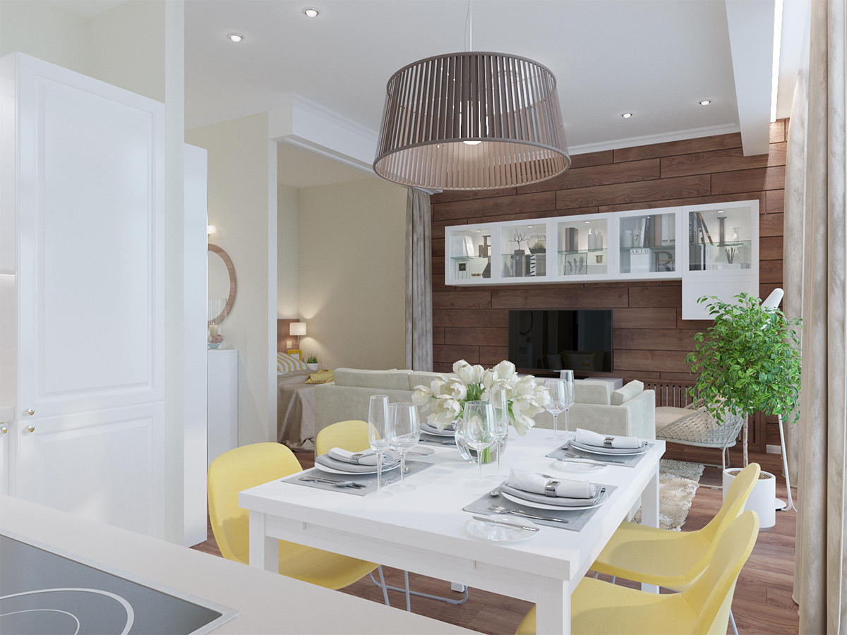
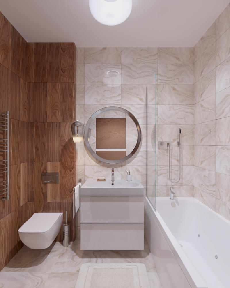 These materials were used locally,therefore, the leading role in the interior was taken by wood of a warm, rich color. It is able to give the space coziness and contrast, so it was used in the flooring in the living room and bedroom area, on the wall in the TV area and at the head of the bed. The walls in the apartment are painted and have a warm sandy shade. Yellow is used as a color accent, but it is present in measured doses, in textile and decor elements. The kitchen set, in which all the necessary equipment is located, covers the end of the furniture and increases the surface of the wall along which the cabinet is located. The dining group is designed for four people, but if necessary, the table can be extended.
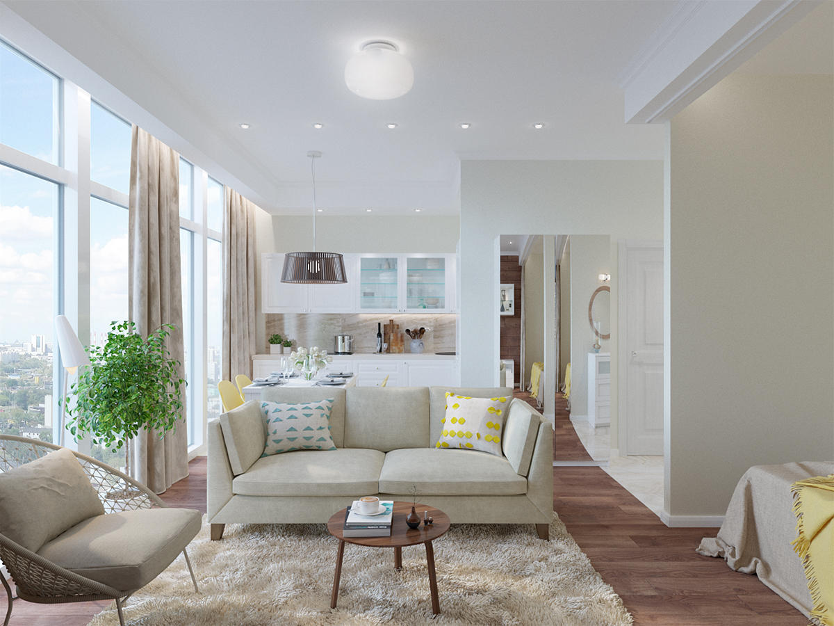
 The rest of the space is a living room.The sofa visually separates this area from the kitchen, and together with the armchair it faces the TV on the opposite wall. The open layout of the space does not hide the volume of the room and allows you to enjoy the beautiful view from the huge windows. Yulia Telnova: - Almost all the furniture in the project is white, which is why it looks airy and fresh. I deliberately did not use a large number of different materials so as not to overload the space. If desired, the tenants of this apartment can adjust the color scheme to their taste by changing the accessories.
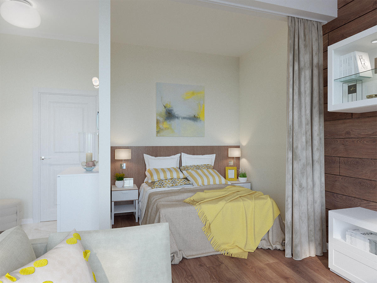 The lighting in the project is zoned and hasseveral modes. Along the panoramic windows there is a plasterboard structure that hides the curtain rod and LED lighting. The kitchen area has spotlights, including a large pendant light above the table. The living room combines central lighting and spotlights, and there are two sconces by the bed.
 When designing it was necessary to take into accountavailability of materials and furniture in the developing and under construction city of Sochi. Therefore, IKEA furniture was used, Dulux paint was used for the walls, porcelain stoneware - from the manufacturer Atlas Concord (Supernova Onyx and Frame collections). Yulia Telnova: - The project is currently in the implementation stage and will soon welcome its first residents. In my opinion, this apartment is a striking example of ergonomics, which, provided that the apartment is rented out, does not make it faceless and simple. I believe that I managed to create a cozy, bright and comfortable environment in this small space.
One-room apartment design: studio interior in modern style
