How to properly zone open space inhouse? Why shouldn't it be cluttered with partitions and walls? We decided to consider these questions using the example of an unusual house project that is being built in Yalta. Without unnecessary pomposity, stylish, extraordinary and, most importantly, functional - these were the parameters that the house that a young, successful couple dreamed of had to have. He is an Englishman, and once having arrived from London to Crimea, he fell in love not only with its beautiful landscapes, but also with a girl with whom he no longer wanted to part. She is sunny and optimistic, like all Crimeans, and her hometown is Yalta. Here the newlyweds decided to build the house of their dreams. They turned to the design and architecture studio of Elena Ponomarenko for help. Elena Ponomarenko, architect Head of the interior design studio Vitta-Group, architect, member of the Union of Designers of Russia, member of the Union of Designers of Ukraine, member of the British Academy of Design. vitta-group.com
Dream House
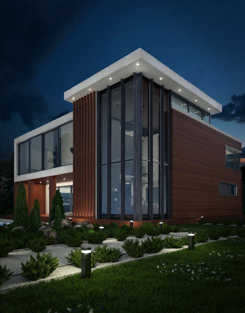
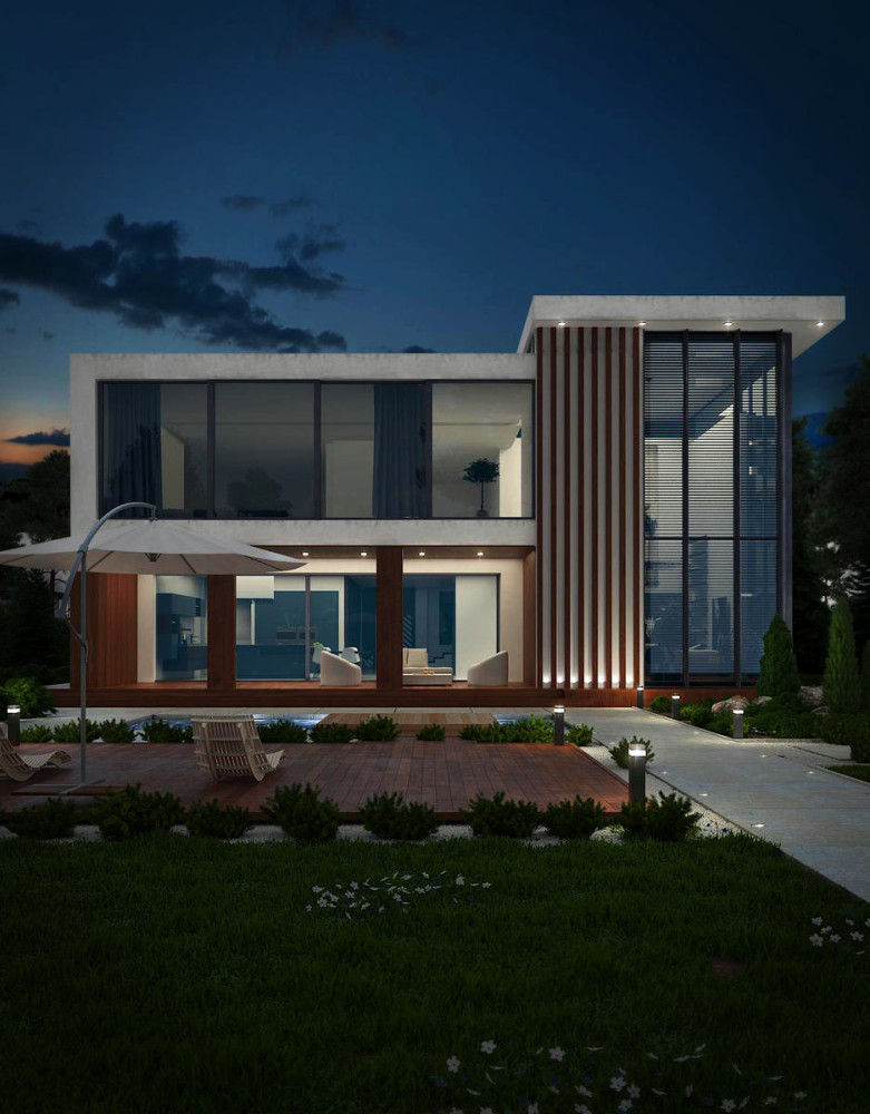
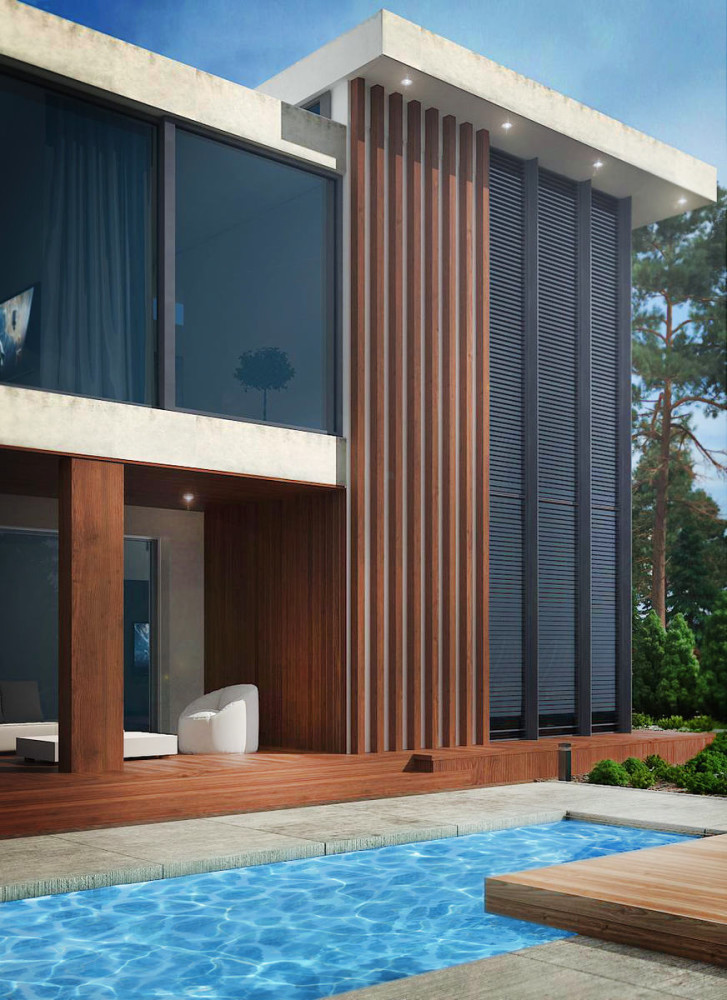
The project was named "Dream House".For this young couple, it is ideal, as it combines an unusually attractive design, many interesting, fashionable techniques and a convenient layout that does not restrict or deprive the feeling of freedom. Since young people love everything new and unusual, the main direction for the design of their home was a modern style. It allowed them to experiment with finishing materials, colors and space planning. Elena Ponomarenko, architect: - The basis of this house is simplicity and maximum functionality. This is what was the main wish of the customers. For a long time, this family dreamed of their own individual, original house, not similar to the same-type buildings of neighbors, and our studio made this dream come true.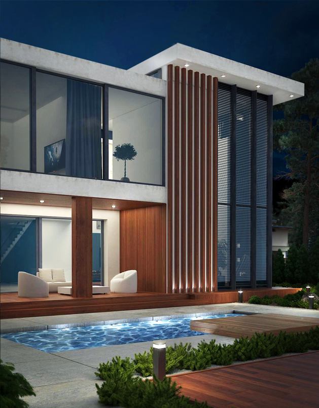

Maximum open space
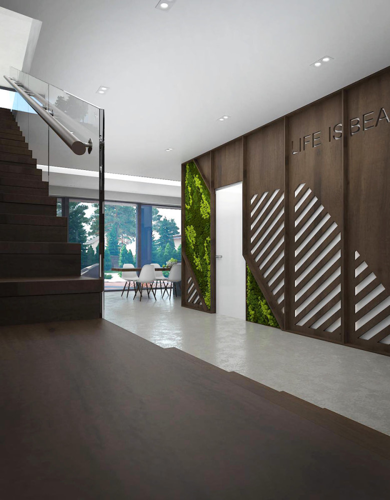
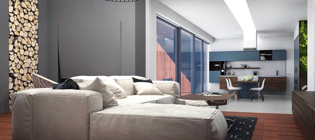
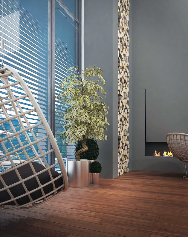
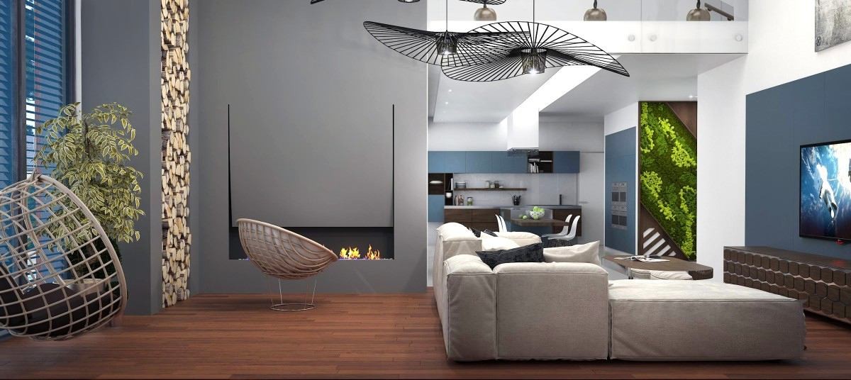
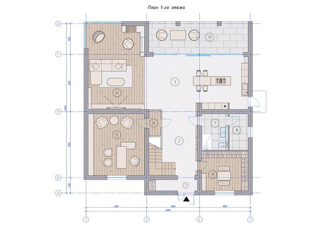
The fact that this family is ready to experiment,noticeable already from the first floor of the house, where they decided to make an open plan. Elena Ponomarenko believes that this type of planning has many advantages, and that it should not be closed with low-functional walls. Using this project as an example, we can see how you can zone the space without resorting to standard partitions. In one spacious room there are several functional zones, each of which is divided by the ceiling level, furniture and interior items. The technique with the ceiling in particular allows you to make the interior more airy. The highest ceiling level is in the living room area, its height is 7 meters, which made it possible to highlight this zone more brightly and give it more significance.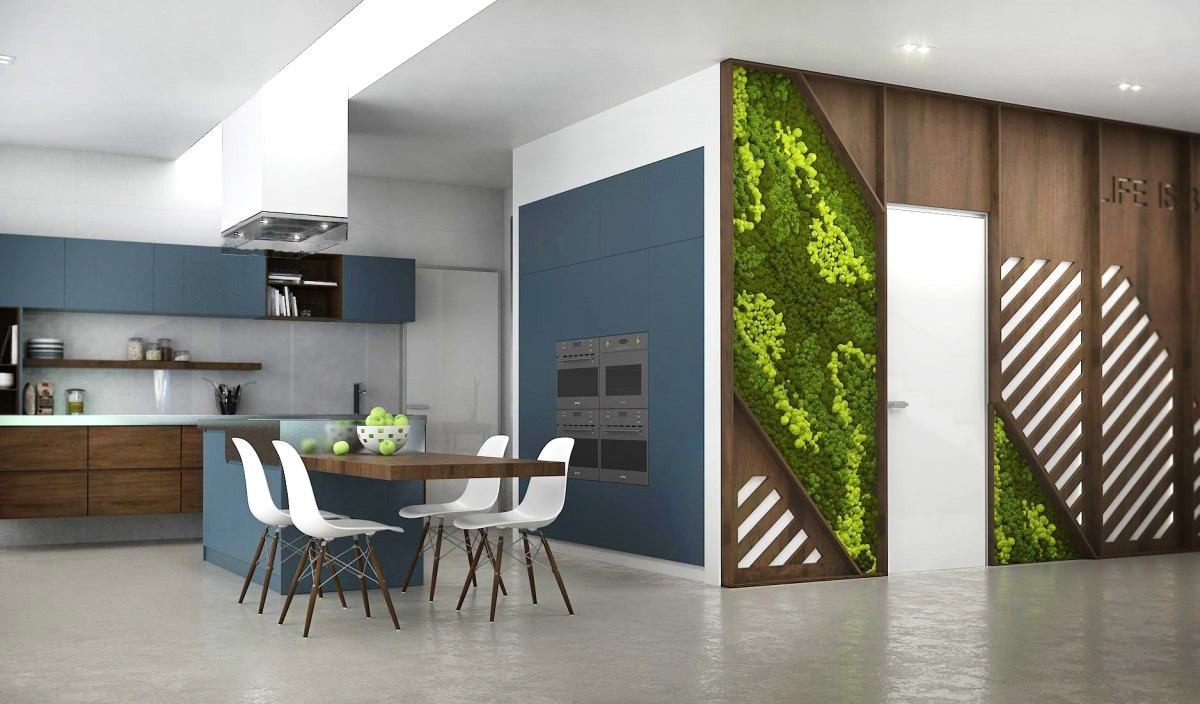

On the fashion wave: eco-theme
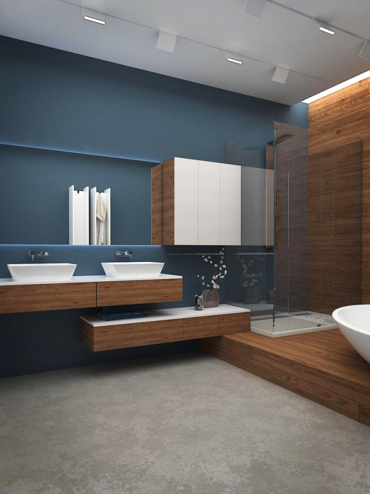
Our heroes love nature very much, that's why theywanted to surround themselves with natural materials. They wanted to touch the texture of wood and see the texture of brick on the walls. Based on this, the main shades on which the entire interior of the house is built were chosen to be the colors of steel and wood. Furniture items and other elements created from natural modern materials harmonize perfectly with them.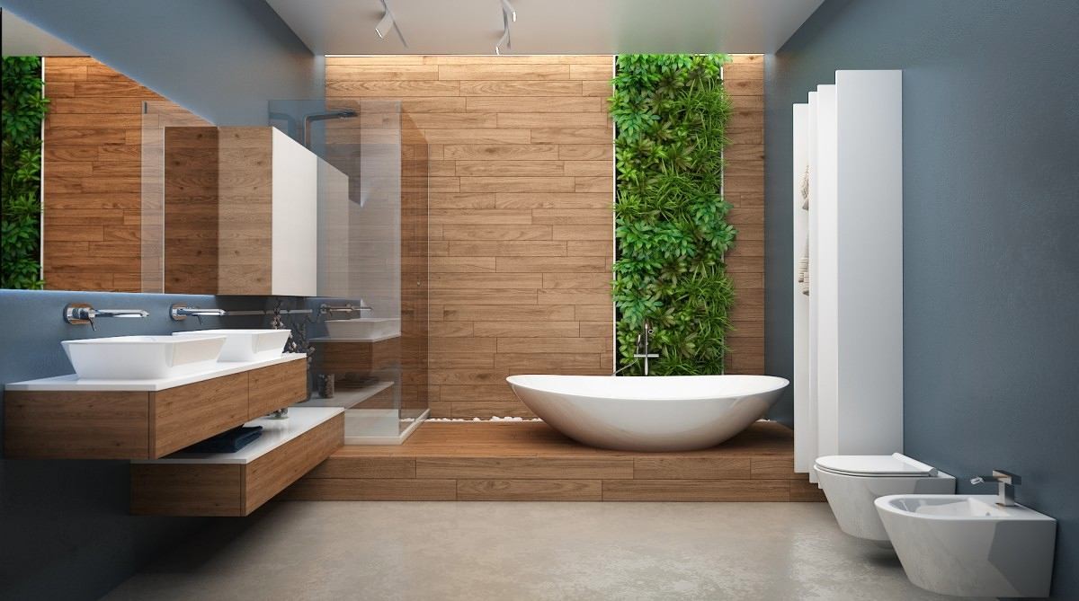

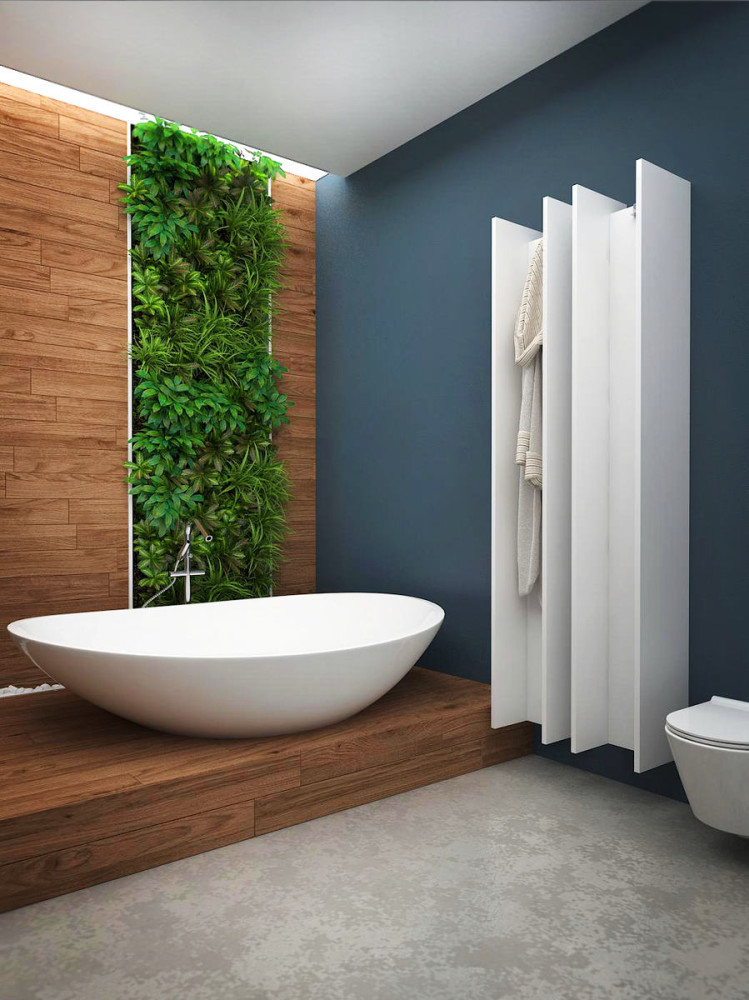
Art living room and bedroom in refreshing shades
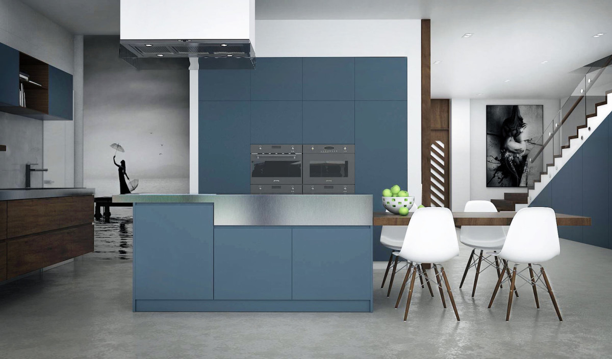
Now let's move on to a detailed examination.each of the rooms. And we will begin our tour of the dream house with the kitchen, where our heroes plan to create joint culinary masterpieces. It is distinguished by its functionality and simplicity, everything is located at hand. The main role is given to a large kitchen island with a hob. Its work area smoothly flows into the dining table, which is adjustable in height.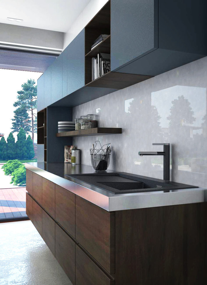
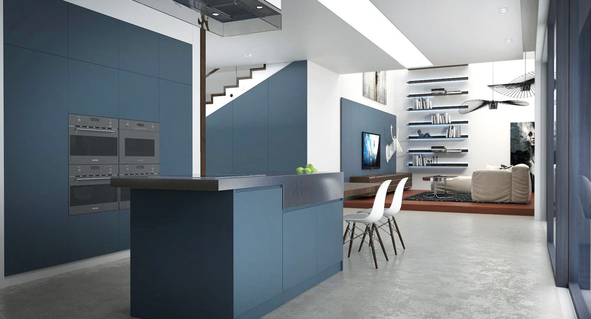
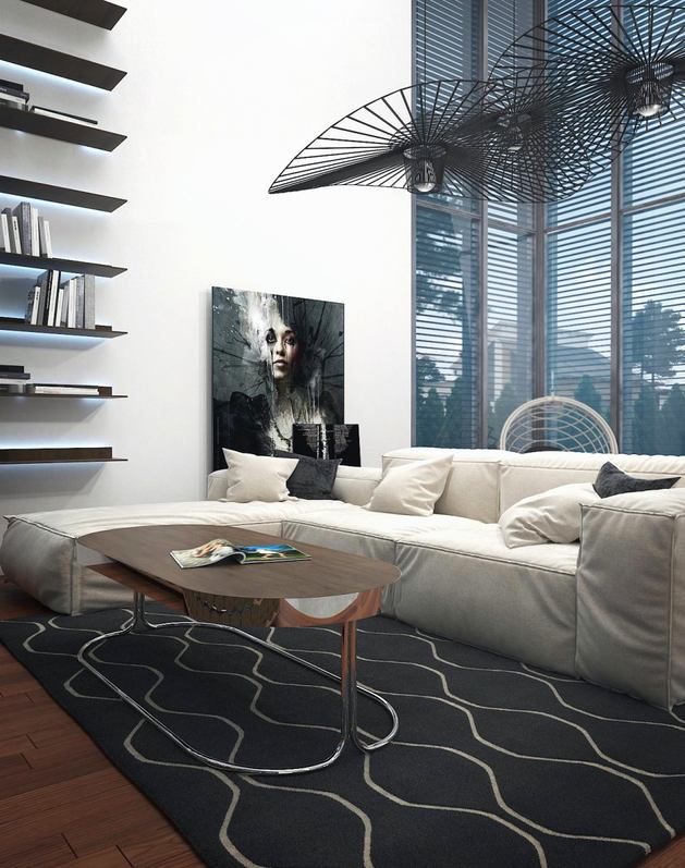
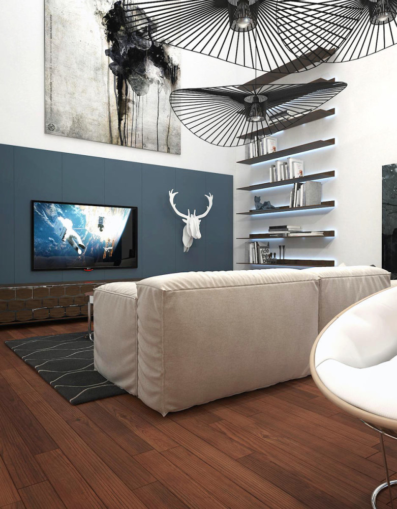
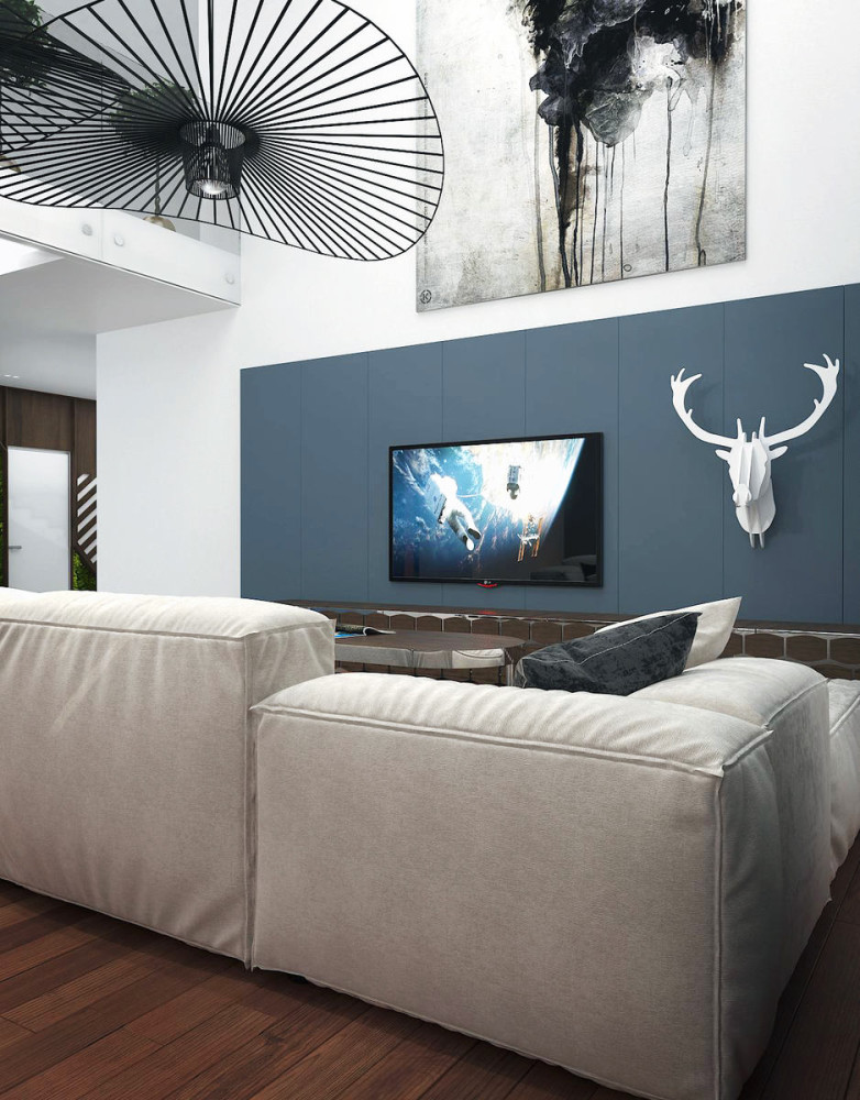
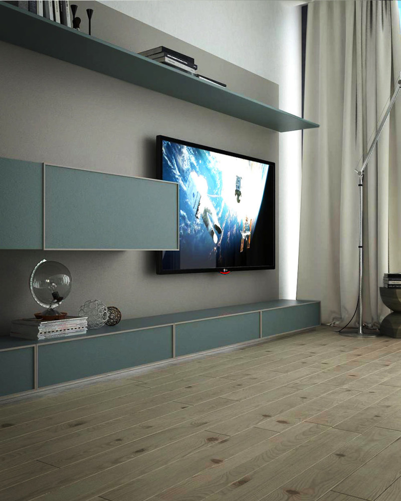
 The living room is the central room in this house.an area where the newlyweds plan to receive guests and spend a lot of time watching their favorite movies and simply enjoying the conversation, sitting by the fireplace on unusually shaped chairs. It is planned to make a real art gallery out of this area, where contemporary art objects will be placed, of which the project's customers are big fans.
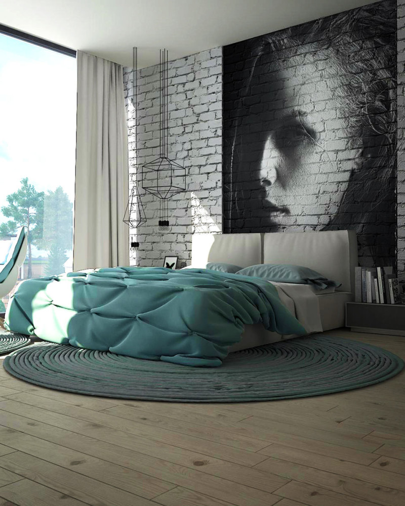
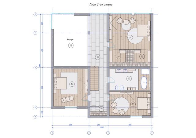
 On the second floor there are three bedrooms andbathroom. In the master bedroom, we decided to create a refreshing interior with mint notes that will prevail in the textiles. Elena Ponomarenko, architect: - What is unusual about this interior? We created a highlight by using the space wisely: part of the room was given over to a dressing room, the rest is occupied by a bed and a TV area. The accent of the interior is a panel with an image of a girl on a brick wall. We had great fun working on the project. In this interior, we used all the professional skills that we have. The highest praise for us is the customer's praise and faith in us as specialists.
Advice from Elena Ponomarenko:
visualizations provided by Elena Ponomarenko
