When the house was just starting to be built, its areawas 83.6 sq. m, but the architects managed to increase it The house is located in Menlo Park, California (USA). The main tasks that the owners set for the architects were a complete rethinking of the existing space, integrating the house into the environment and increasing the flow of daylight. The designers from Ana Williamson Architect reused the existing foundation and also added 46 sq. m to the interior space of the building. They built the house from environmentally friendly materials, it has a lot of natural light and an interesting combination of open and closed spaces. They also developed a new layout for its central part, which separates the public and private areas.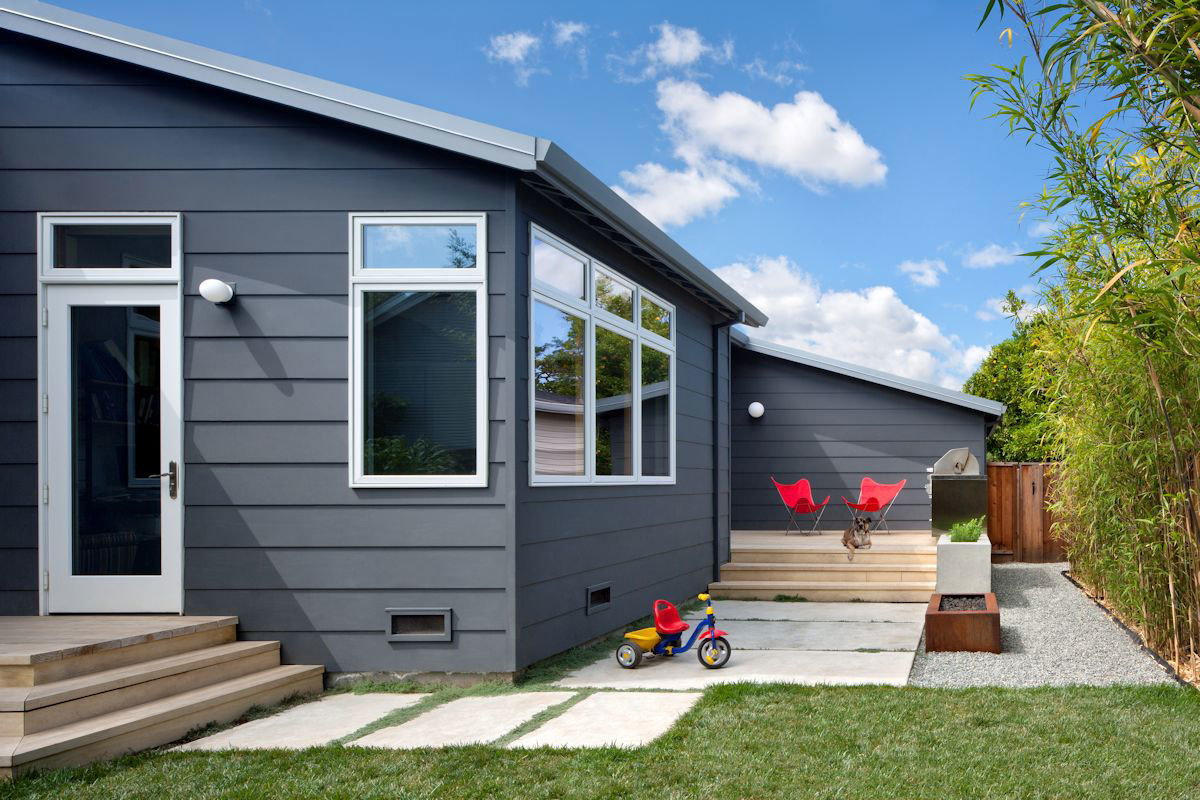
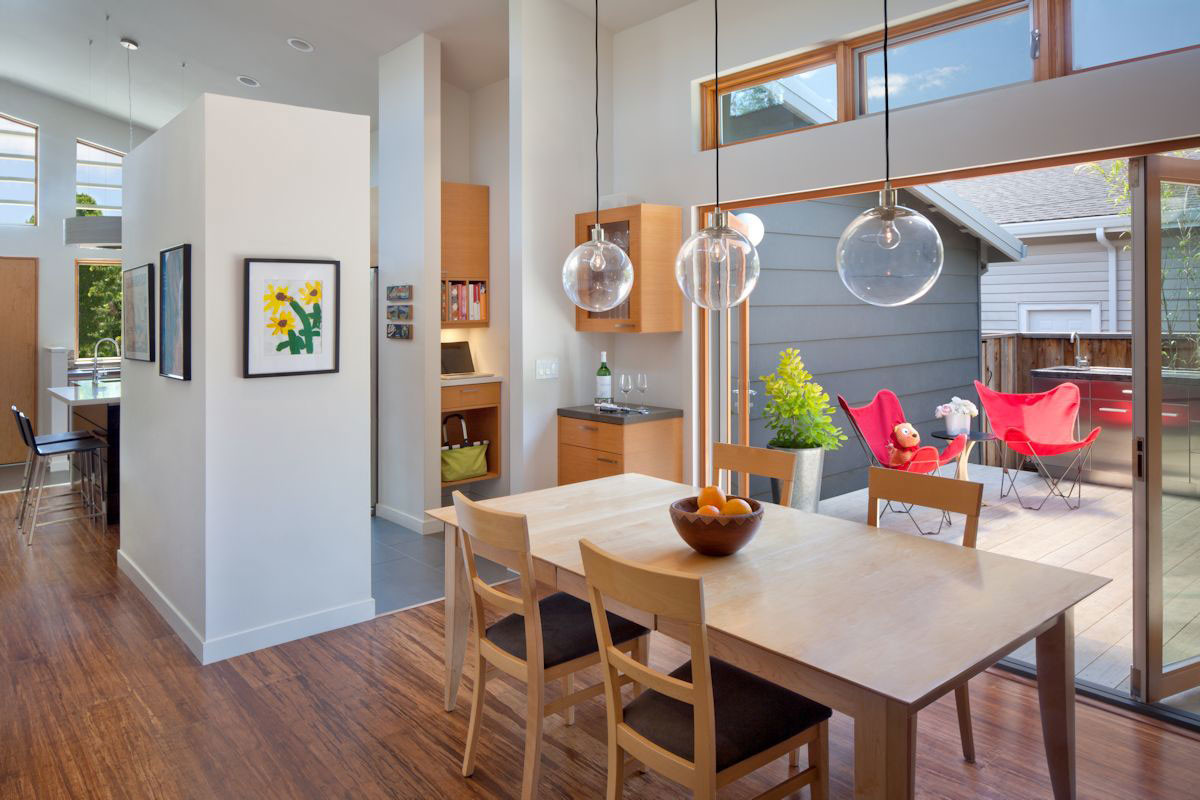
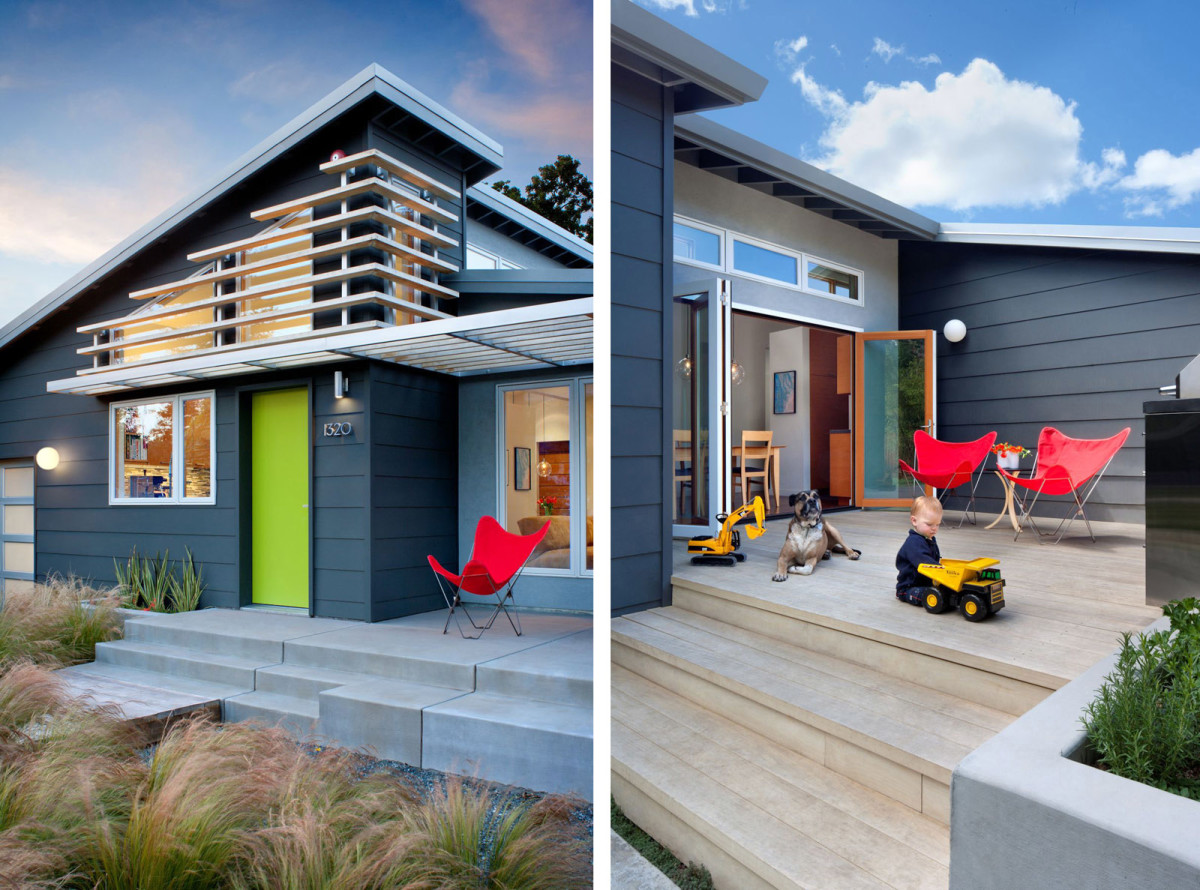 Large glazed double doors connectdining room with a courtyard, so that this entire space has become an integral part of the daily life of the owners and their small children. The roof line has been completely redesigned into ceiling vaults, and an upper row of windows has also been added. Although the area of the house is quite modest, thanks to the successful layout it seems spacious. And it is very pleasant to be in it. The homeowners (designers by education) like to experiment with materials. For the house, they have chosen those that suit it not only for aesthetic reasons, but also for their useful properties.
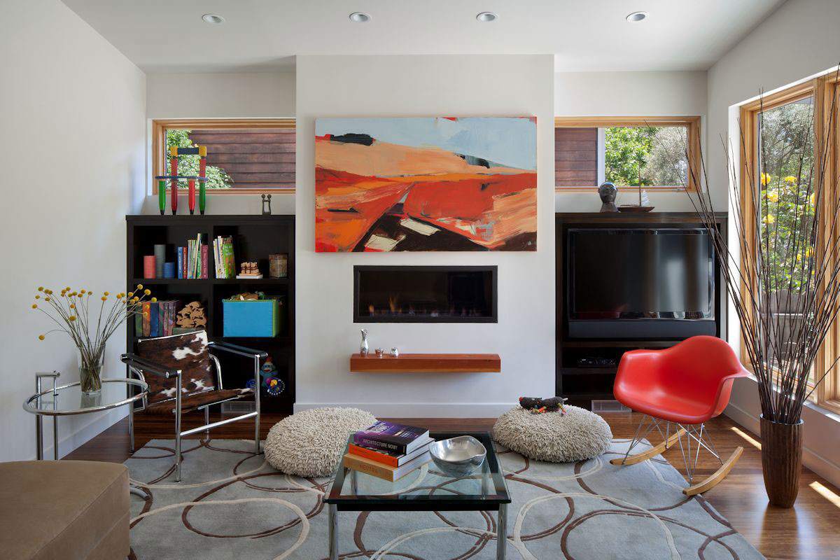
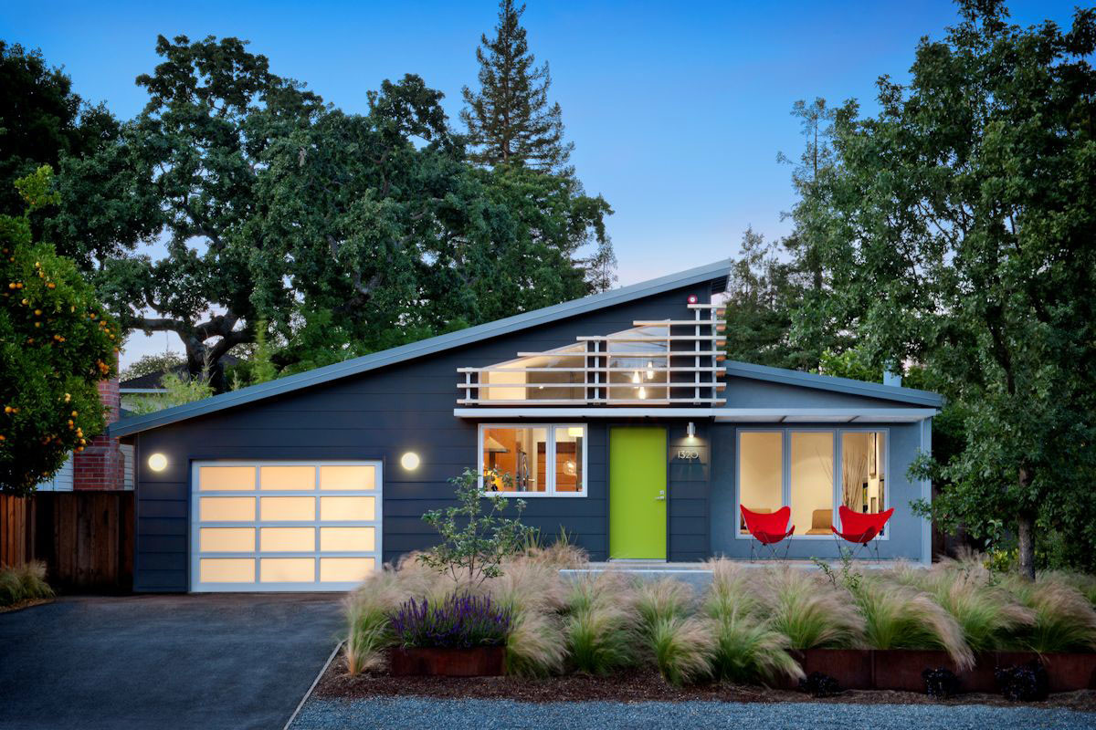
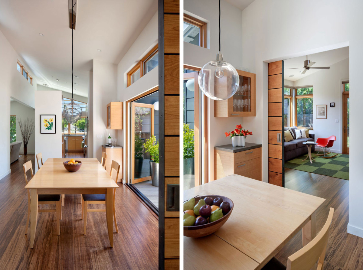 Roof with canopy, front and rear wallsare made of acetylated wood. The material does not absorb moisture well. This makes it durable and allows it to maintain its dimensions regardless of weather changes. Kitchen cabinets are covered with composite veneer. This inexpensive alternative to wood is a fairly new product on the construction market. As a result, the house looks more modern than its neighbors, but is maintained in the same style as them. The facade of the building (with a welcoming porch and a beautiful flower bed) seems to warmly greet everyone who walks or drives past it. And sharp geometric lines and bold color schemes often arouse the interest of passers-by, which greatly facilitates their communication with the owners of the house. Our opinion Choosing the right color for the facade of a house is one of the most difficult tasks when completing construction. White is impractical. You will quickly get tired of yellow. Green houses are nonsense. In Finland, they like to paint country cottages in a “sweet” tricolor - raspberry-pink-white. But dark gray and gray-blue in combination with a light green door also look very nice. And not at all gloomy. In any case, no matter what color scheme you choose, remember that if the walls have a smooth texture, it is better to choose different colors for different parts of the house. This way it will not look too massive, and it will also have dynamics and versatility.
 homedsgn.com, contemporist.com
House on Cloud Street
