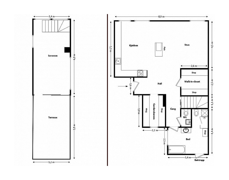
How to use space if it is"broken" ceilings and walls, and wooden beams to boot? Let's look at a real example of how to turn disadvantages into advantages and create a functional and warm interior. So, let's move to Oslo, where a two-level apartment with non-standard walls and ceiling is located on 120 square meters. The interior is decorated in the Scandinavian style, which is characterized by space and light. For this reason, the walls, ceiling and wooden beams are painted white, and the room is divided into functional zones. Everything is done reasonably, logically, taking into account national traditions and features. The living room area is separated from the dining room and kitchen by beams and a fireplace. In general, the room looks spacious, but it is clear that these are separate territories. Here the past and the present coexist. Ethnic carpets, skins, original figurines, paintings on the walls add color, make the interior interesting and lively.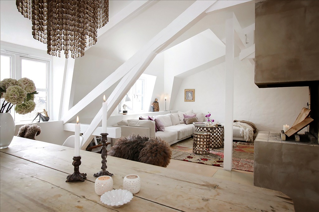
Feature of the living room
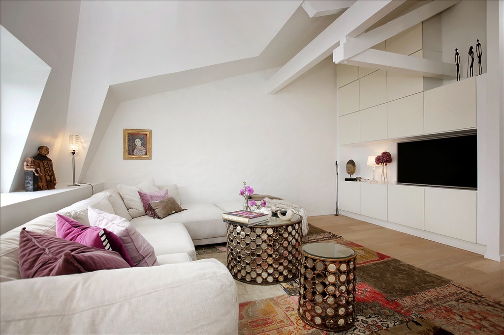
The living room interior looks modern and stylish.It is built on the principle of clean lines and clear shapes. Squares, rectangles and circles are present in the furniture, on the carpet, on the walls, which makes the interior neat and harmonious, organizes the non-standard space. To distract attention from the non-standard ceiling and walls, an additional emphasis is placed on the carpet with ethnic motifs. It is bright and made in the form of different squares. Our opinion: - The original round tables with mirror surfaces deserve attention. They are located by the window so that the light, falling on them, is reflected like sunbeams. This technique works in the interior to create additional lightness and light. Remember what an incredible rainbow effect is obtained when the sun's rays fall on the snow. Since our furniture is white with a glossy surface, something similar is obtained.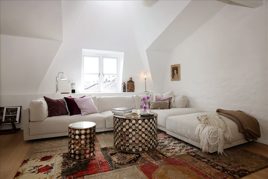
The role of the fireplace
Of course, the fireplace plays an important role.It is distinguished by its color and attracts attention. It also acts as a visual partition between the kitchen and the living room, but maintains the integrity of the space with its shape and color. Thus, in the living room area, it echoes the color of the carpet and tables, and in the kitchen, it harmonizes with the wooden table, skins, floor and steel surfaces of the kitchen set. It also fits into the overall concept of the room in shape. And, most importantly, it performs an important function - it gives real warmth. It is, literally, a home hearth, uniting the living room, dining room and kitchen.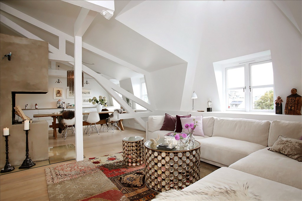
Kitchen-dining room
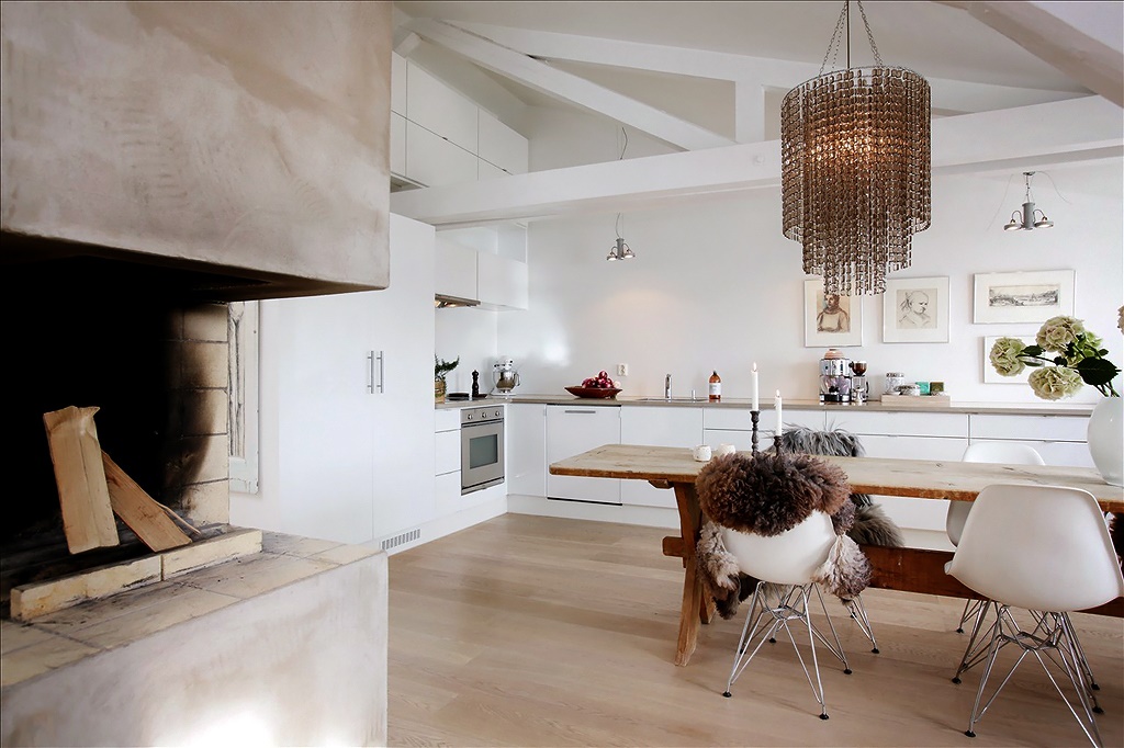
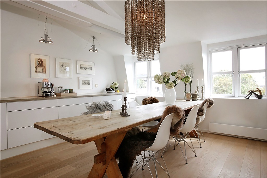
The dining area was designated by a spaciousa wooden table and a chandelier of impressive dimensions. There should be a lot of light in the Scandinavian interior. Therefore, in addition to natural light, the room has many artificial sources. To give the interior a touch of antiquity, candles in original candlesticks act as decorative elements. Modern plastic chairs look great against this background. The unifying link between the past and the present are skins, which are relevant at all times. The kitchen is equipped with light furniture, without upper modules. The empty space on the wall is filled with posters and paintings. The images on them are calm, not flashy, in accordance with the overall style. To prevent the walls from merging with the furniture, the kitchen set was provided with a steel surface. The work area is marked with modern lamps located in a row. The interior corresponds to the spirit of the Scandinavian style. Our opinion: - To make the room look more spacious and the floor visible, choose furniture on legs. Visually, they do not look heavy.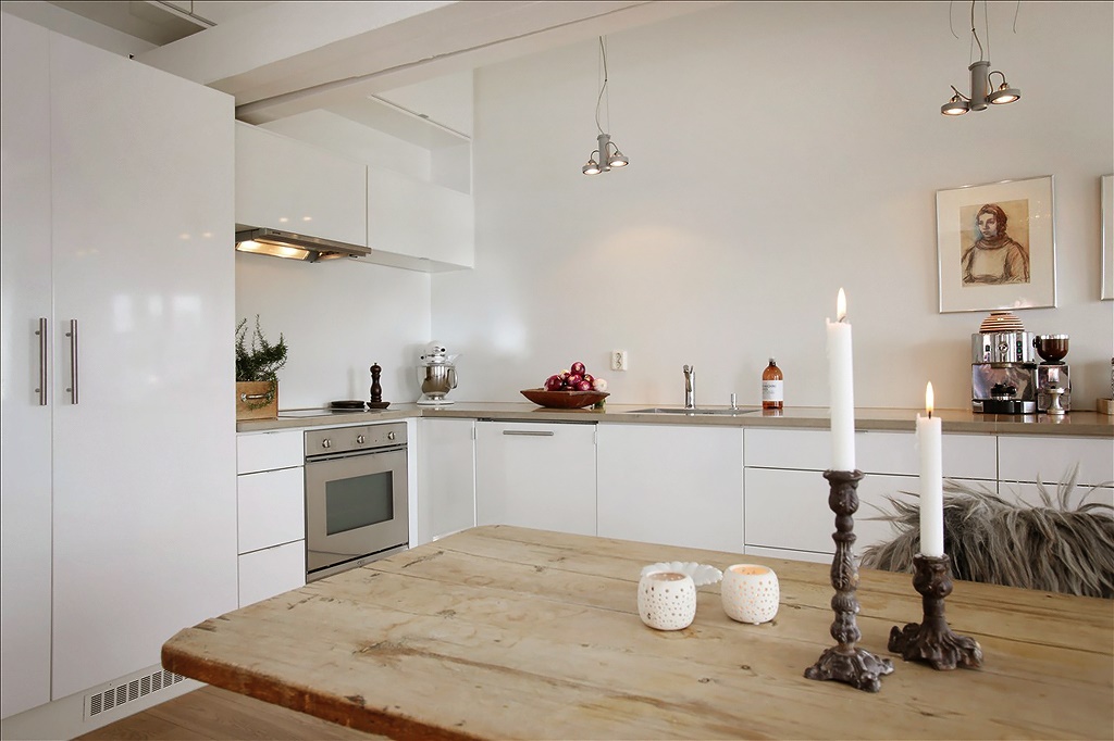

White-white
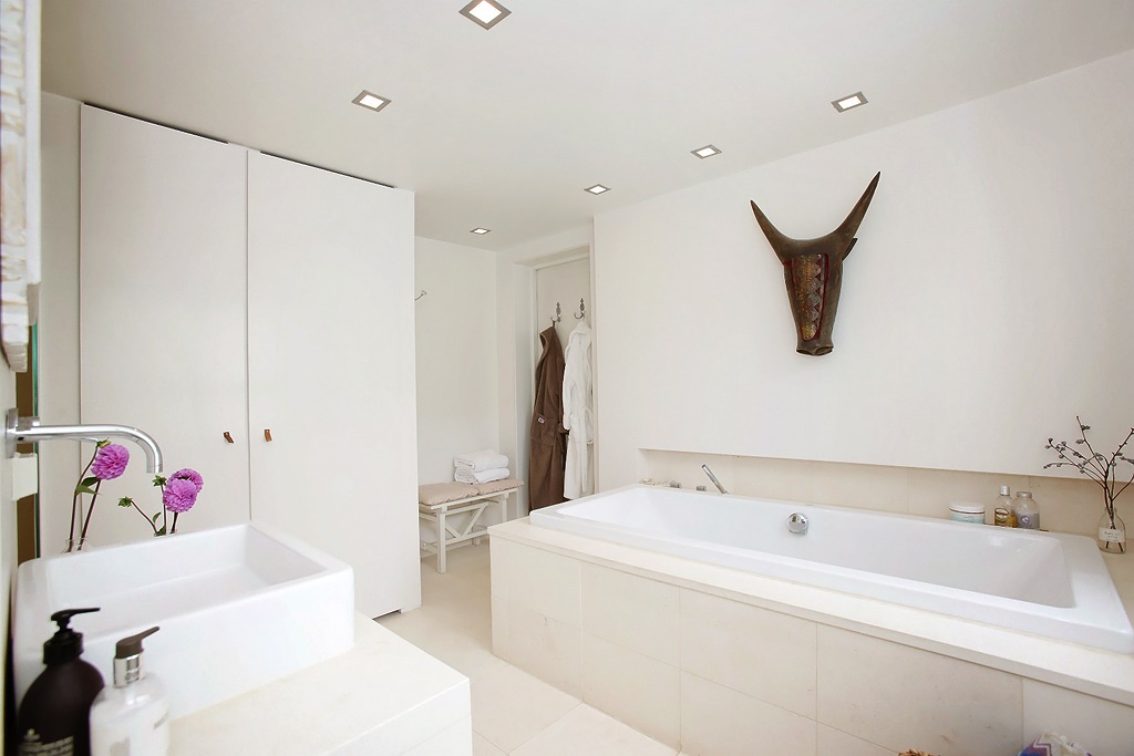
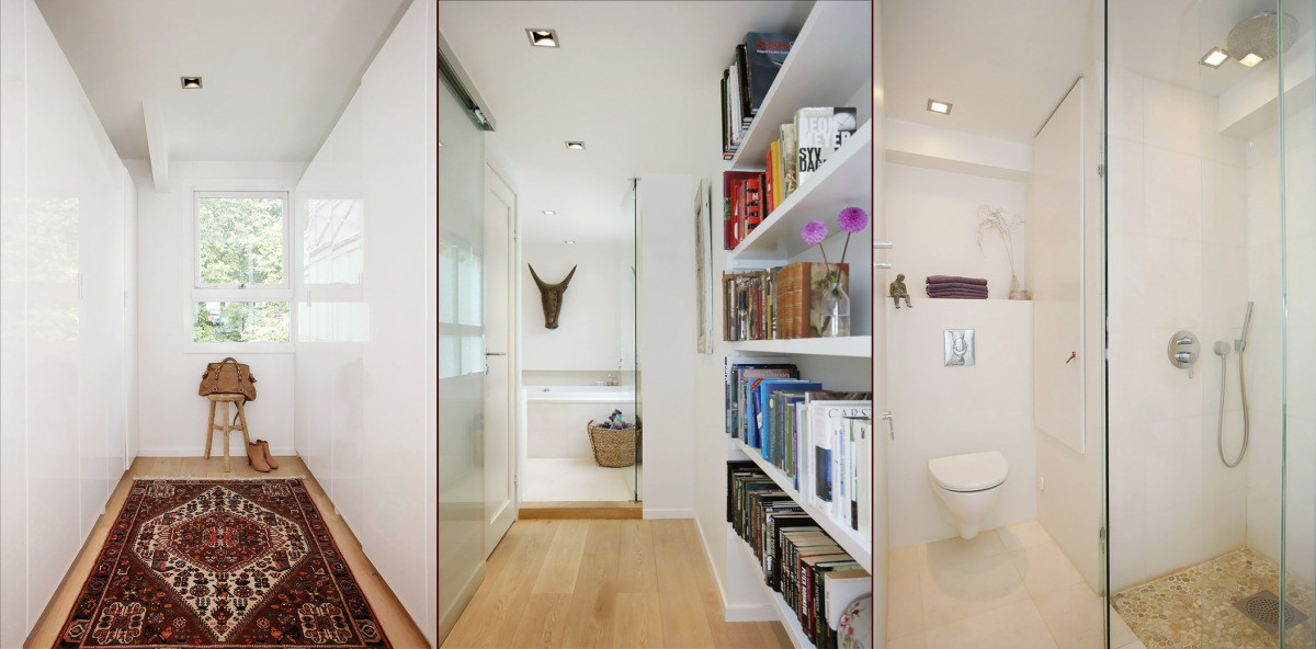
White is the calling cardScandinavian interior. There should be a lot of it, as it gives a feeling of space, light, air and cleanliness. It has become the main background of the entire space. Accent details in it are: textiles, carpets, fancy figures, flowers. Look how with their help the room has been transformed, sparkled with colorful paints. Even the books on the white shelves look like decoration. The living room greets residents and guests with a colorful mood. White walls do not press, looking at the floor, you immediately feel the warmth of this house. This effect is enhanced by a small wooden stool on which you can sit down, taking off your shoes. The dressing room is no exception. It is simple, functional and bright. The snow-white bathroom looks very stylish. White color, glass partitions in the shower, the shape of the toilet - everything works to increase the space. Pebbles on the floor in the shower, the head of an animal above the bathtub add natural and ethnic motifs. Even the bathrobe is matched to the fittings and decorative elements. Interestingly, the bathroom and toilet floor is finished with heated ceramic tiles. Practical and warm! In the bedroom, the white color was diluted with textiles, furniture, and a carpet. The headboard of the bed was highlighted with a darker background, but diluted with a white pattern. The result was a peaceful atmosphere.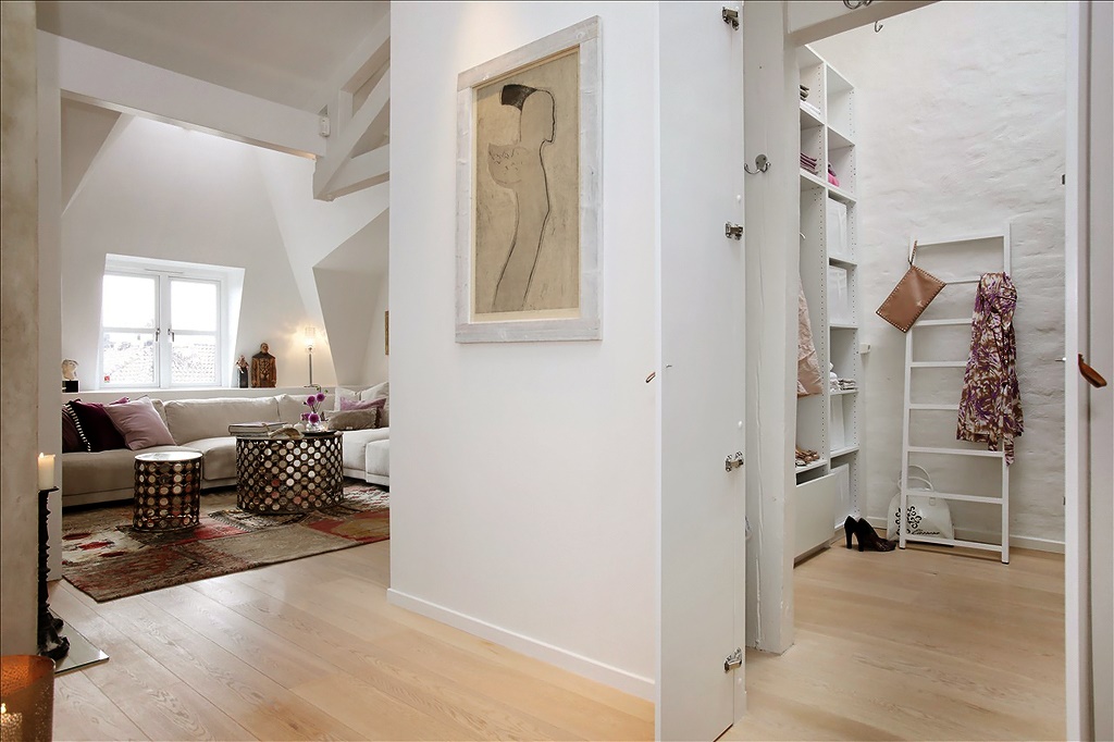
Terrace: a touch of nature
A small bedroom located on the second floorlevel of the apartment, visually managed to expand due to the fact that part of the wall is glass and opens onto a terrace, the area of which is 22 square meters. Since the harsh climate of the Scandinavian countries does not spoil with an abundance of greenery and sun, every corner of living nature is very valuable. The terrace with vegetation is located on the south side. It is an outlet for the owners and an extension of the space.

Note!
 Despite the broken walls and ceilings, the interiorlooks balanced and comfortable. The presence of wooden beams divides the space into functional zones and adds an original sound to the space. finn.no
