In the house, as in a person, everything should be beautiful. Carefully thought-out design and furnishings are the key to a wonderful mood and well-being.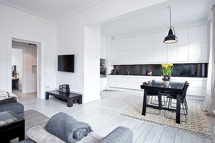 Let's find out about the main shortcomings that threaten to become a real failure when creating your own project.
1. How not to spoil a small space
The key to success is rational usearea. First, limit the amount of furniture. Moreover, it is better to place it near the walls, and not scattered around the room. A large and roomy wardrobe (preferably with doors made of mirrors or opaque, frosted glass) is an alternative to many bedside tables, shelves, chests of drawers. The same applies to accessories, if there are too many of them, the room will acquire the effect of clutter. Make only 2-3 bright accents with their help. Secondly, the wrong color scheme. You should avoid an abundance of white, remember about pastel shades, they are very diverse and not boring. The same applies to the flooring. Let it be light, so you will visually increase the area. If it is dark, then “throw in” a beige or milky carpet. Thirdly, use the vertical space. Charming hanging shelves in high-tech style or with a rustic flavor will add uniqueness and charm to the interior. It is also worth mentioning about curtains, you should not hang them too low, the best option is ceiling tracks. Fourthly, more light and a small room will become more comfortable and spacious. Built-in spotlights or hidden lamps, floor lamps of lightweight construction are best suited.
2. Layout and design of small-scale
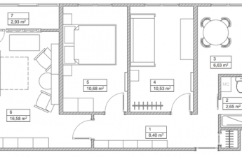
The first thing that comes up is the question of storing things,limited space requires a balanced solution. Use horizontal areas, niches that are easy to disguise in the wall. Don't be afraid of large furniture, the main thing is that it is proportional to the volume of the room. But all sorts of little things should be in limited quantities, get rid of the old and unnecessary. Before starting the renovation, you should carefully plan everything, down to the smallest details. Don't get carried away with zoning and using different materials as dividers. Unity of style - that's what makes a small-sized apartment better.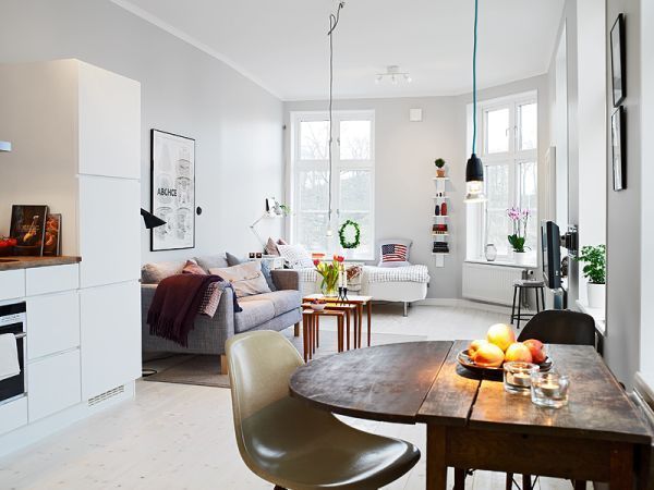
3. Living room without errors
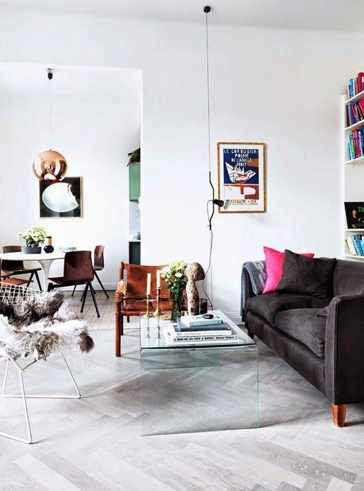
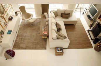
One of the most common problems is abundancefurniture and the wrong selection of mismatched accessories. Move away from the usual arrangement of sofas and tables near the walls, along the perimeter. According to design experts, the arrangement of small zones, grouped elements, looks much more interesting. Another problem with most living rooms is monotony and fear of bright accents. The entire space in one color scheme (even if it differs in shades) is extremely boring and has long been out of date. Do not confuse rich colors and elements applied pointwise with the desire to absorb the apartment in all the colors of the rainbow. The main ally in this matter is a sense of proportion. A couple of orange pillows or green curtains on the windows will bring freshness and individuality to the interior. It is also worth mentioning paintings, photographs, or rather their arrangement. Often, we intuitively understand that something is wrong, but habit does not allow us to see the mistake. It's all about the height. Canvases are often hung from the ceiling, while the ideal place is at eye level (think art galleries, museums) and in one line, unless it concerns collages of different sized frames.
4. “Lyapy” in the bedroom
The main principle when creating a sleeping area andrelaxation is a feeling of comfort and privacy. Do not make the lighting too bright and "striking" into the eyes, it is best to have muted and soft colors. The same applies to the color scheme. It is better to be less saturated, use pastel and natural shades. The location of the bed in the space plays a role. Consider its size and dimensions, it is most convenient when there is access from both sides. Contrary to popular belief, furniture pushed into a corner, on the contrary, will reduce the volume of the room.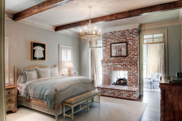
5. Mistakes in the children's room
Don't try to incorporate it into your room designyour children their old fantasies and dreams, and it is best to consult with them, find out their wishes and preferences, because the room is intended for them. As a rule, thematic design (space or sea ship, princess house, etc.) quickly gets boring for everyone. Therefore, when planning a long-term renovation, give preference to neutral design options, and accessories or furniture, which are much easier to change, will help to give them a particular theme. It is not customary to save on children. But the funds must be invested wisely. It is best to spend them on high-quality environmentally friendly materials, but leave expensive accessories and trinkets for later. Let the furnishings be functional, designed for children's games, where an irrepressible character can correct something with a pencil and felt-tip pens.
6. Failures in the kitchen
Triangle with sink, stove and refrigeratorshould be calculated rationally: not too big, but not tiny, where two people can barely fit. As for materials, it is worth thinking about quality. Having initially saved on buying tiles or special wall coverings, in the near future you risk ruining the surface with steam from cooking and greasy stains that cannot be washed off. The same can be said about the hood, it is not a luxury, but a necessity.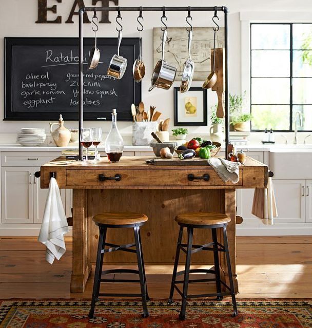
7. Bathroom without problems
This is the place in an apartment or house wherethe arrangement of which it is simply unreasonable to save. Any imperfections or cheap materials can easily lead to plumbing failures in the future, and this threatens a flood and a total waste of repairs. Therefore, if you have difficulty installing communications, lighting, it is better to invite specialists. Choose the right sources that correspond to the specifics of the room. Namely: resistant to high humidity, temperature changes, the appearance of fungus and mold.
8. The queen of mistakes - poor lighting.
The most common method is whenonly one light source is used, which is fundamentally wrong. Create multi-level structures with spotlights, sconces, floor lamps, etc. Use dimmers - power regulators, they will allow you to create an atmosphere in the room, as they say, on demand. If there are large cabinets in the room, do not neglect additional lighting built into them.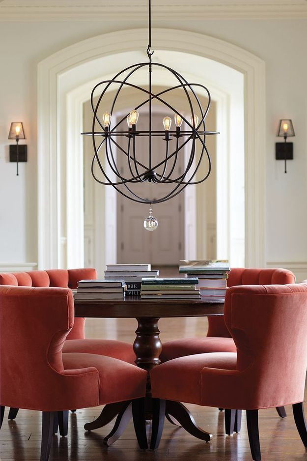
9. Wrong color matching.
• Choose a color palette taking into account the lighting.The same shades look completely different in natural and artificial light. • No one limits you in the number of colors, but it is preferable to have 2-3 main ones or the same number of additional ones to place accents. • Unity of the interior, all the rooms should echo each other, and not be a separate universe. • People learn from mistakes and this is a fact, take risks, try, this is the only way to find the perfect solution.
10. Put things right
Having completed the repairs according to all the rules andusing the given tips, you have received ergonomic housing. But now it is important to maintain it in a decent form, and for this you will need cleaning and tidying up. Use, for example, modern special containers and boxes that carry not only a functional load, but also a decorative one. Do not fill the space with unnecessary things.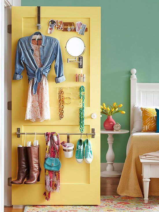
11. Mistakes to be made
Breaking some rules is not only fun,but sometimes it is useful, and this also concerns the interior design. What is unacceptable in some conditions, in others will sparkle with new colors and become a highlight. Therefore, everything is strictly individual and depends on how you present a non-standard solution. A floor without a carpet, no curtains on the windows or pillows on the sofa, etc. - all this is worth trying and seeing what happens in the end.