Do you plan to change the color scheme of the kitchen and can not choose between beige and brown? Inspire with our article and break your own stereotypes
Every time, thinking about renovating a kitchen, inWe choose the tried and tested shades of wood, white and beige as the color scheme for the most popular space in the house. However, as we use it, we realize that we may have made a mistake, and more juicy shades are exactly what our kitchen lacks now. In order to save you from the excruciating pain of disappointment from an unsuccessful choice, we suggest puzzling the problem in advance and familiarizing yourself with bright color schemes, one of which will surely get a response in your soul thirsty for new impressions. Egg yolk color
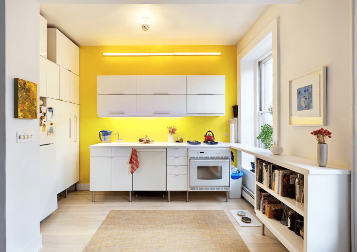
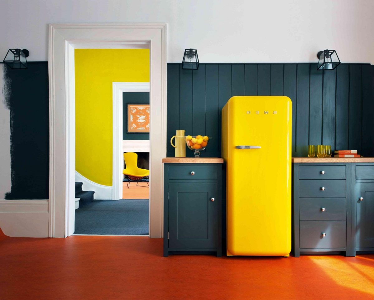
Yellow - the color on all sides is positive: it increases mood, stimulates optimism and strengthens digestion. However, its use in the kitchen should be dosed. Yellow is beautiful in the form of a kitchen apron, small details of facades, towels and accents. 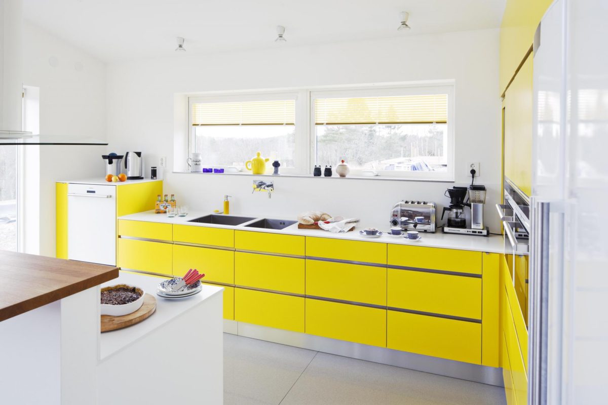
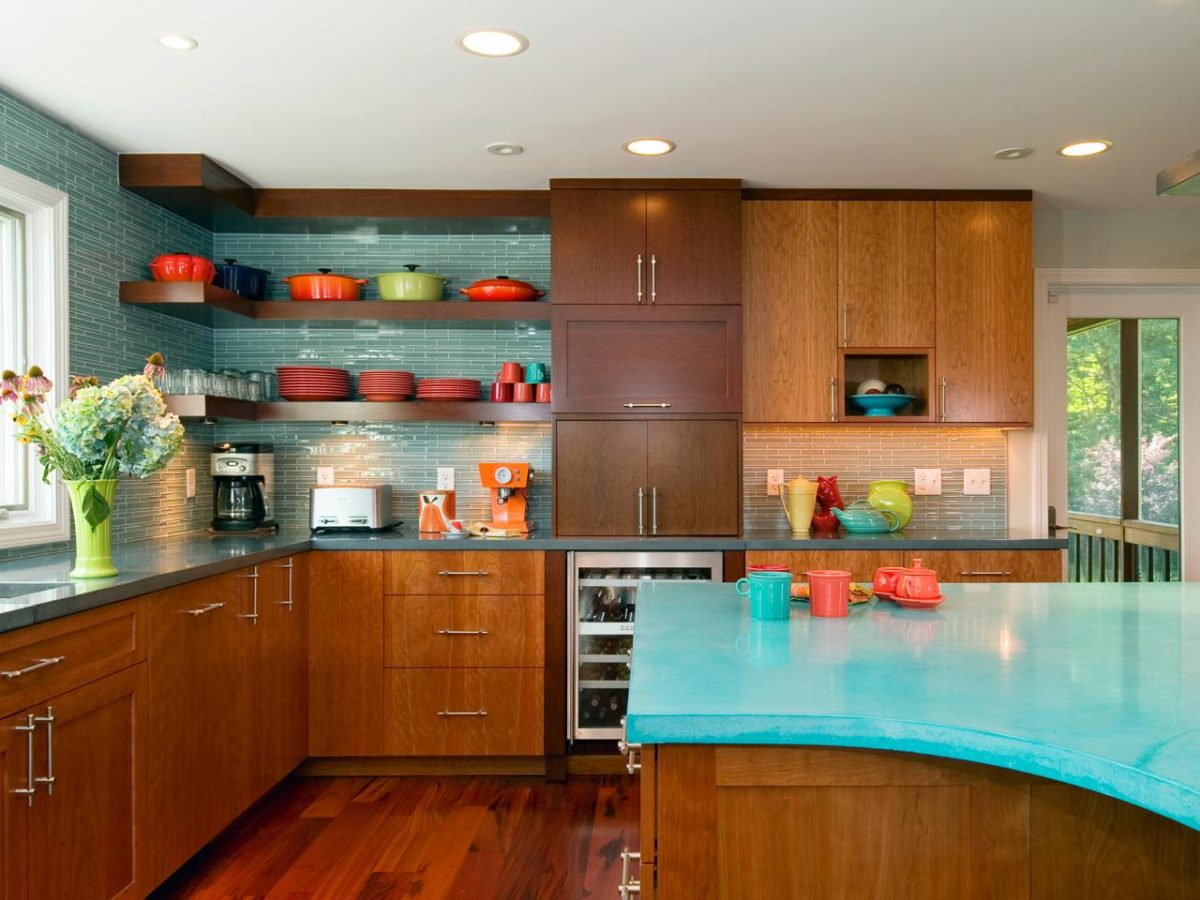
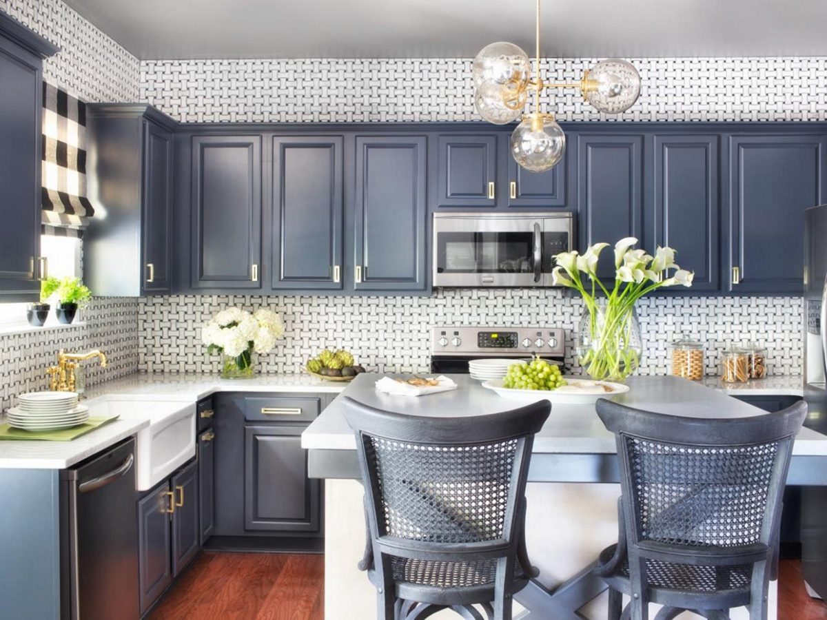
 Color of the sea
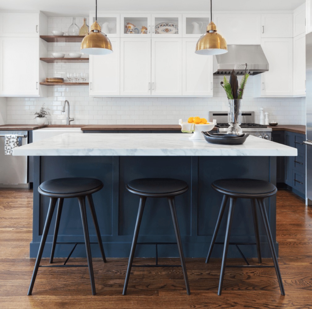
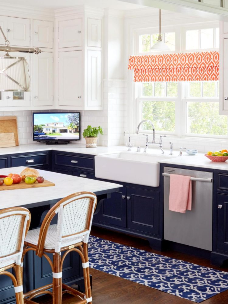
Blue-blue is now at the peak of popularity ininterior design. Despite the depth and richness of the hue, in the kitchen, it looks more than appropriate, does not suppress or puff. But if you are planning to create an absolutely stunning effect, we recommend adding white, gray, gold shades and wood textures to the blue kitchen. Together they will look like a strict blue suit with brown shoes, a white shirt and gold cufflinks. In other words - the style is guaranteed to you. 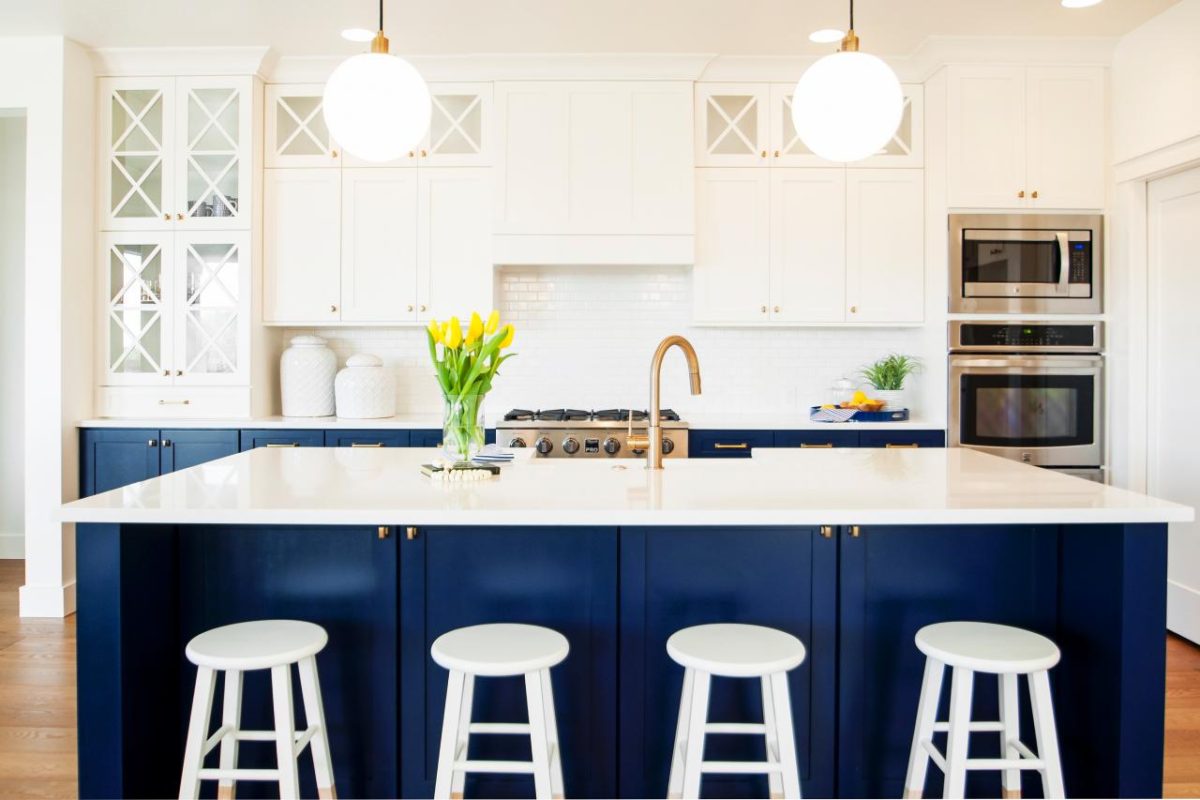
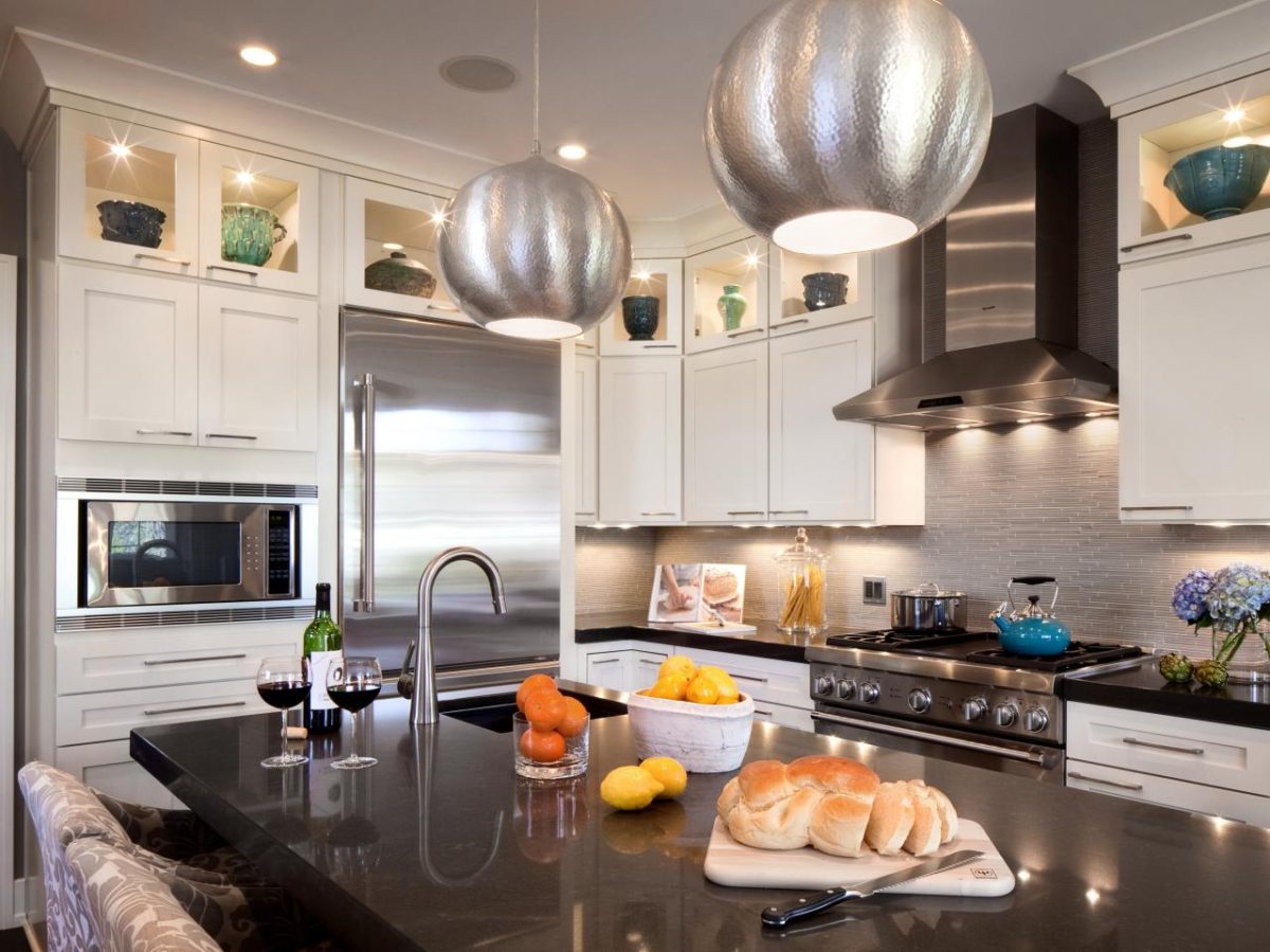
 Glitter of metal
Metal reflects light and as a consequence -increases its number. And for the same reason, he attracts attention. And the brighter the shade of metal, the more this attention it attracts. To chromium, all have long been accustomed to, but this season, a wide acceptance received a mixture of different colors of metals in one particular room. Depending on the environment, copper, chrome and gilding in the form of accents and details look solemn, stylish, bright, glamorous or even vintage (if the metal is chosen with a patina). 

 Bright combinations
To achieve an impressive result,necessarily mix yellow with purple, but terracotta with turquoise, orange with gray and red with white will be quite appropriate. Of course, the brightest shade can be used as an accent in details, textiles and accessories. 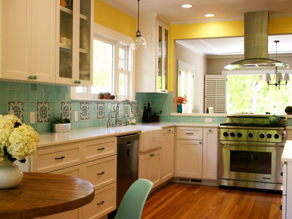
 Shades of gray
Without a doubt, "gray" is a new "beige". But unlike beige, which is often called boring, gray has a wider tonal range. Gray can be stylish, silvery, smoky. It perfectly combines with many rich shades and is good both as a base and as accents. 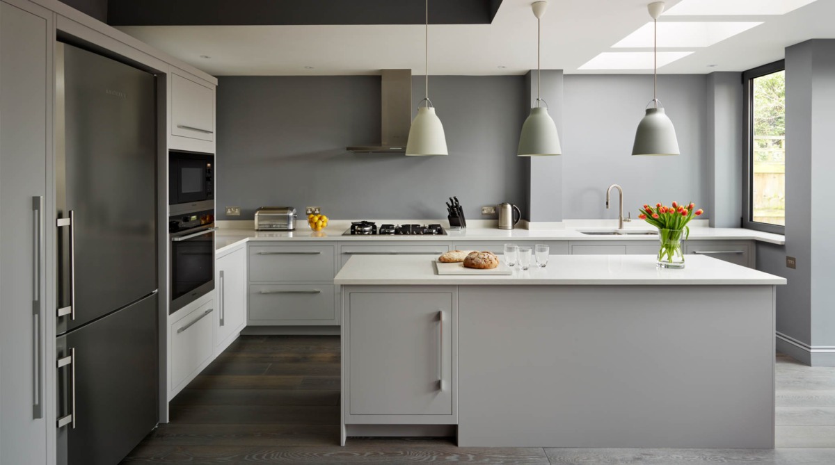
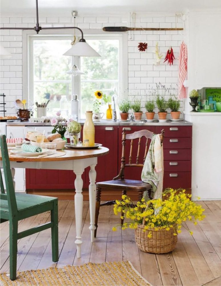
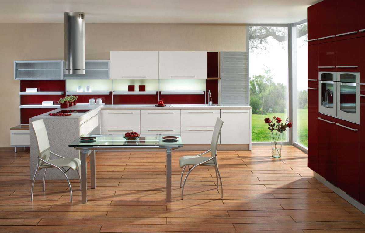
 Bordeaux
Red cuisine may seem daunting, it isso we do not recommend painting the facades in wine shades, especially if the space itself suffers from a deficit of light. However, bicolour facades, white with red for example, where white predominates, will be good even in small kitchens.