We don't always get an apartment or a house,that we dreamed of. Low ceilings, gloomy dark rooms, a kitchen with no room to turn around, a narrow hallway... In this article, we will figure out how to fix some common space shortcomings. Fortunately, the problem has already been identified, which means the first step has been taken. Now it's time to do the little things!
Problem: Low ceilings
If your room is like a cave with low vaults, and you dream of a spacious hall, like in a palace, a miracle will not happen overnight. But you will still be able to "raise" the ceiling a little.
Decision:
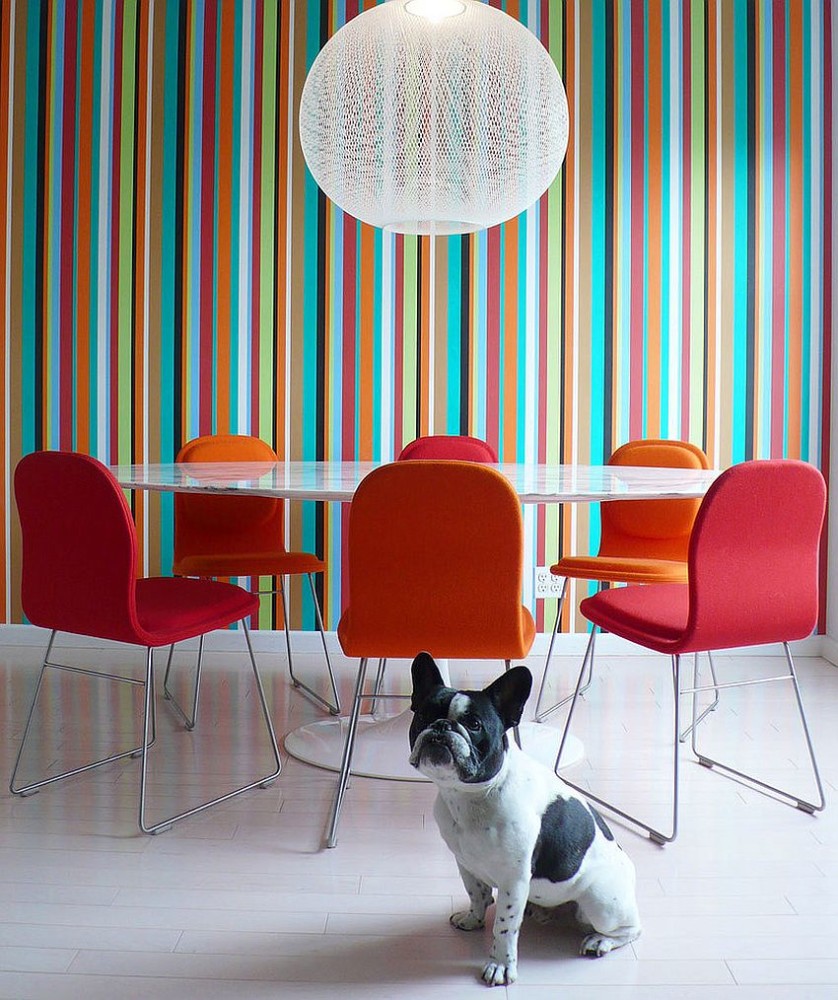
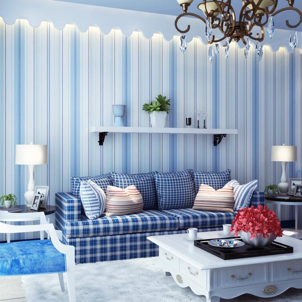
The "gloss" on the ceiling will visually lift it up -This can be a special paint, a glossy stretch ceiling or mirror panels. Another trick is that the paint for the ceiling should be at least a little lighter than the walls, but of the same shade. Avoid a contrasting border on the border between the walls and the ceiling, a mirror strip is the maximum. Pay attention to wall or local lighting instead of a traditional chandelier. Wallpaper or tiles with a vertical pattern will visually "stretch" the room.


Problem: Few lights
Decision:
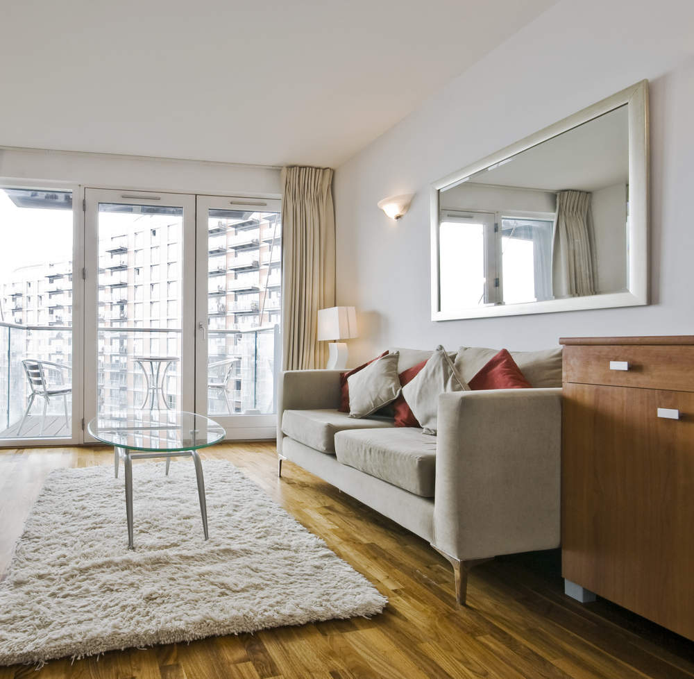
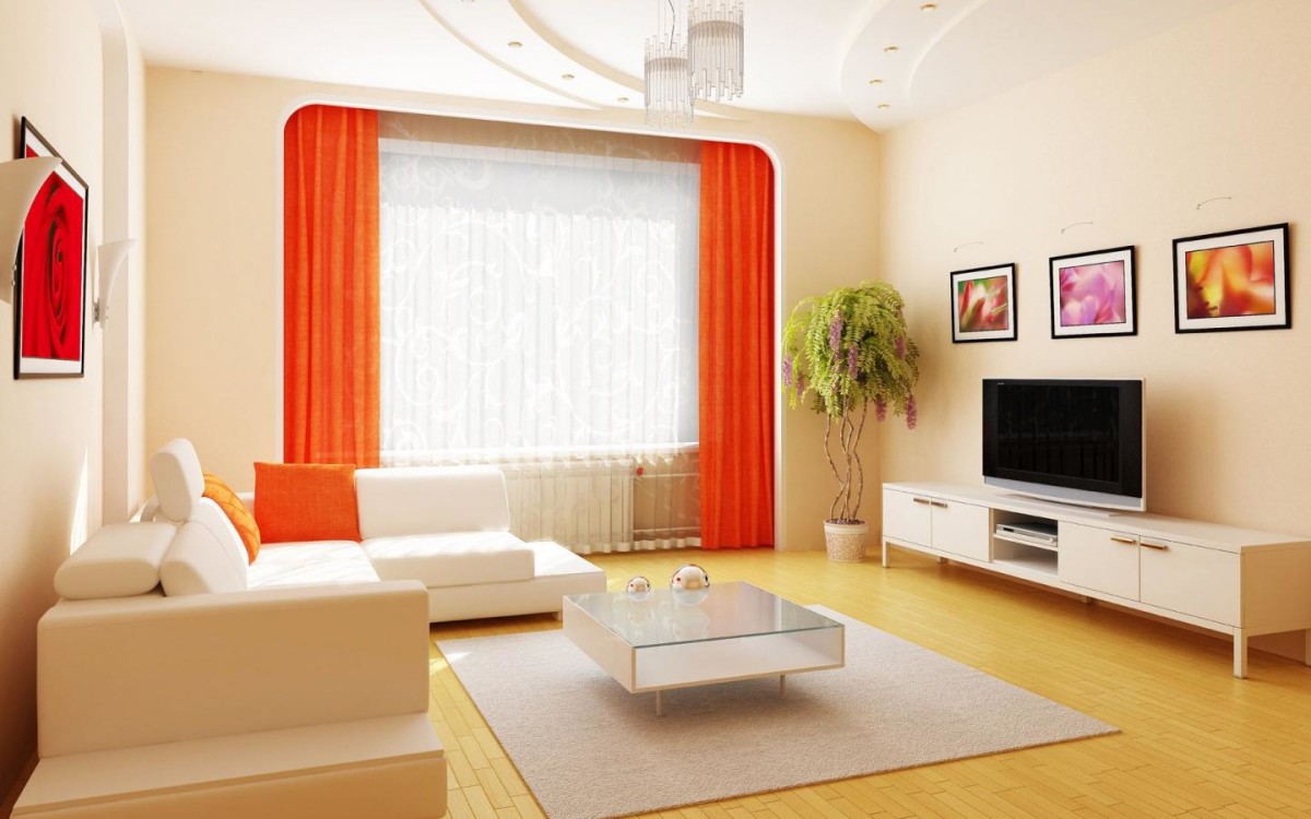
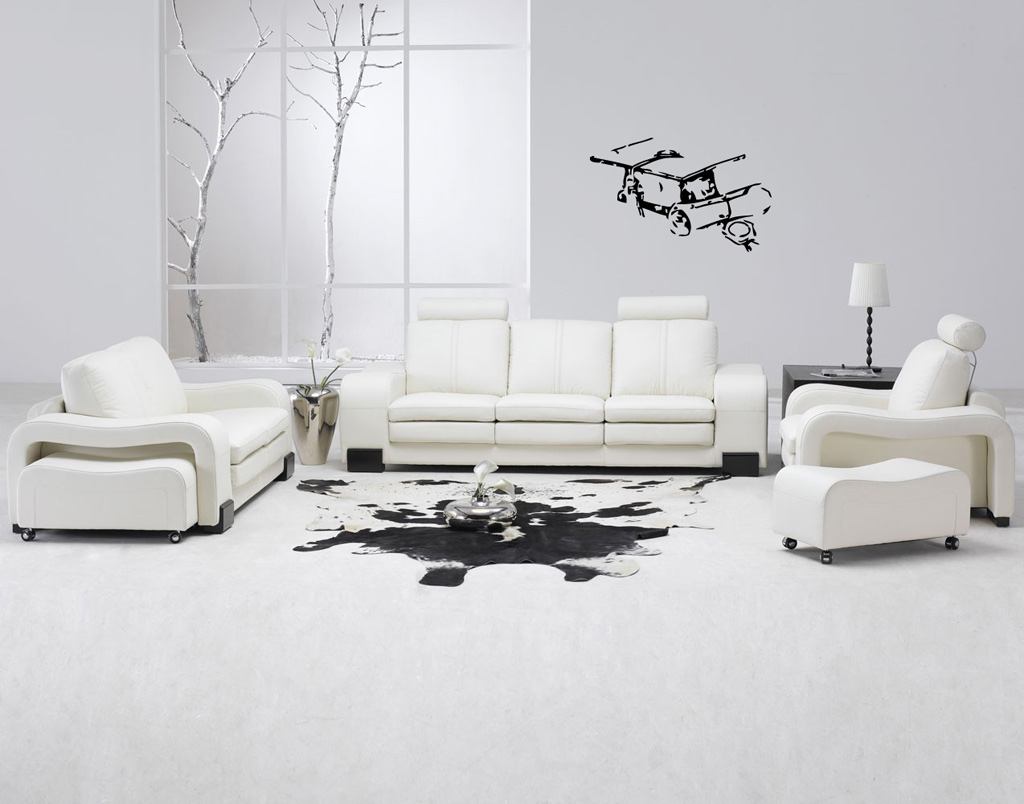
First of all, let's remember something old but provenmethod — use light coverings for the floor, ceiling and walls. These can be shades of white and beige. The curtains on the windows should be light to let in the maximum amount of natural light. Large furniture should not be too dark, otherwise it will nullify all your efforts. Glossy, reflective surfaces, as well as glass, behave well. Editorial opinion: — — is also a great way to deceive your own perception, make the space larger and brighter. The main thing is to place them correctly: for example, opposite the window or so as to “catch” the light from the chandelier.

Problem: Lost bathroom view
Decision:
Even if the tiles in yours look perfect,A picture can be spoiled by such a trifle as cracked seams. Using modern grout, you can quickly "refresh" the bathroom. Check the condition of your plumbing. Something needs to be cleaned, and something needs to be replaced. A new curtain or bath mat will lift your spirits. The room should not be dark - replace the lamps, use additional lighting for mirrors or shelves. Editorial opinion: - Sometimes less is more. Even such trifles as a new glass for toothbrushes, interesting hooks and fresh towels can instantly transform the bathroom.
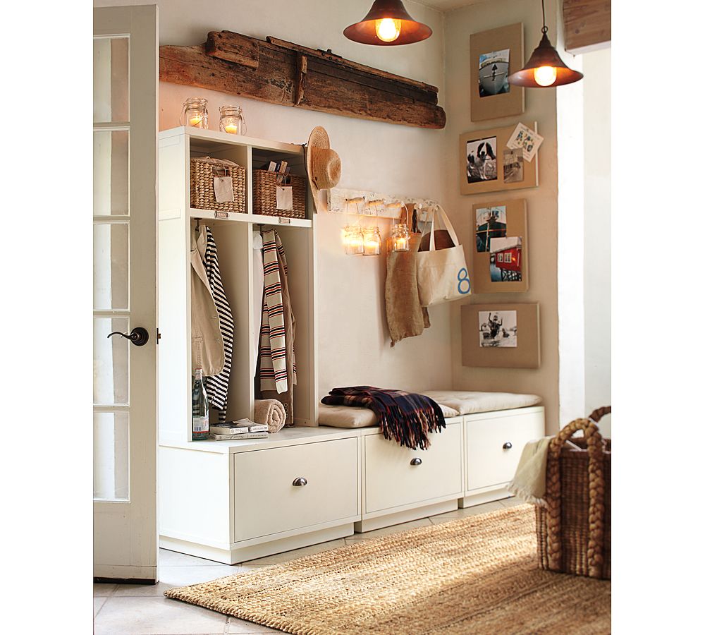
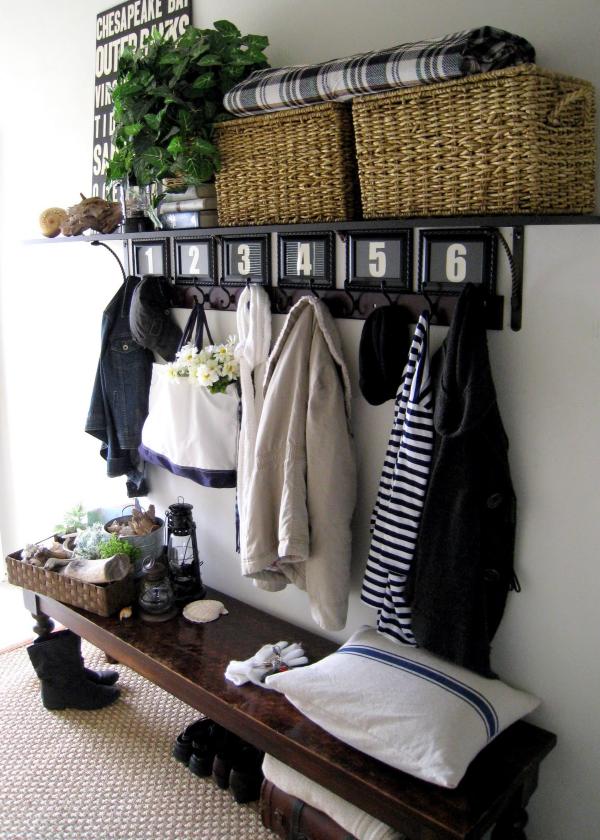
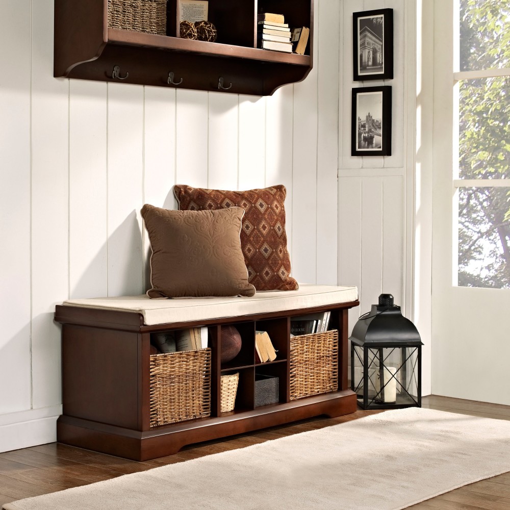
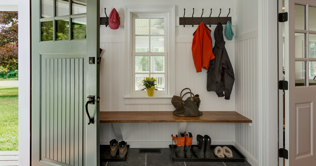
Problem: The small hallway
Decision:
Maria Abramova, interior designer:— It is necessary to avoid dark deep colors of walls or floors, do not create a strong contrast between them. Choose finishing materials for the floor with a small proportional pattern. It is better to choose tiles of a size range up to 20 x 20 cm, possibly with even smaller decorative inserts. Marble mosaic with a weaving pattern may also be suitable, but it is better to avoid very small ones (2 x 2 cm), for example, mosaics. Diagonal laying with small decorative inserts that go "into the walls" will visually expand the floor. It is also better not to use proportionally large objects on the walls, such as bulky furniture for the hallway. A wall hanger will be enough. A large volume of mirrors will greatly increase the space. For example, you can make sliding mirrored doors for a wardrobe or hang a large mirror to the left or right of the front door. am-interiors.ru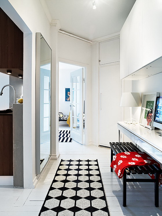
Problem: Small kitchen
Decision:
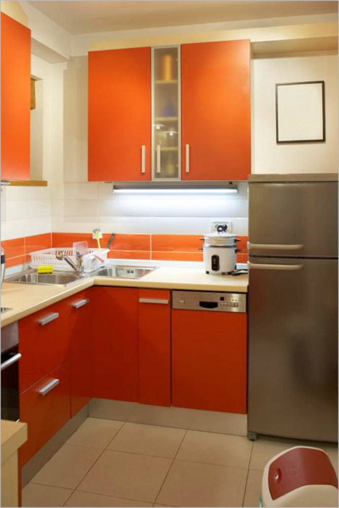
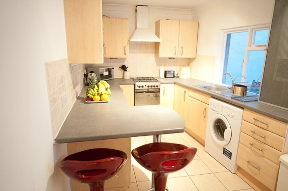
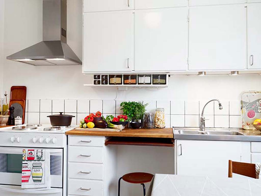
Мария Абрамова, дизайнер интерьеров:— Proportions are also important here. From the standard sizes of kitchen furniture bases offered by manufacturers, it is advisable to choose bases of 45-60 cm, no more. Upper horizontal drawers up to 90 cm can be used to visually lengthen the wall, but in small quantities. Now there is a tendency to abandon upper drawers in favor of horizontal open shelves, which also visually lightens the space. In the design of the "apron", it is important to choose a small tile size, avoid massive textures. Glass or other glossy material, with photo printing, for example, can also be suitable. Horizontal lighting hidden under the line of upper drawers or shelves will especially increase the space. am-interiors.ru
And:
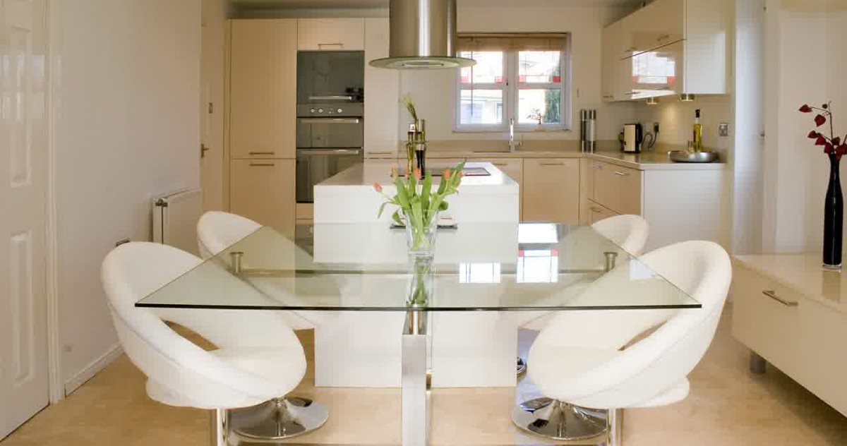
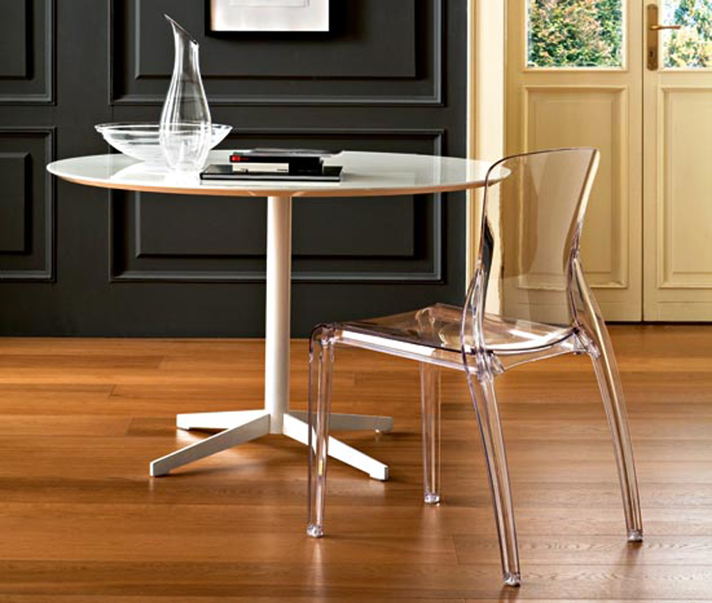
Not everyone likes transparent furniture, but it isit will visually increase the kitchen space. In fact, a round or oval table takes up less space. This way you will have more chances to maneuver. And sometimes the problem lies on the surface: clear the surfaces of unnecessary things, remove or throw away equipment and dishes that you no longer use.