This Swedish apartment won us over with itsendless snow-whiteness and how harmonious, cozy and stylish a monochromatic space can look. Do you want to know how to correctly place accents in a white interior? We will tell you now It is no secret that they are a favorite for many designers. After all, they are like blank canvases for an artist and are an excellent basis for any compositions and color combinations. But to understand how to make such an interior ideal and where to place accents, it is best to turn to real examples. One of such stunning role models can be called a two-level apartment from Sweden, which we will now get to know.
Attic in Swedish
Situated on the top two floors of the historic buildingbuilding in Stockholm, the apartment occupies a total area of 117 square meters. Its interior is made in the traditional style for these parts, but the elegant color scheme and the presence of vintage elements make it more original and stand out from the crowd. What is very captivating is that here each room is like a continuation of the other, and the whole space looks very harmonious and peaceful. Quite often in monochrome interiors, designers use different shades of the main color to make the space more voluminous and visually interesting. However, in this apartment there is not even the slightest hint of such an approach and everything is based on pure white.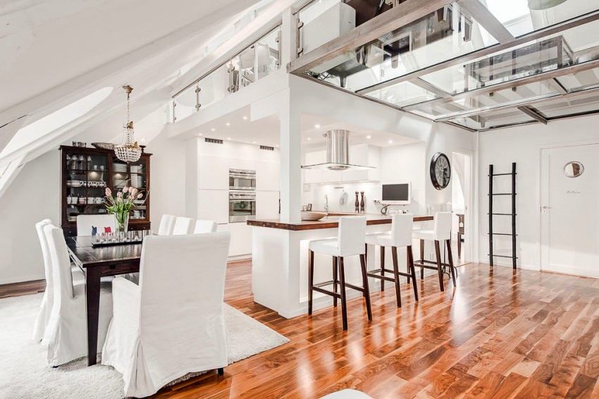
Layout features
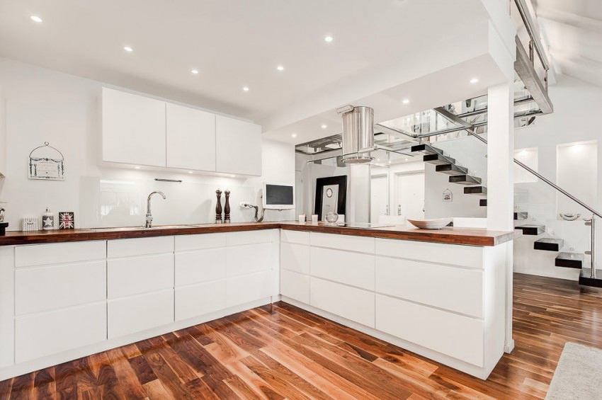
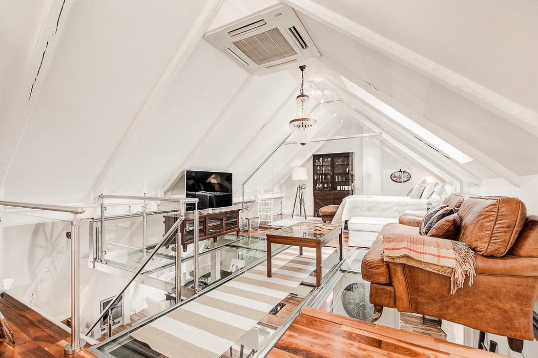
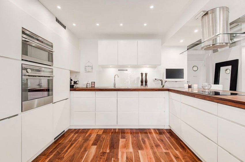
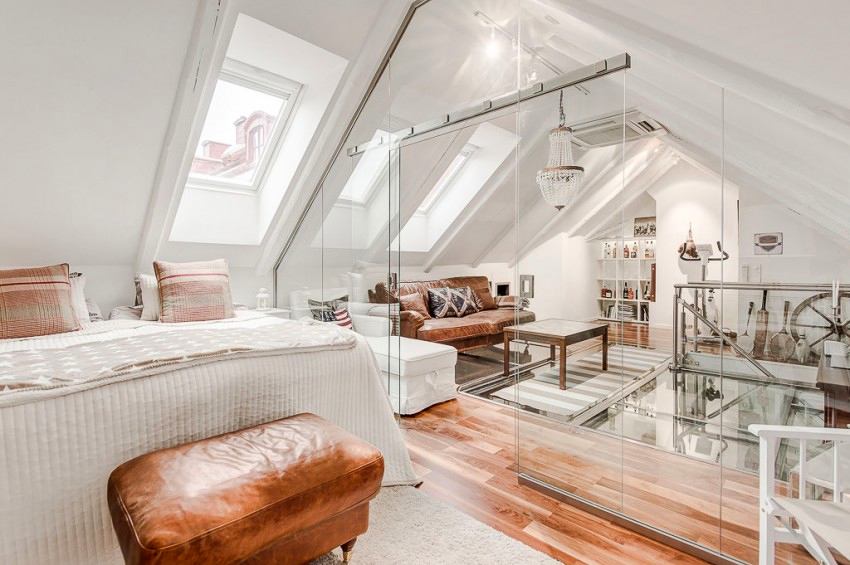
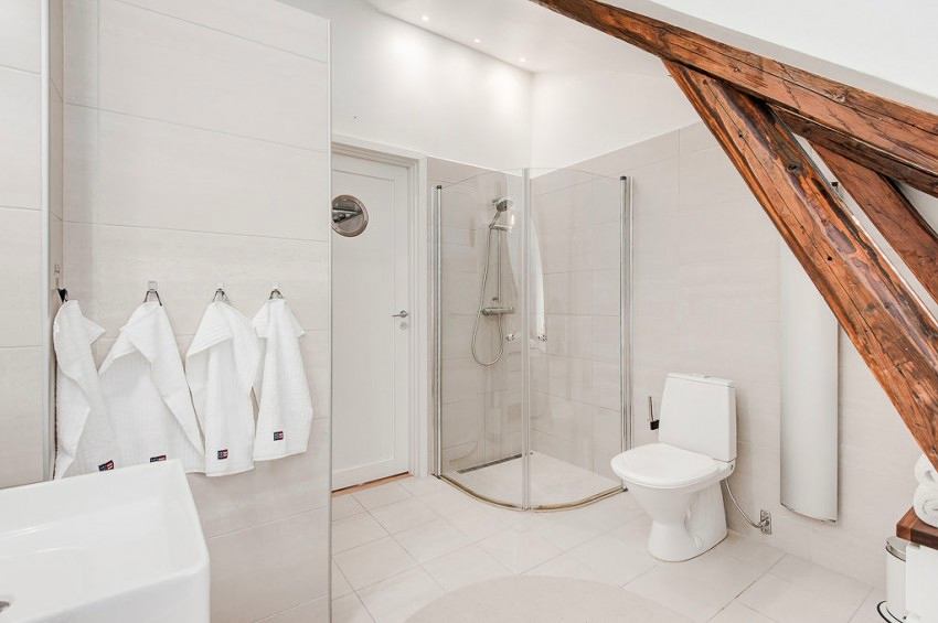
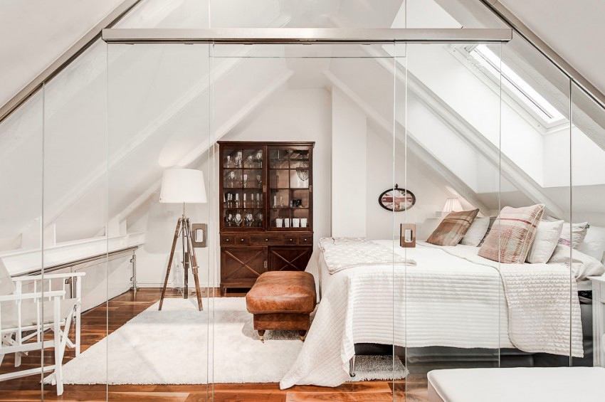
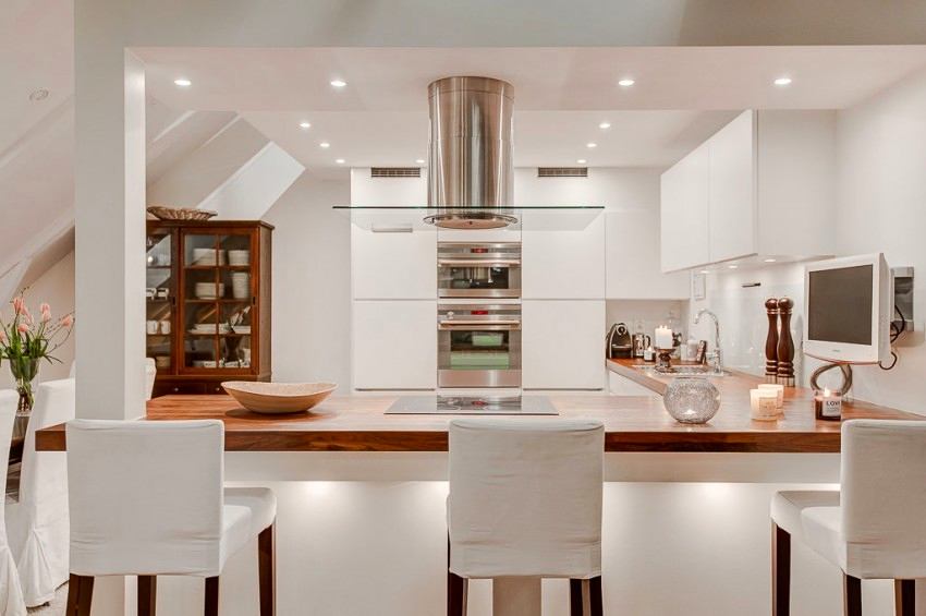
On the first floor of this apartment we will finda secluded bedroom, a home version of an office, a bathroom, as well as a large kitchen and adjoining dining area. I would especially like to note the ultra-modern kitchen equipment, as well as chrome elements in the appliances, which shine incomparably in the rays of the wonderful multi-level . Ascending to the second floor, we will find the master bedroom and a cozy living room with glass partitions that make the space integral and airy. And, of course, it is impossible to pass by the breathtaking transparent glass floor.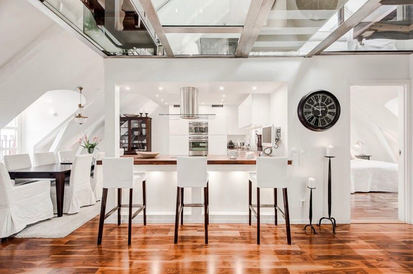


Floor or ceiling?
The glass floor in the living room is alsoceiling above the kitchen and dining room, which means the owners will have to wash it from both sides. But for such beauty, this is a mere trifle. But such a floor-ceiling gives even more light to the apartment, which visually expands the space and creates a feeling of freedom. On the first floor, the floors, of course, are not so spectacular, but nevertheless, the glossy red-brown laminate looks excellent and fits well into the overall picture of the rooms smoothly flowing into each other.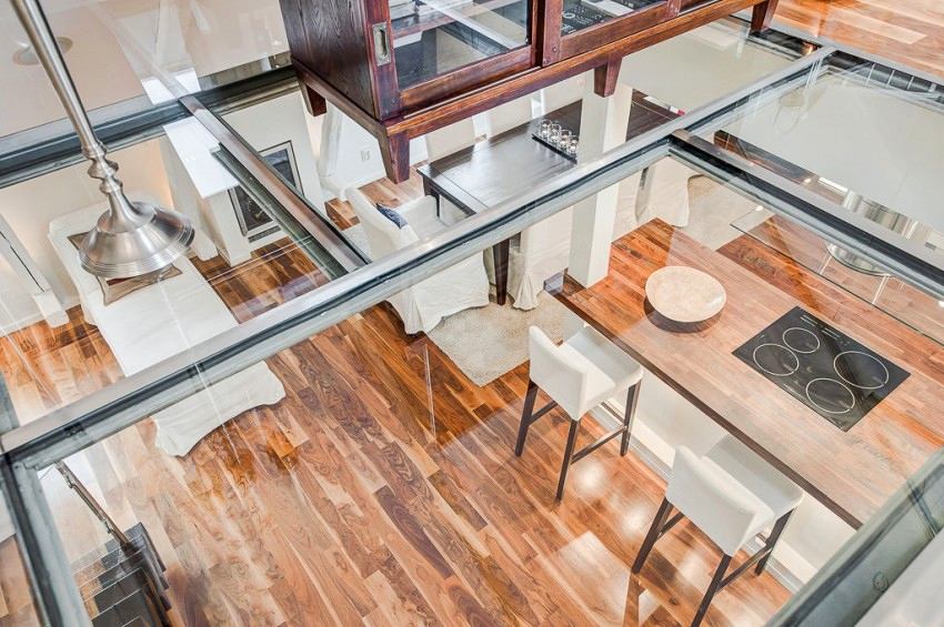
Important accents
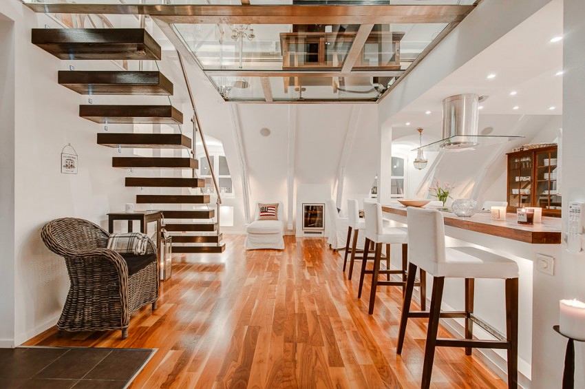
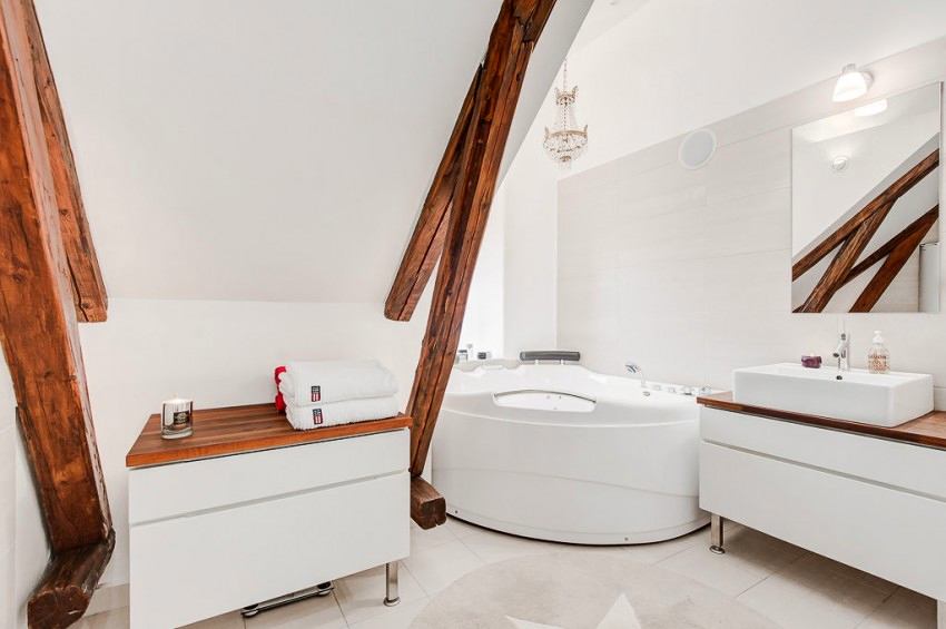
And so that the white interior does not end upcool and uncomfortable, the warmest and most homely element was added here - and this is, of course, wood. Together with white, it looks simply stunning and perfectly compensates for the lack of other shades. There are many such contrasting wooden accents in the apartment: an antique sideboard in the dining room, where white porcelain dishes are stored, another, similar, on the second floor, furniture in the living room, floors, a kitchen countertop, a rattan chair, several more decorative elements and even a staircase. By the way, if you do not look closely at the translucent fasteners, it seems that the staircase with dark wood steps seems to be floating in the air, and it really looks exciting. In addition, the presence of leather furniture and antique wooden beams brings additional texture, originality and color to the space.
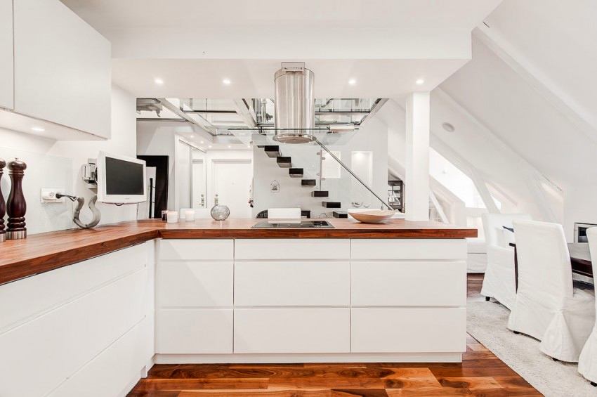
 The abundance of glass and reflective materials is also important.surfaces that allow the room to be filled with light and visually increase it. Therefore, crystal chandeliers, huge mirrors and chrome elements have not only an aesthetic component, but also a practical value.

 freshome.com

