Build a country house-chalet or pompousa new cottage, or maybe a summer house, to make everyone jealous? Not everyone has such thoughts. The owners of the small house that we are presenting today wanted only one thing: a small cozy world for two, so that every corner would please the eye and warm the heart. You can see how wonderfully everything turned out for them and, perhaps, pick up something for yourself A country house near the village, small and cozy, with elements of a rustic style, where on the table of a small wooden veranda there is a scattering of wild berries. And certainly an attic with rooms for him and for her - these were approximately the wishes of the owners of the house under construction. Designer Tayana Zhuravleva enthusiastically took up the matter. Tayana Zhuravleva, designer Graduated from the Kiev National University of Design and Technology. Graduate of the school "Details". Currently - the owner of the studio of textile decor and interior design "Tayana". textil-story.wix.com/tajana This project was unusual for her, because she had a chance to be an architect for a while. The plan for the 96 sq. m. area had to be adjusted in order to use the small area of the house as efficiently as possible. Tayana Zhuravleva, designer: — Even before construction, we had to carefully calculate the sizes of the rooms and the furniture that would be placed in them, so all the furniture was made to order. Initially, we planned that there would be nothing superfluous in the rooms, only the most necessary and convenient to use. We chose wooden paneling as the main finish, since it best suits the rustic style and is also quite affordable. textil-story.wix.com/tajana
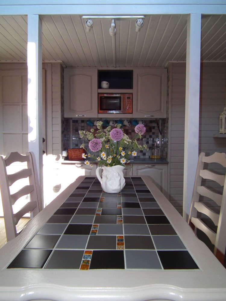
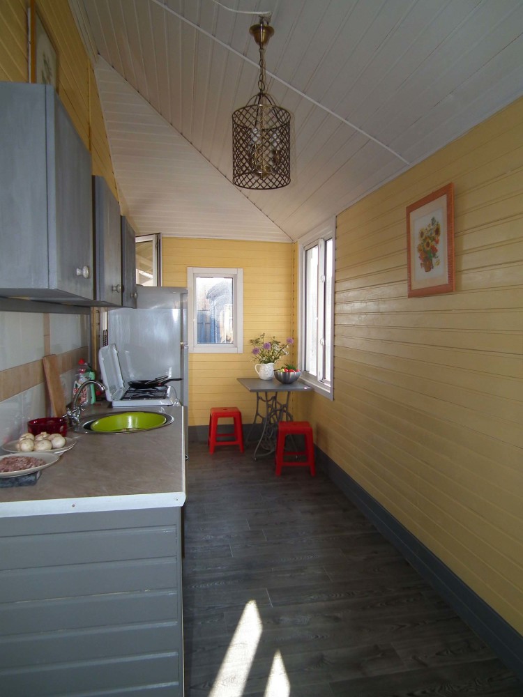
Kitchen veranda
The walls are painted in the color of linden honey, which creates a warm mood even in the most cloudy weather.
Living room
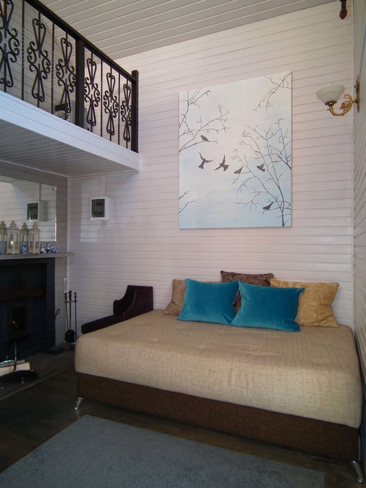
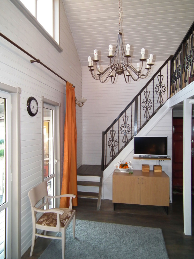
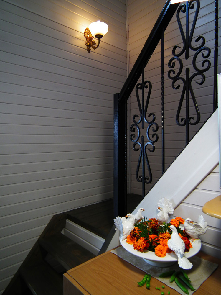
Living room area: 17 sq. m.Two glass doors lead out onto the terrace. The living room with a second light gives a feeling of air and space. The color of the walls supports this feeling. On the ceiling there are beams that were not covered up, but on the contrary, highlighted in a darker tone. The black openwork staircase somewhat dilutes the severity of the forms.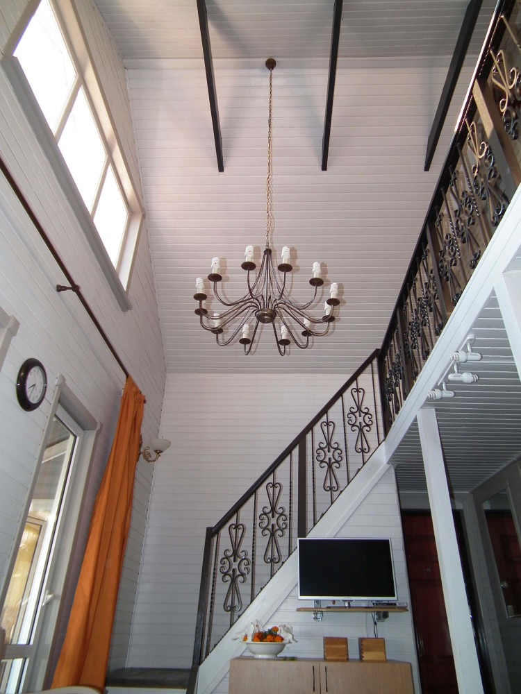 Tayana Zhuravleva, designer:— The double-height space dictates its own conditions, so large-scale items were chosen for the living room interior. In particular, a large panel with images of birds was hung on the wall above the sofa. Since the wall is blank and has a fairly large area, this panel was a kind of imitation of a window. The color of the upholstery of the sofa, armchairs, and chairs was chosen to be discreet. Bright details were added to the interior by turquoise pillows. Drops of this color were repeated in . All textiles (curtains in the living room, pillows, bedspreads) were made in the textile studio "Tayana". textil-story.wix.com/tajana
Rest Rooms
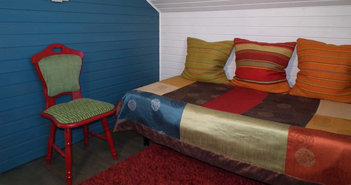
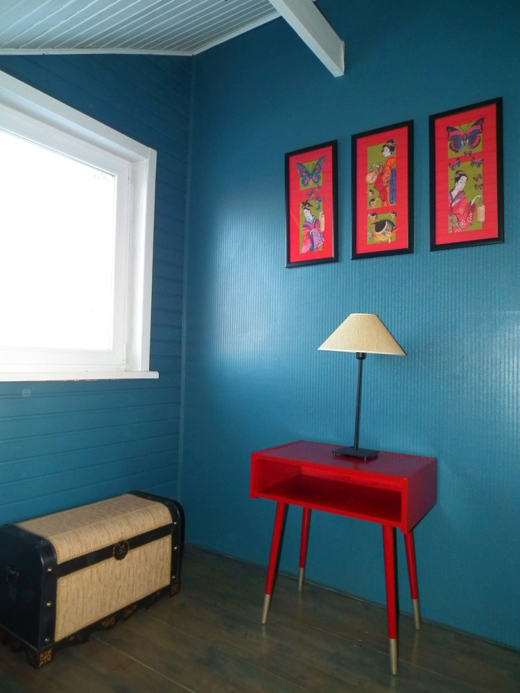
On the upper, attic floor there are tworecreation rooms. They are almost identical in color scheme, but completely different in theme and content. One is for women, with embroideries on the walls. The other is for men, it is not decorated, but rather filled with military-themed items that are interesting for leisurely viewing. The walls of the rooms are painted a deep blue. Despite the fact that each is only 7.5 sq. m., this color does not visually narrow the space, but makes it more intimate and pleasant for privacy.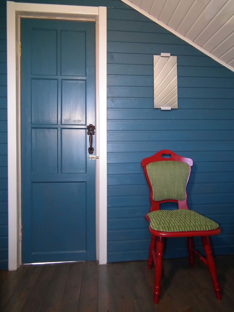 Tayana Zhuravleva, designer:— The objects in the men's room are military-themed. On the wall are framed reproductions of the artist O. Parkhaev's "Russian Army of 1812." On the table is a small bust of Napoleon. All these objects are not accidental: the house is located near the city of Mozhaisk. Not far away is the Borodino field. So to speak, the interior of the room is connected with geography and history. There is a field bag hanging on the chair, in which, as it should be, there is paper, pencils, and a map of the area. The owners of the house "travel" to famous places of the Mozhaisk land using these maps in their spare time. textil-story.wix.com/tajana
 The women's room features rich textilesfurniture. The vintage nightstand and chair were repainted, after which they perfectly “made friends” with the embroidered compositions on the walls. The chest turned out to be very practical — it replaces a chest of drawers for the owner. Tayana Zhuravleva, designer: — We deliberately refused to decorate the windows with textiles so that nothing would distract or interfere with admiring the meadow and forest landscapes. And we were right: storks live in this area. Early in the morning they can often be seen walking along the meadow. textil-story.wix.com/tajana
Bathroom and bath
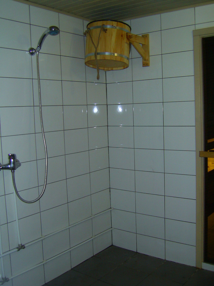
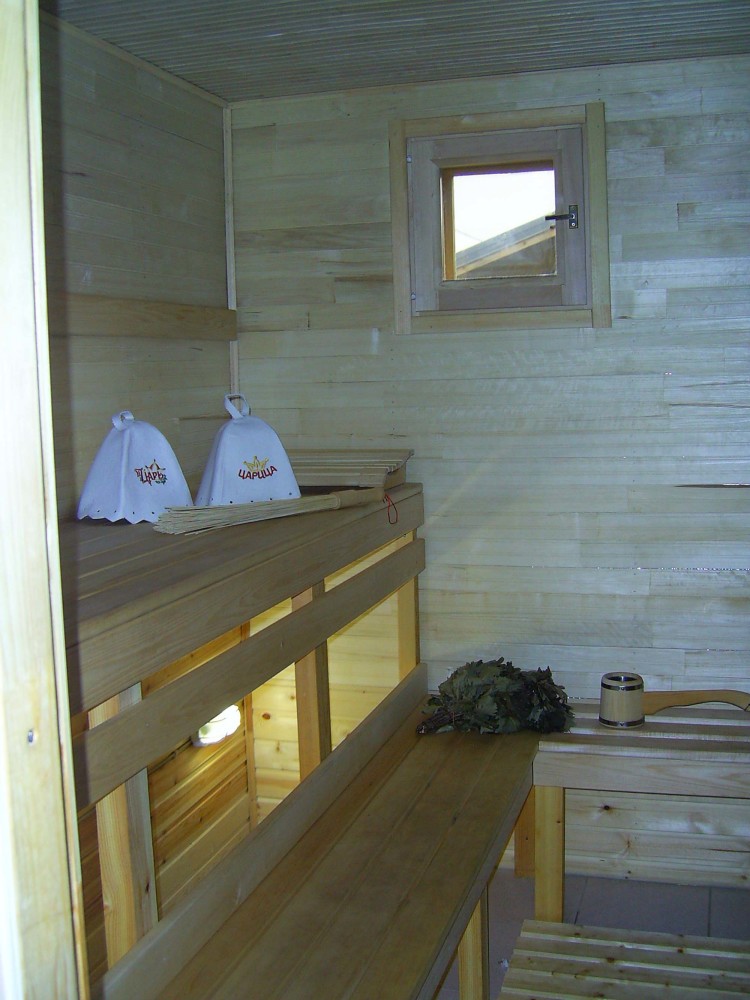
Despite the small area of the house,The bathrooms turned out to be small, but not cramped, with all the standards for the arrangement of furniture and plumbing. The toilet and washroom are 4 sq. m each, the steam room is 6 sq. m. The walls in the bathroom were not painted, but the wood was treated with a special compound. Since this room is "borderline" between the rest room and the washroom with the steam room, we decided to preserve the texture of the wood here. But we added colors in the form of a mosaic and a painted handmade cabinet.
Terrace
At a dacha or in a small country house in the summerthe terrace is a living room, a dining room, and a recreation room. Entirely wooden, painted light gray, which contrasts well with the dark floor. Tayana Zhuravleva, designer: — The terrace is quite compact — 12 sq. m. The house has a circular movement: veranda — living room — terrace — veranda, which is convenient to use. The contrast of the floor and walls on the terrace is due to the fact that I wanted to transfer the black color from the living room here, since with the doors open these two areas are visible in both directions. textil-story.wix.com/tajana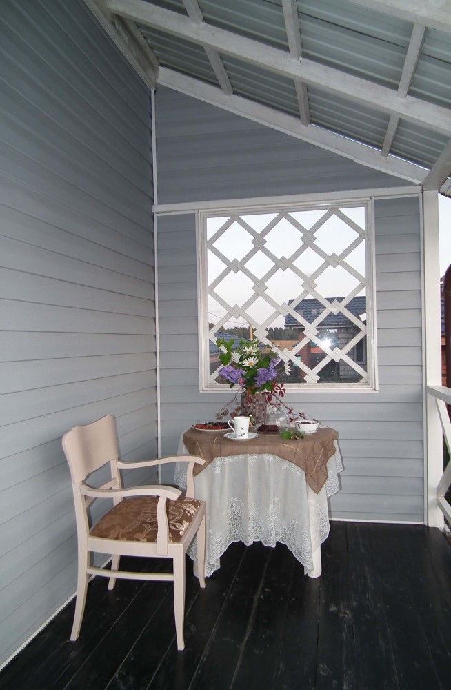
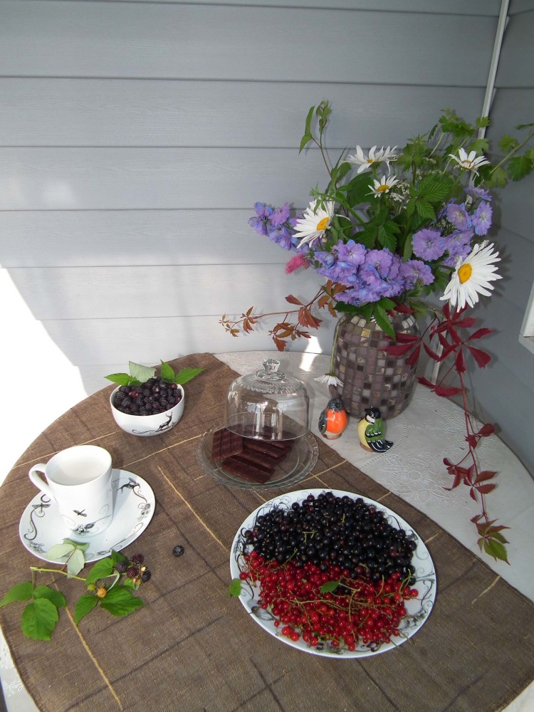 This house creates the impression of a single whole. It is difficult to disassemble it by rooms. This happens when the designer "catches" the idea and reflects it in every element of the interior. Tayana Zhuravleva succeeded in this.
 Five tips from professionals on how to expand space using zoning.
