Any space for medical purposesa priori cannot evoke positive emotions? The project of the diagnostic center "Medscan", completed by the architect Mito Melitonyan, proves the exact opposite. We asked the author of the project, Mito Melitonyan, about the intricacies of working with special-purpose spaces, the difficulties he had to face, and much more. Mito Melitonyan, architect: - I was born into a family of architects, and I was lucky enough to be the 12th. After the 9th grade, I entered the MKAMS (architectural technical school) and for a very long time I could not understand what they wanted from me. The taste for the profession came after the 3rd year, when we were sent for industrial practice. Then I got to the architect Boris Uborevich-Borovsky, whom my father and I accidentally met at one of the architectural exhibitions. My first salary set the direction of my activities and, in fact, predetermined my fate. I began to work in the profession with enthusiasm and continue to do so to this day. I don't know what will happen next, but now I'm doing what I can do best. For 4 years I was mainly involved in large urban development projects, thanks to which I learned to think structurally, then I preferred to work independently. During my independent work, I came to the conclusion that in architecture and design, the object itself is secondary, what is important is communication with the environment in which you are designing, or the person for whom you are creating the object. This is, in fact, a formed life position that applies not only to architecture: I do not work with an object, I work with people. melitonyan.com
— The layout of this space was setinitially due to the fact that any medical institution must comply with certain standards and the logic of the processes occurring there. In fact, in this project I solved the problem of functional zoning and decoration.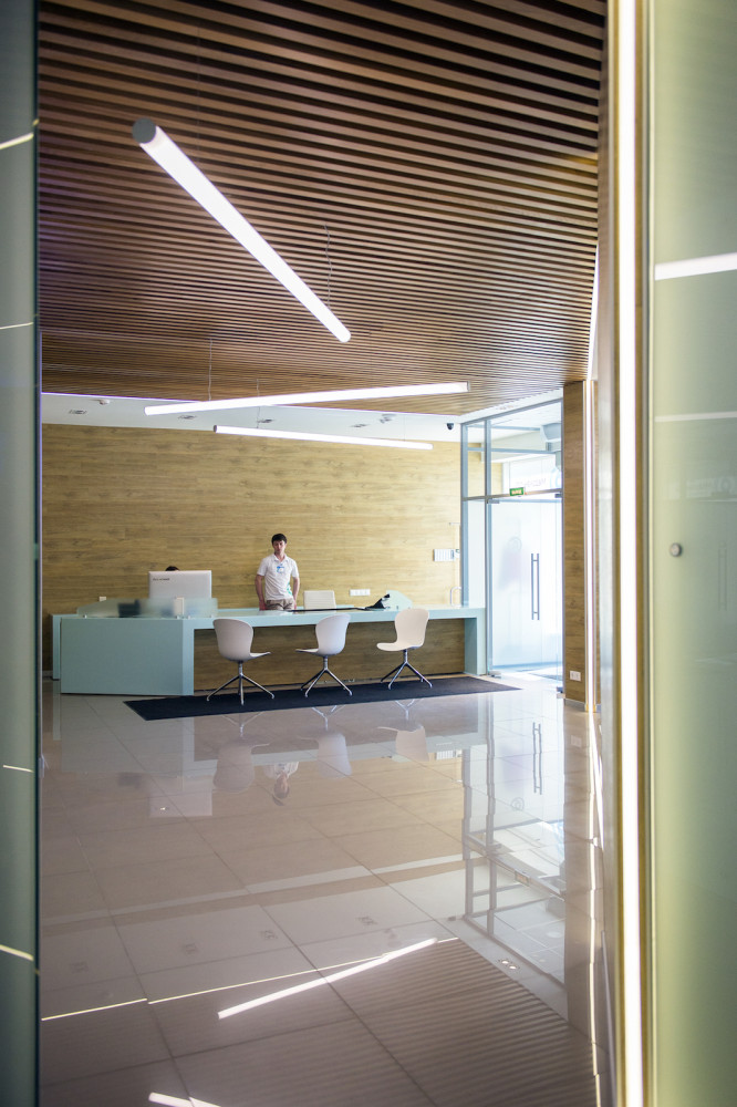
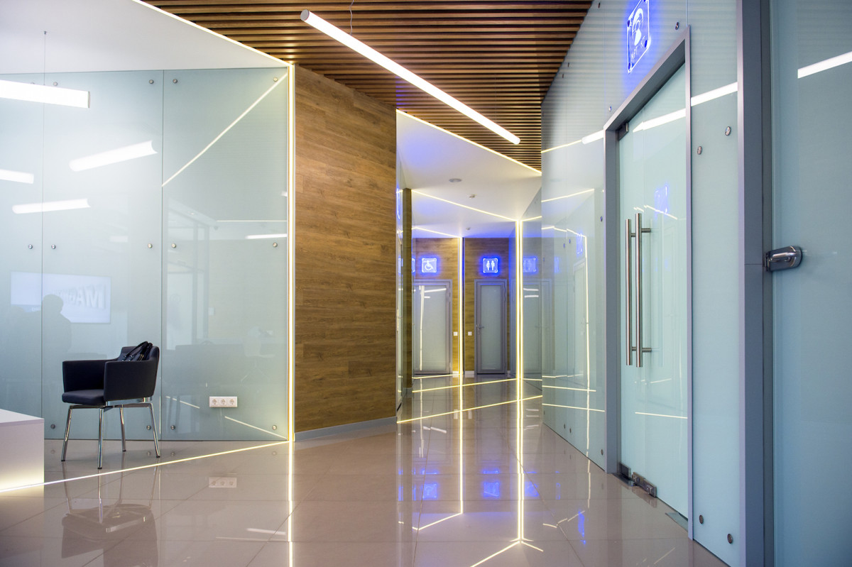
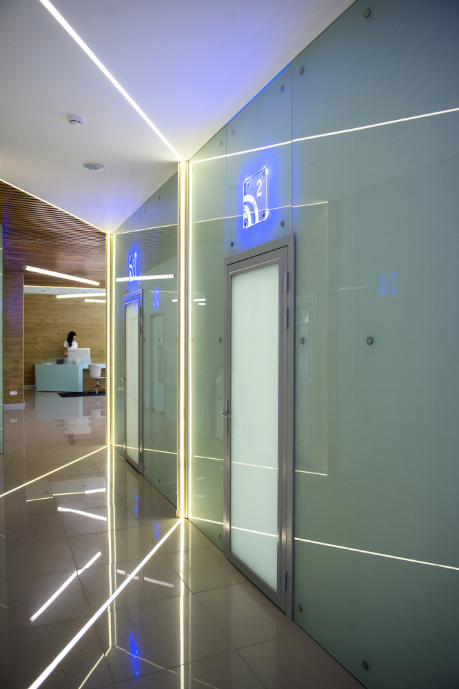
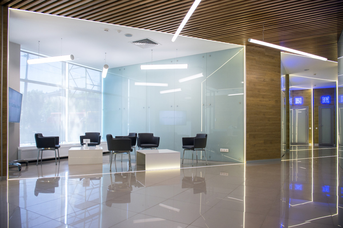
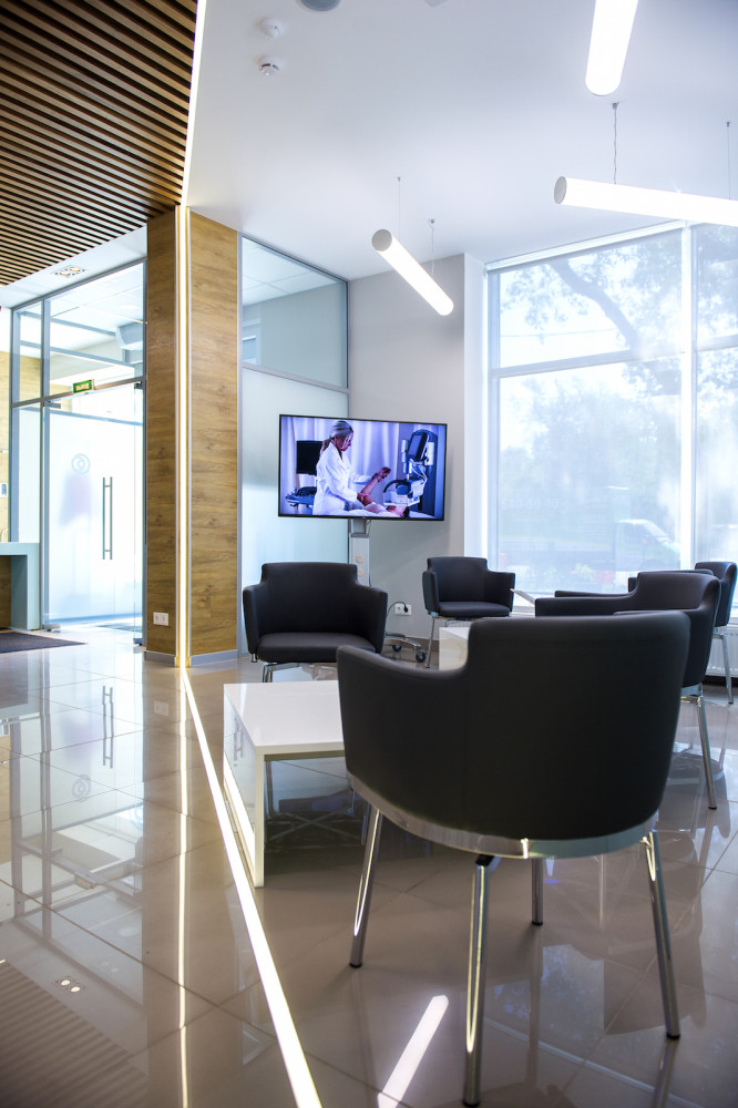
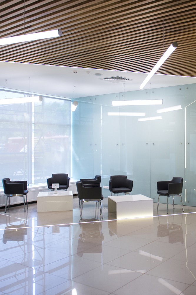
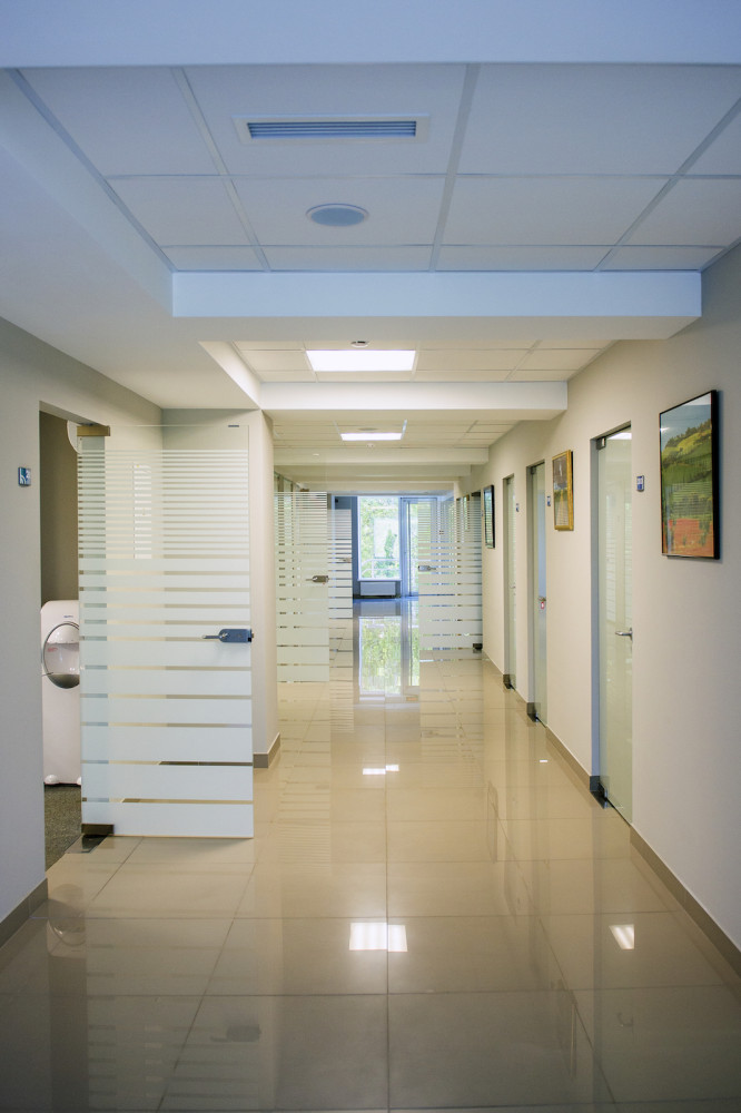
The main point I made when I startedWhen working on this project, there was a need to divide the space of the first floor into three zones: reception and general reception area; waiting area and corridor area with diagnostic rooms.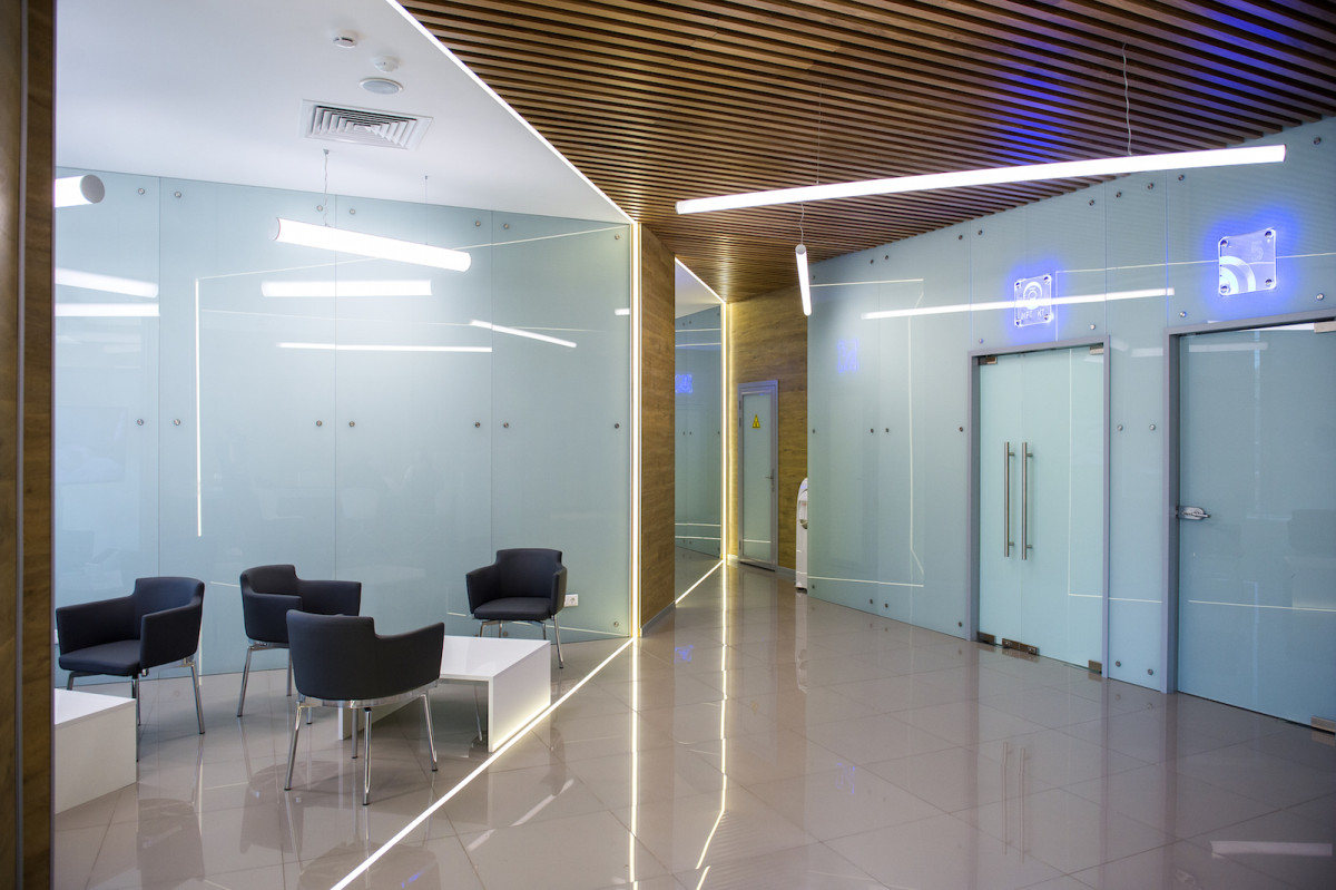
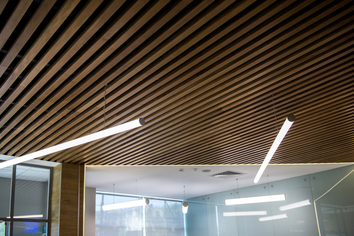
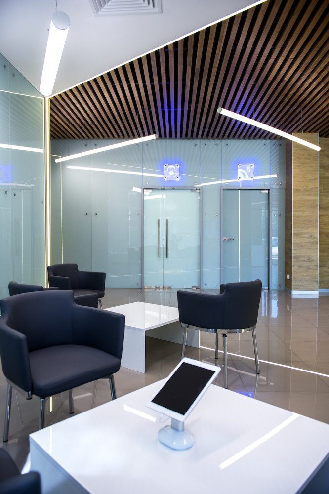
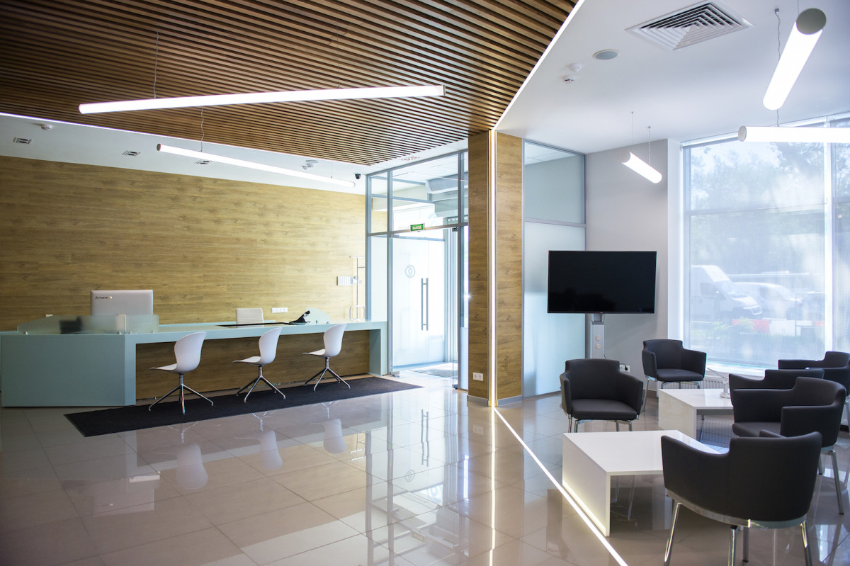
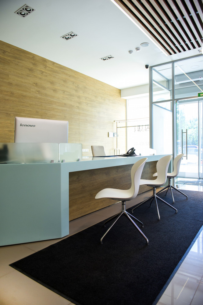
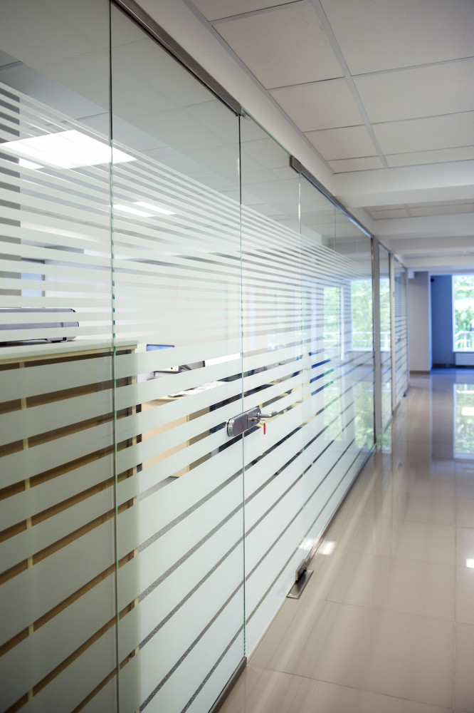
In the decoration I tried to use a minimumamount of materials. Basically, there are only four of them: wood and wood-like linoleum, floor tiles, glass, and a painted white ceiling surface.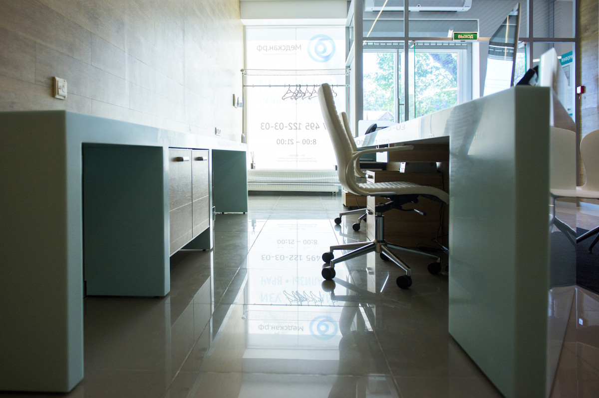
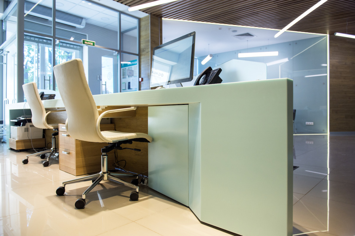
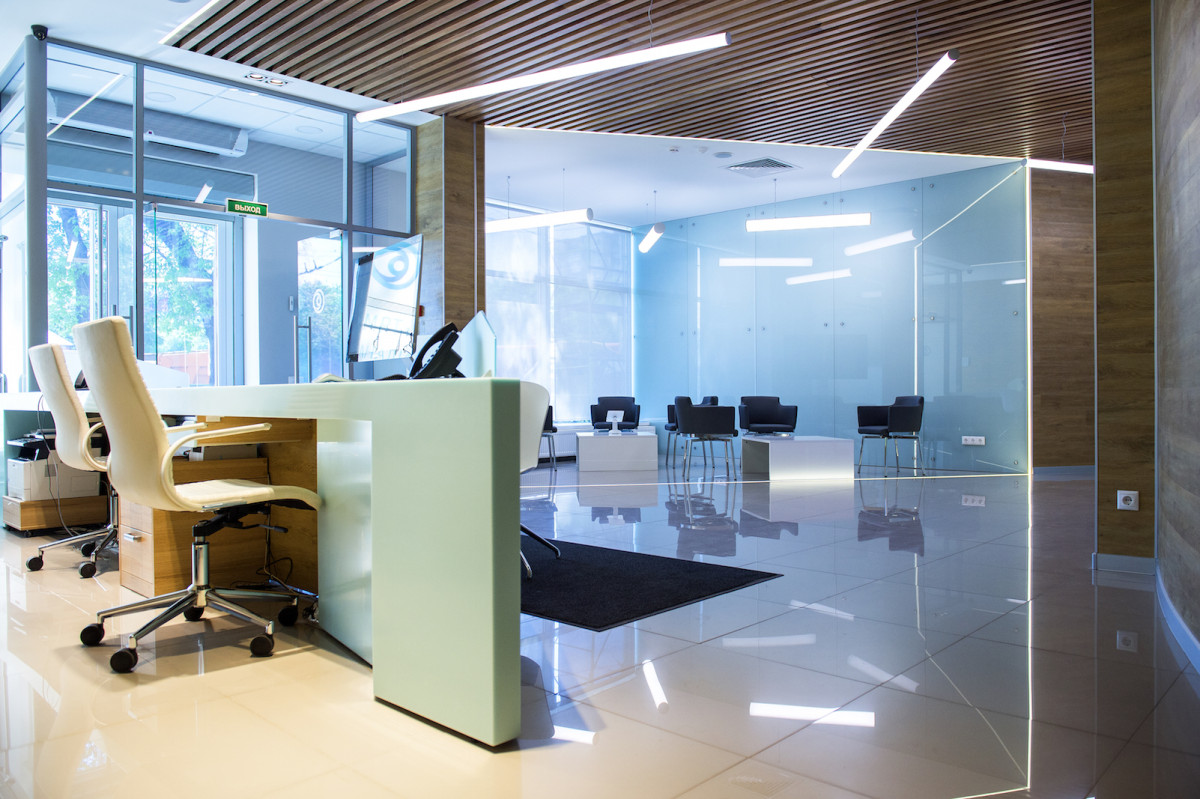
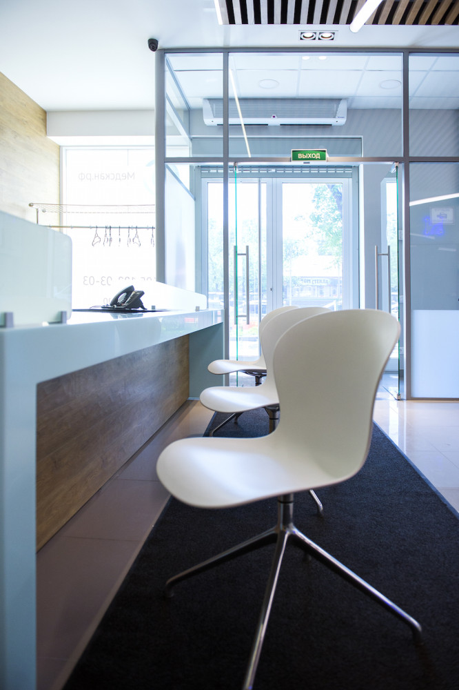
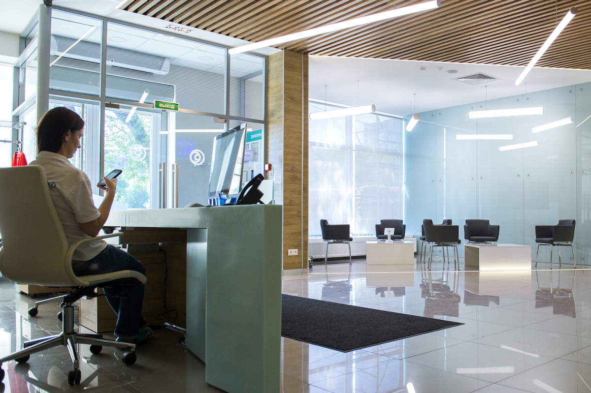
The logic of dividing space was firstThe queue is determined by the column located to the left of the entrance. One of its corners actually became the starting point in the process of "cutting" the space - a beam extends from it, which separates the waiting area from the reception area. From it, in turn, a beam extends, which "cuts" the reception.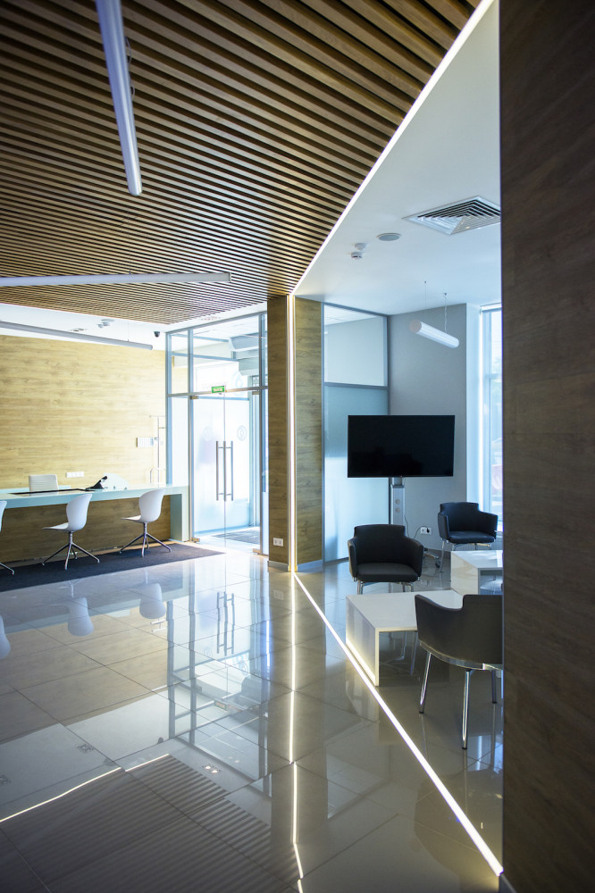
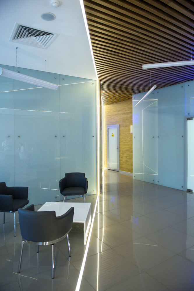
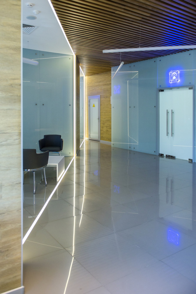
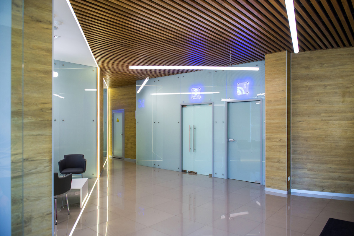
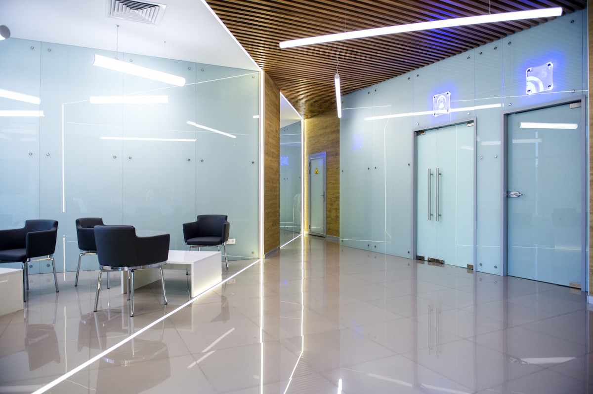
The line itself is not really visible, but it is clearly felt. When a person enters a room, he finds himself in a kind of funnel, sucking him deep into the space.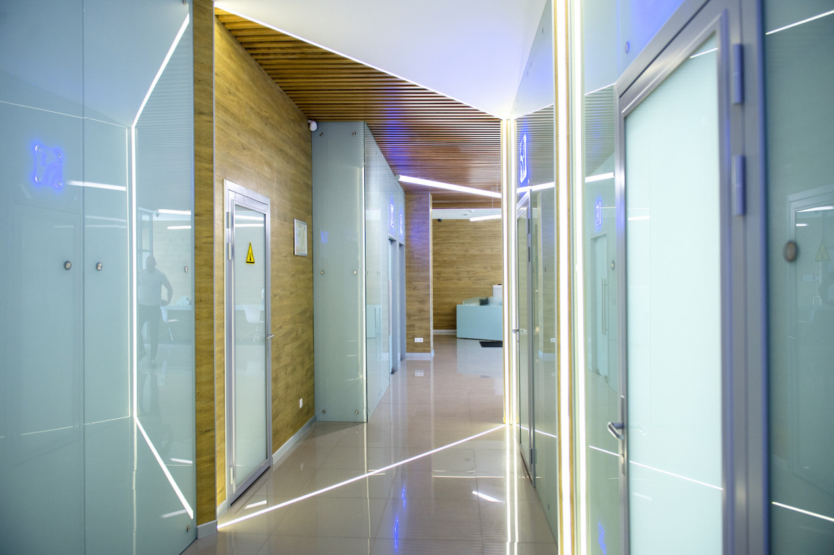
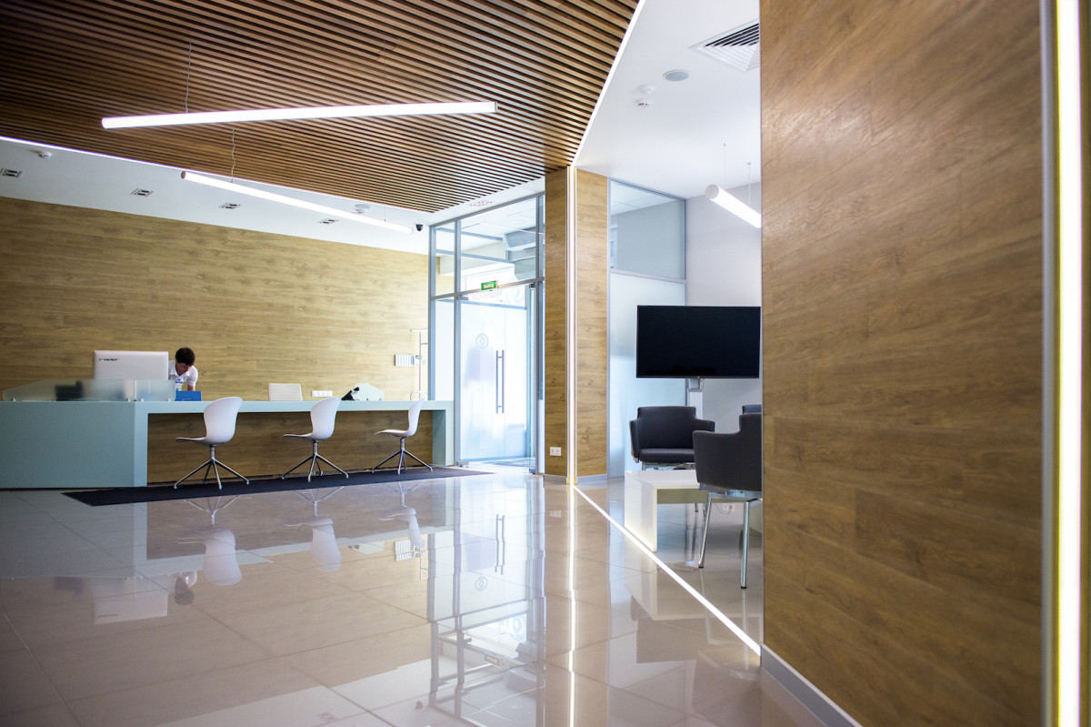
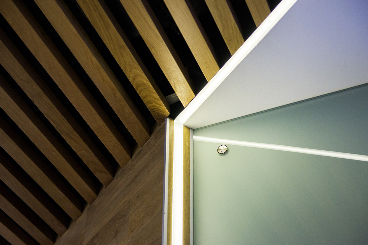
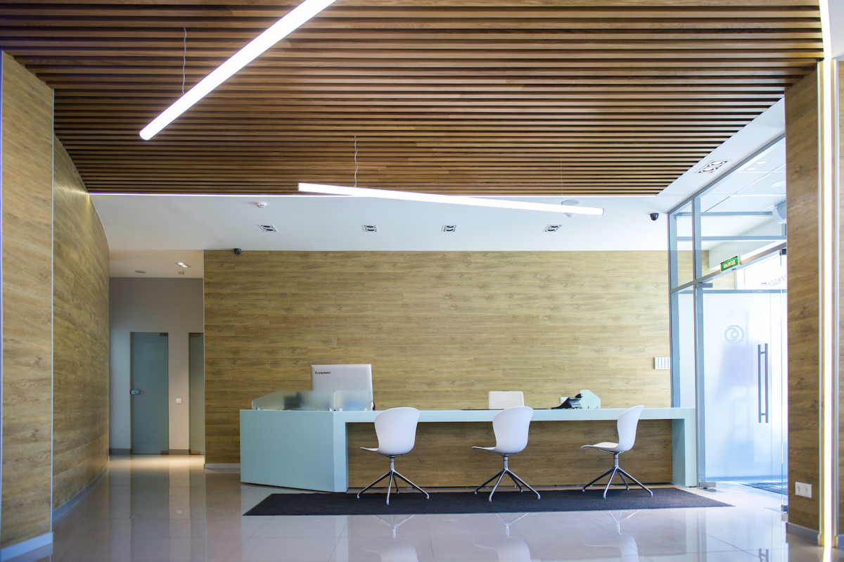
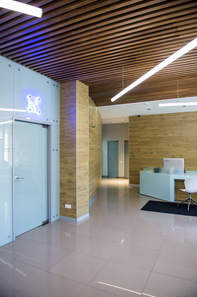
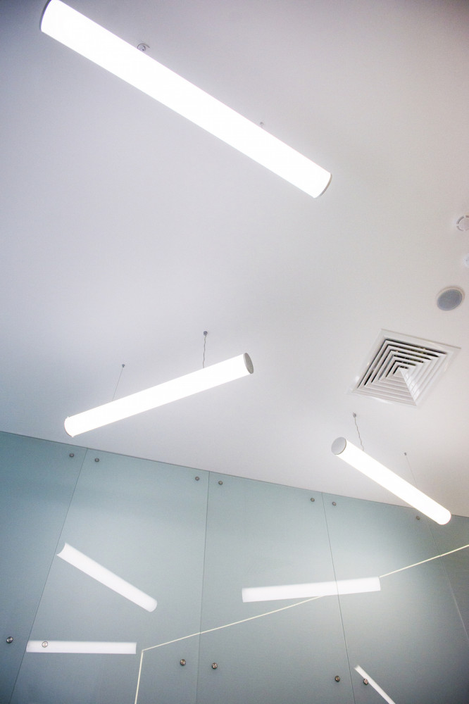
The main zoning tool in this projectbecame light. In working with the illumination of the guides, from which a closed light contour was to be obtained, a significant difficulty arose. The lamps are located immediately in the floor, in the ceiling and in the walls, at the same point where the lamp approaches the wall, the cross-section turns out to be objectively much wider relative to the parameters of the lamp itself. In order to solve the problem, it was necessary to literally "turn out" a piece of the wall so that the lamps were completely perpendicular to each other. This was the most difficult thing.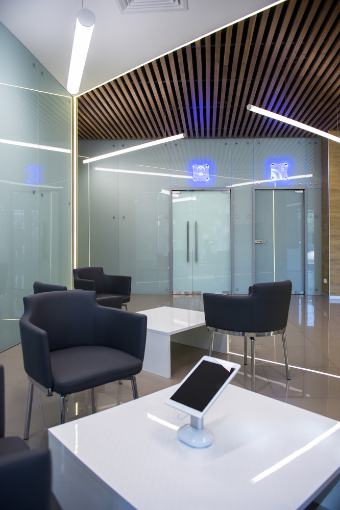
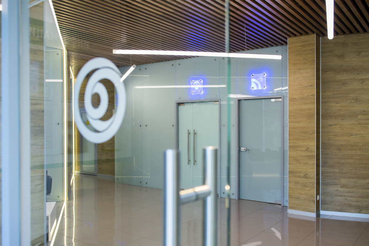
To finish the walls I used textured linoleum.The reason for this decision was the need for a quick and budget finish of a rounded wall. By the way, now no one can tell the difference between linoleum and laminate.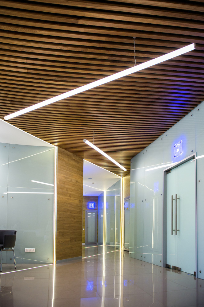
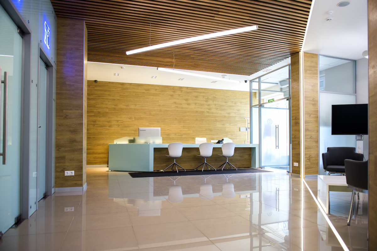
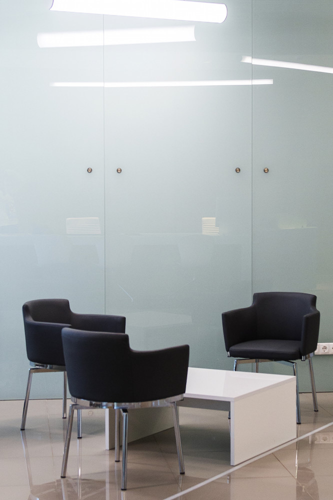
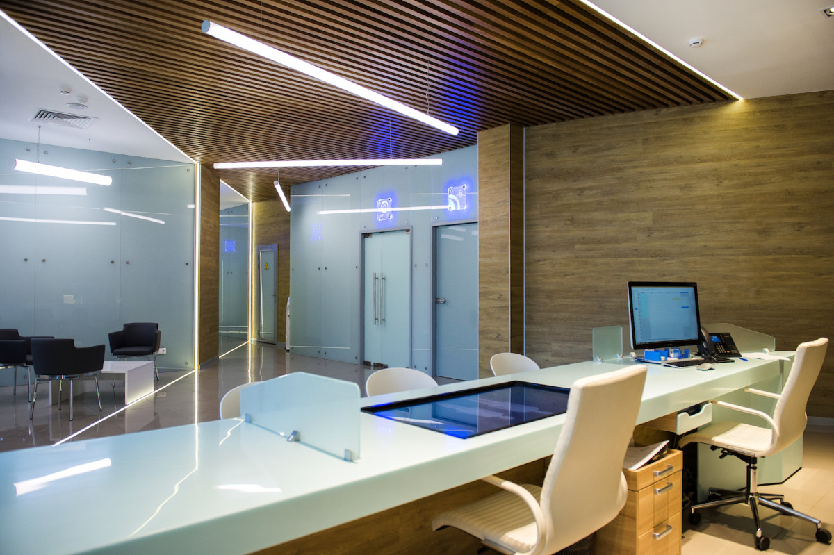
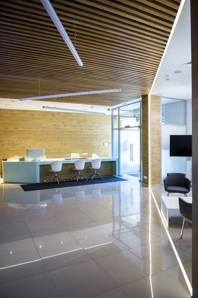
There are actually only four colors in this project, andall of them correspond to the materials used. The slatted wooden ceiling, localized near the MRI and CT rooms, is due to the essence of magnetic resonance imaging technology, which works on the principle of slices, and the ceiling in this case acts as a kind of replica.