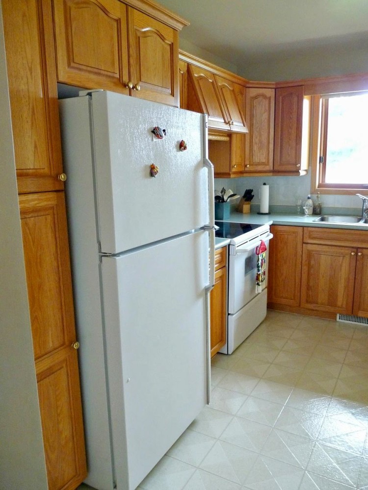
Deciding to buy a new kitchen is not an easy task.But there is a way out - you can update your kitchen by changing just a few items and the color. An example of a kitchen that has outlived its usefulness and has received a second life is in today's article Time inexorably changes everything, that's a fact. It can turn stone into dust and disable the most reliable mechanism. Nothing lasts forever, and even if you own the highest quality item on Earth, sooner or later the moment will come when it loses its appeal, and its former functionality disappears somewhere, or, even worse, it will give up its life. There are only two options: throw it away, finding a replacement, or keep it as a long memory. It's easier with small items, both options are applicable here. But what if it's, say, an entire kitchen section, pretty shabby, but quite tolerable for use? Be prepared for your inner pragmatism to throw up a hodgepodge of doubts: you can’t take it to the dacha, the attic is already full of “what if it comes in handy” stuff, it’s a shame to throw it away, because 10 years ago this kitchen set cost a fortune, and it’s a shame to leave it — guests won’t understand. Actually, why not follow the example of a young Canadian named Tanya. The girl attaches great importance to how her home looks. Having refused all kinds of hired labor services, she completely dumped the finishing touches on the interior decoration on her husband and herself, while also implementing her own ideas, and not the proposed option. One of the clear examples of this couple’s creativity is the kitchen furniture, which they inherited from the previous owners. Tanya, a master in her hobby, blogger Without even a hint of a specialized education in the field of architecture and design, and being a doctor, Tanya and her husband have been finishing interiors and furniture as a hobby since her student years. For over five years, she has been running her own blog, Dans le Lakehouse, where she regularly shares information about her projects. Lately, she has been eager to share her successes in independently decorating and refining a recently purchased house on Lake Superior, near the Canadian-American border. dans-le-townhouse.blogspot.ca For purely practical and understandable reasons, they decided to tackle the kitchen remodel first. “The main thing is to dine properly, and then you can slowly continue renovating the rest of the house,” jokes Tanya. The original look of the kitchen was not so bad, but not very good either. The previous owners, apparently, were not particularly worried about the design and color of the kitchen sections, so they chose a win-win classic: traditional wooden furniture covered with colorless varnish. Perhaps this option would have been quite suitable if the owners were not young and creative people. Even with two windows and beige walls, Tanya was still confused by the lack of brightness in the room. A solution to the problem immediately appeared in her head - a gray base color that would be complemented by turquoise accents. "Neutral gray will curb the bright sea colors, while making the kitchen lighter and more cheerful, and the double color combination will not be so boring," - such arguments could explain the girl's decision.
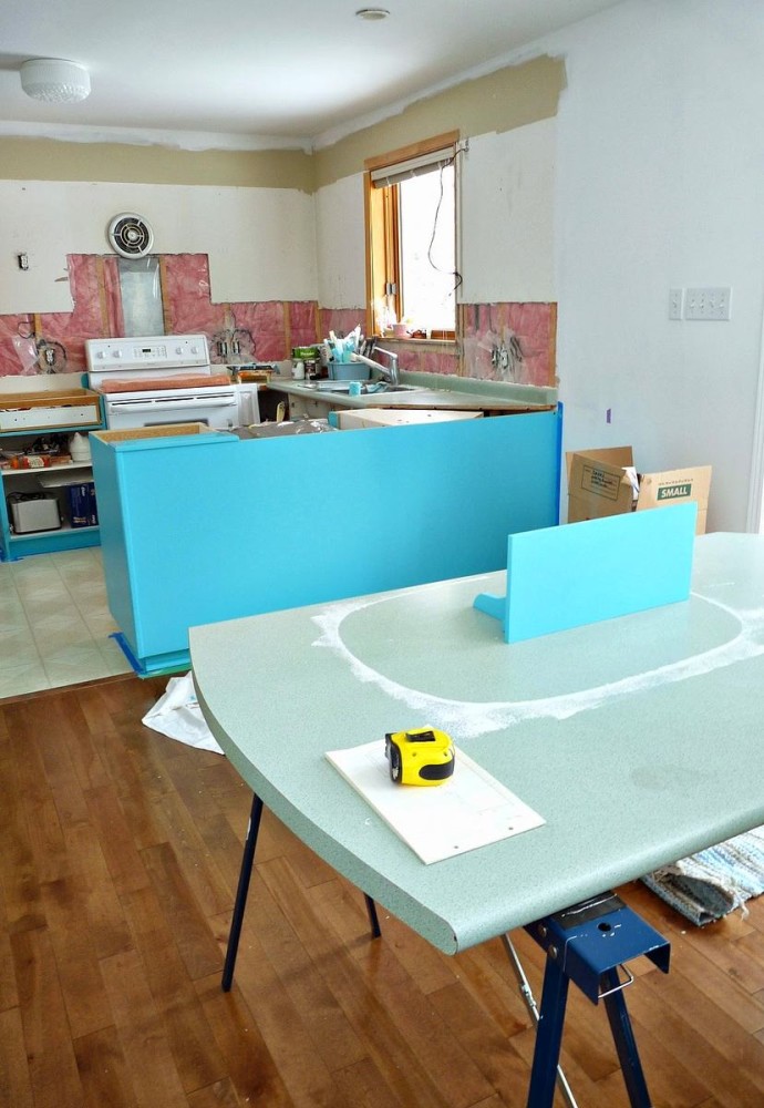
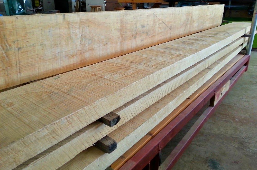
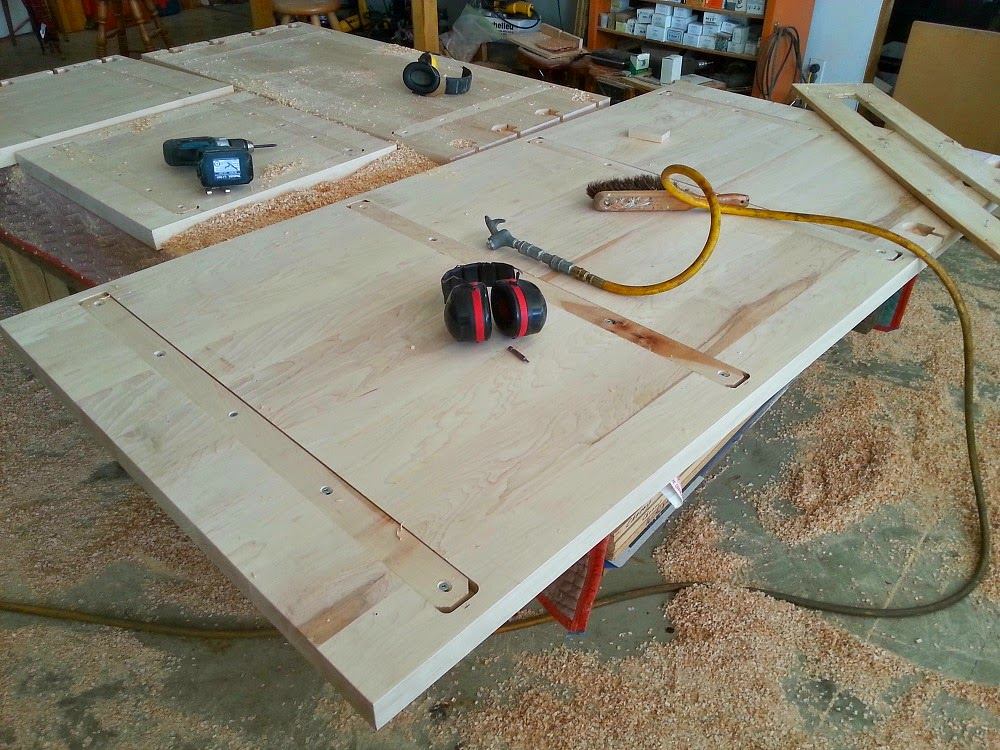
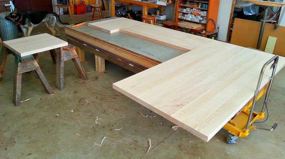
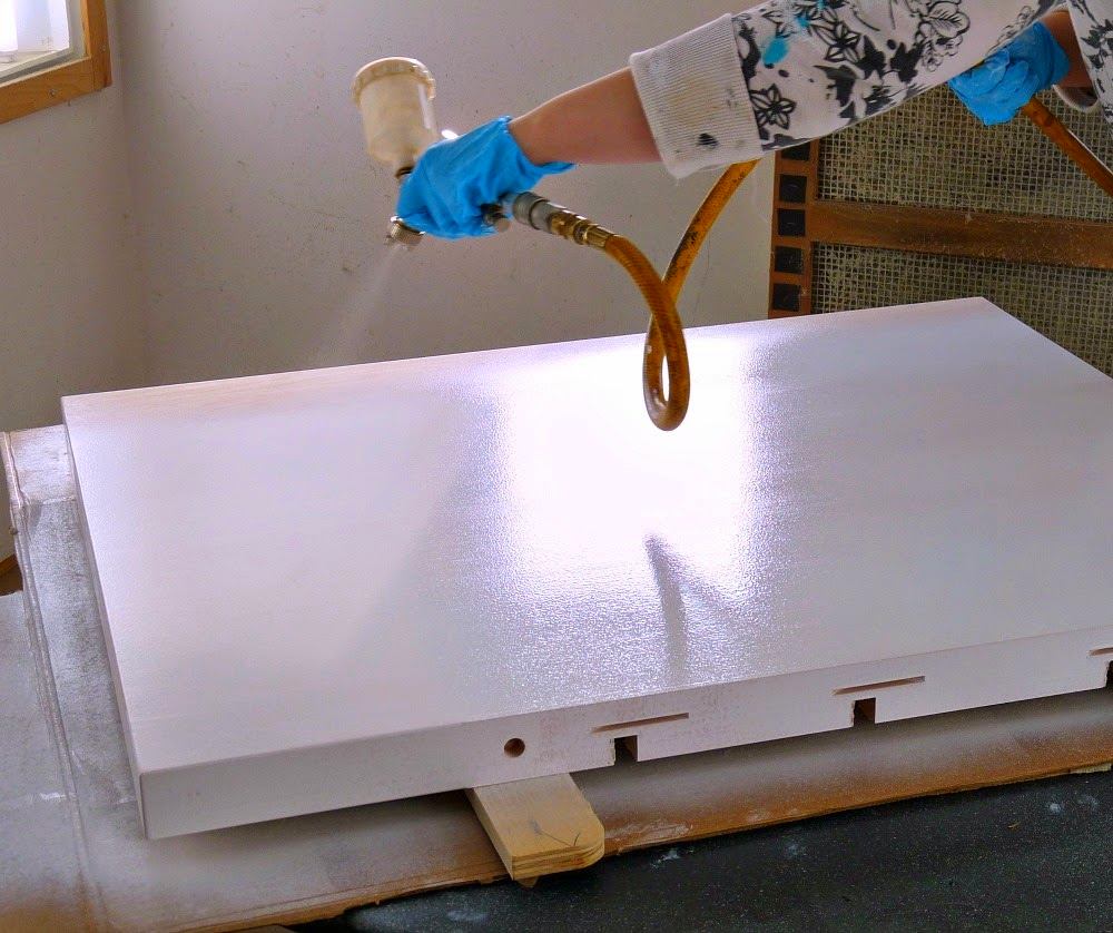
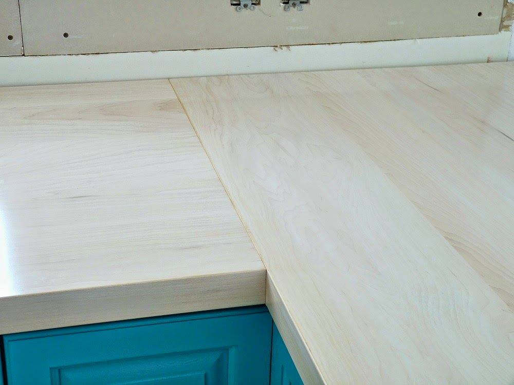
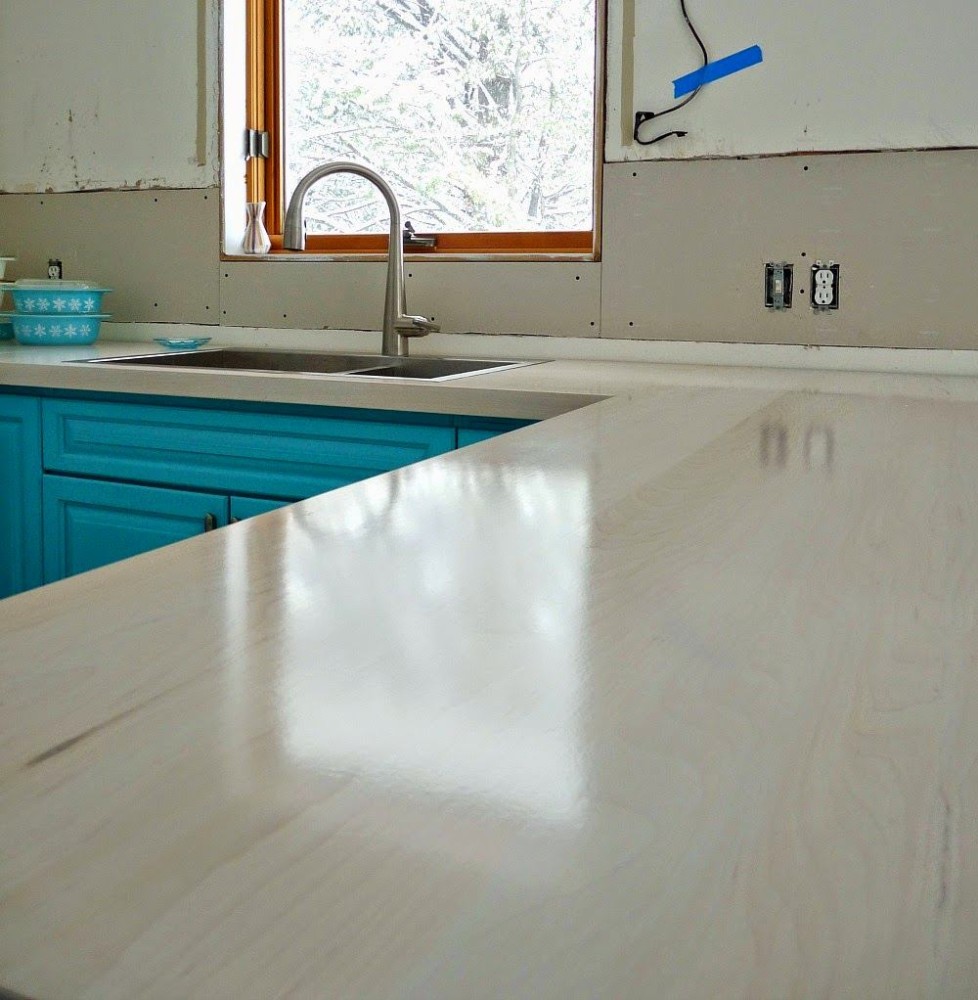
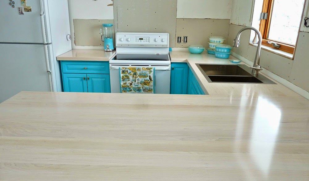
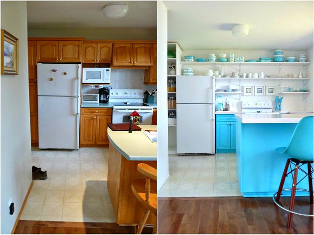
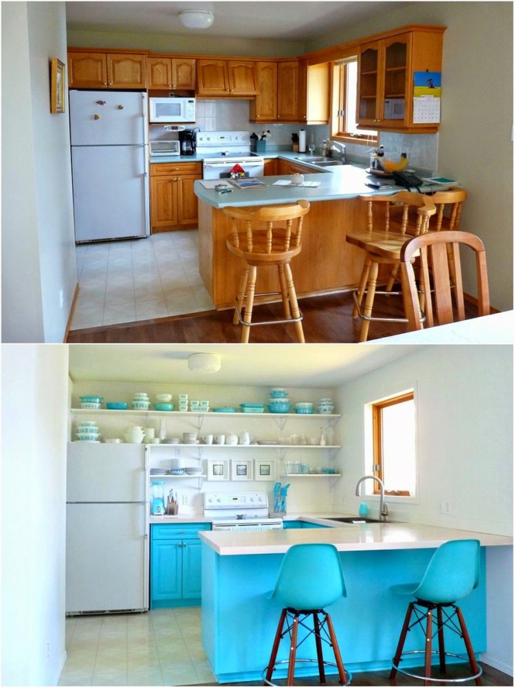
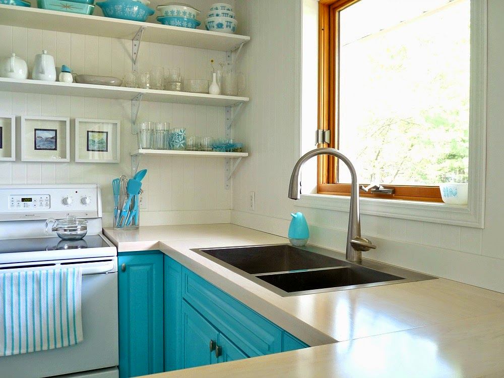
 The first candidate for abolition wascountertop. The owner did not really like the rounded surface in the island area. The budget was limited, and there was no talk of buying a laminated board, so the husband's father helped with the choice of a decent and, compared to laminate, inexpensive maple. There is plenty of this wood in Canada, and there are even more craftsmen who work with it. So, a new countertop for the kitchen was assembled from several weighty parts. It was processed manually, giving the surface a smoothness. The board was painted in several layers using an airbrush, at the final stage it was covered with a special protective agent resistant to moisture and mechanical damage.

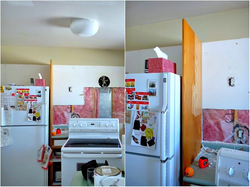
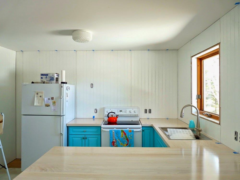
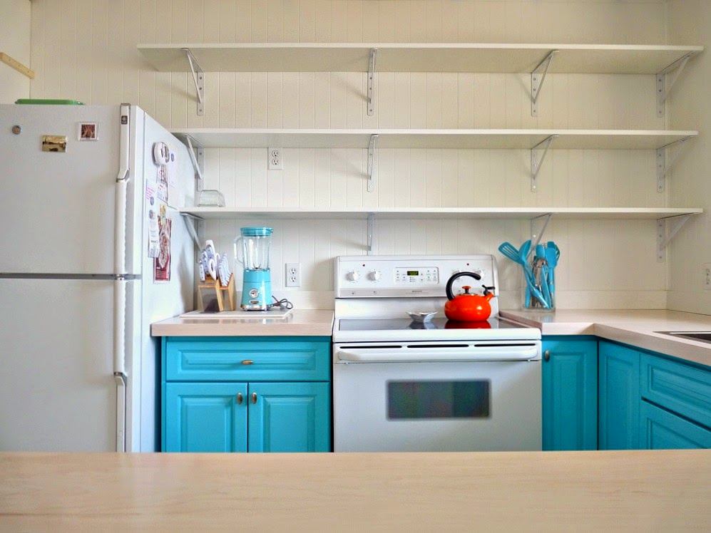
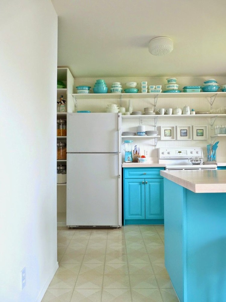
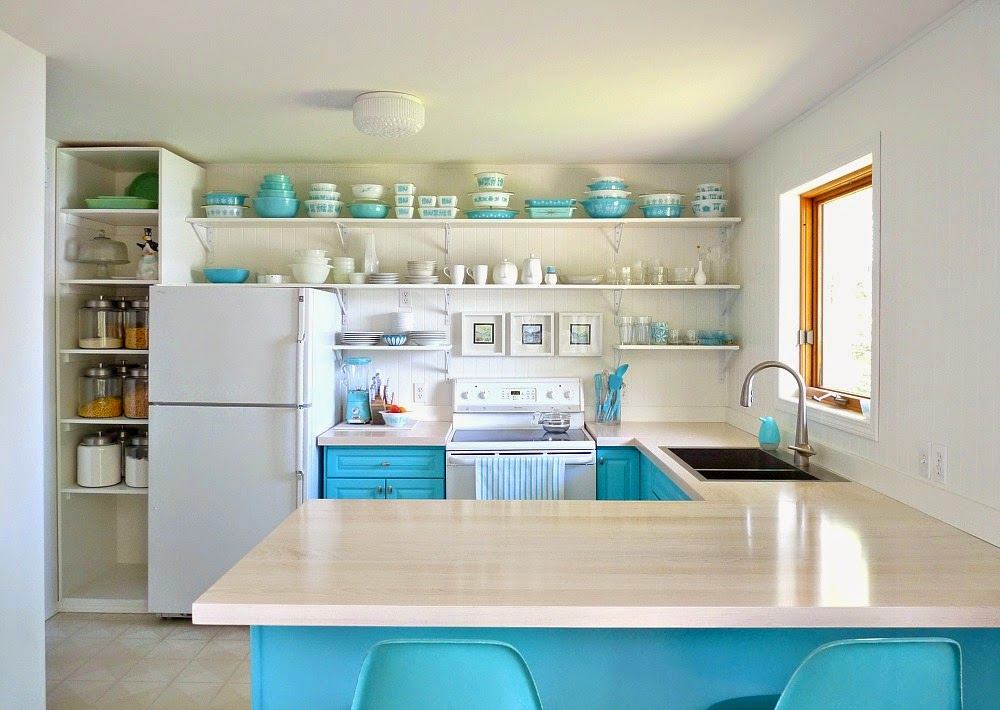
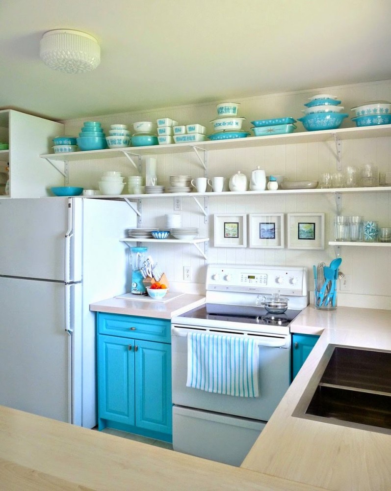
 “The grey colour we had planned at the start"The epic kitchen makeover, unfortunately, was a hasty decision," the girl admits, well, how could it be otherwise, because you can't foresee everything. Nevertheless, there was a backup option. As it turned out in practice, the white color for the upper part of the kitchen contrasted much more successfully with the bright bottom of the drawers and island. After dismantling the storage system and tiles, the voids in the walls were covered with plasterboard. As a decorative cladding, the owners, having abandoned plaster, cunningly and quickly used fiberboard panels. Imitating the slatted structure, whole sheets were pre-painted in a brighter shade of white and fixed to the walls with mounting glue and self-tapping screws.

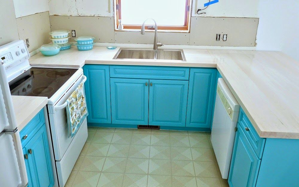
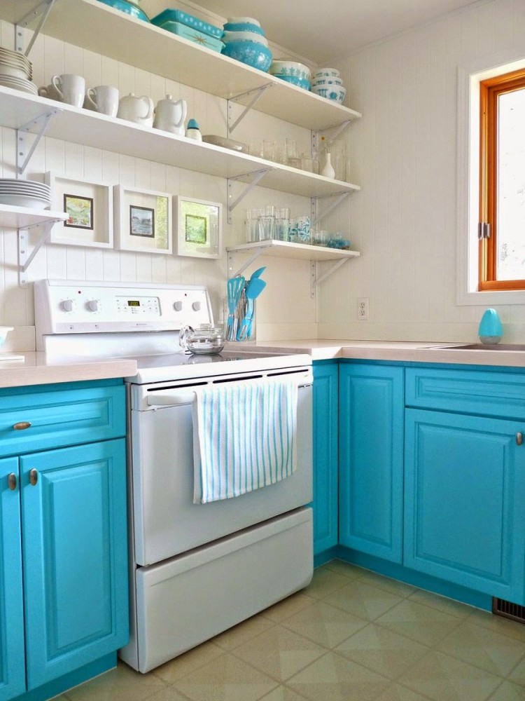
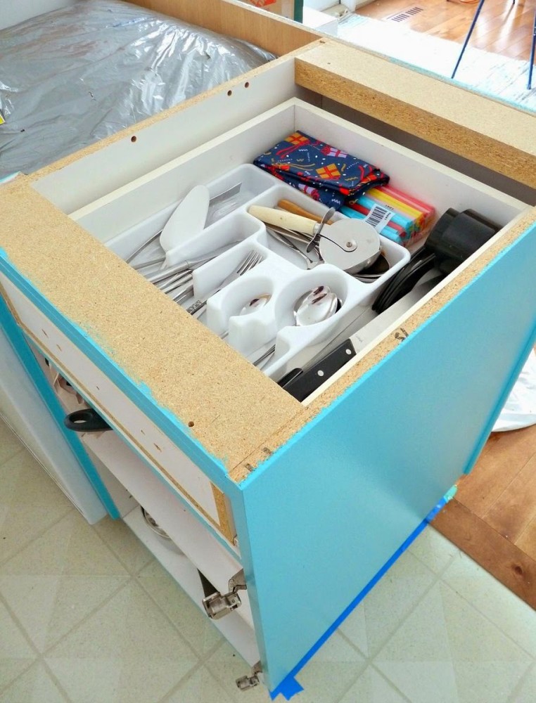
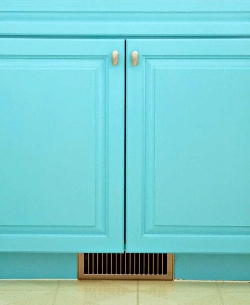
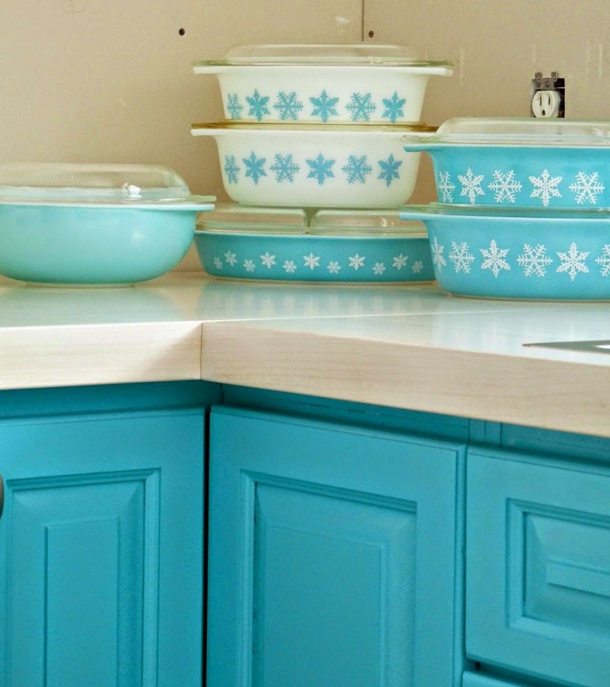
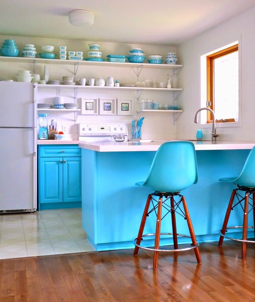
 The kitchen windows overlook a picturesque forest edge, andmore often than not, guests turned their gaze to the landscape rather than being interested in the interior of the room. Tanya was not happy with this, and it was no wonder with the old kitchen. Having undertaken to equalize the balance of external and internal beauty, the girl decided to add character to the interior, personalize it with color. All the drawers from the floor storage system and the island, which is also a bar counter, remained in their places. A simple process of revision noticeably transformed the existing kitchen furniture: temporary dismantling of the doors, then light sanding, one layer of primer and three layers of semi-gloss paint did the trick. The old door handles were attached with only one screw - they bought new ones, had to drill an additional hole. The rusty ventilation grill under the cabinet was replaced with a similar one, in the color of the fittings.


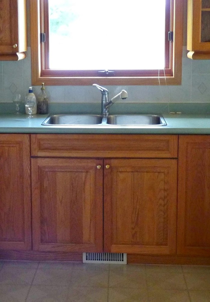
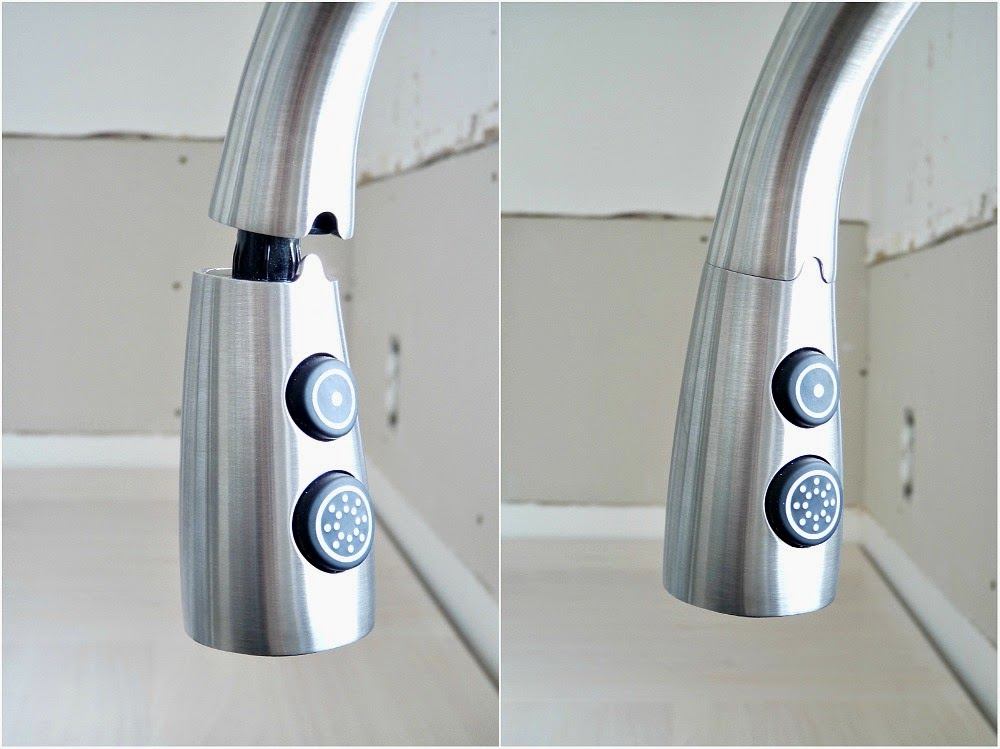
 The hole for the sink was made in the processcountertop installation. The round, time-worn sink was replaced by a square, more capacious sink with two stainless steel compartments - the choice was determined by the low price. If there is one thing that is definitely not included in the budget savings category, it is a smart faucet with a pull-out spout from Pfister. Initially, the Lita model faucet was ordered for the kitchen in the previous house, but has already been delivered to the new place of residence.


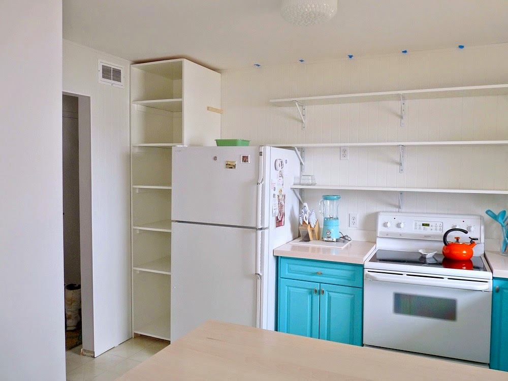
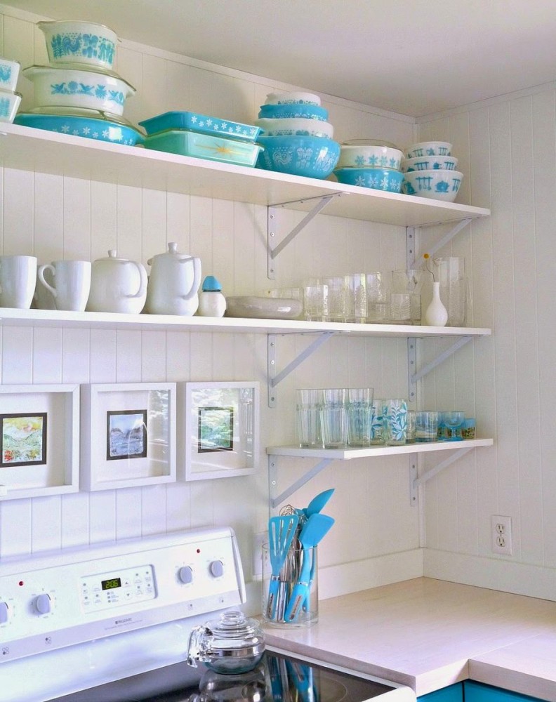
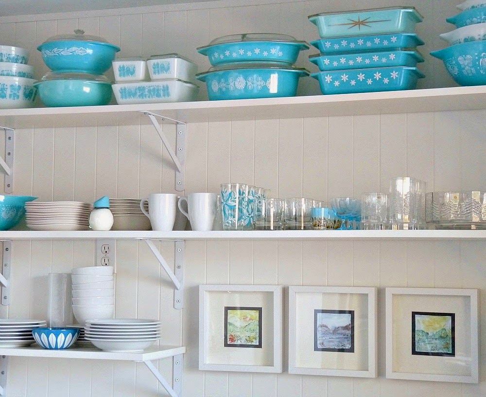
 The reason for the lack of light inroom. Oddly enough, the main object that prevented full access to natural light was the top row of closed drawers. One of the former craftsmen, imagining himself a design guru, decided to cover the window with a canopy, connecting two parts of the hanging row. These bulky sections narrowed the space, greatly “eating up” the volume of the room. Subsequently, the upper part of the kitchen became open, and the storage system in the form of drawers was replaced with three levels of wall shelves for dishes and decorative elements.
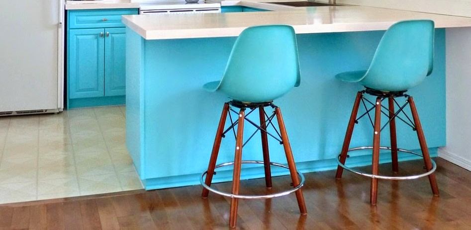
 Bar stools productionfrom a small factory Modernica from Los Angeles (USA), which specializes in the production of hand-made furniture, fit perfectly into the overall atmosphere of the interior not only due to the color.
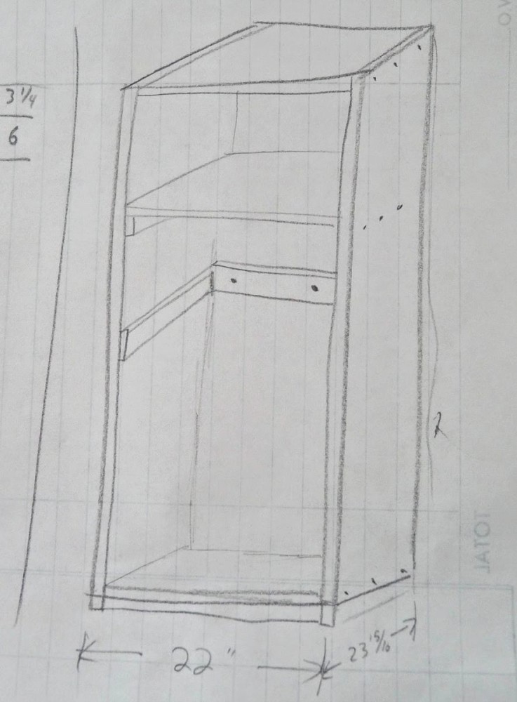
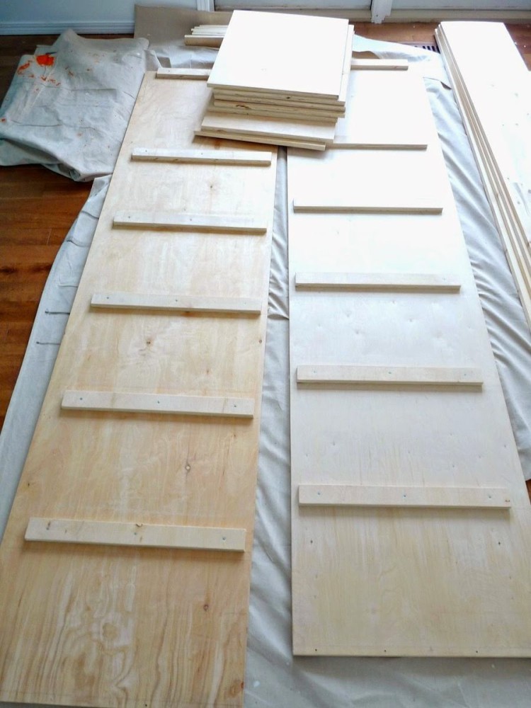
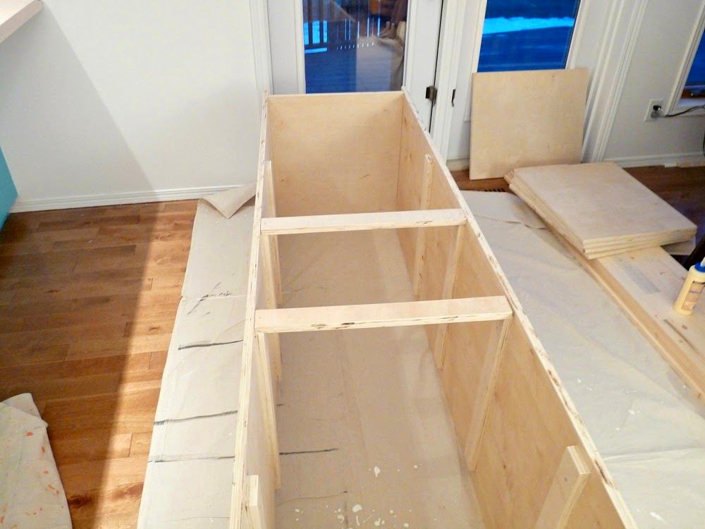
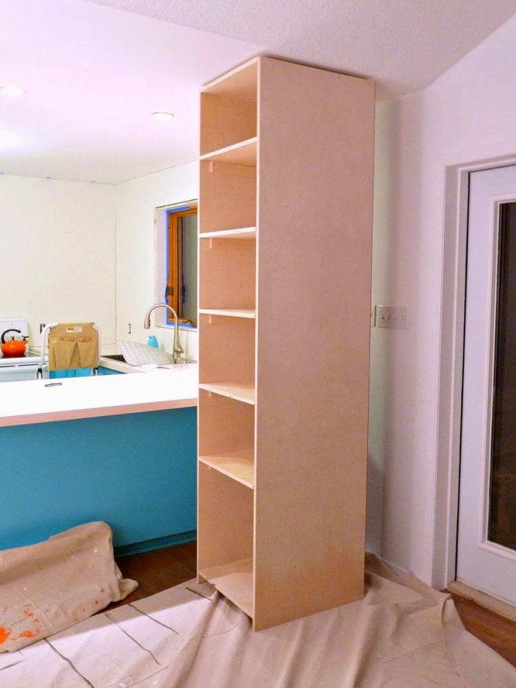
 The closed cabinet in the corner has left its boundaries foreverkitchen. Its place was taken by the author's design of an open plywood shelving unit. The sketch, preparation of parts and final assembly - all done by the hands of Tanya's husband. Thanks to the open facade, the prefabricated shelving unit successfully echoes the shelves on the wall.
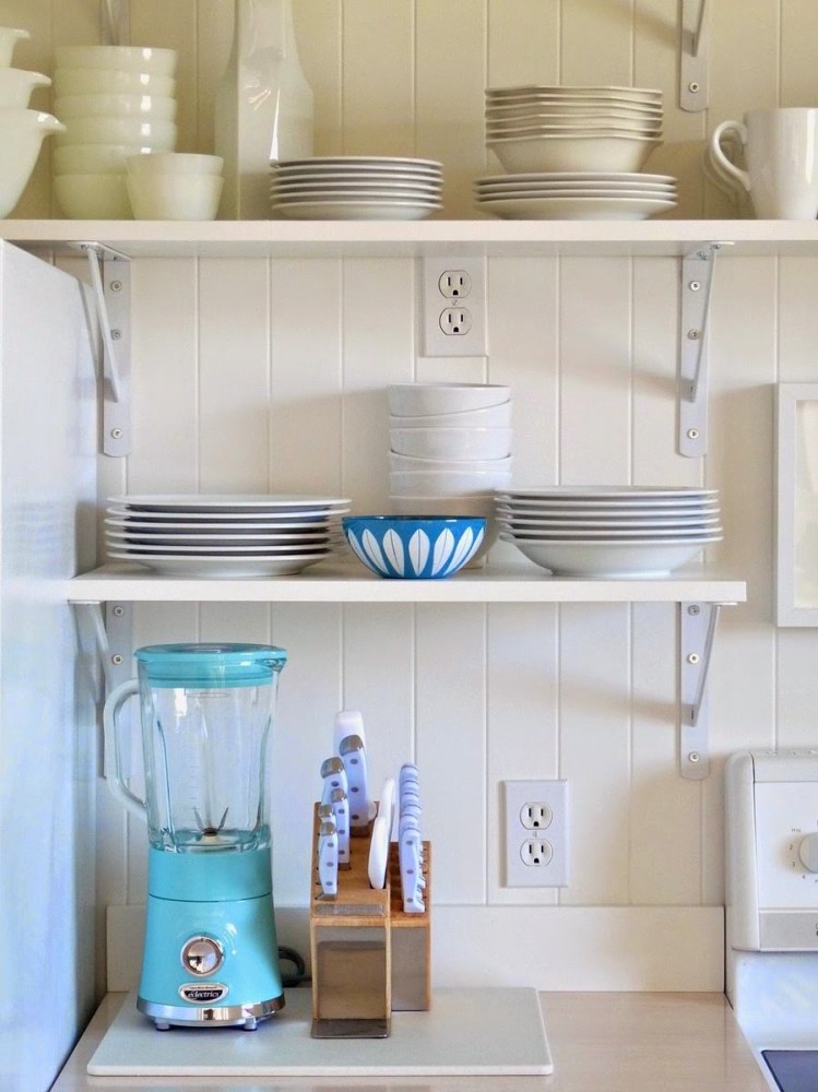
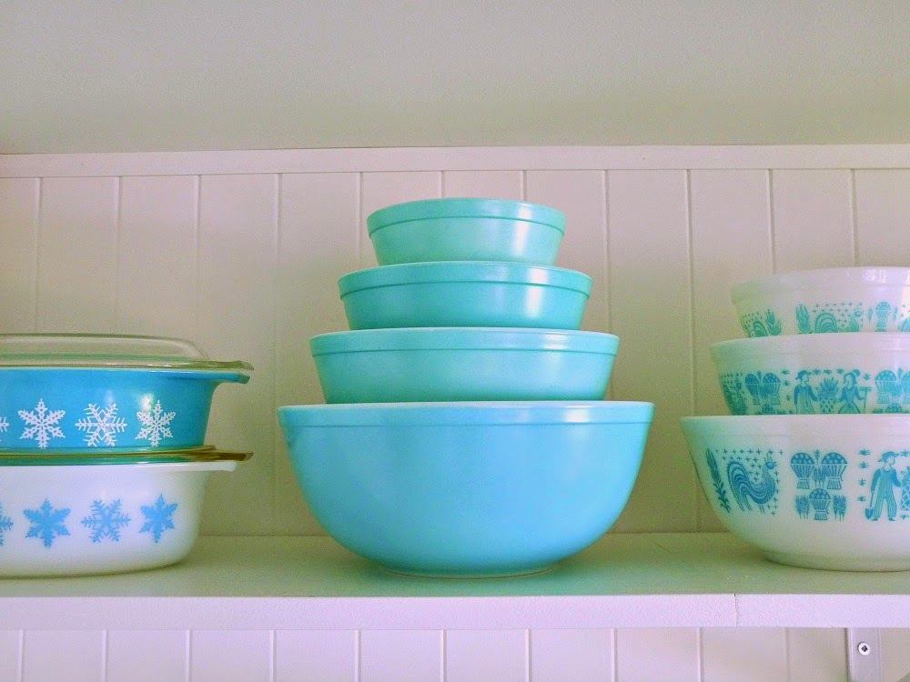
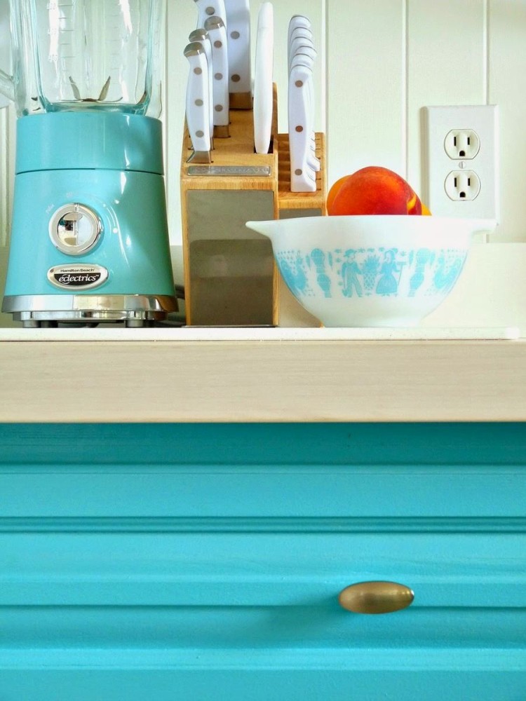
 The final touch to the kitchen remodel wasan integral part of this functional space — . Matched to the color of the furniture, in addition to its direct use, it also serves as a kind of decor. Tanya and her husband have collected a whole collection of items from the manufacturer Pyrex over the years of their life together. Something was bought specially: a mixer with a turquoise base, cutlery. Something has a historical origin or is a housewarming gift.
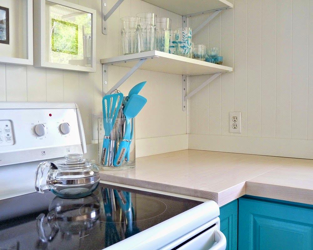 The only thing that remained untouched wastiles and laminate flooring, and the same stove and old refrigerator as household appliances. The kitchen renovation is behind us, a short break for rest - and the owners will once again take up the renovation and decoration of the house, or rather, those few rooms that have not yet been touched by the hand of home-grown craftsmen.



 dans-le-townhouse.blogspot.ca, pinterest.com
Spring kitchen update: step by step instruction
