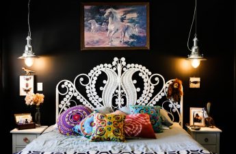
About how to match a chair to a painting, whyto lay an animal skin under a wooden idol and why Dali's etchings look great on concrete walls, read in our material today. This selection of ideas will be of interest primarily to art lovers. It is very easy to distinguish them: the interior of a true connoisseur is built around art objects and is aimed at emphasizing their presence as much as possible. If this approach is close to you, our advice will come in handy.
1. General tonality
The simplest technique is to surround the art worktones that are consonant with it. However, it is not at all necessary to fill the room with one color, a common background or closely located objects is enough. In the image below there are 2 canvases created in different shade solutions. The sofa matches one, and the floor lamp, table and bass guitar match the other.


2. Conformity of forms
Please note how in the photo belowThe artistic solution of the canvas is played up: the vases, table lamp, pillows and even the curves of the chair match it. At the same time, the textiles and accessories are made in the same palette as the painting hanging on the wall.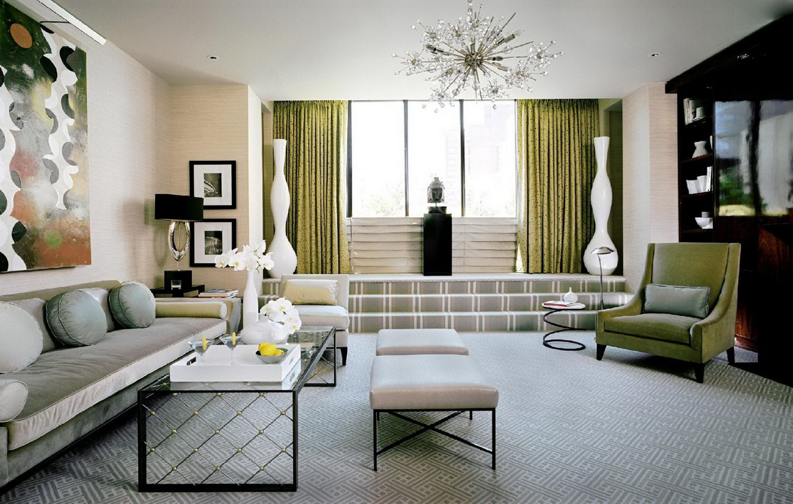 Mito Melitonyan, architect:“To be honest, I don’t like decorating interiors, it’s not my strong point at all. I approach design quite functionally, often leaving the decor to the discretion of the owners, but at the same time I set a tone in the interior for which only a certain decor is suitable. I often use contemporary art as decor, since it is what I understand best, despite the fact that I spent my entire childhood within the walls of the Historical Museum. First of all, the art objects themselves are important and what the owner is guided by when it comes to placing the collection. In any case, art should be displayed based on the era to which it belongs: modern art implies creative solutions, classical art – more strict ones. This is the first principle. The second principle concerns the scale of the exhibited items. You shouldn’t hang a lot of small items on a large wall, they will look more advantageous in display cases. The rule also works in the opposite direction: a large painting on a slightly larger wall will remove all the lightness around it, so you should always leave some air. I am often asked how to preserve a collection of magnets, plates and other tourist souvenirs from different countries. I try to dissuade owners from exhibiting such collections, but here too there is one important piece of advice. There must be a system for selecting these very souvenirs. It would be good if they were distributed by theme. For example, magnets in the shape of country outlines - separately, in the shape of mugs - separately. The formation of a collection in general should be subject to a certain theme. Any selection created spontaneously, without any principles, looks unfavorable and has neither aesthetic nor financial value. Perhaps these are the 3 main principles."
3. Subject approach
Some art works look especially goodagainst the background of furniture and decor items. They literally grow into the interior, spreading part of their own artistic value to it. But for everything to work out, you should choose the right furniture and decor that match in color.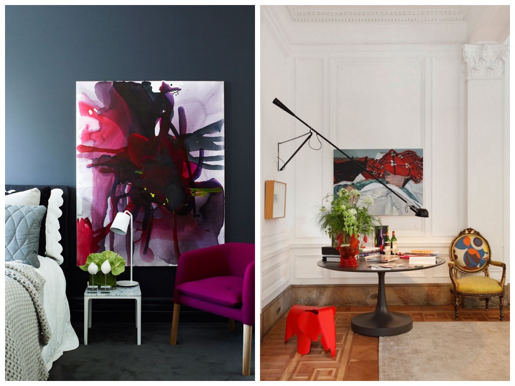

4. In the same style
It is equally important to maintain stylistic consistency.interior details and art objects. In the photo below is a modern graphic art work, the lines of which are repeated in the table lamp, and the vase nearby is in dialogue with the drawing on the pillow lying on the chair. In the photo with the stairs, the same technique is used: a bright modern canvas is emphasized by an equally modern staircase of the same shade, and here is an object of cultural heritage of a certain ethnic group very successfully located on the skin of an animal.


5. Window into another reality
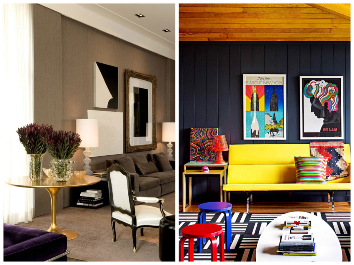
What else can you call a piece of art if nota window into the consciousness of its creator? This principle can be used to play up the presence of a painting or photograph. The most effective will be a "window" that matches the background in color.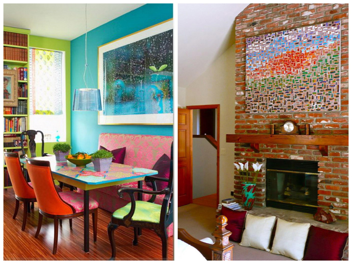 Mito Melitonyan, architect:“A collection of classical paintings will most likely be exhibited according to classical canons. At the same time, it is always good to group paintings by size, theme and general impression. I would prefer to divide a collection of modern figurines and place them in several places in the apartment. It is important here whether you want each guest to have the opportunity to touch them. If it is wood, stone, metal or another dense material, then this is possible. If it is a collection of dolls, then it is better to hide them behind glass - they will not gather dust. One of my friends asked me to place a series of Dali etchings in his tiny apartment. A modern interior - glossy surfaces, self-leveling floor, extravagant painting in the style of Andy Warhol. We hung the entire collection right opposite the front door on a large concrete wall. It looked fantastically beautiful there: thin black frames separated the master's thin, bright drawings from the gray concrete covered with varnish. A couple of spotlights from the ceiling - and everyone who entered froze in amazement: the impression was so unexpected. Another friend of mine lives in a 2-story apartment in the city center. From the kitchen, he goes up the back stairs to a 400-meter attic with dormer windows. Along the entire perimeter, at a height of 50 cm, there is a window sill on which lies a huge collection of bladed weapons from African countries. Built-in windows in the pitched roof provide enough light, and the items look very harmonious. It would be possible to place the collection in a classic way, hanging it on the walls, but in this case, my friend wanted to be able to literally touch history. There are huge Moroccan carpets on the floor, and wooden African statues of human height divide the space into zones. And everything is subordinated to a common idea: the art of the black continent. I am very fond of placing objects from different eras in one interior. Armchairs from the 1960s will look great with floor lamps from the 19th century, or, for example, a vintage English leather armchair with a glass and stainless steel table. The same applies to art objects, but they should be combined with great care." baolisha.com, associerge.com, elementofengshui.com, construccionesmarva.com, homedsgn.com, speronewestwater.com, jamesrixner.com, garrisonhullinger.com, pinturadecor.com, rexohome.com, rodjonesartistblog.com, modpiecesblog.com
