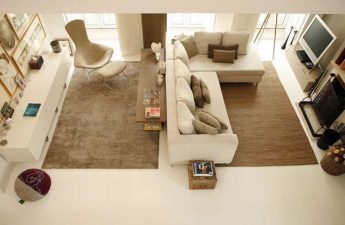
 Combining different directions in oneIndoors Invites you to get acquainted with a talented Russian designer and her projects. Irina Krasheninnikova is a wonderful young interior designer who managed to combine nostalgic notes and modernity in one small apartment on a minimal budget.
Author
 Irina graduated from an interior design school"Details". Participated in the "Apartment Question" program on the NTV channel. Received a nomination at the INTERIA AWARDS competition. In architecture and design, she reached the final of the PINWIN competition. Took part in the SRETENKA DESIGN WEEK design festival. Architecture and interior design are always inseparable friends, they correspond to the image that corresponds to the people living in it, Ira believes. "A good designer should also be a psychologist, then he will accurately guess all the wishes and requirements of the customer, and also create a comfortable, universal and artistic interior of any apartment."
Tell me, how many square meters does your apartment create?
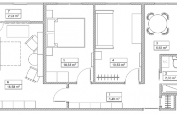
The area of the apartment, the design of which was completed byIrina, only 50 sq. m. At first, the apartment had a couple of living rooms, ten and twenty meters respectively. The dimensions of the hallway and combined bathroom are the same - 10 meters each. The house is built of brick, so the entire perimeter of the apartment consists of load-bearing columns.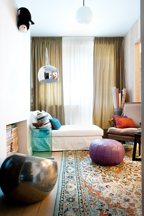 Soviet-style floor carpet
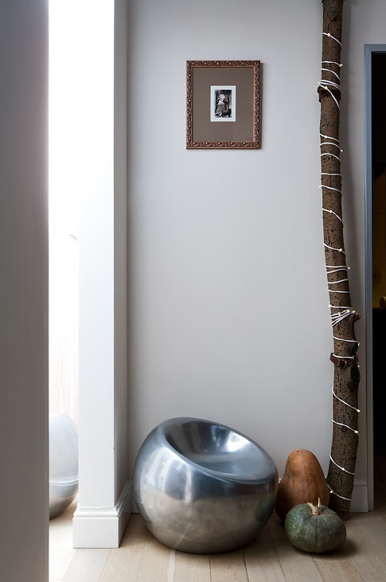 Vegetables, wood and metal – an unusual solution
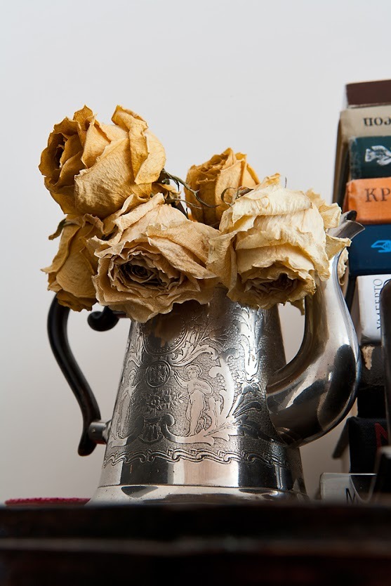 Dead roses in the same dish
 Functional bookcase
Who ordered the project?
The couple are thirty-year-old intellectuals who work in advertising and marketing. They love their cat, books, and art. They were the ones who commissioned the project.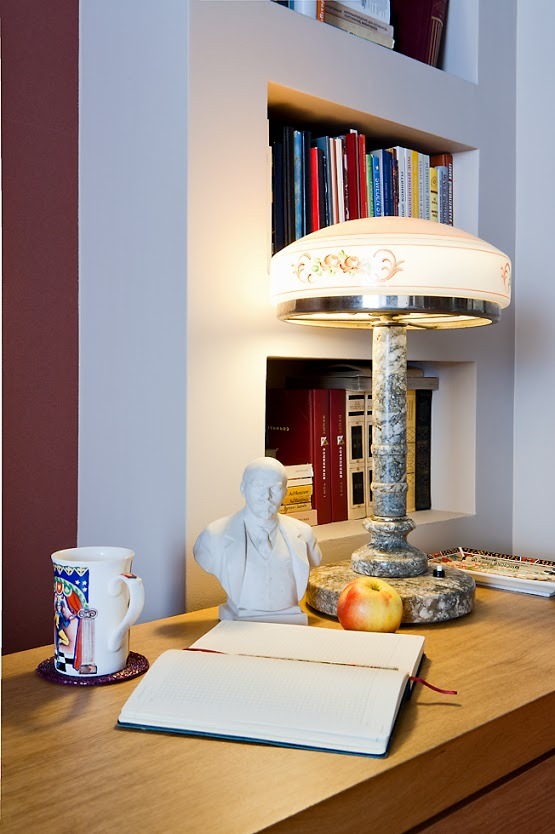 The table of a real communist
 New Year's ball of the future
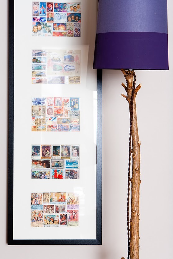 Nostalgia – Soviet-era stamps
What ideas did customers suggest?
The clients wanted to retain the spirit of their modernlife, but to bring some cheerfulness to the overall picture of the apartment. The desire to have a living room with an imitation fireplace, an office, a cozy kitchen, a bedroom, coexisted with the decision to divide the bathroom and put a shower cabin instead of a bathtub. Another condition - it is necessary to allocate space for storing literature. Everything changed dramatically.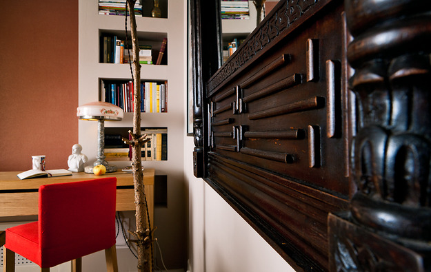 Is eco-friendly wood the best finishing option?
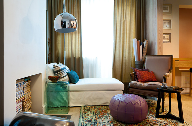 Oriental theme, bright pillows and a soft pouf
 Classic and high-tech – the best harmony of style
What helped you create this project?
The apartment is new, so createthe nostalgic atmosphere here was unusual. The designer decided to create a "real" interior, which is completely imbued with history, and not a parody of it. There is no luxury in it, although the textures and materials are natural and expensive. The apartment does not look prestigious, but everything in it is expensive for a family. Fashionable - this is not about it. Ordinary objects are used here in an unexpected way.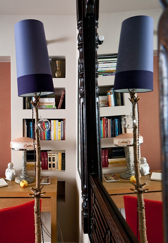 Tree trunk as a lamp stand
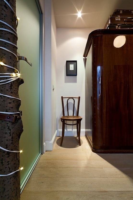 Chair from the beginning of the 20th century
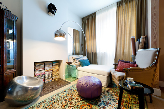 Niche in the wall for books
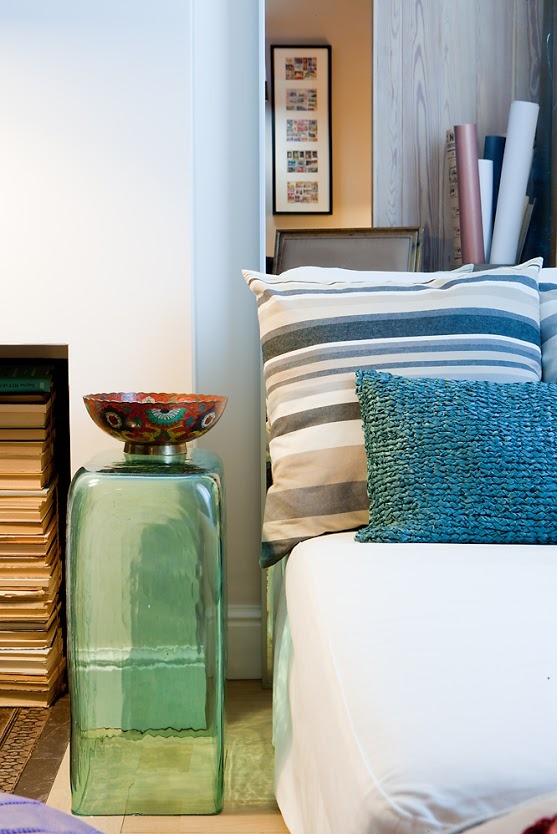 Glass nightstand for painted bowl
Redevelopment was required?
The layout of the apartment was mandatory.The load-bearing parts of the apartment were hidden, and niches for storing books, things and wardrobes were located in them. The bedroom was placed in a smaller room. The large room was divided by a partition into two different zones. One was occupied by , and in the other zone there was a dining room-kitchen and an office. In the converted bathroom there was a toilet, a shower and a vestibule where you can change clothes and leave dirty laundry.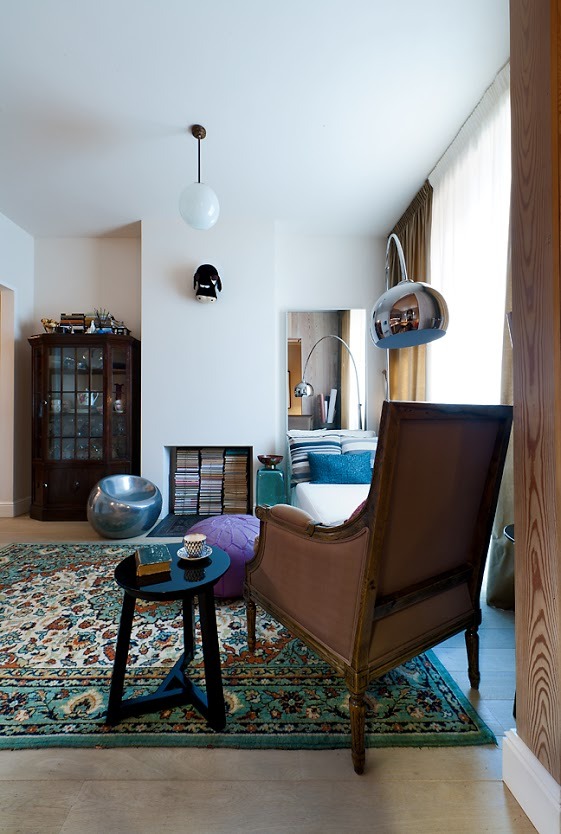 English table near the royal chair
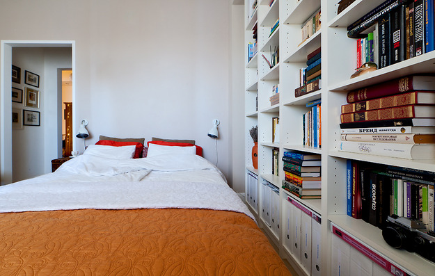 Wide, roomy shelves on the walls
 It's good to work on a full stomach
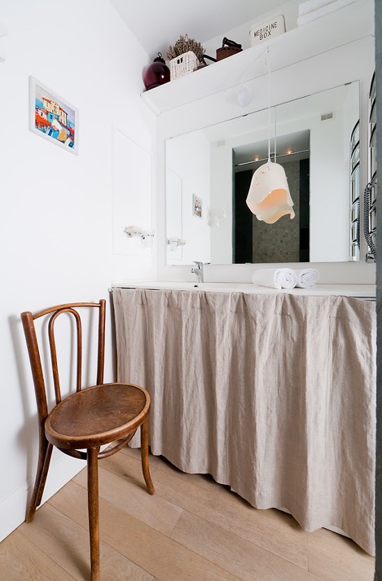 Aged items and modern lighting - a wonderful transformation
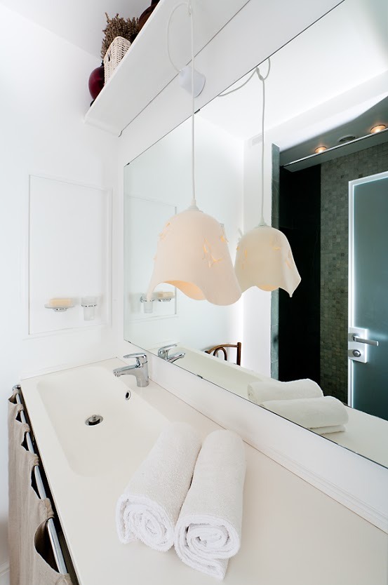 The similarity with the Provence style is colossal
 Terry and white are always in fashion
How was light and color used?
The color scheme is calm - it's lingonberry andturquoise. The shades of all Russian nature prevail, and in them - restraint and calm. But the main thing in any project is considered to be the right light. The right light will always enliven, fill with energy and refresh any color. To make the atmosphere pleasant, you need to use different lighting: the main overhead light, various floor lamps, lamps and table lamps. Unusual lamps give the room a fairy tale and always surprise customers. Here we used the floor lamps "Fir Trees", located in the dining room near the mirror and the wall lamp "Aspen", in the hallway. The different textures of the pillows are impressive
 The mirrored chair and lamp complement each other perfectly.
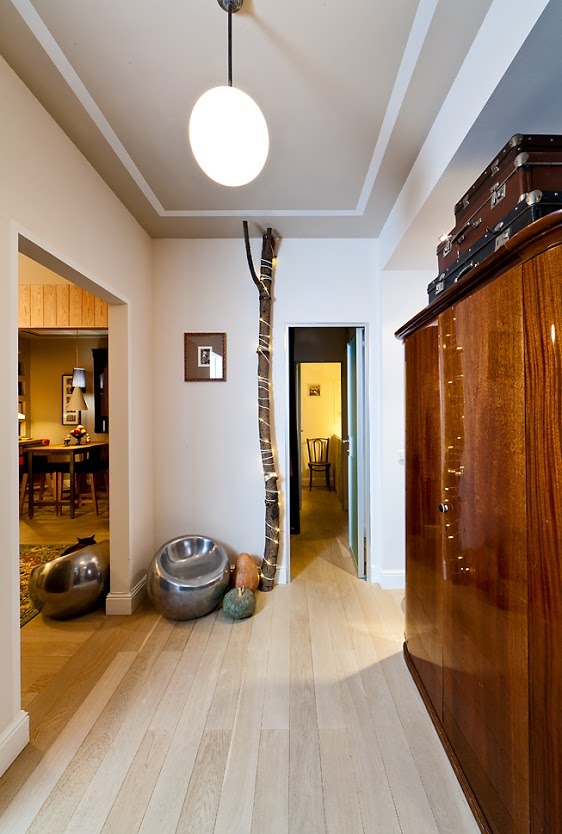 "Yolki", but it's not New Year's yet
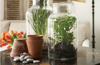
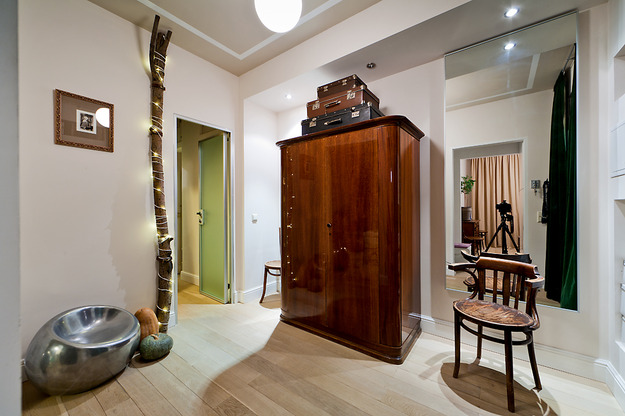 A vegetable garden in the hallway, illuminated by a garland
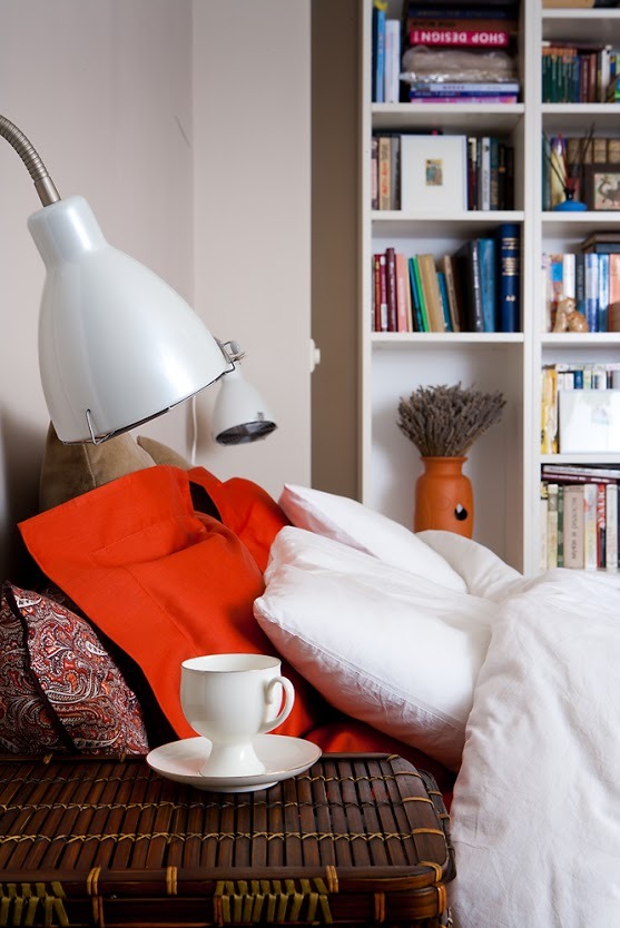 Peach diluted the white extravaganza
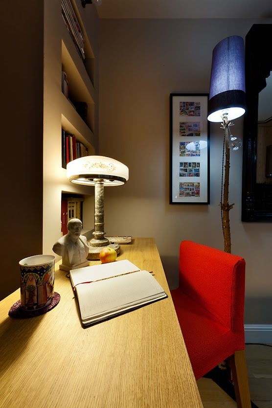 Purple and yellow, light and dark
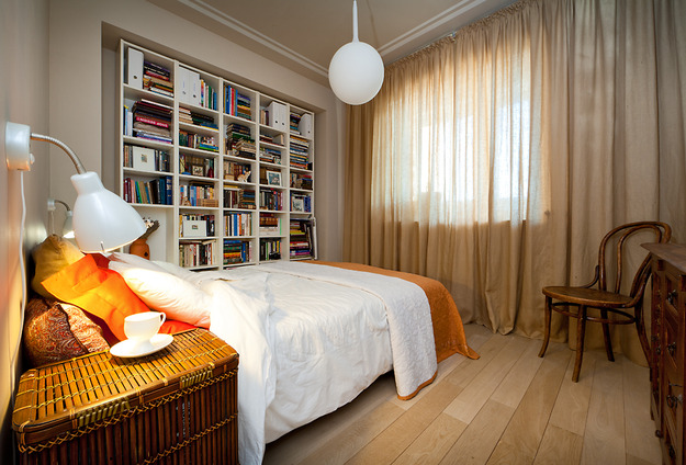 Floor and textiles in beige tones
How did you choose the furniture?
Based on the total area of the apartment, a selection was madeall furniture. The quantity is precisely dosed. All the most necessary things have small dimensions. The large sofa was replaced by , a compact but roomy refrigerator is built in, like a tabletop. Expensive and cheap in one interior, which significantly reduced the project budget. Lilac pouf from the tales of Scheherazade
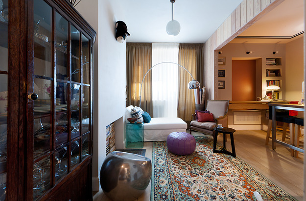 Beautiful built-in sideboard
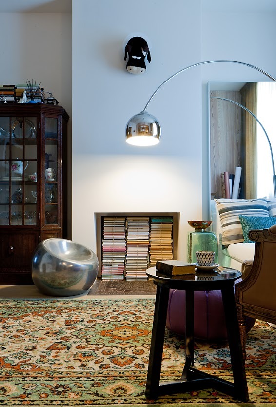 Cow on the wall - cool
What makes you proud?
In a small apartment everything is rationalplanned, so there is much for normal life here. Everything is very competently arranged, the composition looks spacious. Intricate accessories create an individual interior. It fully meets the needs and lifestyle of the customers.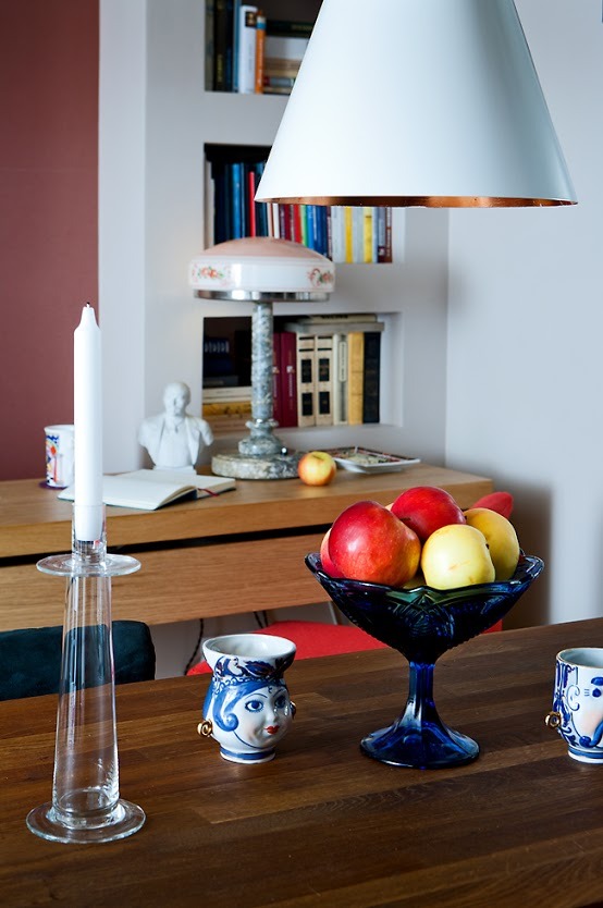 Apple etudes in the kitchen
 Reading and drinking tea in bed is beauty
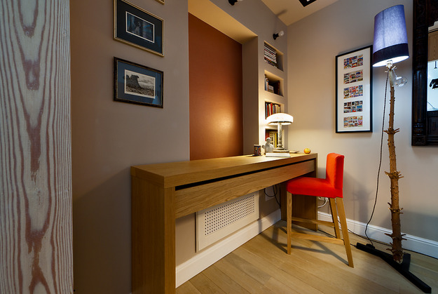 Rich and varied color range
Difficulties in implementing the plan?
The small budget limited the implementation of the project.
Small tips from designer Irina Krashennikova, which can increase the space of a small room
1.A single color for the walls and ceilings that matches the floor and surfaces of adjacent rooms will create a continuous effect. 2. Edgings of other colors will visually increase the space on the ceiling, drawing attention to it. 3. Huge mirrors will create the illusion of many rooms. 4. The area of the room matching the height of the ceiling makes it calm, harmonious and peaceful. 5. The absence of doors will help to unite the two rooms. 6. free up a lot of space and merge with the overall interior, especially if they are the same color as the wall. 7. Shelves that are located above eye level are used for rarely used things. 8. Large pieces of furniture distract from the overall picture of the room, attracting glances to themselves. 9. Purchasing the most necessary and small sizes leads to success. 10. Gloss on surfaces is also good. 11. Haze on the glass adds lightness to the atmosphere of the room. 12. Corridors and nooks visually . 13. If you remove large household appliances, then a lot of free space will appear. 14. You can’t fill all the walls, one should be empty, on which the eye can rest.
