Tired of the winter? Do you dream of "charging" the living room with the energy of the sun? How about orange? We talked to the interior designer and learned all the subtleties of working with this complex color
The color of the sun, oranges and sand. Once it was called "the new pink", now it is just good as an accent and in our opinion it will look great in the living room. In order not to be unfounded, we found 15 examples with successful application of this shade in the interior and even asked to tell the interior designer Varvara Zelenetskaya how best to decorate the living room with orange.
The blue sky and the orange sun are a completely natural composition. Pay attention, the owners even cups were selected for the interior. 
Neutral background - an excellent occasion to "play" with accents. 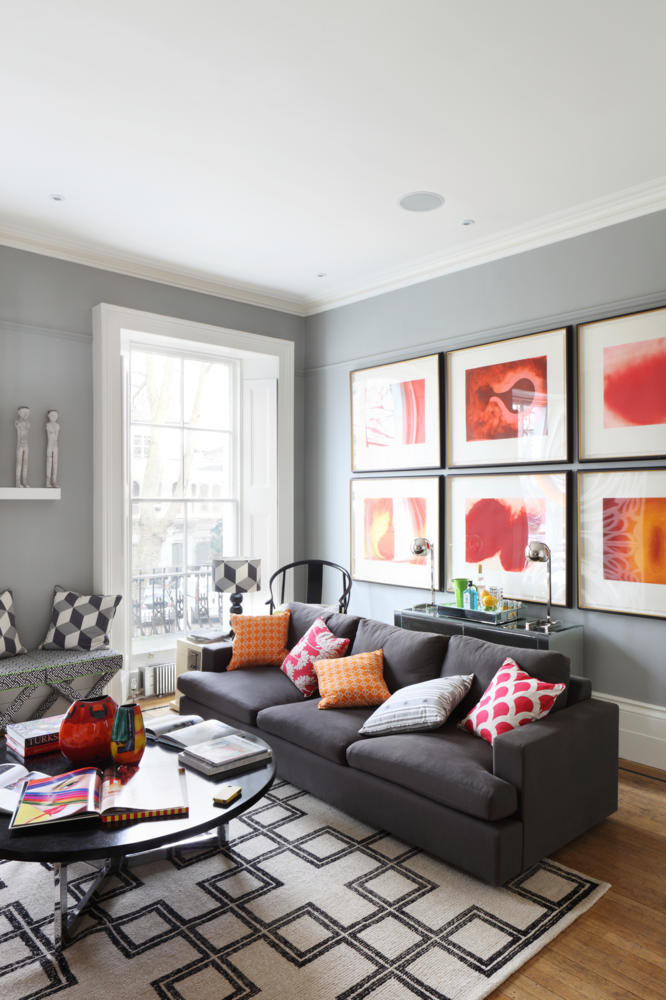
It is better to frame a larger shape with a calmer version of the orange shade. 
Intensively, therefore contrasted and very effective. If this is your goal - be inspired. 
A great way to "accustom" yourself to the color is to test it on the window curtains. 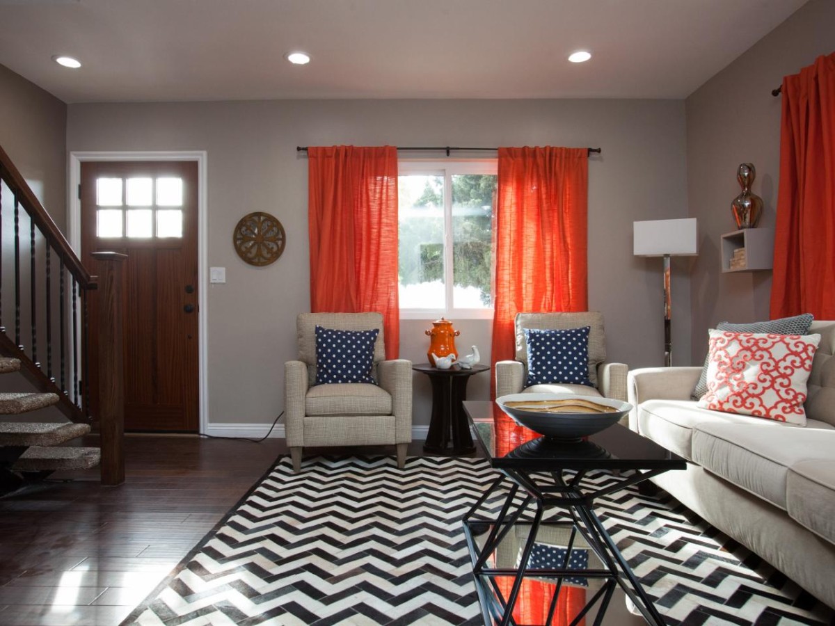
Here everything is quite simple, minimalistic (in the palette) and at the same time very intricate. 
Orange perfectly matches with gold. 
By the way, it's a very good idea to sew several pillowcases from the same fabric as the curtains. 
Thanks to the quiet environment and the "powdered" orange shade, this interior energizes, but does not irritate at all. 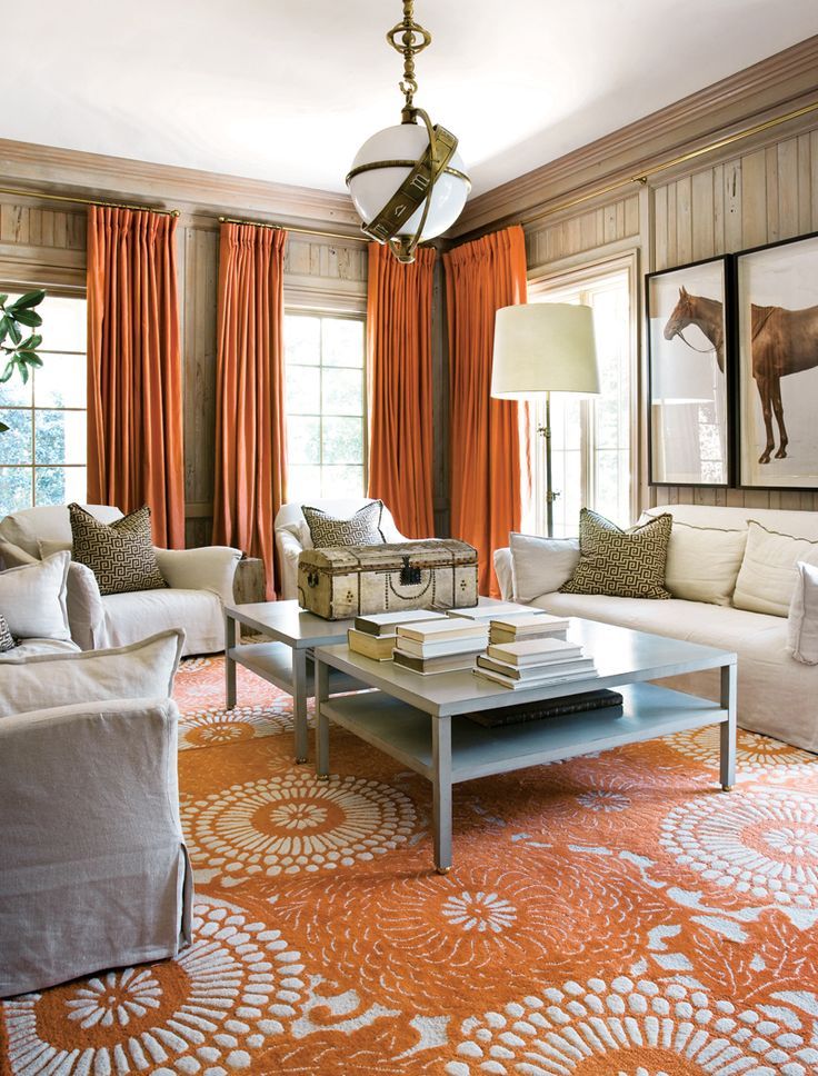
Extremely clean and fresh interior. 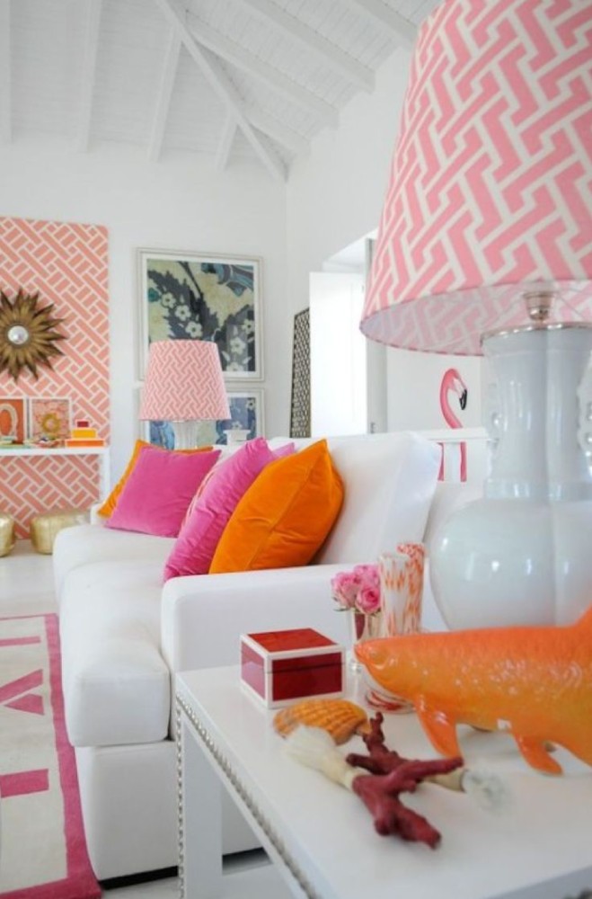
There are many orange, but thanks to the difference in shades and serving, the interior looks very organic. 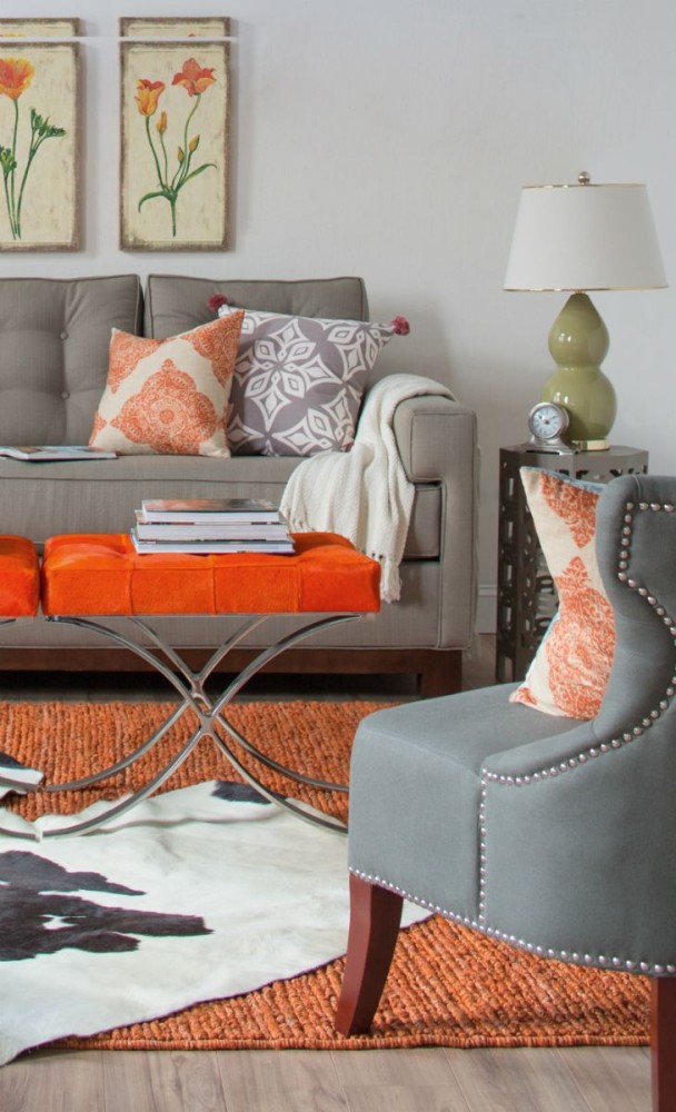
In this living room, orange balances the abundance of blue. 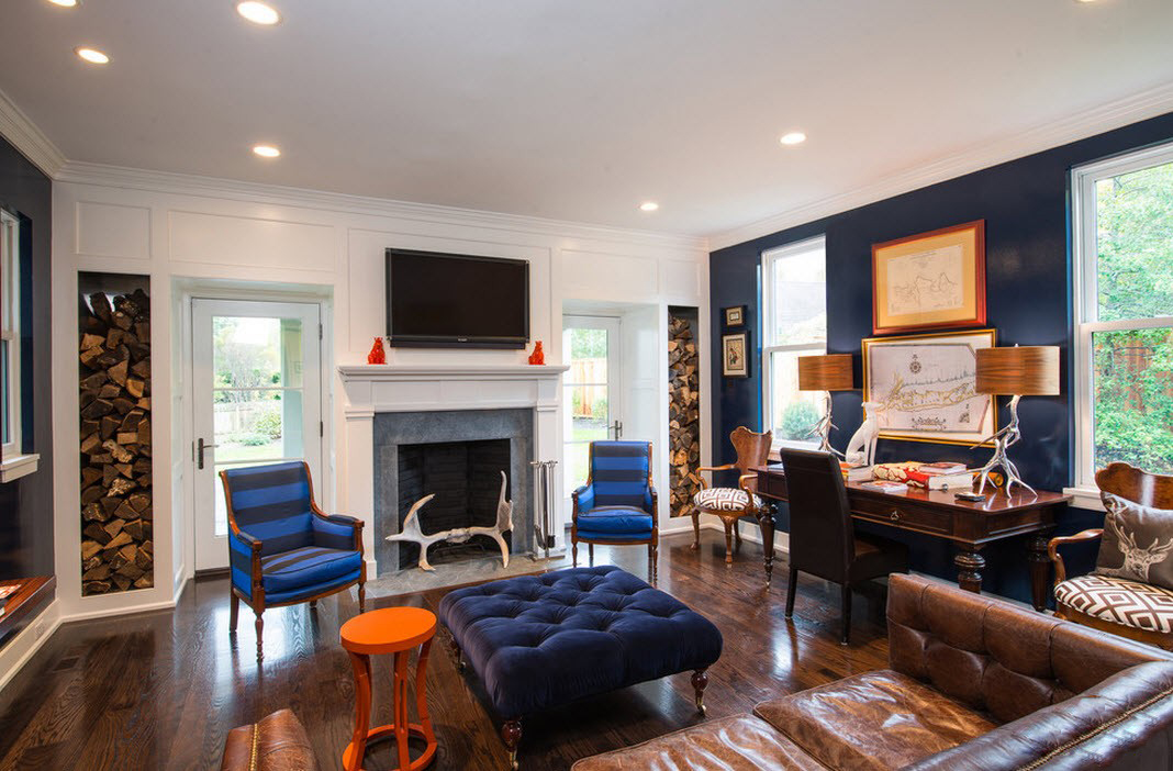
Bronze can also be considered an orange accent, especially in conjunction with gladioli. 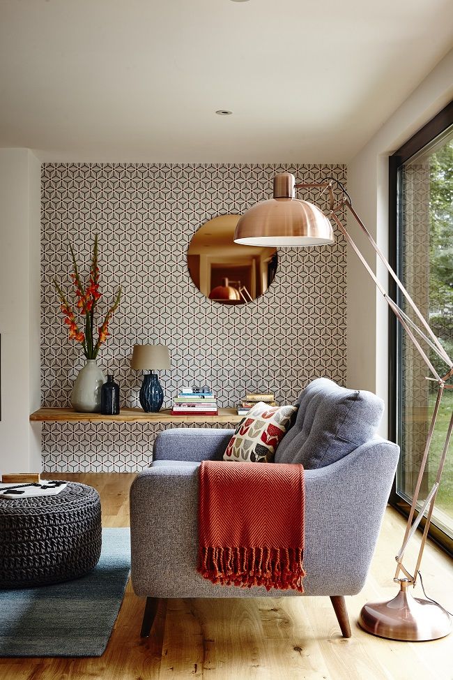
With a clear abundance of color, this living room makes a whole impression - and all thanks to the correspondence to the declared Moroccan style. And he without orange is unthinkable.  This method can be used as a zoning tool.
 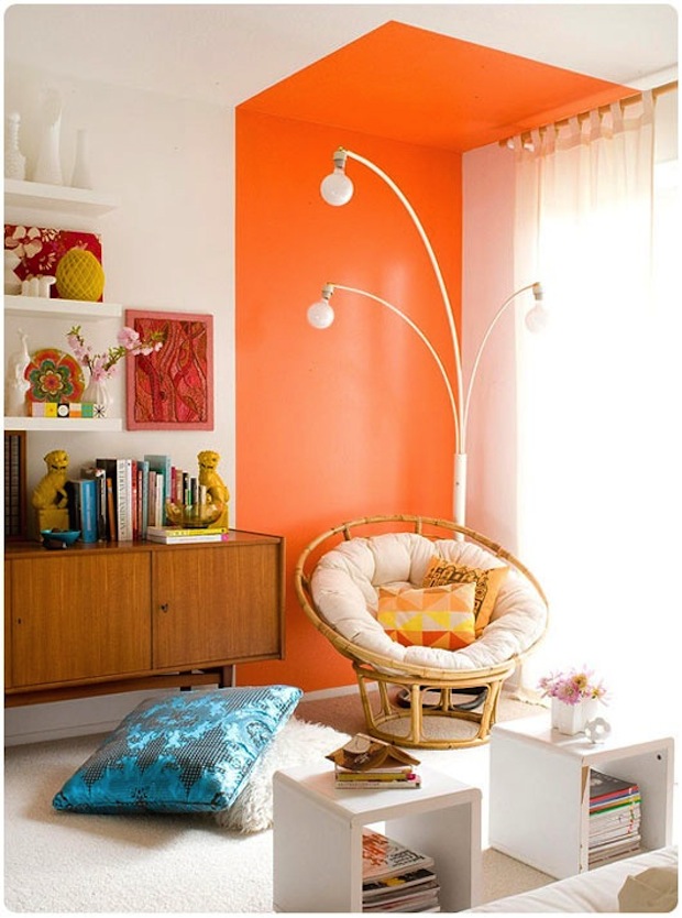 Varvara Zelenetskaya, designer Graduatedspecialist in interior design and furniture design, specialist in art management (graduated from the Humanities and Applied Institute and the Institute of Contemporary Art), trained in Florence at the Lorenzo di Medeci Design Institute. Since 2002, he has been a co-owner of the Dekointeriors studio in the Central House of Architects. In 2005, she opened her own studio, working with interiors from the beginning of the development of an architectural project and ending with individual items that are developed and created according to the sketches of the studio's designers in her own workshop. vzstudio.ru
- Orange color is more than complex in the firstbecause because there are a lot of different shades of it. It can be orange, ocher, honey, brick. When choosing an orange color, first of all you need to understand what style you are going to go with this color. So let's start with the main thing.


