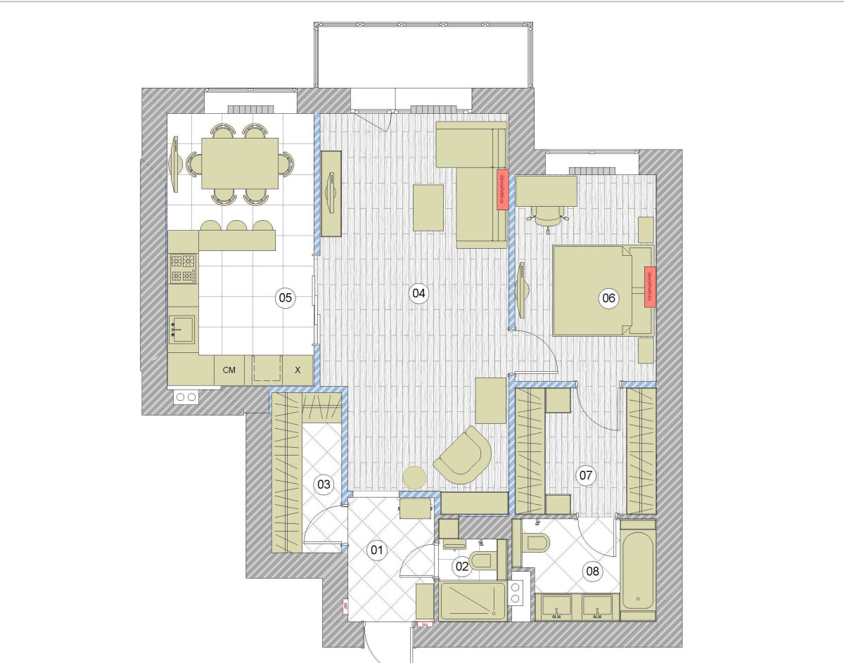
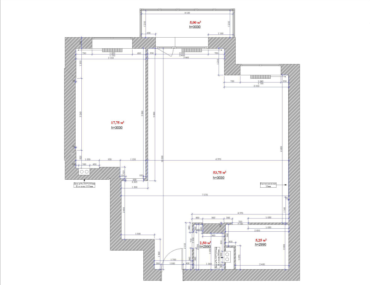
How to create a bright and cozy interior, whileusing a color palette of just two shades? Designer Ekaterina Bachurina knows the answer to this question. Today, she will tell and show, especially for etk-fashion.com, how she managed to make the customer’s dream come true. Today, interiors in this style are especially popular. This style implies the use of simple geometric shapes, a minimum number of pieces of furniture and decor, as well as a light color palette based on the play of halftones. We invite you to take a look at the interior created by designer Ekaterina Bachurina in a two-room apartment on Michurinsky Prospekt. Katerina Bachurina Katerina Bachurina graduated from the Stroganov Moscow State Academy of Art and Industry, specializing in “Artistic Interior Design”, and is a finalist in competitions for designers and architects. Creative credo: to be an artist, to live several lives at the same time, because in order to design a good interior, you have to “live the customer’s life” yourself. The customer of the project wanted the rooms to be isolated and the interior itself to be light. The main idea was to fill the space with the maximum amount of light, using a minimal color palette. The space of the room was initially ideal for creating a minimalist style: the apartment is large, the ceilings are quite high.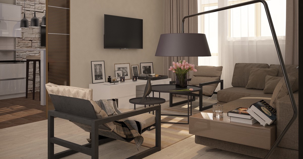 The apartment turned out to have no partitions,Accordingly, a redevelopment was necessary. During the installation, the footage of the dressing room was reduced, the visualization of which, unfortunately, is not yet available. The area of the dressing room was 7 sq. m. The area of the living room in the final project was almost 24 sq. m., the dining room together with the kitchen took up 18.5 sq. m., and the bedroom — 11.25 sq. m.
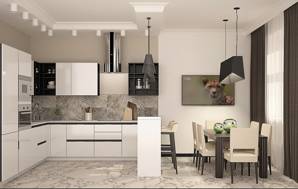 built on all shades of beige and ocher.In this regard, it was necessary to correctly position the lighting: so that when a warm light source hits the surfaces of furniture, walls and floors, there is no distortion of shades towards the green spectrum. The designer managed to cope with this task perfectly (that's why she is a designer).
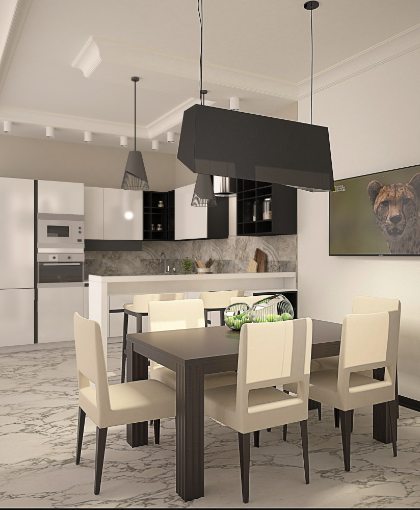 Furniture and finishing materials:kitchen — custom-made (Alno); living room — Nara, Sachi, Sancal folk, IKEA, Dupen; bedroom — BoConcept; bathrooms — Atlas Concorde Mark, Atlas Concorde Marvel tiles; walls — Benjamin Moore paint; floors — Tavolini, solid oak Carta; kitchen — Arabescato Vagli marble; doors — Solo.
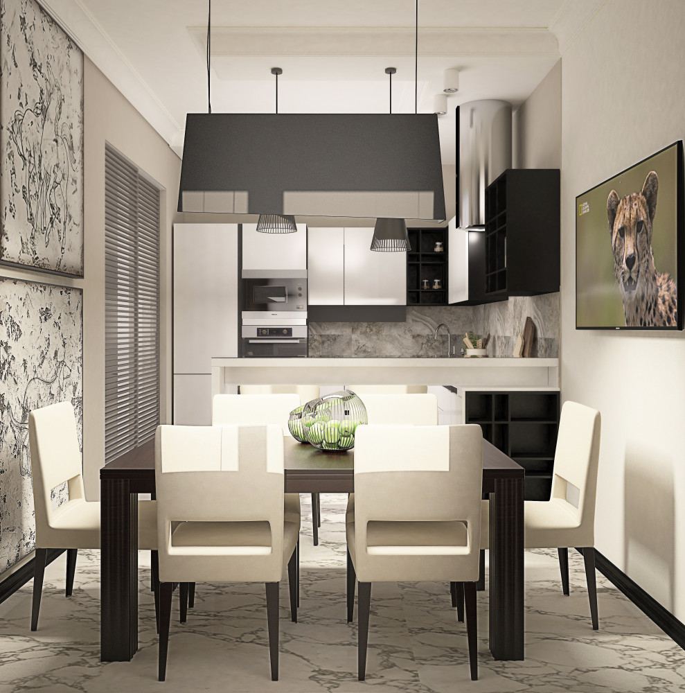 Strict modern interior in styleminimalism was complemented by classical elements (cornices, baseboards). The result was an organic combination that perfectly suited the overall interior style of the apartment.
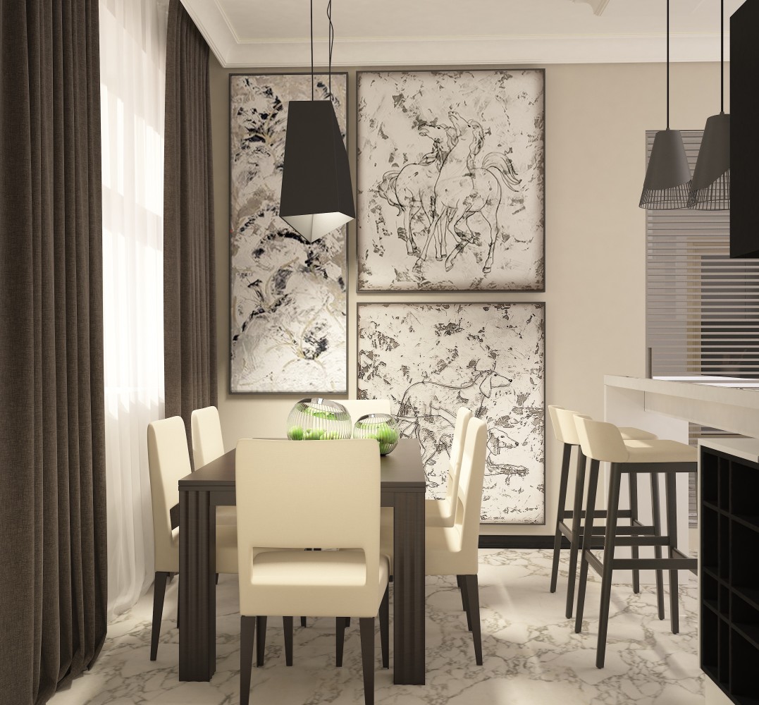 The most important thing for me in this project is the absence of frames, any restrictions. I was able to express myself both as an artist and as a designer. Katerina Bachurina, designer
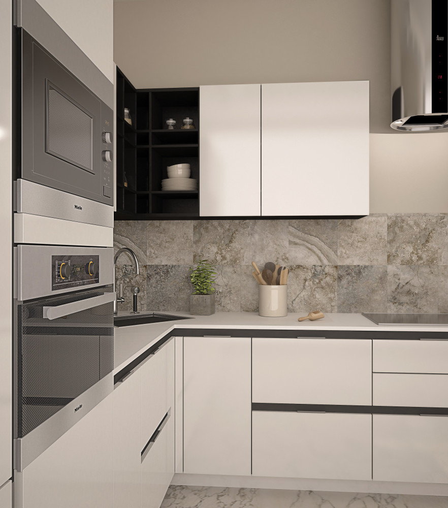
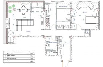
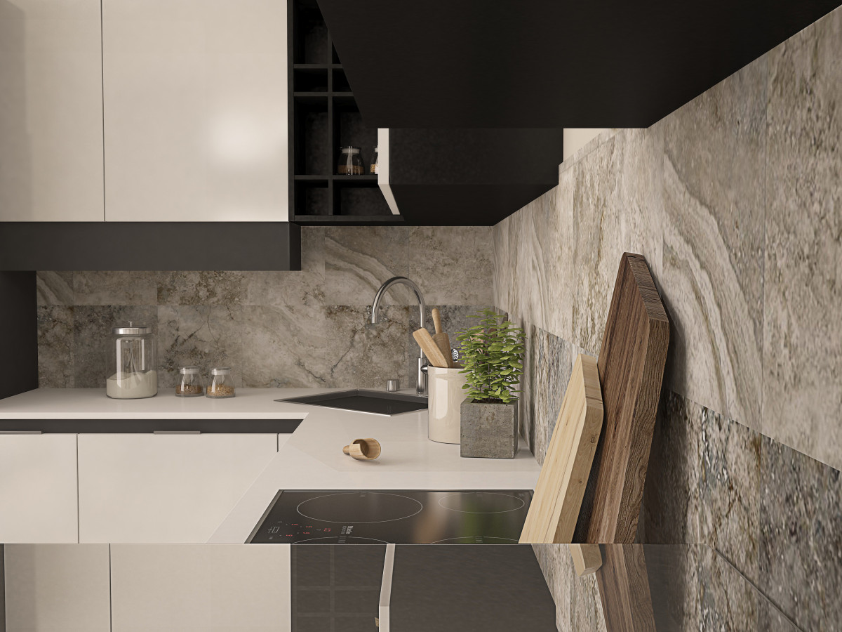 Project plans

Minimalist apartment on Michurinsky Prospekt: more light, less color – etk-fashion.com
