Do you think that the bathroom is not the place for designerexperiments? Bright colors for other rooms? And is it unreasonable to use wallpaper and wood? The bold solutions in our bright example will convince you otherwise During renovations, the bathroom is sometimes dealt with on a residual basis, believing that this purely functional space does not require much effort, and there is nothing more interesting to come up with than light tiles. It is all the more pleasant to see examples of the opposite approach, reflecting the desire of the owner and designer not to retreat in the face of difficulties, not to limit the flight of fantasy and to devote no less time and effort to the bathroom than to other rooms. Sometimes this leads to the emergence of small masterpieces. The bathroom, which was given a second life by American designer Christopher Patrick, was remodeled in the late 50s, was decorated sparingly and restrainedly and has since become completely morally outdated. On the plus side: a window and a sufficient amount of free space.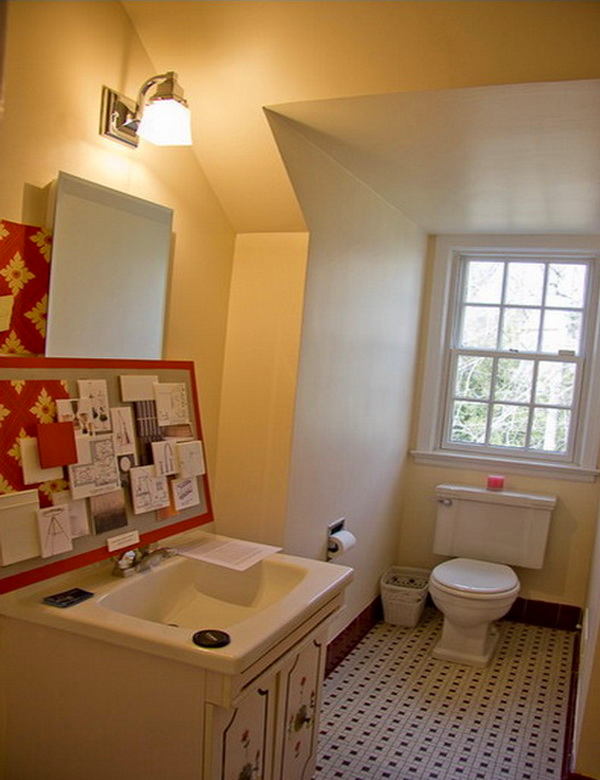

 Christopher Patrick, designer Christopher foundedhis own company relatively recently, in 2011, but has already earned a reputation as one of the most promising designers in Washington. He believes that design should be fun and exciting, loves to travel, and is ready to exhaust himself by searching for the perfect pieces for his interiors. He calls his style "modern, but warm, masculine and with a personal touch." christopherpatrickinteriors.com Looking through projects for inspiration, the designer saw so many absolutely identical and typical interiors that he set himself the goal of creating an "anti-bathroom." Indeed, the result resembles a living room or a cozy boudoir, and the feeling of abandonment and sterility was replaced by an impression of chic retro.

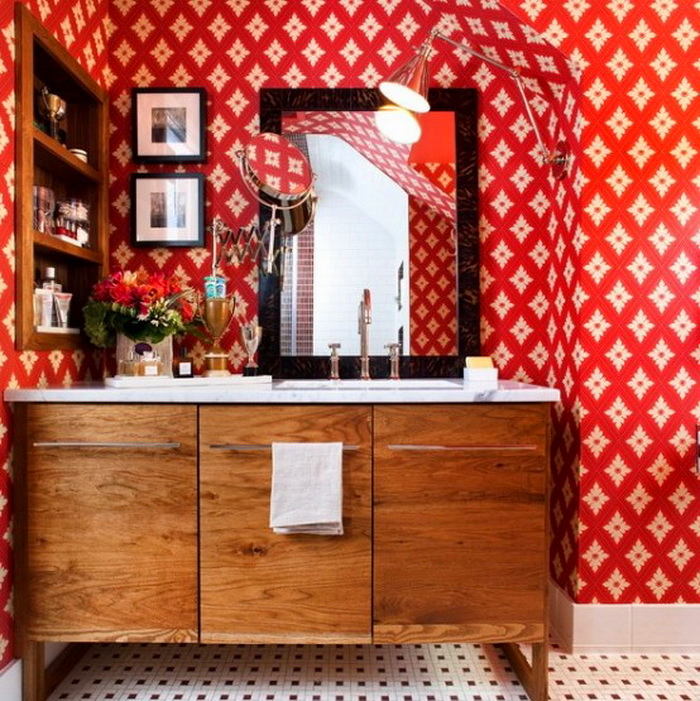
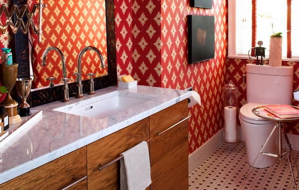
 The design of the walls immediately catches the eye -a rich but noble red color with a geometric pattern that reflects the pattern of the floor tiles. Unexpectedly, but it is . Why not? Modern materials are resistant to moisture and with normal ventilation in the bathroom will be an excellent and unusual alternative to tiles. The bright red color does not look intrusive and tiresome due to the well-thought-out lighting and noble, muted shade of the wallpaper. The bathroom project has a lot of interesting details and solutions. The attention is drawn to the wooden cabinets in a retro style and open shelves for , echoing the teak floor in . The wood maintains the nostalgic atmosphere of nobility and brightness of the 50s style, which the designer wanted to preserve, and at the same time makes the room look like a box.

 Another wonderful highlight of our bright bathroom is the paintings of sheep on a dark background, funny and sophisticated at the same time.
 The owner of the bathroom is lucky - it hasa small window. Additional light from a flexible lamp, reminiscent of a drafting or industrial lamp, is reflected in both mirrors - a large one and a small swivel one. The lamp is easy to adjust and rotate, achieving the most comfortable position. The design of the dressing table is in no way inferior to a real dressing room - there is even room for flowers from fans.

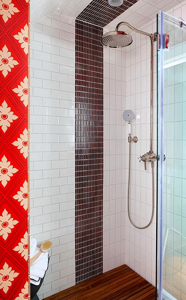
 It cannot be said that the tiles have given in completelyits positions in the interior to wood and wallpaper - it plays an important role. Firstly, the floor tiles from the 50s with a "pinwheel" pattern left over from an old renovation served as the starting point for the entire interior - the rhythm of its pattern is accompanied by bright wallpaper. Secondly, the restrained and modern white brick tiles in the shower area bring a fresh note of cleanliness and order. And thirdly, the chocolate mosaic, which decorates small niches in the shower, convenient for storing small items, and a vertical strip is laid out, visually "stretches" the space vertically and gives the interior a complete look.
Tips and ideas
christopherpatrickinteriors.com, digsdigs.com, pinterest.com
