Who doesn't want to know the future, at least a little bit?part of it? Everyone wants it. We will be happy to tell you which shades will be popular next year: knowing the fashionable color trends, you can "catch" the wave in many directions. From year to year, specialists from Dulux and the British Color Institute AkzoNobel prepare a collection of five color trends called Color Futures. They not only have a single concept, but are also necessarily united by the color of the year. And this is not just someone's whim, the choice is made by analyzing color preferences around the world. The main concept of the album Colour Futures 2015is about bringing something special into everyday life and finding something surprising in the ordinary. The color of the year was named a deep copper-pink shade, and it goes well with all the color collections of 2015. There are five of them: “Big Nature + Small Me”, “Layer + Layer”, “Invisible Spaces”, “Him + Her”, “Friendly Exchange”. Now let’s get to know each color trend better:
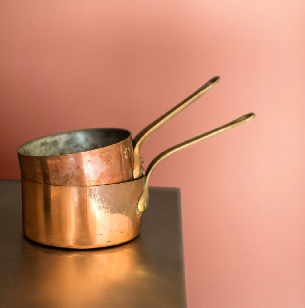
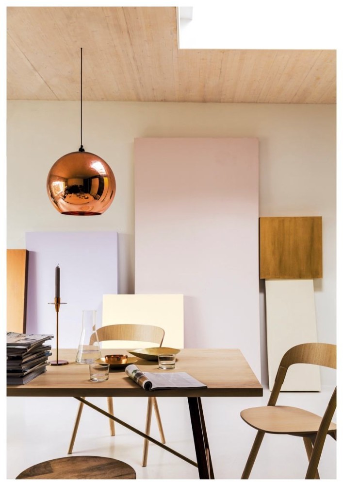
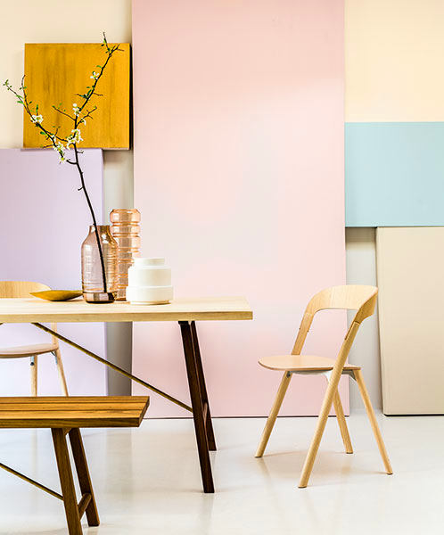
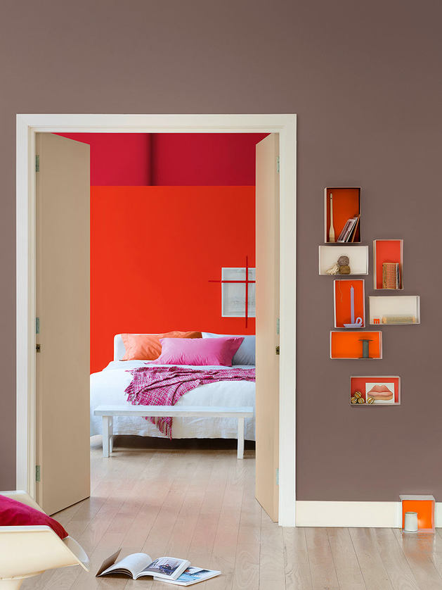
Color of the Year 2015: Copper Orange
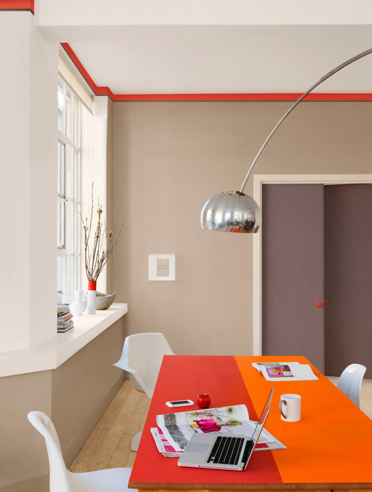
Replacing cool blue and green toneswarm colors come from previous years: orange, pink and red. Plus, metallic shades have become more significant in modern design. So the winner of this year was unanimously chosen orange-copper shade. Our opinion: - Copper color not only perfectly harmonizes with all color collections of the next year, as well as with wood tones, but also fits perfectly into everyday life. Whether clay, sunny yellow or nude colors - they all evoke warmth and naturalness.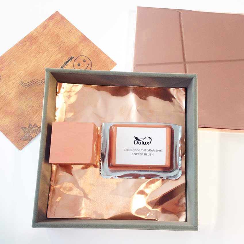


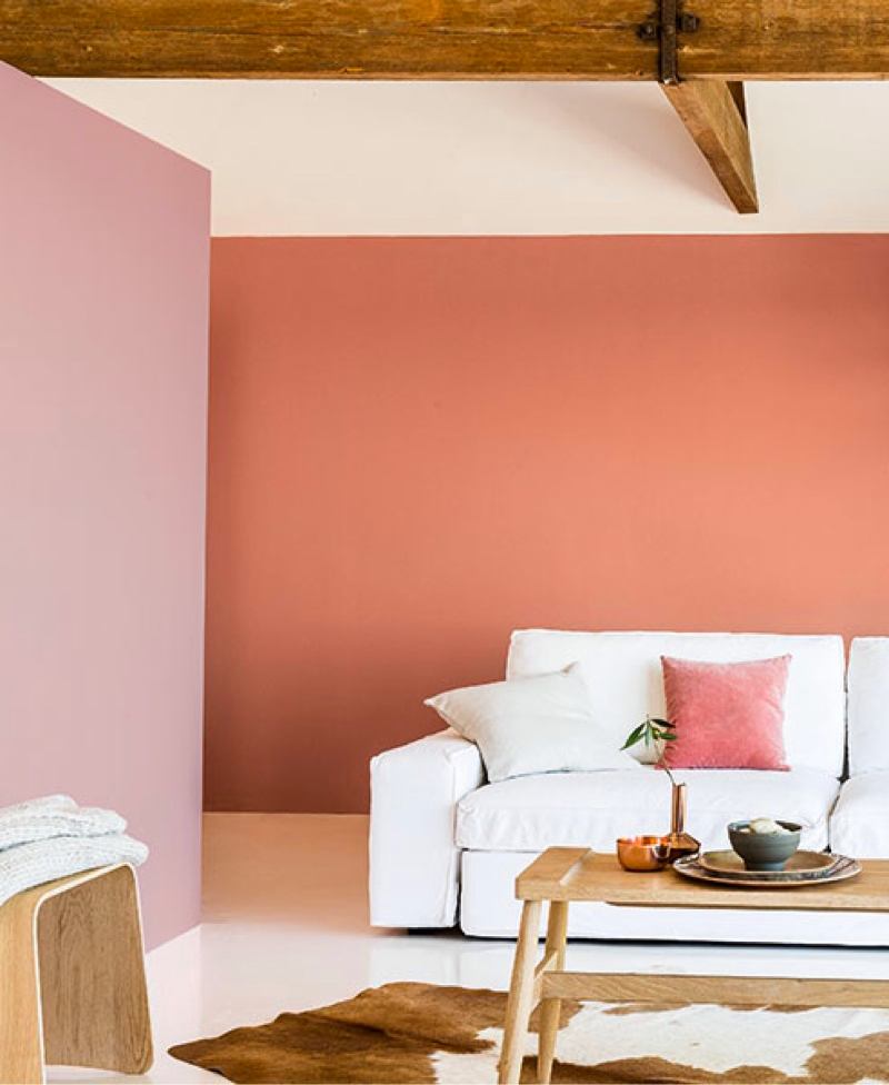
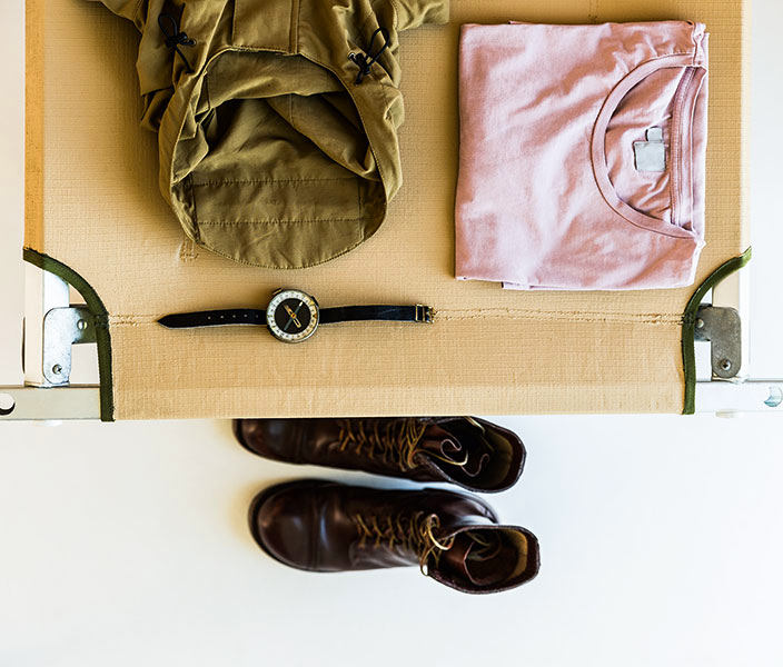
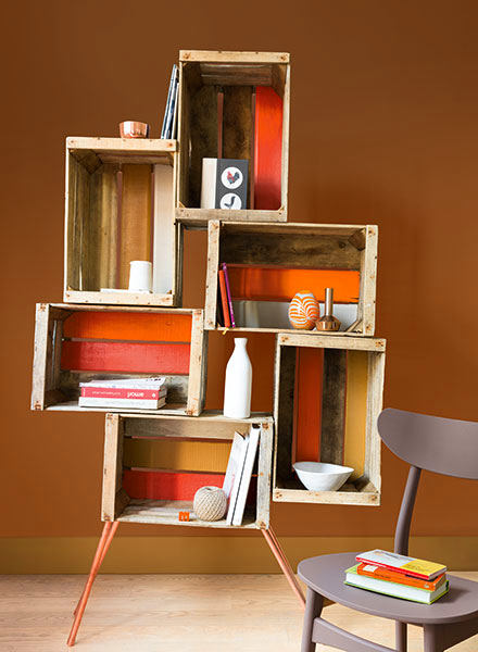
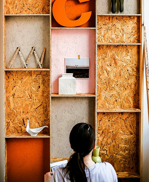
Big nature + little me
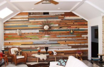
This collection features the image of the desert.The Mojave, parched by the scorching sun. It is terrifying in its vastness, but at the same time, astonishingly beautiful. Rich earthy tones of sepia and sienna, as well as ochre and ceramic, present a powerful color palette that seems inspired by nature itself. Believe in yourself completely. Know that there is something inside you that will overcome any obstacle.
Christian D. Larson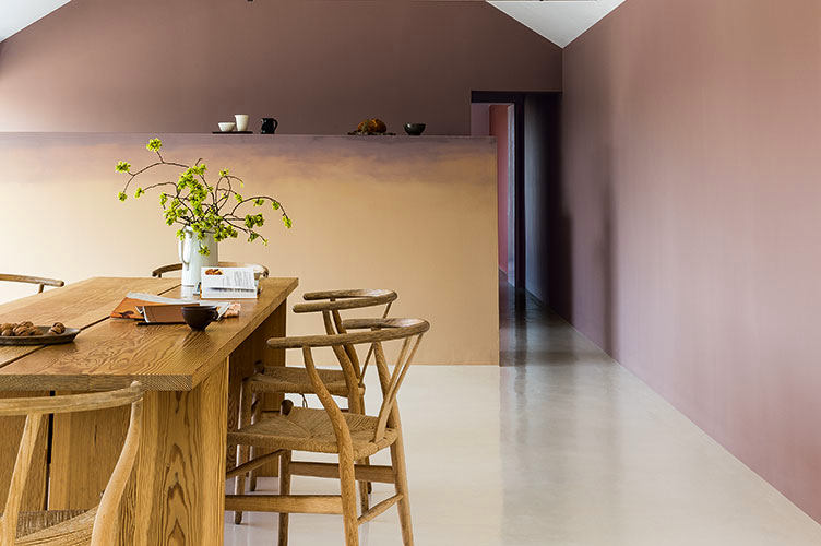
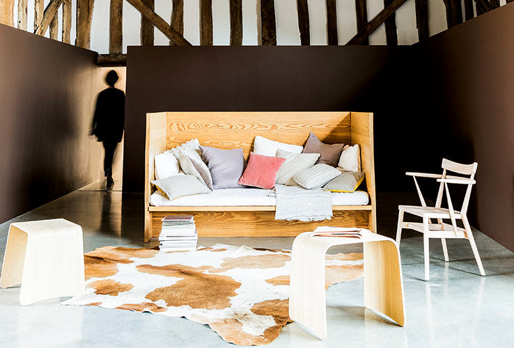


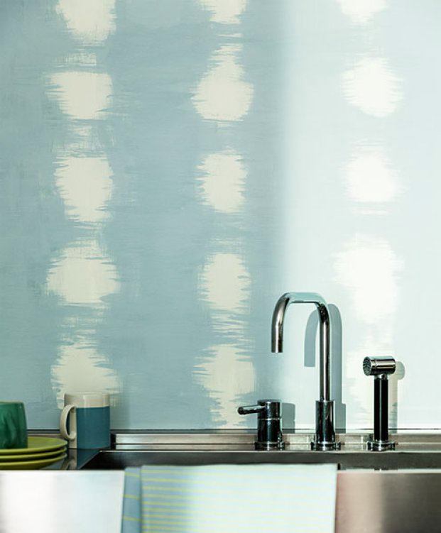
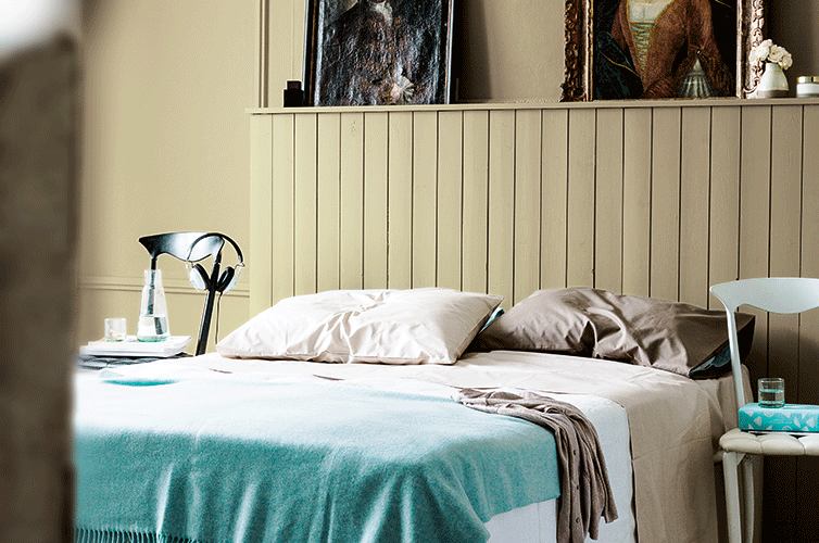
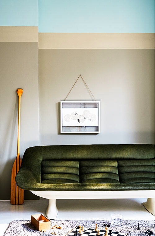
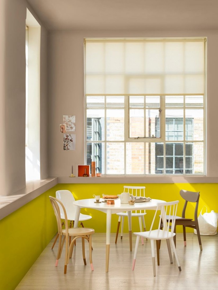
Layer + layer
A mixture of past and present - that's exactly itthe idea behind this trend. A subtle combination of different colors instead of a single shade looks very elegant, especially when done in pastel and soft tones. And the addition of layered and fading elements creates a sense of depth in the composition. Design is the essence and soul of human creation, embodied in a sequence of outer shells.
Steve Jobs
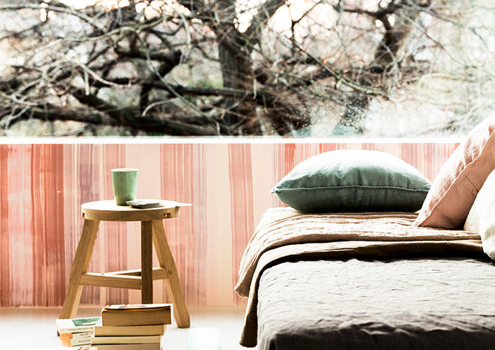


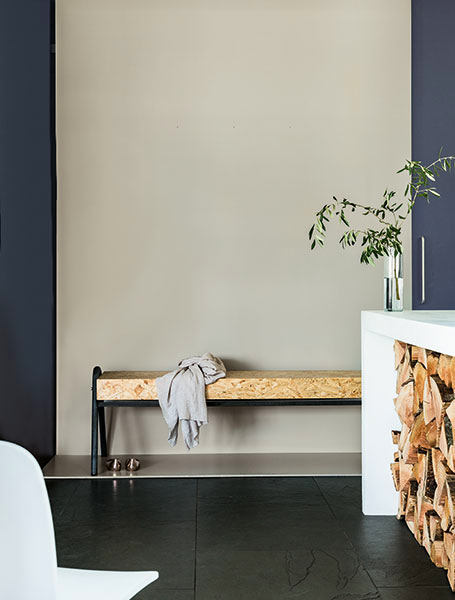
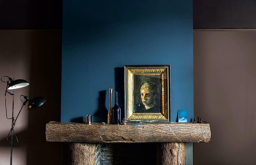
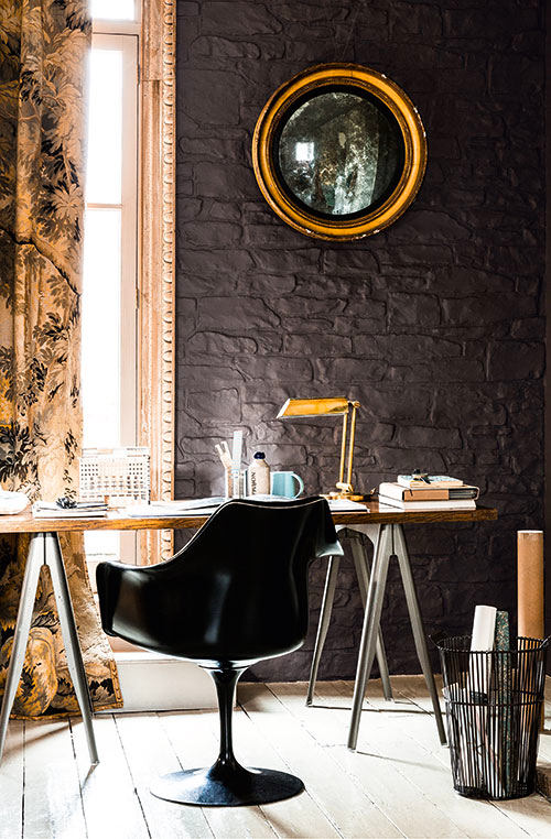
Invisible spaces
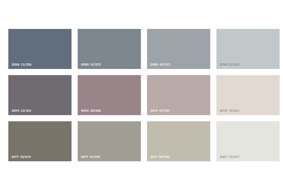
In today's reality, every piece counts.space, so it is worth using forgotten and even unloved corners to make something beautiful out of them. The trend in question is aimed at this with all its nature. The combination of dark and light shades creates the effect of depth on the plane, and the refined color schemes of gray-blue, pale pink and khaki make the collection exquisite. Our opinion: - Different saturation of the same color or a variety of shades of the same saturation will simultaneously make the space multifaceted and will not disturb the original harmony of color.


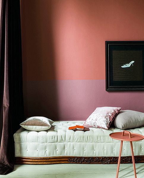
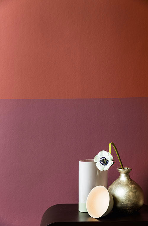
He + She
Trying to achieve equality in the modern worldsociety, despite gender differences, there is a tendency to develop the best qualities of each gender. After all, differences complement each other even better than similarities, because it is the plus that is attracted to the minus, and not vice versa. Uniqueness and balance are the basis of this trend. Parents should instill in their children from an early age that there is beauty and strength in diversity.
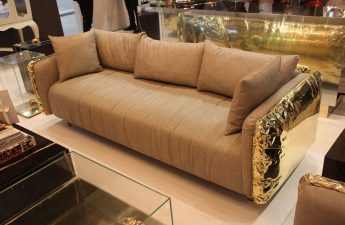
Maya Angelou Masculine Shades of Slate Gray,Khaki and teal are combined with feminine colors - cream, pink powder and prune. The created image can be called restrained, confident and even classic. Such a composition can be used not only in residential premises, but also in bars, cafes, restaurants.

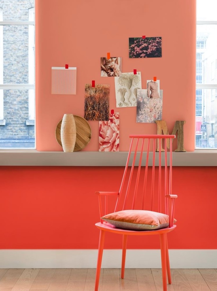
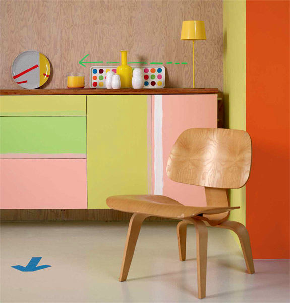
Friendly exchange
A friendly atmosphere should be createdthrough collaboration and resourcefulness in communities. And such trust must certainly be promoted by warm colors, and in the most unpredictable combinations. Red, berry and pink tones give softness together with orange and lime color. In turn, gray, ocher and dark brown fill the composition with incredible juiciness.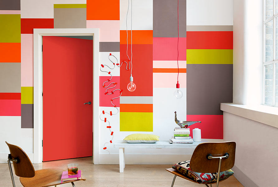
 hannahinthehouse.com, colorfutures.com