Today we will tell you about the most popular andtrendy colors of 2014. Romantic purple, deep blue, shimmering gold ... Which shade is more relevant now? Choosing the right color for the future interior is just as crucial a step as determining the style in which a room or the entire apartment will be decorated. It is important to take into account not only personal preferences, but also fashion trends, so that the interior will always fascinate with its perfection. And even if the renovation has already been completed, the walls are painted, the wallpaper is pasted over, the furniture is arranged, you can dilute the composition with accessories of the shades that are relevant this year. What are the trend colors for 2014?
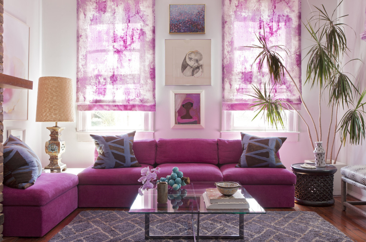
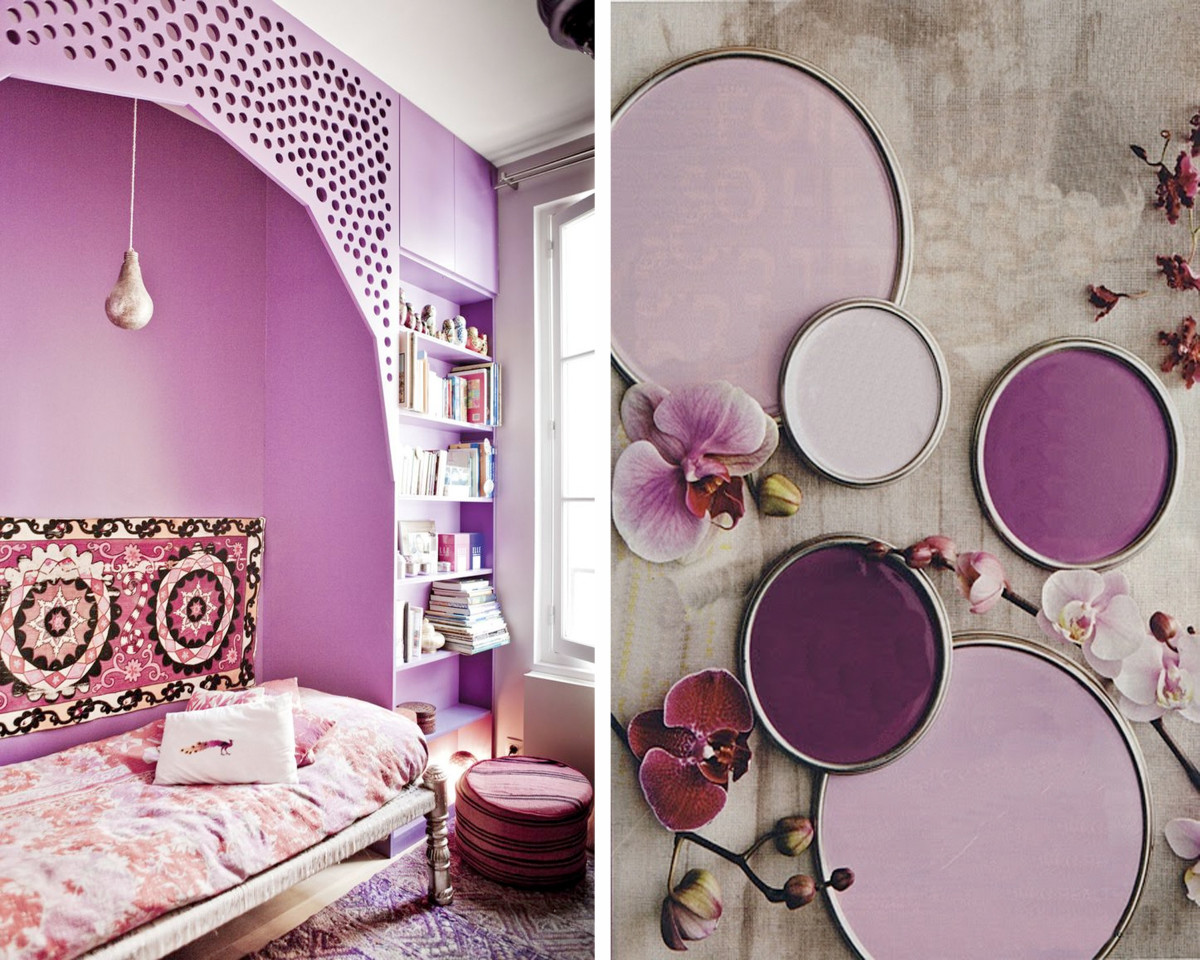
Aroma of orchids
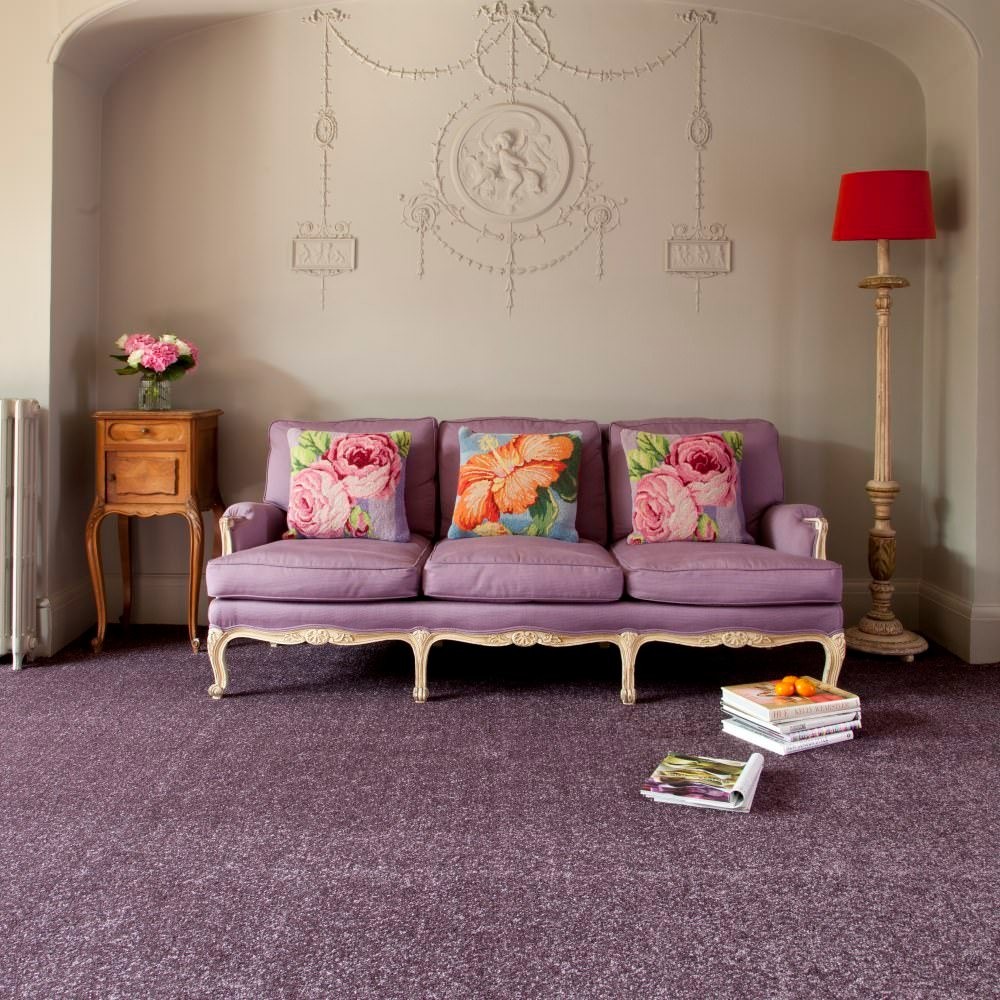
Purple, lilac, orchid are colors thatfell in love with designers back in 2013. And they could not part with them! Therefore, these shades automatically became the trends of 2014. They look gentle and romantic and, depending on the saturation, can fill the interior with depth or, for example, bring notes of lightness into it. Shades of purple with azure, pale yellow, ocher green and olive are ideally combined. Our opinion The color scheme, which has already become classic, will help prolong the trail of gray refinement: bluish, light brown, beige. 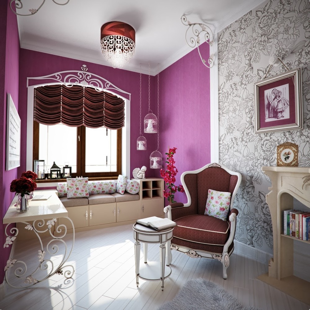
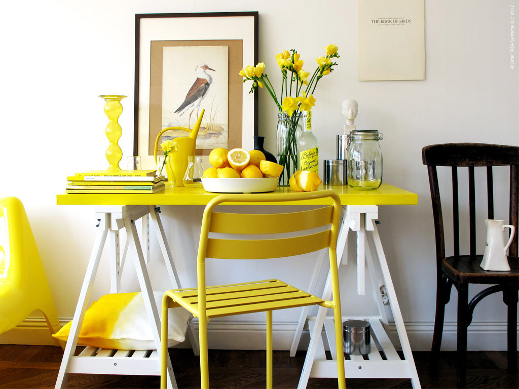
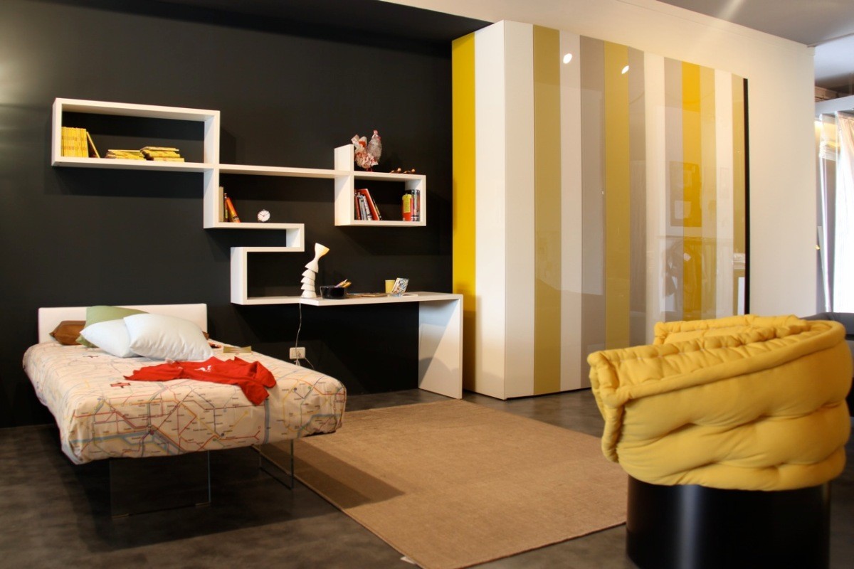
Solar Bunnies
Mustard, hydrangea, freesia - shades of yellow,which are able to make your interior not only fashionable, but also more striking. They are especially relevant for apartments located in large cities that are not devoid of monochrome color. Such sunbeams cheer up, give warmth, invigorate and tune in to a cheerful wave. Combine shades of yellow with blue, turquoise, herbal green and black. If you are afraid to dress the entire interior in a bright outfit, then focus only on curtains, pillows or individual accessories. Alexey Eliseev, head and co-owner of the MANDERS chain of English paint stores: “Nowadays bold, bright and saturated colors are used in interiors much more often. Shades such as mustard ocher, arsenic green, blueberry gradients are increasingly used in interiors. " 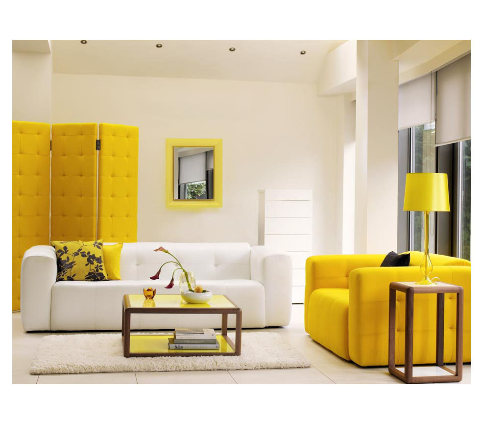
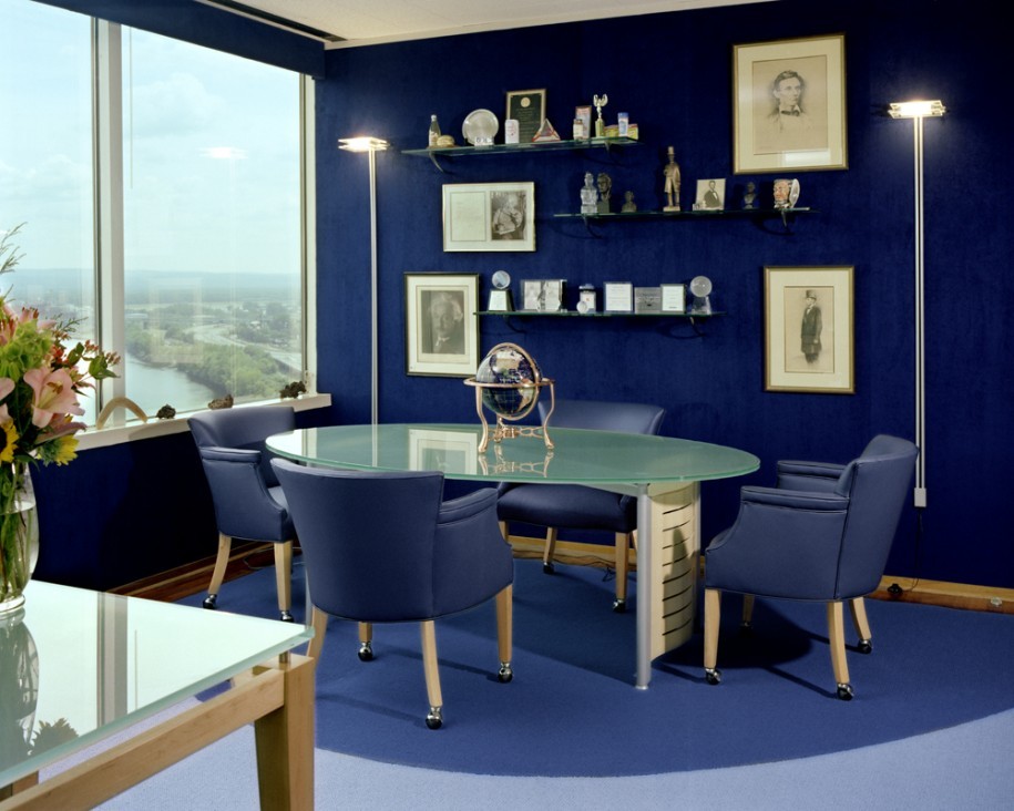
Deep dive
Blue and all its shades are a trend that has long becomeclassics. It is so versatile that it can be used in almost any interior and in any room. The psychological effect of this color can be both soothing, tune in to thought, and refreshing, prompting to create and act. Our opinion Blue is best combined with white, yellow and red. This year, designers recommend paying attention to the deep, velvet blue. 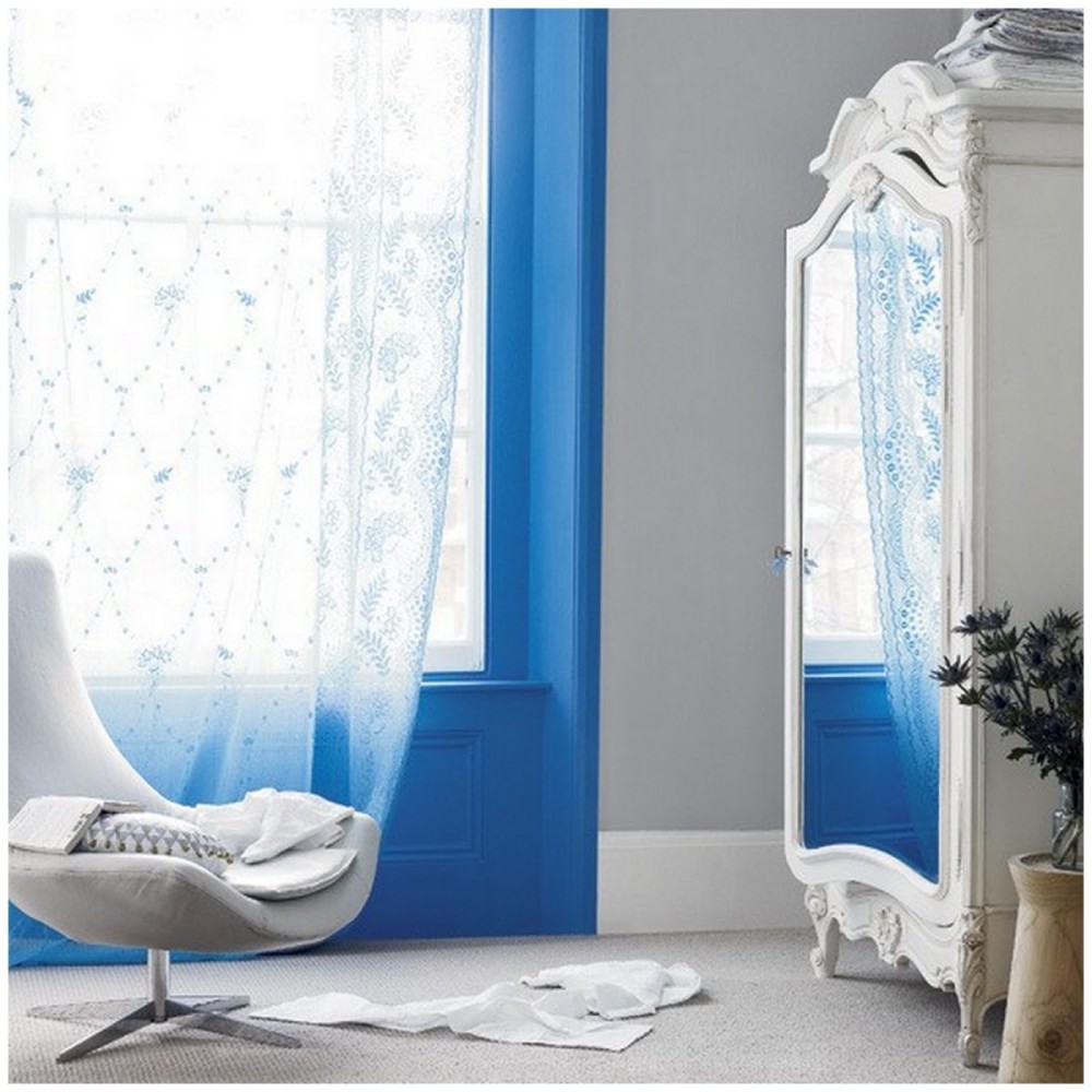

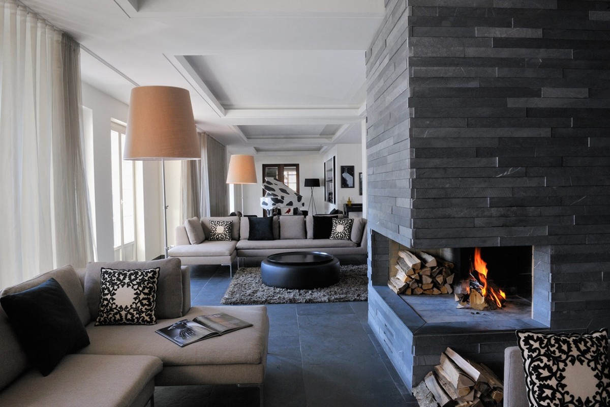
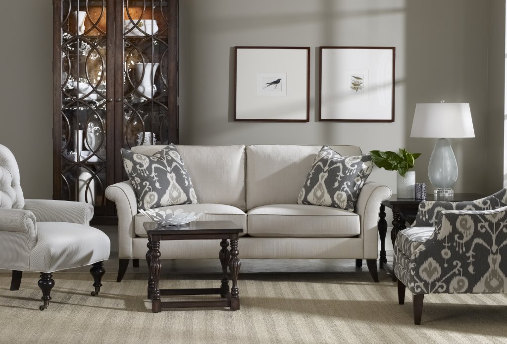
Color of nobility
Gray, it would seem, is one of the mostunremarkable shades, but not for interior designers. Many are already tired of the classic beige and yearn for fresh sensations. A noble smoky shade can make the interior graceful. And don't be afraid that it will be boring: gray has a lot of different colors, combined with neutral and bright shades. Variations of gray in the apartments of people who are in constant nervous tension are especially good: it is precisely such calm colors that balance emotions. On a smoky canvas, juicy accents in the form of paintings, vases and flowers will be appropriate. Alexey Eliseev, head and co-owner of the MANDERS chain of English paint stores: “Quite often, designers prefer glossy paints, enhancing the brightness of the color. Another trend that is gaining momentum can be noted - the transition to colder palettes. " 
Pastel mood
Another shade that can adjust toRelaxation and calm the nervous system, - light green pastel Hemlock. It is good because it can act as a base. At the same time, it does not overload the space, does not scream with brightness and adjusts to carelessness, lightness and summer romance. 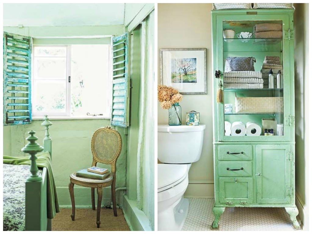
Barefoot on Sand
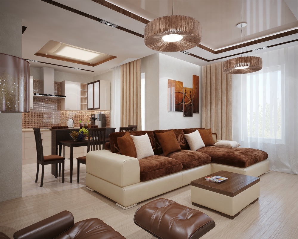
Brown and its shades this year againReturn to the pedestal of popularity. A saturated beige, color of cinnamon, wet sand or natural wood - each of them can be used as a basis or can appear in separate color patches. 
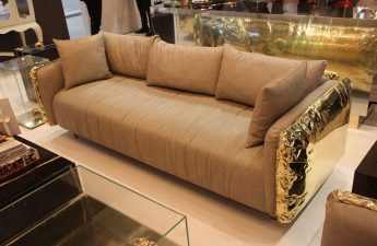
Silver in gold
Gold and silver this year have become one of the mostinteresting and used in the interior combinations. They, like two opposites, complement each other, conflict on the edge. It is important not to overdo it with these emitting shades of luxury, or the room will look ridiculous. Our Opinion Don't forget copper and brass. Some of their inclusions will add a kind of gloss to the interior. 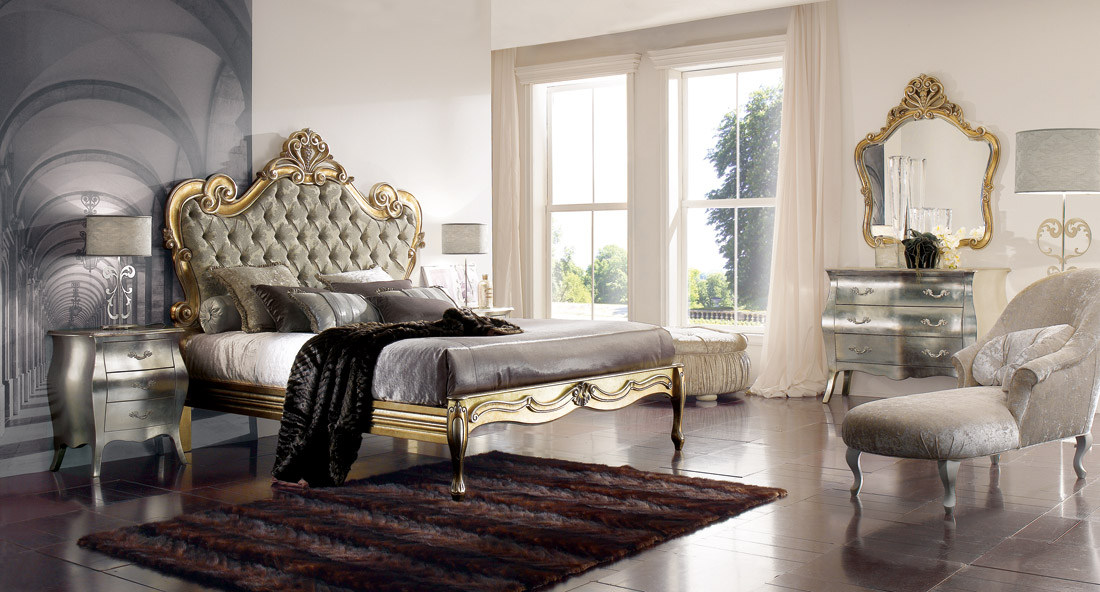
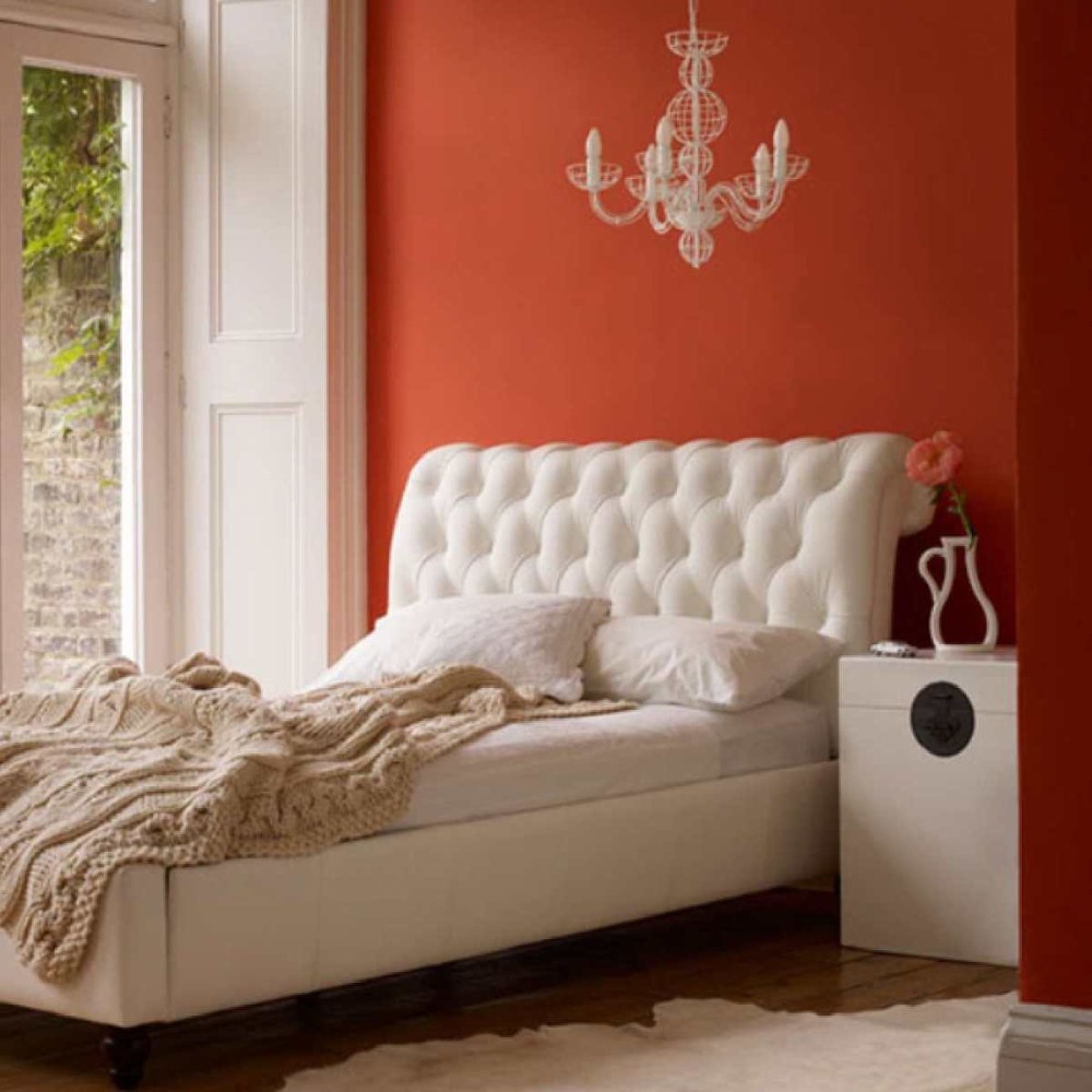
With ostrinkoy!
Perhaps the most daring, bright and sharp colorThis year can be considered cayenne, that is, "pepper". Bold, experimental and enchanting, it will become an ideal accent shade in a neutral interior. Do not avoid brightness! Season this "pepper" with a calm color composition, make it more piquant and tasty! 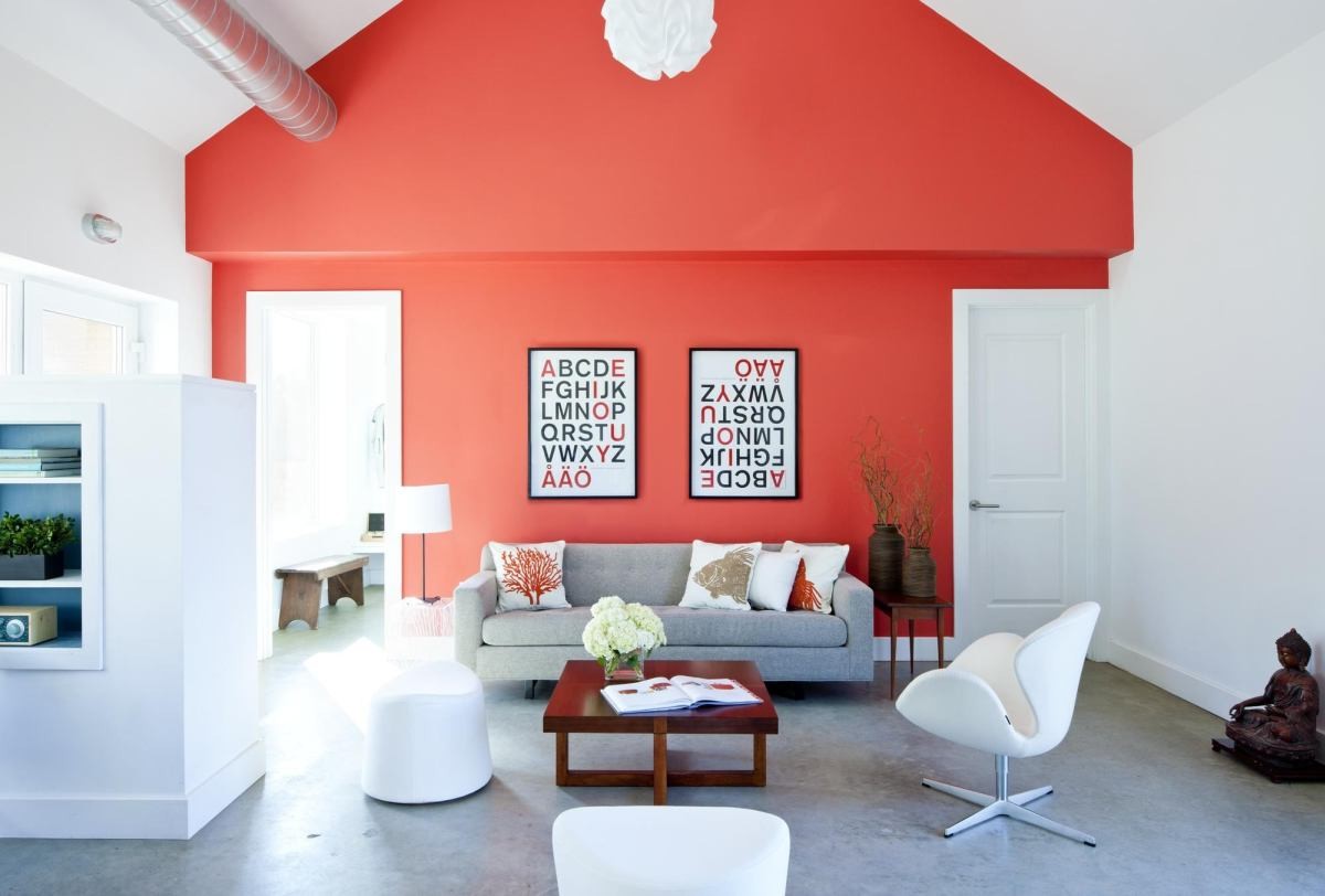
 Adisabledmomslife.blogspot.com littlemisshomes.com meccinteriors.wordpress.com pinterest.com