The word "brutal" is most often associated withimage of a handsome man with medium stubble and excellent muscularity. You may ask, what does this have to do with the interior? The most direct. Rough, but elegant; strict, but stylish - this is how you can describe the interior, which rightfully bears the name brutal. This style was developed by designers and architects in the West in the late 70s of the last century, taking post-war modernism as a basis. Russian masters brought local flavor to it and adapted it to Russian perception, leaving the main thing: rough texture and elegance.
Dedicated to lovers of severe simplicity
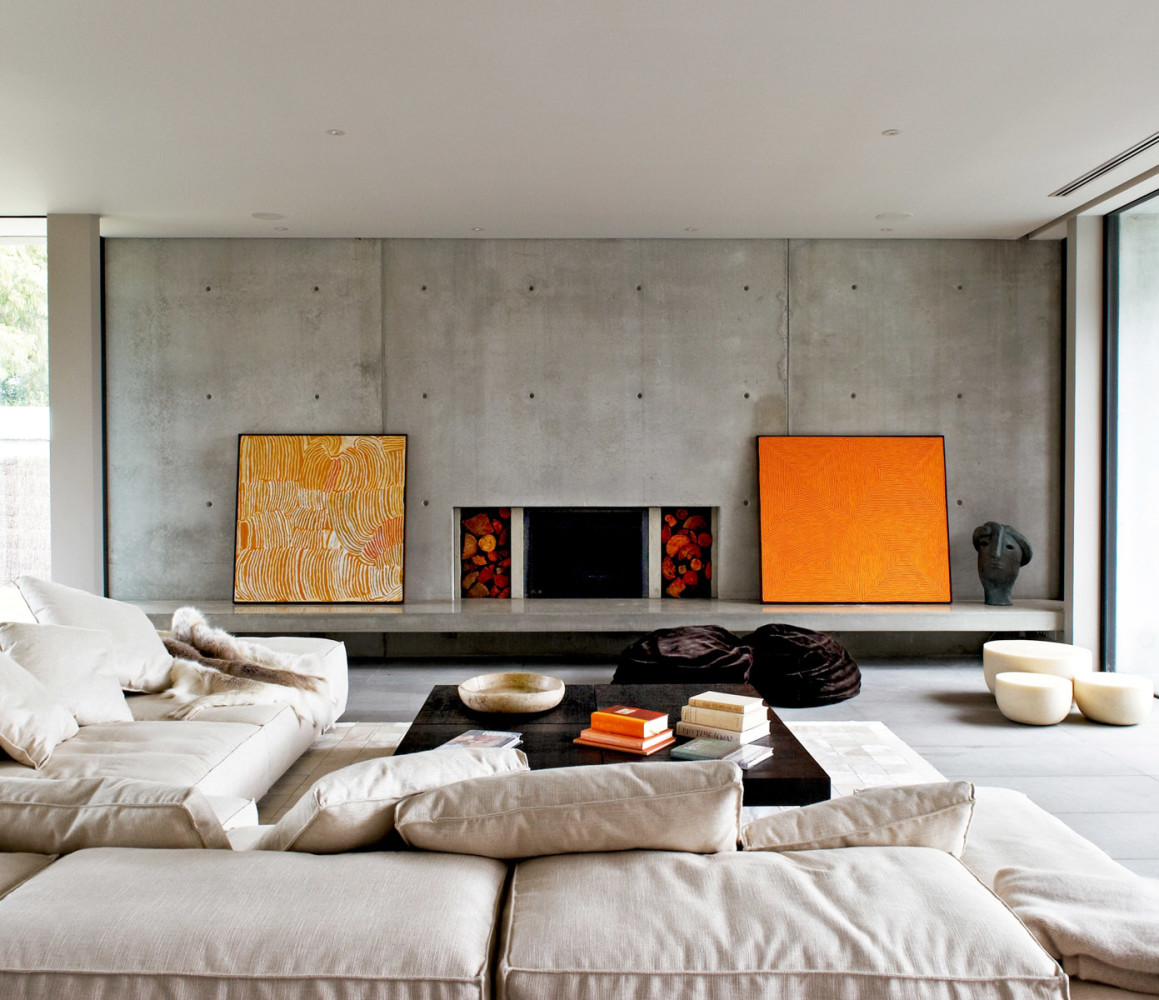
Brutality in the interior is naturalness,but for show; finishing, but minimal; decorations, but heavy. And in this combination of the incompatible, amazing balance, harmony and beauty are born. Designers use straight lines, strict geometry to create a brutal interior, showing the natural essence of the original elements, emphasizing their naturalness. Sometimes natural materials can be replaced with artificial imitations, but they must be made flawlessly so as not to turn brutality into vulgarity and kitsch. Well-processed, carefully integrated into the overall interior, concrete and brick can be complemented with metal beams and wooden elements. Such a corner of the apartment can be called cozy only with reservations, but lovers of naturalness and severe simplicity will certainly like this style.
No place for sissies
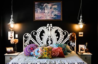
If you are drawn to aesthetic pleasures,If you prefer to contemplate exquisite interior solutions, immerse yourself in the gentle warmth of a soft chair and a gentle blanket, the brutal style is not for you. You will feel discomfort from the cold walls, from the roughness of the lines, from the dull colors. However, gray concrete does not exclude colored accessories, for example, in the form of pillows on a monumental classic sofa or a beautiful carpet near a brick wall. But one sign that has already become a symbol of the brutal style will help to unmistakably recognize it even in the most unusual interpretation: this is an inverted pyramid, present in any form and size in such a design solution.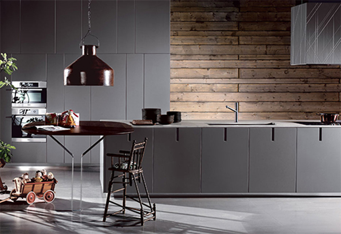 They fit perfectly into the brutal interiorsecret niches, safes and closets. Paintings and photographs look great on concrete walls. There is only one rule: there should not be too many of these additional details, otherwise they will nullify all efforts to create a rough interior, will blur the view, distracting from the main thing. Almost any furniture with such finishing is combined - from classic, heavy and massive to plastic and even wicker. But the ideal option is old or artificially aged furnishings that emphasize the brutal beauty of the interior, playing with muscle details, and the stingy smile of strict window openings.