Today we will tell you how from a typical, nothinga remarkable cottage near Moscow, the designer managed to make a stylish country house. White columns, bright colors, European spirit and 240 meters. This country house is located in a very picturesque and quiet place - the village of Voskresenskoye, Noginsk district, Moscow region. The customers purchased it along with a large plot and wanted to create a modern and bright interior with a lot of free space and air, while avoiding cold minimalism. But the house needed a major overhaul, for which the designer Julia Telnova was invited. Julia Telnova, interior designer She graduated from the B&D Institute (Institute of Business and Design) at the Faculty of Practical Design. For more than 7 years he has been designing interiors of varying degrees of complexity, mainly apartments and country houses. telnova.ru Related Articles The owners of this house not so long ago became a family: a husband and a wife with two small children. They lived in Germany for several years and then moved to Moscow. The husband is in the business of building power plants, and the wife is a pediatrician, passionate nature and a caring mother. They are so accustomed to European modern style and comfort that they decided to settle outside the city. 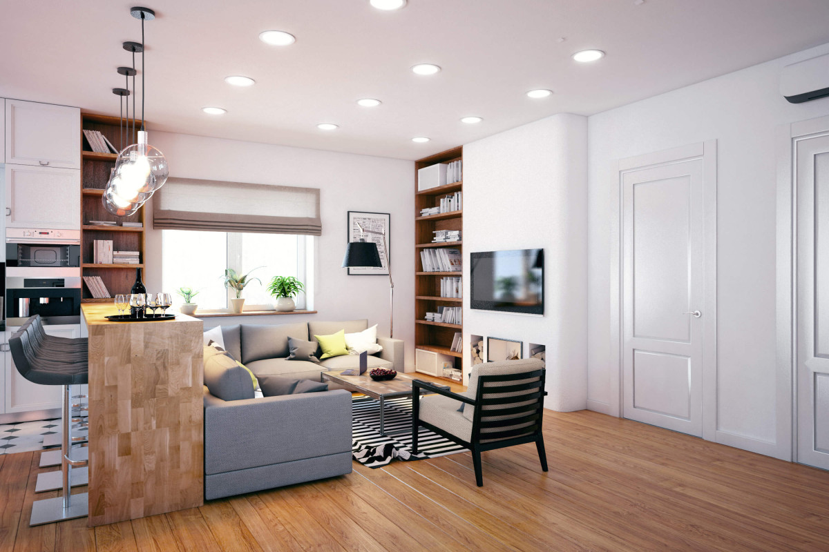 The choice fell on a plot of 40 hectare. The previous owners built the house and landscaped the territory, where there was a place for a small football field, orchard, berry bushes, recreational lawns, flower beds and flower gardens, ornamental reservoirs and a barbecue area. But the house, built in the 90's, required major repairs.
  The layout of the house is very good and corresponds tothe needs of the whole family. The basement floor is half occupied by utility rooms, and the rest of the space is occupied by a relaxation room, a small sauna and a plunge pool. On the ground floor there is a kitchen and communal areas, as well as a staircase to the attic. And in it there is a spacious hall with a large round supporting column and private rooms. Yulia Telnova, designer: - Several windows on the second and first floors have an arched shape, which at first confused the customer - she considered it a big drawback and wanted to hide it. Later I managed to convince her that the shape of these windows is harmonious and does not spoil the impression of the interior at all. The ceiling height of the first floor is slightly higher than the other levels and slightly exceeds three meters.
  One of the main tasks at the initial stageit was optimal to use the given layout of the house. There were no problems with this, and the design work went very quickly. The designer wanted to reflect in the interior not only the individuality of each member of this family, but also their experience of living abroad. The concept is based on restrained colors, laconic design and functionality. Julia Telnova, designer: - Blue turned out to be one of the customer's favorite colors. We played it in the main areas of the house. The monochrome range of these areas is complemented by color accents. I deliberately did not want to overload and complicate the interior with additional structures and excess decor, having relied on high-quality and beautiful finishing materials, furniture and interior items. This makes the space look much more spacious and "cleaner".
  The accent palette is based on a combination of cold andwarm colors. Blue and its shades harmoniously look next to the warm colors of textiles, natural stone and walnut wood. The alternation of large volumes and smaller details saturates the composition.
 Private rooms are cozier, reflectingthe nature and preferences of each family member. Warm colors prevail here. In the nursery, one of the walls is covered with wallpaper with formulas. The background of this wallpaper is combined with the cappuccino-colored cabinet furniture. Orange and shades of green complement this calm range and reflect the preferences of the owner of the room. Yulia Telnova, designer: - We deliberately tried to make this nursery not very childish. The boy is already on the cusp of the age when preferences and hobbies are rapidly changing. Therefore, the room can change with him. But my daughter has a typical girl's room. Pink, light and soft.
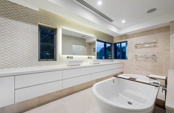
 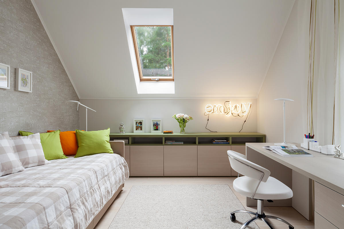 In the bedroom, the main color is white. Elements of the head of the bed have the texture of a tree, the warm color of which harmoniously combines with deep turquoise textiles. This composition draws attention from the very entrance. The bathroom is bright. The natural light from the attic window is reflected in the big mirror, and the rather rich color of the walls does not look gloomy. The warm and dark color of the furniture is combined with the ceramic granite whose geometric ornament softens the severity of the bathroom.
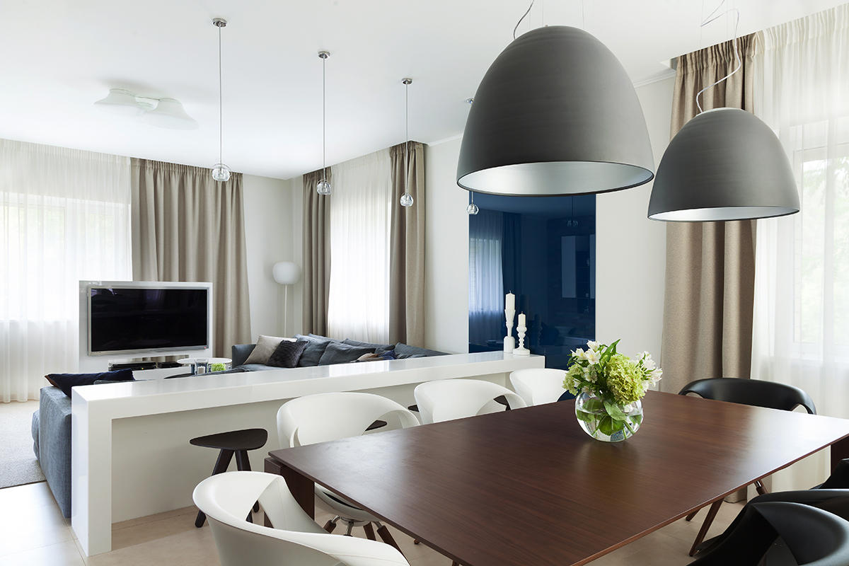
 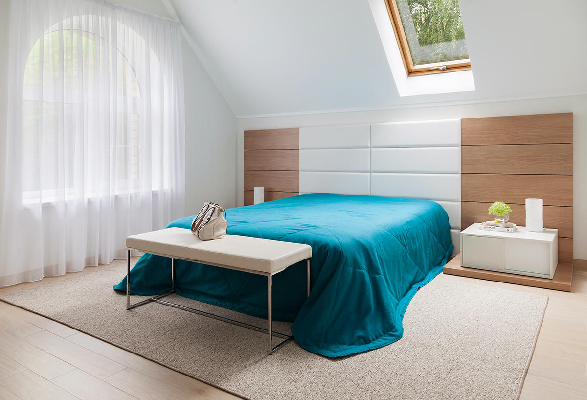 The layout of the premises of this house has already been set,and there was no way to radically change it. The only thing that has been changed is the unification of the kitchen and living room. This made it possible to visually enlarge the space several times. The highlight of the kitchen-living room is the large tempered glass in the area of the bar console. It is attached to the wall and painted in a deep navy blue. It greets guests from the corridor especially effectively. Julia Telnova, designer: - Another very important alteration was the increase in the height of the doorways on the first and second floors. This idea arose in parallel with another - to use blue in the color of the hall on the second floor. Copper lampshades of the lamps completed the picture. Then I proposed a glass staircase rail so that all this beauty could be seen when climbing from the first floor. This is how the walk-through area of the hall acquired its individuality and expressiveness. Related Articles
  Materials and interior decoration Customersare attentive to the safety of their home and asked the designer to use the most environmentally friendly materials. This became one of the reasons to order furniture in Europe, where the quality of products is monitored. As a result, the following materials were selected.
 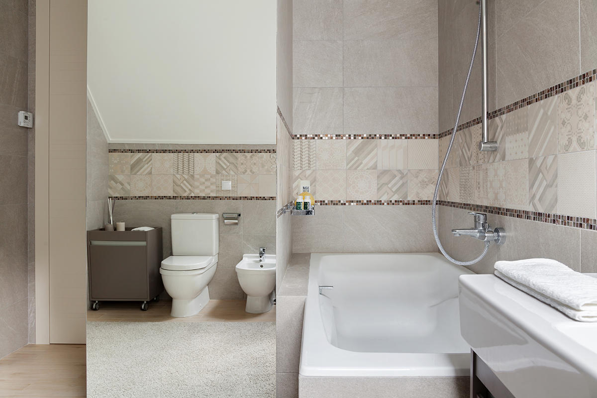 For walls:Beckers paint (all rooms), Benjamin Moore (blue in the second floor lobby and gray in the basement lounge); Mutina, Azulej collection (bathroom and shower - decors), Peronda, Botania collection (background - bathroom and shower), Bas-Relief (kitchen apron); natural quartzite (living room, fireplace wall); tempered painted glass (living room), spruce panels (sauna); Cole & Son wallpaper, Fornasetti II collection (ground floor office), Caselio wallpaper, Miss Zoe collection (baby daughter), York wallpaper, Boy`s World collection (baby son), Boras Tapeter wallpaper, Borosan collection (bedroom). For floors: Peronda porcelain stoneware, Alumiland collection (first floor floor), second floor porcelain stoneware.
 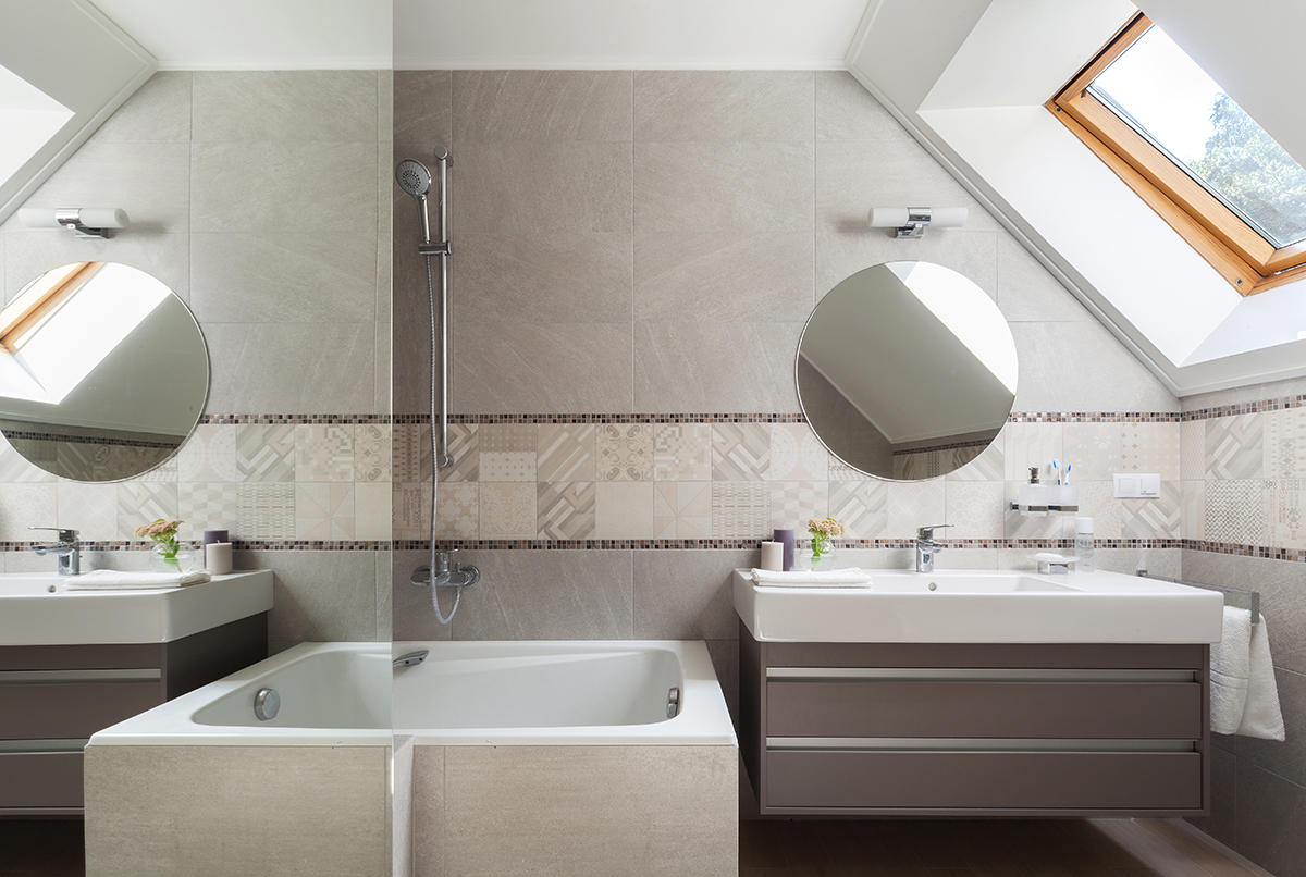 The project also used: bathroom furniture and plumbing Duravit, furniture Mobilstella (children's, bedroom), Twils - children's beds, Poliform (dining table Dolmen Due, stools Ics-Ipsilon, Bristol sofa, blue Mad chair by the fireplace, armchair Santa Monica in the hall of the second floor) , Bonaldo (TV stand in living room, coffee table in recreation room, ground floor), Tonon dining chairs, Up chair, custom-made bar counter, coffee tables B & B Italia - living room, armchair Husk B & B Italia (children's daughters), a kitchen set Cesar, fixtures Artemide and Fabbian.
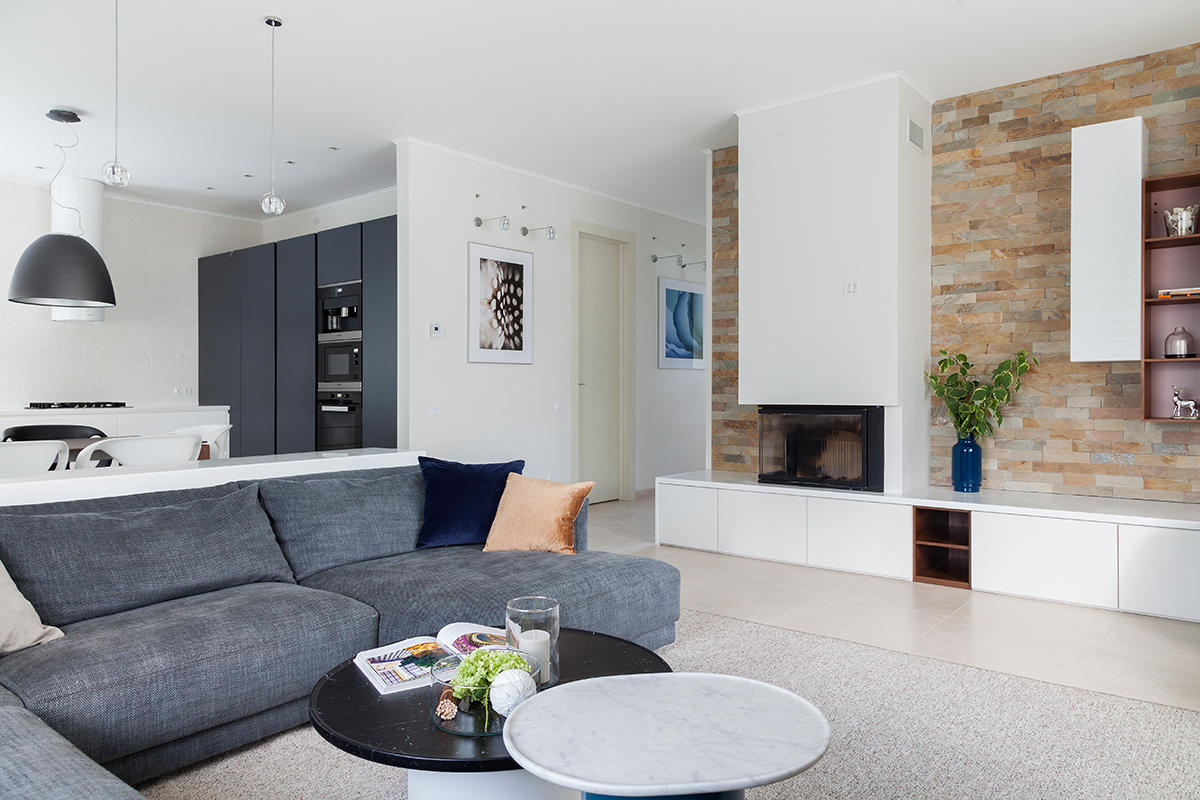
Design of a country house: an interior in the style of minimalism