Scandinavian style as interpreted by the studioINT2architecture is a project filled with light, air and bright spring shades, where you can’t get bored. This time, our project of the week is a light and bright apartment in Scandinavian style from INT2architecture studio. The beauty of this object is undeniable, but it has many nuances that are not noticeable at first glance. INT2architecture studio is a young, active, multidisciplinary team of architects, designers, artists, photographers and philosophers, which has been actively working since 2008. The main specialization of INT2architecture studio is the design of private country houses, design of private and public interiors, landscape and industrial design. Alexander Malinin, architect, graduated from the Volgograd State University of Architecture and Civil Engineering (Department of Residential and Public Buildings) in 2005. Participated in workshops in Europe and Russia. Co-founder of INT2architecture, leading architect and project designer. Anastasia Sheveleva, architect, graduated from the Volgograd State University of Architecture and Civil Engineering (Department of Residential and Public Buildings) in 2009. A little later, in 2012, she graduated from the postgraduate educational program of the Strelka Institute of Media, Architecture and Design (Citizens As Customers studio). Participated in summer schools and workshops in the Netherlands, Austria, Japan, Russia. Co-founder of INT2architecture, leading architect and project designer. — Tell us about the customer of this project. — The customer of the project is a young unmarried girl, a financier. She loves to travel.
 -Where is this apartment located?— The 45 sq. m. apartment is located in a new building in Khimki. Inside, interior partitions, windows and radiators have already been installed, and the electrics have been installed.
 — Will there be any redevelopment?— The project involves a complete redevelopment of the apartment with the demolition of interior partitions (except for the bathroom). The windows and radiators remain.
 — What were the customer's requirements?— The main task was to create a beautiful and functional interior, taking into account the minimum area of the apartment and the low cost of project implementation. Functionally, in a small apartment it was necessary to place a bedroom with a small wardrobe, a living room area with a fold-out sofa, an armchair and a coffee table, a kitchen with a bar counter, a wardrobe for outerwear in the hallway. It was also necessary to find additional storage space.
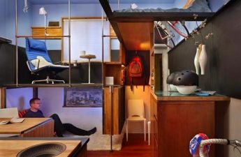
 Alexander Malinin, architect:"With the help of rational redevelopment, it was possible to functionally divide the space of a one-room apartment into a living room, a sleeping area and a kitchen, and at the same time visually unite it. One of the main problems of small apartments - a lack of storage space - was solved with the help of "thickened" new partitions, which were turned into closets (meaning a built-in closet in the hallway and a small wardrobe on the side of the sleeping area). In addition, the bed in the bedroom was raised on a podium, on the one hand, to visually separate the living room and bedroom areas, and on the other - to get additional storage space for such bulky things as blankets, pillows, bed linen, etc. On the balcony, seating is made from repainted army boxes, which can also be used for storage."
 — How did you work with the color scheme?— The entire interior is designed in soft light tones. The color scheme is based on a combination of a white background and color accents: coral in the bedroom, emerald in the kitchen, yellow in the bathroom, and blue on the balcony.
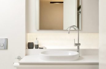
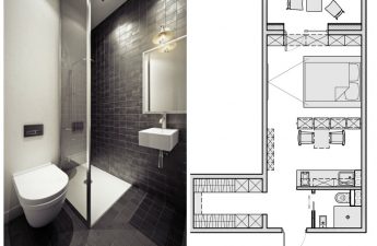
 — What floor, wall and ceiling coveringschosen and why? — The apartment floor is covered with laminate with a light wood texture. The bathroom floor is covered with black honeycomb mosaic – hexagon with a chip size of 5x5 cm. The walls are supposed to be painted white, some walls are decoratively treated to look like brick. The kitchen apron is ceramic tile with a print (20x20 cm). Also, part of the partition near the bar is painted with special paint for school boards, due to which a hard matte slate coating appeared for writing with chalk. The red brick wall on the balcony is painted white so that the blue window frames installed by the developer fit harmoniously into the interior. In the bathroom, one of the walls is covered with a black honeycomb mosaic from the floor, while the others are covered with white Kerama Marazzi tiles measuring 10x10 cm with partial Scrubble lettering, as well as water-resistant paint in white and dark gray. The bathroom screen is made of ceramic tiles imitating vintage wood.
 Anastasia Sheveleva, architect:"The apartment is in a round house, so the walls are radial, tapering slightly from the outer wall to the entrance. This was not a problem. Where built-in furniture will be installed, the decorators will make the corners at 90 degrees. The oblique angle does not interfere with anything else." - What furniture and lighting did you choose for the interior design and why? - The furniture was selected mainly from IKEA at the customer's request. Some items (a podium, a bar counter, a built-in wardrobe in the hallway) will be made in the workshop. The builders will make a rack on the balcony from black-painted water pipes and wooden furniture boards for the shelves. The army boxes that people will sit on will be made according to sketches, painted in the desired color, and marked with a stencil. Due to the small height of the room, it was decided not to lower the ceiling, but to use surface-mounted lamps and spotlights purchased at IKEA and CenterSveta, as well as pendant lamps from Muuto and homemade lamps from cans on the balcony. The ceiling is lowered only in the hallway and bathroom, where built-in lighting is used.
Interior features of studio apartments: insulated balcony, bed on the catwalk, Scandinavian style


