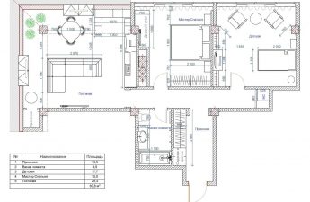
How to create a bright, functional, modern andwhile keeping the interior as easy to clean as possible? We look at useful tips from French designer Glenn Medioni, who created a comfortable space for a single father and his 5-year-old son, The House in Which . This was the task set for the designer by the owner of a 70-square-meter apartment on the fifth floor of a modern building in Paris, just two blocks from the Buttes Chaumont, one of the largest city parks. This small but very close-knit family loves bright colors and active recreation. The owners wanted to optimize the available meters so that there would be as much free space and air as possible, but everything necessary could be easily put away in its place and would not cause problems when cleaning. The father and son left the rest to the discretion of the invited designer Glenn Medioni.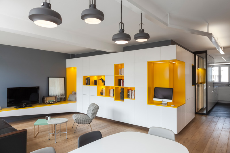 Glenn Medioni, Designer, Owner and FounderGlenn Medioni architecture & design bureau The young Parisian designer opened his architectural bureau in 2010. The team of five people - two interior designers, a graphic designer, an architect and an engineer - specializes in the renovation and refurbishment of private apartments in a contemporary style. Sources of inspiration: modernism, Scandinavian design and oriental minimalism. Despite the fact that the founder of the studio is a designer, the team is known for its functional approach to space planning and successful design solutions. glennmedioni.com
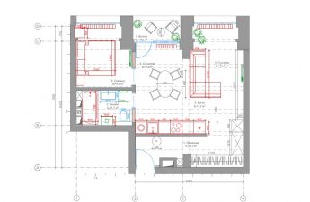
 Glenn Medioni, designer:— The owner of the apartment is very attached to his son and wanted to take into account the interests of the child first of all. He did not tell us what to do in terms of color or shape. But he understood very precisely what they both needed in practical terms. Lots of light, lots of freedom and warmth, bright colors and convenient storage. So we started by removing the maximum number of partitions and doors. Only the bathroom and both bedrooms, father's and son's, are closed, all the other rooms flow freely into one another. glennmedioni.com
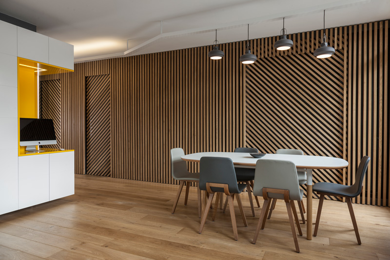
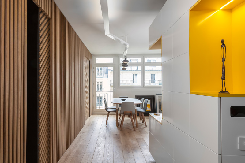 Three in one A small hallway leads straight intoThe heart of the apartment is an open living-dining room, which can also be used as a study if needed. The entire space is visually united by a wall, which is broken up by three sliding doors with a 45-degree pattern. The slats are attached to dark sheets of valchromate - a wood-fiber board based on organic resins and natural dyes, which combines all the advantages of wood and plastic, it is a durable, moisture-resistant and environmentally friendly material.
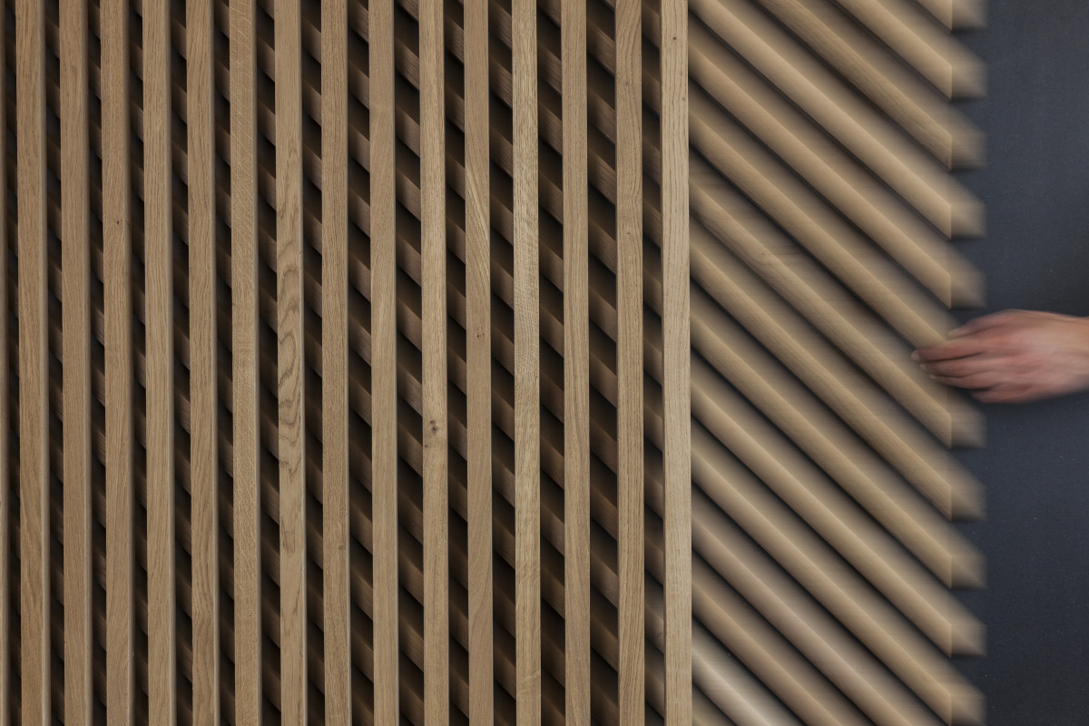
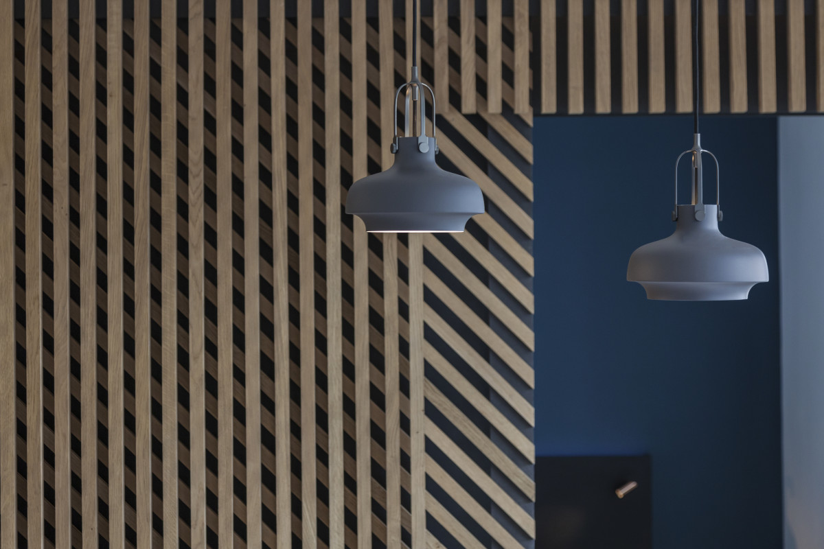
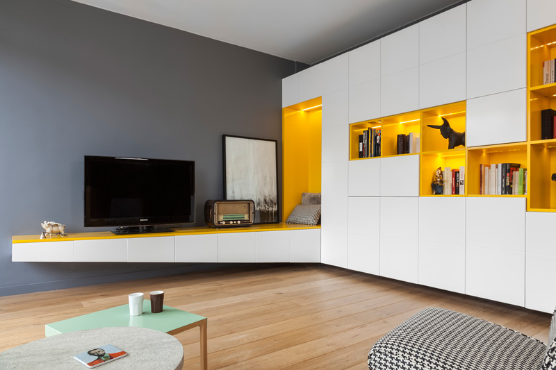
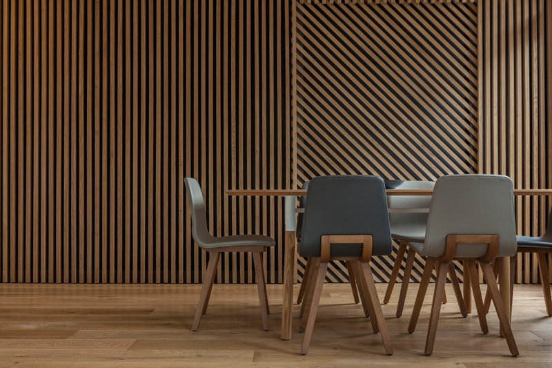 Glenn Medioni, designer:— For me as a designer, the main idea of this space is concentrated in simple geometric shapes interacting with each other. And I wanted to add graphic dynamics there — rhythm. This is exactly what the clear pattern on the wooden wall serves. And it contrasts with the rectangular shapes of the white storage system opposite. It is made entirely to order according to our drawings and includes both cabinets and a desk. The office area is highlighted in bright yellow — and adds energy of pure color. glennmedioni.com
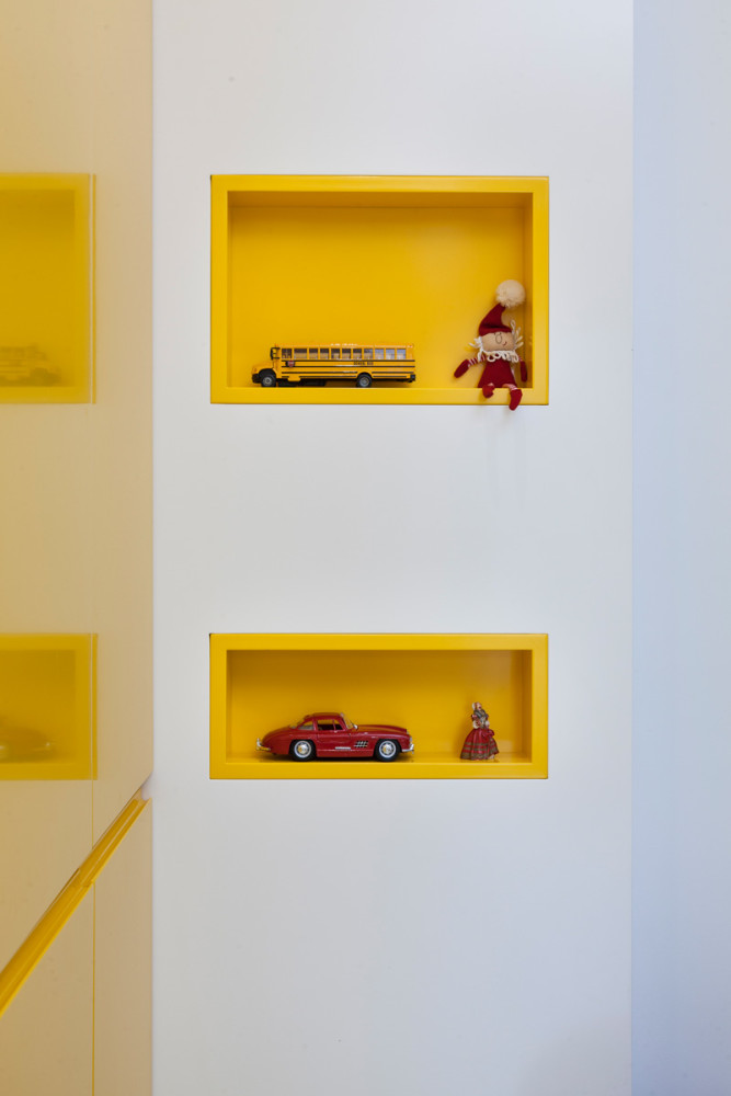
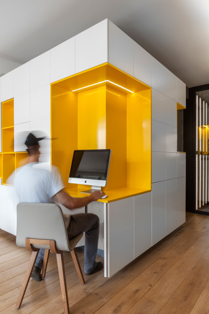 The closed white part of the cabinets is made verylaconic, but bright: white form with flashes of yellow, . And therefore it looks almost weightless. The impression of "floating furniture" helps to create a small space left to the ceiling and floor. In the twilight, the optimistic egg color emphasizes the LED lighting: painted niches are intended for books, family photos and important little things.
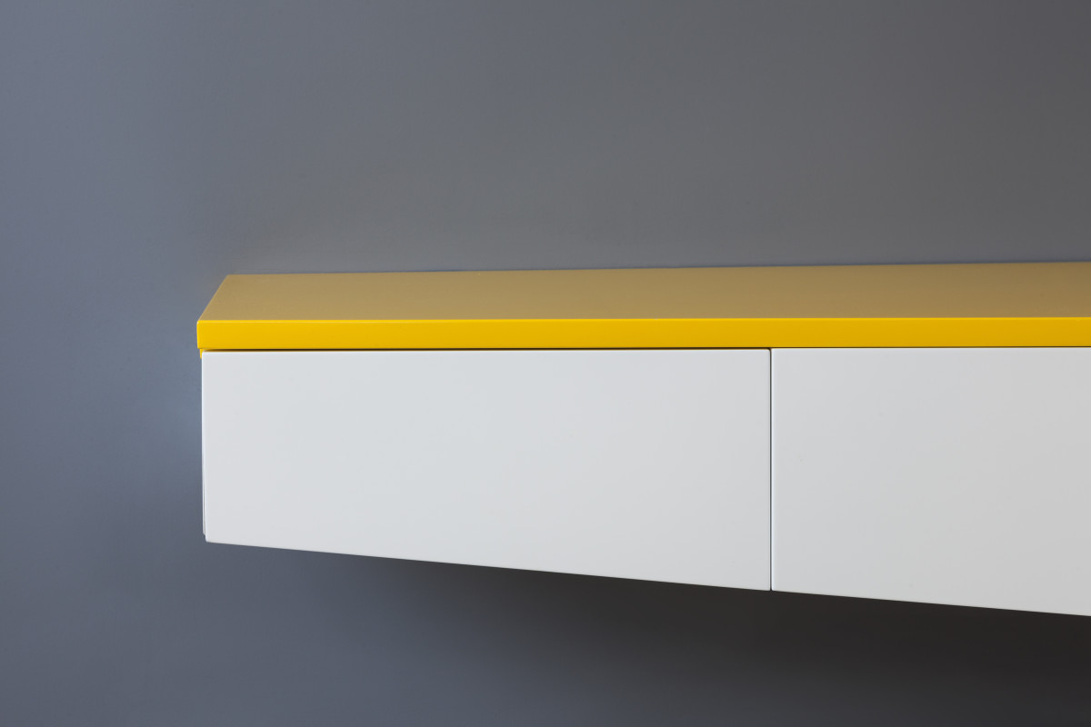
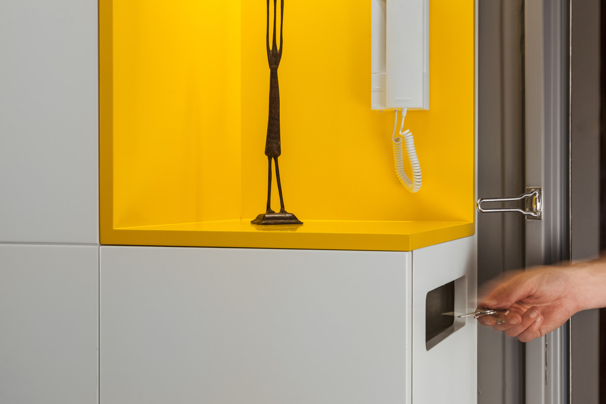
 An interesting and convenient solution is a speciala compartment for keys and a wallet on the end of the furniture, similar to a mailbox, so that the owner of the apartment does not have to remember every time where he put everything.
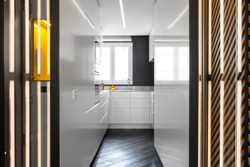
 Kitchen and bathroom Kitchen,designed as an extension of the flowing space, yet separated from the living area. It is a small, narrow room with a window, which houses a short bar counter for everyday food, with a separate work area. The furniture, made according to Medioni’s designs, follows the forms of the living room storage system. The minimalist cabinets with glossy fronts are topped with an elegant Carrara marble countertop, and one of the walls is painted in a semi-matte dark gray for a contrasting effect.
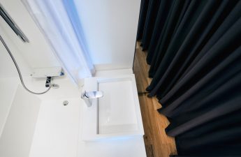
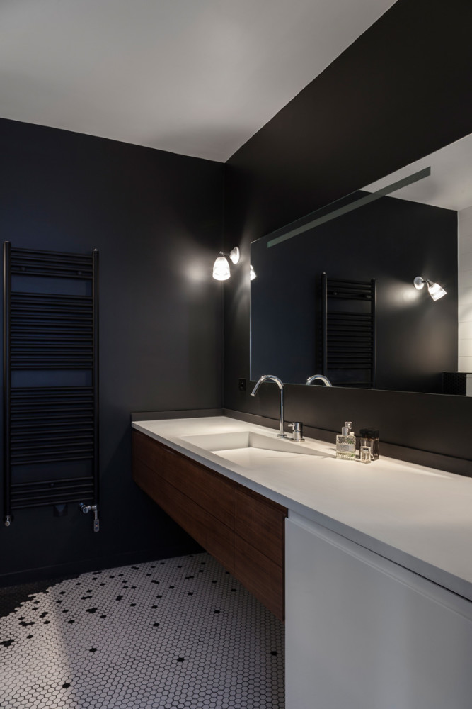
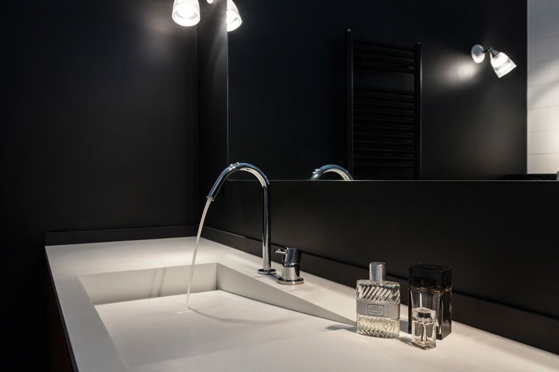
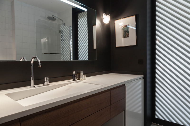
 The bathroom had to be expanded and enlargedby combining it with the toilet to accommodate a large washing machine, dryer, shower and bathtub all at once. Once again, custom-designed furniture helped save space – it was made in the Medioni studio from walnut and artificial Corian stone. The bathroom is accessed by a single door, where the slats are placed on frosted glass to allow daylight into the room.
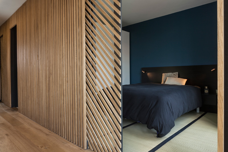
 Bedrooms The father's bedroom is designed in the same styleJapanese minimalism. Clean, straight lines and contrasting colors prevail. The walls are painted in gray-blue and white, and the floor is covered with traditional rice straw adapted for flooring.
 The complete opposite is the son's bedroom.Glenn Medioni, designer: — The father specifically chose a larger and brighter room for his son, so that it would be more comfortable for him to play. If the father’s bedroom is about 10 meters with a small window, then the son’s bedroom is more than 13 meters and has a large glass door to the balcony. The client asked me to be bolder with the colors, so that the child would have more fun and interest. And I chose an invigorating combination of blue, yellow and white. Even the floor there is “striped.” glennmedioni.com
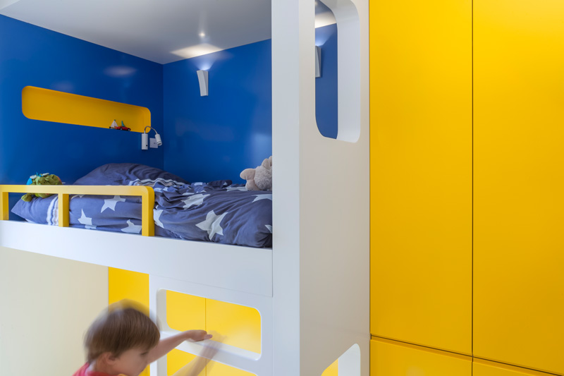
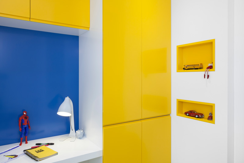
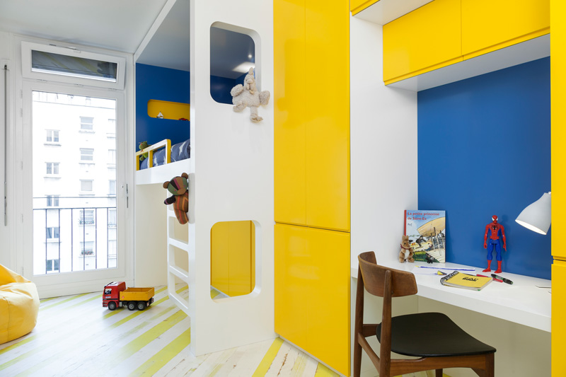 To leave the child as much space as possiblefor active games, the entire functional area was concentrated near one wall. There is a bunk bed, a small table, and cabinets - both for clothes and for storing toys. As in the living room, the boy made several separate niches for placing his favorite items - to help the budding collector.
 To save space and ensure optimalThe architectural bureau designed all the main furniture individually, without using storage systems. However, this interior has many items and accessories: from lighting to a dining set, specially selected to give it character and mood.
A House for Real Men: 70-Meter Apartment in Paris – etk-fashion.com
