If you want to create the perfect interiorcolor scheme, but have no idea how to do it, use our cheat sheets! Today we have made for you a selection of "color" tips that will help you create a harmonious interior in a fashionable color scheme. Hallway Of course, a bright colored interior can be made in any color scheme. In blue or green, in contrasting or harmonious, in multi-color or one-color. We consider our today's version a good solution for those who want to be in trend. We have made "cheat sheets" based on the two most popular scales today: turquoise and beige and chocolate. Since dark shades are not the best solution for a small hallway, we offer you the following option. The main colors should be: light gray, beige, brown and turquoise, or a tiffany shade. We recommend using light gray and beige colors for walls - they will increase the space. The ceiling, painted in tiffany shade, will visually become higher. And for interior details, we recommend using brown and contrasting yellow. 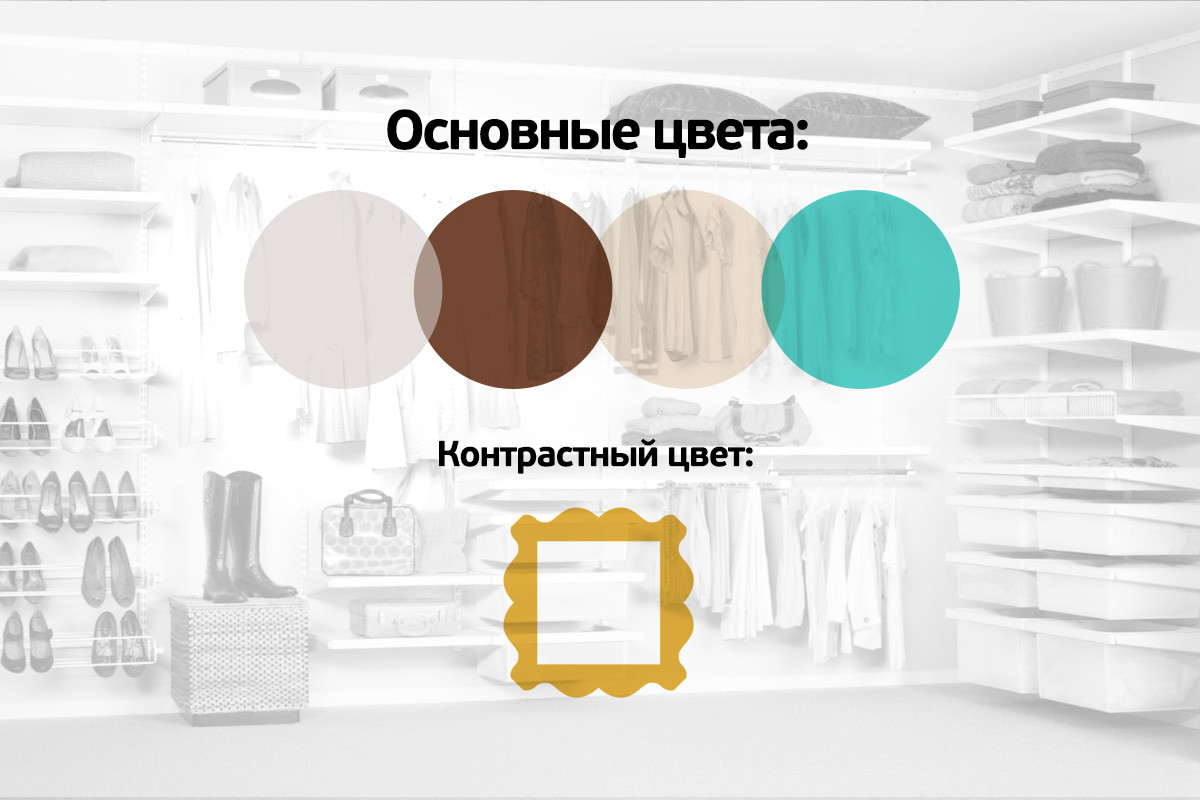 Living room Living room - "place of execution" in anyapartment. Here, as a rule, the inhabitants of the house gather, and everyone has their own tastes and preferences. Therefore, it is important that everyone feels comfortable in the main room of the dwelling. Colors should not be harsh, but also not faded (you want to emphasize the importance of the room). For the living room, we offer three options for the color palette: for the bold, for the moderately bold and for the cautious. For the bold, we suggest leaving brown for the floor; for textiles (curtains, furniture upholstery, carpets and pillows), use lime and bright turquoise; and we recommend highlighting the details with fuchsia and bright yellow. For the moderately brave, we advise you to make the walls in beige tones, the floor - brown, furniture and curtains - the color of lime or turquoise, and for vases, lamps and other small interior details leave fuchsia and yellow. For the cautious The main colors should be beige and brown - floor, walls, ceiling. For furniture, you can use dark brown and also beige. And for interior details, leave bold colors: turquoise, lime color, fuchsia and yellow.
 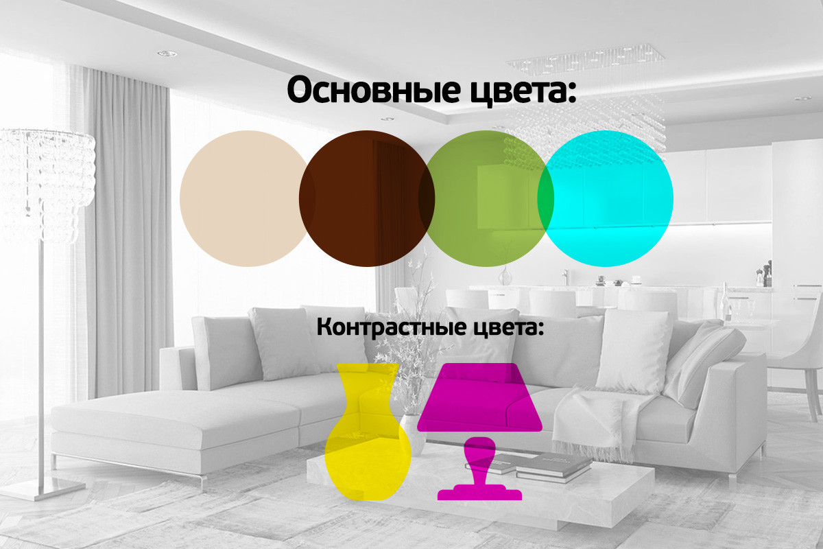 Kitchen The color palette of the kitchen is very important - from herdepends not only on whether your kitchen will look stylish, but also on the appetite of the household. So, for the walls it is better to use vanilla and light gray; furniture (table and chairs), we recommend choosing brown colors; the floor in the kitchen can be made lemon; and we will leave light green, raspberry and burgundy shades for the details of the kitchen interior (also contrasting colors are suitable for tablecloths).
  Bedroom The bedroom is designed mainlyfor relaxation. Therefore, we suggest that you do not accept extraordinary color solutions, but we also do not recommend making the bedroom boring. You can create the perfect color palette for your bedroom by simply using the colors from our Roomble Cheat Sheet. Just a few comments: it is better to leave the ceiling white or pastel beige; and contrasting colors (if you decide to use them) are preferable to leave for details (purple and coral).
  Bathroom and toilet We believe that the colorthe palette in the restroom should contribute to the psycho-emotional relaxation of a person. Therefore, we offer the following option: white ceiling, brown walls, floor, we also recommend making a chocolate shade, accessories (soap dish, jars and bottles) - teal color, and coral-colored towels. We also offer you another option "for the brave" from our designer: Make the walls and floor chocolate, and the textiles and the vanity unit in teal colors. A great option to relieve stress and keep warm in cold winters. Oksana Kashenko, editor-in-chief, etk-fashion.com
 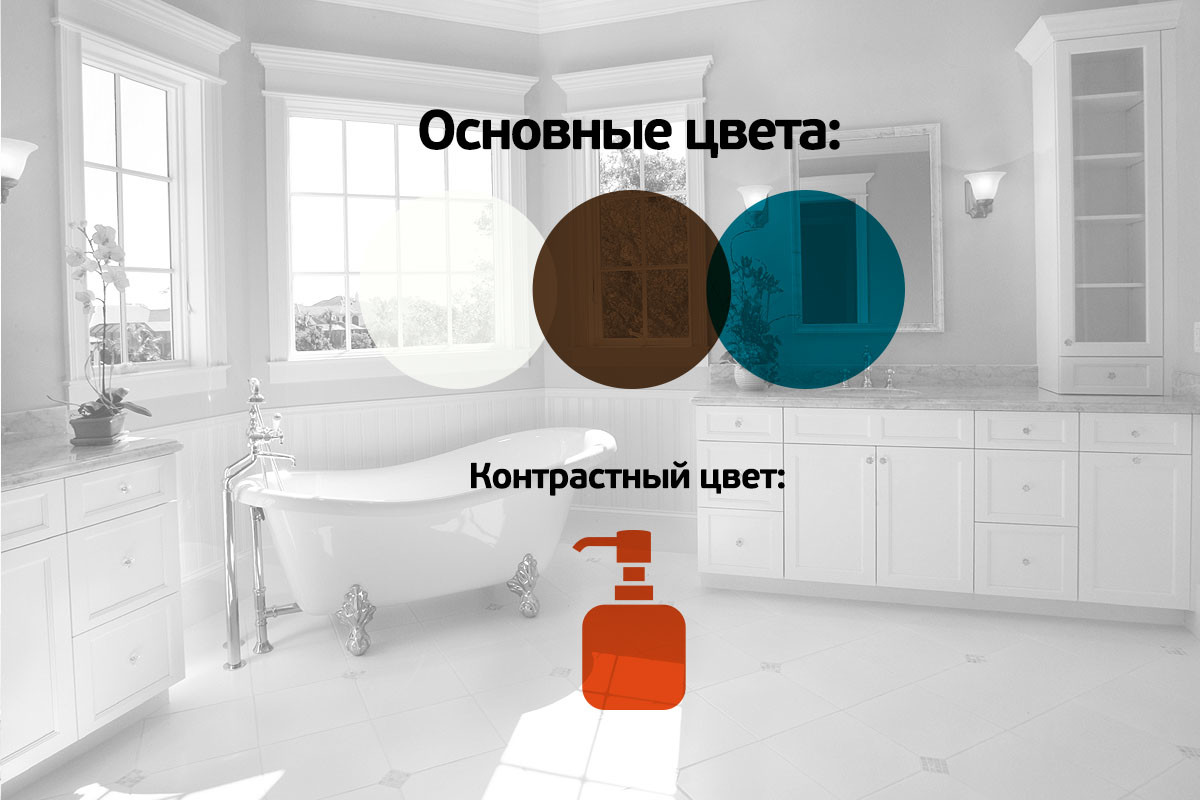 Cheat sheets from etk-fashion.com you can bring with you to the store and assemble with their help a memorable and stylish interior for your home. Use cribs - you're not on the exam.
Ideal color palette for the house: cheat sheet from Roomble - etk-fashion.com