230 meters for a villa is not much at all.Especially when you need to place 7 rooms, 4 bathrooms and a large kitchen, while leaving a sense of spaciousness in the interiors. Today we will see how a Russian designer coped with a difficult task. And at the same time, we will see how our compatriots furnish villas in Montenegro today. Harmonious layout based on the principle of symmetry, spacious rooms without unnecessary furniture, modern unobtrusive design and full compliance with the wishes of customers. Designer Natalia Chernichkova coped with the task 100%. Related articles Natalia Chernichkova, BerryConceptDesign In 2011, she graduated from the Psychology Department of Moscow State University named after M.V. Lomonosov, specializing in ergonomics. In 2013, she completed her studies at the International School of Design, and also took advanced training courses in interior design at the British School of Design. In 2015, she opened her interior design studio BerryConceptDesign, which offers a full range of services for creating and implementing interior design for residential and public spaces. The most difficult stage was the layout. The main limitation was the load-bearing columns that stand throughout the first and second floors, so the layout solution was largely determined by their location. For a villa of 230 square meters, the area is small, but it was necessary to provide four bedrooms and a bathroom for each. Stylistic unification of many different rooms is also not easy, so it was decided to make a neutral finish for all the rooms, using the same finishing materials.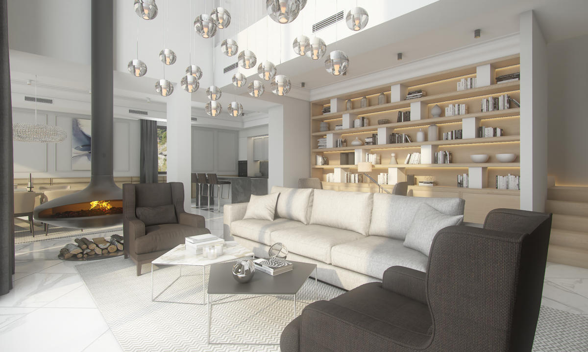 Two more important tasks are to think about storagethings and common areas for relaxation. The designer managed to implement them, while using very little furniture in the project so as not to clutter the space. After all, the owners of the villa primarily plan to relax and unwind here. As a result, the first floor of the villa is a large open space with a kitchen-dining room and a living room and a zoning element - a hanging fireplace. On the first floor, in a separate wing of the house, there is one of the bedrooms, a bathroom, a guest bathroom and a laundry room. On the second floor there is a large gallery from which you can get to private areas: three more bedrooms and two bathrooms.
 ground floor plan
 second floor plan To realize the idea ofIn keeping with the overall neutral finish, the designer decided to decorate the villa in a light color scheme. This was achieved using gray and white shades from the Little Greene palette, moldings and wall panels made of light wood, doors with Lualdi Porte wood trim, Coswik mosaic parquet, and Calacatta and Luciano Marron marble in the bathrooms. A restrained palette was also used when choosing textiles from New Pottery Barn. Such an interior required well-planned lighting. Here, the panoramic glazing of the villa plays an important role, helping daylight to penetrate inside. For lighting in the dark, overhead and built-in lamps are used. They create architectural light and focus attention on certain interior details. And for cozy lighting of individual zones, multi-level lamps in the living room and chandeliers in the dining room are provided.
 The kitchen-dining room occupies an entire wing of the firstfloor. The central place in it is given to the glass Spider table by Cattelan Italia. Comfortable armchairs around it, as well as bar stools made of dark leather of a rich chocolate color - also Cattelan Italia. Simple and laconic kitchen set is made to order, mainly in light colors, and the countertop, apron and island are made of dark gray marble. By the way, the facades of the upper cabinets repeat the shape of the wall panels in the dining room. From the kitchen-dining room we get to the living room, which connects two different parts of the house. For this room, the designer chose a Minotti sofa made of textured beige fabric and two Porada armchairs made of brown. Two more Minotti armchairs with a black and white houndstooth pattern found their place near the shelving unit. The white classic chest of drawers for the TV was made to order according to the designer's sketches.


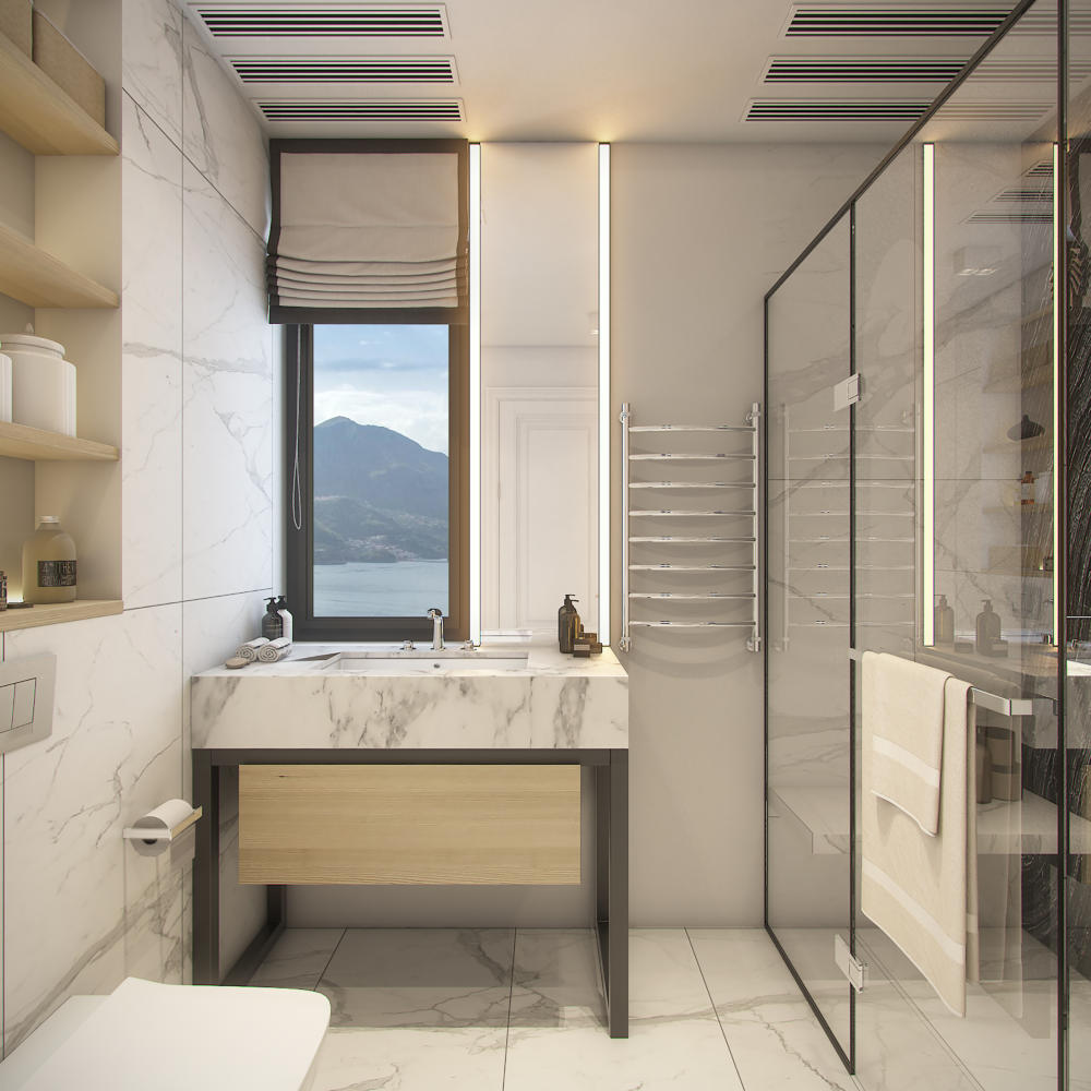
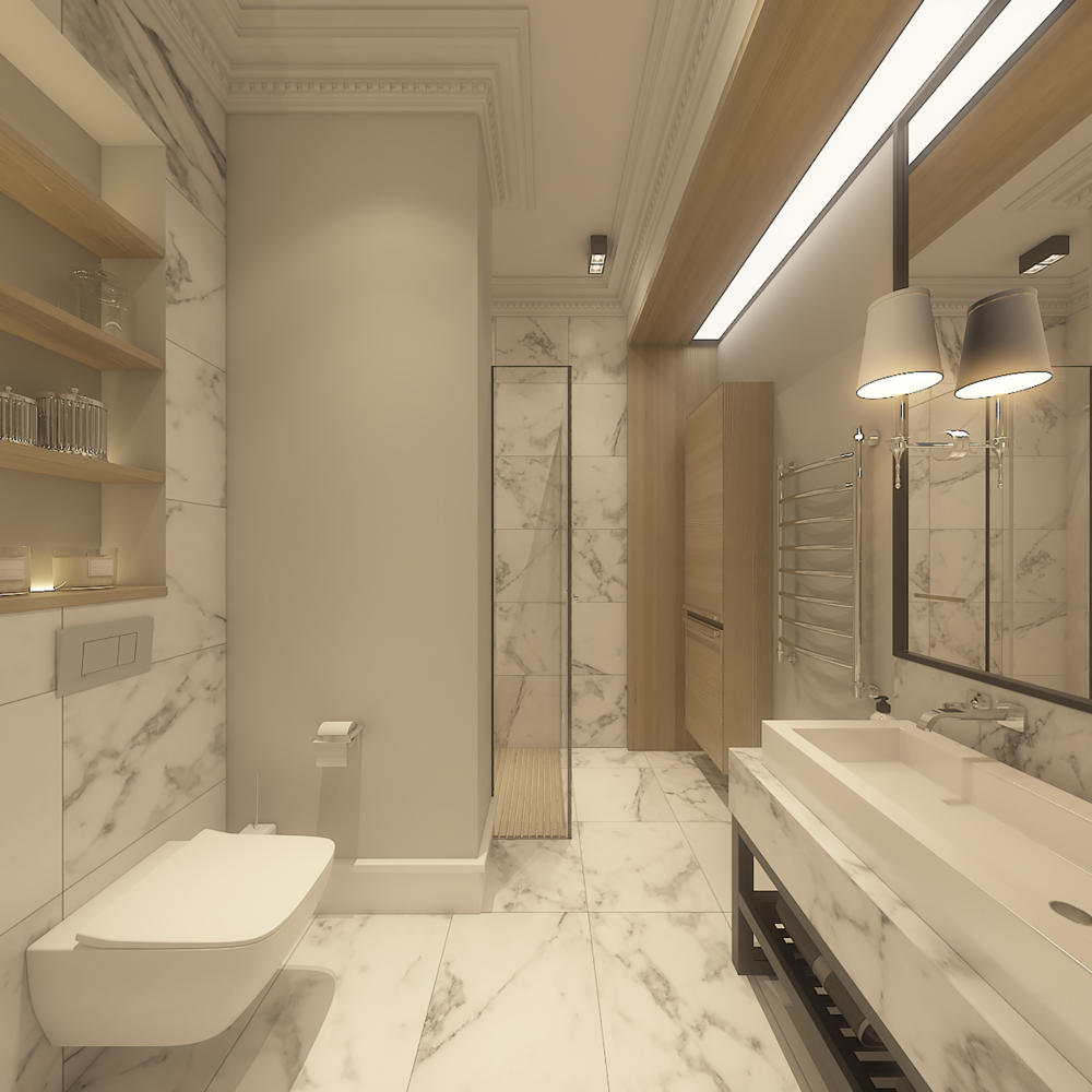
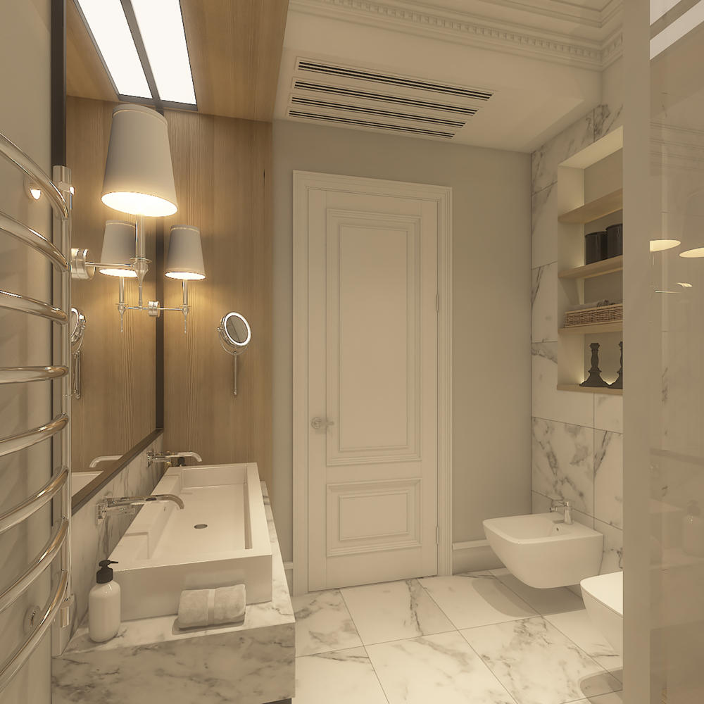
 On the ground floor there is one of fourbedrooms. Its main character is the Calligaris bed with a high headboard, and the decoration is light wooden panels by Emme Mobili. The bathroom adjoins the bedroom. The toilet and bidet are suspended here, Villeroy & Boch, Vinticello collection. The vanity unit with a metal base and a white marble countertop is custom-made, as is the light wood cabinet. The chosen washbasin is a surface-mounted one, from Kerasan, with a Hansgrohe wall spout. There is also room on the first floor for a small guest bathroom. The walls are decorated with panels made of natural oak, and the sanitary ware is from Hansgrohe and Villeroy & Boch.


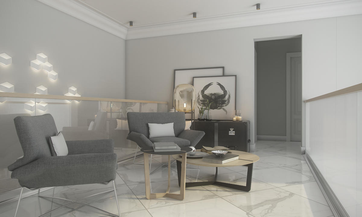
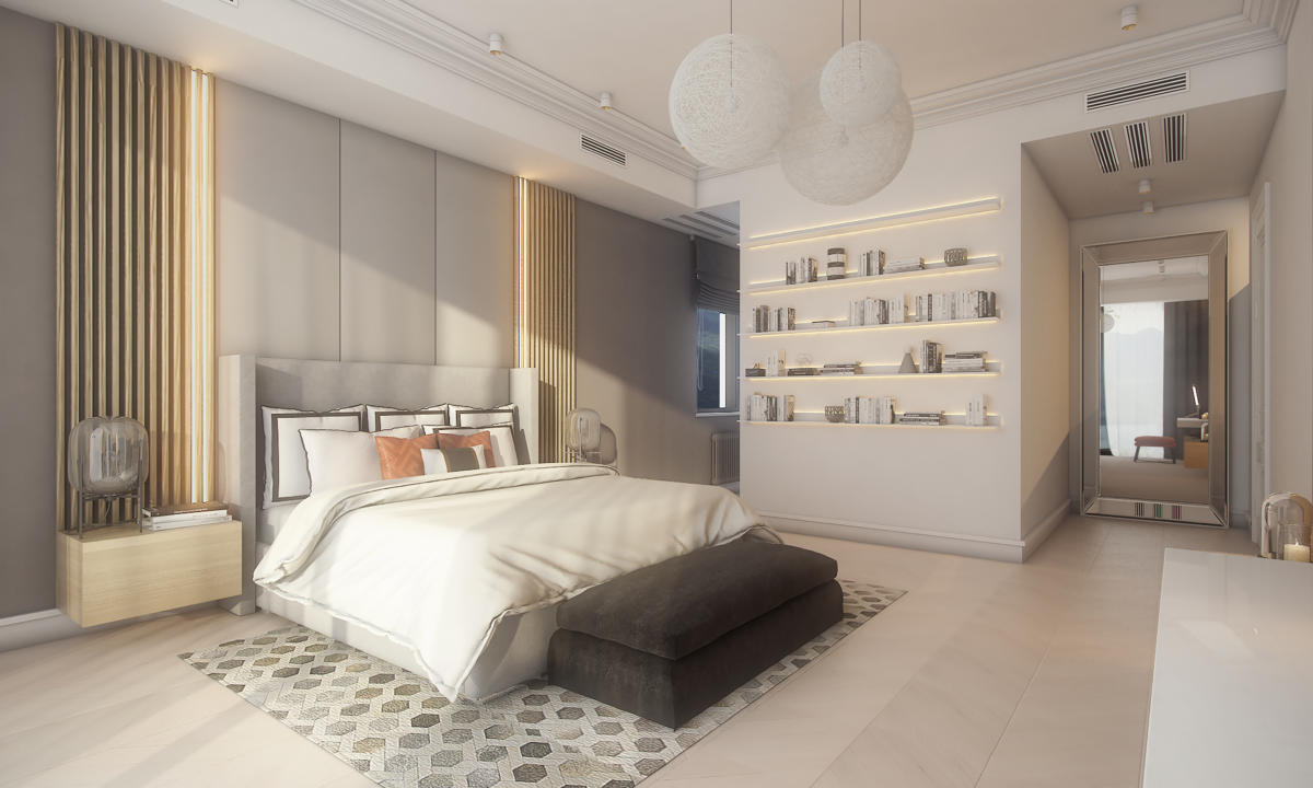
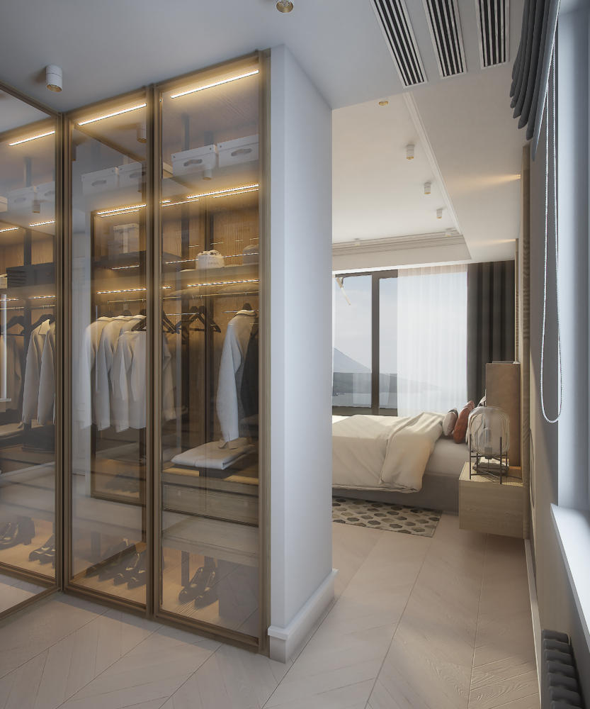
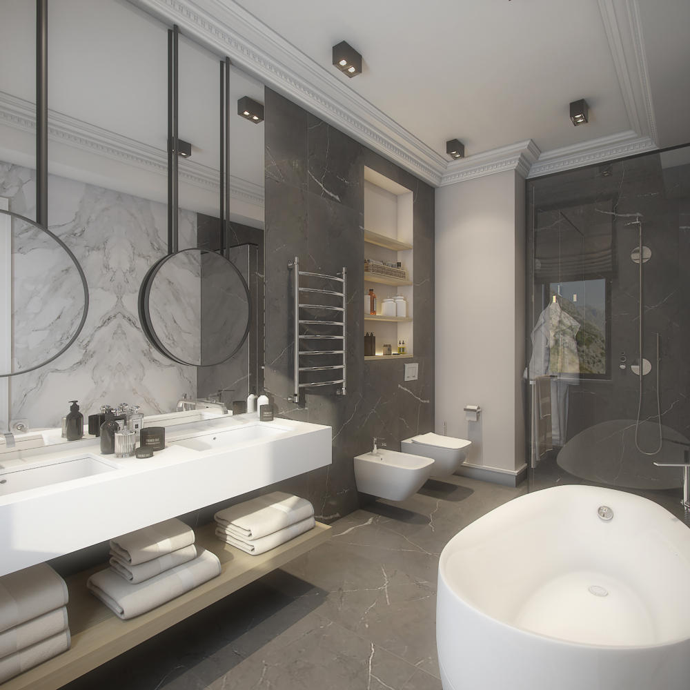
 The second floor begins with a gallery, whichplays the role of a common relaxation area. It is furnished with two comfortable Dublin armchairs with a thin metal frame, a dark ethnic chest of drawers in the form of a chest from the Oxford Student Long Trunk series and round light wood coffee tables with dark and light frames from My house. From the gallery you can immediately enter the largest bedroom in the house - the master bedroom. The walls in it are decorated with light wooden panels with LED backlighting, made to order. We chose a Marko Kraus bed with a high headboard in light gray upholstery. The bedside tables are also made to order and are part of the design of the wooden wall panels. Directly from the bedroom you can enter the dressing room and further into the spacious bathroom. The washbasin countertop is made of white Laufen quartz, and the washbasin spout is Hansgrohe Puravida. The freestanding oval-shaped bathtub is from Villeroy & Boch, chrome heated towel rail - Margaroli.

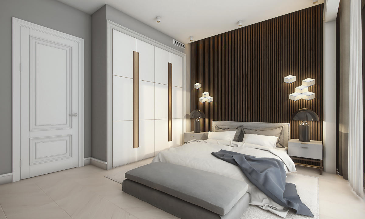
 There are two more bedrooms on the second floor,which are united by a small hall and a shared bathroom. In the first of them, the bed in gray-beige upholstery is custom-made, and the ottoman in light textured gray fabric is from Curations. The dark vertical wooden panels behind the headboard and the built-in spacious wardrobe with white glossy facades were made to order according to the designer's sketches. In the second bedroom, the bed is from the Italian brand Poliform with a straight headboard in pearl gray. Decorative panels and a built-in wardrobe are custom-made, as in the first bedroom. And the Trans Atlantic bedside tables from Restoration Hardware with a metal finish add a loft aesthetic to the interior. As for the bathroom, they decided to do without a bathtub and created a spacious shower area, decorated with two slabs of natural Antic Wood marble. The cabinet under the sink and the countertop made of white marble are custom-made. Related articles


Interior of a house in Montenegro: 230 squares in a modern style
