 Interior of a small studio in New York styleloft In December 2015, architects Carla Lopez and Margo Meza from the Transition Interior Design agency completely redesigned the interior of a small studio belonging to a 26-year-old man.
Briefly about the project:
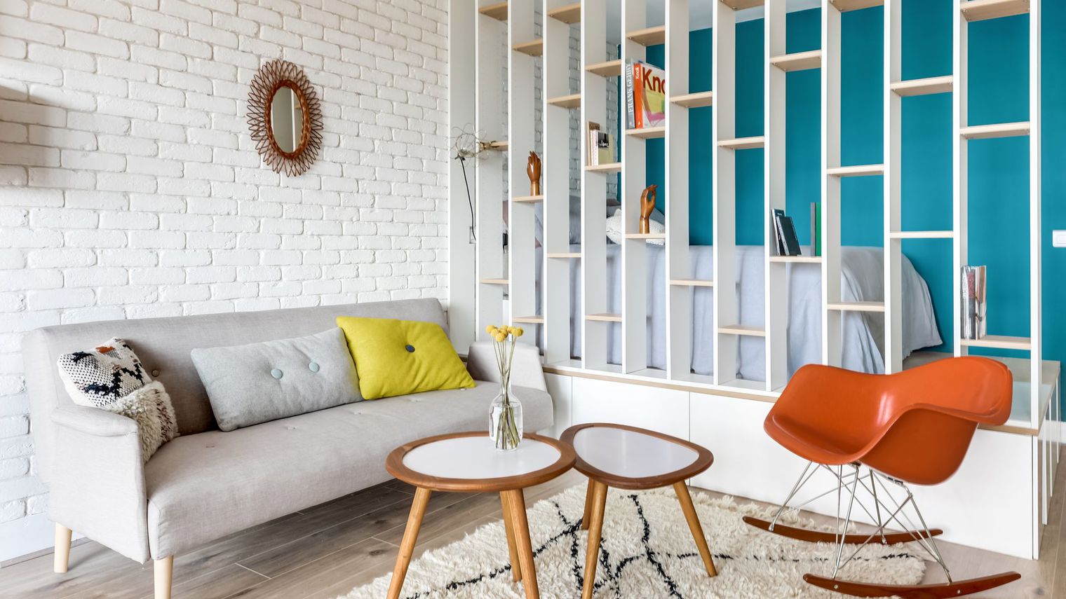
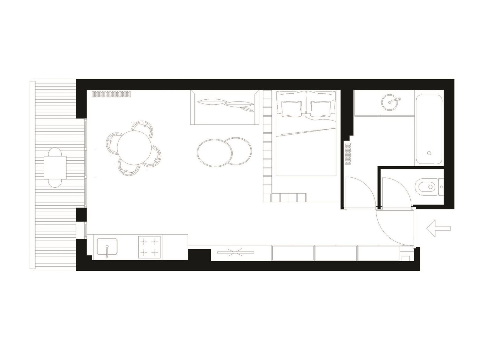
Area: 25 m2 Location:Asnieres-sur-Seine, France, a stone's throw from the train station Duration of work: 2 months There is no bed under the ceiling, nor — the young owner of the apartment demanded a real bed for himself. Of course, in order to create the "night corner" he so badly needed, the remaining space had to be reduced to 13 m2. But due to the fact that not a single total partition was erected during the renovation, the room remained light and did not fall apart into small fragments. The architects chose to construct a bookshelf along the entire wall, which allowed to preserve maximum light in the studio, while creating depth of space. In dwellings of this type, there are often not enough shelves and cabinets, in this case, the shelving unit helped to solve this problem. In addition to practicality, it is distinguished by its aesthetics, and its graphic design sets a certain rhythm to the interior. And the turquoise surface of the other wall brings dynamism and highlights the sleeping area. The same turquoise color is used in the bathroom to create a sense of unity.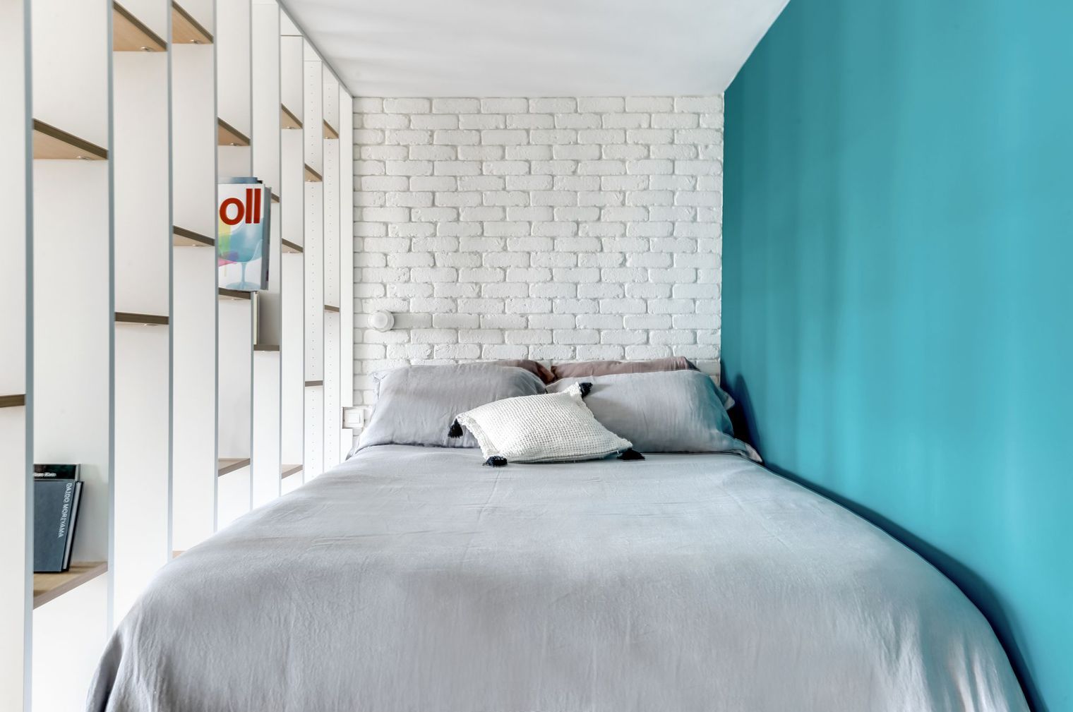 While the owner was only thinking about refreshingapartment and furnish it in the style of an American loft, Karla and Margot convinced him to create a Scandinavian decor. Wood remains the central element, bringing warmth and coziness to the living space. Wooden flooring was chosen for the floor and for all the walls. The linearity of the furnishings allows freedom of movement. Between the kitchen and the wardrobe there are light oak shelves, which were positioned in such a way as to create a place for the TV. The Scandinavian spirit is felt here thanks to the presence of wooden flooring and a tiled splashback with a decor imitating wood. This is modern design that brings joy and comfort to the home.
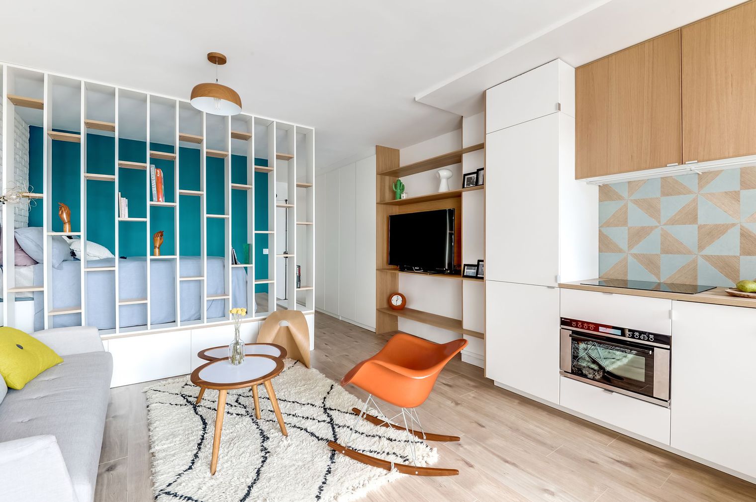
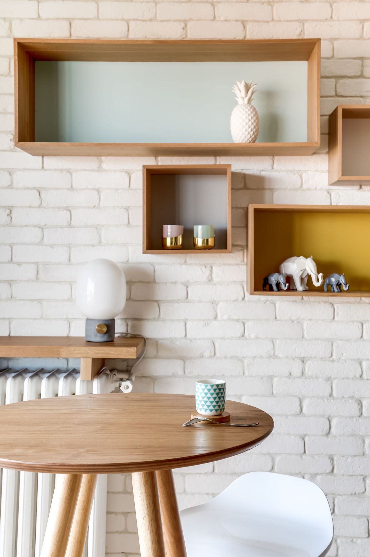
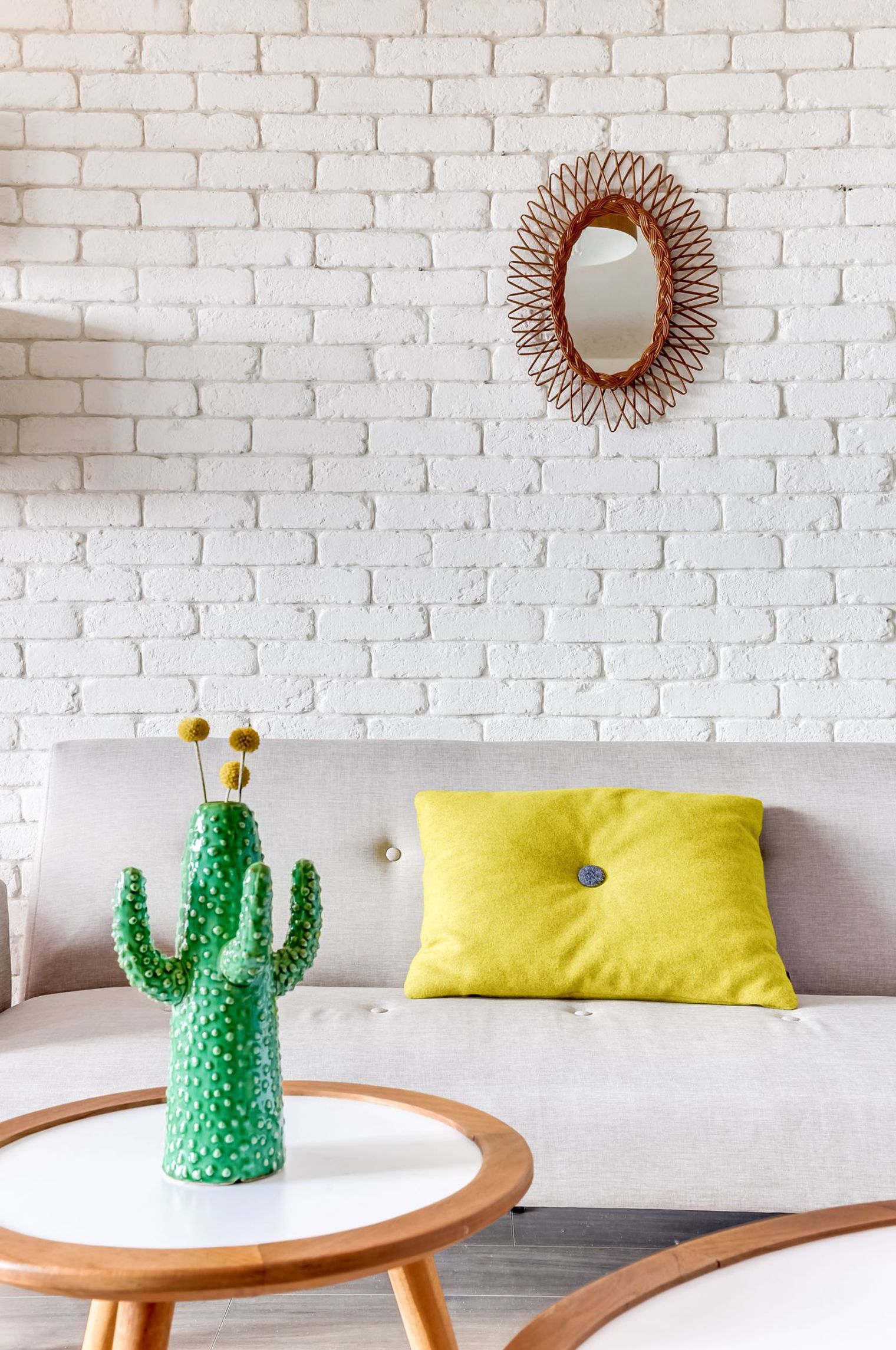
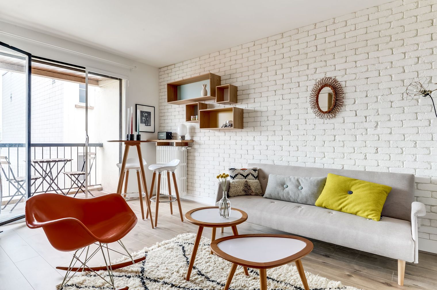 A solid wall of decorative white bricks,found in Castorama, gives the apartment charm and enhances the lighting. To create a trendy but cozy atmosphere, the designers opted for unique furniture found in second-hand shops and flea markets. It goes perfectly with the milky carpet from the AM.RM store and the light gray sofa from Miliboo. As for the shelves, purchased at Maison du Monde, they increase the visual depth of the room.
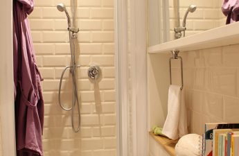
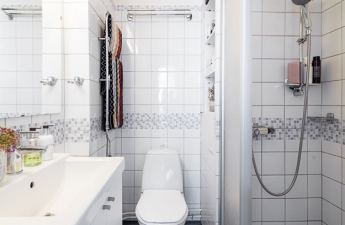
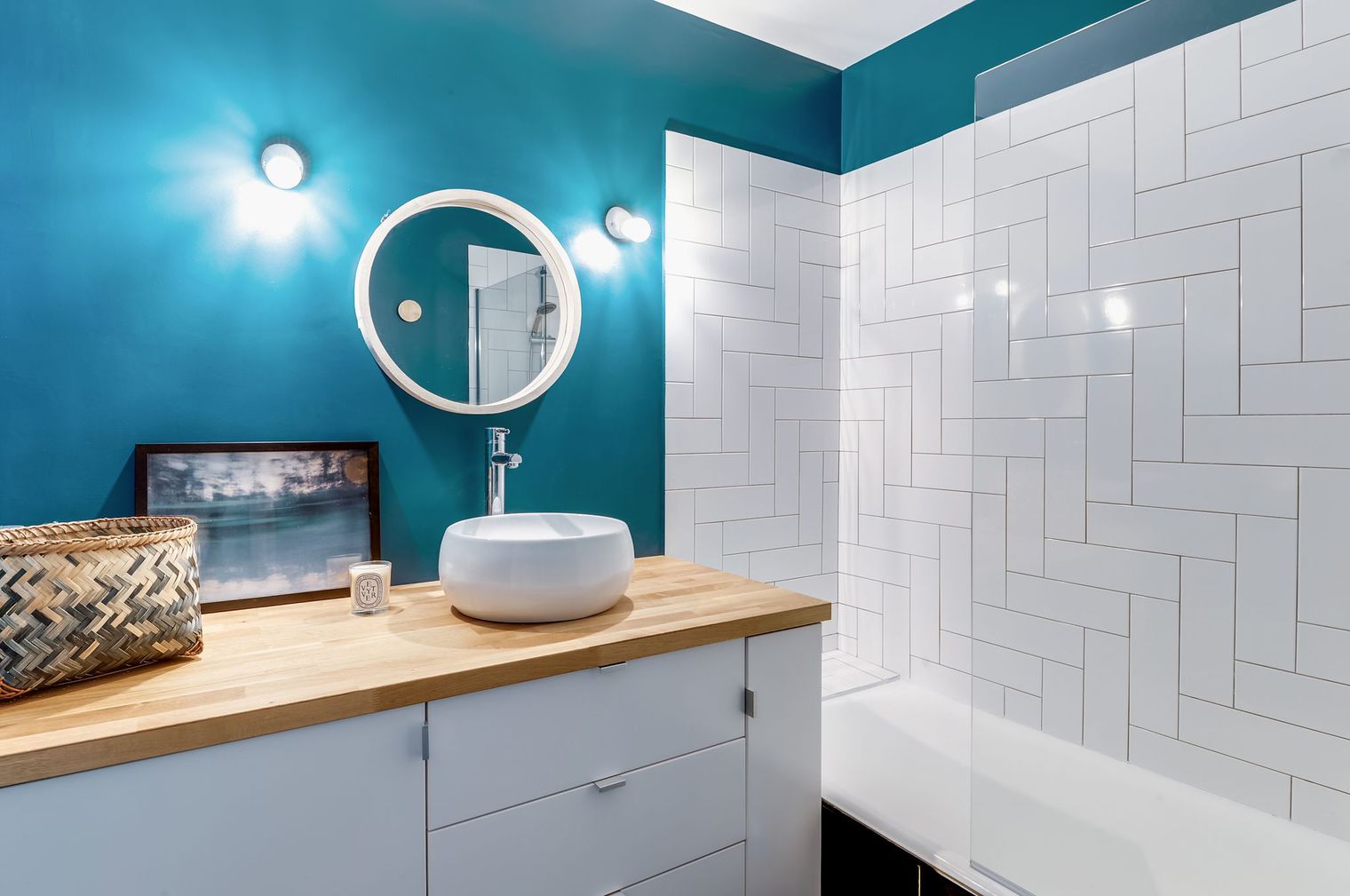
 The owner's budget is very limitedforced the architects to look for effective solutions. For example, the bed was placed on kitchen drawers, and thus it was raised, and the sleeping area turned into a cozy cocoon. Kitchen drawers, having lost their original purpose, are now used to store various things. The same principle was used in the bathroom: all the same kitchen drawers, grouped under the IKEA countertop, form an original place for washing. Such tricks allowed to completely re-equip the bathroom for very little money. A glass shower partition is more aesthetically pleasing and practical than a plastic curtain. To enhance the graphic quality of the interior, the architects used white subway tiles, arranging the tiles in the form of elements in Tetris. This decor echoes the design of the rack and the brick wall in the room.
 The owner of the apartment claims that the result achieved by the architects exceeded all his expectations. What do you think about this project?

