As many designers and publications claim,including experts from the Pantone Color Institute, pink will be the main trend of the beginning of 2016. The most important thing now is to understand whether it is worth using in your interior and if so, how. And we will help you figure it out. We have already considered one of the trends of the next year. Among others, pink stands out, which has already begun to actively penetrate the world of high fashion and is now spreading to all spheres of life. Including interior design, becoming the most relevant color solution. According to experts from the Pantone Color Institute, the main trend of 2016 will be serene blue, as well as rose quartz.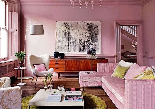
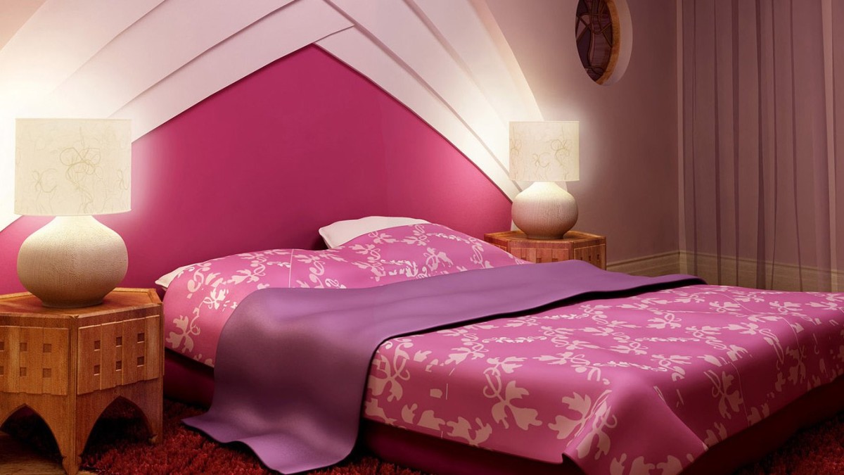
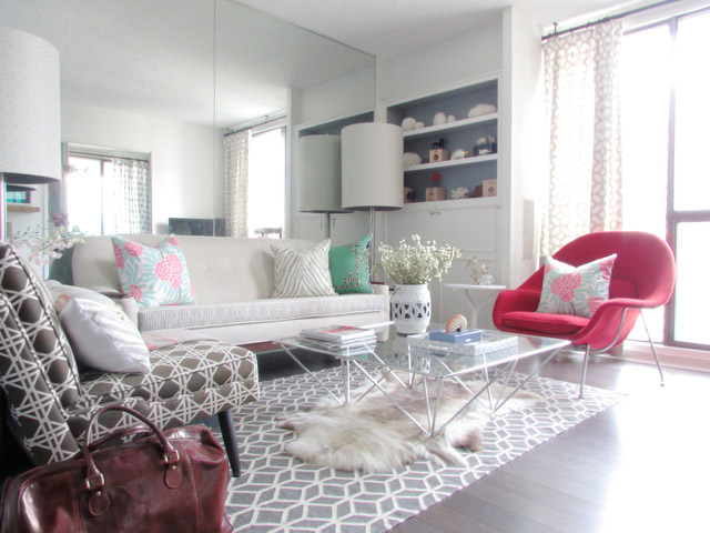
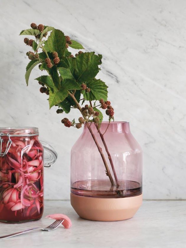
 Many people believe that the only possiblethe use of pink — a girl's room or a woman's boudoir. This is absolutely not true! Pink has a huge number of shades and temperatures, and by combining such an exquisite color with others, you can get truly original design solutions. For example, pink with gray. Or with copper tones, or shimmering with a metallic sheen, or extremely bright — there really are many options.
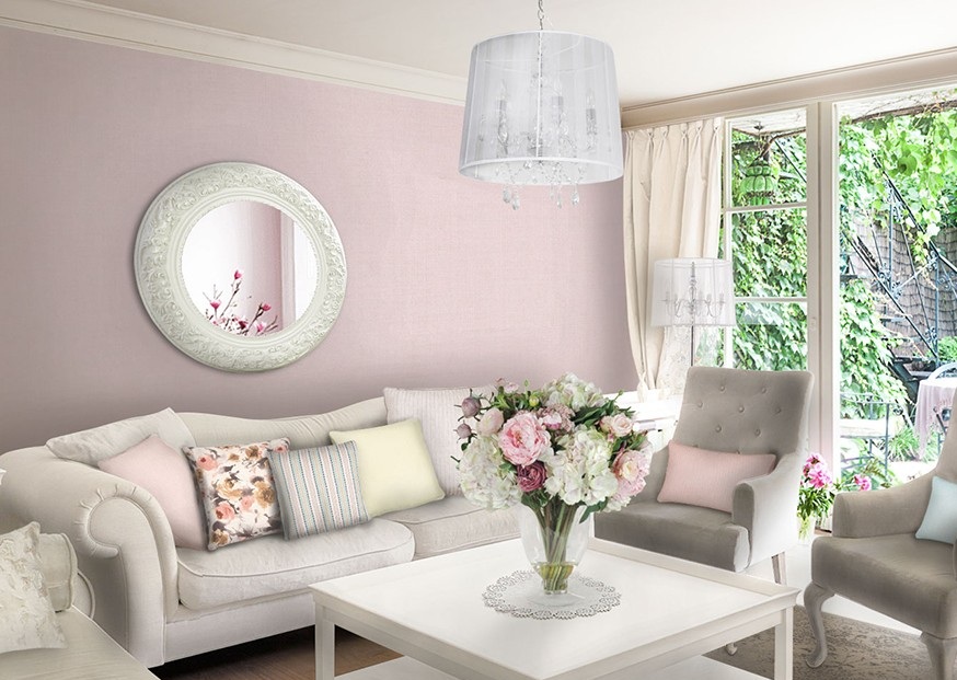
 Designers and experts believe that pinkwill become a trend next year. This assumption is based on the analysis of public sentiment and the season's novelties in all areas of life - fashion, interior, even industry. Following the advice of professionals, manufacturers of textiles, paints and furniture try to add the specified shades to their catalogs in order to be "on the wave". In addition, the use of pink tones or combinations in the design of premises will be relevant not only for the bedroom, but also for the living room or kitchen, and the interior style can be any - from classic to Provence.
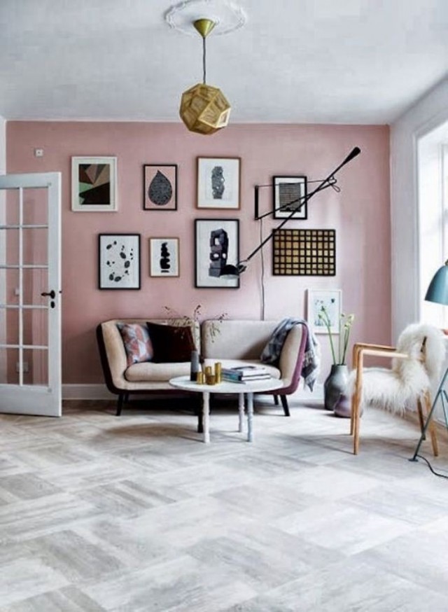
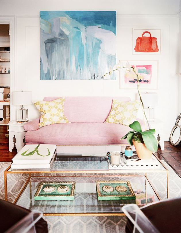
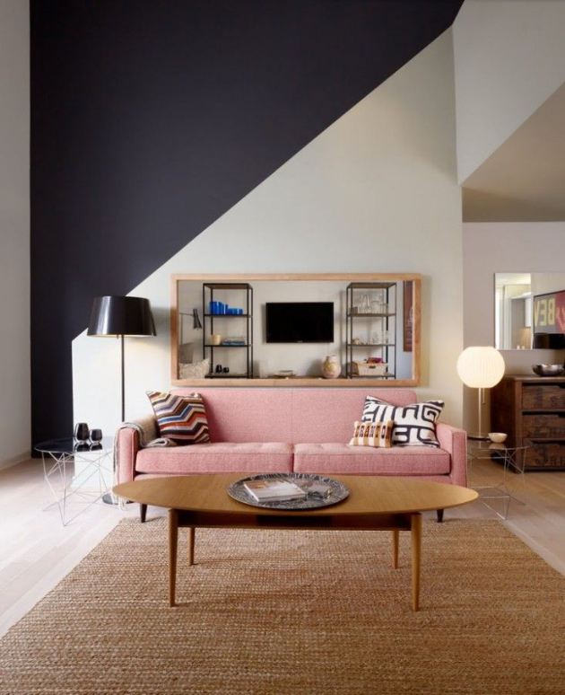 At the same time, the color is too bright and saturatedIt is recommended to avoid. Calmness and comfort are what a person needs, so soft and muted tones will be the most popular. In addition, pink is also found in nature - on autumn leaves and in the pleasant, calming haze of dawn, which makes the color very gentle and sensual, causing it to be associated with joy and fullness of vitality.
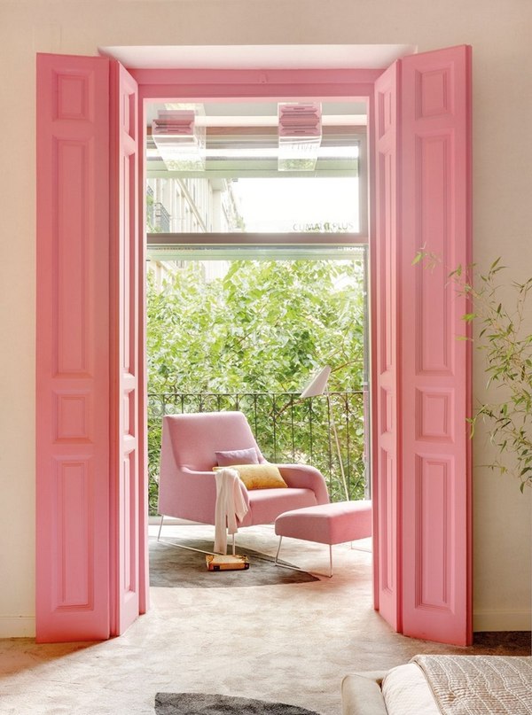
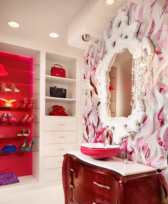
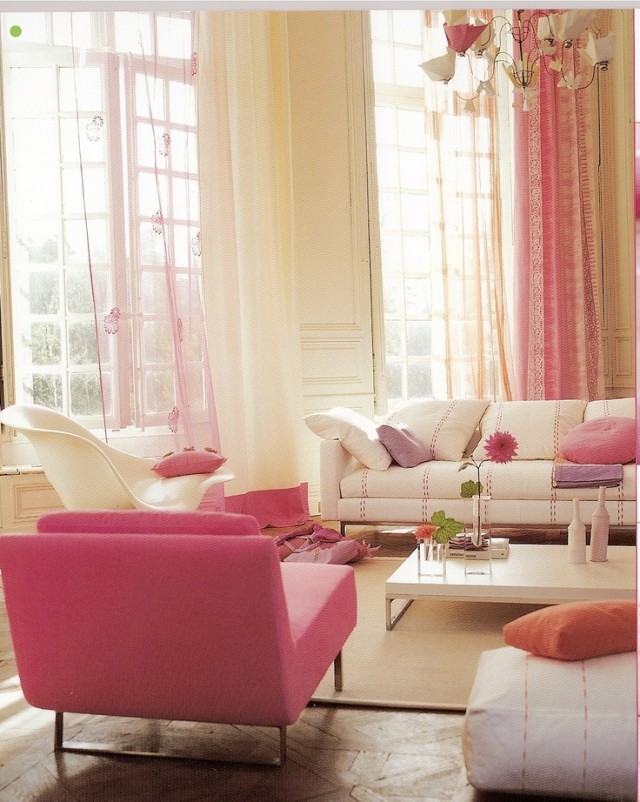
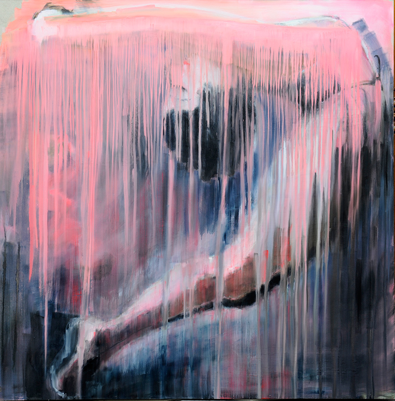
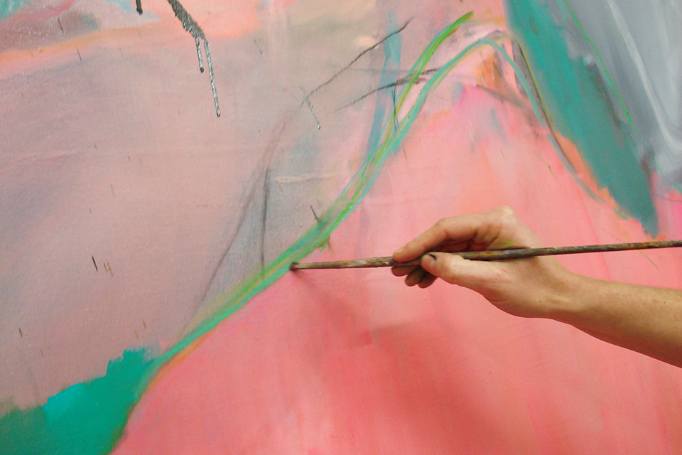
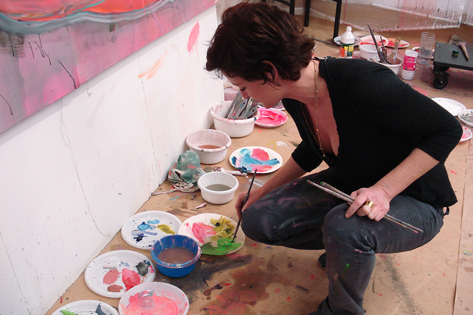
 This color can be used not only ininterior design or fashion news, but also in painting. For example, French artist Natalie Harvey, whose graduation took place on December 6, uses mainly shades of pink in her works. The editors of etk-fashion.com took a short interview with Natalie, where they asked her about her preferences, plans and dreams. — Why do you use pink and black in your paintings? — For me, pink is one of the deepest and widest colors in its spectrum. It can either completely captivate the viewer or repel him. In my paintings, I use pink for absolutely everything, it's like a filter through which I look at the world. And it's just my favorite color! — How did you realize that your calling is an artist? — I've always loved painting. Everything around me inspired me to write: strong emotions and experiences, love, music, poetry, light and even temperature. For a long time I was embarrassed by the profession of an artist, so I went to study to become a graphic designer and photographer. When I received my diploma, I immediately went to my studio, where I stayed forever. - Your creative dream? - To continue to love and live my work, to develop internally, to constantly overcome difficulties and obstacles in my work.

Pink is the main trend of 2016 – etk-fashion.com
