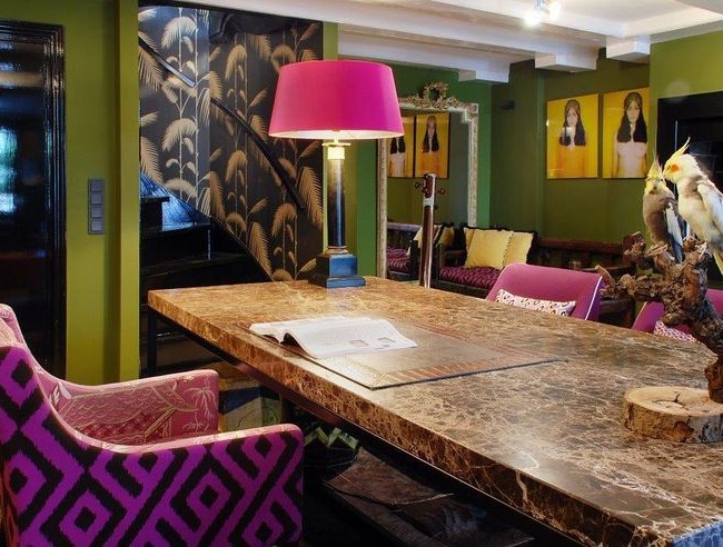
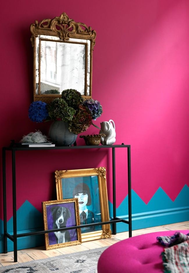
Pink Yarrow is one of the top 10 colors of 2017according to Pantone. Designer Natalia Chernichkova told what role it will play in the interior and how to use it correctly.We have already talked about for 2017 from Pantone and Fr. Today we will turn to the very color from the palette - Pink Yarrow, or "pink yarrow". The main thing is to correctly combine it with other shades and use it in a dose in the interior. Natalia Chernichkova will tell you exactly how. Natalia Chernichkova, BerryConceptDesign In 2011 she graduated from the psychology department of Moscow State University. MV Lomonosov with a degree in ergonomics. In 2013, she graduated from the International School of Design, and also completed refresher courses in interior design at the British School of Design. In 2015, she opened her interior design studio BerryConceptDesign, which offers a full range of services for the creation and implementation of interior design for residential and public premises. - “Pink Yarrow” is suitable for minimalistic or classic interiors, but most of all for eclecticism. It is important to remember that even one object of this color can completely transform the interior. Pink Yarrow and Greenery from the same Pantone palette are, for my taste, one of the most harmonious and vibrant combinations. It was created by nature itself, two such bright colors complement each other perfectly. Pink Yarrow pairs well with gold and chrome. 


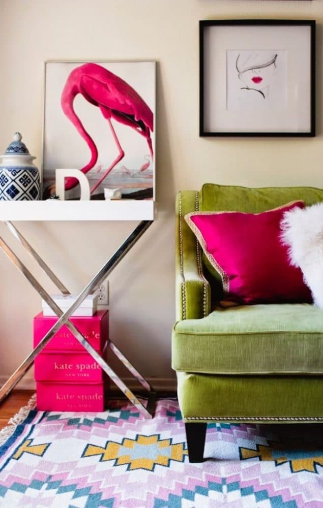
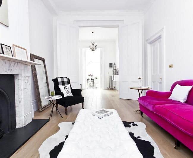
 It seems to me that the "Pink Yarrow» moreSuitable for public areas - kitchen, living room, dining room or study. And it is not necessary to paint all the walls in this color, it will be enough for one. Please note, in such a room should be neutral furniture, without pretentious shapes. Another option is absolutely calm walls, for example white, decorated with moldings, and an accent for such an interior would be furniture of the color Pink Yarrow.
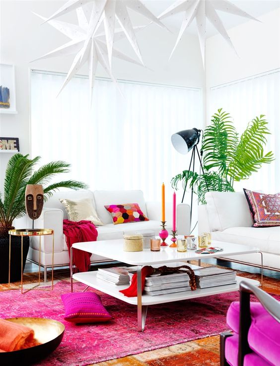
 In the bedroom and the nursery the color is "pink yarrow"It is better to use only in accents - 10-15% of the whole decoration, not more. After all, the bedroom is a place of rest and relaxation: do not weight it with such a rich and bright color in large quantities. I advise you to add Pink Yarrow in details, for example in decor elements, textiles or small pieces of furniture.
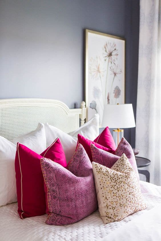


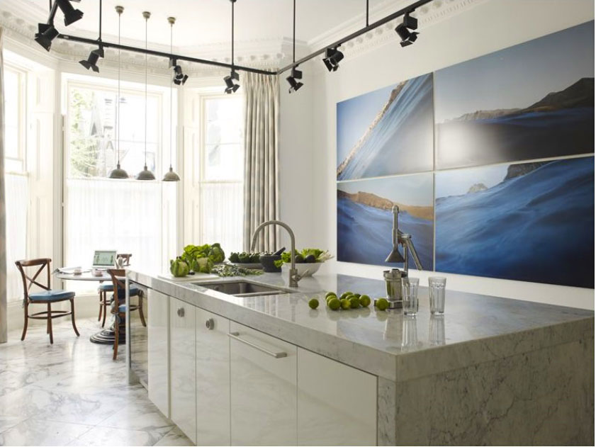
 The best solution for the kitchen will beUse gray and white as basic shades for decorating walls, and Pink Yarrow can be used, for example, for the facades of the upper cabinets or kitchen apron. An excellent combination will be a bright "pink yarrow" with a calm light tree or a gray stone.
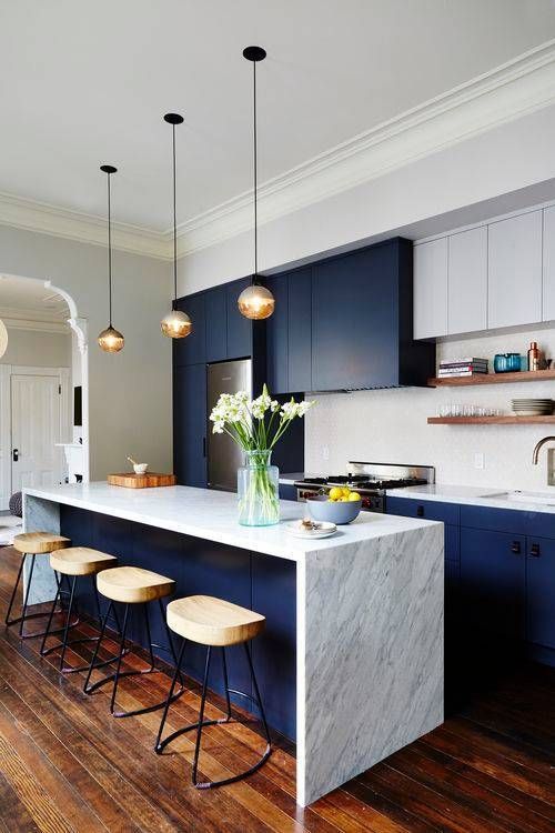
Color in the interior: bright pink, and how to use it


