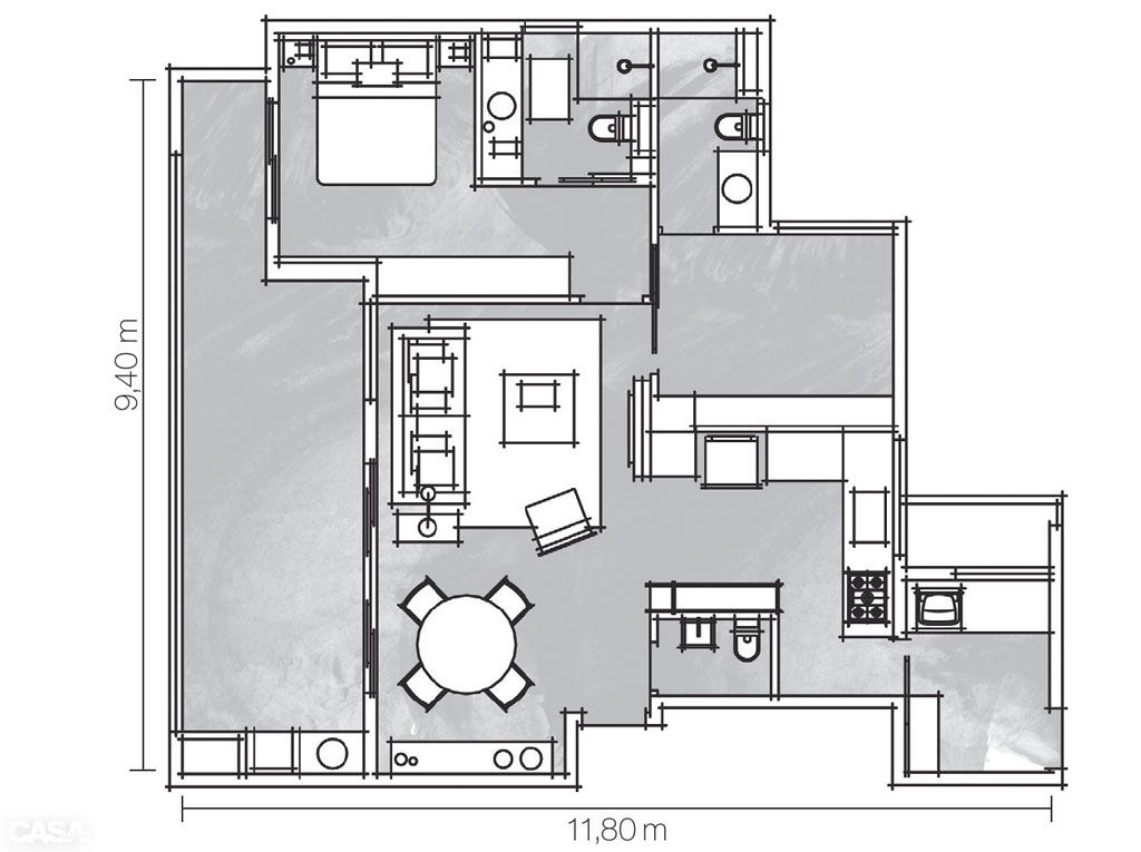
How to Optimize Space on 27 Square Metersmeters and place a bedroom, living room, dining room, kitchen and study here? And at the same time double the space! Impossible? Possible! This apartment is located in Brazil. The project was developed by designer Antonia Mendes for a family of doctors. Together they thought through everything in great detail for a year. Everyone was happy with the result.
Mirror focus: was white - became gray
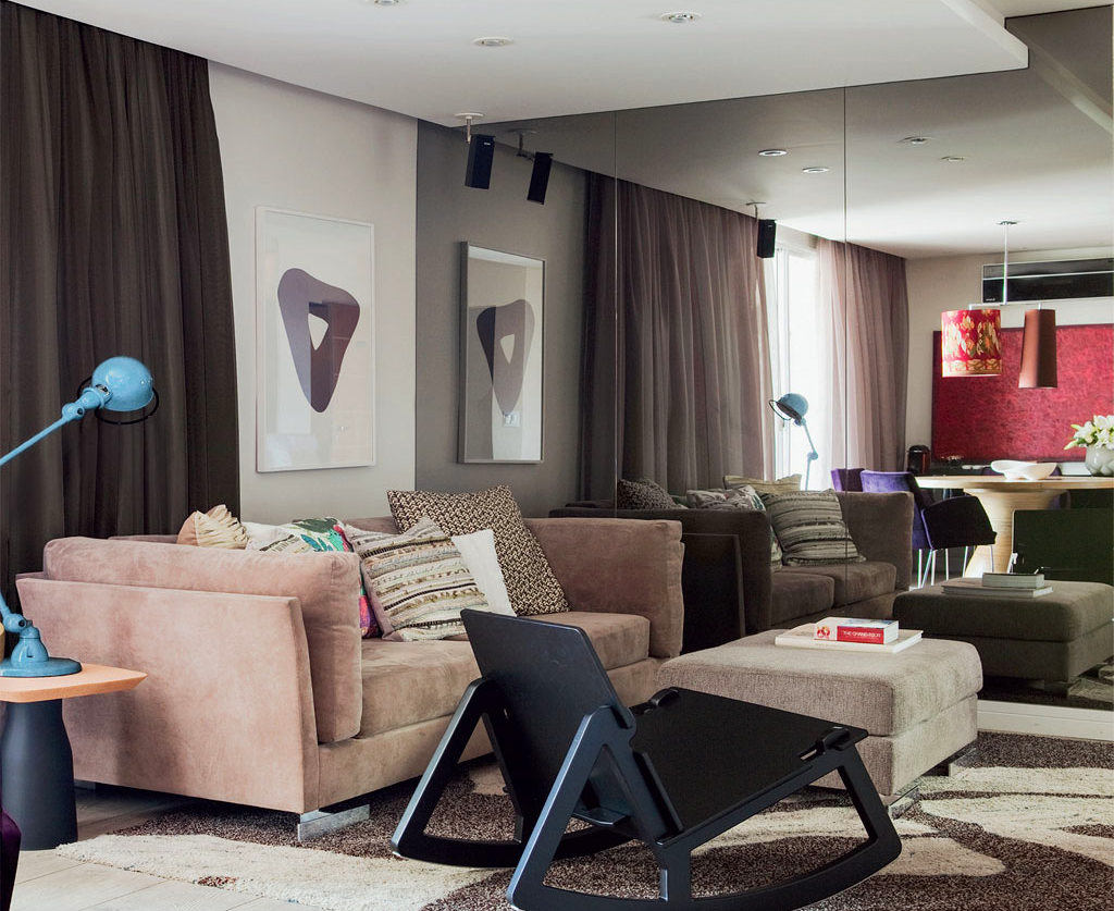
This apartment is small in size, but whenyou get into it, there is no feeling of tightness. This effect is provided by the mirror wall. An interesting technique allowed the designer to create the illusion that this is one space, zoned by color. If you look more closely, you will notice that the reflection of the ceiling and walls in the mirror is gray, although in fact they are white. This is a play of light, which the designer skillfully applied.
So that it doesn't seem smaller
All pieces of furniture have graceful shapes,therefore, they do not "steal" space. Everything in the room is reflected in the mirror and, accordingly, is doubled. To optimize space, a round table was installed in the dining area.
Flashes of color
Although gray is not an easy color touse, it is an excellent background in the apartment. It has a calming effect. To prevent the interior from seeming boring, the designer diluted it with bright flashes of color. The round table is surrounded by chairs with purple upholstery. On the wall, the red fabric provides an excellent accent, as do the bright lamps of an unusual shape. The interior looks calm, relaxing and welcoming at the same time. Our opinion: - The combination of red and gray is considered one of the most fashionable trends. The owners of the apartment keep up with the times, so they diluted the gray background with bright accents. Purple is formed by blue and red, which "extinguish" each other. And it turns out that red and purple interact harmoniously with each other. Such colors contribute to idealization and increased self-esteem. And did you think that everything in the doctors' interior would be sterile white? The varnished headboard and bedside tables in the bedroom have become the most attractive elements of this room.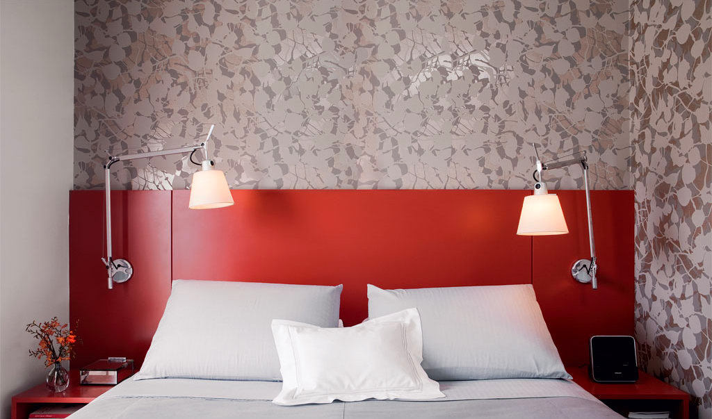

What else can you save on?
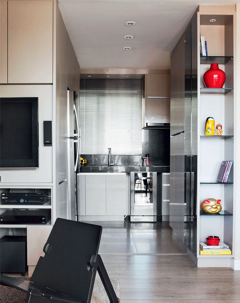
Since the room is very small, I had tothink about how to use it profitably and compactly. As you know, doctors like order in everything. And it is difficult to fit everything you need in a small area and still maintain order, but it is still possible. They developed the project with the designer for a long time, and in the end they got what they wanted. In order not to “steal” extra meters, they installed a sliding door between the bedroom and bathroom. But the most interesting solution is a modular minimalist kitchen combined with a living room. The project was specially developed for this apartment. And look how compactly they managed to place household appliances and a large refrigerator. Our opinion: - But it is clear that the kitchen is not the most important place in the apartment where they like to spend time, but an important necessity. Pay attention to the part of the module that goes into the living room area. Here you will see a plasma TV, DVD player, speaker and other electronic gadgets. It turned out to be an excellent innovative office!
 decoholic.org
