What are you capable of for maximum comfort anda feeling of lightness in your apartment? Are you ready to give up cozy textiles, familiar decor and even furniture in the generally accepted sense? The interior of the Moscow apartment that we will show you today will surprise and inspire you. Simple and functional, but with a distinct personality. Airy and light, but not cold. Calm and bright, but bright. An apartment in which every centimeter “works” at one hundred percent appeared in a five-story “Stalin-era building” on Bagrationovskaya Street.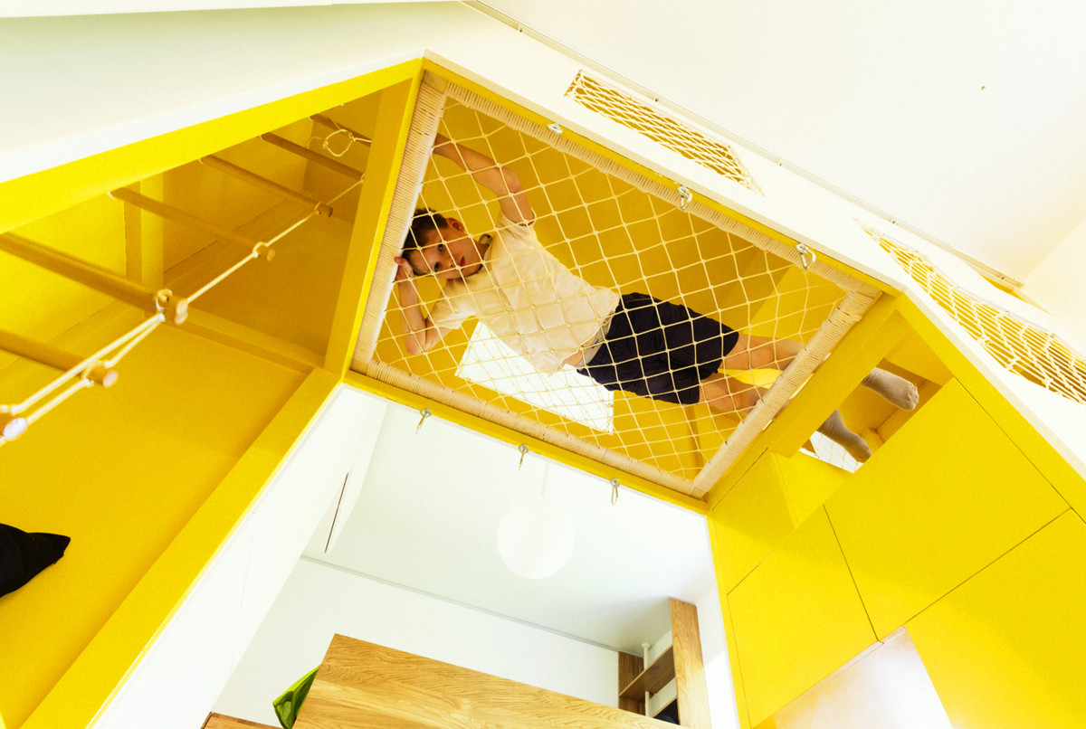 Interiors like this are usually praisedexhibitions for a successful concept and departure from stereotypes and discuss in blogs as messages from the future. But they rarely "reach" real people in real houses - public taste is still too conservative. This time everything worked out: customers and architects found in each other not only partners, but also like-minded people.
 The owners of the apartment are dynamic andmodern, with two daughters of an active age, 10 and 4 years old. Hence the needs: a laconic interior with a minimum of furniture and corridors and a maximum of light and opportunities for a variety of pastimes with children. One of the most daring architectural studios in the capital, Ruetemple, took on the task. Alexander Kudimov and Daria Bukhtueva, architectural studio Ruetemple Graduates of the Moscow Architectural Institute (2007), worked in several architectural studios during and after their studies, until they founded their own in 2008. The list of its completed projects was still very short when the name Ruetemple first sounded loudly throughout the country, literally from the blue screen. Alexander and Daria created an original transforming cube for the program "Dachny Otvet" on NTV. The constructor, capable of turning into a bedroom, living room, office or recreation area at the request of its owners, has collected many awards. Unexpected and innovative approaches, the search for the most ergonomic solutions and attention to the needs of the customer distinguished all subsequent projects of the studio. The area of interest is the space that surrounds a person, be it an interior or an urban environment, so the architects take on the design of both experimental reading booths for Moscow parks and multifunctional furniture with equal pleasure. "We strive for organicity and simplicity and, when solving this or that problem, we try to get away from stereotypes and look for fresh transparent solutions." ruetemple.ru
Organization of space
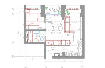
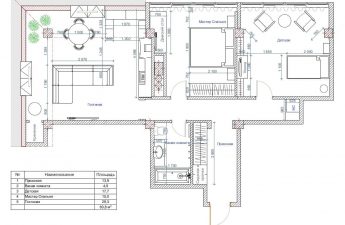
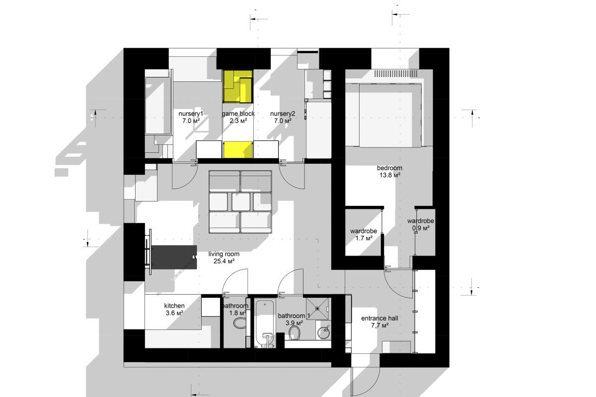
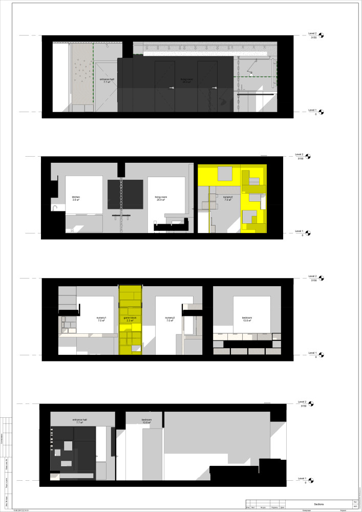
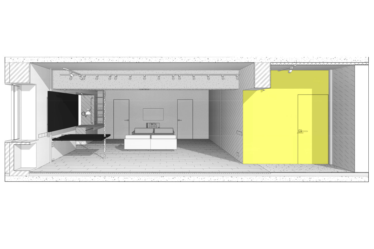
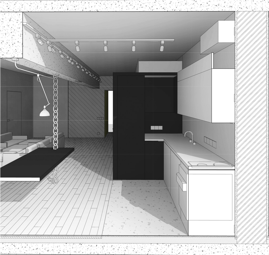
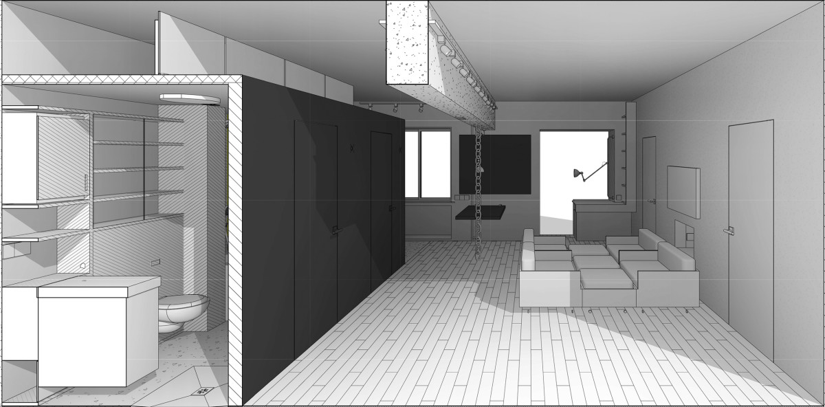
As in most Stalinist buildings, this oneall the walls are load-bearing, the architects had to work within very strict limits. Architectural studio Ruetemple: — It was impossible to make a radical redevelopment. The only thing we managed to do was to demolish the partition separating the corridor with two bathrooms and the living room. Thanks to this, we got an open living room space. The long children's room with two windows was divided into two parts by a central play block — we actually got two rooms with a play area. The shape of the long and narrow bedroom is smoothed out with the help of two built-in wardrobes. The black cube contains bathrooms, a closet and a kitchen at the same time. ruetemple.ru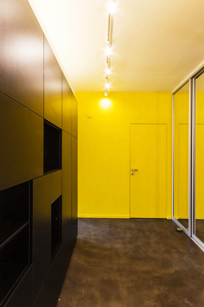
Colour
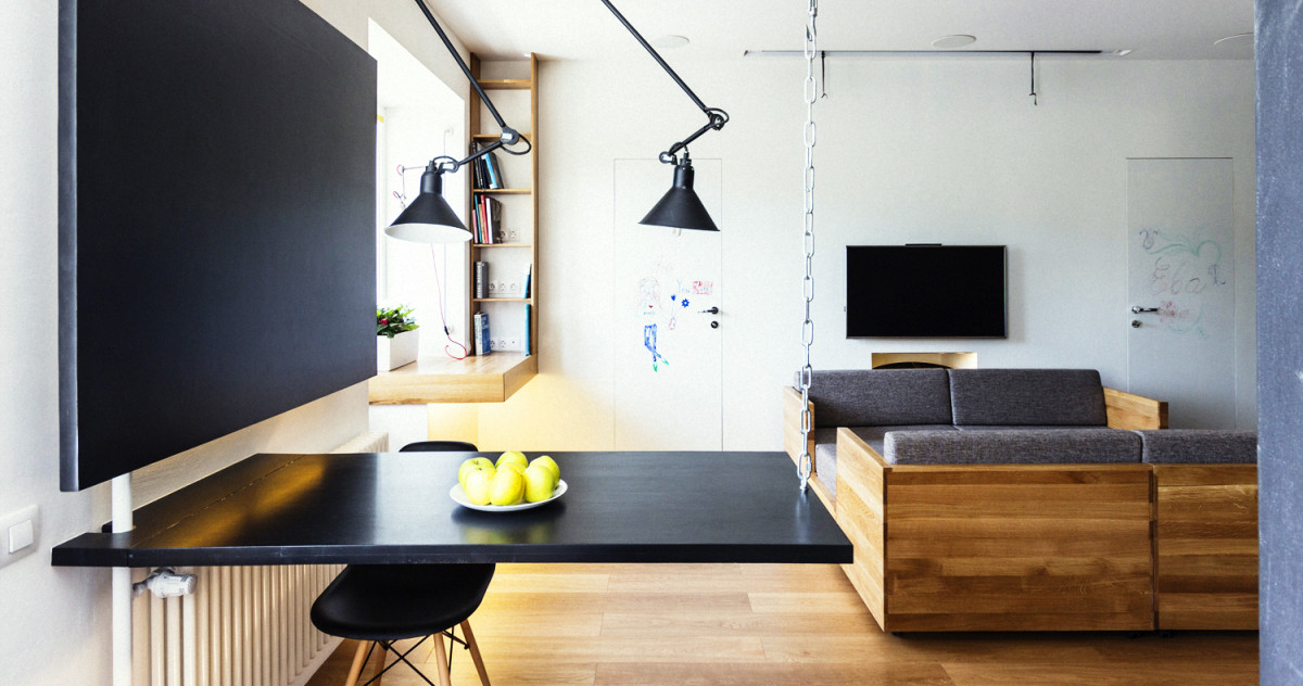
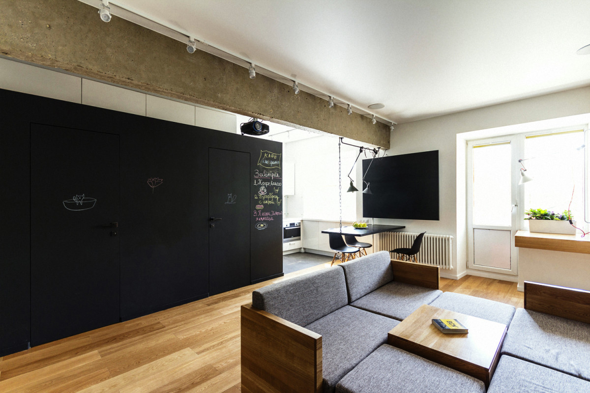
White background, oak floor and two bright colors andfunctional accents: black volume and yellow spots - the wall opposite and the play wall. One could say that the solution is in the Scandinavian spirit, if the architects had put a period there. But they ended up with ellipses. The walls of the black block are covered with chalkboard paint, and the white wall opposite is covered with marker paint. It is easy to imagine what children can turn them into in a fit of inspiration. And what if parents help? Color is a very personal element of design, it can be added to this space with the same ease with which you can change the mise-en-scène in each of the rooms.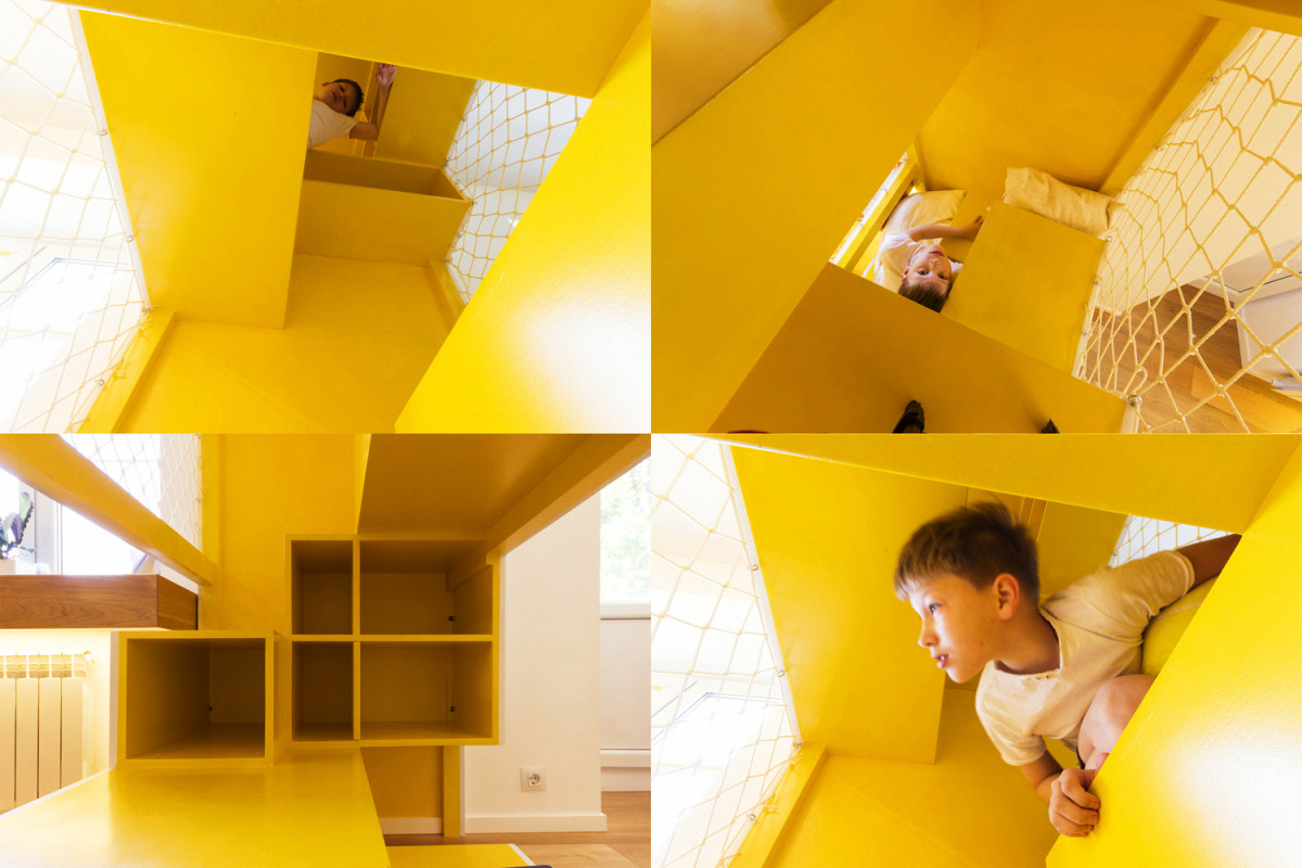
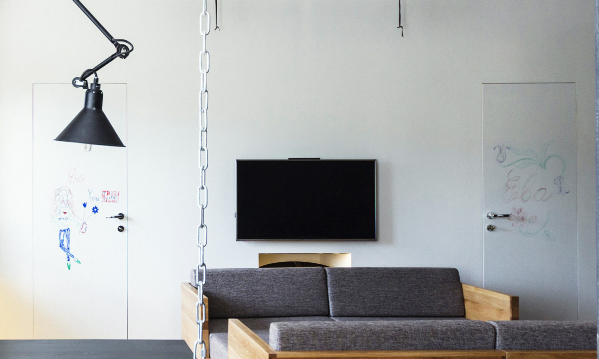
Living room and kitchen
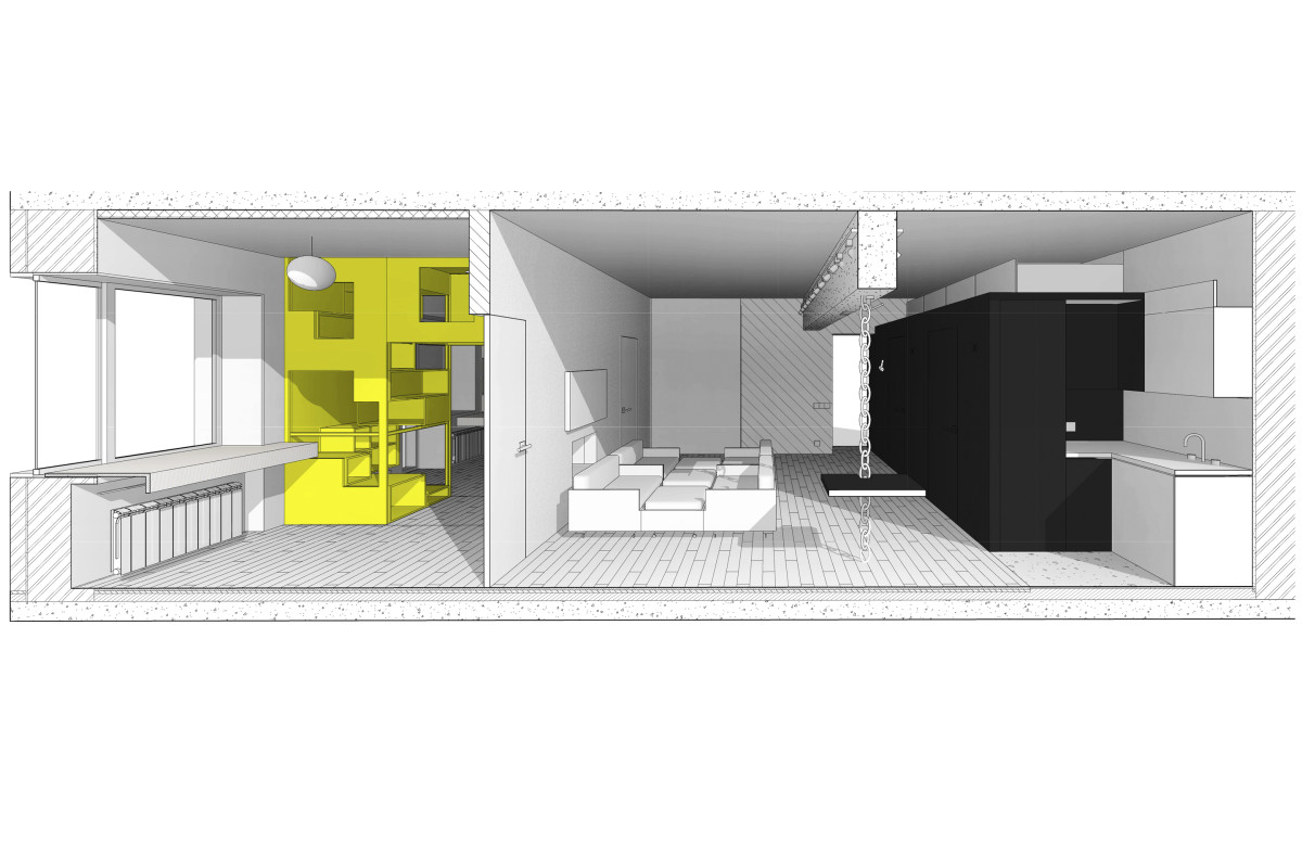
A chameleon interior that can adapt toany needs at the wave of the owner's hand - the main idea that led to a whole scattering of interesting and unusual finds. Architectural studio Ruetemple: - The owners of the apartment wanted to have a transparent light space, without a clutter of cabinets, nightstands, shelves and other things. That is why we made all the furniture integrated into the walls and floor, it is simply not visible. We tried to include as many functions as possible in the black block, even under the ceiling above the block - mezzanines for storage. ruetemple.ru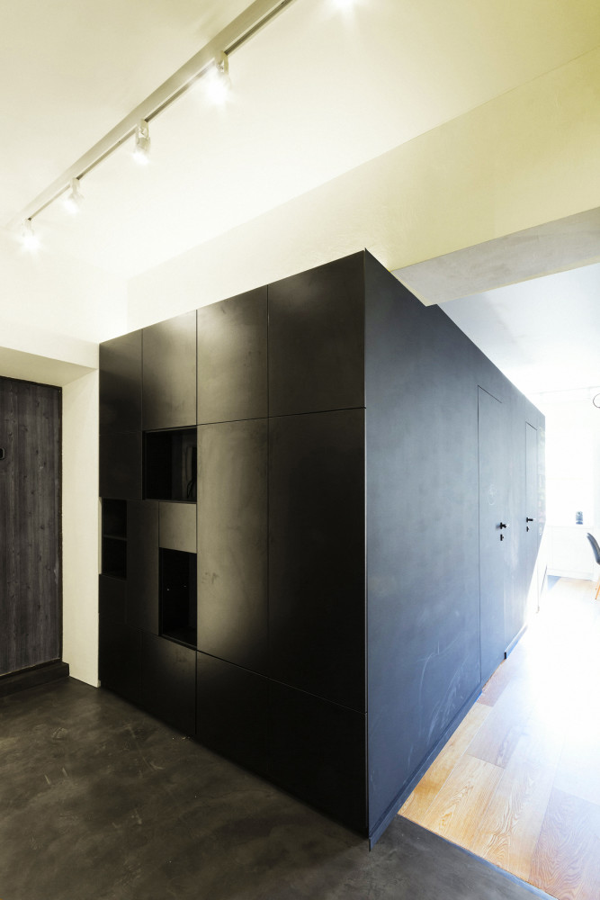
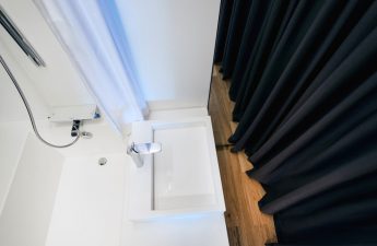
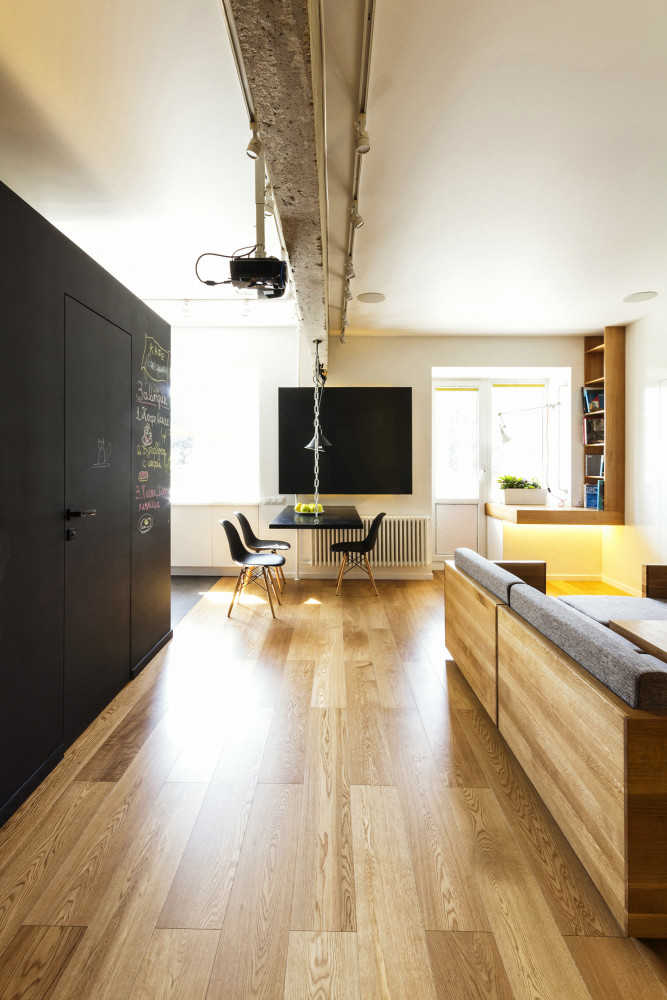 There are two bathrooms inside the block:one includes only a toilet and a washing machine, the other is a full-fledged one, with a bath, shower and storage system. Both are in yellow and black tones, with microcement on the walls and microconcrete on the floor, relatively new materials for Russia, but very interesting.
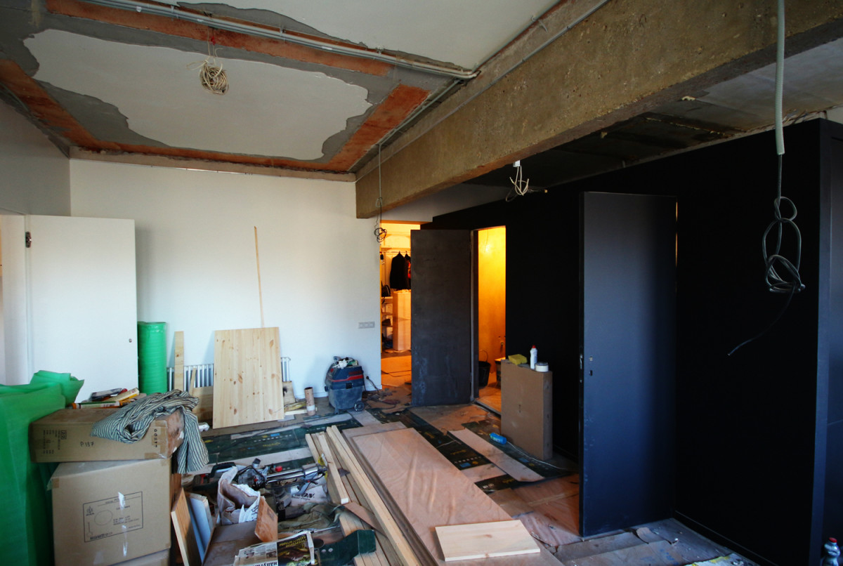 From the black cube a black and white one logically growskitchen. The dark part is built into the volume - a refrigerator, a dishwasher and separate cabinets; the light part connects the structure with the main living area. Simple and minimalist in form, the kitchen emphasizes and highlights the cube as the main element of the living room.
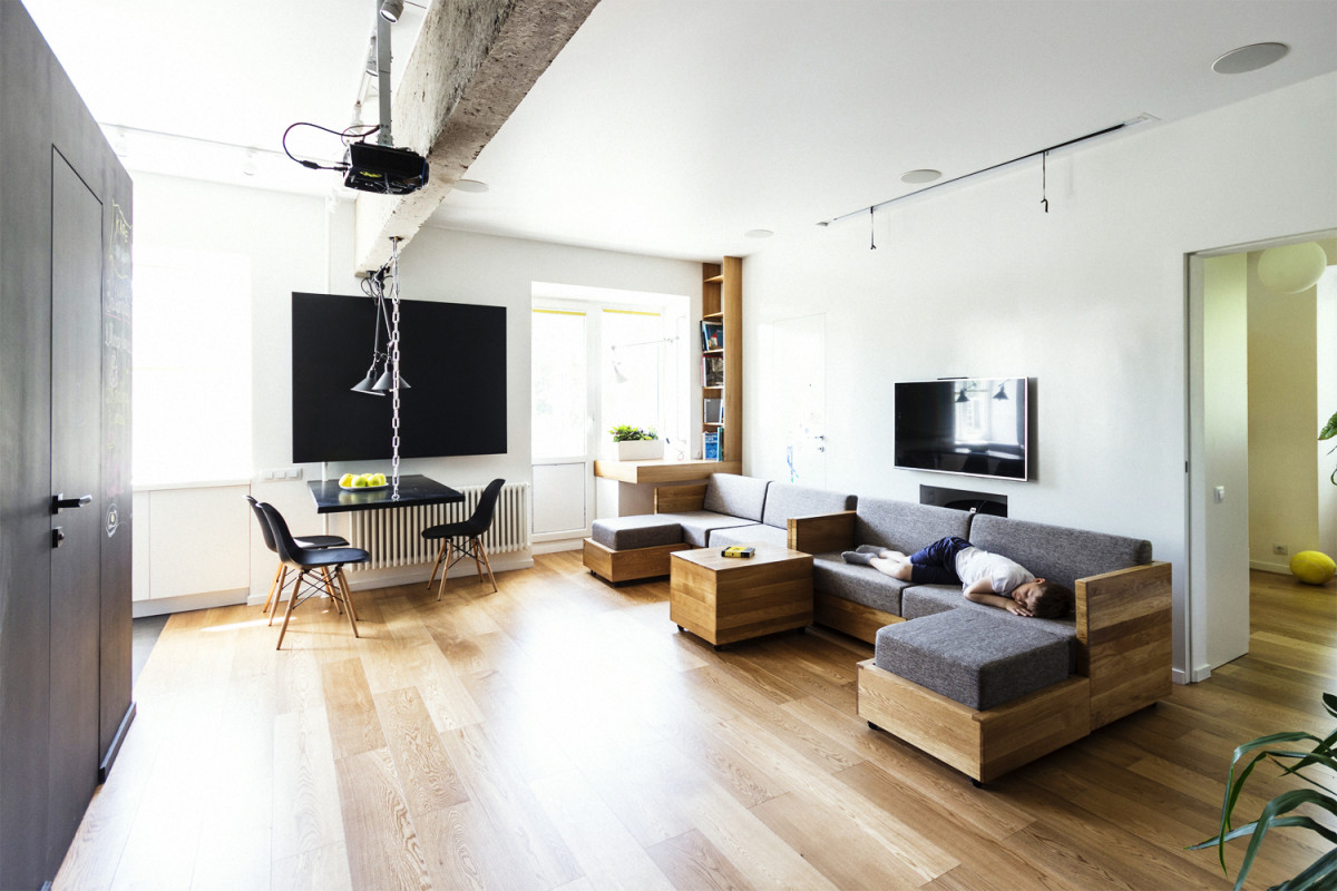
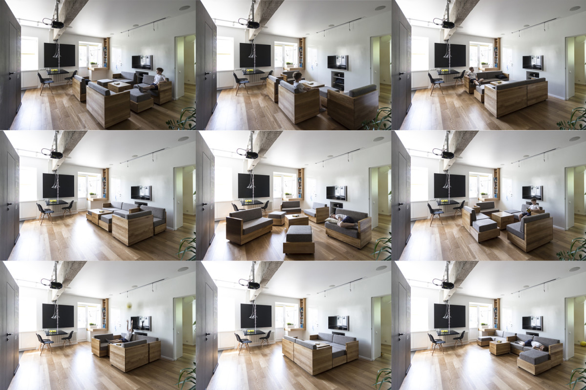
 On the contrary, it is the know-how and pride of the architects who were the first to undertake the development of modular upholstered furniture.
 Architectural studio Ruetemple:— Universal modules are a key part of the living room, specially designed for this place. Instead of one, ordinary store-bought sofa, we made five small movable half-sofas (on wheels), which allow you to get completely different combinations of zones: from a large chill-out for the whole family with guests to a small chamber place for reading. In this way, you can change the functional purpose of the room, today, for example, you can watch football with friends, and tomorrow receive guests and play board games. ruetemple.ru
Bedroom
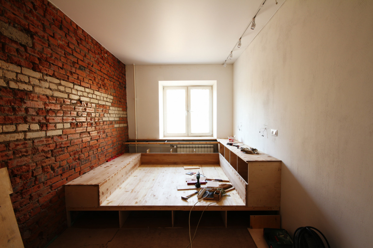
The bedroom is decorated in the same spirit.Instead of a store-bought bed, wardrobe and chest of drawers, there is a single structure designed by Ruetemple. The oak podium is simultaneously a sleeping space, a complex storage system, a bedside table and a shelf. The only decorative element is the brick wall, which they decided to leave as is.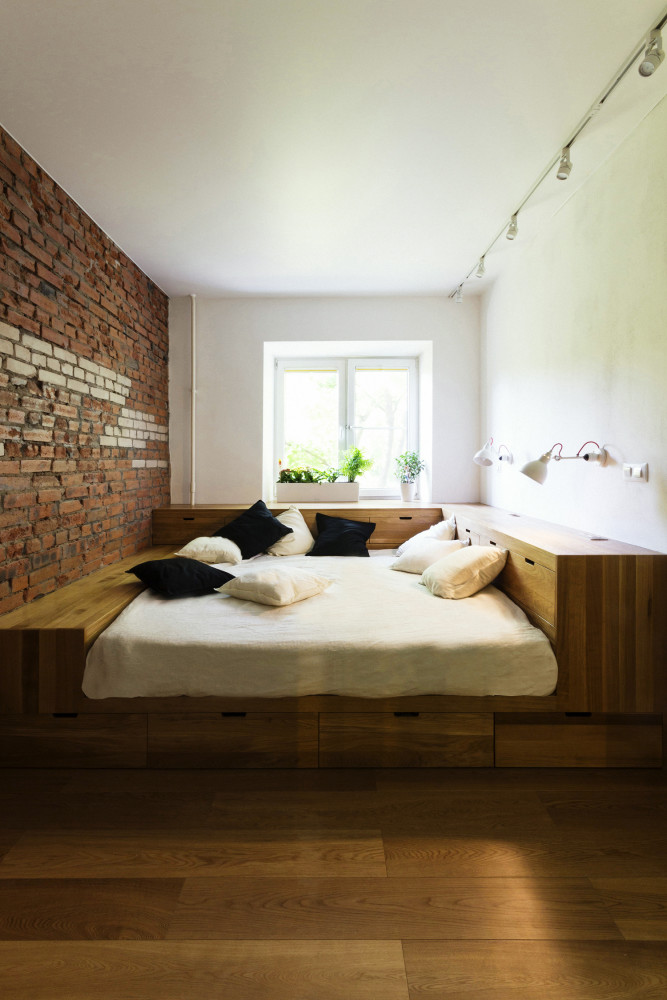
Children's
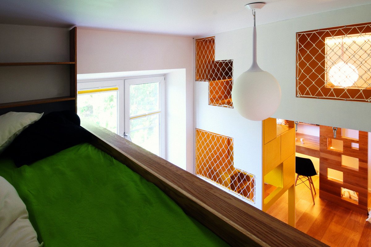
The most elegant solution was found in the children's room,source of enthusiastic parental comments on social networks. Not even because one room logically and naturally became two, but because of how exactly it happened. Architectural studio Ruetemple: - You might think that our children's play block is just a place for games: climbing levels, a hammock and houses with a window, but in fact it is also a large storage system made of boxes. On both sides there are sleeping places and tables for studying. The parts are equal, but not symmetrical. ruetemple.ru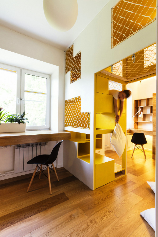
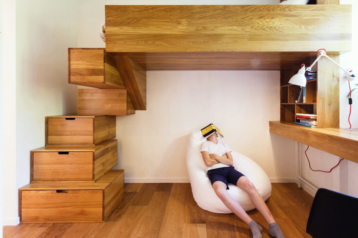
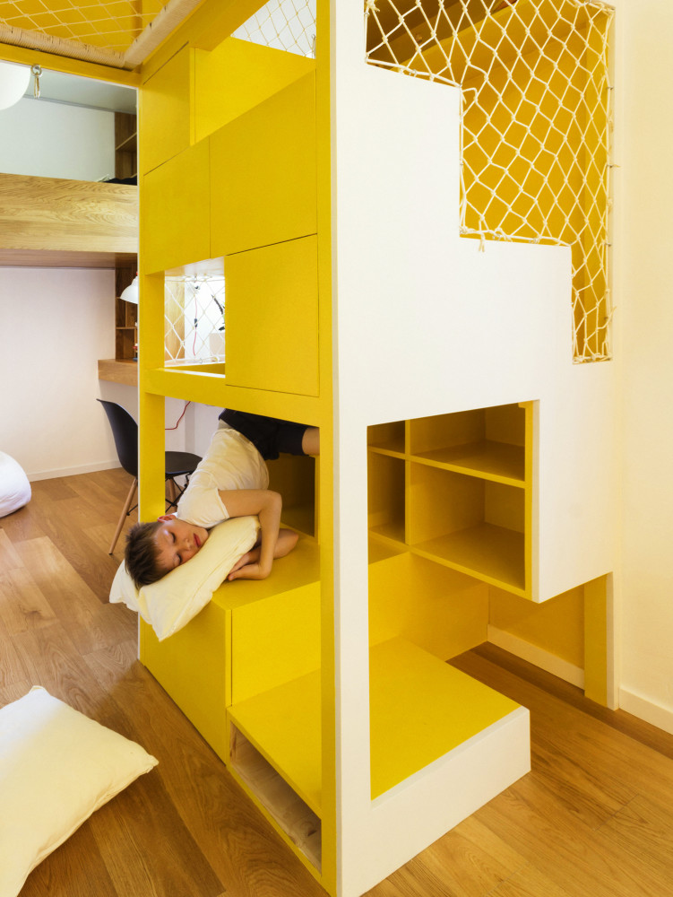 Tables grow out of the windows and drawers are built ineven in the steps. The result: each child has their own personal space, but not isolated, but connected to each other; a field for creativity, where there is all the tools necessary for a child's imagination, but there are no ready-made models that hinder its development.
Idea
What happens if you remove almost all the furniture from your house?Most of the textiles? Not very necessary, but familiar and comfortable little things? And replace all this with a universal home construction set like Lego, capable of assembling into any figures you wish? Pure geometry will remain - the beauty of lines and volumes interacting with each other in free and airy space. Perhaps this solution is not for everyone, but you can’t deny its originality and ingenuity.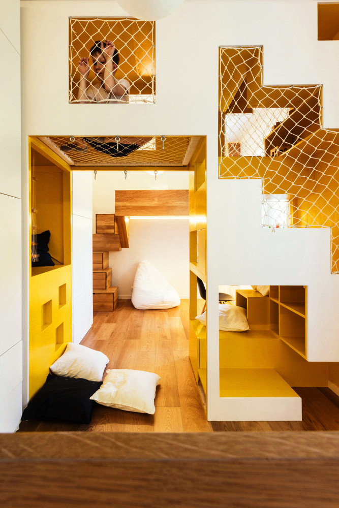
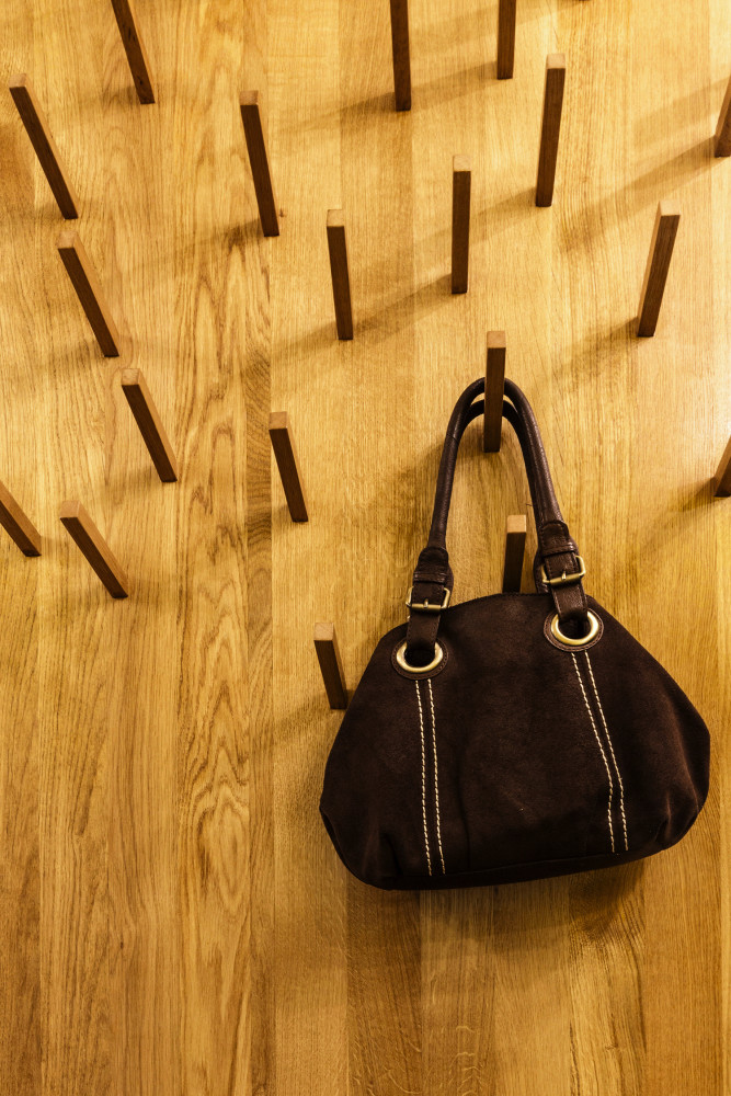
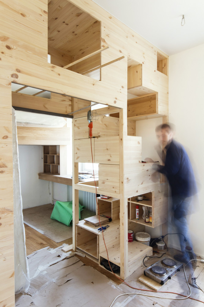 Architectural studio Ruetemple:— The best thing about this project is its individuality. There are practically no branded items in it, we designed all the tables, beds and other furniture ourselves. There are so many complex structures here that the need to decorate the walls essentially disappeared. In general, it cannot be said that we made the walls first, then the furniture, etc., everything was done in a single vein, in one breath. ruetemple.ru
In the interior used:
- Almost all the furniture is custom-made, made to order according to Ruetemple’s sketches.
- Kitchen - "Stylish Kitchens" (Russia).
- Doors - Hameleon, Union (Italy).
- Fixtures - Artemide (Italy) and IKEA (Sweden).
Tips from professionals for those who want to create a laconic, yet bright and multifunctional space:
