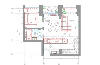
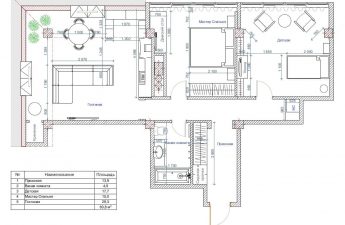
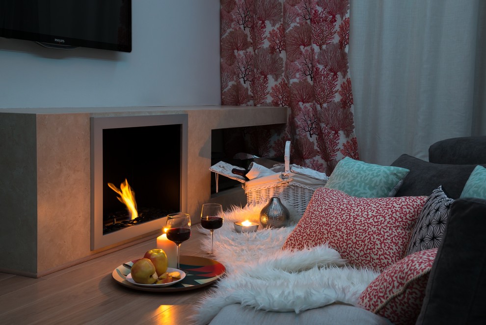
Today, using the example of a bright two-room apartment, we will tell you,Why bold design decisions are not a hindrance to home comfort, how to squeeze the maximum space and light out of 60 square meters, and what a European interior of a Moscow apartment should be like. This apartment has it all: original art objects and bold color combinations, but at the same time, behind all the design delights, the warm home atmosphere and, no less importantly, the functionality of the interior were not lost. Designer Marina Sirko tells us more about her project of a two-room apartment of 60 square meters. Marina Sirko, designer Graduate of the British Higher School of Design, specializing in "designer of residential and public interiors". At the beginning of her creative path, she was engaged in textile decoration of interiors, took part in the creation of the design and decoration of the interior of the Naya hotel on the island of Byukada. For several years now, she has been engaged in private practice, specializing in psychodesign, the goal of which is to create a balance of geometry and psychology of space. www.marinasirko.com According to Marina, she fell in love with the apartment at first sight: lots of windows overlooking the garden, open layout, 3-meter-high ceilings. The first thing that came to the designer’s mind was the fireplace. It was given a place between the windows, and on the left there was an ideal place for a sofa. Why ideal? It was made this way by the widest viewing angle of the entire apartment, the ability to look out the windows, at the fireplace, without interrupting your movie watching. It was decided not to separate the study, so as not to fragment the space and leave the center as free as possible. The living room got the largest part of the area, so the designer made the bedroom small, and moved the dressing area into the hallway. The location was then determined:After several options, the most optimal solution turned out to be to build a small wall for it, in which all communications could be hidden and the kitchen area could be neatly separated.
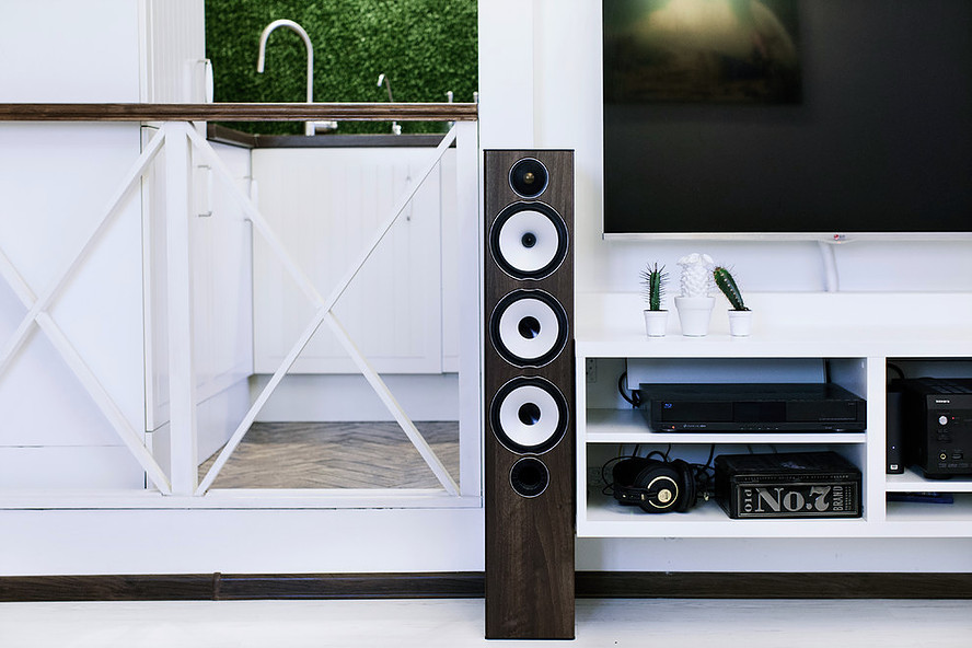
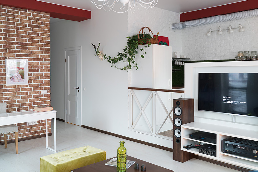 Marina Sirko, designer:— I was very pleased with the fact that the entire apartment is permeated with many beams and columns. I only slightly synchronized their sizes and refined them with contrasting colors, but overall their geometry gives depth to this project and effectively resonates with the color palette of the walls.
 The living room is based on the white floor andwalls, which fills the space with air. Wildlife motifs add zest to the interior: worn clinker cladding on one wall and wild ivy twining around the horns of a mountain goat (who died a natural death somewhere in the vastness of Altai) on the other.
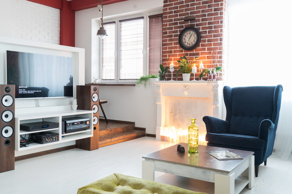 Around the aged coffee table,found at a sale at Hoff, there is a furniture dialogue between three completely different objects in character, and the colors of their upholstery exactly repeat the shades of the Ray Caesar reproduction hanging on the wall above. The velvet pouf and fireplace mantel were made by Marina Sirko especially for this project under the brand Rabbit & Krolik.
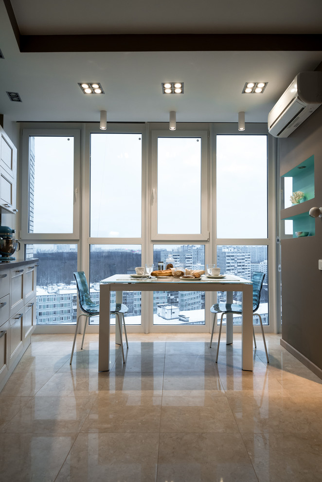

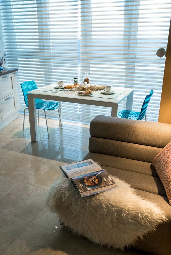
 The kitchen is placed on a light podium andfenced with railings on one side and steps on the other, it looks more like a summer veranda. The floor is covered with wood-like tiles laid in a herringbone pattern, and instead of heavy wall cabinets there are several open ones. The windowsill has been transformed into a small but comfortable table, where it is pleasant to have breakfast and watch the world outside the window wake up.
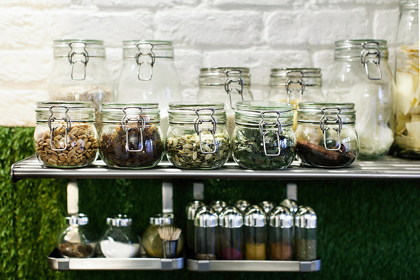
 But the most striking element of this kitchen is its unusualapron. Here, its role is played by a grass lawn, which is attached to the wall with Velcro. Drops of fat are practically invisible on it, and it can be easily removed from the wall, so it is very convenient to care for. As Marina admits, this idea came to her completely spontaneously. Initially, she drew moss on the sketches, but such a solution was expensive and not functional enough for the kitchen, and then an artificial Dutch lawn was accidentally found in a hardware store.
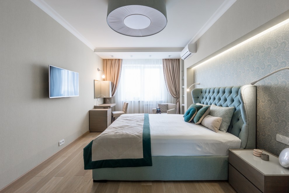
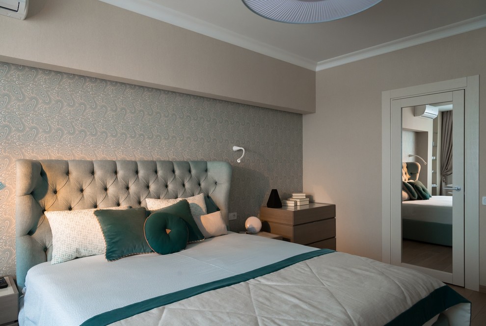
 The bedroom is radically different in colorgamma from the rest of the apartment. The designer was inspired to use this color scheme by the halls of the Royal Palace in Madrid and the sensations of moving through them: moving from hall to hall, you are immersed in a completely new world. With the help of a deep blue color, this effect was repeated in an ordinary Moscow apartment: leaving the blue gloom of the bedroom for the light living room, you wake up instantly, and vice versa.
 Marina Sirko, designer:— The design of the shelves, table and bedside table was also conceived and developed by me. I have a small carpentry workshop where I make custom furniture items under my own brand.
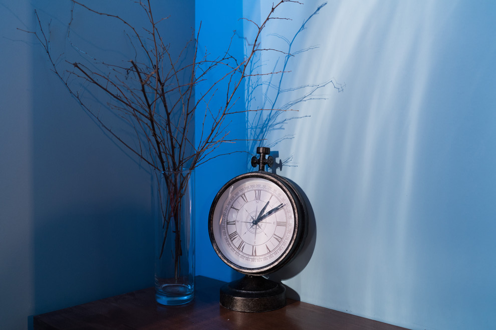
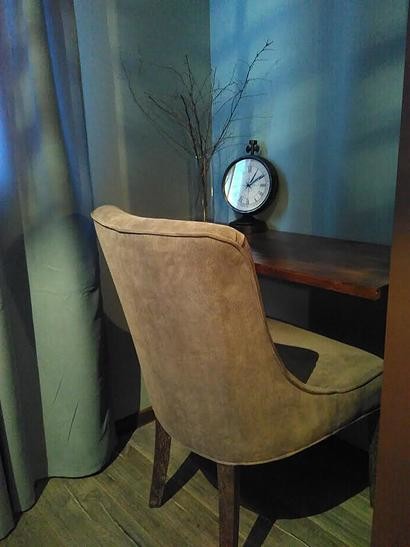
 To visually increase the area of a smallThe bedrooms, sleeping area and work area are marked in different shades of blue. In the niche of one of the columns there is a mini-office for quiet evening work. The Jane chair from the Dutch brand Roomer perfectly matches the color of the bed and is friendly with the delicate cashmere texture of the curtains.
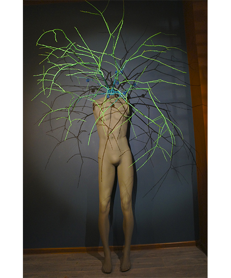
 It serves as an accent in the bedroom.an unusual art object - a mannequin, symbolizing the tree of thoughts and made by the designer herself. She deciphers its idea as follows: the branches in place of the mannequin's head symbolize the diversity of thoughts and ideas, this is a metaphor for the neural connections that create a person's individuality, and also store information about his experience, about who he was, who he is now and who he can become.
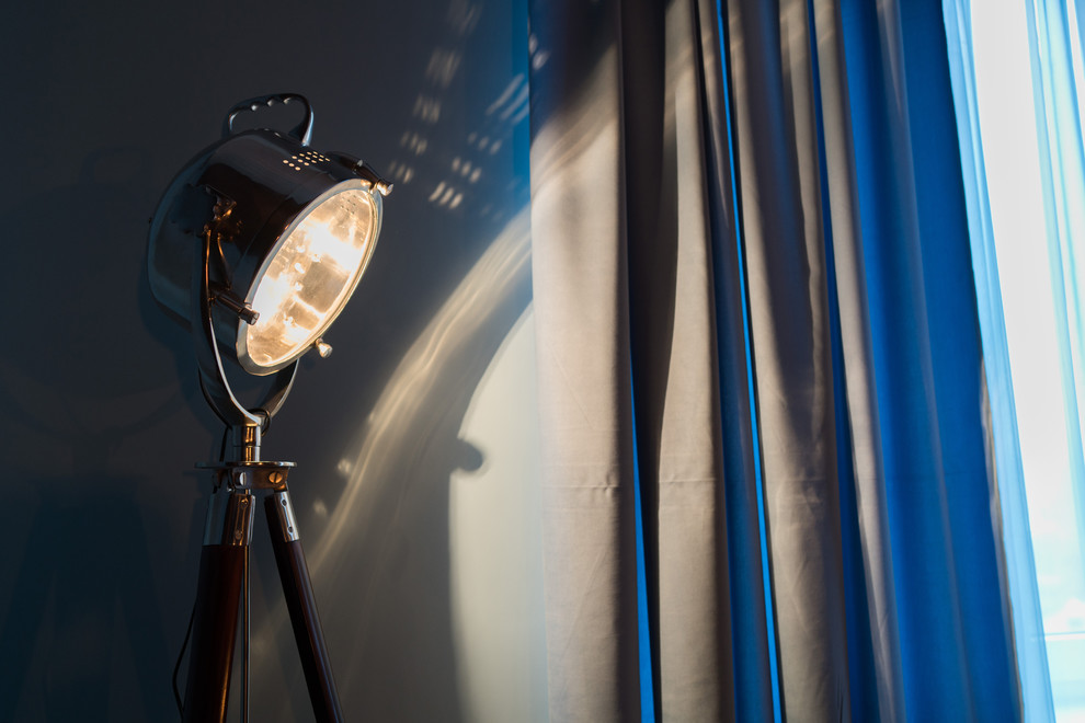
 Marina Sirko, designer: - I was lucky to find this wonderful nest-shaped chandelier, it casts incredible reflections on the ceiling and walls. A Montauk floor lamp illuminates the room from the corner.
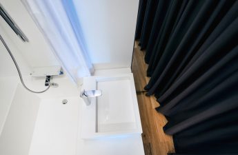
 In the bathroom, both the designer and the customer wantedto move away from the standard ideas about bathroom design, to make this room as similar to a living room as possible. This idea was realized 100%: the walls are finished with moisture-resistant plaster up to the middle, the floor tiles imitate the texture of wood, there are many paintings, the sink is placed on an old nightstand found at a flea market, instead of sconces - lanterns.

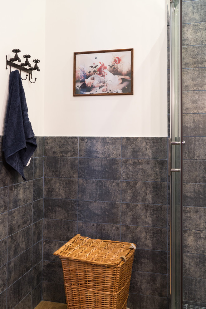 Marina Sirko, designer:— I accidentally discovered the hook-faucets in one of the wonderful interior shops of the Flacon design factory. The podium for the shower cabin is laid out with mosaics, which echo the wall tiles well.
 The hallway also turned out unusual, withcharacter. The basis of the color scheme was set by a sea-colored console found in the "Tvoy Dom" store. Then came a painting of flamingos hovering in the air by Olga Tobreluts, which determined the choice of color for the columns and beams. As a result, the combination of a delicate green-blue wall color with a terracotta-red palette became an excellent accent solution for the hallway - the place where you begin your acquaintance with the apartment.
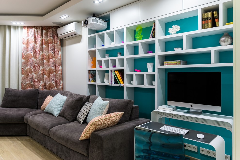
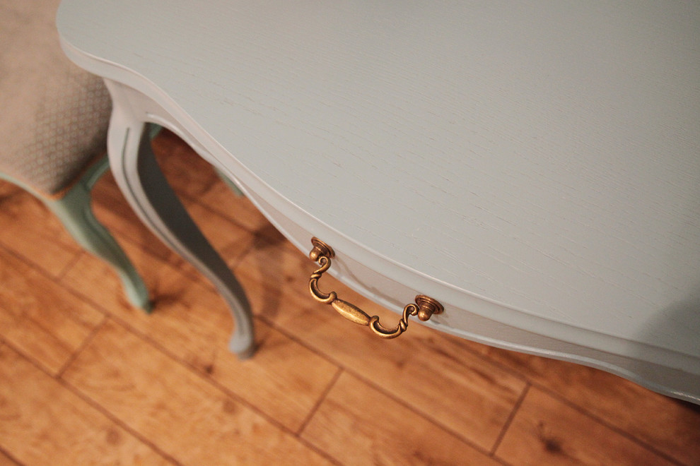 A huge white mirror and linen white curtainsvisually widen the narrow passage and add lightness to the corridor space. And of course, here we also see red beams, which, as in all other rooms, act as an indispensable accent of this interior.
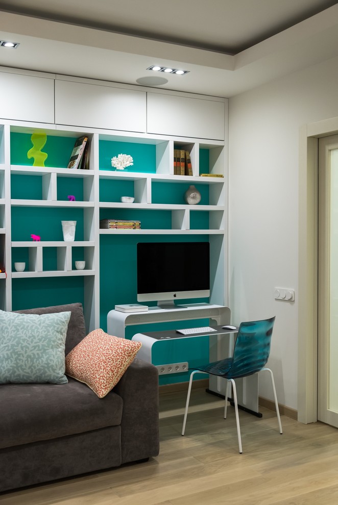 In fact, there are three working rooms in the apartment.places: one, more quiet, is in the bedroom, the second is on the podium in the kitchen and, finally, the third is the so-called “office” in the living room. All work areas differ in energy, and this office turned out to be the most active and bright: a white console table from IKEA is combined with a CosmoRelax chair in a rich red color and paintings by Ray Caesar on the wall.

How to get the most out of a 60-square-meter apartment – etk-fashion.com
