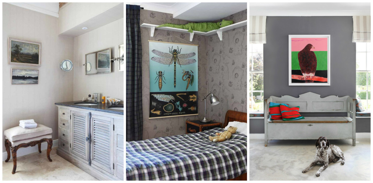
There are no boring rooms in this house, because its ownernot only a designer and a keen collector, but also a great lover of experiments and bright solutions. The reasons for looking for a new, more spacious home can be different: some people’s financial opportunities improve, others’ families grow, but designer Henriette von Stockhausen’s collection of antiques has grown.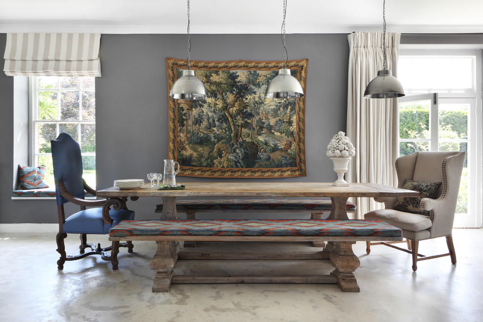 The designer's family is also quite large:A husband, 3 children and 2 dogs required no less space than antique furniture. And no matter how much she loved the 18th century cottage (their first shared home), she had to look for a more spacious replacement. The ideal option was an old stable built in 1730, which the designer found in the English town of Dorset. The building had already been converted into a residential building, but had not been used by anyone for a long time. Therefore, the only thing that Henrietta noted for herself was the huge windows and high ceilings. However, this was enough to decide to move here.
 The designer’s new home has 5 bedrooms and 4 bathrooms.
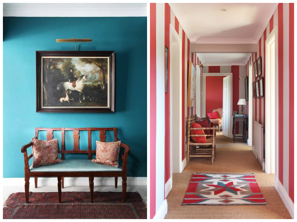
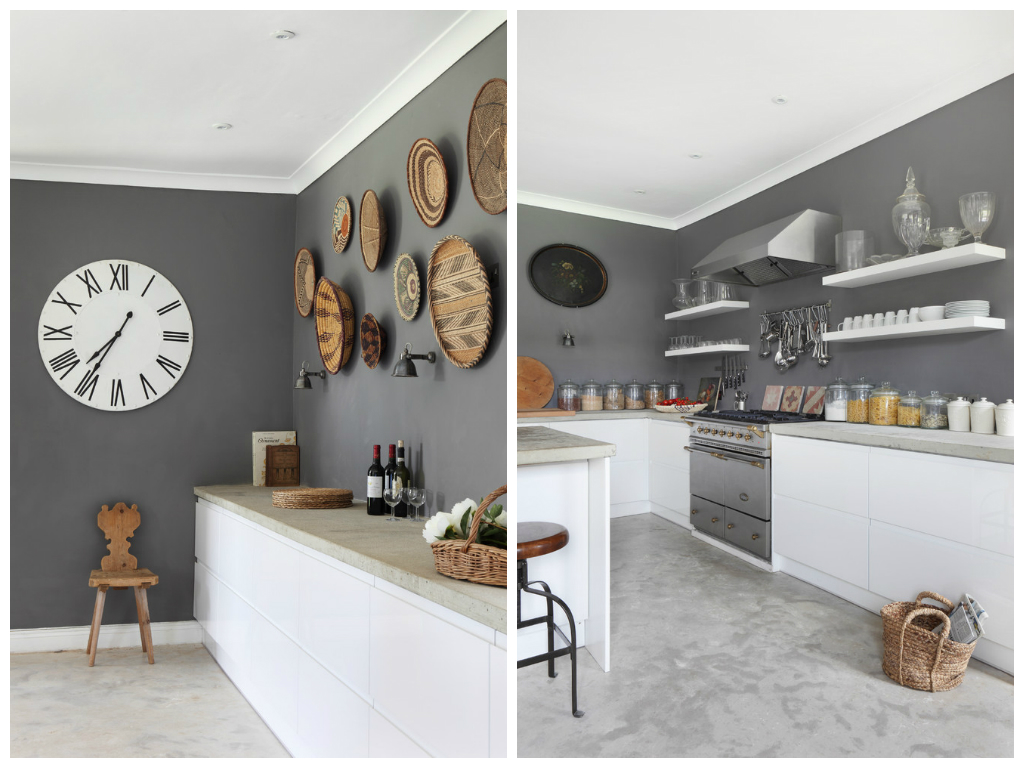 Henriette von Stockhausen tried to preservemaximum of historical elements of this house, but the temptation to create a modern background for his huge collection was too great, and most of the walls were painted a deep gray shade. The walls of the hallway, the only room with a tiny window, were “dressed” in a rich blue shade. The designer does not find this choice strange: the smaller and darker the room, the more interesting it should be, and the hallway simply must charge with energy.
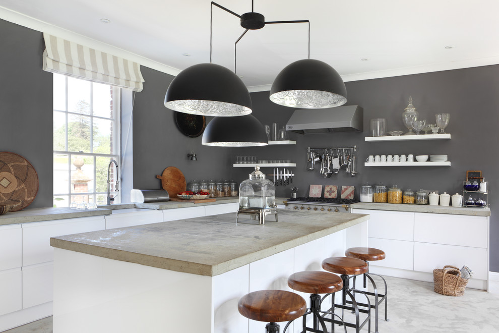
 The concrete floor in the kitchen is another strange thing.a decision that the owner explains by her love for living textures, which, in her opinion, can only be found on the surface of polished concrete. However, the decision has paid off: the kitchen looks stylish, modern, cozy and seemingly timeless. The owner claims that it is all about the hidden technology. From her point of view, household appliances are the killer of home comfort, and it is better to hide them.
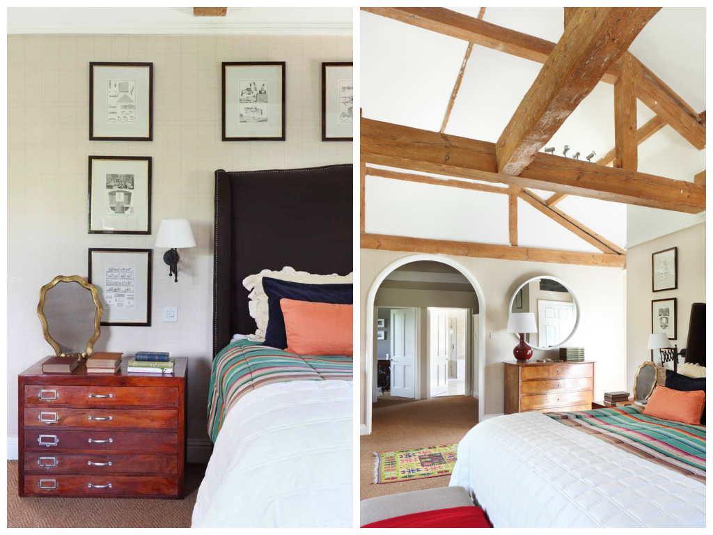 As for the fabulous living room, itThe design is due not only to the owner's ability to combine old and new, but also to the selectivity of her clients. The spectacular Verdure wallpaper by Zoffany was rejected by several customers at once and found a meaning of existence only in the designer's living room.
 Our opinion Corridors are that part of the interior,which can tolerate almost anything. There is no need to worry about overly dark, bright or risky decisions. The walls can be painted in a contrasting shade to the rest of the interior, covered with wallpaper that you really liked, but do not fit in with the decor of other rooms, or arrange a whole gallery from the family archive. And over time, you will be amazed to discover that those decisions that previously seemed risky are already perceived as quite acceptable, and the hallway can be decorated even more effectively. vspinteriors.com
Stable for a Collector: Vintage and Eclecticism in a Designer's House
