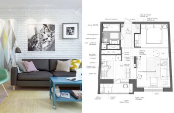
 We present an interesting article for discussionabout the amazing design of a small apartment. A professional in her field, Marina Sarkisyan did everything possible to bring to a very small home what a modern person needs for a comfortable life. Modest 28 square meters did not prevent her from compactly and conveniently arranging a kitchen, a bedroom and even a separate place for rest. She also managed to form, albeit a very tiny, but still functional living room.
Layout
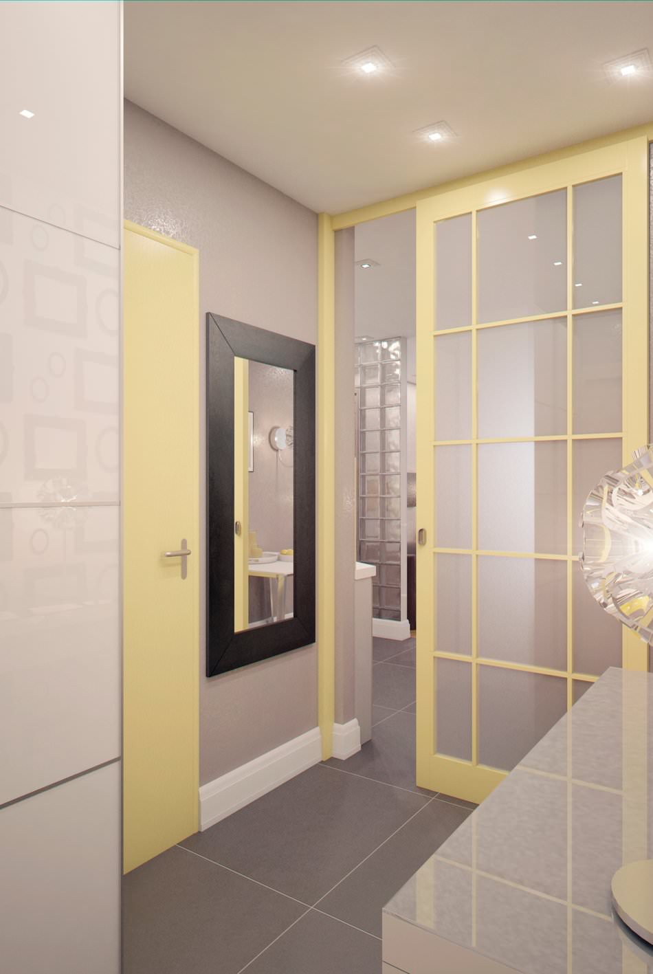
In cases where the area of the home is not pleasinglarge dimensions, it is not recommended to use bulky partitions for zoning. They further reduce the already miniature space. In this apartment, the division into zones occurs visually, and this task is performed by floor coverings that differ in appearance and composition. The original glass partition between the kitchen and the living room fits perfectly into the interior and visually expands the area of the apartment.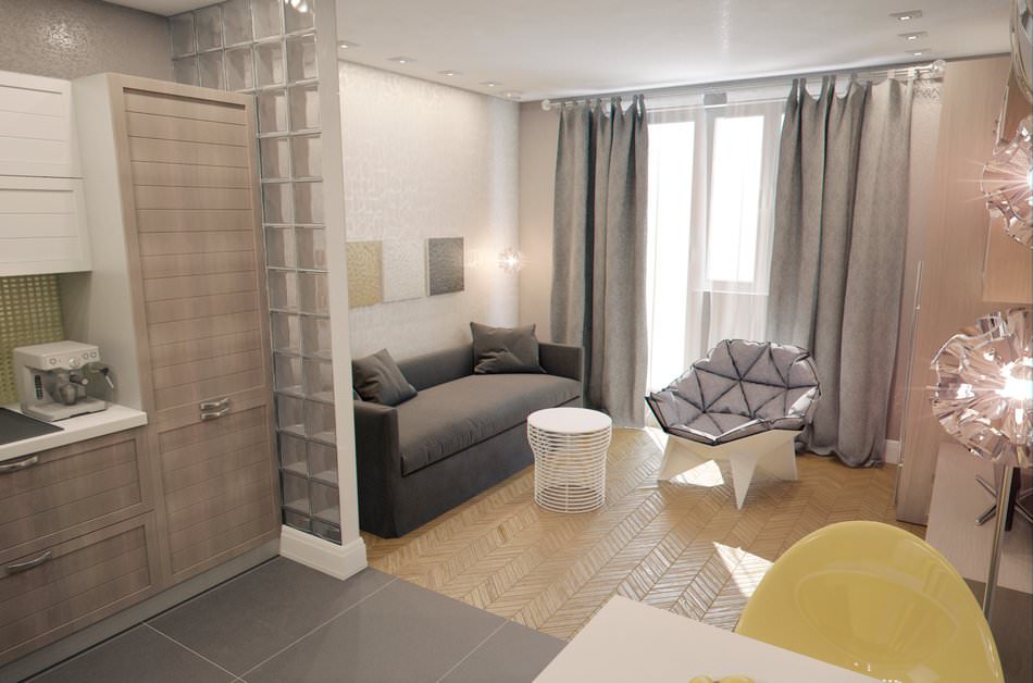 To avoid overloading small apartmentsunnecessary elements, the furnishings contain a minimal amount of furniture - only those items that cannot be dispensed with. But it was their original designs that were the main focus of the interior. The armchair and coffee table are spectacular art objects. They not only attract attention, but also give the room a unique charm.
Color spectrum
A gentle, calming tone was chosen as the basisgray tone. And the colorful yellow shade helped to correctly place accents in the room. The extraordinary play of light from the unique presentable lamps of the dining area created a lively festive atmosphere. And the elegant halogen lamps perfectly replaced the ceiling chandelier.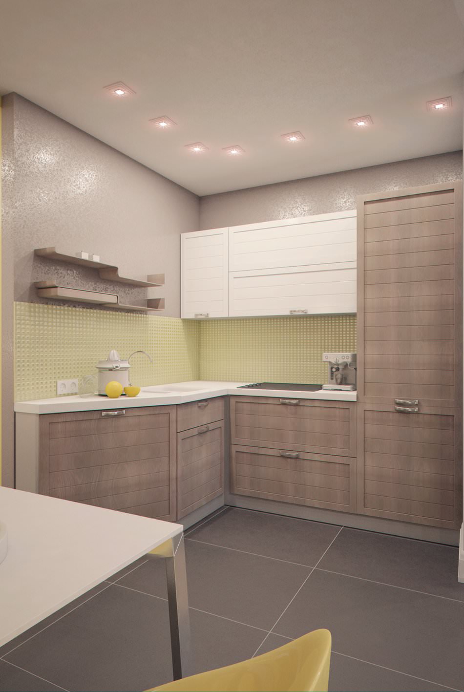
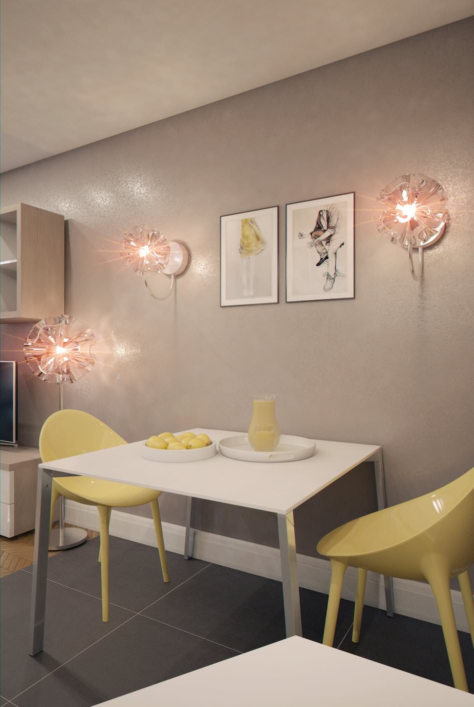 decorated in a comfortable modern style.It features even, calm and, at the same time, cozy shades, and the rich yellow color of some objects adds a touch of positive energy to the interior.
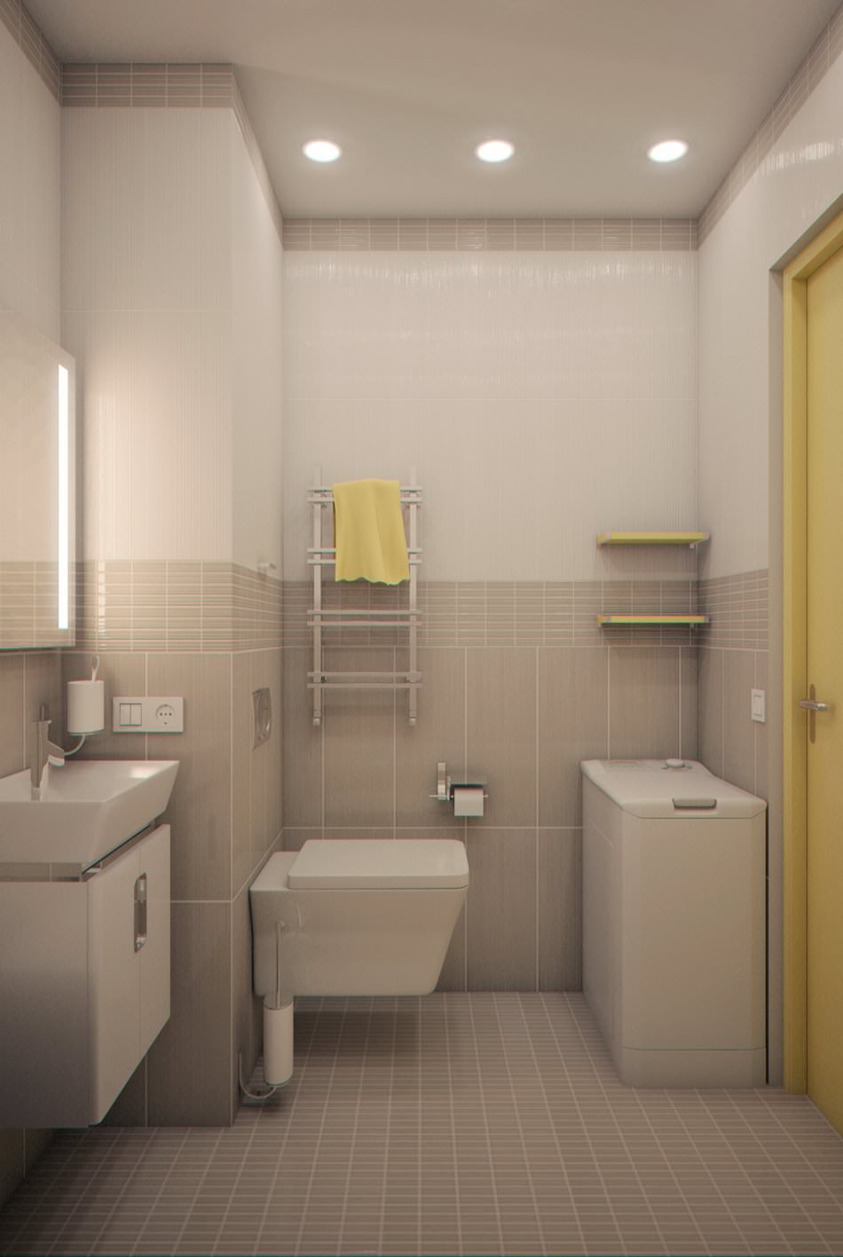
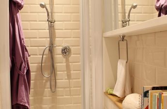
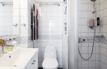
 The bathroom is also dominated by a grey tone, while sunny-coloured towels and shelves effectively accentuate the attention and fit organically into the overall style of the interior.

 The interior of the apartment is submitted to the readers' judgmentwith a total area of about 50 square meters on Primorsky Prospekt in St. Petersburg, owned by a young family of two. This couple decided to seek help from promising designer Anastasia Barkhatova. A few words about the artist. After graduating from university, Anastasia Barkhatova worked at the Siberian Research and Design Institute as an architect. After some time, she took up 3D graphics, while simultaneously studying design. After completing her studies and to this day, she has been engaged in interior design. Her track record includes victories in several competitions in 2001 and 2013.
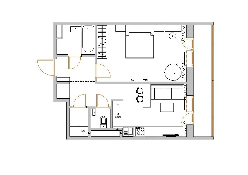
 The room where the specialists workedwas slightly smaller than stated, because the customers asked not to touch the bathroom and laundry room. All the space, except for the one left unchanged, was divided into zones. The living room was turned into a full-fledged bedroom, and the kitchen and the guest room were combined.
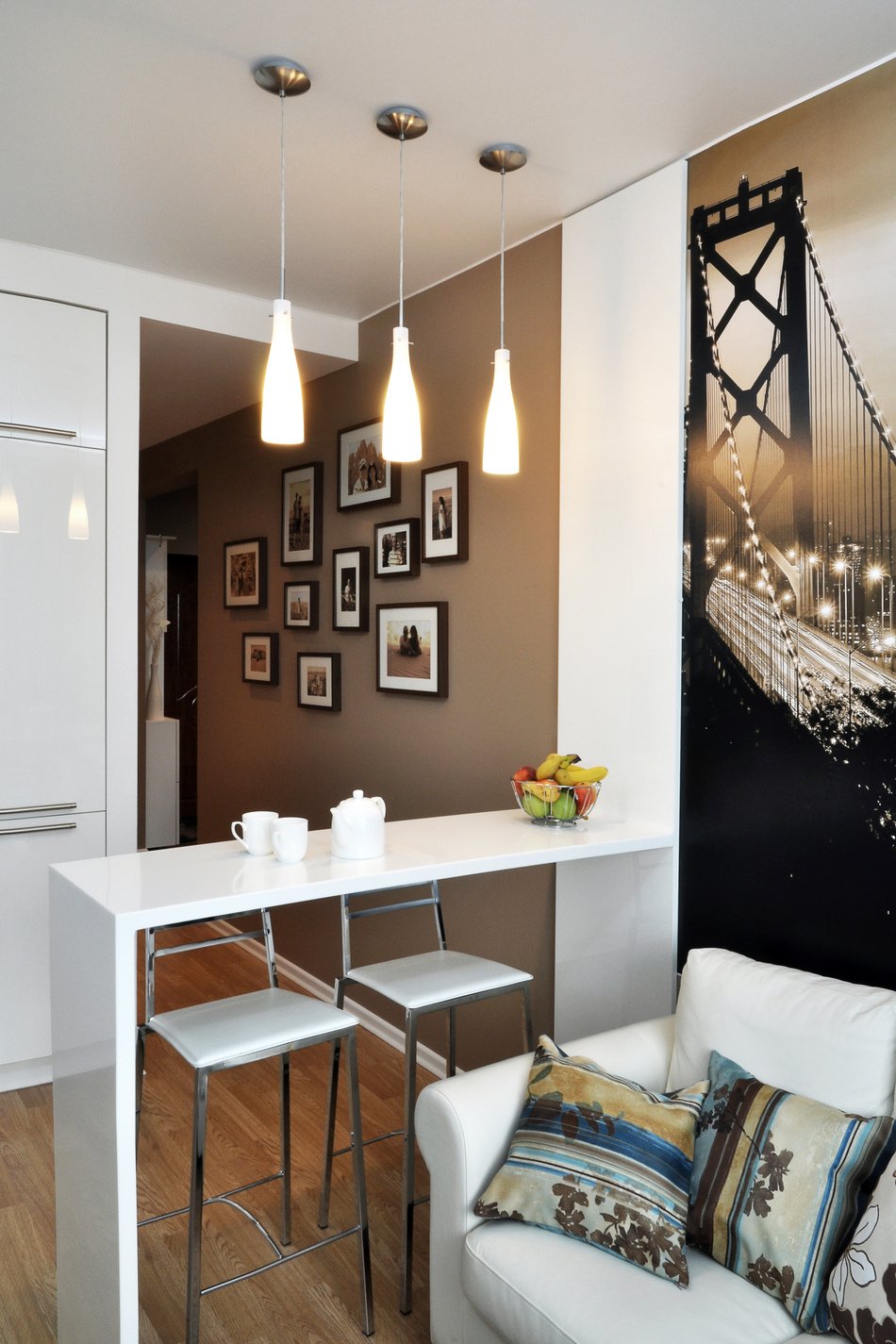

 Style No specific style was chosen. The professionals were faced with the task of developing a modern and, most importantly, in which a young couple could live comfortably.
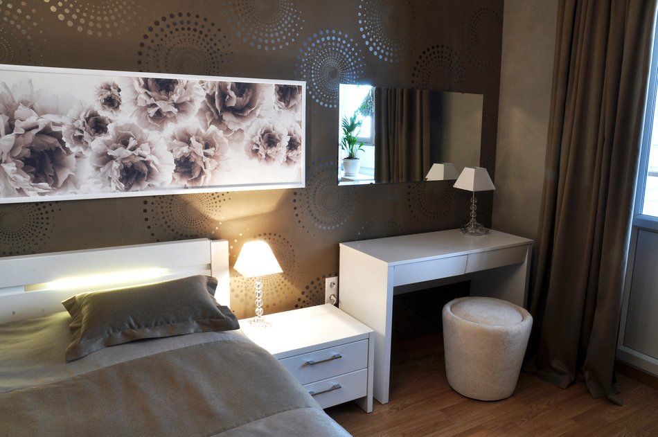
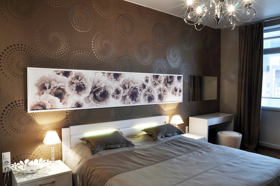
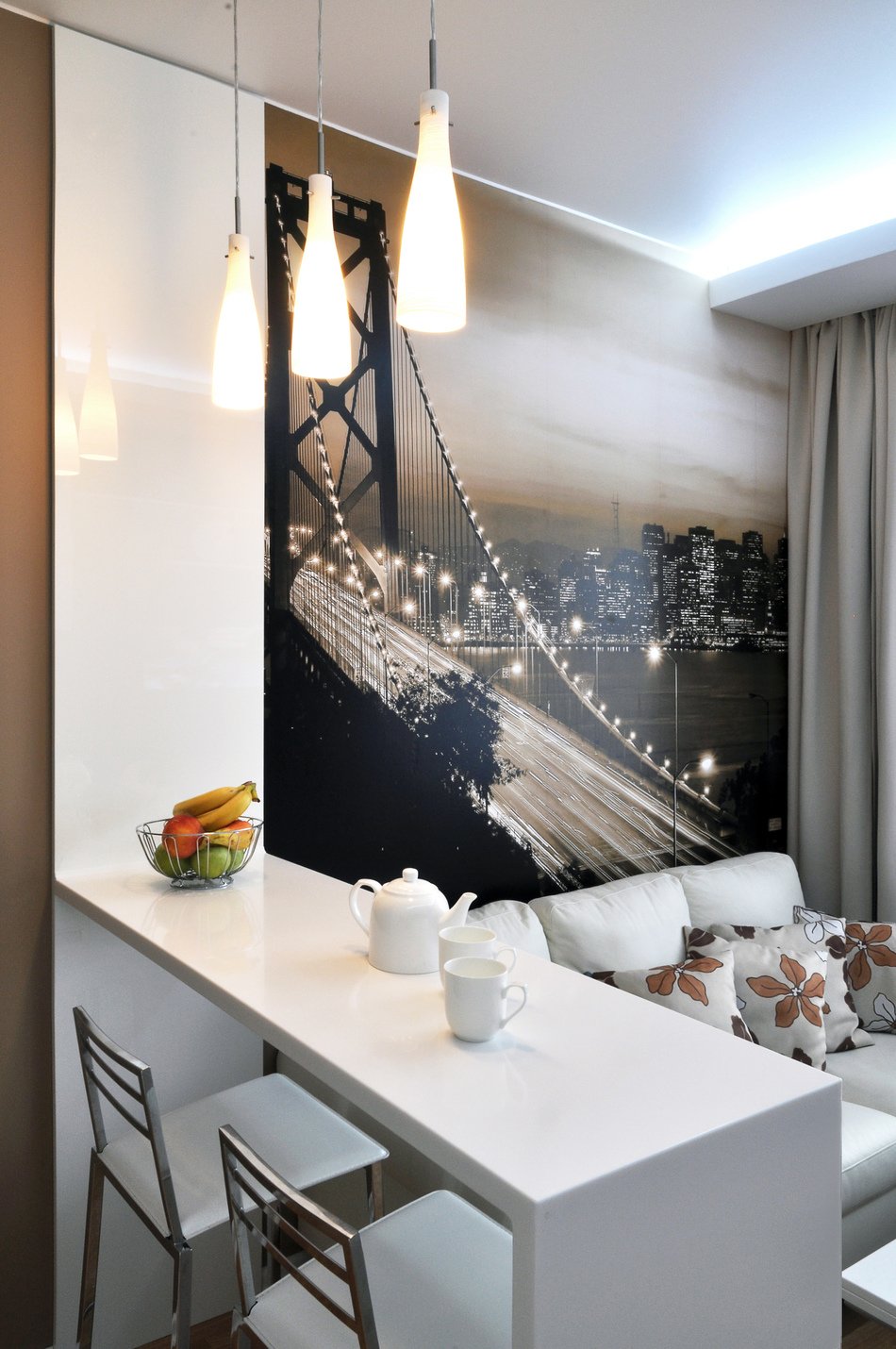
 Color and light The selection of colors was limitedexisting details. There were already dark brown tiles, white furniture for the bedroom and laminate, also a light shade. The tiles were laid in the kitchen and hallway. Wallpaper with an interesting pattern was selected to match it. The muted and relaxing atmosphere is created by dark walls and, in contrast to this, specially selected milky-white furniture seems to expand the space, visually expanding the small room.
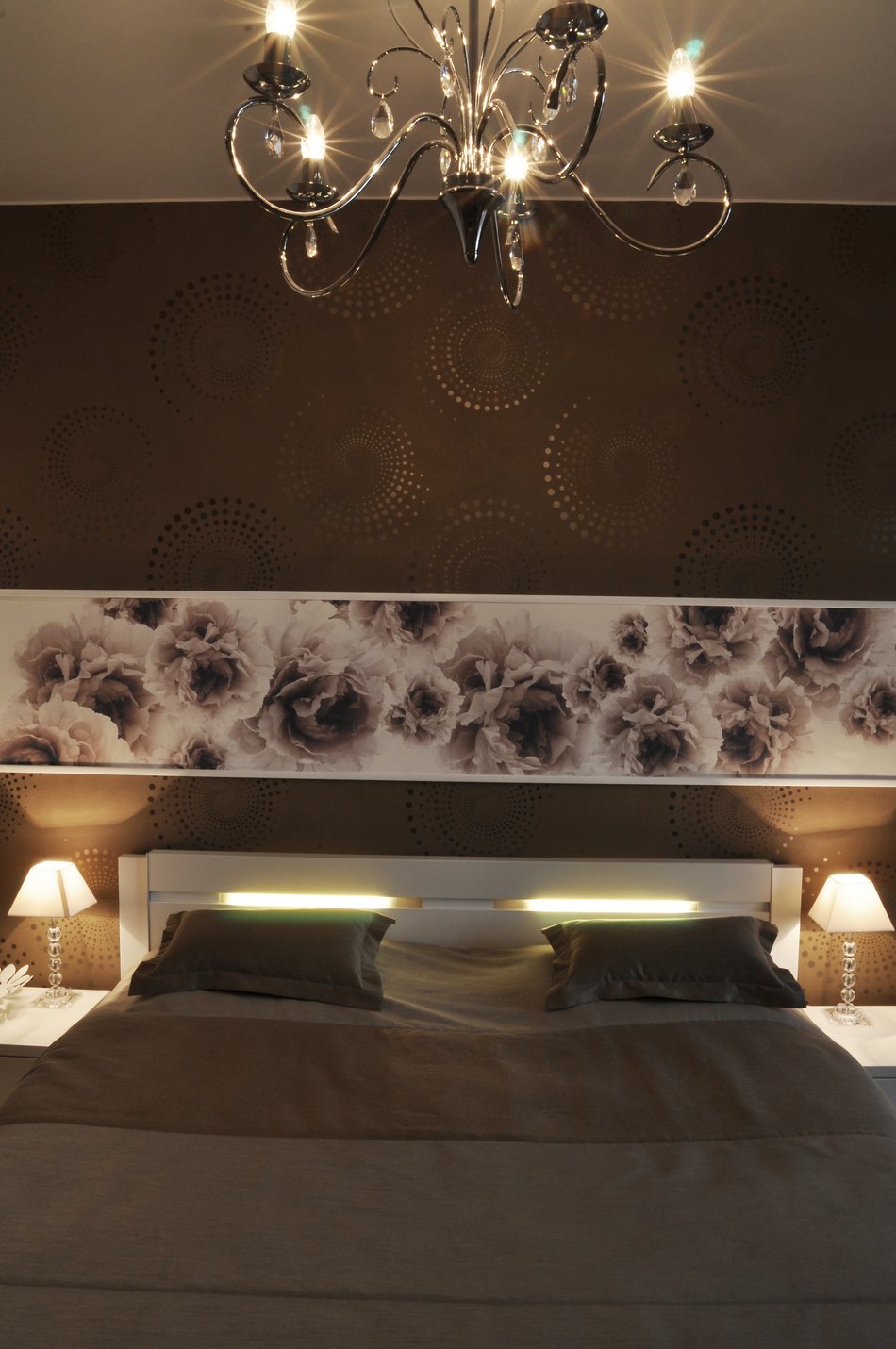

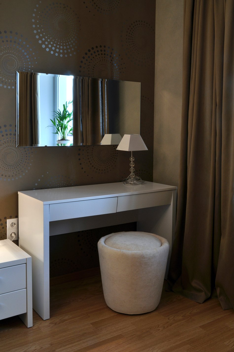
 Furniture Customers have already chosen for themselvesbedroom set, this question was not put before the designers, but as for the cabinet furniture, everything was designed and made to order: the kitchen, cabinets and bar counter. The dining table, which can be easily transformed into a coffee table if necessary, deserves special attention.
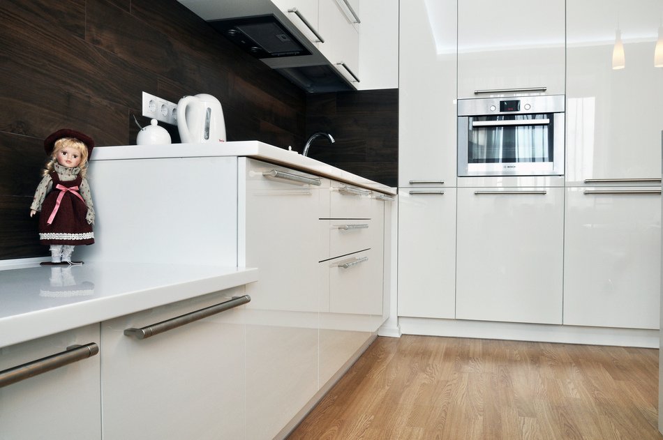

 What techniques did you use to visuallyincrease it? 1. The main element used in the described case is light furniture, which together with other details (doors, baseboards) visually expands the space of the room. 2. Another technique is the creation of a single style that erases the boundaries between rooms, which allows you to perceive the entire apartment as a whole. The overall impression is supported by the shade of the walls, floor, furniture.
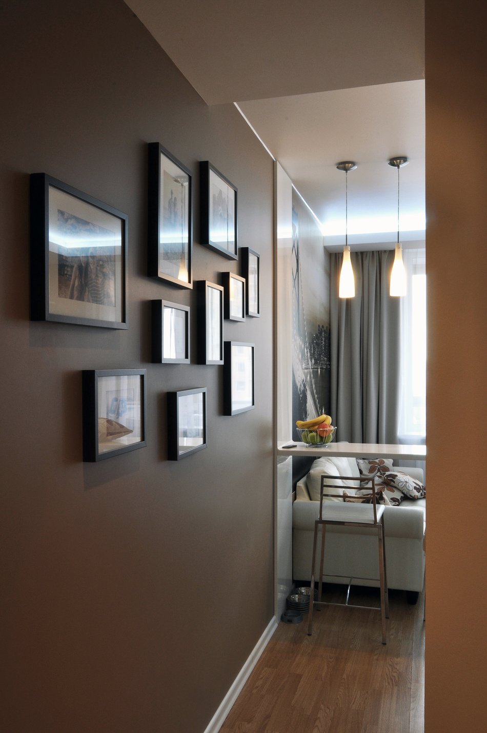
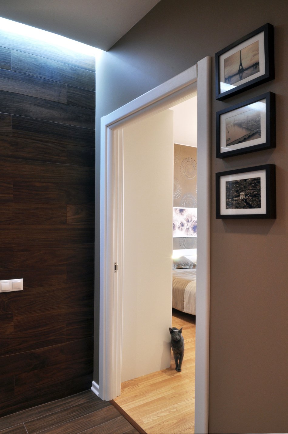
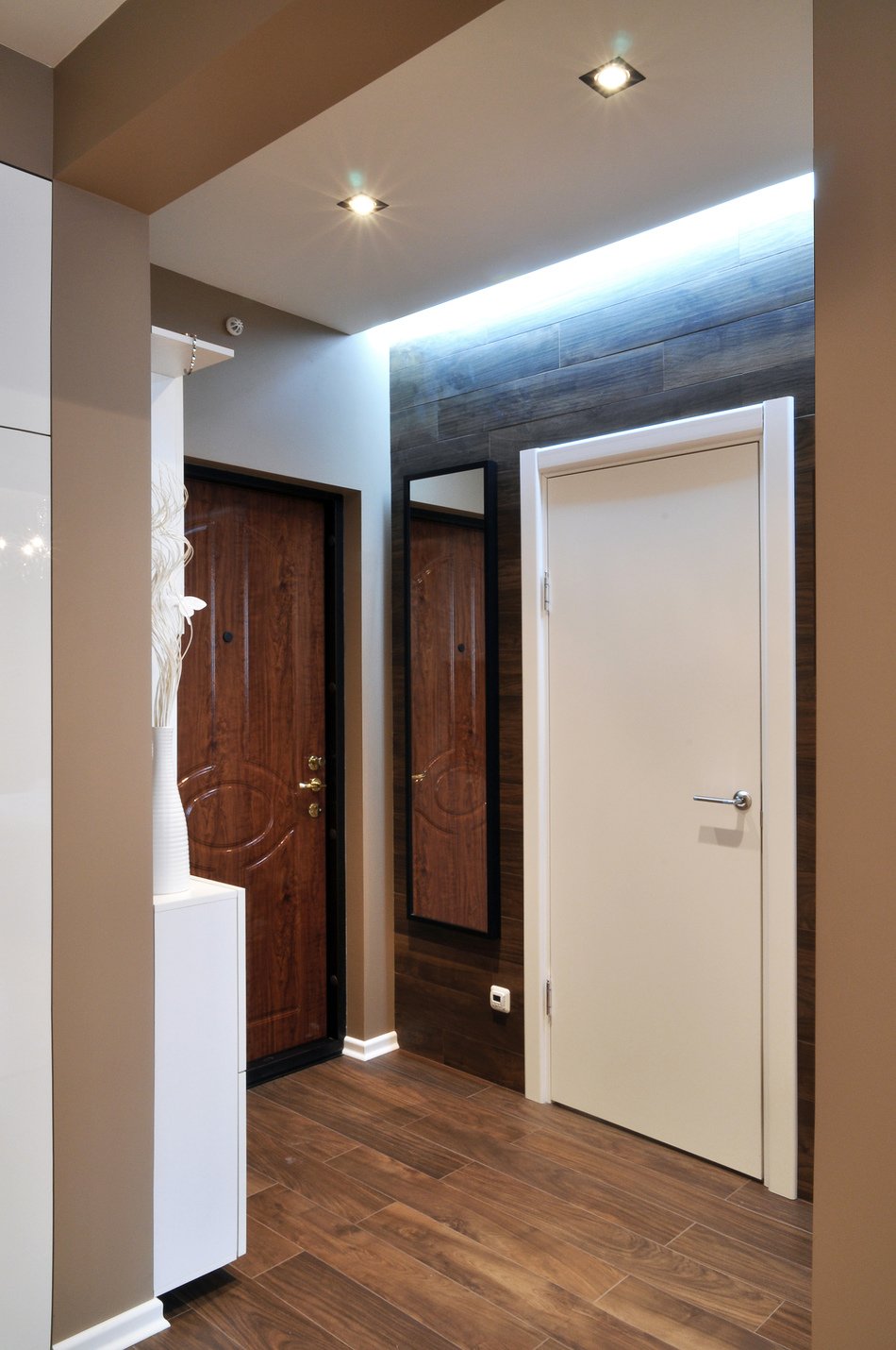
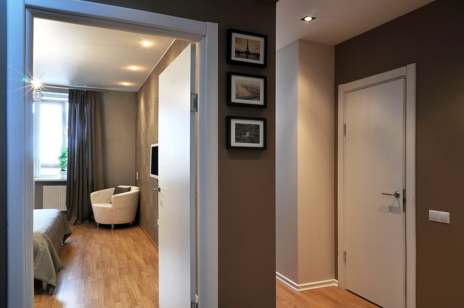 3.If you make built-in cabinets, you will have a feeling of more free space around. This also plays an important role when nothing hangs over you, as is usually done. 4. Functionally allocated zones according to their purpose also serve the set goal. For example, in the kitchen it is determined where food is prepared, and the place for receiving guests is clearly visible, all this is clearly defined visually and functionally.